What is Crown Royal Purple Velvet (1939)?什么是 Crown Royal Purple Velvet (1939)?
In 1939, a bottle of Canadian whisky dressed itself in deep purple velvet and gold filigree for a king — and never changed.1939年,一瓶加拿大威士忌为国王穿上深紫色天鹅绒与金色丝绣礼服,此后从未更改。
Crown Royal Purple Velvet (1939) in briefCrown Royal Purple Velvet (1939) 速览
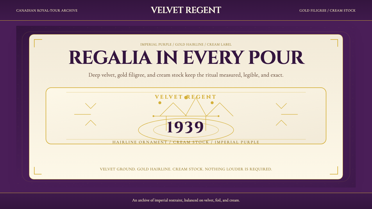
Crown Royal Purple Velvet (1939) is the visual identity system originating from one of the most deliberate acts of royal gifting in North American brand history. The aesthetic is built on three material references held in careful tension: deep purple velvet as the primary ground, giving the system its sense of ceremonial weight; gold filigree and hairline ornament as the decorative register, suggesting engraved regalia rather than printed label; and warm cream as the content surface, evoking the ivory of fine stationery and the paper of letters addressed to courts.Crown Royal Purple Velvet(1939)是北美品牌史上最刻意的一次皇室馈赠所诞生的视觉识别体系。这套美学建立在三种材质参照之间精心维持的张力上:深紫色天鹅绒作为主底色,赋予整套系统以仪典的分量感;金色丝绣与发丝线装饰作为修饰层,唤起的是雕刻徽章而非印刷标签的质感;温暖的奶油色作为内容承载面,令人联想到高级信纸的象牙白,以及呈递宫廷的信函用纸。
The system is not luxe in the contemporary sense — it does not chase shine or maximalist abundance. It is imperial in the older sense: every element earns its place through ritual significance. The velvet ground is not decoration; it is the pillow on which a crown sits. The gold hairline is not flourish; it is the stamp of authority. Cream is not softness; it is the dignity of fine paper. This hierarchy of materials, translated into visual language, produces a style that reads as ceremonial restraint — opulent without excess, formal without stiffness.这套系统并非当代意义上的奢华——它不追逐光泽感或极繁主义的丰盛。它是更古老意义上的帝王风范:每一个元素都通过仪式意义赢得自己的位置。天鹅绒底面不是装饰,它是王冠安放其上的软垫;金色发丝线不是华饰,它是权威的印记;奶油色不是柔和,它是精良纸张的体面。这种材质等级,被转化为视觉语言后,产生了一种读起来像是仪典式克制的风格——奢华而不过度,正式而不僵硬。
Designers working within this system must internalize the logic of the original object: a whisky bottle that functions as regalia, a cloth bag that functions as a jewel case. Every digital element — a card border, a section divider, a headline typeface — should answer the question of what material it is meant to evoke and whether it earns its ceremonial weight.在这套系统中工作的设计师,必须内化原始对象的逻辑:一瓶以礼服形态呈现的威士忌,一只以珠宝盒形态呈现的布袋。每一个数字元素——卡片边框、段落分隔线、标题字体——都应当回答这样一个问题:它意在唤起什么材质,它是否赢得了属于自己的仪典分量。
See the Crown Royal Purple Velvet (1939) design system查看 Crown Royal Purple Velvet (1939) 完整设计系统
Where does Crown Royal Purple Velvet (1939) come from?Crown Royal Purple Velvet (1939) 从何而来?
The commission was unprecedented in Canadian spirits history. In 1939, Samuel Bronfman, the founder of Seagram, learned that King George VI and Queen Elizabeth would visit Canada — the first reigning British monarch to do so. Bronfman directed the Seagram design team to create a whisky of exceptional quality that could be presented as a gift from Canada to the Crown. The whisky was blended from fifty selected whiskies sourced from Seagram's distillery in Gimli, Manitoba, and its production facility in Montreal, Quebec. The number fifty was itself a gesture: excess as tribute.这次委托在加拿大烈酒史上是前所未有的。1939年,施格兰创始人塞缪尔·布朗夫曼获悉英王乔治六世与伊丽莎白王后将访问加拿大——这是在位英国君主的首次加拿大之行。布朗夫曼指示施格兰设计团队创制一款品质卓越的威士忌,以作加拿大献给王室的礼品。这款威士忌由马尼托巴省吉姆利蒸馏厂与魁北克省蒙特利尔生产设施出产的五十种精选威士忌调配而成。五十这个数字本身即是一种姿态:以过剩作为敬意的表达。
The packaging was designed to be the gift as much as the liquid it contained. The Seagram designers of 1939 reached not toward the conventions of spirit labeling — the crests, the certificates of age, the stippled portraits of founders — but toward the language of the royal wardrobe and the jeweler's cabinet. A cloth bag of deep purple velvet, trimmed with gold-colored cord, encased the bottle entirely. The bottle itself bore a crowned label with gold-stamped lettering. The effect was of an object that belonged in a vitrine alongside medals and orders of chivalry, not on a back-bar shelf.包装被设计为与其中的液体同等重要的礼物本身。1939年的施格兰设计师们并未转向烈酒标签的惯常语汇——那些纹章、年份证书、点刻创始人肖像——而是转向了王室衣橱与珠宝师陈列柜的语言。一只以深紫色天鹅绒制成、以金色绳索收口的布袋将酒瓶完整包覆。酒瓶本身带有一枚烫金字体的王冠标签。整体效果令人觉得这件物品应当陈列在装有勋章与骑士勋位的玻璃橱柜里,而非摆放在酒吧货架上。
The royal tour completed, the gift was received, and Bronfman recognized what the packaging had achieved: it had elevated whisky from a product to a ceremony. Crown Royal was released commercially in Canada beginning in 1964, retaining every element of the original 1939 design — the purple velvet bag, the gold cord, the crowned label, the cream ground. The decision to not modernize the packaging has proven to be one of the most durable brand commitments in North American spirits history. The bag became an artifact in its own right; generations of consumers saved and repurposed the velvet pouches, creating an unplanned tradition of Crown Royal bag collecting and reuse that further embedded the object in cultural memory.皇家巡访结束,礼物被接受,布朗夫曼意识到这套包装所达成的成就:它将威士忌从一种商品提升为一种仪式。Crown Royal自1964年起在加拿大正式商业发售,保留了1939年原始设计的每一个元素——紫色天鹅绒袋、金色绳索、王冠标签、奶油色底面。不对包装进行现代化更新的决定,已被证明是北美烈酒史上最持久的品牌承诺之一。绒袋本身成为一件独立的文化遗物;数代消费者保存并再利用这些天鹅绒小袋,形成了一种计划外的Crown Royal袋收藏与再利用传统,进一步将这件物品嵌入了文化记忆。
The brand passed through Seagram's portfolio until Diageo acquired it in 2000 as part of the breakup of the Seagram empire. Under Diageo, Crown Royal expanded its product line significantly — new expressions, limited editions, collaborations — but the core visual identity established in 1939 remained the fixed reference point for every extension. The purple velvet and gold filigree, now legible as a design system rather than simply a packaging choice, have been interpreted across bottle formats, gift sets, promotional materials, and, more recently, digital and experiential contexts. The original commission for a king has outlasted the empire it honored.品牌在施格兰旗下持续运营,直至2000年帝亚吉欧在施格兰帝国解体过程中将其收购。在帝亚吉欧旗下,Crown Royal大幅扩展了产品线——新酒款、限量版、联名合作——但1939年确立的核心视觉识别始终是每一次延伸的固定参照点。紫色天鹅绒与金色丝绣,现在可以被理解为一套设计系统而非仅仅是包装选择,已在瓶型格式、礼品套装、推广物料以及近年的数字与体验场景中被反复诠释。为一位国王而生的原始委托,已然比它所致敬的帝国存续更久。
What defines the Crown Royal Purple Velvet (1939) look?Crown Royal Purple Velvet (1939) 的视觉特征是什么?
Color Ground底色基调
The dominant ground is a deep, saturated purple — not the bright violet of heraldic tradition nor the cooler lavender of Art Nouveau, but a velvet purple that absorbs light rather than reflecting it. This quality of absorption gives the system its weight. Against this ground, all other elements read as though illuminated from within rather than lit from outside. The secondary ground, used for content surfaces, is a warm cream that evokes fine laid paper and the color of aged ivory, providing a resting point within the system's ceremonial gravity.主导底色是一种深邃、饱和的紫色——既非纹章传统中明亮的紫罗兰,也非新艺术主义较冷的薰衣草紫,而是一种吸收光线而非反射光线的天鹅绒紫。这种吸收特质赋予了整套系统以分量感。在这一底色衬托下,所有其他元素读起来像是从内部发光,而非被外部光源照亮。次要底色用于内容承载面,是一种温暖的奶油色,唤起精细纸张与陈年象牙的色泽,在系统的仪典分量中提供一处视觉停歇。
Gold Ornament金色装饰
Gold functions not as fill but as line — a hairline filigree that traces borders, frames, and typographic embellishments with the precision of engraved metalwork. The character of this gold is warm and slightly matte, closer to the surface of stamped foil or antique gilding than to bright metallic paint. It reads as crafted rather than printed. The weight of gold lines is deliberate: thin enough to be understood as fine work, present enough to be seen at reading distance. Where gold appears as a broader element — a rule, a divider, an emblem — it still reads as drawn rather than flooded.金色的功能不是填充而是线条——一种发丝般的丝绣细线,以雕刻金属工艺的精准度勾勒边框、画框与字体装饰。这种金色的特质是温暖而略带哑光的,更接近烫压箔纸或古董镀金的表面,而非明亮的金属涂料。它读起来像是手工制作而非印刷输出。金色线条的粗细是经过深思的:细到足以被理解为精工之作,又足够显眼以在阅读距离内清晰可见。金色以较宽元素出现时——如分割线、隔断或徽章——仍然读起来像是描绘而非填充。
Typography字体排印
The typographic register draws from the tradition of Roman-imperial engraving — the carved letterforms of monuments and official proclamations — filtered through nineteenth-century British commercial typography and the fine spirits labeling conventions that followed from it. Serifs are essential to the system: they carry the weight of historical authority that sans-serif letterforms cannot. Headlines are set with deliberate formality, often capitalized, with generous letterspacing that gives each word the presence of a title carved in stone. Body text, where it appears, is set in smaller serif type on cream grounds, readable and dignified without competing with the ceremonial headline register.字体系谱源自罗马帝国铭刻传统——纪念碑与官方公告的雕刻字形——经由十九世纪英国商业排版及其后烈酒标签惯例的过滤与传承。衬线字体对于这套系统至关重要:它们承载着无衬线字体所无法传递的历史权威分量。标题以刻意的庄重感排设,常用全大写,字距宽裕,赋予每个词以石刻标题般的存在感。正文(如出现)则以较小的衬线字体排设于奶油底面上,清晰而庄重,不与仪典标题层级形成竞争。
Texture and Material Reference质感与材质参照
Unlike minimal or flat design systems that insist on the denial of material illusion, this system is rooted in the presence of material. The velvet ground is not merely a color; it is a surface with implied pile and depth. Gold ornament implies the resistance of metal under a graving tool. Cream implies the weight of heavy paper stock. In digital or print translations of the system, this material language is honored through surface treatments, printing effects, and rendering choices that amplify rather than suppress the sense of physical substrate. The system should never read as flat — it should read as though the materials are present beneath the surface.与那些坚持消除材质幻觉的极简或平面设计系统不同,这套系统根植于材质的在场感。天鹅绒底面不仅仅是一种颜色,它是一种具有隐含绒毛与深度的表面。金色装饰暗示着雕刻工具切入金属时的阻力。奶油色暗示着厚重纸张的分量。在系统的数字或印刷转译中,这种材质语言通过表面处理、印刷效果与渲染选择得以尊重——这些选择放大而非压制对物理基底的感知。系统的呈现绝不应当读起来平淡无物,而应读起来像是那些材质就潜伏在表面之下。
Proportion and Framing比例与画框
The system uses framing as a primary compositional device — nested rectangles, borders within borders, labels within panels — derived from the anatomy of the original bottle: a crowned label within a velvet bag within a gift box. This layering of containers gives every element a sense of having been placed and presented rather than simply positioned. White space within frames is treated as the silence of ceremony — necessary, deliberate, and not to be filled. The proportion of ornamental frame to content area is calibrated so that the frame is assertive but does not compete with what it contains.系统将画框作为主要构图装置——嵌套的矩形、边框中的边框、面板中的标签——这源自原始酒瓶的解剖结构:天鹅绒袋内的王冠标签,礼品盒内的天鹅绒袋。这种容器的层叠使每个元素都具有一种被摆放与呈献而非仅仅被定位的感觉。画框内的留白被视为仪式的沉默——必要的、刻意的、不应被填满的。装饰画框与内容区域的比例经过校准,使画框具有存在感却不与其所包含的内容形成竞争。
Ceremonial Restraint仪典式克制
The system achieves opulence through restraint, not excess. A common misreading of the style treats the velvet-and-gold combination as license to layer, embellish, and accumulate. The authentic logic is the opposite: because each element carries ceremonial weight, fewer elements are needed. A single gold hairline border on a cream field is more powerful than three borders stacked. One crowned emblem is more authoritative than a pattern of repeated emblems. This principle — that maximum ceremony is achieved through minimum elements correctly weighted — is the defining discipline of the system.这套系统通过克制而非堆砌来实现奢华感。对这种风格最常见的误读,是将天鹅绒与金色的组合视为层叠、修饰与累积的许可。真实的逻辑恰恰相反:正因为每个元素都承载着仪典分量,所需的元素才更少。奶油色底面上的一条金色发丝线边框,比三条叠加的边框更有力量。一个王冠徽章,比重复徽章的图案更具权威性。这一原则——最高程度的仪典感通过最少数量的正确分量元素来实现——是这套系统的核心自律。
Symmetry and Axial Balance对称与轴线平衡
Where Bauhaus prized asymmetric tension and Swiss International Style developed the rational grid, Crown Royal Purple Velvet works from axial symmetry — the compositional logic of medals, royal warrants, and formal proclamations. Layouts are centered, elements are mirrored, and the visual hierarchy flows from the crown at the apex downward through headline, sub-heading, and body in a formal cascade. This axial symmetry is not the rigidity of bureaucratic form; it is the deliberate staging of ceremony, the arrangement of a table set for a formal dinner rather than an office workspace.包豪斯推崇非对称张力,瑞士国际主义风格发展了理性网格,Crown Royal Purple Velvet则从轴线对称出发——勋章、王室授权状与正式公告的构图逻辑。版面居中,元素镜像,视觉层级从顶端的王冠向下流经标题、副标题与正文,形成庄重的瀑布式排列。这种轴线对称并非官僚表格的僵硬,而是仪式的刻意布置——如同一张正式晚宴的餐桌摆设,而非一个办公工作台。
See the Crown Royal Purple Velvet (1939) design system查看 Crown Royal Purple Velvet (1939) 完整设计系统
Who shaped Crown Royal Purple Velvet (1939)?谁塑造了 Crown Royal Purple Velvet (1939)?
The founder of Seagram and the man who commissioned Crown Royal for the 1939 royal visit. Bronfman built Seagram into the largest distilling operation in North America through a combination of aggressive acquisition and relentless quality investment. His decision to create a gift whisky of exceptional standard for King George VI was both an act of personal ambition — Bronfman was acutely aware of his outsider status as a Jewish immigrant in Canadian society — and a calculated assertion of Canadian distilling on the world stage. The Crown Royal commission was the crowning expression of his belief that Canadian whisky could achieve the dignity of the finest spirits anywhere.施格兰创始人,1939年皇家访问的Crown Royal委托发起者。布朗夫曼通过积极并购与持续的品质投入,将施格兰建设为北美规模最大的蒸馏企业。他决定为乔治六世创制一款品质卓越的礼品威士忌,既是个人抱负的体现——布朗夫曼对自己作为加拿大社会中犹太移民局外人身份有着强烈的自觉——也是加拿大蒸馏业在世界舞台上的一次蓄意宣示。Crown Royal委托是他信念的至高表达:加拿大威士忌可以达到世界上任何顶级烈酒所具有的尊严。
The anonymous designers of Seagram's 1939 Crown Royal packaging made decisions that have proven essentially permanent for over eighty years. Their choice to foreground the bag as the primary experience — to make the unveiling of the bottle from its velvet pouch a ceremony in itself — was a remarkable inversion of conventional spirits packaging logic, which treats the bottle and label as the primary object and any additional packaging as secondary. The visual vocabulary they established: the purple velvet ground, the gold cord closure, the cream crowned label, the filigree border — became fixed reference points that no subsequent redesign has dared to substantially alter.施格兰1939年Crown Royal包装的匿名设计师们,做出了在八十余年后被证明实质上永久有效的决定。他们将袋子置于主要体验位置的选择——将从天鹅绒袋中取出酒瓶本身变成一场仪式——是对惯常烈酒包装逻辑的显著颠覆,后者通常将瓶体与标签视为主体对象,附加包装视为次级元素。他们所确立的视觉词汇:紫色天鹅绒底面、金色绳索收口、奶油色王冠标签、丝绣边框——成为此后所有改版设计都不敢实质改动的固定参照点。
The occasion of the 1939 Canadian royal tour — the first visit by a reigning British monarch to Canada — directly commissioned the creation of Crown Royal. George VI and Queen Elizabeth's visit was itself a diplomatic gesture of considerable importance, as Britain was preparing for the likelihood of war with Germany and sought to strengthen bonds with Commonwealth nations. The king did not design anything, but his symbolic presence as the intended recipient shaped every decision the Seagram team made: the scale of the commission, the choice of materials, the deliberate elevation of packaging to the level of royal presentation. The brand has carried his visit as its founding myth ever since.1939年加拿大皇家访问——英国在位君主首次访问加拿大——直接促成了Crown Royal的创制。乔治六世与伊丽莎白王后的此次访问本身具有重大的外交意义,彼时英国正为与德国开战的可能性做准备,积极寻求加强与英联邦国家的纽带。国王本人未参与任何设计,但作为预期受礼人,他的象征性存在塑造了施格兰团队的每一个决定:委托的规格、材料的选择、将包装刻意提升至王室呈献层级的决心。此后这个品牌将他的访问作为自身的创立神话,代代相传。
The global spirits conglomerate that acquired Crown Royal in 2000 as part of the dissolution of Seagram. Under Diageo's stewardship, Crown Royal has expanded from a single product into a wide range of expressions — flavored whiskies, higher-age-statement releases, limited editions, and collaborations — while maintaining the 1939 visual identity as the fixed anchor. Diageo's decision to extend the range without altering the core visual system has been commercially shrewd: the purple velvet and gold filigree function as a recognizable frame within which new expressions can be introduced without disrupting brand recognition. The tension between the static identity and the expanding product range has made Crown Royal one of the more studied cases in brand extension strategy.2000年在施格兰解体过程中收购Crown Royal的全球烈酒集团。在帝亚吉欧的管理下,Crown Royal从单一产品扩展为宽泛的系列酒款——加味威士忌、更高年份表达、限量版及联名合作——同时将1939年视觉识别作为固定锚点。帝亚吉欧在不改动核心视觉系统的前提下扩展产品线的决策在商业上颇为明智:紫色天鹅绒与金色丝绣作为可辨识的框架,使新酒款得以在不扰动品牌认知的情况下被引入。这种静态识别与扩张中的产品线之间的张力,使Crown Royal成为品牌延伸战略领域研究得最多的案例之一。
How do you use Crown Royal Purple Velvet (1939) today?今天怎么用 Crown Royal Purple Velvet (1939)?
The Crown Royal Purple Velvet system transfers to contemporary design contexts most naturally when the subject calls for ceremony, legacy, or institutional distinction — rather than approachability, informality, or technical neutrality. Applied correctly, it signals that whatever it adorns is of established quality and formal significance. Applied incorrectly, it reads as costume: the visual equivalent of wearing a crown to a casual gathering.Crown Royal Purple Velvet系统在当代设计场景中,当主题呼唤仪典感、传承感或机构区分度时——而非亲切感、非正式感或技术中立性——移植效果最为自然。正确应用时,它传递出被它装点的事物拥有成熟品质与正式意义的信号。应用不当时,它读起来像是服装表演:在休闲聚会上戴王冠的视觉等价物。
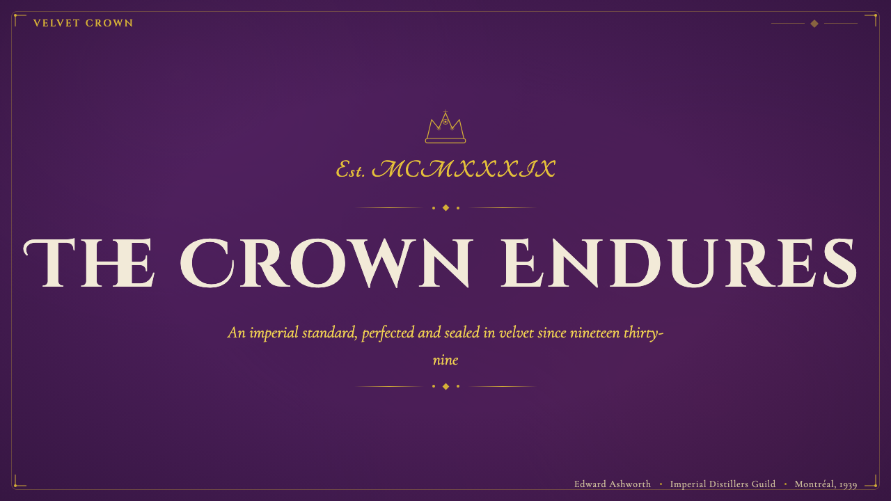
For presentation slides, the system works with particular force on cover pages and section dividers. A cover built on the deep purple ground, with the title set in formal centered serif type at generous scale, a gold hairline border framing the content area, and a cream-ground credential block at the bottom, achieves an immediate impression of gravity and occasion. Content slides should shift to the cream ground with the purple used sparingly — a left-margin rule in gold, a section label in deep purple — to prevent the dominant color from overwhelming legible content. Data slides within this system should be treated as formal charts rather than casual infographics: axis labels in small serif type, data bars or segments in a restrained palette drawing from the system's established hues, no decorative chart junk.在演示文稿中,这套系统在封面页与章节分隔页上的效果尤为强劲。以深紫色底面为基础的封面,标题以正式居中的衬线字体大号排设,金色发丝线边框围绕内容区域,底部以奶油色底面的资质信息块收尾,即刻产生一种分量感与仪典感。内容页应转移至奶油色底面,将紫色克制地使用——左侧留白处一条金色竖线规则,章节标签以深紫色点缀——以防止主导色淹没可读内容。系统内的数据页应被视为正式图表而非随意信息图:坐标轴标签使用小号衬线字体,数据柱或扇区使用来自系统既定色彩的克制色板,无任何装饰性图表杂质。
For web interfaces, this visual language is well-matched to premium product pages, membership program landing pages, gift configurators, and any context where the user is being invited into an experience of distinction. The system does not suit high-frequency transactional interfaces — checkout flows, search results, dense data tables — where the ceremonial weight slows rather than enhances. For a pricing or membership tier page, the approach works elegantly: each tier presented as a framed panel on cream ground, the highest tier distinguished by the full purple ground with gold typographic accent, creating a natural visual hierarchy that mirrors the product's actual value structure.对于网页界面,这种视觉语言与高端产品页、会员计划落地页、礼品配置器,以及任何邀请用户进入区分度体验的场景高度匹配。系统不适合高频交易界面——结账流程、搜索结果、密集数据表——仪典分量在这些场景中会拖慢而非提升体验。对于定价或会员等级页面,这种方法效果优雅:每个等级以奶油底面上的画框面板呈现,最高等级以完整的紫色底面配以金色字体点缀加以区分,创造出一种与产品实际价值结构相映照的自然视觉层级。
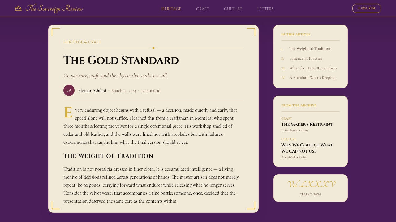
For editorial and marketing work, this style supports long-form feature content, brand heritage storytelling, and anniversary or commemorative publications. A feature article layout places the headline in a centered, capitalized serif at large scale on the purple ground, transitions to cream for the body text column with a narrow measure and generous margins, and uses gold ruled lines as section breaks. Marketing materials — print advertisements, digital display, out-of-home — work best when they resist the temptation to crowd the velvet ground with multiple competing elements. A single strong headline, a restrained gold ornament, and the branded bottle or emblem on the purple field will outperform a cluttered composition every time.对于编辑与营销工作,这种风格支持长篇特写内容、品牌传承叙事,以及周年纪念或纪念性出版物。特写文章版面将标题以居中、全大写的大号衬线字体置于紫色底面上,过渡至奶油色用于正文栏——窄行宽、宽裕边距——以金色分割线作为段落分隔。营销物料——平面广告、数字展示、户外媒介——在抵制用多个竞争元素填满天鹅绒底面的诱惑时效果最佳。一个有力的单一标题、一处克制的金色装饰,以及紫色背景上的品牌酒瓶或徽章,将始终优于一个杂乱的构图。
A common mistake when applying this system is treating the gold and purple as a color palette to be applied broadly, rather than as material references to be honored selectively. Designers who fill large interface areas with the full deep purple, use gold as a general highlight color across all interactive states, and multiply filigree ornament across every section will produce work that reads as themed rather than authoritative — the difference between a Halloween costume and dress uniform. The system's power comes from the considered use of the velvet ground as a moment of ceremony, cream as the working surface, and gold as the mark of authority applied only where it is truly earned.应用这套系统时最常见的错误,是将金色与紫色视为可以广泛应用的色板,而非应有选择地尊重的材质参照。将大面积界面区域填满完整的深紫色、将金色作为所有交互状态的通用高亮色、在每个章节中倍增丝绣装饰的设计师,将产出读起来像是主题化而非权威性的作品——就像万圣节服装与正式制服之间的差距。这套系统的力量来自于将天鹅绒底面视为仪典时刻的审慎使用,奶油色作为工作表面,金色作为仅在真正赢得之处施加的权威印记。
See the Crown Royal Purple Velvet (1939) design system查看 Crown Royal Purple Velvet (1939) 完整设计系统
Crown Royal Purple Velvet (1939) — FAQCrown Royal Purple Velvet (1939) · 常见问题
How is Crown Royal Purple Velvet different from other luxury or premium design styles?Crown Royal Purple Velvet与其他奢华或高端设计风格有何不同?
Most contemporary luxury design styles operate through one of two modes: the sparse minimalism of high-fashion houses (vast negative space, thin typography, near-absence of color) or the maximalist abundance of legacy jewelry and couture brands (gold fills, dense pattern, layered richness). Crown Royal Purple Velvet occupies neither position. Its foundation is material ceremony rather than visual scarcity or visual abundance. It uses a single dominant ground color at full depth, a single accent material (gold as line), and a single secondary surface (cream). The opulence comes from the weight and specificity of each element, not from their multiplicity. It is a system of three materials in disciplined relationship, which makes it more legible — and more transferable — than either of the dominant luxury modes.大多数当代奢华设计风格通过两种模式之一运作:高级时装品牌的稀疏极简主义(大量留白、细体字排版、近乎缺席的色彩),或传统珠宝与高级定制品牌的极繁丰盛感(金色填充、密集图案、层叠的富丽)。Crown Royal Purple Velvet两者均不属于。它的基础是材质仪典感,而非视觉稀缺或视觉丰盛。它使用一种完全深度的单一主导底色、一种单一的点缀材质(金色作为线条),以及一种单一的次要表面(奶油色)。奢华感来自每个元素的分量与特异性,而非它们的数量。这是三种材质在自律关系中的系统,这使它比两种主流奢华模式都更为易读——也更具可移植性。
Can this style work on a light background, or is the deep purple ground essential?这种风格能用在浅色背景上吗?还是说深紫色底面是不可或缺的?
The cream ground is a legitimate and frequently used surface within the system — it is not a compromise but a designed part of the original packaging vocabulary, representing the bottle label within the velvet bag. Work built primarily on cream with gold and purple used as accent reads as the label idiom rather than the velvet idiom; it is lighter, more legible for body text, and appropriate for contexts where the velvet ground would be too heavy. What does not work is a neutral grey, off-white, or white ground substituted for cream: these backgrounds lack the warmth and material suggestion that connect them to the system's material logic. The choice is between the velvet ground (deep purple, for ceremonial moments) and the label ground (warm cream, for content-heavy surfaces) — not an open selection of any light background.奶油色底面是系统内合法且频繁使用的表面——它不是妥协,而是原始包装词汇中被设计的组成部分,代表着天鹅绒袋内的酒瓶标签。主要建立在奶油底面上、以金色与紫色作为点缀色的作品,读起来是标签惯例而非天鹅绒惯例;它更轻盈、对正文更易读,适合天鹅绒底面会显得过重的场景。不奏效的是用中性灰色、米白或纯白代替奶油色:这些背景缺乏将它们与系统材质逻辑相连接的温暖感与材质暗示。选择在于:天鹅绒底面(深紫色,用于仪典时刻)与标签底面(温暖奶油色,用于内容密集的表面)之间——而非任意浅色背景的开放选择。
Does the style's association with alcohol limit where it can be applied?这种风格与酒类的关联是否限制了它的应用场景?
The style's source material is a spirit brand, but the visual language it employs predates that application by centuries. Deep purple, gold filigree, and cream are the materials of royal ceremony, ecclesiastical vestments, and aristocratic portraiture — all of which long predate any association with whisky. In contemporary practice, the style works naturally for: luxury goods of any category, financial services positioning themselves as established and trusted, membership programs with tiered distinction, hospitality and travel at the premium end, and any cultural institution (museum, opera, heritage organization) communicating longevity and authority. The association with spirits becomes a constraint only if the designer is working in a context where that association is culturally sensitive — children's educational contexts, certain health or wellness applications — in which case the style is simply the wrong choice.这种风格的素材来源是一个烈酒品牌,但它所运用的视觉语言在那次应用之前已有数百年历史。深紫色、金色丝绣与奶油色是王室仪典、宗教礼服与贵族肖像画的材质——所有这些与威士忌的关联都晚了许多。在当代实践中,这种风格自然适用于:任何品类的奢华商品、将自身定位为成熟可信的金融服务、具有层级区分的会员计划、高端酒店与旅游,以及任何传递持久性与权威感的文化机构(博物馆、歌剧院、遗产组织)。与烈酒的关联只有在设计师工作于该关联在文化上敏感的场景时才会成为限制——儿童教育场景、某些健康或健康应用——在这些情况下,这种风格从根本上就是错误的选择。
How should photography be handled within this system?在这套系统中应如何处理摄影图像?
Photography enters this system most successfully when it is treated as an object of presentation rather than a window into a scene. Product photography placed on the velvet ground works when the product is lit to emphasize material quality — the refraction of glass, the surface of precious metal, the texture of fine fabric — rather than set in a lifestyle context. Portrait photography, where it appears, should be treated formally: centered framing, dignified lighting, and a presentation that suggests the photographic tradition of official portraiture rather than casual documentary. Photography that implies informality, spontaneity, or everyday casualness will undermine the system's ceremonial register. When in doubt, a single well-chosen product image on the velvet ground will serve better than multiple lifestyle images competing for attention.摄影图像进入这套系统最成功的方式,是将其视为一件呈献的对象而非观看某一场景的窗口。置于天鹅绒底面上的产品摄影,在以强调材质品质的方式打光时效果最佳——玻璃的折射、贵金属的表面、精良织物的纹理——而非置于生活方式语境中。肖像摄影(如出现)应以正式方式处理:居中构图、庄重打光,呈现方式唤起官方肖像摄影传统而非随意纪录。暗示非正式感、即兴性或日常随意性的摄影将破坏系统的仪典基调。如有疑问,天鹅绒底面上一张精心选择的产品图像,将始终优于多张争夺注意力的生活方式图像。
What is the most important discipline to maintain when working with this system over time?长期在这套系统中工作时,最重要的自律是什么?
The most important discipline is resisting the accumulation of elements. Over the lifecycle of a design system in active use — across presentations, campaigns, product pages, social content — there is consistent pressure to add: a new accent color, a secondary ornament, an additional typographic register, a looser interpretation of the gold treatment. Each individual addition may seem minor, but collectively they erode the system's primary quality, which is the power of restraint. The velvet ground should feel rare when it appears. The gold hairline should feel precise and earned. Cream should feel like a deliberate choice rather than a default. A periodic audit that removes recent accretions and returns the system to its three essential materials is more valuable than almost any new addition.最重要的自律是抵制元素的累积。在一套设计系统被积极使用的生命周期中——跨越演示文稿、营销活动、产品页面、社交内容——始终存在添加的压力:一种新的强调色、一个次级装饰元素、一个额外的字体层级、对金色处理更宽松的诠释。每一次单独的添加或许看似微小,但累积起来,它们会侵蚀系统的核心品质——克制的力量。天鹅绒底面出现时应当感觉稀有。金色发丝线应当感觉精准且赢得应得。奶油色应当感觉是一种刻意的选择而非默认设定。定期进行一次审计,移除近期的累积元素并将系统归还给其三种本质材质,比几乎任何新增内容都更有价值。
Related design styles相关设计风格
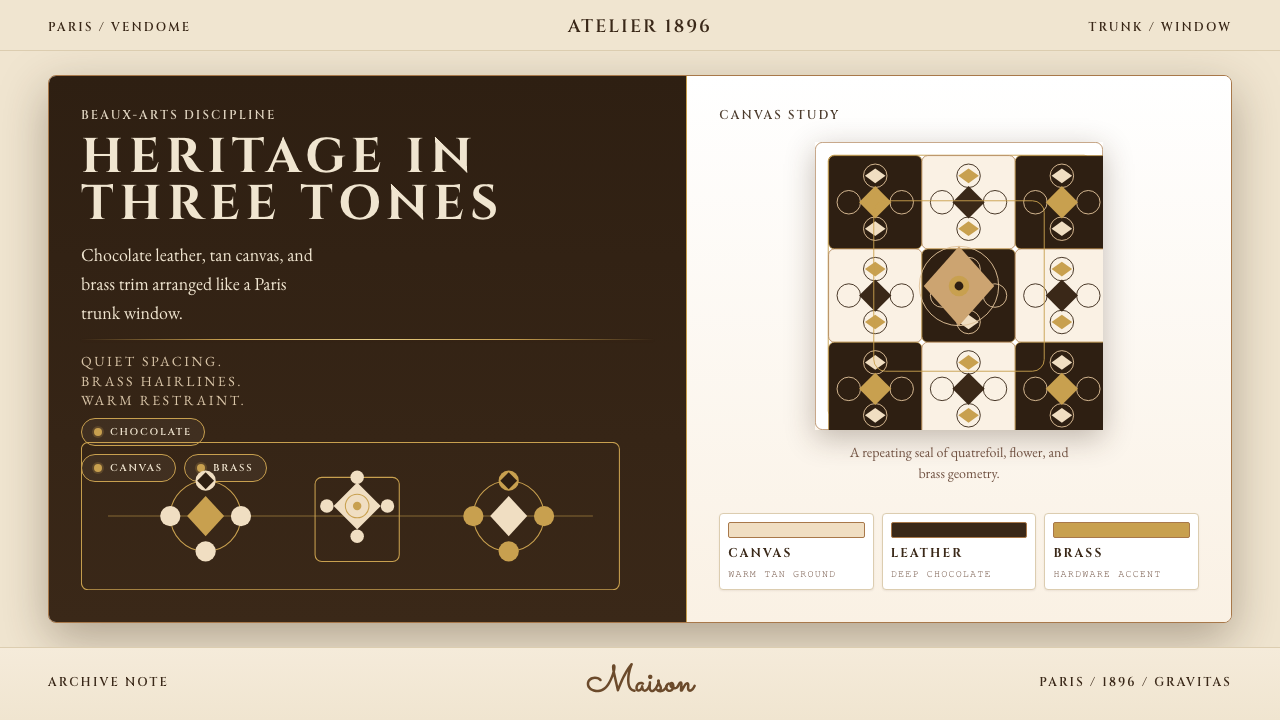 Louis Vuitton MonogramHeritage stays luminous. Chocolate, tan, and brass stage a Paris trunk window.优雅很有分量。巧克力棕、驼色与黄铜构成巴黎箱窗。
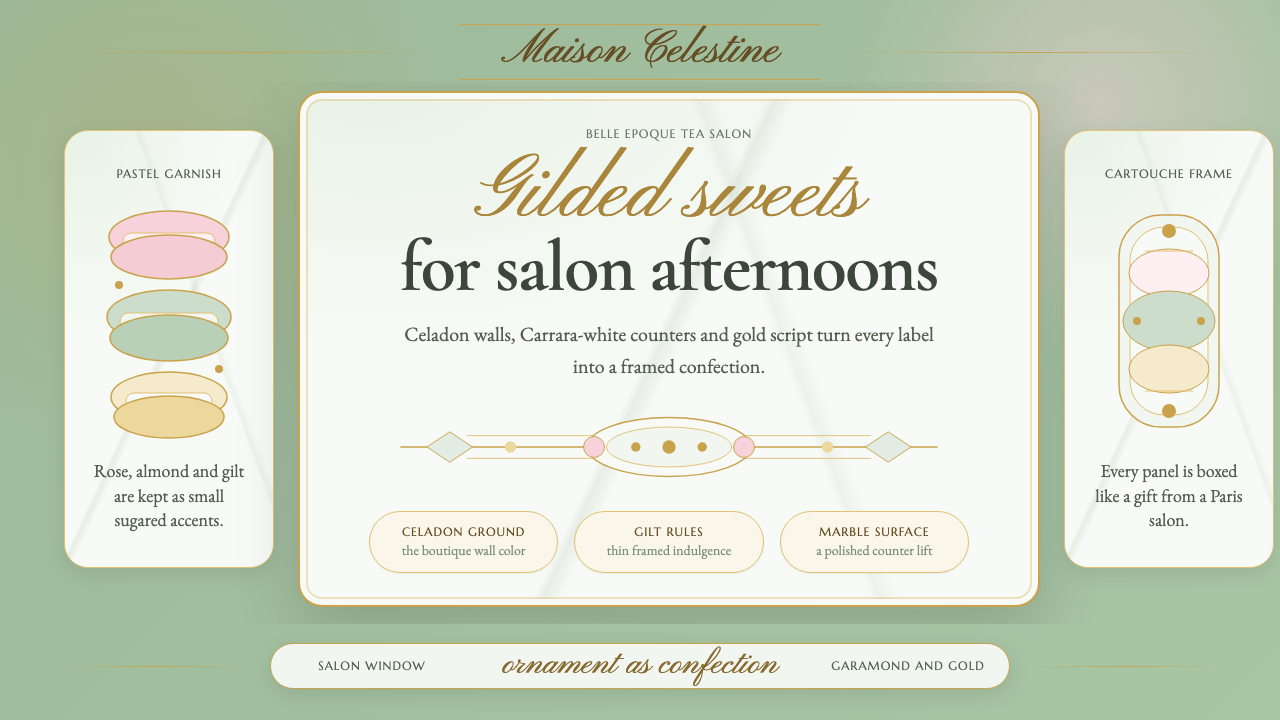 French PâtisserieOrnament is the luxury. Celadon ground, gilt cartouches, Garamond and script…以装饰定义奢华:青瓷绿底、烫金框、加拉蒙与花体字。
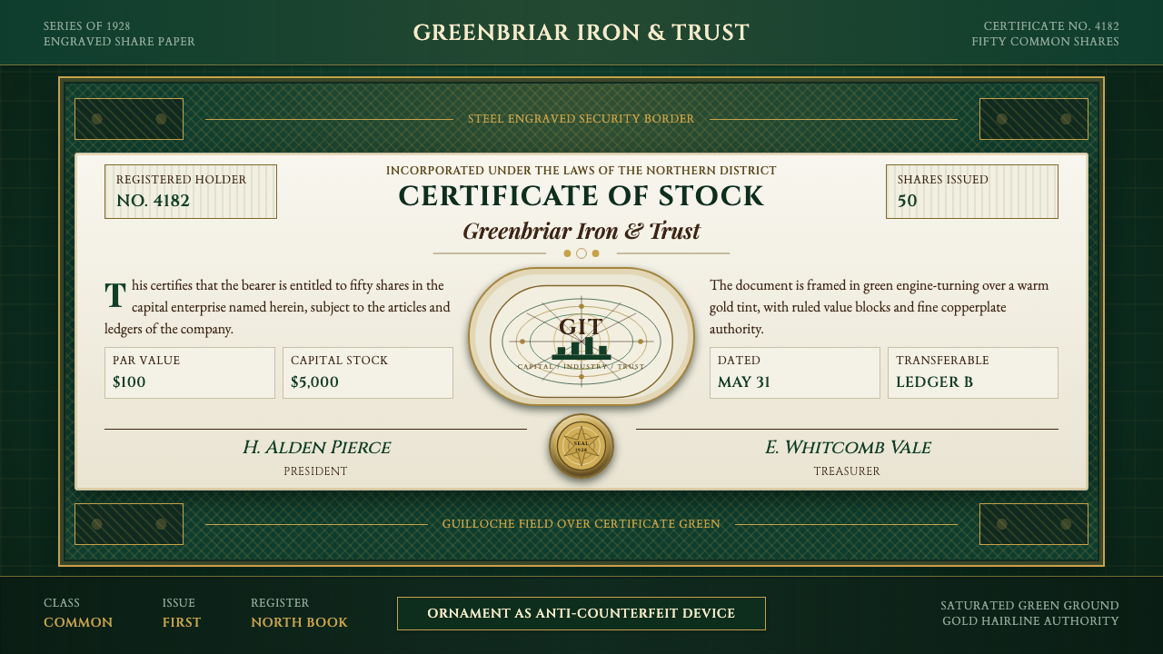 Stock CertificateCapital made ceremonial. Certificate green, gold hairlines, and guilloche bor…资本被仪式化。证书绿、金色细线与扭索边框撑起权威感。
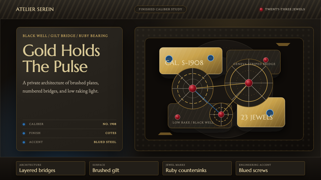 Watch MovementLuxury turns mechanical. Gilt stripes, ruby points, and blue accents glow on…机械化作奢华。黑底镀金纹、红宝石点与蓝钢细节发光。
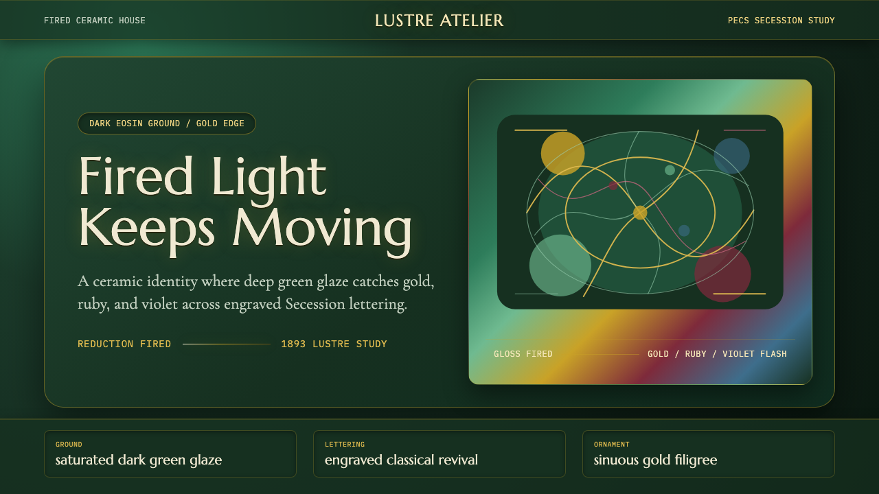 Zsolnay Eosin CeramicsGlaze becomes theater. Dark eosin green flashes gold, ruby, and violet throug…釉色即剧场:深绿釉地在分离派曲线中闪出金、红与紫。
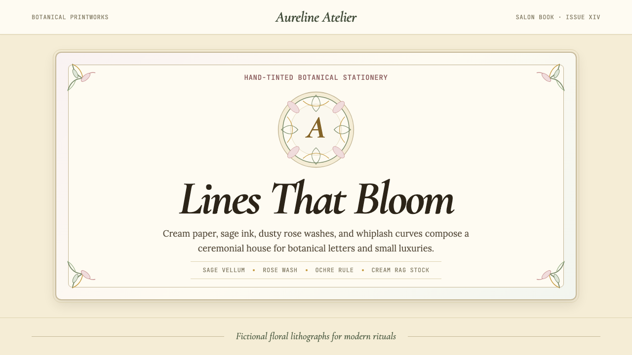 Art Nouveau (Mucha)Mucha's whiplash arabesques. Botanical halos, muted lithograph palette, no ma…穆夏的鞭线式有机曲线:植物光环、柔和石版印刷色、奶油纸底——拒绝机械刻意的边缘。