What is Stock Certificate?
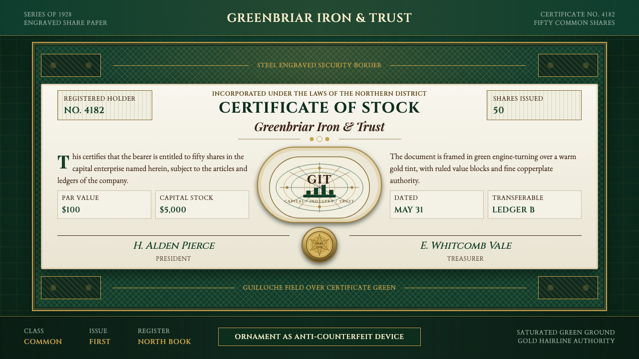
A stock certificate was engraved like currency because it needed to be trusted like currency — the design itself was the security system.
Stock Certificate in brief
Stock Certificate is the design language of the American engraved share certificate at its most elaborate, roughly 1900 through 1950 — the era when specialist security-printing houses treated a piece of corporate paper with the same craft rigor as a banknote. The dominant color is a saturated certificate green, the color long associated with American paper money, laid over warm engraving-paper panels that read as aged, fibrous, and slightly ivory rather than clinical white.
The system exists because a certificate had to do two contradictory jobs at once: look valuable enough that an investor believed the company behind it was substantial, and resist forgery well enough that a bank or transfer agent could accept it at face value without a second look. Both jobs were solved by the same techniques — dense engraved linework, a central allegorical vignette, and a gold medallion seal — which is why the aesthetic still reads as authoritative rather than merely decorative.
Visually, the language is built from a small number of repeating devices: a guilloché border of interlocking fine lines too intricate to hand-copy, a copperplate script masthead carrying the company name, ruled boxes for par value and share count, and one large steel-engraved vignette in the center — typically an allegorical figure or an industrial scene standing in for the company's business. Nothing is casual; every line was cut by hand into a metal plate before it ever touched paper.

Where does Stock Certificate come from?
Engraved security printing has roots in banknote production going back to the eighteenth and nineteenth centuries, when governments and private banks needed paper money that ordinary counterfeiters could not reproduce by hand. The technique that made this possible was steel-plate engraving combined with guilloché — a mechanically generated pattern of continuous interlocking curves produced by a rose engine, a lathe-like device that traces mathematically precise, repeating geometric paths. A human forger could copy a picture; almost none could copy a guilloché pattern freehand, which made it the security feature of choice.
As American capital markets expanded through the late nineteenth and early twentieth centuries — the era of railroads, industrial trusts, and the first wave of publicly traded corporations — the same printing houses that produced currency and government bonds began producing stock and bond certificates for private companies. Firms such as the American Bank Note Company, formed in the 1850s through the merger of several earlier security printers, became the dominant supplier: a company that wanted its shares to look legitimate on Wall Street commissioned an engraved certificate from a bank-note printer, not a general commercial printer.
The central vignette was not incidental decoration — it was a visual shorthand for legitimacy and often for the company's actual business. A railroad certificate might carry an allegorical figure representing Commerce or Industry flanked by a locomotive; a mining company might show a miner and a furnace. These images drew on a shared visual vocabulary of nineteenth-century allegorical engraving, itself descended from classical and Renaissance personification traditions, reworked into an industrial-capitalist register. The gold medallion seal, embossed or foil-stamped, echoed the wax seals of older legal documents, carrying that older authority forward into a modern financial instrument.
This aesthetic dominated share certificates for roughly half a century, from the late 1800s through the mid-1900s, before physical certificates began giving way to book-entry and electronic share registration in the second half of the twentieth century. Paper certificates never fully disappeared — collectors still prize elaborately engraved examples, especially from defunct railroads and early industrial giants — but the practical need for hand-engraved anti-counterfeiting design faded once shares were tracked digitally rather than physically possessed.
What defines the Stock Certificate look?
Color
The palette is anchored by a deep, saturated certificate green — the same family of green historically associated with American currency — used for the primary ink and border tint. Warm, aged paper tones stand in for the ground rather than clinical white, and a single metallic gold is reserved for the medallion seal and select rule lines. The effect is deliberately restrained: two or three colors doing the work, never a rainbow of accents.
Guilloché Ornament
The border and background tint are built from guilloché — continuous, mathematically regular interlocking curves generated by a rose-engine lathe rather than drawn by hand. The pattern is dense and repetitive to the point that it reads almost as texture rather than illustration, and its regularity is the whole point: anything hand-copied would betray irregularities immediately.
Typography
Two typographic registers coexist. The company masthead is set in ornate copperplate script — the flourished, connected hand associated with formal engraved lettering — while numerical and legal detail (share counts, par value, dates) sits in a plain, rigid serif or block letter for unambiguous legibility. The contrast between decorative script and austere numerals is deliberate: flourish signals prestige, plainness signals precision.
The Central Vignette
A single large steel-engraved illustration anchors the composition, almost always allegorical or industrial in subject — a personified figure of Commerce or Industry, a locomotive, a factory scene. The engraving style uses fine parallel and cross-hatched lines to build tone and shadow rather than solid fills, giving the image the dense, slightly silvery texture characteristic of banknote-grade illustration.
Structured Grid
Beneath the ornament lies a strict functional grid: ruled boxes for share quantity, par value, issue date, and signature lines, arranged with the same rigor as a legal form. Ornament and structure never fight each other — the guilloché and vignette occupy their own zones, leaving the transactional information in clean, unadorned boxes.
The Gold Seal
A circular medallion, rendered in metallic gold and often given a raised, embossed quality, sits near the signature block. It descends visually from the wax seals of older legal instruments and functions as a final mark of authenticity — the one purely metallic accent against the green-and-paper palette, used sparingly enough that it never competes with the vignette for attention.
Ceremonial Density
Almost no area of the surface is left plain. Border, background tint, masthead, vignette, and signature block all carry some form of engraved detail, producing an overall density that signals labor and cost — the opposite instinct of contemporary minimalism, and deliberately so, because the density itself was the proof of value.

Who shaped Stock Certificate?
Formed through a mid-nineteenth-century merger of several earlier security printers, the American Bank Note Company became the dominant supplier of engraved stock and bond certificates in the United States. Its house style — dense guilloché borders, allegorical vignettes, copperplate mastheads — effectively set the industry standard that most competing printers and imitators followed for decades.
The unnamed technicians who operated rose-engine lathes were the true authors of the guilloché patterns that made engraved certificates secure. Their machines traced mathematically precise, continuously repeating curves onto steel plates — a skill and toolset shared with fine watchmaking and banknote production, and one that could not be replicated by an ordinary printer.
The craftsmen who cut the central vignettes worked in the intaglio tradition, building tone entirely from incised lines rather than solid ink fills. Their allegorical and industrial subject matter — Commerce personified, locomotives, factories — drew directly on nineteenth-century academic engraving conventions, adapted to serve a new class of financial document.
How do you use Stock Certificate today?
Stock Certificate reads as an aesthetic of institutional trust, and it transfers well to any context that wants to signal permanence, seriousness, or heritage rather than speed or novelty. The core discipline in applying it is restraint in color — green, gold, and warm paper tones only — combined with density in ornament, since the style's authority comes precisely from how much careful detail fills the surface.
For presentation slides, a cover page benefits enormously from the guilloché border treated as a full-bleed frame around the title, with the company or deck name set in a script or engraved-style display face and a small allegorical mark standing in for the vignette. Content slides should keep the ornament to the margins and header rule only, letting body copy sit in plain, high-contrast type inside a lightly bordered panel — echoing the certificate's own separation of decorative frame from functional grid. Data slides work well as ruled ledger tables, since the style's native format is already a form with boxes for numbers.
For web interfaces, the style suits premium or heritage-positioned products: pricing pages for a finance or legacy-brand product can use a guilloché-bordered card for the top-tier plan, with the price rendered in engraved-style numerals and a small gold seal-like badge marking a 'recommended' or 'verified' tier. Dashboards should use the ornament sparingly — as a header treatment or watermark — while keeping data tables plain, since dense ornament competing with live data becomes illegible fast.
For editorial and marketing work, the aesthetic is strong for anything referencing capital, legacy, credentials, or authenticity — certificates of achievement, membership documents, annual reports, or brand stories about heritage and trust. A full guilloché border around a pull-quote, or a gold seal used as a badge of authenticity, both read immediately in this vocabulary without needing explanation.
The most common mistake is treating the guilloché pattern as generic 'fancy border' decoration and scattering it everywhere, or mixing in bright contemporary accent colors. Authentic certificate design uses ornament with intention — it frames specific zones (border, vignette surround, seal) and leaves functional areas plain. Diluting the green-and-gold discipline with additional hues, or applying dense ornament uniformly across an entire layout, collapses the sense of ceremony that makes the style work.

Stock Certificate — FAQ
Why is green so central to this style rather than another color?
Green became the default color of American paper currency in the mid-nineteenth century, in part because the ink pigments available at the time — chromium-based greens — resisted photographic reproduction and were relatively cheap to produce in a stable, consistent shade. Once green became synonymous with money in the public imagination, security printers extended the same color to stock and bond certificates, since the goal was to make a piece of paper feel as trustworthy and valuable as currency itself.
What exactly is guilloché, and why couldn't forgers copy it?
Guilloché is an ornamental pattern of continuous, interlocking curved lines generated mechanically by a rose-engine lathe, a precision device also used in fine watch-case decoration. Because the pattern follows an exact mathematical path repeated with machine precision, any hand-drawn attempt to copy it would show tiny, detectable irregularities in line spacing and curvature. This made it one of the most effective low-tech anti-counterfeiting devices available before modern printing security features existed.
What was the point of the central allegorical vignette?
The vignette served two purposes at once. Practically, a large, finely detailed engraved image was itself difficult to forge, adding another layer of security beyond the guilloché border. Symbolically, the imagery — often a personified figure of Commerce or Industry, or a scene directly depicting the company's business, such as a locomotive for a railroad — reassured a potential investor that the company was substantial and legitimate, functioning almost like a visual mission statement.
Does this style still make sense for a digital-only product with no physical certificate?
Yes, because what transfers is the trust signal, not the physical security function. A modern fintech or investment product can borrow the guilloché border, the green-and-gold palette, and the ledger-like ruled grid purely as a visual shorthand for institutional seriousness, without needing an actual anti-counterfeiting purpose. The style works particularly well for anything asking a user to trust it with money, credentials, or legal standing.
Where does this style struggle or feel out of place?
It struggles in contexts that want to feel fast, casual, playful, or cutting-edge — consumer social apps, gaming interfaces, or youth-oriented brands will find the density and formality actively work against the desired tone. It also loses its power if diluted: a light sprinkling of guilloché texture with a bright, contemporary color palette reads as costume rather than genuine institutional weight, so the style rewards commitment to its full density and its narrow green-gold-paper palette rather than a partial borrowing.
Related design styles
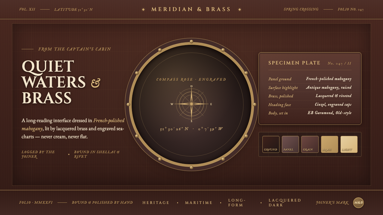 Mahogany Ship CabinPre-1900 maritime luxury. Mahogany panels, brass portholes, Cinzel caps over…
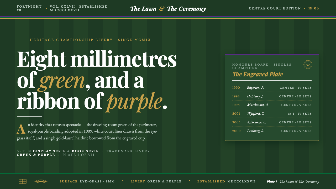 Wimbledon GrassHeritage, not stadium. Championship green ground, purple-and-green livery, go…
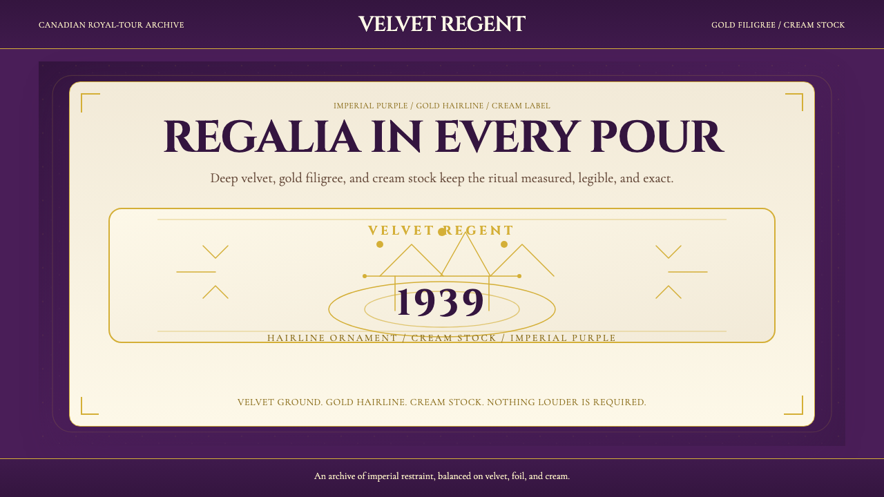 Crown Royal Purple Velvet (1939)Ceremony, not spectacle. Deep purple velvet, gold hairlines, and cream stock…
 Fountain Pen & InkInk holds the room. Blue-black wash, Pinyon script, and 14k gilt rules do the…
 Hindu Pantheon Bazaar PrintDevotional calendar art, edge to edge. Gold halos and garland borders on baza…
 Kandy Esala PeraheraA torchlit night procession, not a poster. Gold flecks and crimson brocade fl…