What is Hindu Pantheon Bazaar Print?
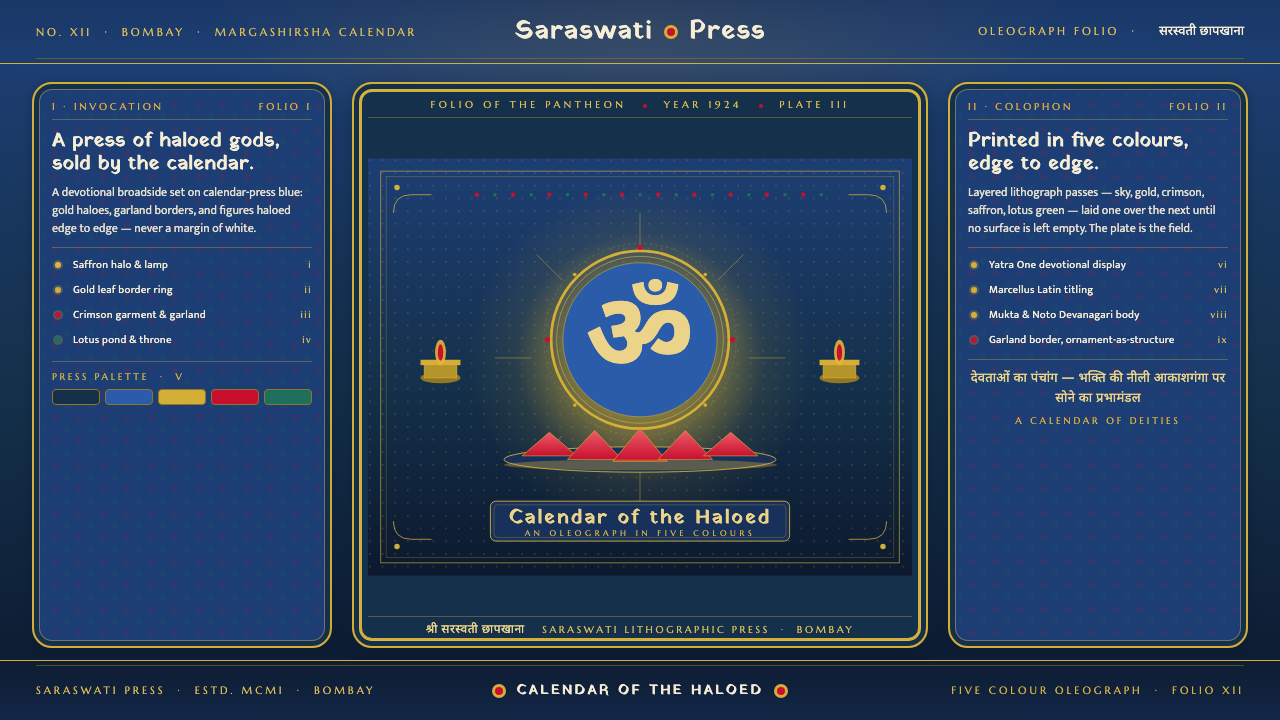
Hindu Pantheon Bazaar Print turns devotion into total visual abundance — radiant deities, gold halos, floral garlands, and saturated blue filling every available surface.
Hindu Pantheon Bazaar Print in brief
Hindu Pantheon Bazaar Print is a design language distilled from the chromolithograph devotional posters and calendar art associated with the Raja Ravi Varma Press during the oleograph era of 1900–1950. Its central subjects belong to the Hindu pantheon: blue-skinned Vishnu and Krishna, multi-armed Durga, and Lakshmi seated upon a lotus. Each figure is presented not as an incidental illustration but as the radiant center of an image organized around reverence, recognition, and visual immediacy.
The style is defined by accumulation. A deep devotional blue forms the atmospheric ground; gold halos establish sacred radiance; garlands, flowers, and ornamental frames gather around the central figure until the composition feels complete from edge to edge. White space and muted restraint have little place here. Layered oleograph color gives the image a jewel-like density in which figure, sky, halo, throne, and border remain distinct while contributing to a single saturated field.
Translated into a contemporary design system, the devotional poster becomes a framed panel. Important content occupies the ceremonial center, supporting information settles into decorated bands or bordered compartments, and gold ornament glows against blue rather than floating on a neutral canvas. The aesthetic depends on hierarchy within abundance: the surface is richly occupied, but the deity, title, or principal message must remain unmistakably dominant.
Where does Hindu Pantheon Bazaar Print come from?
The style belongs to the visual culture of South Asia, especially India, and to the period identified with the Ravi Varma Press oleographs of 1900–1950. It emerged within a meeting of Indian academic-realist devotional painting and mechanical color reproduction. Sacred figures could be modeled with a painted sense of bodily presence while also being reproduced as chromolithographs for the calendar and bazaar-print environment.
Raja Ravi Varma provides the defining name within this lineage, while the Ravi Varma Press represents its reproductive engine. The press context matters because the aesthetic was shaped not only by devotional painting but by the transformation of such imagery into repeatable printed objects. Images intended for circulation required immediate recognition, emphatic color, clearly centered figures, and ornamental framing strong enough to preserve a sense of sacred presentation beyond an individually painted original.
Fine Art Lithographic Works belongs to the same pre-approved account of this print culture. Together, the named artist, press, and lithographic works describe a system in which artistic modeling and industrial multiplication were not opposites. Layered oleograph printing carried dense fields of color, luminous gold effects, floral borders, and carefully differentiated divine attributes into widely circulating visual formats.
Calendar and bazaar settings encouraged a direct, self-contained composition. Each print had to operate as a complete devotional world: deity, halo, garland, throne, sky, and frame gathered into a single panel. This demand helps explain the characteristic horror vacui, or fear of empty space. Fullness was not merely decoration added after the subject; it was the environment through which sacred presence became visible, memorable, and visually commanding.
What defines the Hindu Pantheon Bazaar Print look?
Devotional Blue
The ground is a saturated, dark devotional blue rather than white, beige, or atmospheric gray. It behaves at once as sky, depth, and ceremonial backdrop. Because the blue remains intense across broad areas, gold and floral colors appear illuminated from within. Muted fields weaken the effect; the style needs a ground rich enough to hold equally rich ornament.
Gold Radiance
Gold is the language of sacred emphasis. It forms halos, crowns, ornamental lines, and luminous framing rather than serving as a casual luxury accent. A halo establishes the visual center before the eye begins reading smaller details. Gold should feel radiant and layered against blue, with brighter and deeper passages suggesting the richness of printed oleograph color.
Central Sacred Figure
The deity occupies the compositional and devotional center. Vishnu or Krishna may be recognized through blue skin, Durga through multiple arms, and Lakshmi through her lotus throne. Surrounding ornament must amplify this figure rather than compete with it. Symmetry, frontal presentation, and a strong silhouette help the subject remain legible within the abundant surface.
Garland Borders
Flowers and garlands form active borders, not delicate marginal decoration. They enclose the panel, repeat around corners, and create a rhythmic passage between the central image and the outer edge. The frame may feel layered, as though successive rings of blossom, gold, and colored ornament protect and honor the image within.
Edge-to-Edge Fullness
Empty space is replaced by image, pattern, atmosphere, or border. Even quieter passages remain saturated and visually inhabited. This is horror vacui used as a positive principle: fullness conveys abundance and ceremonial completeness. The challenge is not to introduce emptiness but to control density through scale, repetition, and a clearly dominant center.
Oleograph Layering
Color should appear built in layers, producing a polished, jewel-like field rather than a flat modern diagram. The figure, halo, flowers, and sky retain separate chromatic identities, yet no element feels isolated. Subtle tonal modeling can give faces, garments, and lotus forms a painted presence while the enclosing composition remains poster-like and direct.
Ornamental Hierarchy
Richness does not mean that every detail carries equal weight. The halo and figure lead, the garland frame contains them, and smaller motifs complete the field. Repetition creates unity, while changes in scale distinguish sacred focus from supporting ornament. Without this hierarchy, abundance collapses into visual noise and the devotional center disappears.
Who shaped Hindu Pantheon Bazaar Print?
Raja Ravi Varma is the defining artistic name attached to this visual lineage. In the supplied account, his importance lies in the connection between Indian academic-realist devotional painting and the printed culture that carried divine figures into calendar and bazaar formats. The style retains that meeting of modeled, pictorial presence with immediate popular legibility.
The Ravi Varma Press gives the style its principal historical frame, especially the oleograph era of 1900–1950. It represents the conversion of devotional imagery into layered, repeatable color prints. Its associated visual language centers recognizable deities within gold radiance, saturated skies, lotus imagery, garlands, and complete ornamental borders.
Fine Art Lithographic Works identifies the lithographic production context within the approved source material. Its relevance is technical and cultural: devotional painting became print culture through layered color reproduction. The resulting objects joined painterly modeling to the emphatic framing, dense saturation, and self-contained composition required by calendar and bazaar circulation.
How do you use Hindu Pantheon Bazaar Print today?
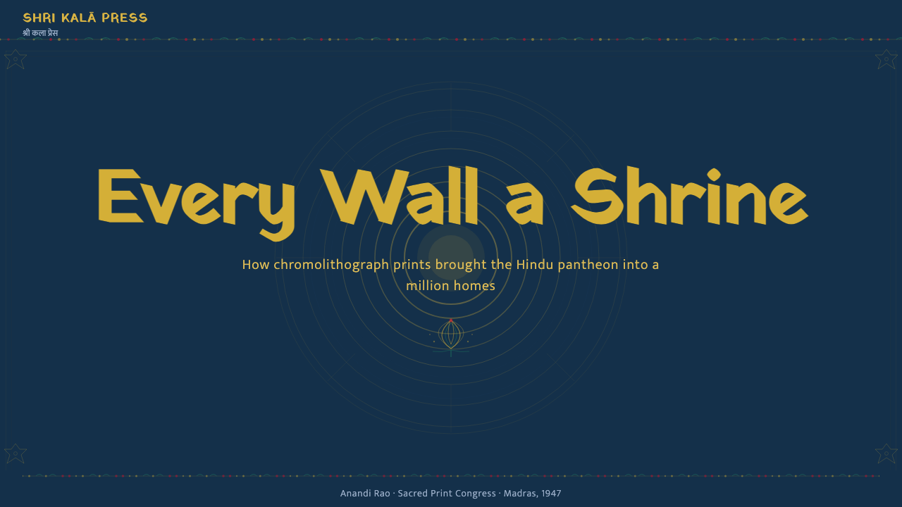
For presentation covers, treat the slide as a devotional poster panel rather than a neutral title page. Place the title at the ceremonial center or immediately beneath a halo-like ornament, surround it with a complete garland frame, and allow saturated blue to reach every edge. Gold establishes importance, while floral color supplies secondary rhythm. The cover should feel finished and frontal, with no accidental empty corner.
Content slides need the same abundance but a firmer reading order. Use a dominant central heading, then place supporting text inside framed compartments or ornamental bands that belong to the larger poster structure. Decorative borders can separate sections, but every boundary should appear ceremonial rather than administrative. Keep body copy concise enough that it remains readable against the rich ground, and use gold emphasis only for the most consequential phrases.
Data slides work best when information is recast as a hierarchy of radiant objects. A principal result can occupy the haloed center, while comparisons sit in smaller framed panels around it. Charts should use saturated, jewel-like color and strong figure-ground separation; subdued corporate gray would feel foreign to the system. Ornament may frame the data, but it must never cross marks, labels, or the relationships the chart is meant to explain.
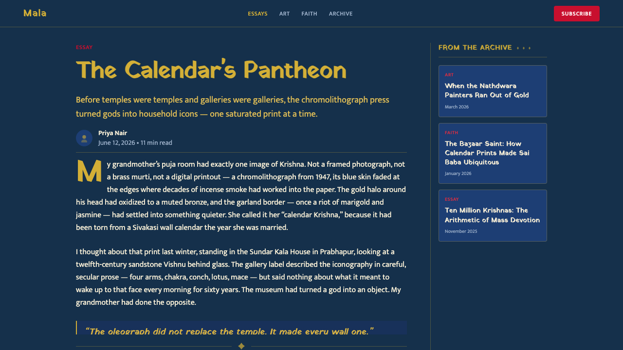
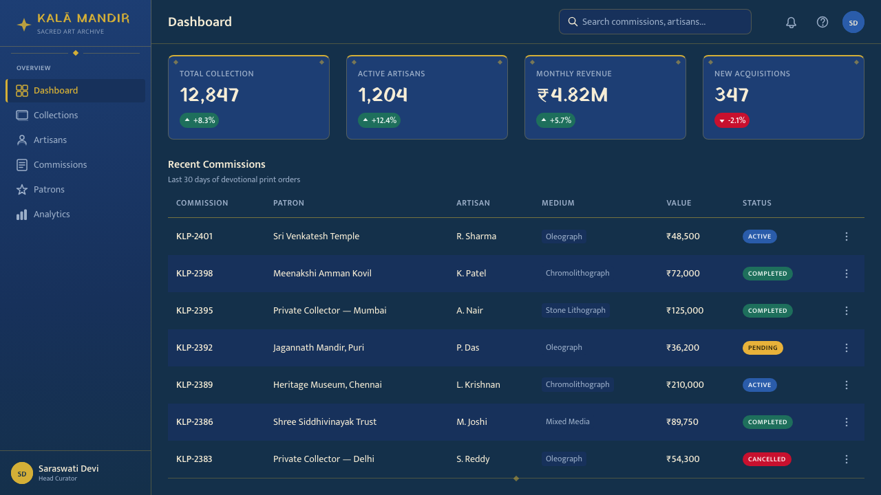
For web interfaces, apply the style most convincingly to dashboards, pricing pages, cultural collections, or feature panels that benefit from ceremonial emphasis. A dashboard can organize major indicators as framed devotional tiles on a continuous blue field. A pricing page can give the recommended offering the strongest halo and garland treatment, while quieter offerings receive simpler frames. Navigation and controls should remain plainly identifiable even when their containers are ornamental.
Editorial and marketing layouts can borrow the poster logic through full-bleed blue fields, centered hero imagery, gold display lettering, floral section frames, and repeated panel motifs. The common mistake is to equate abundance with indiscriminate decoration. If every label receives a halo, every border becomes equally elaborate, and every color competes at full intensity, hierarchy vanishes. Authentic richness depends on a commanding center supported by disciplined repetition.
Hindu Pantheon Bazaar Print — FAQ
Is Hindu Pantheon Bazaar Print simply a dark blue ornamental theme?
No. Deep blue and ornament are visible signatures, but the style is organized around devotional presentation. The central figure or message receives halo-like emphasis, garland borders create ceremonial enclosure, and layered saturation makes the panel feel complete. A blue interface with scattered gold flowers lacks the subject hierarchy and sacred framing that give the original print language its structure.
Why does the style avoid white space?
Its source is edge-to-edge devotional calendar and bazaar art, where deity, atmosphere, halo, garland, and border form a self-contained world. Empty ground would interrupt that sense of abundance and enclosure. The alternative to white space is not disorder: quieter blue passages, repeated ornament, changes of scale, and strong centrality provide breathing room without leaving the field visually vacant.
Can the style be used without depicting a Hindu deity?
A contemporary design may translate the compositional system without reproducing a deity: a title, product, portrait, or key result can occupy the radiant center. However, the historical source should remain explicit, especially in public educational work. Gold halos and garland frames are not culturally neutral ornaments here; they derive their visual force from a devotional print tradition centered on the Hindu pantheon.
How can dense ornament remain readable on screen?
Preserve a strict order of attention. The central subject should be largest and most radiant, framed sections should hold supporting material, and the smallest motifs should remain peripheral. Text needs strong contrast against the devotional blue and should not sit directly over busy flowers or modeled imagery. Richness belongs around information as enclosure and emphasis, not across it as interference.
What is the most common failure when adapting the style?
The most common failure is preserving surface richness while losing devotional hierarchy. Designers may add blue, gold, flowers, and ornate frames everywhere, yet provide no commanding center. The result resembles decorative collage rather than bazaar-print devotion. Begin with the principal figure or message, give it unmistakable radiance, and let every border, garland, and secondary panel reinforce that focus.
Related design styles
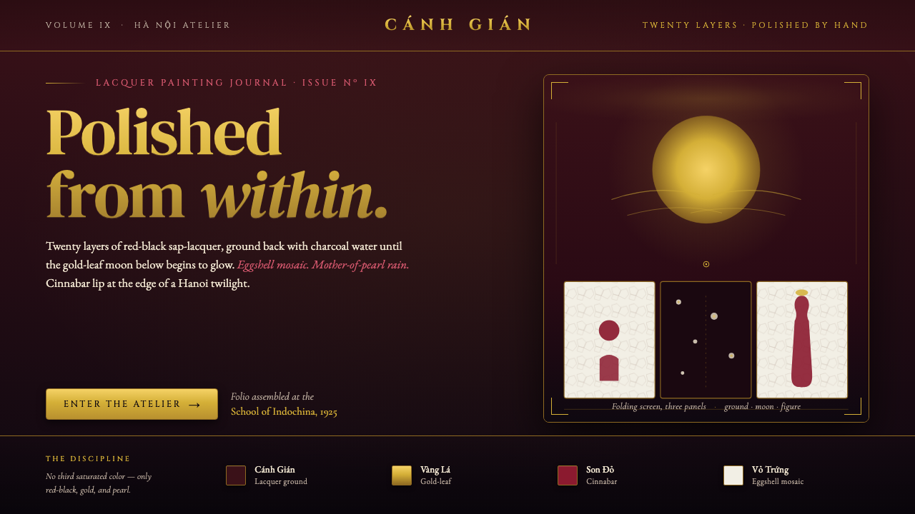 Vietnamese Sơn Mài LacquerTwenty layers polished to glass. Cockroach-wing red-black ground, gold-leaf m…
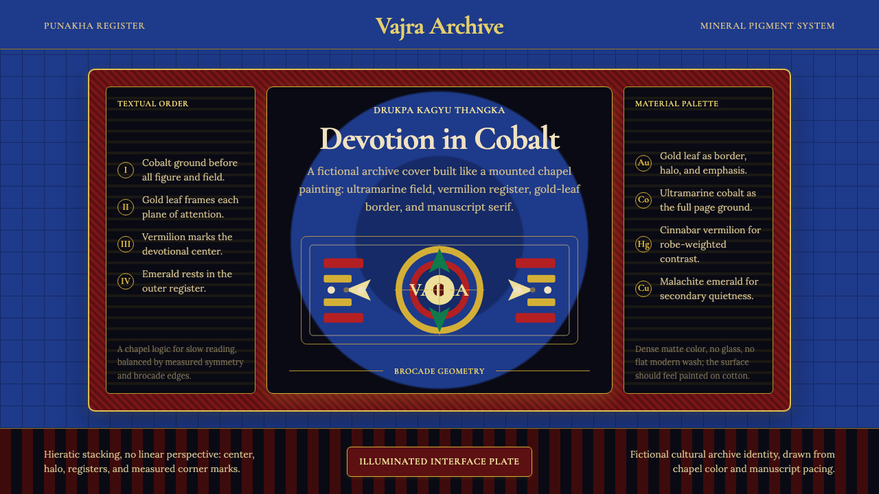 Bhutanese Drukpa Kagyu ThangkaDevotion made cobalt. Gold frames, Cormorant serif, and vermilion marks hold…
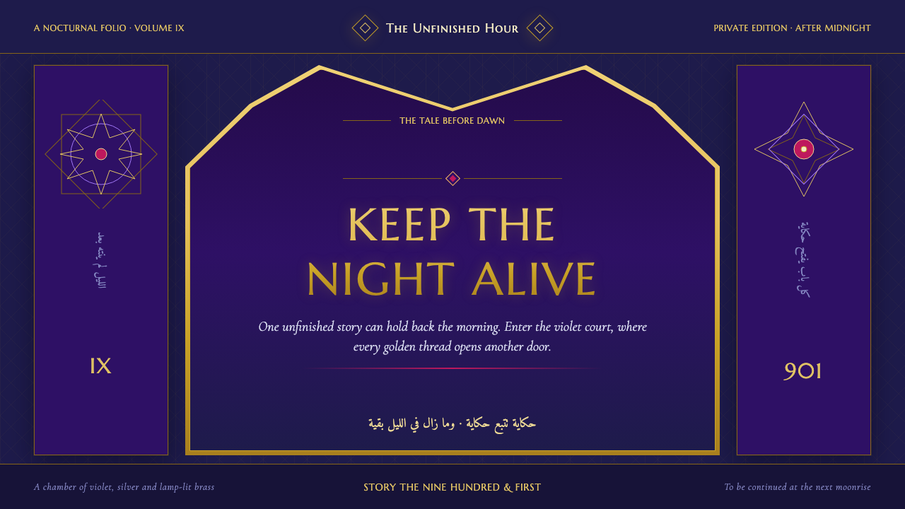 One Thousand and One NightsNight refuses to end. Midnight indigo, lamp-lit gold and star lattice frame e…
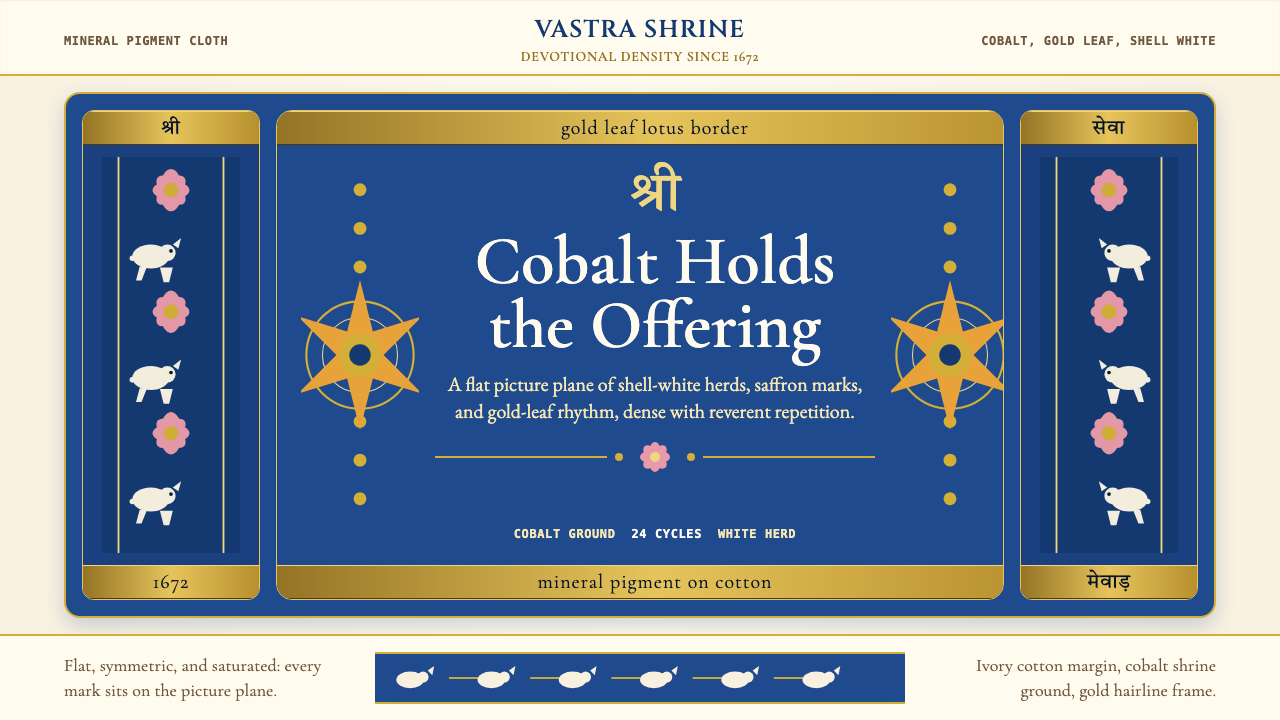 Rajasthani Pichwai (Nathdwara)Devotional density in cobalt. Gold borders, shell-white herds, lotus pink on…
 Russian Palekh Lacquer MiniatureBlack lacquer turns mythic. Gold ovals hold crimson, lapis, and emerald tempe…
 Armenian ErkatʿagirDevotional lapis reigns. Gold rules and angular serif glyphs frame a sacred g…