What is One Thousand and One Nights?
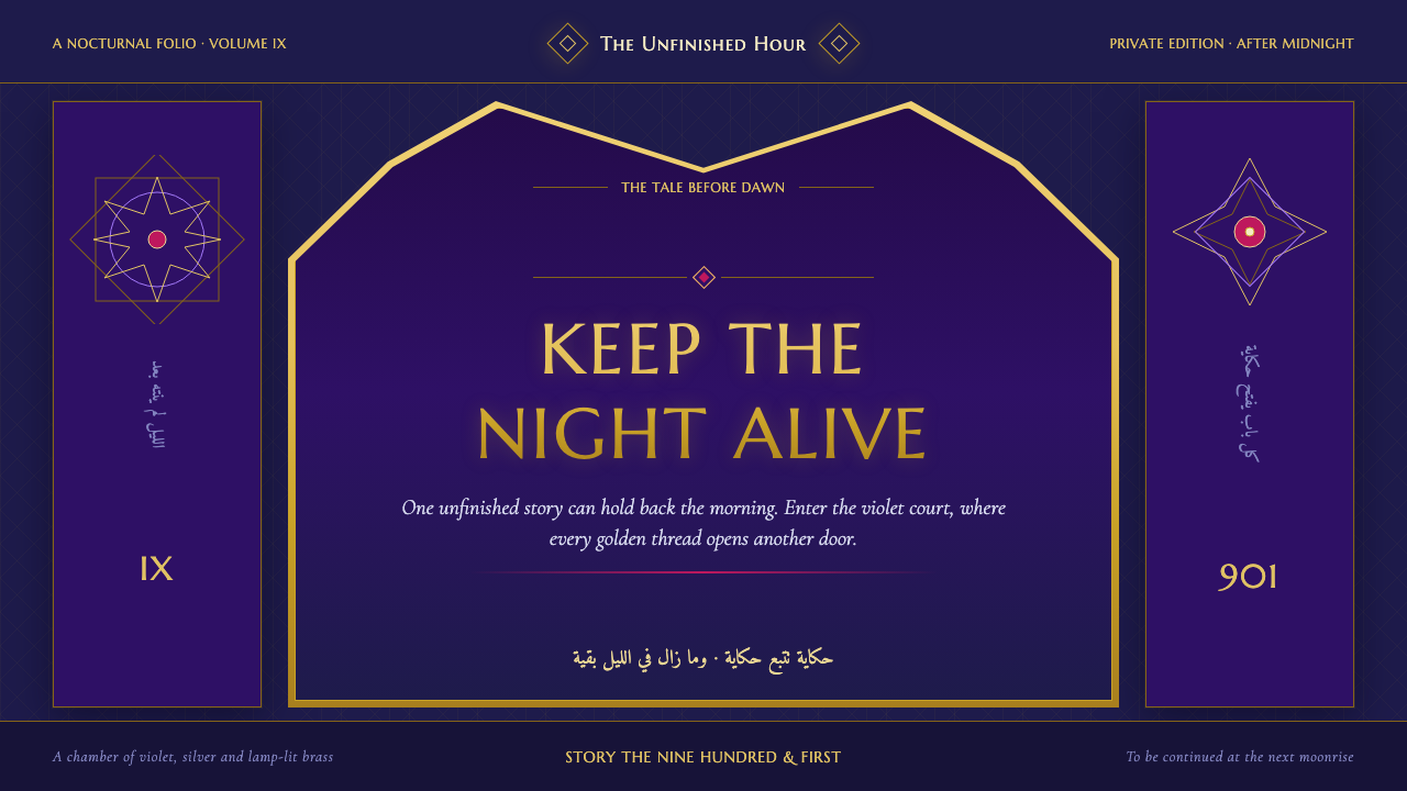
Night refuses to end: indigo chambers, lamp-lit gold, and star lattice turn every page into a sheltered place for the next tale.
One Thousand and One Nights in brief
One Thousand and One Nights is a literary and visual atmosphere drawn from Arab, Persian, and Indian oral traditions: a moonlit court, a suspended danger, and a succession of tales held together by the voice of Scheherazade. As a design language, it does not attempt to reproduce a market fantasy or a generic collection of exotic props. Its central setting is intimate and architectural: a palace interior after midnight, where darkness has weight and a single brass lamp gives ornament its reason to appear.
The palette begins in deep aubergine and royal indigo, with silver, brass, honey-gold, and small pools of lamplight emerging from the dark. Gold is not a broad field of luxury; it is a catching edge, a line around an arch, a glint within a screen, or a delicate border that seems to have been discovered by light. The contrast between dark grounds and illuminated detail gives the style its narrative tension: the room conceals as much as it reveals.
Its ornament is elaborate but governed by repeatable forms. Eight-pointed star lattice, geometric mashrabiya screens, filigree arches, mihrab niches, and keyhole windows establish a vocabulary of enclosure and passage. Text is treated as part of the architecture, framed within an alcove or set behind a delicate screen. The resulting atmosphere is ceremonial, nocturnal, and patient: every decorative element suggests that another chamber, another listener, or another story may be waiting beyond the visible frame.
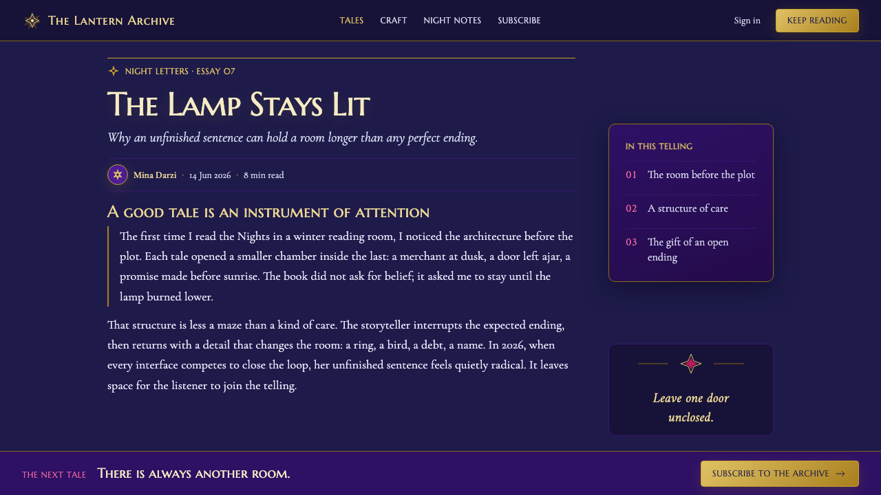
Where does One Thousand and One Nights come from?
The source world of One Thousand and One Nights was compiled across centuries, from the eighth through the fourteenth century, from Arab, Persian, and Indian oral traditions. That layered origin matters for design. The visual language should feel accumulated rather than authored in a single gesture: patterns repeat, frames contain frames, and a story seems to pass through several cultural rooms before reaching the reader. Its richness comes from continuity and transmission, not from indiscriminate excess.
Cairo and Baghdad manuscript traditions provide the atmosphere of the book as an object of care: pages held within borders, text granted a formal setting, and ornament functioning as a threshold between one passage and the next. The design lesson is not to imitate a manuscript literally. It is to preserve the manuscript’s sense that language deserves a chamber of its own, and that a margin, arch, or lattice can prepare the reader to enter a new narrative register.
The illustrated golden age, spanning editions from 1704 to 1930 in Paris, London, and Copenhagen, widened the style’s visual inheritance. Book illustration brought theatrical light, costume, silhouette, and fantasy into contact with the older manuscript sensibility. This created a useful duality for contemporary work: the structure can remain geometric and disciplined while images, surfaces, and transitions retain an atmosphere of performance and wonder.
Islamic geometric ornament, Orientalist book illustration, Art Nouveau plate art, and Ballets Russes stage design are the supplied movements around this theme. Together they explain why the style can be lavish without becoming chaotic. Geometry establishes order; illustrated plates create scenes; flowing ornamental line introduces sensuality; stage design gives each panel a sense of entrance, curtain, and revelation. The most convincing applications let these influences meet under the governing condition of night.
What defines the One Thousand and One Nights look?
Nocturnal Ground
Deep indigo and aubergine establish the dominant field. Darkness is not empty background; it is the enclosing room from which text, metal, and ornament emerge. Large quiet dark areas are essential, because they make each illuminated detail feel intentional rather than merely decorative.
Lamp-Lit Gold
Brass and honey-gold behave like reflected lamplight. Use them for contours, key details, small emblems, and framing rather than for broad visual coverage. Their role is to direct the eye through the dark and make the composition feel physically illuminated.
Geometric Lattice
Eight-pointed stars and mashrabiya-like screens provide repeated structure. Their repetition should create rhythm, opacity, and glimpses rather than visual noise. A lattice can divide content, veil an image, or establish a border while still allowing the underlying night to remain present.
Storyteller Arches
Thin filigree arches, mihrab forms, and keyhole openings frame content as if each section were an alcove for speech. These forms work best as thresholds: they invite entry, mark a change of tale, and give a title or quotation ceremonial focus without overwhelming the reading surface.
Ornamental Discipline
The style welcomes richness, but every flourish needs a structural job. Borders establish containment, stars establish rhythm, arches establish hierarchy, and metallic detail establishes focus. If ornament does not frame, separate, guide, or reveal, it weakens the courtly restraint that makes the atmosphere believable.
Silvered Mystery
Silver provides a cooler counterpoint to gold, suggesting moonlight, distance, or a half-seen surface. It should remain quieter than brass, often appearing in fine linework or subdued detail. This temperature contrast prevents the palette from becoming uniformly warm and keeps the night emotionally spacious.

Who shaped One Thousand and One Nights?
Galland is named among the key figures of the theme’s illustrated and published inheritance. His association places the Nights within the Paris edition history and reminds designers that the work’s visual afterlife belongs not only to oral storytelling and manuscripts, but also to the changing culture of the printed book.
Burton appears among the key figures connected with the London edition tradition. Within this design context, his presence signals another stage of transmission: the tales move between languages, readers, and publishing worlds while retaining the recurring promise of a story continued into the night.
Dulac belongs to the illustrated golden age named in the source material. His inclusion points toward the value of plate-like composition: images can be staged as luminous scenes within a darker page, where decorative framing does not merely surround the picture but deepens its narrative threshold.
Nielsen is another figure from the supplied illustrated tradition. His place in the theme supports an approach in which silhouette, costume, and ornamental contour carry atmosphere efficiently. A scene need not explain every object when its outline, framing, and light already suggest a palace world.
Bakst connects the theme to Ballets Russes stage design. That association is useful for layouts with dramatic entrances and layered reveal: a panel can behave like a stage opening, while arches, curtains of lattice, and concentrated light make information feel presented rather than simply placed.
How do you use One Thousand and One Nights today?
For presentation covers, build the first impression around a single nocturnal chamber rather than a crowded collage. Let an indigo or aubergine field hold one lamp-lit gold motif, a star-lattice fragment, or an arch that appears to open into the title. The title should feel like an announcement inside a palace alcove: confident, spacious, and protected by darkness rather than covered by decoration.
For content and data slides, translate the style into a system of frames and reveals. Use restrained ornamental dividers to distinguish sections, and allow key metrics, quotations, or diagrams to receive the brighter metal treatment. Data graphics should remain legible before they become atmospheric; lattice can occupy margins or empty regions, while silver and gold can establish emphasis without turning every mark into jewelry. The goal is a narrative sequence in which each slide feels like the next chamber of the same night.
For web interfaces, this style is strongest in dashboards, member areas, storytelling products, and premium pricing pages that can benefit from a sense of privacy and occasion. Keep navigation and controls plain enough to scan against the dark field, then reserve arches, star screens, and metallic borders for section headers, featured states, and moments of transition. A dashboard should feel like an illuminated table in a dark room: information remains immediate, while the surrounding system gives it ceremony.
For editorial and marketing pages, use the style to pace long reading. Open with a broad nocturnal field, then alternate dense story passages with quieter framed callouts, illustrations, and ornamental pauses. Marketing imagery should favor lamp-lit interiors, silhouettes, openings, and patterned screens over a pile of literal genre symbols. The reader should encounter a coherent courtly world, not a decorative inventory of lamps, carpets, and crowns.
The common mistake is to treat One Thousand and One Nights as permission for unlimited gold, pattern, and purple. That produces noise and turns the palace into a theme set. Start with darkness, choose a small number of illuminated focal points, and give every arch or lattice a role in hierarchy or navigation. The style succeeds when ornament makes the story feel more inevitable, not when ornament competes to be the story.
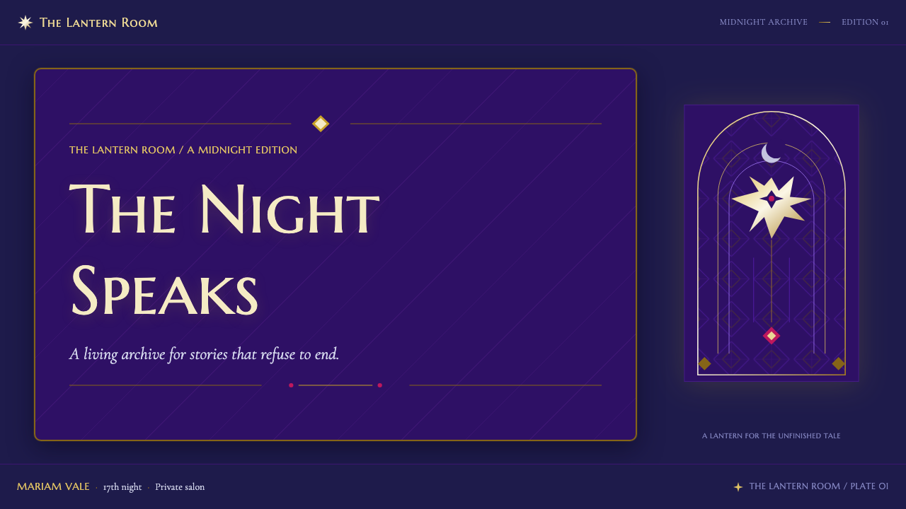
One Thousand and One Nights — FAQ
Is this style simply an Orientalist fantasy aesthetic?
It should not be approached that way. The supplied material explicitly distinguishes the theme from a bazaar cliché. Its visual center is a moonlit court, oral storytelling, manuscript inheritance, and disciplined Islamic geometric ornament. Contemporary work should therefore prioritize architecture, narrative suspense, light, and repeatable structure over a loose collection of supposedly exotic symbols.
Can the style work without large amounts of gold?
Yes. Gold works best as evidence of lamplight, not as the entire visual field. Deep indigo, aubergine, silver detail, architectural framing, and patterned shadow can establish the atmosphere before gold appears. Restricting gold often makes the few illuminated edges feel more convincing and preserves the sense that light has a source.
How should typography behave inside the ornamental framework?
Typography should remain calm enough to carry the tale. Treat arches and filigree as architectural support, not as a substitute for hierarchy. Titles may occupy a ceremonial niche, while body text needs generous darkness and a clear reading path. When ornament touches type too often, the page stops feeling like a storyteller’s chamber and starts feeling like a label.
Can this visual language be adapted for a light background?
It can, but the night must remain legible through other means. A lighter page can use indigo frames, shadowed arches, silver linework, and concentrated gold details, yet it will lose some of the style’s native sense of enclosure. Light variants work best for secondary reading surfaces, while the principal entry, cover, or hero area retains the midnight atmosphere.
What makes an application feel ornate yet disciplined?
Assign every decorative form a task. A star lattice can regulate a margin, an arch can introduce a section, a metallic line can identify a focal point, and an illustrated panel can mark a narrative turn. Reuse these jobs consistently. When ornament has a grammar, abundance feels ceremonial; when it appears without a role, abundance becomes clutter.
Related design styles
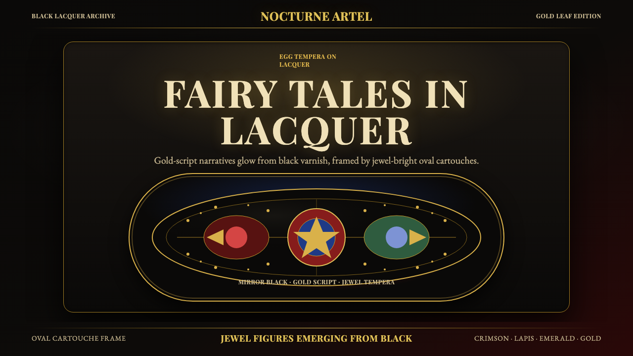 Russian Palekh Lacquer MiniatureBlack lacquer turns mythic. Gold ovals hold crimson, lapis, and emerald tempe…
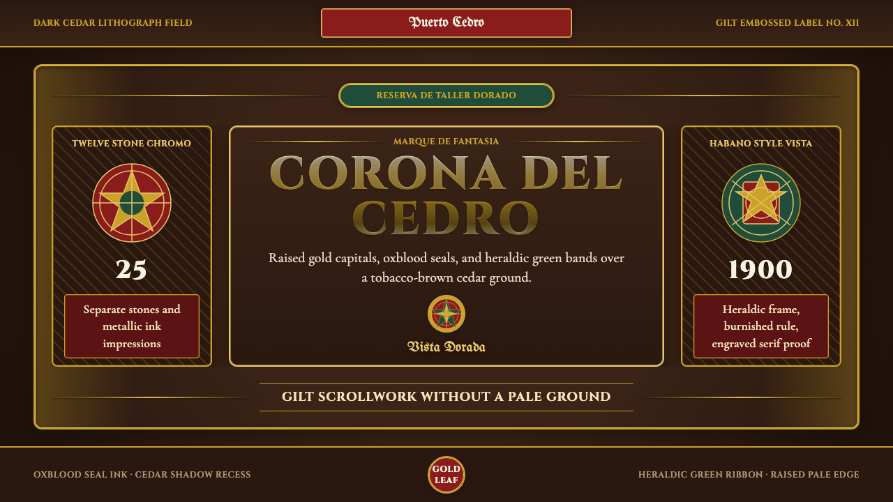 Cigar Box LabelGilt maximalism glows. Gold Cinzel capitals lock into a tobacco-brown framed…
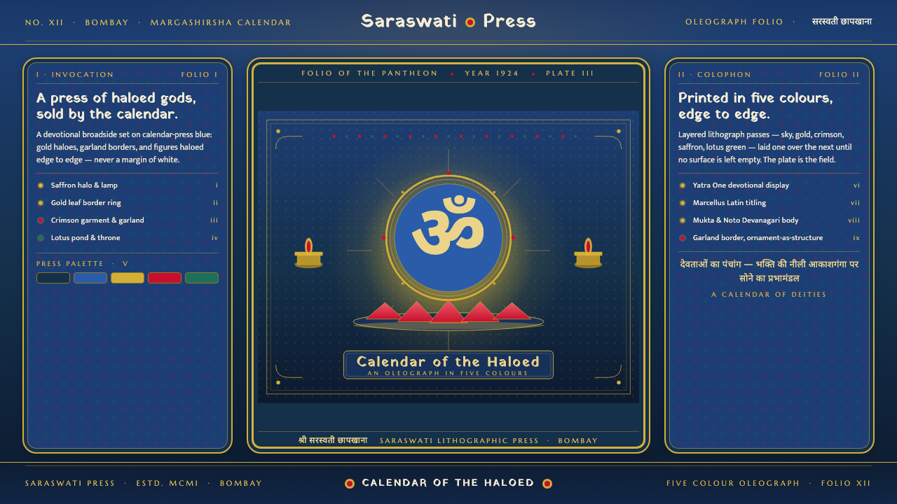 Hindu Pantheon Bazaar PrintDevotional calendar art, edge to edge. Gold halos and garland borders on baza…
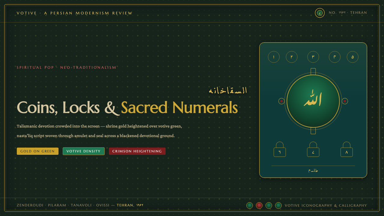 Saqqakhaneh MovementSpiritual Pop with a shrine pulse. Coins, locks and nasta'liq in gold over bl…
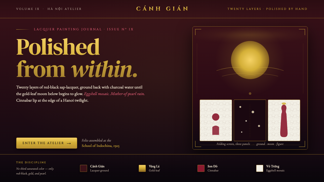 Vietnamese Sơn Mài LacquerTwenty layers polished to glass. Cockroach-wing red-black ground, gold-leaf m…
 Armenian ErkatʿagirDevotional lapis reigns. Gold rules and angular serif glyphs frame a sacred g…