What is Cigar Box Label (Cuban)?
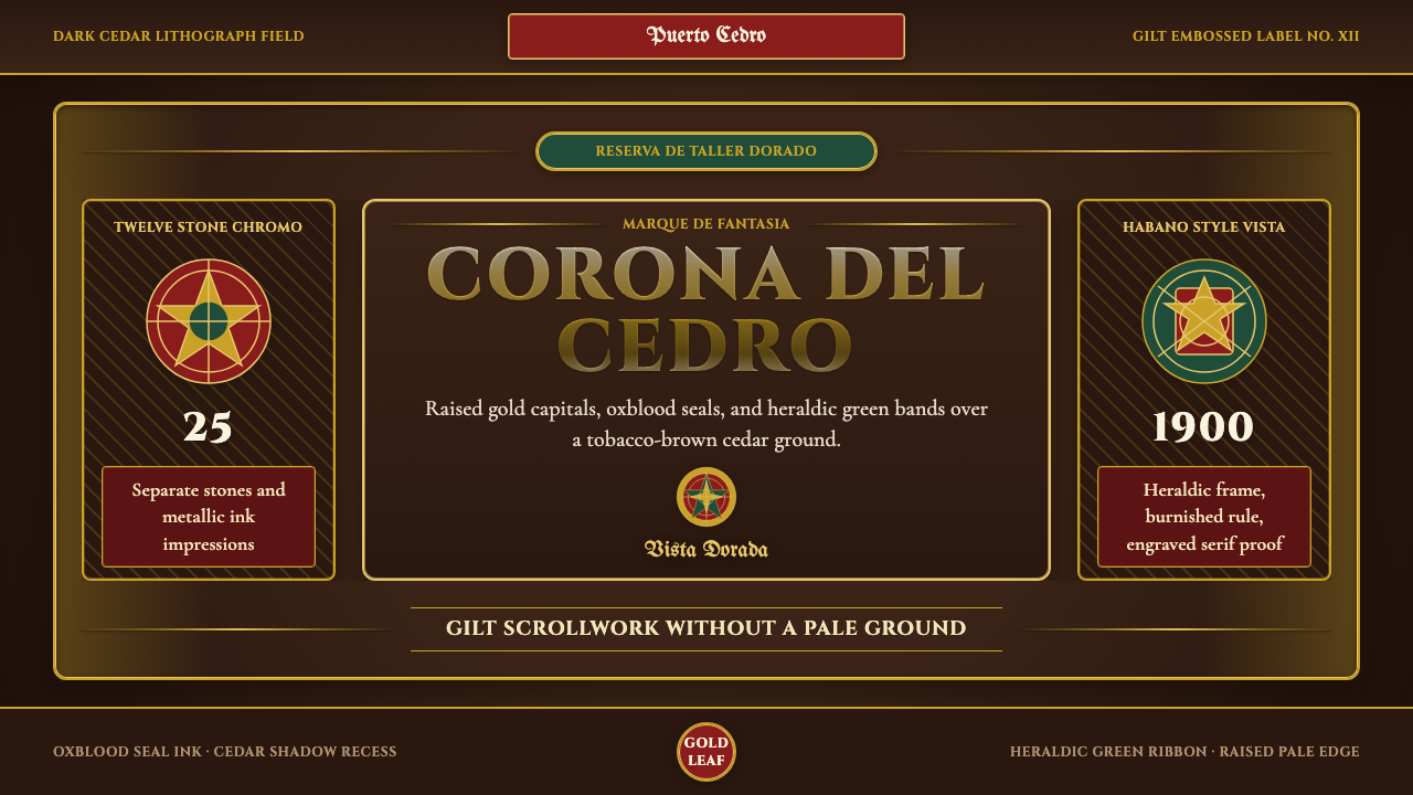
Cuban cigar box labels turned a wooden shipping crate into a miniature vault of gold — heraldic crests, engraved lettering, and metallic ink applied through a printing process so laborious that a single label could take two dozen stones to produce.
Cigar Box Label (Cuban) in brief
Cigar Box Label (Cuban) is a maximalist packaging style built on a single deliberate contrast: a deep, near-black tobacco-brown ground pierced by brilliant metallic gold. Where many design systems ration ornament, this one spends it freely. Scrollwork borders, laurel wreaths, ribboned crests, and allegorical figures crowd the frame, rendered in the dense, saturated inks of nineteenth-century chromolithography rather than the flat, restrained color of most contemporary packaging.
The labels were never meant to whisper. Glued to the inside lid of a Spanish-cedar cigar box, a label of this kind — trade slang once called it a 'vista' — worked as advertisement and certificate at once. It had to persuade a buyer, often thousands of miles from Havana and unable to sample the product before paying for it, that the box in front of them held the genuine, high-grade article rather than a cheap imitation. Heraldry did that persuading: a crest borrowed the visual authority of European nobility, a medal ribbon implied a prize won at a world exposition, and an engraved neoclassical letterform carried the gravity of a banknote or a diploma.
The palette pairs that dark ground with gold as the defining ink and a small reserve of jewel tones — oxblood red, heraldic green — kept for crests, ribbons, and accents. Nothing in the system is pastel or desaturated; the entire object was designed to catch candlelight or gaslight on a shop counter and look, at a glance, expensive.
Where does Cigar Box Label (Cuban) come from?
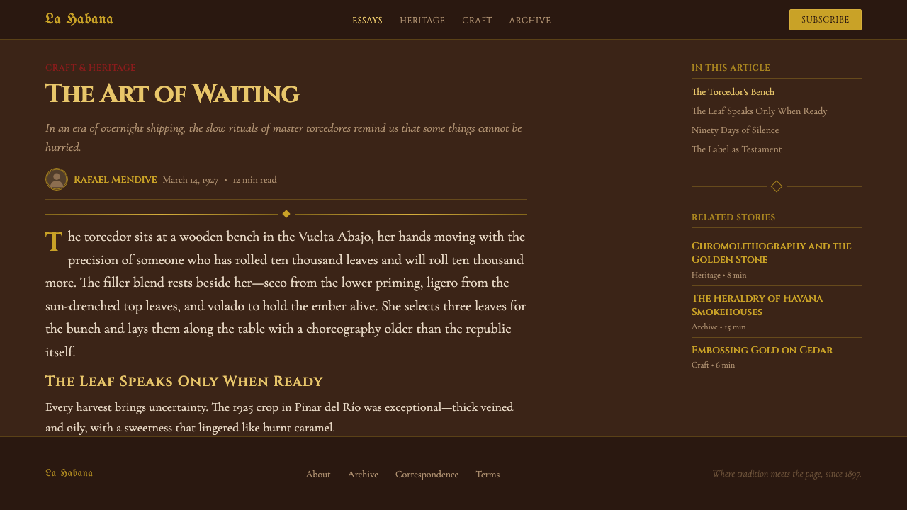
Cuba's reputation for tobacco predates this label art by centuries. Spanish colonists found the crop already under cultivation when they arrived, and by the eighteenth century the volcanic, red-clay soils of the Vuelta Abajo region west of Havana were producing leaf regarded, then as now, as among the finest wrapper and filler tobacco in the world. Havana itself grew through the nineteenth century into the industry's manufacturing capital, where large factories consolidated the work of growing, fermenting, and hand-rolling into an export trade that reached across the Atlantic and into the United States.
That export trade created a problem chromolithography would eventually help solve: counterfeiting. Genuine Havana leaf commanded a steep premium, and as demand grew abroad, so did the number of boxes falsely claiming Cuban origin. Factories responded by treating the packaging itself as a form of proof. A label dense with fine engraving, built from many separate ink passes, and finished in a gold a cheap forger could not easily replicate, became a practical anti-counterfeiting device as much as a decorative one — visual complexity doubled as a security feature.
Chromolithography — a nineteenth-century printing method that builds a full-color image from a separate stone for each ink, rather than from a single exposure — made that complexity possible at commercial scale. A single cigar label could be assembled from twelve to twenty-five separate stones, each hand-drawn and precisely registered so the colors locked together without gaps or overlap. Gold was applied as a true metallic ink or, on the finest labels, as gold leaf stamped onto the paper, catching light in a way flat pigment never could. The artists who drew these images inside the factories, known in the trade as marqueros, worked from a visual vocabulary borrowed wholesale from European heraldry and the medal culture of the great nineteenth-century world's fairs — crests, ribbons, laurel, and allegorical female figures standing in for Cuba, Commerce, or Industry.
The style's golden age runs roughly from 1900 to 1950, though the chromolithographic technique behind it dates back to the late nineteenth century. Cuba's 1959 revolution and the nationalization of the cigar industry that followed changed the economics of the label almost overnight: private factories and their competing marketing budgets gave way to state production, and the ornate interior label gradually thinned into simpler, more uniform branding. The historic labels survive today mainly as collected ephemera and auction-house curiosities, and their visual grammar — gold on a dark ground, heraldic density, engraved gravitas — has become a recognizable shorthand for luxury and old-world craft, echoed today in rum packaging, cigar-bar signage, and vintage-revival branding well beyond tobacco.
What defines the Cigar Box Label (Cuban) look?
Color
The ground is a near-black tobacco brown, never cream or white — this is a dark-canvas system from the outset. Gold functions as the defining ink rather than an accent, carrying titles, borders, and crest details. A small reserve of jewel tones, chiefly oxblood red and a deep heraldic green, is held back for ribbons, shields, and interior crest fields. Every hue in the system reads as saturated and lacquered, never muted or dusty.
Typography
Lettering is engraved neoclassical capitals — letterforms that look cut into a plate rather than drawn with a pen, with the crisp, slightly flared strokes of a banknote or a diploma seal. Words of importance, especially a brand or product name, are set wide and centered, often in a serif with historical roots in engraving faces such as Cinzel. Smaller supporting text runs in tighter capitals or a modest italic, keeping the hierarchy legible without introducing a second typographic voice.
Ornament & Heraldry
Scrollwork borders, laurel wreaths, ribboned crests, oval medallions, and allegorical figures are not occasional flourishes — they are the composition. Ornament density is itself a signal: a label crowded with fine detail argued, historically, that the box was too expensive and too well-made to be a forgery. Applying this style thin, with sparse ornament, works against its own logic.
Metallic Finish
Gold in this system behaves like foil, not paint — it is meant to catch and throw light rather than sit flat on the page. The finest historic labels achieved this with true gold leaf, hot-stamped and slightly raised off the paper surface. A faithful digital treatment should distinguish gold from ordinary yellow: it needs a sense of directional sheen and a subtly raised, embossed presence, not a flat swatch.
Composition & Framing
Layouts are symmetrical and centered, built as concentric frames — an outer scrollwork border, an inner rule, a central crest or title — much like the seal on a certificate. Hierarchy is carried by scale and position rather than by color shift: the largest, most central element is the most important one, and everything else radiates outward in decreasing size.
Material Ground
The system references fine printed paper glued to dark cedar wood, not a flat digital vector. Surfaces carry a faint printmaking texture — subtle crosshatching, a hint of grain — that keeps the gold and jewel tones from looking like clean, modern flat color. This texture is part of what signals 'engraved by hand' rather than 'generated on a screen.'

Who shaped Cigar Box Label (Cuban)?
The marqueros were the in-house artists working inside Havana's cigar factories, responsible for drawing the master artwork that a shop's letterer and lithographer would later separate onto the dozen-plus stones needed to print it. Their training blended commercial illustration with an almost heraldic-scholar's fluency in crests, ribbons, and classical ornament.
The specialist print houses of Havana, and the contract shops abroad used by the largest factories, translated the marqueros' designs into the chromolithographic process at commercial scale — hand-cutting each color separation onto its own stone and registering as many as twenty-five passes so the finished sheet locked together without a visible seam.
Rather than a single studio, this is a genre convention that hardened into an industry standard: the interior lid label, built around a crest or coat-of-arms-like device, that every serious Havana factory adopted as a certificate of authenticity for its box. The convention outlived any one factory or artist and is what modern eyes recognize as 'the Cuban cigar look.'
The printing technology itself deserves credit as a defining force. Developed in the mid-nineteenth century and refined through the 1870s–1890s, it was the first method able to reproduce dense, full-saturation color at commercial volume, and cigar packaging was one of the industries that pushed the technique hardest, commissioning some of the most labor-intensive multi-stone prints of the era.
The finishing technique that gives the labels their signature shine — hot-stamping true metallic foil onto paper so it sits slightly raised and reflective rather than flat — was a costly upgrade over ordinary gold ink, and its use signaled a factory's confidence in its own prestige.
How do you use Cigar Box Label (Cuban) today?
This is a style built to argue for trust and expense, and it transfers best to contexts that want exactly that argument made quickly. It reads as heritage, craft, and old-world authority rather than as playful or casual, which makes it a poor fit for anything that needs to feel light, fast, or approachable — but a strong fit for anything positioning itself as premium, exclusive, or steeped in tradition.
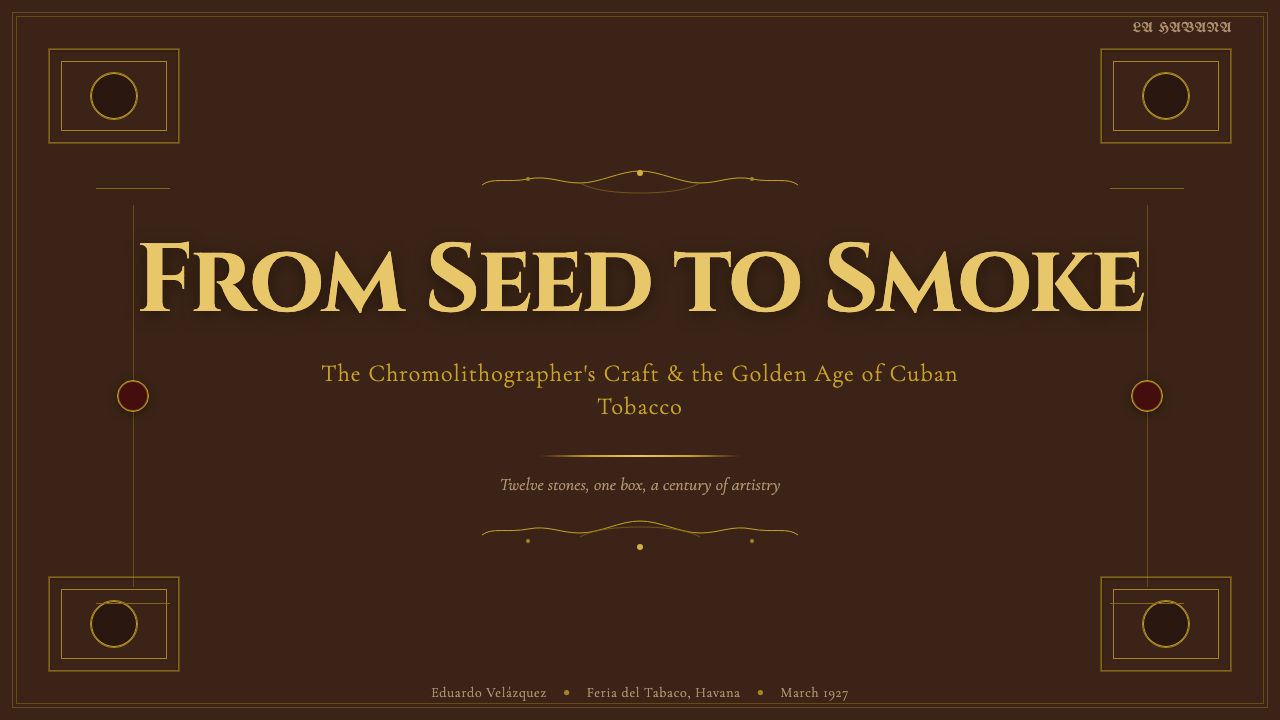
On presentation slides, a cover works well as a literal label: the dark tobacco ground fills the frame, a crest or ribbon motif anchors a corner, and the title sits in wide, centered engraved capitals in gold. Content slides should hold the dark ground but frame the body copy inside a lighter bordered panel — a 'vista within the vista' — so paragraph text stays legible instead of competing with the ornament. Data slides work best rendered as medallions or bordered plaques rather than default bar charts: a circular framed diagram reads as part of the system, where a plain gridded chart looks foreign to it.
For web interfaces, the style suits premium subscription tiers, loyalty programs, and heritage or spirits-adjacent brands particularly well — a dark tobacco-brown surface with gold reserved for calls to action and price emphasis reads as expensive without needing a single product photo. It is a poor match for dense, data-heavy dashboards: long tables and multi-column layouts need the ornament dialed back to structural devices — a gold rule, a bordered card — rather than literal crests scattered through the interface.
In editorial and marketing work, the style is strongest as a framing device rather than a body-text treatment: a pull quote set inside a scroll-bordered plaque, a section break marked by a laurel-and-ribbon rule, a limited-offer banner rendered as a medal. Marketing hero sections can treat the entire header as a label in miniature — full-bleed dark ground, centered gold title, ornament at the edges — which gives even a digital-only product a sense of physical object and provenance.
The most common mistake is treating gold as confetti — sprinkling it across every heading, icon, and divider until nothing is emphasized and the whole composition looks garish rather than prestigious. Authentic label design reserves gold for a small number of load-bearing elements: a title, a seal, a key numeral. A second common error is pairing the dark, engraved ground with a bright modern sans-serif; that combination breaks the banknote illusion the whole system depends on.
Cigar Box Label (Cuban) — FAQ
Is this the same as a generic 'vintage' aesthetic?
No. 'Vintage' is a grab-bag that can mean anything from mid-century advertising to 1970s color grading. Cigar Box Label (Cuban) is a specific genre with hard rules inherited from heraldry and banknote engraving: a dark ground, gold as the defining ink, symmetrical crest-based composition, and engraved capital lettering. Those rules are what make it read as Cuban cigar packaging specifically, rather than 'old-looking' in general.
Can this style work on a light background?
Not faithfully. The entire visual logic depends on gold catching light against a near-black field, the way it would have caught candlelight or gaslight on a shop counter. Move the same ornament onto a white ground and the gold reads as a dull mustard yellow rather than a metallic accent, and the sense of a jewel-box interior disappears. If a lighter surface is unavoidable, keep it to a narrow cream border around a dark central panel rather than inverting the whole system.
How do you suggest metallic gold without literal foil or animation?
Treat gold as a distinct material, not a color swap. Keep it warm and slightly desaturated rather than a bright lemon yellow, give it a subtle directional highlight so it reads as catching light from one side, and let it sit visually 'above' the surface — a faint edge or outline can suggest the raised quality of stamped foil. The goal is a sense of engraving and relief, not a flat gold-colored fill.
What kinds of products suit this style, and which don't?
It suits anything trading on heritage, craft, exclusivity, or provenance — spirits, cigars and tobacco-adjacent goods, private membership products, luxury certificates, collectible packaging. It struggles anywhere the brand wants to feel fast, casual, playful, or mass-market; the density of ornament and the formality of the engraved lettering work directly against lightness and approachability.
How does this relate to Art Nouveau or Art Deco?
They share a taste for ornament but come from different logics. Art Nouveau's line is organic and flowing, drawn from plant and vine forms; Art Deco is geometric and streamlined, drawn from machine-age optimism. Cigar label heraldry is neither — it is symmetrical, centered, and certificate-like, borrowed directly from coats of arms, medal ribbons, and banknote engraving rather than from either movement's more abstract vocabulary. It predates and runs parallel to both, overlapping in period but never sharing their visual grammar.
Related design styles
 One Thousand and One NightsNight refuses to end. Midnight indigo, lamp-lit gold and star lattice frame e…
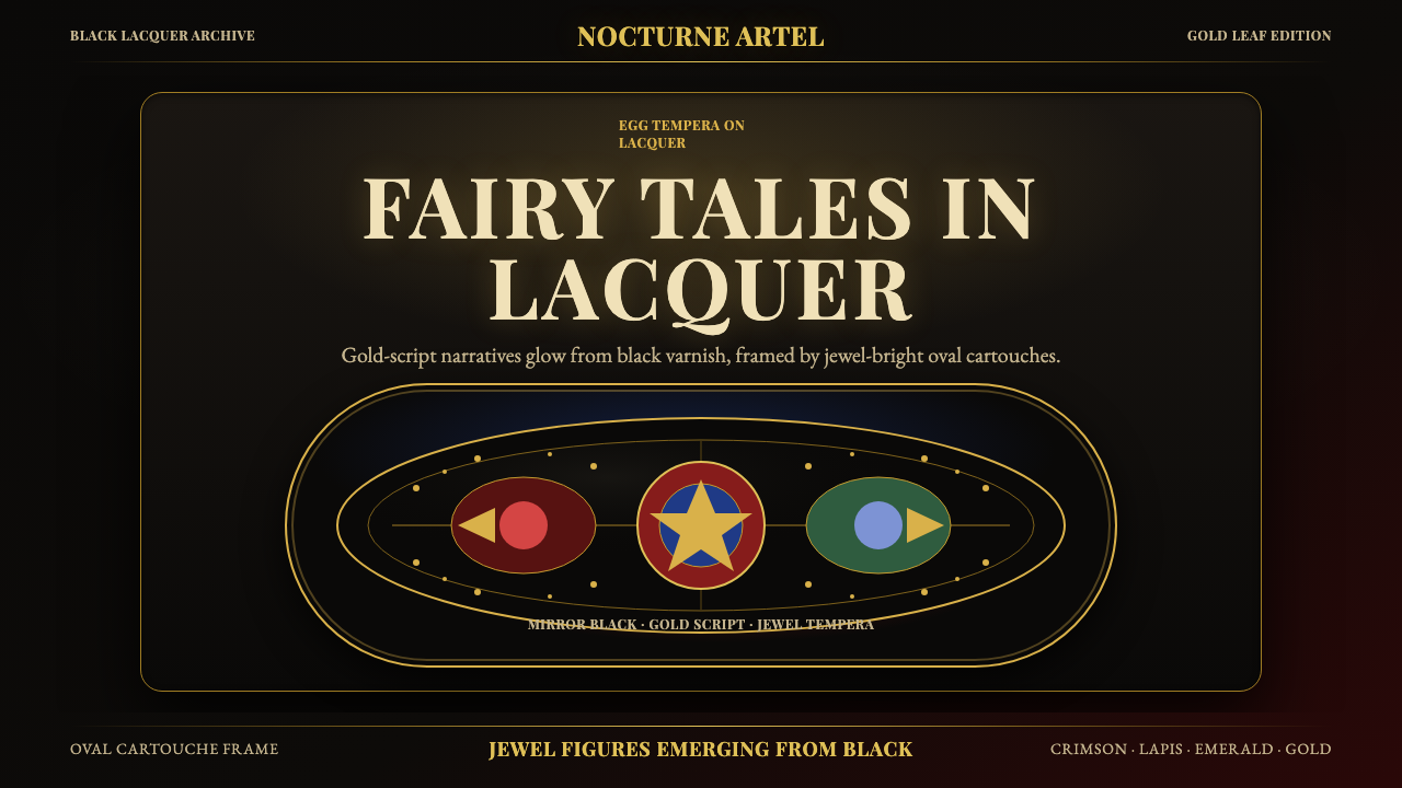 Russian Palekh Lacquer MiniatureBlack lacquer turns mythic. Gold ovals hold crimson, lapis, and emerald tempe…
 Hindu Pantheon Bazaar PrintDevotional calendar art, edge to edge. Gold halos and garland borders on baza…
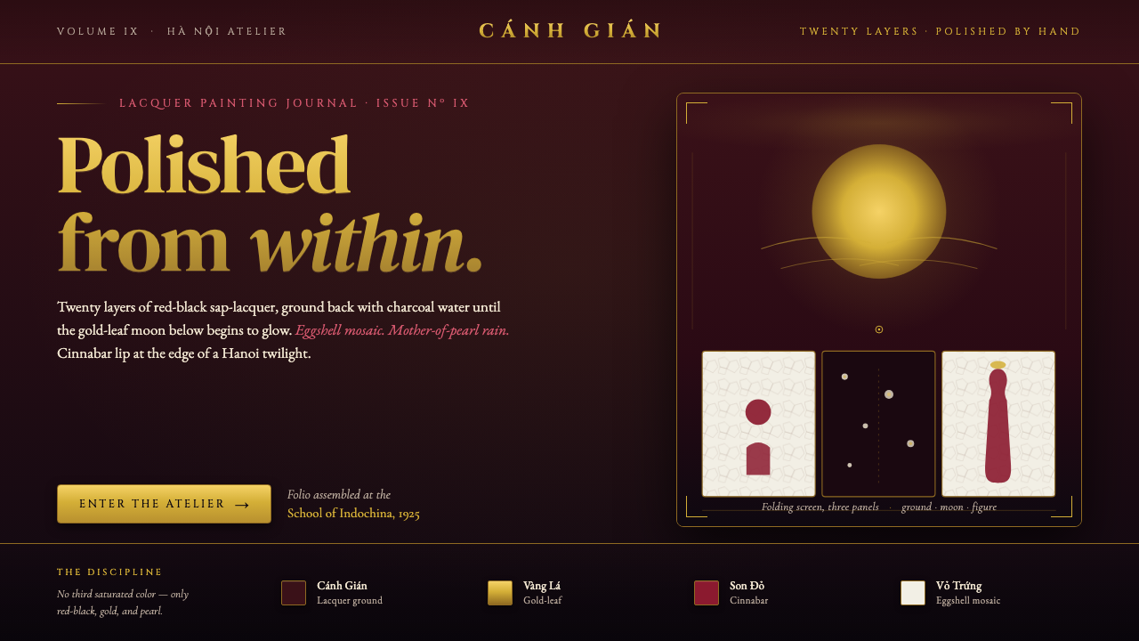 Vietnamese Sơn Mài LacquerTwenty layers polished to glass. Cockroach-wing red-black ground, gold-leaf m…
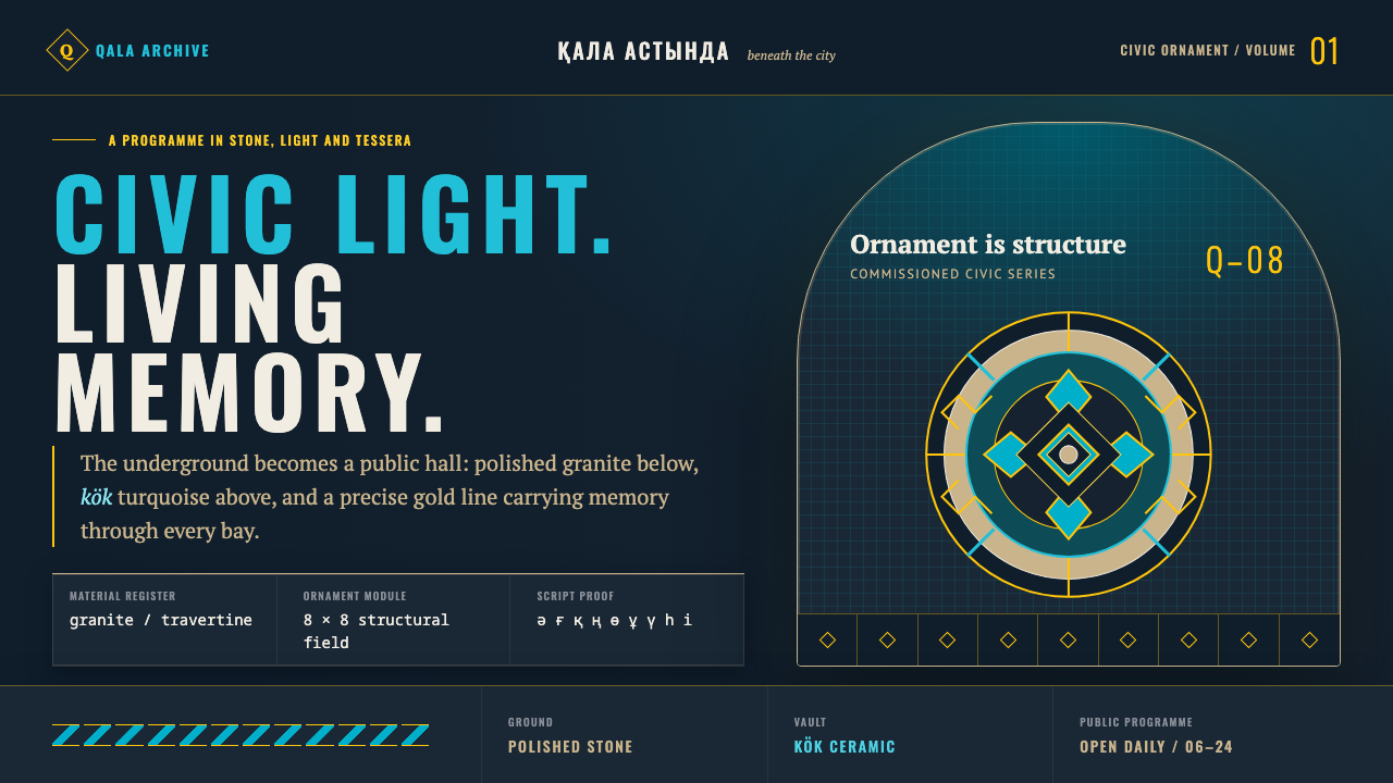 Almaty Metro MosaicCivic grandeur speaks Turkic. Kök vaults and gold geometry rise above polishe…
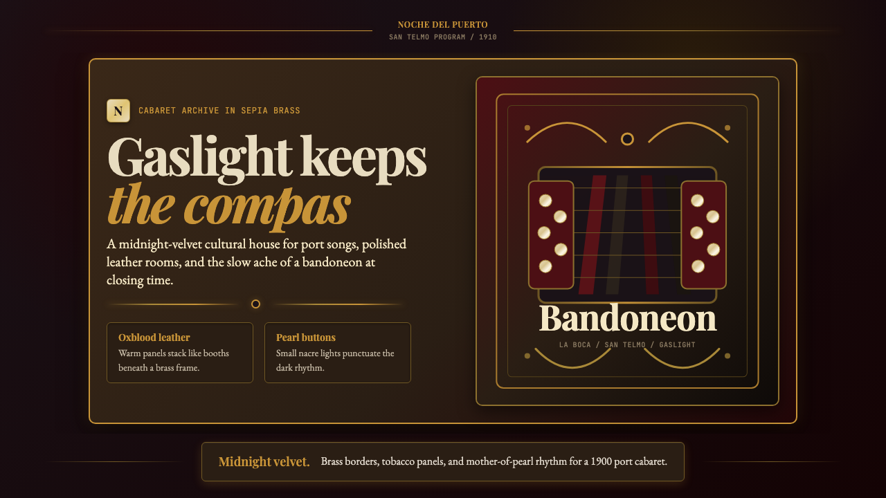 Argentine Bandoneón 1900 (Tango)Gaslit tango luxury. Midnight velvet, brass fileteado, and pearl-button geome…