What is Almaty Metro Mosaic?
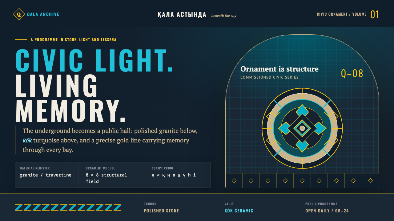
Almaty's metro took twenty-three years to open a single line — and every station that finally opened was built to be a monument, not just a platform.
Almaty Metro Mosaic in brief
The Almaty Metro was not built as a bare transit utility with stations treated as afterthoughts. Construction began in 1988, and by the time the first line finally opened on 1 December 2011, each individual station had been developed as its own commissioned artistic programme, with a distinct color scheme, distinct lighting design, and distinct ornamental vocabulary. Baikonur station reads as a spaceship interior rendered in blue and white. Rayimbek Batyr runs in gold throughout. Zhibek Zholy carries four large ceramic mosaic panels depicting scenes from the Silk Road. No two stations repeat the same formula, yet all of them share an underlying material and ornamental discipline.
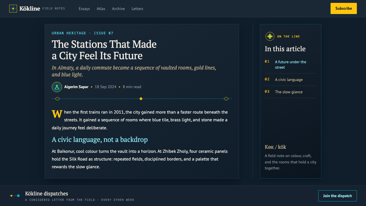
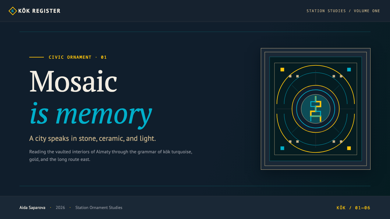
That shared discipline is what this design system takes as its core structure. Dark, polished granite functions as the page itself — the dominant ground against which everything else is set, echoing the deep stone floors and walls that run the length of every platform. Turquoise, drawn from the Turkic word kök for the specific pale sky-blue associated with the region, and a warm flag gold carry the ornamental line across that dark ground, while paler travertine and beige-brown marble appear only as inset medallions and hairline rules — accent stone, never the base.
Geometrically, the system draws on a small, specific vocabulary rather than generic decorative shapes: the koshkar-muyiz spiral, a ram's-horn motif long used in Kazakh ornament, the running meander band, and the curved arc of a barrel vault. These forms are worked with precision rather than looseness, reflecting a civic ambition rather than a folk-craft looseness — this is the visual language of an independent nation's public monument, not a rustic or improvised aesthetic. Lighting plays as large a role as material in this vocabulary: each station's commissioned programme paired its stone and ornament with a distinct lighting design — the cool blue-white glow that gives Baikonur its spaceship character is itself part of the artistic commission, not an afterthought bolted onto a finished architectural shell. A system built on this style should treat illumination as a design decision on the same level as color or geometry, since the stations it draws from never separated the two.
Where does Almaty Metro Mosaic come from?
Construction of the Almaty Metro began in 1988, while Kazakhstan was still part of the Soviet Union, placing the project's earliest phase within the long Soviet tradition of treating metro stations as monumental public art rather than purely functional infrastructure — a tradition visible in showcase systems across the Soviet world, where marble, mosaic, and sculptural relief turned transit stops into civic statements.
The project's long construction period spanned Kazakhstan's transition to independence, and the metro that eventually opened carried a different ideological charge than the Soviet-era systems that inspired its scale. By the time Line 1 opened on 1 December 2011 — twenty-three years after ground was broken — the station programme had become a vehicle for a specifically Kazakh national ornament revival, drawing on motifs such as the koshkar-muyiz spiral and turquoise-and-gold color schemes rather than the generic Soviet decorative vocabulary alone.
This gives the Almaty Metro a double inheritance. Its scale, its commitment to per-station artistic commissioning, and its use of costly permanent materials like polished granite and marble descend from the Soviet metro monumental-art tradition. Its specific ornamental content — the ram's-horn spirals, the Turkic-language color naming of kök blue, the Silk Road subject matter of the Zhibek Zholy mosaics — belongs instead to a post-independence civic architecture project asserting a distinctly Kazakh identity within that inherited monumental form.
Extensions to the system have continued since the 2011 opening, with the design programme credited in part to designer Akzheleng Bassen, continuing the station-by-station commissioning model into the current era rather than standardizing every new station around a single repeated template.
What defines the Almaty Metro Mosaic look?
Dark Polished Granite Ground
The dominant surface is a dark, polished granite tone, functioning as the page itself rather than as an accent. It gives the system its sense of civic weight and permanence, echoing the deep stone floors and walls that run through every station platform.
Kök Turquoise and Flag Gold
Ornament is carried in two colors: a specific pale sky-blue turquoise, named kök in Turkic, and a warm flag gold. These two tones do the work of pattern and line across the dark ground; other colors are absent or strictly secondary.
Travertine and Marble as Accent, Never Ground
Pale travertine and beige-brown marble appear only as small inset medallions or hairline dividing rules. They are never used as a large background field — their role is strictly to punctuate the dark granite ground, not to compete with it for surface area.
Koshkar-Muyiz Spiral
The ram's-horn spiral, a long-established motif in Kazakh ornament, is a core geometric building block. It appears worked with precision — tightly and consistently curved — rather than loosely or informally drawn.
Running Meander and Barrel-Vault Arc
A continuous meander band and the curved arc of a barrel vault supply the system's linear and structural geometry, used for borders, dividers, and framing elements rather than as freeform decorative flourishes.
Civic Grandeur, Not Folk Rusticity
Every element is precise, symmetrical, and monumental in scale rather than loose or handmade in feel. This is a system built to convey the seriousness of a public national monument, and it should never be softened into a casual or folk-craft register.
Who shaped Almaty Metro Mosaic?
Bassen is credited with the design of the Almaty Metro's station programme, continuing the station-by-station artistic commissioning model into the system's current era as extensions have continued past the original Line 1 opening in 2011.
This inherited tradition — treating metro stations across the Soviet world as showcase public art rather than bare infrastructure, using marble, mosaic, and permanent stone materials — set the scale and material ambition that the Almaty Metro's construction, begun in 1988, was built within.
This post-independence current supplied the system's specific ornamental content — the koshkar-muyiz spiral, kök turquoise, and Silk Road subject matter seen in stations like Zhibek Zholy — layering a distinctly Kazakh visual identity onto the inherited monumental metro form.
How do you use Almaty Metro Mosaic today?
This system carries civic weight because every material choice reinforces permanence and craft precision — dark stone as ground, two disciplined accent colors, pale stone reserved strictly for small inset details. Applying it well means treating every surface as if it were built to last decades, not as a temporary visual skin.
For presentation slides, this style suits a cover or a milestone-announcement slide extremely well: a dark granite-toned field with a koshkar-muyiz spiral or meander band picked out in kök turquoise or gold along one edge, title type set in a clean, monumental weight. Data slides should keep the dark ground dominant and use gold sparingly to mark the single most important figure or milestone, with travertine-toned panels reserved for supporting detail boxes rather than the main chart area.
For web interfaces, the system fits an institutional, cultural, or heritage-brand site far better than a lightweight consumer app — its formality reads as trustworthy and permanent rather than playful. A hero section can use the dark granite ground with a turquoise-and-gold meander border framing the viewport, while navigation stays in restrained gold-on-dark type and travertine tones are reserved for card insets or modal dialogs rather than full-page backgrounds. Because the source stations treat lighting as part of the artistic commission rather than a separate layer, digital applications of this style should let glow and highlight states — hover states, active tabs, focus rings — pick up the kök turquoise or gold rather than a generic interface blue, keeping illumination inside the same two-color discipline as the rest of the ornament.
In editorial and marketing layouts, the style rewards treating each major section like an individual station: a distinct but disciplined variation on the shared dark-ground, two-accent-color, precise-geometry formula, echoing how Baikonur, Rayimbek Batyr, and Zhibek Zholy each have their own identity while sharing an underlying system. Pull quotes and figures work well framed by a meander border rather than a plain rule.
The most common mistake is treating the pale travertine and marble tones as a second base color equal to the dark granite, letting light stone fields compete for large areas of the layout. In the source system, pale stone is strictly an accent — inset medallions and hairline rules — and a version that expands it into a major background undermines the dark, monumental ground that gives the style its gravity.
Almaty Metro Mosaic — FAQ
Why does every station — and every version of this design — look slightly different?
Because the Almaty Metro was built as a station-by-station commissioned art programme rather than a single repeated template — Baikonur is a blue-and-white spaceship interior, Rayimbek Batyr runs in gold, Zhibek Zholy carries Silk Road mosaic panels. The design system preserves that same principle: a shared material and color discipline that allows each application to develop its own specific variation rather than repeating one fixed layout.
Why is pale stone used only for small details instead of large surfaces?
Because in the source stations, travertine and beige-brown marble function as inset medallions and hairline rules against a dark granite ground, not as an alternative base. Keeping pale stone strictly as an accent preserves the contrast and the sense of weight that the dark ground provides; expanding it into a large field would flatten that hierarchy.
Is this style appropriate for a playful consumer app?
Not really. Its formality — dark polished stone, precise geometric ornament, monumental scale — is designed to communicate civic permanence and national pride, closer to an institution or a heritage brand than to a casual consumer product. Forcing it into a playful context tends to feel mismatched, since the entire system depends on reading as serious and enduring.
Where does the turquoise color specifically come from?
It is named kök, the Turkic-language word for the pale sky-blue associated with the region, and it is used deliberately rather than as a generic decorative blue. Pairing kök turquoise with flag gold ties the ornament directly to the post-independence Kazakh national ornament revival that shaped the metro's later station design.
Why did it take twenty-three years to open the first line, and does that matter for the design?
Construction began in 1988 under Soviet-era planning and continued through Kazakhstan's transition to independence before Line 1 finally opened in December 2011. That long span matters because it is why the finished system carries two layers at once — the Soviet monumental-art scale and material ambition from the project's origin, and the specifically Kazakh national ornament revival that shaped the station designs actually completed by the time the line opened.
Related design styles
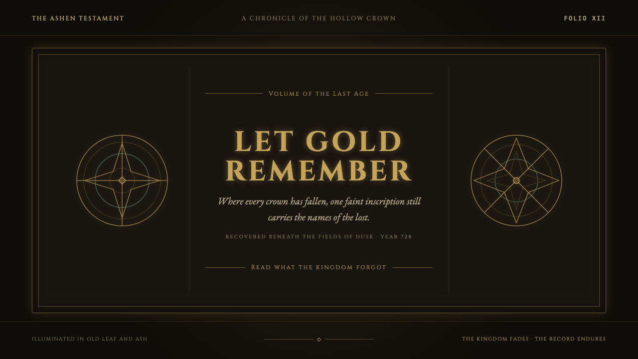 Elden Ring (2022)A kingdom mourns in gilt. Aged gold hairlines and Roman capitals glow in warm…
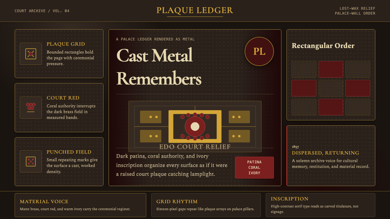 Benin Bronze Oba CourtCourt gravity in cast metal. Patinated brass grid, coral red panels, ivory se…
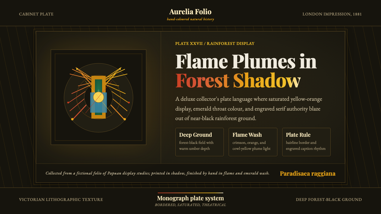 Bird of Paradise MonographTheatrical plate-book darkness. Flame plumes blaze from a bordered forest-bla…
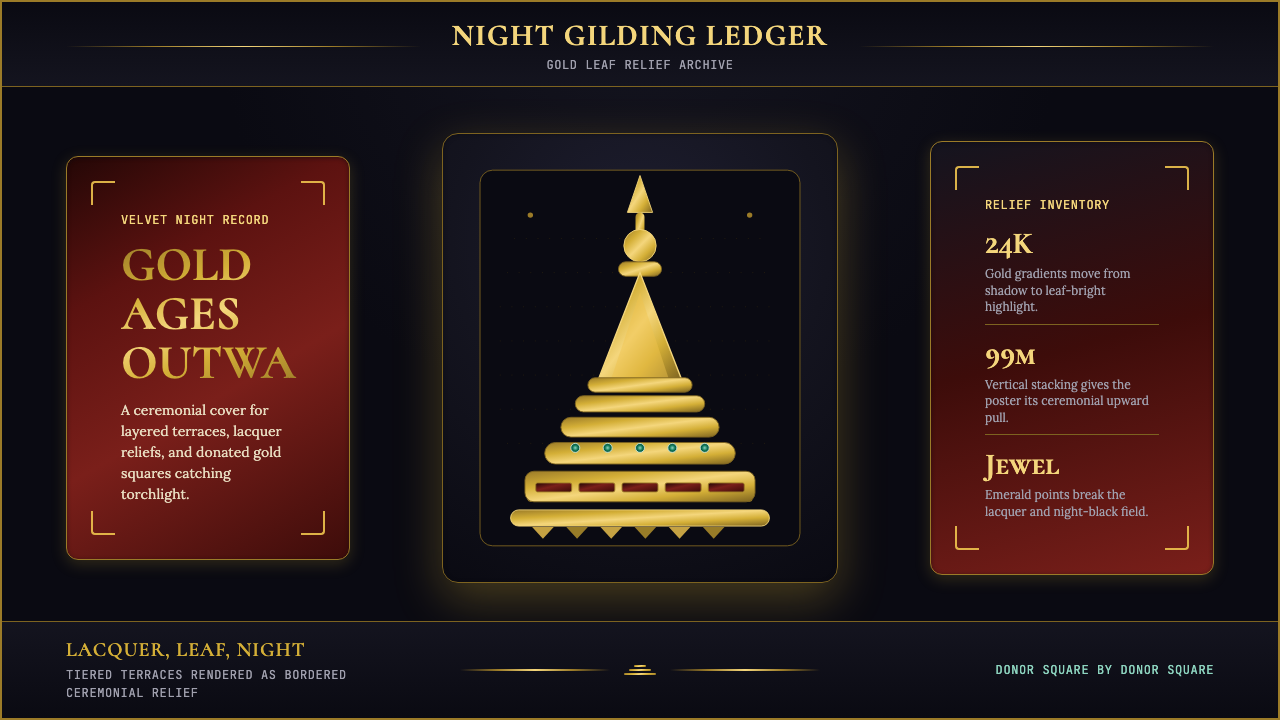 Burmese Shwedagon Stupa ReliefGold refuses restraint. Velvet black, teak-red lacquer, and tiered gradients…
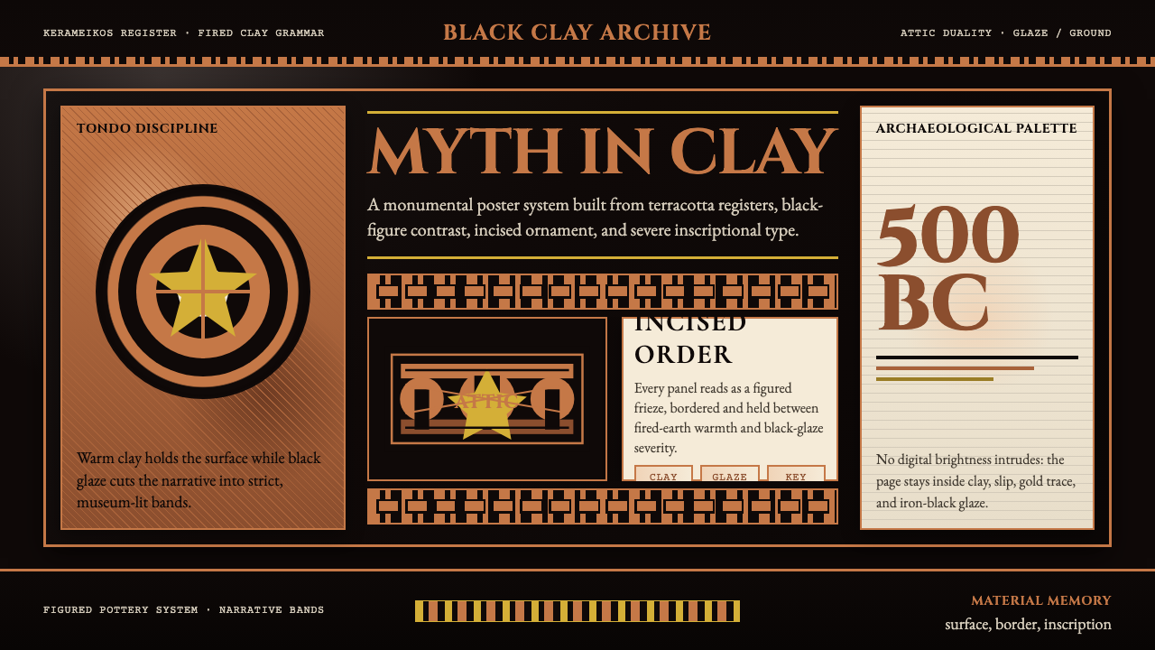 Greek Vase Attic (500 BC)Archaeological severity. Jet-black glaze, terracotta bands, and meander borde…
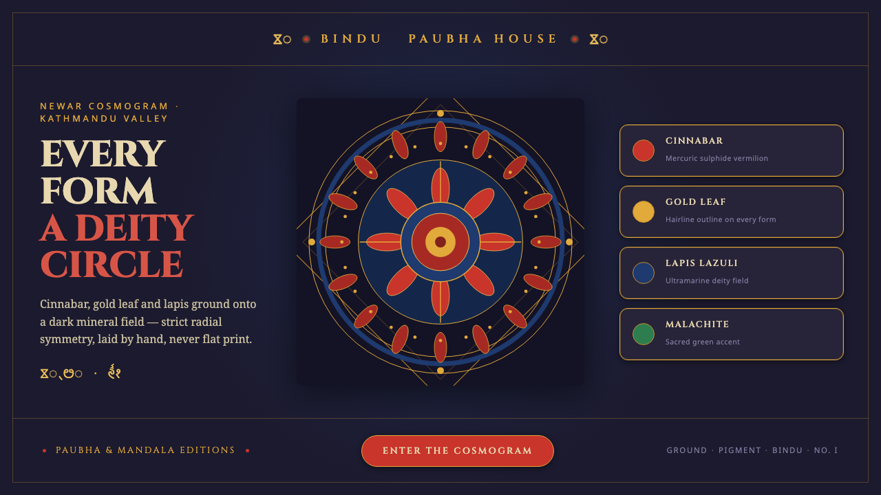 Kathmandu Tantric MandalaSacred geometry as interface. Cinnabar, gold and lapis rings radiate from one…