What is Kathmandu Tantric Mandala?
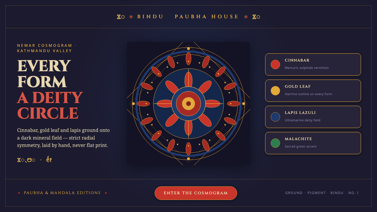
Kathmandu tantric mandala turns sacred geometry into interface: cinnabar, gold, and lapis radiate from a single bindu across a dark mineral ground.
Kathmandu Tantric Mandala in brief
Kathmandu tantric mandala painting belongs to the Newar paubha tradition of the Kathmandu Valley, where anonymous master-painters built sacred images from ground mineral pigments. Cinnabar, gold leaf, and lapis lazuli sit against a dark indigo-black field, producing a surface that feels mineral, matte, and ceremonially precise.
Its organizing principle is radial symmetry. A central bindu anchors concentric lotus rings, square toranas, protective flame borders, and lettering in Ranjana script. Every form participates in a deity-circle, so the composition reads as a unified cosmogram rather than a collection of independent decorations.
As a digital design system, the style translates this structure into centred layouts, matte fills, restrained gold outlining, and repeated geometric containment. The result should feel hand-laid and stone-pigment based: solemn, dense, and luminous against darkness, never like a flat poster with exotic ornament added afterward.
Where does Kathmandu Tantric Mandala come from?
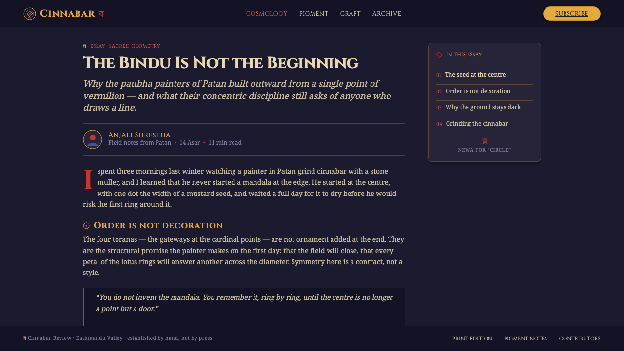
The tradition comes from the Kathmandu Valley in Nepal, within a Newar Buddhist and Hindu tantric milieu. Its historical setting is the pre-1900 paubha cloth-painting tradition, a practice described as centuries deep. The paintings are therefore not merely graphic compositions; they are sacred images shaped by a long workshop culture and by the disciplined construction of mandala geometry.
Anonymous Newar paubha master-painters formed the central creative lineage. Their practice joins mineral preparation, controlled application, symbolic geometry, and calligraphic inscription. The material vocabulary is distinctive: cinnabar supplies a forceful red, gold leaf introduces concentrated radiance, and lapis lazuli gives the composition a deep blue presence against the indigo-black ground.
Chakrasamvara-mandala lineage workshops and donor patrons also belong to the tradition’s source structure. The workshops preserve and transmit the mandala format, while patrons support the making of sacred images. Together, they situate the style between individual craftsmanship, lineage practice, and devotional commission rather than personal expression alone.
What defines the Kathmandu Tantric Mandala look?
Mineral Color
The palette begins with a dark indigo-black ground and is punctuated by cinnabar, gold, and lapis. These colors should feel dense and particulate rather than luminous in a digital or glossy sense. Gold is most effective when concentrated in rings, outlines, or sacred accents; cinnabar and lapis establish the larger visual rhythm.
Central Bindu
The bindu is the visual and compositional anchor. It is small, concentrated, and never treated as a casual decorative dot. Surrounding forms should acknowledge its position through alignment, repetition, and measured expansion, allowing the eye to move outward from the centre and return to it.
Radial Geometry
Forms expand through concentric lotus rings, square toranas, and protective flame borders. The geometry is strictly centred and should remain legible as a sequence of contained layers. Circles organize continuity, squares introduce enclosure, and flame edges create a final defensive perimeter without breaking the overall symmetry.
Matte Surface
Digital fills should suggest powdered stone pigment laid onto cloth. Keep surfaces quiet, opaque, and tactile in implication. The visual richness comes from the meeting of mineral fields and fine outlines, not from simulated gloss, atmospheric effects, or decorative surface noise.
Gold Linework
Gold works as a contouring instrument as much as a color. Fine gold lines clarify rings, compartments, and transitions between sacred forms. They should be delicate enough to preserve the dark ground, yet present enough to make the geometry appear patiently laid and hand-finished.
Ranjana Lettering
Ranjana script gives the system a calligraphic and ritual register. Lettering should behave as part of the geometry, appearing within rings, beside forms, or along carefully controlled paths. It should never become a detached typographic layer that competes with the mandala’s centre.
Who shaped Kathmandu Tantric Mandala?
These unnamed artists are the principal makers associated with the tradition. Their importance lies in the disciplined union of mineral pigment, sacred geometry, cloth-based surface, and Ranjana lettering. The anonymity shifts attention away from individual celebrity and toward inherited workshop knowledge and the precision of the finished image.
The lineage workshops represent the continuity of a mandala format across generations. Their role is not only to produce images but to preserve the centred construction of bindu, rings, toranas, and flame borders. In the design system, this continuity becomes a repeatable visual grammar rather than a single ornamental motif.
Donor patrons form part of the social structure behind sacred image-making. Their presence reminds designers that the mandala is connected to commission, devotion, and shared cultural purpose. Applications inspired by the style should therefore feel intentional and ceremonial, not merely atmospheric or exotically themed.
How do you use Kathmandu Tantric Mandala today?
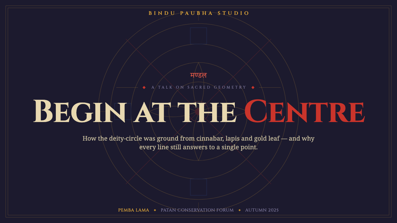
For presentation slides, use the cover as a dark ceremonial field with a centred bindu, restrained radial geometry, and a concise title treated as an inscription. Content slides should preserve the centre-to-edge logic through ringed diagrams or contained panels. Data slides can turn charts into mandala-like structures, using cinnabar for the primary signal, lapis for secondary structure, and gold for key annotations rather than decorating every element.
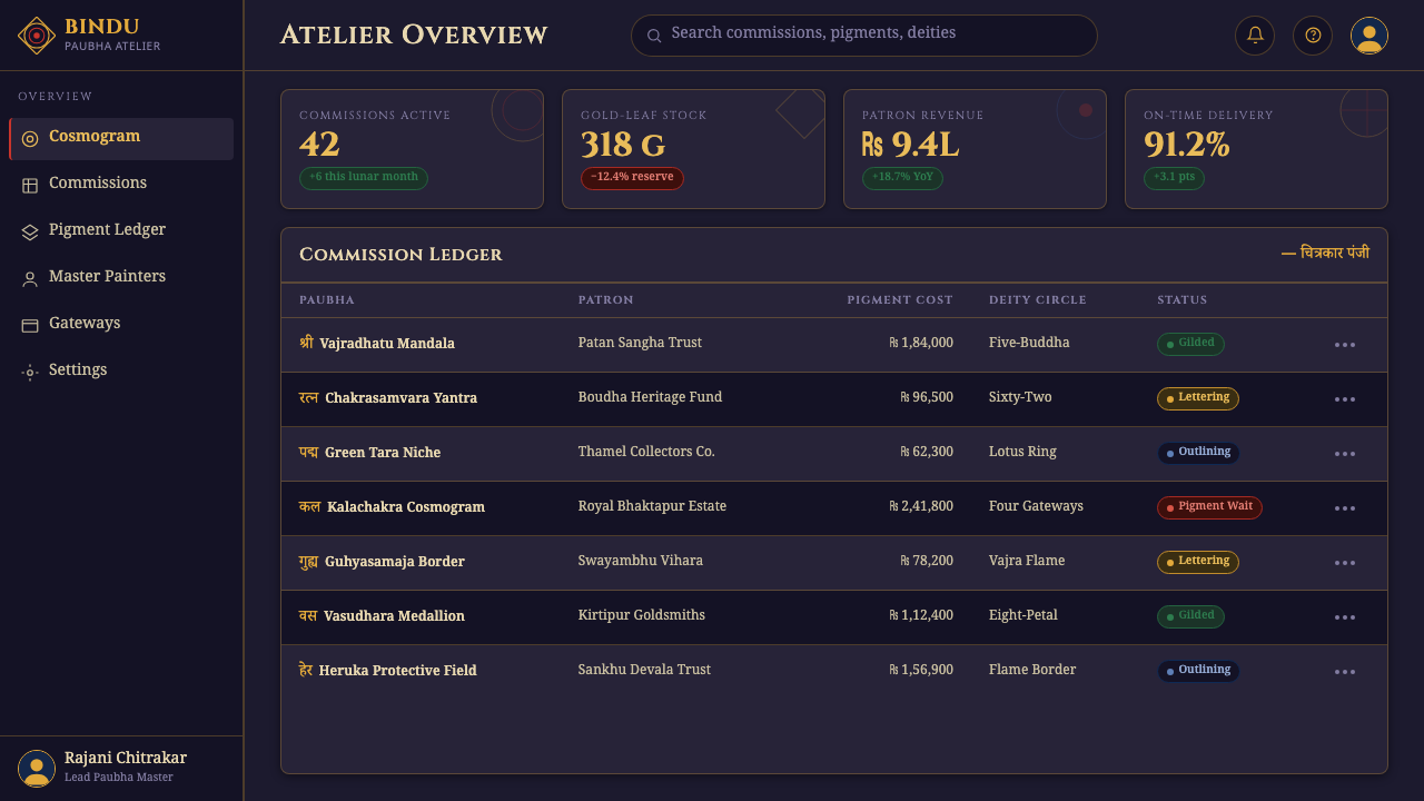
For web interfaces, the style suits dashboards, analytical tools, and pricing pages that need a strong central hierarchy. A dark mineral surface can hold a centred summary or status, while surrounding cards behave like controlled rings or square toranas. Gold should mark focus, confirmation, or important transitions; cinnabar can signal active states; lapis can carry supporting information. The interface should remain calm and deliberate despite its richness.
For editorial and marketing work, the system supports covers, campaign posters, long-form essays, and cultural programming. Use a single centred emblem or mandala fragment as the dominant visual, then let narrow text columns and quiet margins protect its presence. Marketing pages can alternate dark mineral fields with pale breathing spaces, while gold rules and Ranjana lettering provide continuity across sections.
A common mistake is to treat the style as a generic dark theme with metallic decoration. Scattering rings, flames, gold effects, or script-like marks without a central bindu destroys the visual logic. Another failure is using cinnabar, gold, and lapis with equal intensity everywhere. The system depends on hierarchy: darkness establishes depth, the bindu establishes focus, geometry establishes order, and color arrives selectively.
Kathmandu Tantric Mandala — FAQ
Is Kathmandu tantric mandala simply a dark luxury aesthetic?
No. Its darkness is structural: the indigo-black ground gives the mineral colors and gold lines their presence. Its identity comes from the centred bindu, radial rings, square toranas, protective flame borders, and Ranjana lettering working as one sacred geometry. Removing that construction leaves only a surface mood.
Can the style work without gold?
It can, but gold is one of the clearest signals of the system’s ceremonial character. If gold is reduced or removed, the dark ground must remain strong and the cinnabar and lapis must be organized through precise linework and radial containment. The result will feel quieter, but it should still preserve the bindu and concentric construction.
How should Ranjana script be used in a digital interface?
Use it as integrated lettering rather than as a novelty font applied to every label. It works best inside rings, along controlled paths, or beside a central emblem, where its calligraphic character reinforces the ritual geometry. Ordinary interface information should remain legible and subordinate to the mandala’s main focus.
Does the style suit every product?
No. It is strongest where contemplation, sacred symbolism, cultural depth, or concentrated hierarchy are appropriate. It can support dashboards, analytical tools, pricing pages, editorial work, and cultural campaigns, but it may feel overly ceremonial for products that require casual energy, playful informality, or a deliberately neutral surface.
Related design styles
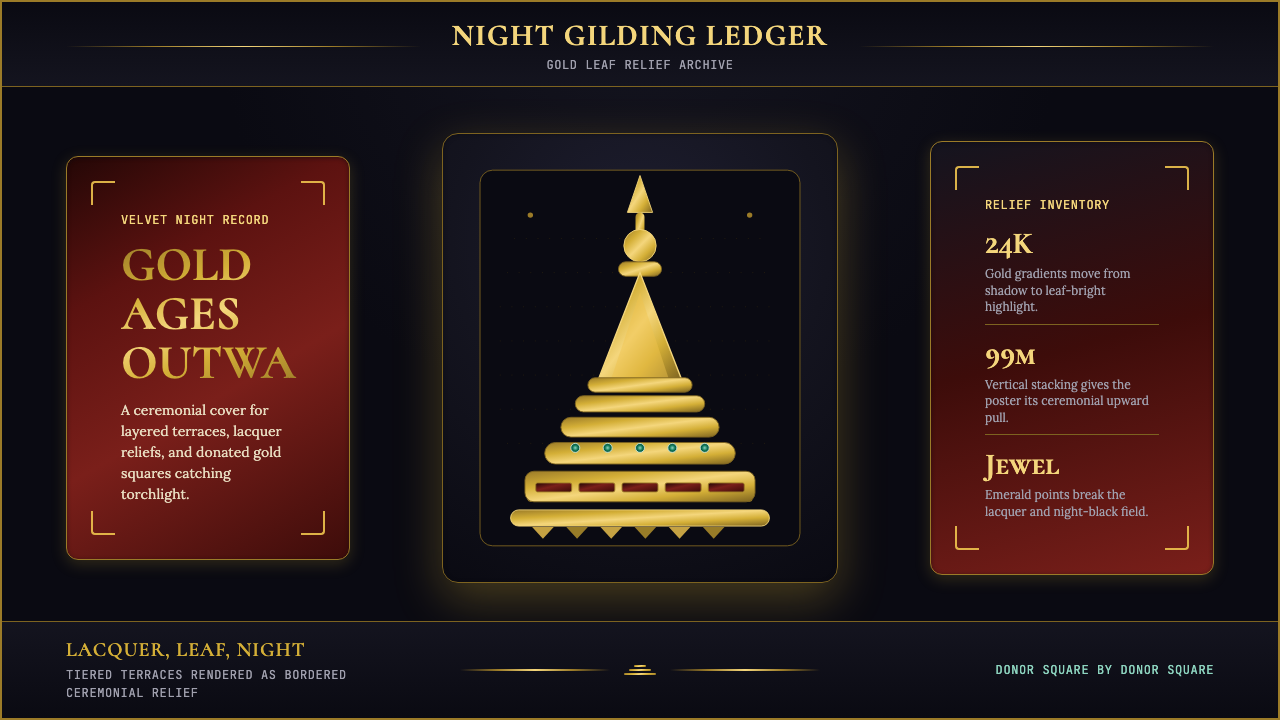 Burmese Shwedagon Stupa ReliefGold refuses restraint. Velvet black, teak-red lacquer, and tiered gradients…
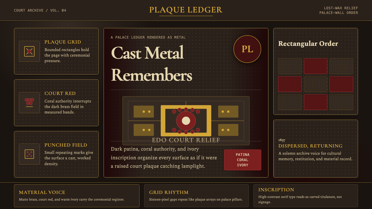 Benin Bronze Oba CourtCourt gravity in cast metal. Patinated brass grid, coral red panels, ivory se…
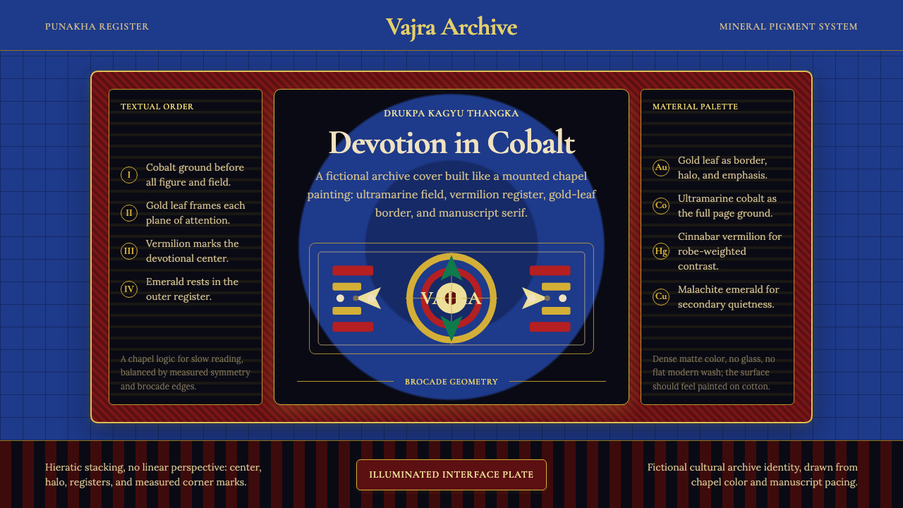 Bhutanese Drukpa Kagyu ThangkaDevotion made cobalt. Gold frames, Cormorant serif, and vermilion marks hold…
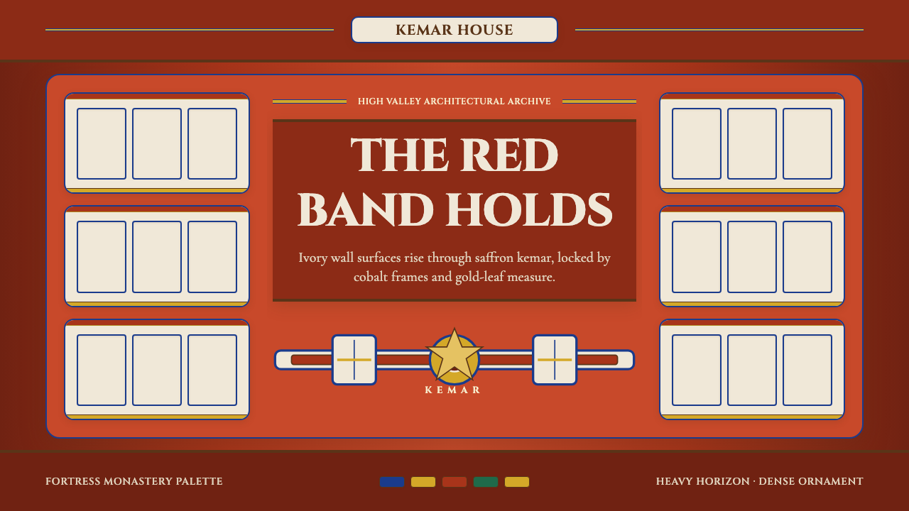 Bhutanese Dzong (Fortress Red)Monumental red holds the page. Cobalt frames and gold bands lock the fortress…
 Bird of Paradise MonographTheatrical plate-book darkness. Flame plumes blaze from a bordered forest-bla…
 Burmese Kalaga TapestryVelvet becomes theater. Black ground, gold-thread borders, ruby and emerald p…