What is Bird of Paradise Monograph?
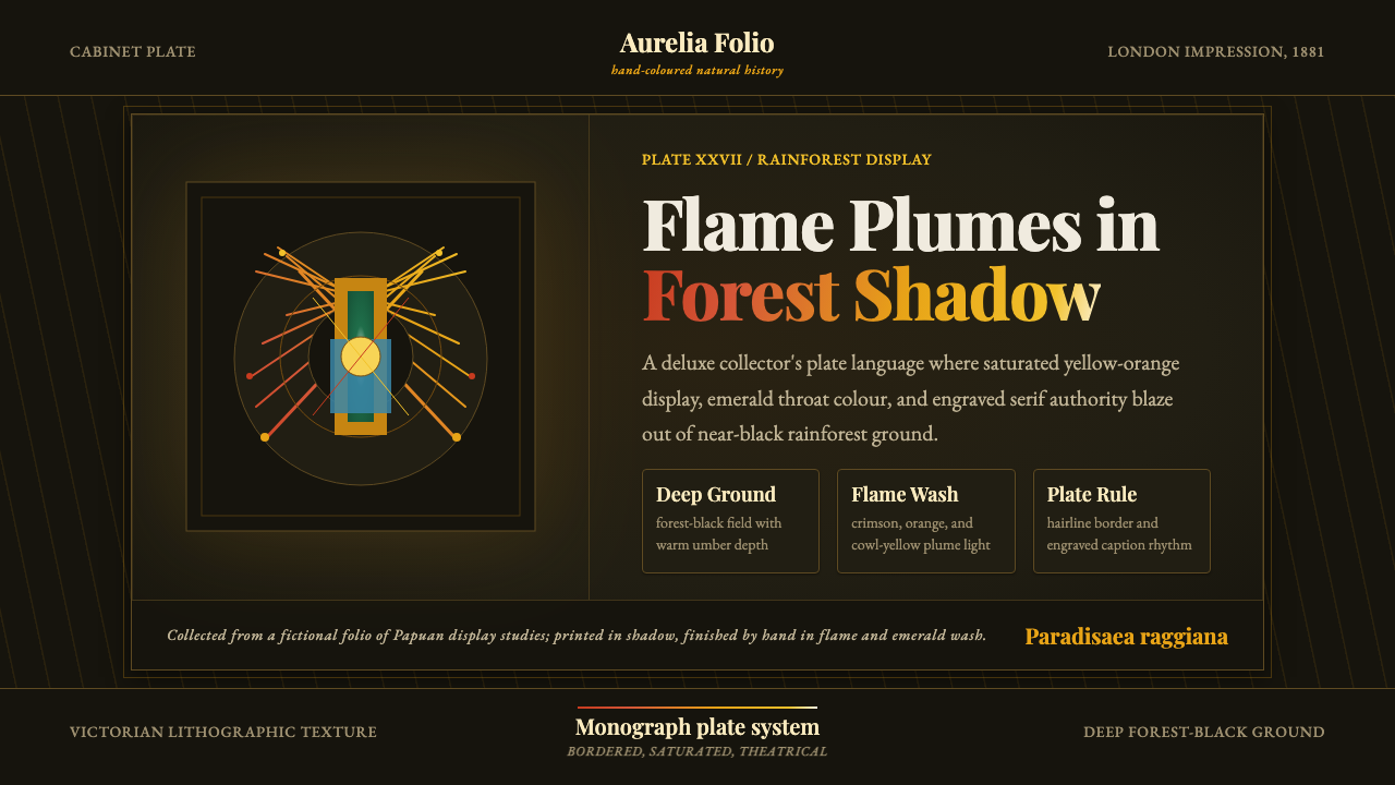
John Gould's plate books turned the impossible flare of a bird-of-paradise's courtship display into the most theatrical object a Victorian drawing room could own — printed, then colored by hand, one feather at a time.
Bird of Paradise Monograph in brief
Bird of Paradise Monograph draws its design language from a specific and extraordinary object: the large-format, hand-colored bird monograph produced in Victorian Britain, and specifically John Gould's The Birds of New Guinea and the Adjacent Papuan Islands, his final and most ambitious such work. These were not field guides; they were subscription-only luxury publications, issued in installments over years, each plate a full-page lithograph depicting a single species, or a male-female pair, in a dramatic, theatrical pose against its native habitat.
The system's central subject, the Raggiana bird-of-paradise, gave illustrators an extraordinary problem: how do you render, in printed ink and hand-applied watercolor, a bird whose entire evolutionary strategy is to look impossible? The male's flank plumes — dozens of elongated, gauzy feathers that fan and cascade during a courtship dance — sweep from a deep crimson at the base to a searing orange-yellow at the tip, set off by an iridescent emerald throat patch and a bright yellow cowl. Rendering that against anything but a very dark ground would have flattened the effect entirely, so Gould's plates plunge the bird into a forest interior so dense with shadow that it reads as near-black, letting the plumage do the only work of catching light.
What survives in the design system is that theatrical contrast: an almost-black ground, a single blazing passage of warm plumage color, the visible texture of hand lithography rather than photographic smoothness, and the high-contrast old-style serif lettering that Victorian natural-history publishers used for species names and plate captions. The whole object should feel bordered, framed, and precious — a page meant to be handled carefully, not a screenshot.
Where does Bird of Paradise Monograph come from?
John Gould was not primarily a painter — he was a taxidermist, publisher, and relentless commercial impresario who built one of the nineteenth century's most successful ornithological publishing operations. Starting with A Century of Birds from the Himalaya Mountains in 1830, he issued a string of enormous illustrated works — The Birds of Europe, The Birds of Australia, A Monograph of the Trochilidae on hummingbirds, and finally The Birds of New Guinea and the Adjacent Papuan Islands — each sold to subscribers in installments over years or decades, a business model that spread the enormous cost of hand-colored lithography across a wealthy subscriber base.
Gould rarely drew the finished plates himself. He supplied rough pencil sketches, often based on skins or field notes sent back by collectors and naturalists, and a small studio of artists translated them into finished lithographic drawings. Henry Constantine Richter served as Gould's principal illustrator for four decades, drawing the vast majority of plates published under Gould's name from the 1840s onward, though his contribution was frequently uncredited or minimized on the printed page — the convention of the era attributed authorship to the publisher, not the working artist. When Richter's output slowed in his later years, William Matthew Hart took over much of the illustration work, completing a large share of the plates in Birds of New Guinea.
Birds-of-paradise held a special, almost mythical status in Europe long before Gould illustrated them. Early trade skins arriving from New Guinea in the sixteenth century had their feet and wings removed by local traders for preservation and transport, and this accident of commerce fed a European belief that the birds had no feet at all and spent their entire lives aloft, feeding on dew and never touching earth — a legend echoed in the genus name Paradisaea and in centuries of stories that treated them as literally paradisiacal. By the time Gould undertook Birds of New Guinea in the 1870s, the birds were understood scientifically, but the theatrical, almost supernatural reputation still shaped how they were illustrated: as apparitions of color emerging from darkness.
Gould died in 1881 with Birds of New Guinea unfinished; the ornithologist Richard Bowdler Sharpe completed the text and oversaw the remaining plates through to publication in 1888, working from Gould's notes and the studio's existing artists. Every plate in the finished set was still hand-colored — a process that sent a printed lithographic outline through a production line of colorists, predominantly women, who applied watercolor by hand to a fixed template, plate by plate, copy by copy, for a print run that might number only in the low hundreds. No two surviving copies are ever perfectly identical, which is part of what makes original sets so valuable today.
What defines the Bird of Paradise Monograph look?
Color
The ground is a near-black forest darkness, against which a single warm passage — the bird's plumage — is allowed to blaze. That plumage moves from a deep crimson base into a saturated orange-yellow at its tips, the temperature climbing as the eye travels outward, echoed by a small iridescent emerald accent and a bright yellow cowl. Every other element in the composition stays subdued so this one passage of color reads as the entire point of the page.
Hand-Lithographic Texture
Surfaces carry the grain of hand lithography rather than photographic or digital smoothness: visible brush texture within the watercolor washes, slightly imperfect edges where hand-coloring meets the printed outline, and a matte, paper-toothed finish rather than a glossy sheen. This texture is what separates the system from a generic 'jungle bird' illustration — it should look printed and painted, not rendered.
Theatrical Staging
The bird is staged, not documented: posed mid-display, often at a dramatic angle against a shadowed backdrop, the way a specimen portrait rather than a candid field photograph would present it. Composition favors a single dominant subject placed for maximum theatrical effect over any busy or naturalistic scene-setting — the surrounding rainforest is implied through darkness and a few suggested leaf shapes, never fully rendered.
Old-Style Serif Typography
Species names and plate captions in the source material used high-contrast old-style serif letterforms — the kind of engraved, formal type associated with scientific naming plates and library title pages. That register carries over directly: type should feel printed rather than rendered on glass, formal rather than casual, with a clear hierarchy between a Latin-style display name and smaller descriptive caption text.
Border & Frame
Victorian plate books were bound and often matted, and every plate carried a clear rule-line border separating the illustration from surrounding margin and caption. That framing convention should persist: content reads as a bordered, framed object rather than an edge-to-edge modern layout, with generous margin treated as part of the presentation rather than empty space to be filled.
Iridescent Jewel Accent
Against the dominant warm crimson-to-orange range, a small, highly saturated cool accent — the throat patch's iridescent emerald — functions as a jewel-like counterpoint. It should appear sparingly and specifically, never as a secondary large color field, so that it reads as a flash of unexpected brilliance rather than a competing hue.

Who shaped Bird of Paradise Monograph?
Gould was the publisher, taxidermist, and driving commercial force behind a run of enormous nineteenth-century bird monographs, including The Birds of New Guinea and the Adjacent Papuan Islands, his final and most theatrical work. He rarely drew finished plates himself, instead directing a studio of artists from rough sketches and specimen material, and built a subscription publishing model that made hand-colored natural-history books commercially viable at an unprecedented scale.
Richter was Gould's principal illustrator for roughly four decades, drawing the majority of plates issued under Gould's name from the 1840s onward. His work is characterized by dramatic, life-sized poses and confident, theatrical composition, though his authorship was often minimized on the printed page in favor of Gould's name — a common practice for working artists employed by Victorian publishing houses.
Hart took over much of the illustration workload as Richter's output declined in later life, and completed a substantial share of the plates for Birds of New Guinea. His lithographic hand is generally considered slightly more precise and less painterly than Richter's, and his contribution helped Gould's final, most ambitious monograph reach completion despite the publisher's own death partway through the project.
Sharpe was a professional ornithologist at the British Museum who completed the text and editorial work on Birds of New Guinea after Gould's death in 1881, seeing the remaining installments through to final publication in 1888. His involvement ensured the monograph reached a scientifically coherent conclusion rather than being left as an unfinished commercial fragment.
How do you use Bird of Paradise Monograph today?
Bird of Paradise Monograph works best as a system for signaling rarity, drama, and connoisseurship — it borrows the visual authority of a specimen so precious it was only ever sold to subscribers. It suits products and content that want to feel curated and collectible, and it struggles anywhere the brand needs to feel casual, mass-market, or fast-moving, because the whole point of the source material is deliberate scarcity and theatrical presentation.
On a presentation cover slide, the system rewards restraint: a near-black field, a single warm illustrated or photographic subject given the full theatrical treatment, and a title set in a formal old-style serif rather than anything geometric or playful. Content slides should keep the dark ground consistent throughout rather than switching to a light background for body text, using a narrow band of the warm plumage palette to mark section headers or key callouts. Data slides can borrow the plate-book convention of a bordered, captioned frame around each chart, treating the chart itself the way a plate treats its specimen — a single dramatic subject given room to be seen.
For web interfaces, the system suits dashboards or content platforms built around a small number of premium, carefully chosen items rather than dense grids of options — a curated marketplace, an auction or collector's platform, an editorial showcase. Pricing pages benefit from the same restraint: a dark ground, one plan visually elevated the way a plate elevates its subject, and warm accent color reserved specifically for the recommended tier rather than spread evenly across all options.
In editorial and marketing work, the system is naturally suited to long-form storytelling about craft, rarity, or provenance — auction catalogs, luxury travel, natural-history content, high-end editorial photography features. Full-bleed marketing sections should treat each feature the way a plate book treats each species: one dominant image per screen, generous dark margin, and a caption-style treatment for supporting text rather than dense paragraph blocks.
The most common mistake is treating this as a generic 'tropical' or 'jungle' palette and spreading saturated color evenly across a layout. The system depends on contrast concentration — a large, calm, near-black field making way for one small, blazing passage of color — and loses its theatrical force the moment multiple bright hues compete for attention. A second common mistake is using a clean, flat, vector-style illustration instead of a textured, hand-worked one; the grain of hand lithography is not optional decoration, it is the system's signature.
Bird of Paradise Monograph — FAQ
Is this style the same as generic 'botanical illustration' aesthetics?
No. Botanical and natural-history illustration in general tends toward even, diffuse light and a light or neutral ground, because the goal is usually taxonomic clarity across a whole plate of specimens. Bird of Paradise Monograph is specifically theatrical and dark-grounded, built around one dramatic subject emerging from near-black shadow rather than a evenly lit specimen sheet. The darkness and the singular focus are what separate it from a generic field-guide look.
Does this system require an actual bird-of-paradise image to work?
No — the transferable elements are the near-black ground, the single blazing warm color passage, the hand-lithographic texture, and the bordered, captioned presentation, not the literal bird. Any single premium subject — a piece of jewelry, a rare object, a hero product shot — can be staged the same way: isolated against darkness, given one concentrated passage of saturated color, and framed like a plate rather than cropped like a product photo.
How much saturated color is too much in this palette?
As a rough guide, the saturated warm passage should occupy a clear minority of any given screen or plate — a concentrated highlight, not an even wash. If saturated color starts filling more than a small fraction of the composition, or if a second unrelated bright hue is introduced elsewhere in the layout, the theatrical contrast that makes the system work begins to collapse into generic 'colorful jungle' territory.
Why does the system favor such formal, old-style typography?
Because the source material is a scientific-luxury object, not a casual publication — Victorian plate books used formal, high-contrast serif lettering because they were simultaneously scholarly documents and expensive collectibles, and the typography needed to carry both registers at once. A casual sans-serif or rounded display face undercuts that dual authority immediately, making the whole composition read as decorative rather than as a genuine specimen record.
Can this style work in a light, bright layout instead of a dark one?
It is possible but risky, because the near-black ground is not incidental — it is the mechanism that makes the plumage color read as theatrical rather than merely bright. A light-ground version would need to find some other way to create that concentrated contrast, for instance a large area of muted, deliberately restrained neutral color surrounding one small saturated passage. Without that contrast mechanism in some form, the composition loses the sense of a rare object emerging dramatically from shadow, which is the entire premise of the system.
Related design styles
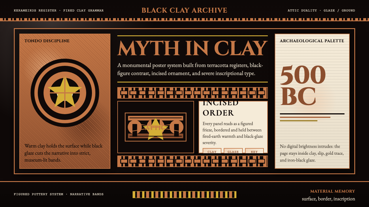 Greek Vase Attic (500 BC)Archaeological severity. Jet-black glaze, terracotta bands, and meander borde…
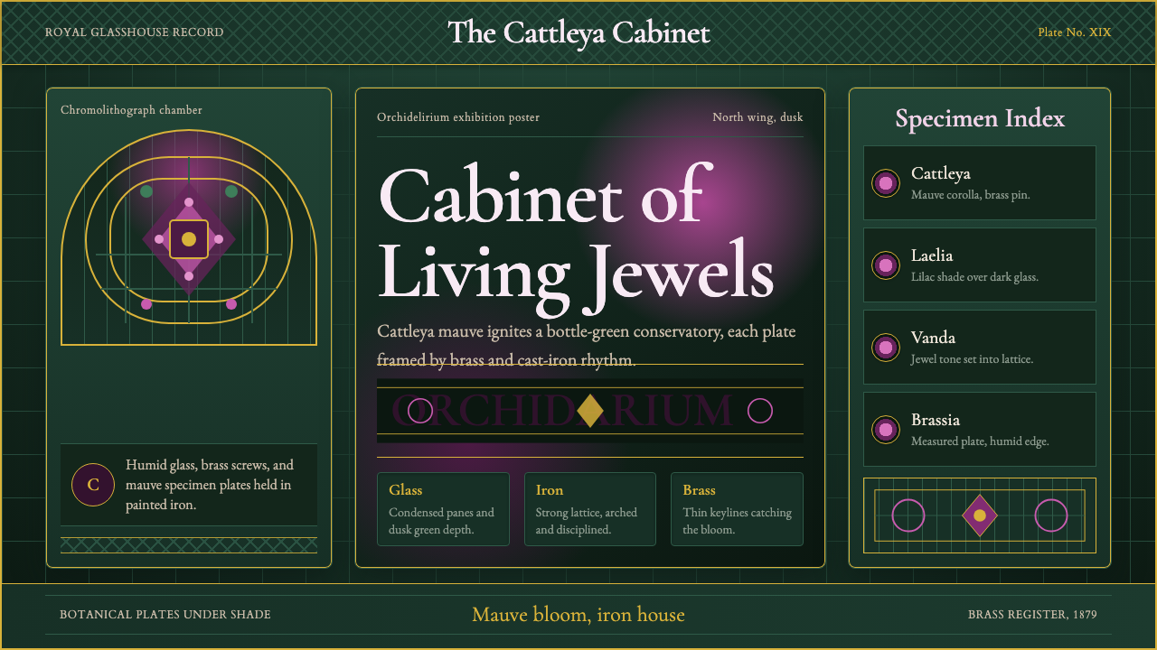 Orchid ConservatoryLush Victorian darkness. Cattleya mauve and brass sit inside bottle-green iro…
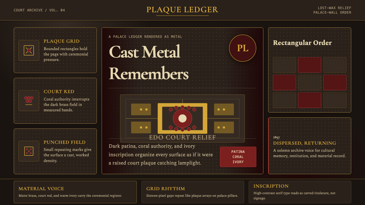 Benin Bronze Oba CourtCourt gravity in cast metal. Patinated brass grid, coral red panels, ivory se…
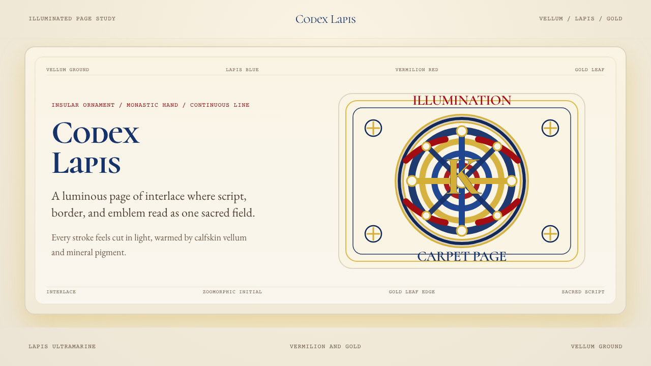 Book of Kells Celtic (800)Sacred and precise. Vellum cream, lapis, vermilion, and gold knotwork.
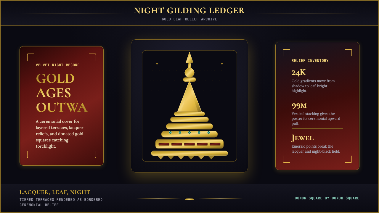 Burmese Shwedagon Stupa ReliefGold refuses restraint. Velvet black, teak-red lacquer, and tiered gradients…
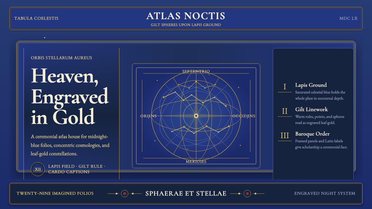 Cellarius Celestial AtlasCelestial luxury on lapis. Gilt serif type, star fields, and concentric chart…