What is Elden Ring (2022)?
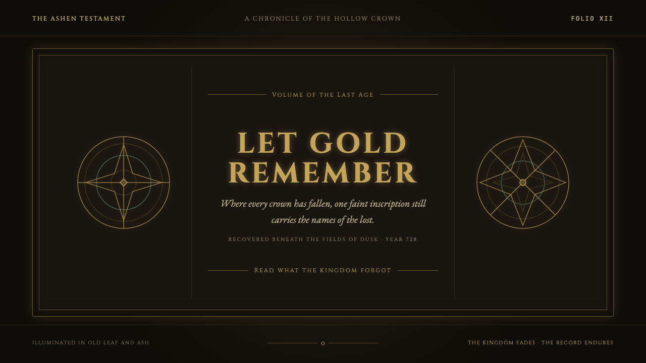
Elden Ring turns interface design into a fading relic: gilt hairlines, Roman capitals, and rune-worn circles glowing quietly inside a mournful dark.
Elden Ring (2022) in brief
Elden Ring is a dark fantasy interface language built around the feeling of a kingdom surviving after its splendor has already begun to decay. Its menus do not present information as neutral panels or efficient utility surfaces. They resemble pages recovered from a ruined archive: inscriptions pressed into darkness, aged metal ornament, and circular marks whose original ceremonial purpose has been eroded by time. The result is solemn rather than theatrical, richly atmospheric without becoming visually loud.
The central visual tension is between darkness and restrained illumination. A warm black field creates depth without asking the screen to simulate a physical room, while old gold details emerge from it like traces of candlelight on tarnished metal. Gold is not treated as a triumphant luxury finish. It feels weathered, faintly green at the edge, and more like surviving leaf or oxidized ritual hardware than fresh decoration. This gives even simple labels and dividers the emotional weight of artifacts.
Its typography and ornament work as one system. Wide-spaced Roman capitals establish an elevated, memorial tone, while thin rules, bronze-like filigree, and concentric rune circles create a sense of order without filling every available area. The interface is minimal in the Soulsborne sense: it withholds persistent visual noise, then makes the information that does appear feel consequential. Each menu reads less like a modern dashboard than an illuminated grimoire that has outlived the civilization that made it.
Where does Elden Ring (2022) come from?
Elden Ring was developed from 2017 to 2022 and released on February 25, 2022. Its visual language belongs to the game’s broader dark-fantasy world, but its interface is not merely an illustration of that world. It translates the atmosphere of ancient power, broken continuity, ritual knowledge, and lingering grief into information design. Menus, labels, circles, and dividers all carry the suggestion that they were inherited rather than freshly manufactured.
The theme emerged in Tokyo, Japan, within a design context associated with Soulsborne UI design. That tradition favors restraint over permanent display, allowing the player’s attention to return to the world rather than surrounding it with a constantly active overlay. When interface elements appear, their limited presence gives them a ceremonial quality. A status readout, a menu heading, or a navigational marker can feel like a fragment of lore rather than an interruption from outside the fiction.
Medieval-manuscript revival is another defining influence named in the source material. Rather than copying a manuscript page literally, Elden Ring evokes its cultural texture: illuminated margins, inscriptions, fragile gilding, and knowledge preserved through repeated handling. The visual vocabulary suggests rubbing, engraving, tarnish, and worn concentric marks. This is why ornament feels historical rather than decorative. It implies a record that has been touched, copied, damaged, and interpreted across generations.
The listed key figures are Hidetaka Miyazaki, George R. R. Martin, Yuka Kitamura, and Tsukasa Saito. Together with the setting of dark fantasy and the approach of a diegetic minimalist HUD, these names frame an interface that makes fiction and usability mutually reinforcing. The style does not ask the player to admire a decorative shell around the game. It makes navigation feel like participation in the same fading kingdom that the player is exploring.
What defines the Elden Ring (2022) look?
Warm Darkness
The ground is dark, but not empty or aggressively cold. It reads as a warm black void that absorbs visual noise and lets small illuminated details carry the composition. Darkness functions as a field of silence: it creates the sense of distance, burial, and night without needing literal scenery. Light is therefore precious, appearing as a held glow rather than a bright interface highlight.
Aged Gilt
Gold is the signature accent, yet it avoids the polished certainty of contemporary luxury branding. It appears aged, muted, and slightly tarnished, closer to old leaf or bronze touched by time. Fine gold hairlines can frame content, divide regions, or trace circular motifs. Their delicacy matters: the metal seems to remain on the screen by endurance, not by force.
Roman Capitals
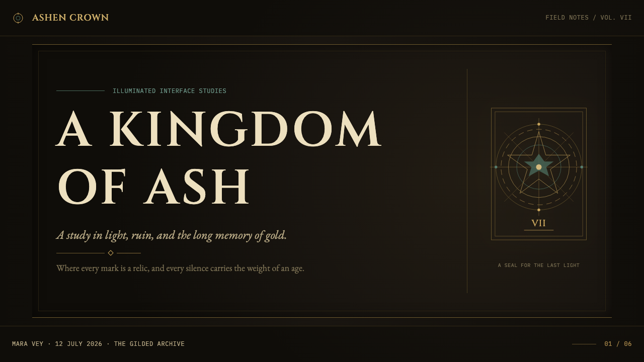
Wide-tracked Roman capitals give headings the character of carved dedication or funerary inscription. The letters should feel pressed into shadow rather than printed above it. Their spacing creates ceremonial pause, allowing a short title to occupy the screen with gravity. This is typography as architecture: the line is not merely read, but encountered as a threshold.
Rune Circles
Concentric circles and rune-like marks introduce the idea of ritual geometry. They should look worn smooth, incomplete, or partly submerged beneath information, never like pristine technical diagrams. A circle can imply a seal, a cosmological map, a trace of enchantment, or an old system of classification. Used sparingly, it gives the interface symbolic depth without requiring illustrative scenes.
Tarnished Filigree
Filigree appears as restrained marginal detail, never as a dense ornamental carpet. Its role is to suggest the remains of craft around the edge of a page or object. Bronze-like curls and engraved traces can soften severe geometry, but they must remain subordinate to text and navigation. The viewer should sense accumulated history before consciously noticing every flourish.
Diegetic Restraint
The minimalist HUD approach prevents the style from becoming a museum display of fantasy ornament. Information arrives selectively, with enough space around it to preserve the world’s silence. This restraint makes each appearance feel deliberate and story-bound. An interface element is not simply a control; it can feel like a surviving instrument within the kingdom’s own visual culture.
Who shaped Elden Ring (2022)?
Miyazaki is listed among the key figures for Elden Ring. Within this theme, the relevant design legacy is an interface atmosphere shaped by dark fantasy, restraint, and a world that feels older than the player’s immediate encounter with it.
Martin is listed among the key figures for Elden Ring. The interface theme aligns with the source material’s emphasis on a kingdom in mourning, where gilded remnants and damaged ceremonial forms make history feel present rather than merely referenced.
Kitamura is listed among the key figures for Elden Ring. Her presence in the source’s key-figure group reinforces the theme’s larger sense of atmosphere: an experience in which solemnity, scale, and lingering emotion are carried across more than one visual or narrative register.
Saito is listed among the key figures for Elden Ring. In a style study, this association supports reading the interface as part of a unified dark-fantasy atmosphere, where restrained illumination and ceremonial marks make practical information feel emotionally charged.
How do you use Elden Ring (2022) today?
For presentation covers, use the style as a threshold into the subject. Place a short title in widely spaced Roman capitals against a warm dark field, then let an aged-gold line, partial rune circle, or faint ornamental trace hold one edge of the composition. The cover should feel calm and consequential, not crowded with fantasy motifs. On content slides, maintain generous darkness around the text, use delicate rules to establish reading order, and allow section names to carry the ceremonial typographic tone.
For data slides, translate the visual language into a quiet system rather than disguising charts as game props. Use muted gilt as a focus color, reserve surrounding marks for secondary series, and keep chart structures clear against the dark ground. Concentric circles can suggest hierarchy or comparison when they genuinely clarify the data, while hairlines can organize legends and annotations. The goal is a chart that feels archival and solemn while remaining immediately legible.
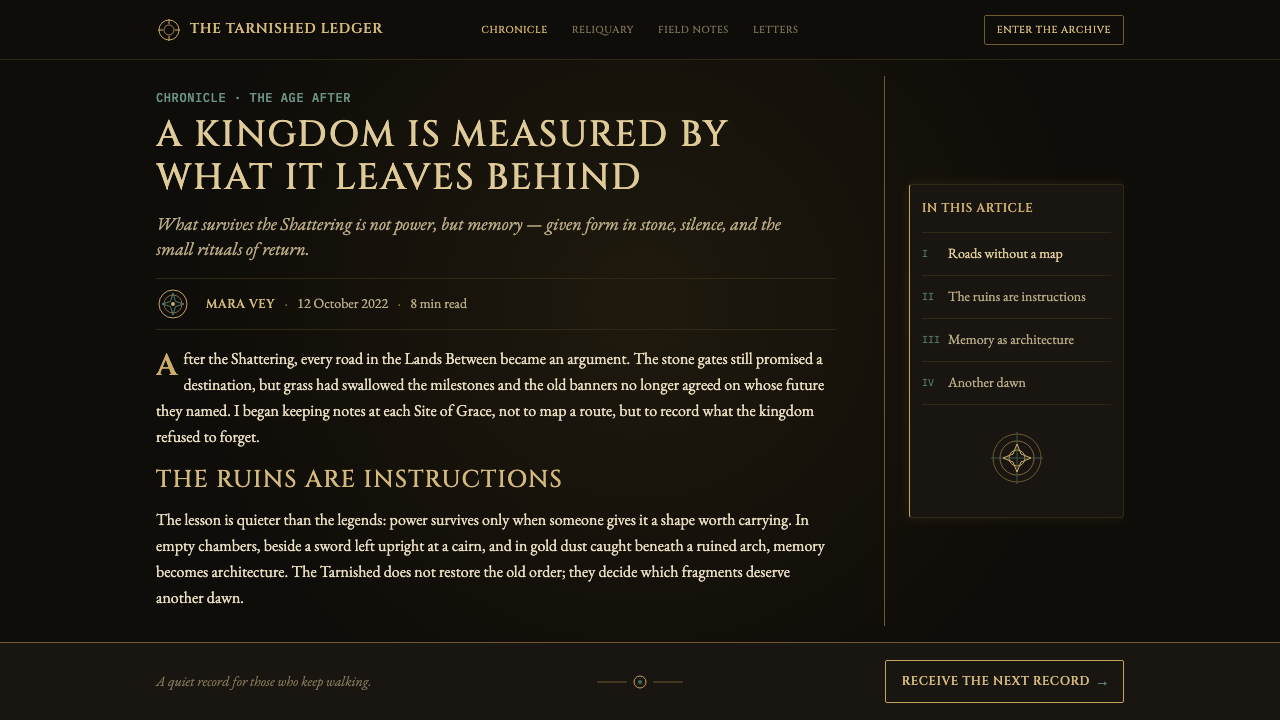
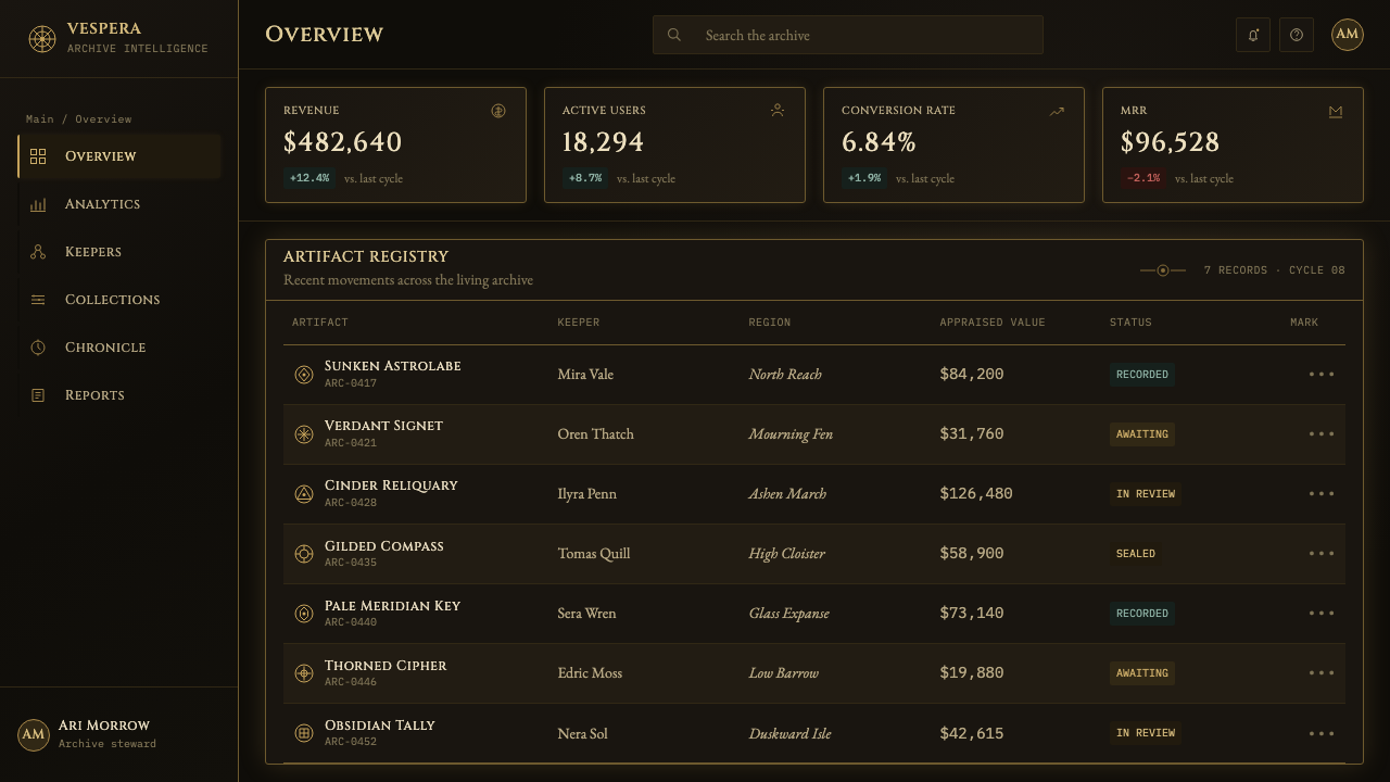
For web interfaces, this approach suits dashboards, account areas, libraries, and pricing pages that benefit from gravity and deliberate pacing. Treat the page as a dark manuscript field rather than a stack of glowing cards. Navigation can use restrained capitalized labels, while dividers and selected states use aged gold with restraint. A dashboard should privilege the most important reading first, allowing decorative circles and filigree to stay at the perimeter rather than competing with active controls.
For editorial and marketing work, Elden Ring’s visual logic is especially effective when the subject involves archives, mythology, craft, rare objects, long-term worlds, or contemplative storytelling. A feature page can open with a large inscription-like title, follow with narrow columns of readable copy, and use worn circular motifs as section transitions. Promotional material should let darkness and absence do much of the work: one illuminated phrase or one gilded detail often creates more atmosphere than a page covered in symbols.
The common mistake is to interpret the style as a license for generic fantasy decoration. Bright gold, dense borders, elaborate flourishes around every component, and constant rune imagery quickly turn mourning into spectacle. The source atmosphere depends on reduction: gold must feel scarce, circles must feel discovered rather than stamped everywhere, and the dark background must preserve silence. If every element announces itself, the interface loses the ancient, inward glow that defines the theme.
Elden Ring (2022) — FAQ
Is this style simply medieval fantasy?
No. Dark fantasy and medieval-manuscript revival are important sources, but the style is more specific than either category alone. Its identity comes from the pairing of warm darkness, restrained aged gilt, Roman-capital typography, worn rune geometry, and a minimalist HUD approach. Generic fantasy often adds more ornament to signal richness; this system uses scarcity and erosion to signal age.
Why should the gold remain muted rather than bright?
The source material describes gold as old, greenish at the edges, and lit from within. A brilliant decorative gold changes the mood from remembrance to celebration. Muted gilt preserves the sense that the interface is carrying traces of a former grandeur. It also keeps typography and information readable by preventing the accent color from overwhelming the dark field.
Can the style work for a practical dashboard?
Yes, if utility remains primary. The diegetic minimalist HUD influence offers a useful model: show the information that matters, preserve space around it, and make decorative language secondary to orientation and action. Use hairlines, capitalized labels, and restrained gold states to organize hierarchy, but do not require users to decode ornamental symbols before they can understand their tasks.
How much filigree and rune imagery is appropriate?
Use them as evidence of history, not as constant content. A partial circle behind a heading, a tarnished corner trace, or an occasional engraved divider can establish the world quickly. Repeating large symbols across every panel removes their mystery and makes the interface feel patterned rather than discovered. The strongest applications let ornament fade into the periphery.
Related design styles
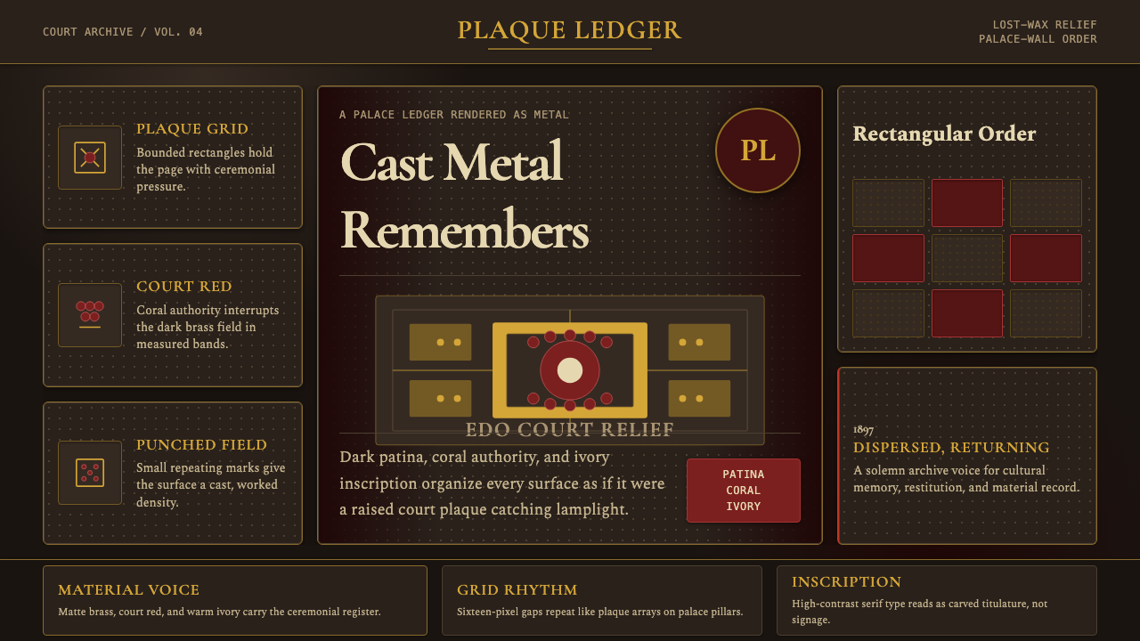 Benin Bronze Oba CourtCourt gravity in cast metal. Patinated brass grid, coral red panels, ivory se…
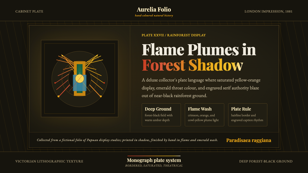 Bird of Paradise MonographTheatrical plate-book darkness. Flame plumes blaze from a bordered forest-bla…
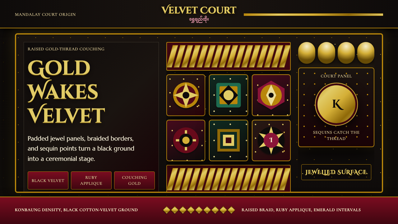 Burmese Kalaga TapestryVelvet becomes theater. Black ground, gold-thread borders, ruby and emerald p…
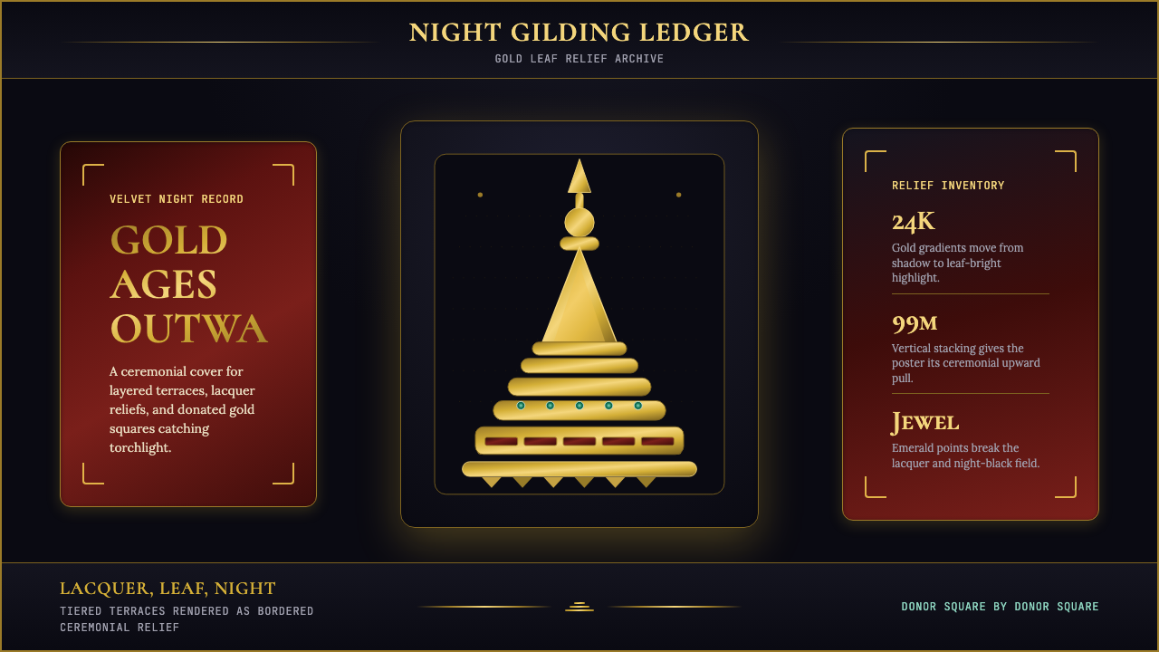 Burmese Shwedagon Stupa ReliefGold refuses restraint. Velvet black, teak-red lacquer, and tiered gradients…
 Cigar Box LabelGilt maximalism glows. Gold Cinzel capitals lock into a tobacco-brown framed…
 Greek Vase Attic (500 BC)Archaeological severity. Jet-black glaze, terracotta bands, and meander borde…