What is Saqqakhaneh Movement?
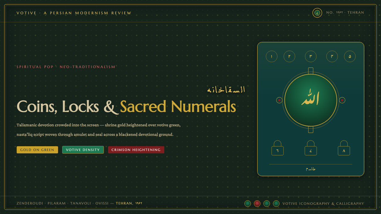
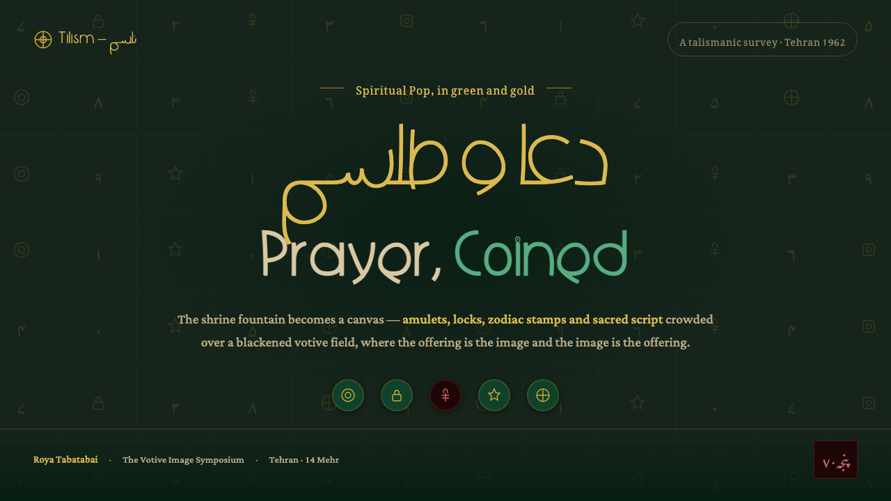
Saqqakhaneh turns the votive shrine into spiritual Pop: talismans, coins, locks, and flowing nasta'liq glinting in gold over blackened green.
Saqqakhaneh Movement in brief
Saqqakhaneh was an Iranian neo-traditionalist movement that crystallized in the early 1960s and remained influential through the 1960s and 70s. Often understood as spiritual Pop art, it drew visual energy from Shia votive shrines and the dense field of objects gathered within them: coins, amulets, locks, hands of Fatima, zodiac signs, numeral stamps, and sacred nasta'liq script.
Its visual force comes from treating devotional objects as both symbols and material forms. A coin is not simply an image of wealth, a lock is not merely an ornament, and a hand is not just a recognizable sign. Each carries the atmosphere of a vow, a request, or a protective gesture. Repeated across a surface, these motifs create an image that feels accumulated rather than composed, as though faith has been layered through use.
The digital interpretation preserves that intensity through a blackened green ground, sacred votive green, shrine gold, and flowing Persian calligraphy. The result should feel devotional rather than luxurious, crowded rather than cluttered, and symbolic rather than explanatory. Text can behave like an inscription, while small marks and talismanic forms create a pulse around the main message.
Where does Saqqakhaneh Movement come from?
The movement belongs to Iran and is closely associated with Tehran, within a broader Middle Eastern context. Its historical span is often placed between 1950 and 1990, although its defining visual language crystallized in the early 1960s. This period saw a renewed artistic engagement with inherited forms, not as nostalgia or literal restoration, but as a way to make traditional signs active within modern visual culture.
Saqqakhaneh looked toward the Shia votive shrine as a living reservoir of images. These spaces supplied a vocabulary of objects marked by devotion: offerings, protective amulets, locks, coins, hands of Fatima, zodiac forms, numerals, and calligraphy. The movement did not treat this vocabulary as a neutral archive. It brought the signs together with unusual density, allowing repetition, accumulation, and material contrast to communicate spiritual intensity.
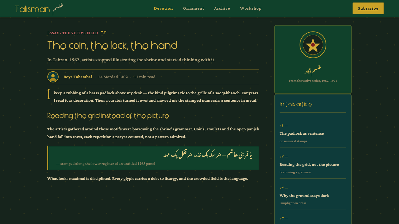
The result was described as spiritual Pop art because familiar popular and devotional imagery was presented with immediate visual force. Green and gold motifs were crowded across near-black grounds, producing surfaces that could feel ceremonial, theatrical, and contemporary at once. The approach joined neo-traditionalist subject matter with an image language that was direct, saturated, and legible as a strong visual statement.
Charles Hossein Zenderoudi and Faramarz Pilaram are central names in the movement’s visual account, especially in relation to talismanic motifs, green and gold, and near-black devotional grounds. Parviz Tanavoli and Nasser Ovissi are also identified among its key figures. Together, these names locate Saqqakhaneh within an Iranian artistic field where inherited spiritual imagery became the basis for a new, highly charged modern language.
What defines the Saqqakhaneh Movement look?
Blackened Devotional Ground
The ground is near-black but not dead black: a deep, smoked green that feels stained by incense, age, and repeated offerings. It gives the surface the gravity of a shrine interior and allows gold and votive green to appear as emitted light. The background should remain materially present, not dissolve into a neutral digital void.
Shrine Gold
Gold is an accent of sanctity rather than a general luxury finish. It should appear in inscriptions, coins, locks, borders, and selected talismanic marks, creating moments of glint inside the dark field. Its value comes from restraint and placement: too much gold turns devotion into decoration, while carefully isolated gold makes each sign feel consecrated.
Talismanic Motifs
Coins, amulets, locks, hands of Fatima, zodiac signs, and numeral stamps form the movement’s recognizable object vocabulary. They should be treated as recurring signs, not isolated illustrations. Repetition creates the sense of a surface charged by accumulated vows, while variation in scale, orientation, and spacing keeps the field alive.
Nasta'liq Flow
Nasta'liq script introduces movement, rhythm, and spiritual presence. Its letters should feel suspended, leaning, and flowing across the composition rather than sitting in rigid horizontal lines. Even when the script is not meant to be read by every viewer, its gesture remains meaningful: it signals devotion, inheritance, and a language carried through form.
Accumulated Density
Saqqakhaneh is dense without becoming visually careless. Motifs gather in clusters, overlap like offerings, and press against the surrounding field, but a dominant sign or inscription still gives the composition direction. The eye should discover layers gradually: first the dark atmosphere, then the gold, then the small protective marks embedded within it.
Spiritual Pop Contrast
The style gains its charge from the collision between sacred reference and immediate visual impact. Traditional signs are not softened into antiquarian detail; they are enlarged, repeated, and made emphatic. A screen application should preserve that tension, allowing the work to feel culturally rooted and visually urgent at the same time.
Who shaped Saqqakhaneh Movement?
Zenderoudi is one of the artists most closely associated with Saqqakhaneh’s talismanic visual language. His place in the source material is tied to the crowded use of devotional motifs, green and gold, and near-black grounds that make the movement feel both ceremonial and immediately contemporary.
Pilaram is identified as another major Saqqakhaneh artist within the movement’s green-and-gold, shrine-derived vocabulary. His association helps define the style as an accumulated field of signs, where calligraphic and talismanic references share the same charged surface.
Tanavoli is listed among Saqqakhaneh’s key figures, placing him within the Iranian neo-traditionalist field that transformed inherited spiritual imagery into modern visual language. His inclusion broadens the movement’s account beyond a single motif or technique.
Ovissi is also named as a key figure of the movement. His place in this account reinforces Saqqakhaneh as a broader Iranian artistic movement, rather than a narrow decorative recipe built only from dark grounds, gold accents, and repeated symbols.
How do you use Saqqakhaneh Movement today?
For presentation slides, use the style as a sequence of devotional panels. A cover can establish the blackened green field with one dominant gold inscription, coin, lock, or hand of Fatima, leaving enough darkness for the symbol to feel discovered. Content slides should introduce talismanic marks as a quiet border or clustered field around the text. Data slides can turn numerals, badges, and repeated marks into the visual language of the chart, so information feels inscribed rather than pasted onto an unrelated template.
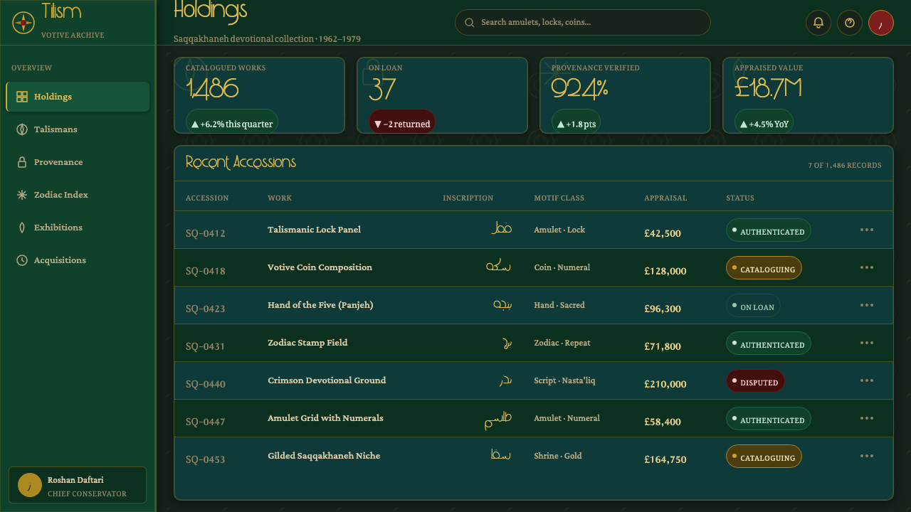
For web interfaces, Saqqakhaneh suits dashboards, archives, cultural platforms, and pricing pages that need a strong sense of identity. Keep the dark green ground consistent, reserve shrine gold for active states and important values, and use votive green to distinguish secondary groups or status. Cards should feel like mounted plaques or devotional panels, with dense internal detail balanced by clear reading zones. Navigation can use calligraphic accents, but labels must remain legible and operational.
For editorial and marketing work, the movement supports a rich relationship between headline, image, and symbolic surface. An article can place a flowing nasta'liq phrase beside a narrow column of explanatory text, then let coins, locks, or numerals gather at the margins. Marketing pages can use a shrine-like hero, gold marks as calls to attention, and repeated protective symbols to create a recognizable campaign rhythm. The strongest work lets cultural references carry atmosphere without turning them into exotic wallpaper.
The style can also shape identity systems for projects that want to communicate devotion, heritage, collectivity, or a connection between popular culture and inherited ritual. Use repeated symbols as a vocabulary across covers, interface states, and promotional materials. Keep the relationship between ground, accent, and inscription stable so the system feels authored. The sense of richness should come from accumulation and meaning, not from adding unrelated ornament.
The common mistake is treating Saqqakhaneh as a black-and-gold luxury theme. That removes the votive tension and leaves only surface glamour. Another mistake is filling every area with symbols until the eye has nowhere to rest. Start with one meaningful sign, let the dark ground hold the composition, and introduce density around a clear devotional or informational center. Gold should heighten significance, not simply make everything look expensive.
Saqqakhaneh Movement — FAQ
Is Saqqakhaneh simply an Islamic decorative style?
No. It is an Iranian neo-traditionalist art movement associated with Shia votive shrine imagery and often described as spiritual Pop art. Its visual language comes from devotional objects, but its importance lies in how those objects were gathered, repeated, and made forceful within a modern artistic field. Reducing it to ornament loses the relationship between vow, protection, memory, and image.
Why are green and gold so important to the style?
The source material presents green and gold as the defining accents of the shrine-derived visual system. Green carries the votive and devotional atmosphere, while gold creates heightened moments of sacred emphasis against the near-black ground. Their power comes from contrast and meaning, not from using them everywhere. They should make selected signs feel charged.
Can the style work without Persian or nasta'liq text?
It can, but the result will lose one of Saqqakhaneh’s most important sources of movement and inheritance. If nasta'liq cannot be used, preserve its flowing gesture through curved inscription-like forms, while keeping the actual interface language clear. The calligraphic reference should support devotion and rhythm, never obscure essential information.
How dense should a Saqqakhaneh-inspired layout be?
It should feel accumulated, not uncontrolled. Let motifs cluster and overlap around a clear focal inscription, image, or value, then preserve darker areas where the eye can pause. A useful test is whether the symbols feel like a charged field with an internal direction. If every mark competes equally, the work has become pattern rather than spiritual Pop.
Where does Saqqakhaneh struggle in contemporary design?
It struggles where extreme clarity, emotional neutrality, or culturally unmarked utility is the main requirement. Its dark ground, dense signs, and devotional references demand attention and interpretation. It works best when a product or publication welcomes atmosphere, heritage, symbolic depth, and a distinctive visual identity. Cultural references should be handled with care rather than used as a superficial exotic effect.
Related design styles
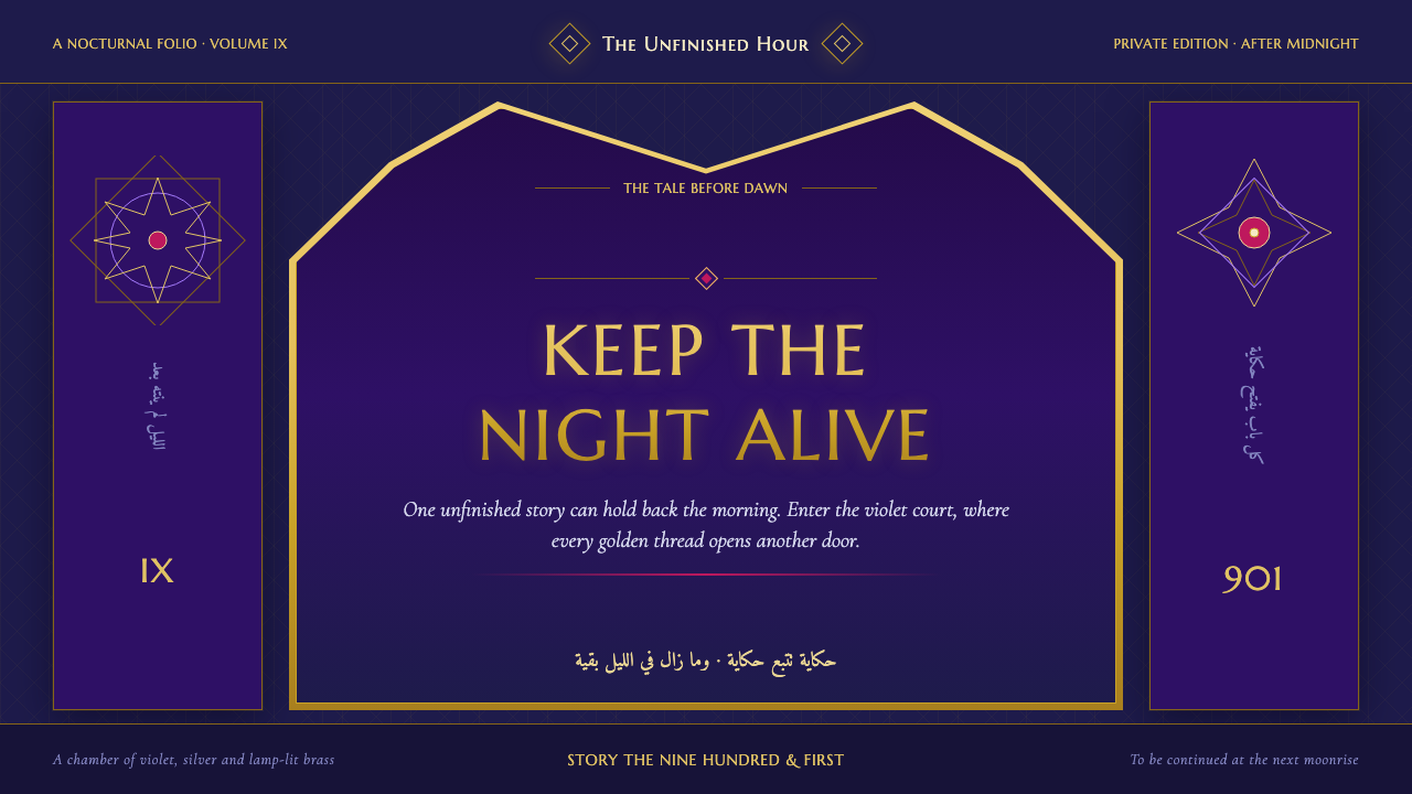 One Thousand and One NightsNight refuses to end. Midnight indigo, lamp-lit gold and star lattice frame e…
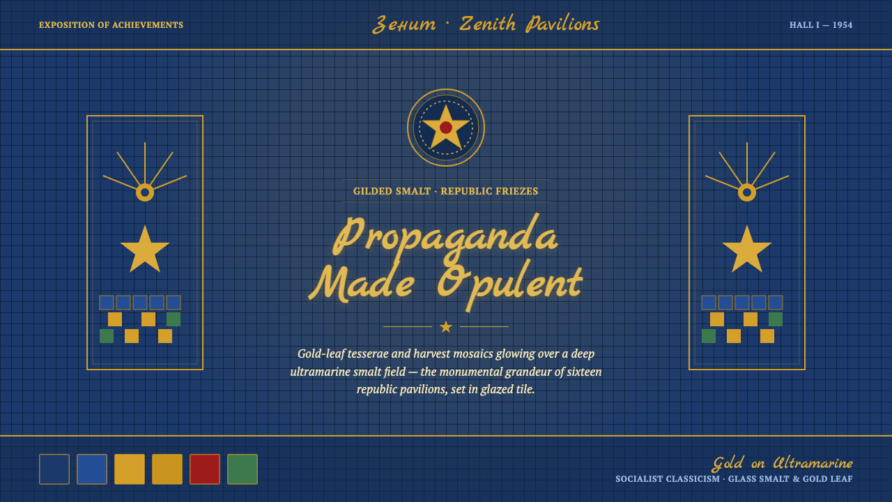 VDNKh Exhibition PavilionsPropaganda made opulent. Gold-leaf tesserae glow over a deep ultramarine smal…
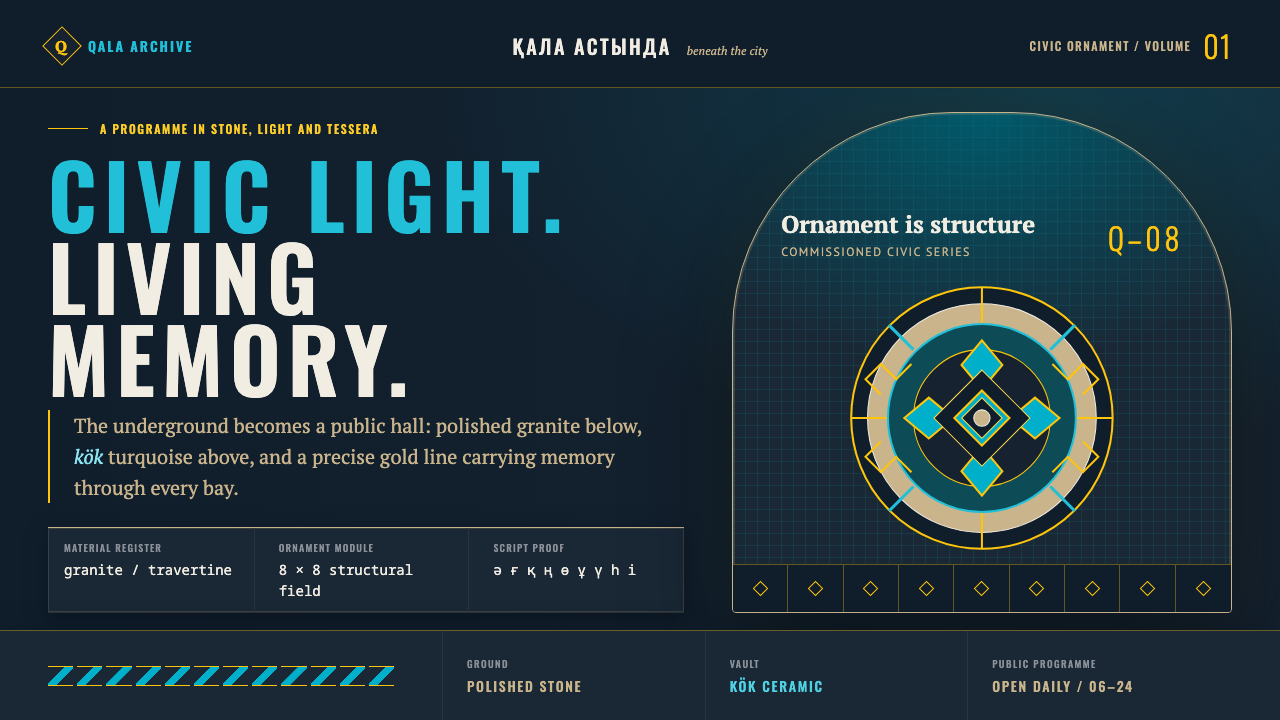 Almaty Metro MosaicCivic grandeur speaks Turkic. Kök vaults and gold geometry rise above polishe…
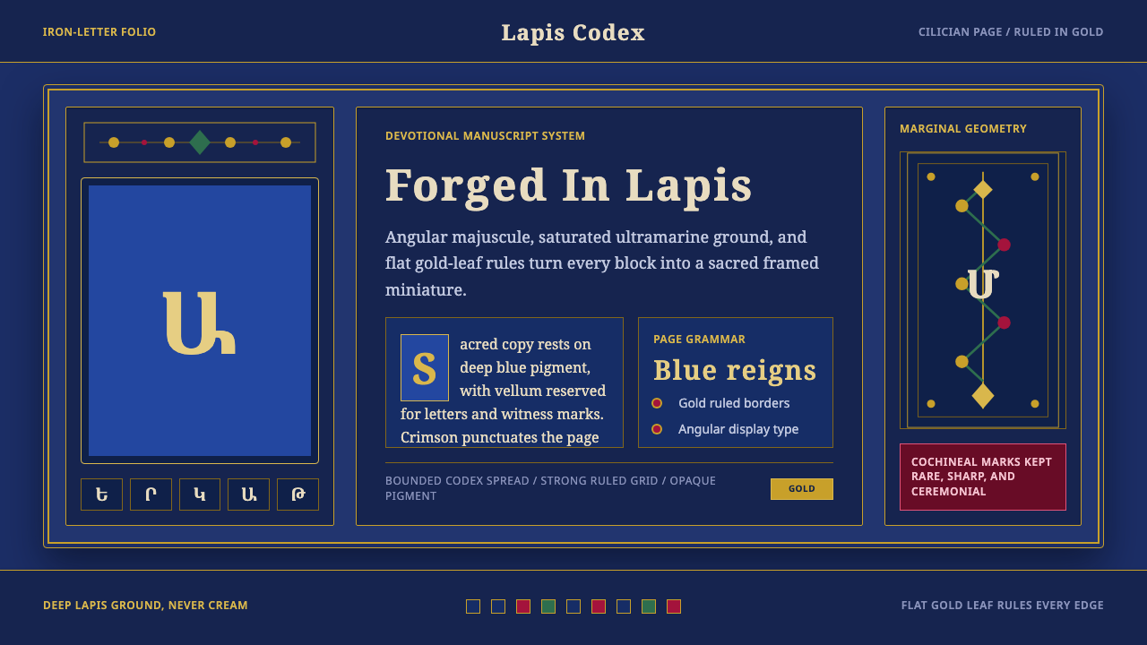 Armenian ErkatʿagirDevotional lapis reigns. Gold rules and angular serif glyphs frame a sacred g…
 Armenian Illuminated ManuscriptGilded maximalism. Burnished gold, lapis frames, and vermilion initials build…
 Benin Bronze Oba CourtCourt gravity in cast metal. Patinated brass grid, coral red panels, ivory se…