What is VDNKh Exhibition Pavilions?
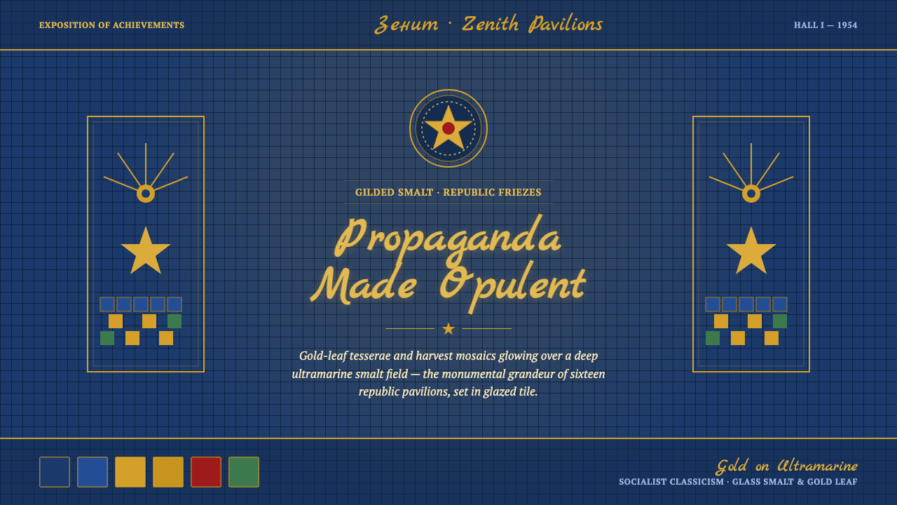
VDNKh turned Soviet achievement into spectacle — deep ultramarine smalt, gold-leaf tesserae, red granite, and imperial ornament arranged with the authority of a monument.
VDNKh Exhibition Pavilions in brief
VDNKh, the 1954 Exhibition of Achievements of the National Economy in Moscow, was the Soviet Union’s gilded showcase: a monumental exposition of sixteen republic pavilions, grand fountains, and harvest imagery. Its visual language translated state achievement into a world of polished surfaces, symbolic ornament, and theatrical abundance.
The style is built from a deep ultramarine smalt ground, luminous metallic gold, republic-blue and red-granite accents, and ornamental serifed type. Glass tesserae and gold-leaf surfaces create a sensation of light embedded in architecture, while wheat, stars, friezes, and reliefs turn political symbolism into a dense decorative vocabulary.
As a digital design system, VDNKh Exhibition Pavilions preserves that maximalist Stalinist Empire character without treating ornament as an afterthought. Every surface should feel constructed, ceremonial, and materially deliberate: dark fields establish depth, gold carries attention, red granite supplies gravity, and blue accents connect separate parts of the composition.
Where does VDNKh Exhibition Pavilions come from?
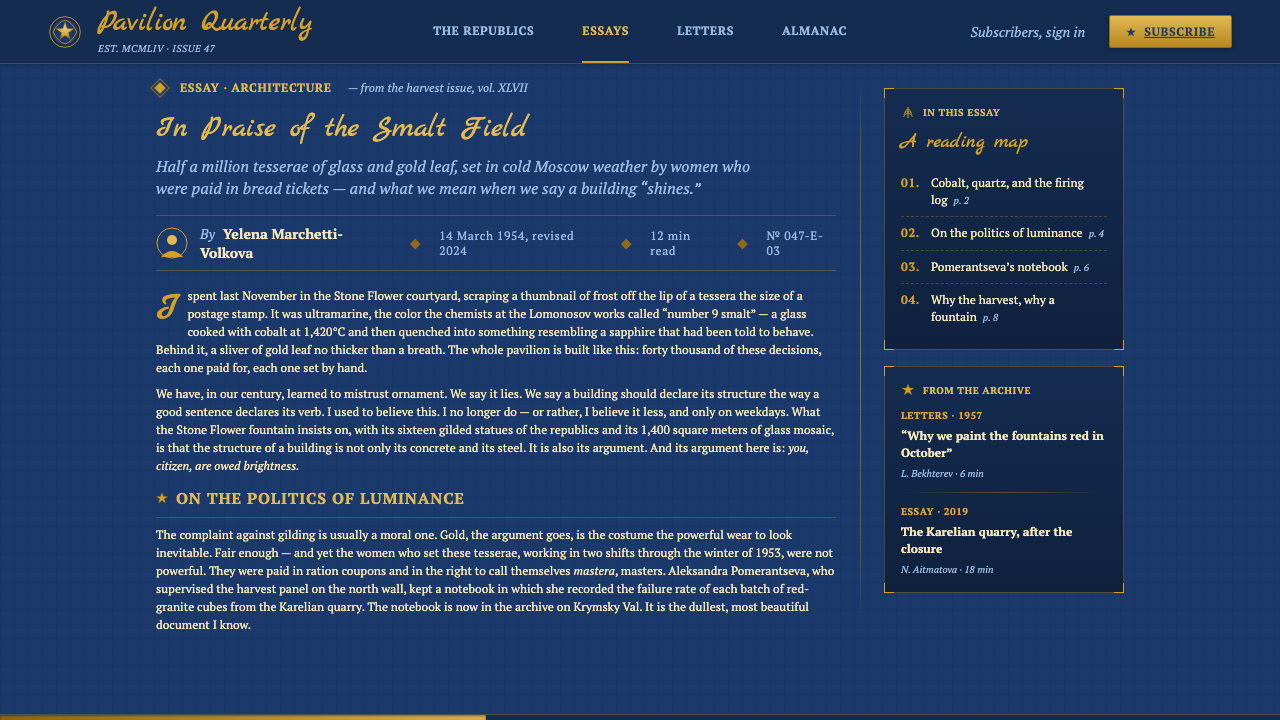
VDNKh emerged in Moscow as the 1954 Exhibition of Achievements of the National Economy, during the monumental peak of Stalinist Empire style, also known as Socialist Classicism. The exposition presented the Soviet Union through architecture and display rather than through a single isolated object. Its pavilions made national achievement visible as a shared, highly organized spectacle.
The exposition’s most recognizable elements were the sixteen republic pavilions, the Friendship and Stone Flower fountains, and harvest mosaics set over red granite. These were not quiet surfaces. They used glass smalt, gold-leaf tesserae, wheat-and-star reliefs, and ultramarine-and-gold friezes to create an environment in which agriculture, industry, and republican identity became monumental ornament.
Its material vocabulary is central to its identity. Smalt gives the ground a jewel-like density; gold leaf turns ornament into radiance; red granite introduces a warm, mineral counterweight; and relief work adds physical authority to the symbolic language. The result is a style in which propaganda and decoration are inseparable: the message is carried by the richness of the surface.
The broader source tradition belongs to Soviet exposition architecture, monumental mosaic art, and Stalinist Empire style. Its credited makers are collective rather than individual: Soviet state architects of the VDNKh exposition, Stalinist-era mosaicists and gilders, and the fresco masters responsible for republic pavilions. The digital system treats their combined vocabulary as a living visual grammar rather than as a reconstruction of one specific building.
What defines the VDNKh Exhibition Pavilions look?
Ultramarine Ground
The foundational field is deep ultramarine smalt: dark, saturated, and visibly material rather than flatly digital. It gives the interface the depth of a tiled architectural surface and allows gold ornament to appear luminous. Republic-blue and red-granite accents should remain subordinate, supporting the ground instead of competing with it.
Luminous Gold
Gold is the principal carrier of prestige. It appears as metallic ornament, gold-leaf tesserae, bands, and highlighted symbolic forms. Used well, it does more than decorate: it establishes rank, directs attention, and makes the composition feel ceremonial. Gold should therefore be concentrated around important titles, markers, and structural edges rather than scattered uniformly.
Tessellated Surface
Mosaic is the style’s signature texture. Glass smalt and gold-leaf tesserae imply that the surface has been assembled piece by piece, with light broken into a dense field of small decisions. Digital applications can suggest this through repeated modules, granular ornament, and carefully bounded decorative fields, while keeping the overall image legible and architectural.
Monumental Composition
Composition should feel like a pavilion façade or ceremonial hall rather than an informal collection of cards. Large fields establish authority; framed sections create procession; concentrated ornament rewards attention at significant moments. Even dense layouts need a governing axis or architectural order so that abundance reads as designed grandeur rather than visual noise.
Wheat, Stars, and Friezes
Symbolic ornament is drawn from wheat-and-star reliefs and ultramarine-and-gold friezes. Wheat introduces harvest and abundance; stars give the surface a civic and monumental charge; friezes bind separate regions into a continuous decorative system. These motifs work best when treated as recurring structural signals, not as random clip-art embellishment.
Ornamental Serif Type
Typography should carry the authority of an inscription while remaining readable. Ornamental serifed type suits titles, pavilion names, and ceremonial statements; supporting text should be calmer but remain within the same classical register. Contrast comes from scale, placement, and gold against ultramarine, not from mixing unrelated type personalities.
Material Contrast
Depth is created through the opposition of dark smalt, radiant gold, mineral red granite, and cooler republic blue. The effect should suggest layered architecture and crafted surfaces. A successful application lets users sense that each material has a role: the ground recedes, gold advances, granite stabilizes, and blue connects or accents.

Who shaped VDNKh Exhibition Pavilions?
These architects established the pavilion-based monumental framework through which the Soviet Union presented national achievement. Their contribution is represented here as architectural order: strong fields, ceremonial framing, and an environment where display becomes civic spectacle.
The mosaicists and gilders supplied the visual system’s distinctive radiance. Through glass smalt and gold-leaf tesserae, they made surfaces feel assembled, luminous, and materially rich. Their vocabulary informs the deep tiled ground and concentrated gold ornament used in the digital interpretation.
The fresco masters gave the republic pavilions their narrative and regional presence. Their work connects harvest imagery, republican identity, and monumental display. In this system, that influence appears through recurring bands, symbolic motifs, and carefully framed image fields.
How do you use VDNKh Exhibition Pavilions today?
For presentation slides, VDNKh works best when the cover behaves like a pavilion entrance: a deep ultramarine field, a commanding ornamental title, and a concentrated gold motif that establishes the subject before any detail appears. Content slides should use framed zones and recurring friezes to create continuity. Data slides can treat charts as ceremonial panels, with gold reserved for the principal finding, red granite for weight or emphasis, and republic blue for supporting distinctions.
For web interfaces, the style suits dashboards, pricing pages, cultural platforms, and other products that want authority, spectacle, and a strong sense of occasion. A dashboard can use ultramarine as the continuous ground, gold for active states and key metrics, and red-granite surfaces for major panels. Pricing pages benefit from pavilion-like tiers, where each offer feels like a distinct architectural bay rather than a generic card. Readability must remain firm beneath the ornament.
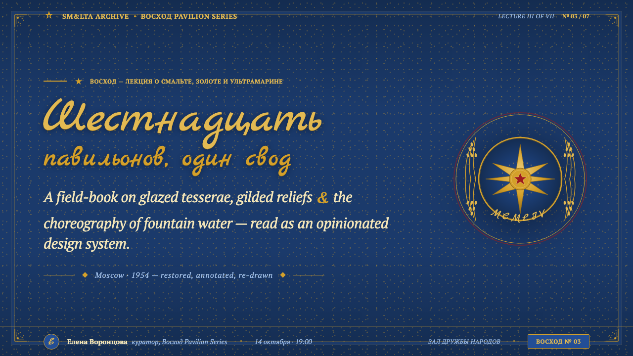
For editorial work, the visual system supports feature articles, exhibition guides, institutional reports, and historical storytelling. Use ornamental serifed type for section openings and major statements, then let quieter supporting text occupy clearly bounded fields. Friezes can separate chapters, while mosaic-like image treatments and red-granite accents keep the page connected to the material world of the pavilions.
For marketing and launch pages, the style turns a product announcement into an event. A dark monumental field can hold a single dominant proposition, framed by gold bands or wheat-and-star ornament. Secondary sections should feel like adjoining pavilions in a larger exposition: related but distinct, with republic blue or red granite used to establish variation. The result is especially effective when the product itself promises importance, heritage, achievement, or public visibility.
The common mistake is to treat VDNKh as permission to cover every surface with gold, symbols, and decorative borders. The source vocabulary is maximalist, but it is still organized. Gold needs a hierarchy, motifs need repetition, and dense ornament needs a stable architectural ground. Another failure is using bright ornament on a pale or neutral interface while retaining none of the ultramarine depth; without the dark smalt field and material contrast, the style loses its monumental identity and becomes generic luxury decoration.
VDNKh Exhibition Pavilions — FAQ
Is VDNKh Exhibition Pavilions simply a luxury-gold style?
No. Gold is important, but it gains meaning from the deep ultramarine smalt ground, red granite, republic blue, mosaic assembly, and symbolic pavilion ornament around it. The style is about propaganda made monumental through material richness. Remove the architectural order and the civic symbols, and what remains is only surface-level luxury.
Why is the background so important?
The dark ultramarine ground is the visual equivalent of the exposition’s smalt surfaces. It creates depth, gives gold somewhere to glow, and keeps the composition connected to the material language of monumental mosaic. Without it, gold becomes flatter and more decorative, while the relationship between surface, light, and architecture becomes difficult to perceive.
How should wheat and star motifs be used?
They should function as recurring symbolic structures rather than isolated decorations. A wheat motif can signal harvest, abundance, or achievement; a star can reinforce the civic and monumental register; a frieze can connect separate content regions. Their strength comes from consistent placement and repetition, not from placing them everywhere at once.
Can this style work outside exhibition or cultural contexts?
Yes, provided the product can support authority, spectacle, and ceremonial emphasis. It can translate effectively to dashboards, pricing pages, editorial features, institutional communication, and launches. It struggles when the experience depends on lightness, informality, softness, or understated restraint. The right question is whether the product’s values can carry monumental ornament without feeling overstated.
How can the style remain readable when it is so ornamental?
Keep ornament concentrated and let the layout provide the hierarchy. Use ornamental serifed type where ceremony matters, calmer supporting type where information accumulates, and reserve gold for the elements that deserve attention. Strong framing, repeated friezes, and a consistent material order allow the surface to be rich without making every element equally loud.
Related design styles
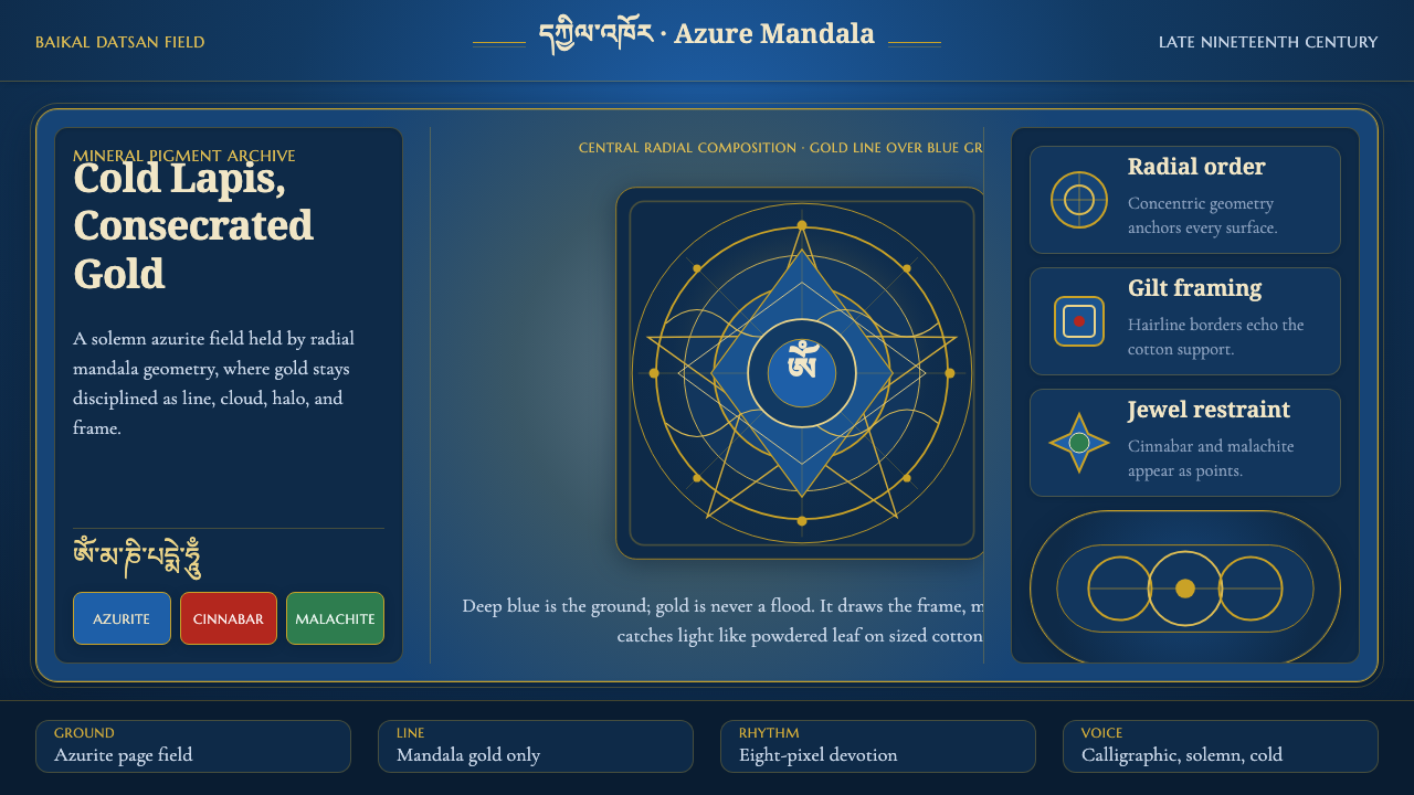 Buryat Buddhist Datsan ThangkaCold lapis holds silence. Gold mandala lines frame a solemn azurite field.
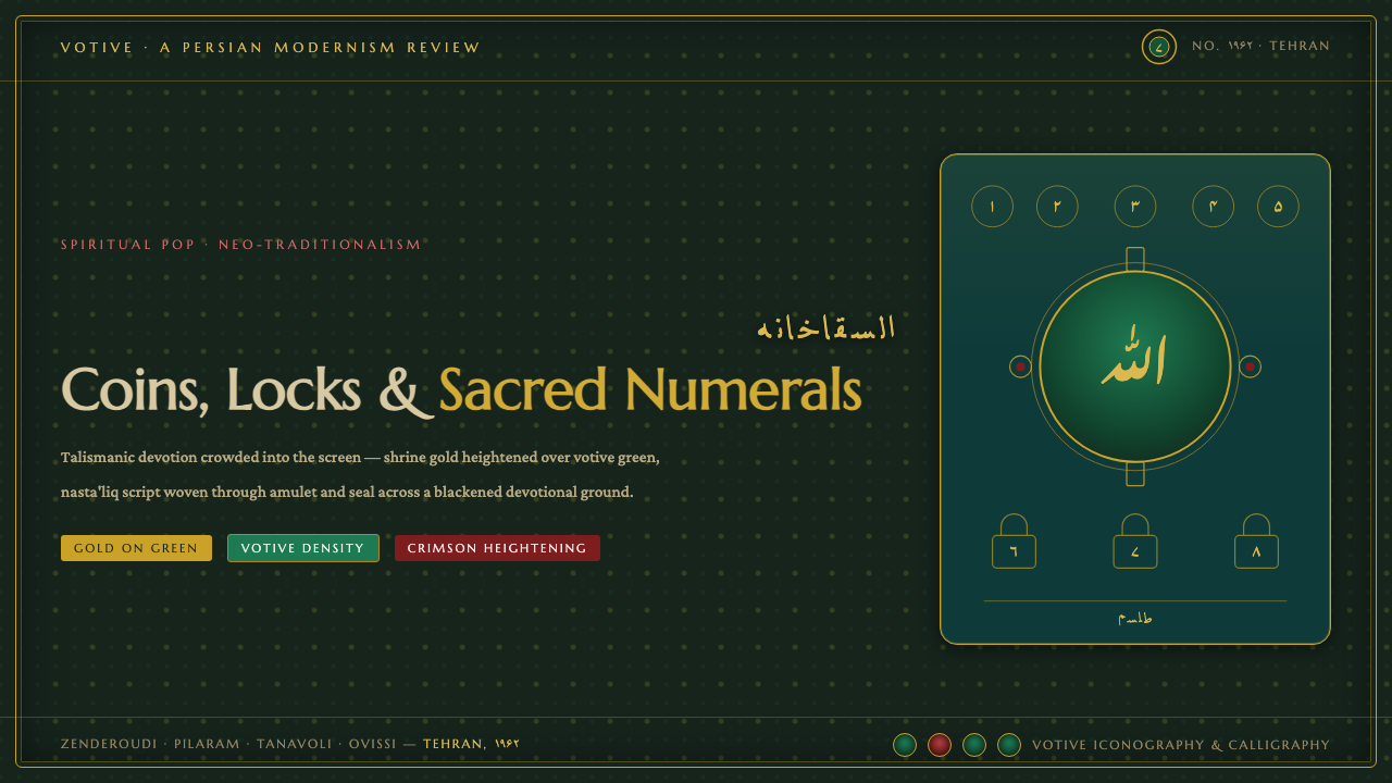 Saqqakhaneh MovementSpiritual Pop with a shrine pulse. Coins, locks and nasta'liq in gold over bl…
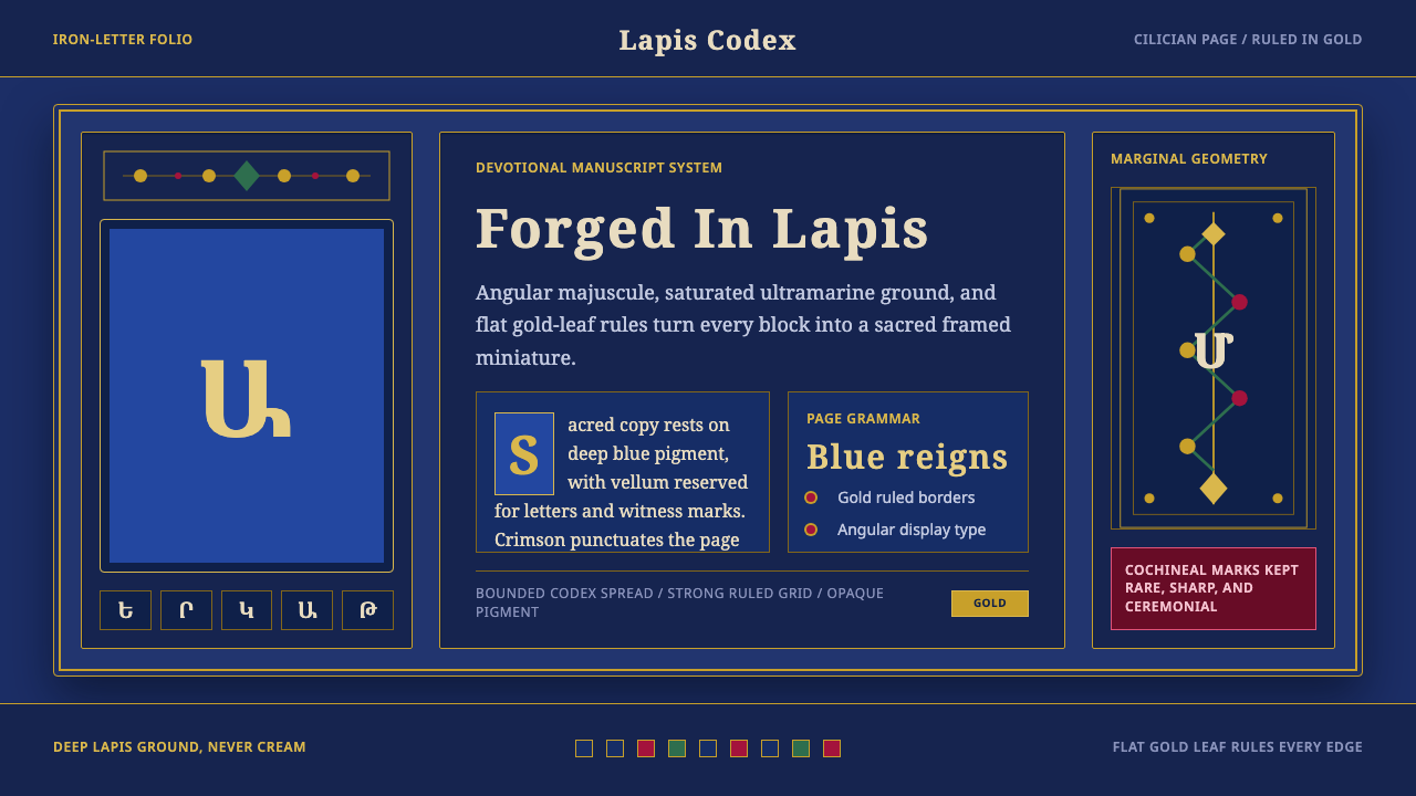 Armenian ErkatʿagirDevotional lapis reigns. Gold rules and angular serif glyphs frame a sacred g…
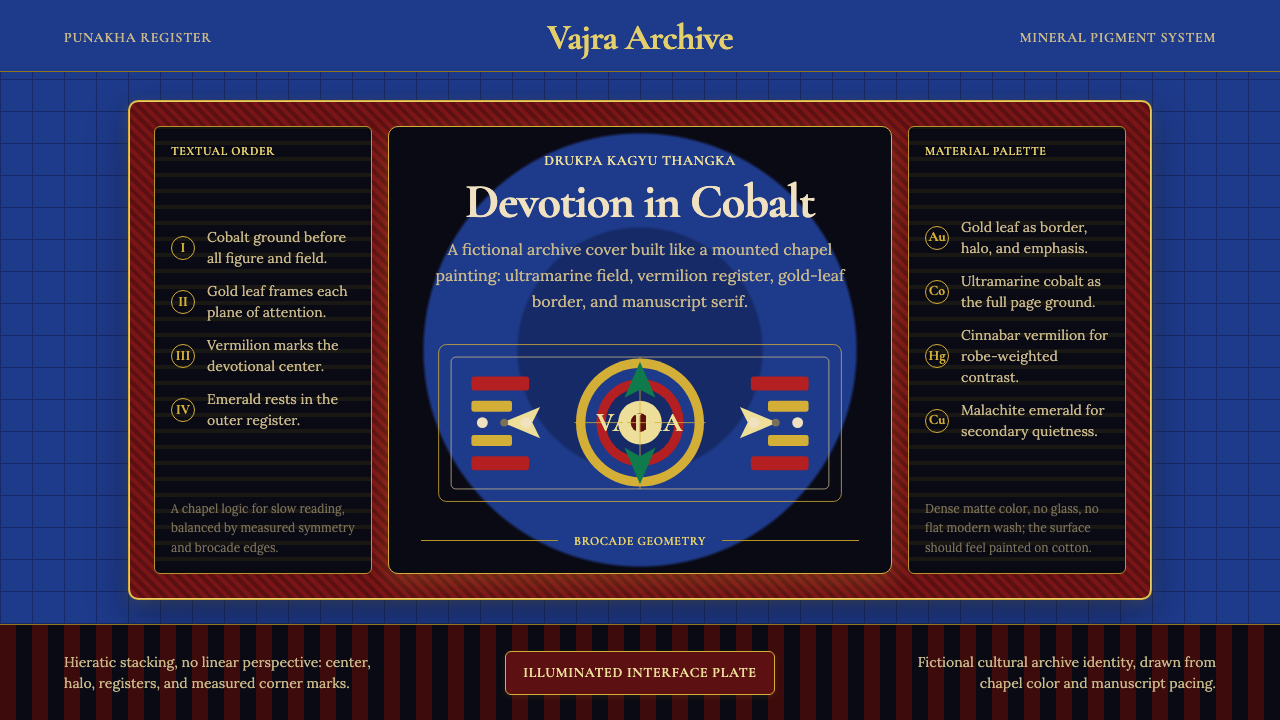 Bhutanese Drukpa Kagyu ThangkaDevotion made cobalt. Gold frames, Cormorant serif, and vermilion marks hold…
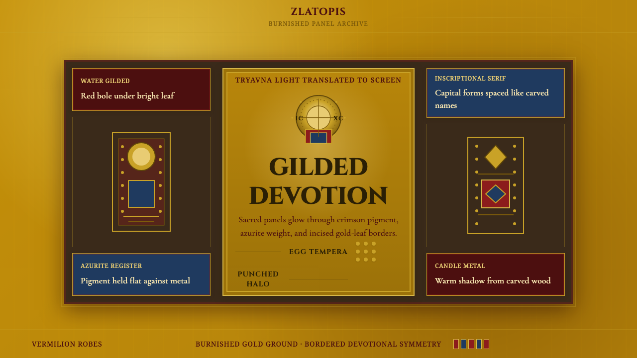 Bulgarian Orthodox IconSacred metal holds still. Burnished gold, crimson panels, and punched halos f…
 Cellarius Celestial AtlasCelestial luxury on lapis. Gilt serif type, star fields, and concentric chart…