What is Bulgarian Orthodox Icon (Gold Leaf)?
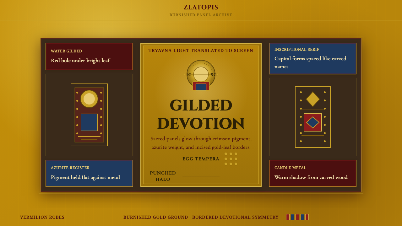
Bulgarian Orthodox icons hold perfectly still: a burnished gold ground, deep crimson robes, and a halo punched by hand into the metal itself, built to catch candlelight rather than daylight.
Bulgarian Orthodox Icon (Gold Leaf) in brief
A Bulgarian Orthodox icon is a small, portable devotional panel: a wooden board coated in a chalk-and-glue ground (gesso), over which a layer of fine red clay (bole) is laid, and onto that clay a sheet of gold leaf is applied wet and then burnished to a mirror shine before any paint touches the surface. The saint or holy scene is painted afterward in egg tempera directly on top of and around that gilded field, so gold is not a highlight added last — it is the foundation the whole image sits on.
The result is an image built to hold light rather than depict it. Figures are shown frontally, facing the viewer directly rather than in three-quarter profile, their eyes large and fixed, their bodies flattened and stylized rather than modeled with naturalistic shadow. Deep crimson defines the robes of Christ, the Virgin, and the saints; ochre and warm earth tones render flesh; azurite blue appears in undergarments and backgrounds. Around each head, a halo is not merely painted but incised and punched directly into the gold leaf, so the metal itself catches and scatters candlelight in the pattern of the tool strokes.
This is a devotional aesthetic, not a narrative or naturalistic one. Where a Renaissance panel painting reaches for perspective, anatomy, and a believable moment in time, an icon reaches for stillness and presence — the sense that the holy figure is not being depicted so much as made available, an object of veneration rather than illustration. Everything about the visual language, from the flatness of the space to the fixed frontal gaze, serves that single purpose.
Where does Bulgarian Orthodox Icon (Gold Leaf) come from?
The Bulgarian icon-painting tradition descends directly from Byzantine devotional art, inherited through the Christianization of the medieval Bulgarian Empire and its close ecclesiastical and artistic ties to Constantinople. Byzantine iconography had already, by the time it reached the Balkans, developed the theological rules that would govern icon painting for a thousand years afterward: fixed compositions for standard scenes, symbolic rather than naturalistic color, frontal address, and gold grounds meant to evoke the uncreated light of heaven rather than any earthly sky.
Ottoman rule, beginning in the late fourteenth century, did not extinguish this tradition, though it constrained it. Icon painting survived largely inside monasteries and in village and small-town workshops that operated with a degree of autonomy from Ottoman civil authority, since religious art fell within the church's own domain. These workshops kept Byzantine conventions alive across centuries even as direct contact with Constantinople and its imperial patronage disappeared, passing technique down through family lines and apprenticeship rather than formal academies.
The tradition reached its most celebrated flowering during the Bulgarian National Revival of the eighteenth and nineteenth centuries, a period of resurgent Bulgarian cultural identity under continued Ottoman rule. The town of Tryavna, along with Veliko Tarnovo, became a recognized center of icon production, giving rise to what is now referred to as the Tryavna iconographic school — a cluster of family workshops whose members trained one another and developed a recognizable local hand. Painters such as Vitan Karchov and Papa Vitan the Elder are named within this school's history, and the Vitanov family in particular produced generations of icon painters whose workshop supplied churches across the region; precise biographical detail for individual painters in this period is often thin, since icon painting was understood as a craft and an act of devotion rather than a vehicle for personal authorship, and many works were left unsigned.
These icons were made to be installed — set into the iconostasis, the screen of images that divides the nave from the altar in an Orthodox church, or carried in procession, or kept in the home for private devotion. They survive today both in active parish churches and in museum collections across Bulgaria, where they are studied as a major branch of Balkan religious art and, since the twentieth century, increasingly appreciated as a national artistic inheritance independent of their liturgical function.
What defines the Bulgarian Orthodox Icon (Gold Leaf) look?
Gold Ground
Every icon begins with a burnished sheet of gold leaf laid over the whole panel before a single figure is painted, so the gold reads as an active field of light rather than a decorative border. Because it is polished by hand rather than left matte, it catches and moves with candlelight, animating a static panel in a way flat paint alone cannot.
Crimson and Ochre Palette
Deep crimson dominates the robes of Christ and the Virgin, paired with warm ochre flesh tones and touches of azurite blue in undergarments and backgrounds. The palette is symbolic rather than observational — a color is chosen for what a figure represents, not for how light would actually fall on cloth — and it is kept deliberately narrow, with no pastel range and no neutral gray filler.
Frontal Composition
Holy figures face the viewer directly with large, fixed eyes rather than being caught in three-quarter profile or mid-gesture, and scale is symbolic rather than perspectival — a more important figure is simply drawn larger, regardless of where they stand in the scene. This produces a composition that confronts the viewer rather than inviting them into an illusionistic space.
Incised Halo
The halo is not painted flat like the rest of the figure; it is drawn and then physically incised or punched into the gold leaf with a fine tool, so the metal's texture itself carries the pattern. This makes the halo the single most reflective, most active point on the entire panel — the place where the gold does the most visible work.
Panel and Border
The physical wooden panel is bordered — sometimes by a raised painted frame, sometimes by a strip where the underlying red bole is left visible around the edge of the gold — which frames the devotional field the way a threshold frames a doorway. This border keeps the composition contained and object-like rather than open and expansive.
Inscriptional Lettering
Names and titles of the depicted saints are inscribed directly onto the gold ground in a stately, upright lettering derived from liturgical manuscript tradition — never a casual or decorative script. The letterforms are treated with the same reverence as the image itself, small in scale but carved-looking and deliberate, identifying rather than decorating.

Who shaped Bulgarian Orthodox Icon (Gold Leaf)?
Centered in the town of Tryavna during the Bulgarian National Revival, this cluster of family workshops trained generations of painters in a shared visual vocabulary — gold grounds, crimson and ochre palettes, incised halos — that is now treated as the classic reference point for Bulgarian icon painting of the eighteenth and nineteenth centuries.
Named within the history of the Tryavna school, Vitan Karchov represents the individual master painters whose workshops supplied the icons and iconostases of churches across the region, working within the school's shared technique while contributing his own hand to it — precise biographical detail beyond his name and school affiliation is limited, typical of a tradition that rarely prized individual authorship.
'Papa,' a title indicating an Orthodox priest, attached to this master's name signals how closely icon painting and clerical life were intertwined in the tradition — painting an icon was itself understood as an act of priestly or devotional service, not a secular commercial trade practiced apart from the church.
One family whose name recurs across generations of the Tryavna school's output, the Vitanovs illustrate how the craft was transmitted: not through public academies but through households where painting technique passed from parent to child alongside faith itself, producing workshops that could supply icons and full iconostases to churches over decades.
How do you use Bulgarian Orthodox Icon (Gold Leaf) today?
As a presentation cover, this style projects gravity and permanence rather than energy or speed: a dark or deep crimson field with a single burnished gold mark — a wordmark, a large numeral, a simple geometric halo shape — sits confidently in the frame the way a gilded panel commands a dim church interior. It suits decks about legacy, trust, heritage, or high-stakes decisions rather than fast-moving product pitches.
Content slides should use scale the way the icons use scale — the most important idea rendered largest, minor supporting points smaller, rather than a uniform hierarchy of bullet sizes. Gold should be reserved for the single most important number or word on a slide, echoing how the halo is the one incised, most reflective element on an otherwise flat panel; using gold everywhere flattens its meaning. Data slides work best when a key metric is treated like a halo — set apart, catching the eye first — while supporting figures stay in the muted crimson-and-ochre range.
For web interfaces, the palette suits products that want to signal trust, permanence, or premium standing: private banking, estate and legacy planning, high-end subscription tiers, cultural or heritage institutions. A dashboard built on this system should keep its ground dark and restrained, with gold reserved for the top-tier plan, the primary call to action, or a single hero metric — never spread across every button and icon, which would read as gaudy rather than sacred.
In editorial and marketing contexts, the style is well suited to long-form cultural writing, luxury goods, and heritage branding, where a dark crimson-and-gold palette signals seriousness and craft. Pull quotes and section markers can borrow the incised-halo idea directly — a headline treated with a fine gold rule or outline rather than a solid gold fill communicates precision and restraint rather than excess.
The most common mistake is treating gold as a decorative color to sprinkle across a layout rather than a structural signal reserved for the single most important element. A second common error is loosening the palette toward bright, saturated, non-symbolic colors — teal, lime, hot pink — which breaks the devotional stillness the style depends on; the crimson, ochre, and azurite range should stay muted and symbolic rather than expanding into a full contemporary rainbow.
Bulgarian Orthodox Icon (Gold Leaf) — FAQ
Is the gold in these icons purely decorative, like a gold foil accent?
No — it is structural rather than decorative. The gold leaf is laid down first, before any figure is painted, and the image is built on top of and around it rather than having gold added as a final highlight. Theologically, the gold ground represents the uncreated light of heaven rather than any physical sky or backdrop, which is why it behaves as an active field of light in the composition rather than a background color choice.
Why do the figures look flat and stylized instead of realistic?
Because icon painting is governed by devotional convention rather than optical realism. The goal is not to depict a believable moment in a physical scene, the way a Renaissance painting does, but to present a holy figure directly and permanently to the viewer for veneration. Frontal poses, large fixed eyes, symbolic rather than perspectival scale, and flattened space all serve that purpose — they make the figure feel present and unchanging rather than caught mid-action.
What distinguishes the Tryavna school from other Bulgarian icon-painting centers?
Tryavna, together with nearby Veliko Tarnovo, developed a recognizable local hand within the broader Bulgarian National Revival icon tradition — a cluster of family workshops that trained one another and produced a large, identifiable body of work across the eighteenth and nineteenth centuries. Other regional centers existed with their own local characteristics, but Tryavna's output is among the most studied and most often cited as representative of the period's gold-ground, crimson-and-ochre visual language.
Can this style work on a light background instead of a dark one?
It is possible, but it loses some of its force. The style's intensity comes from gold catching light against a comparatively dark surround — the deep crimson robes, the dim implied space of a church interior lit by candles — the way gold leaf actually behaves in a dim nave. On a light or cream background, gold reads as merely decorative rather than luminous, so a light-ground adaptation needs to keep the gold element sharply concentrated and treat everything else with real restraint to preserve any of the original's gravity.
How is this different from generic 'gold and black' luxury branding?
Generic luxury gold-on-black branding treats gold as a wash of prestige with no formal rules attached. This tradition carries specific, non-negotiable formal conventions instead: frontal composition, symbolic rather than realistic scale, a halo that is physically incised into the gold rather than merely painted, and a narrow, symbolic palette of crimson, ochre, and azurite rather than an open luxury color range. Those rules — not just the gold-on-dark color combination — are what make a design genuinely legible as drawing on this tradition rather than on luxury branding in general.
Related design styles
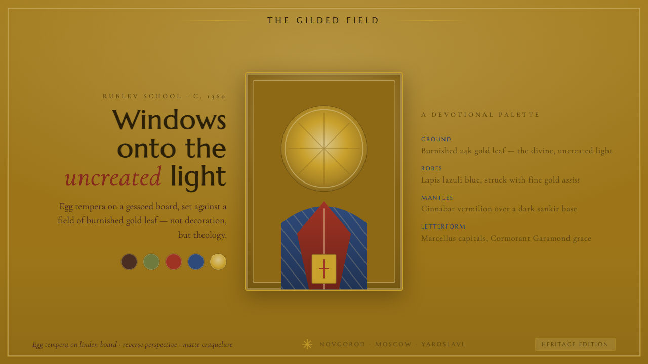 Russian Orthodox IconBurnished gold leaf as divine light. Lapis and cinnabar saints, incised halos…
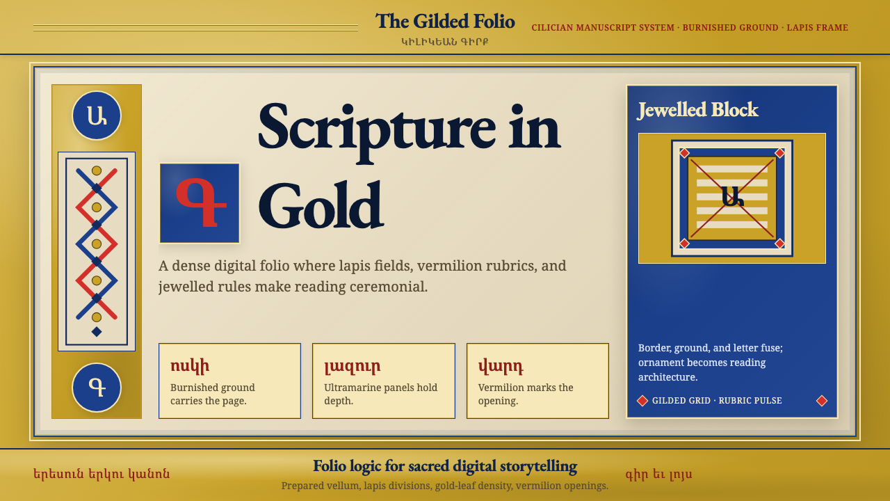 Armenian Illuminated ManuscriptGilded maximalism. Burnished gold, lapis frames, and vermilion initials build…
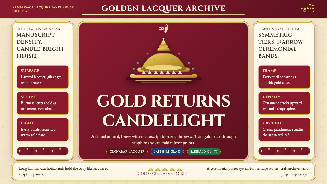 Burmese Shwedagon Gold-LacquerOpulence catches fire. Gold-leaf gradients on cinnabar panels frame a stupa s…
 Buryat Buddhist Datsan ThangkaCold lapis holds silence. Gold mandala lines frame a solemn azurite field.
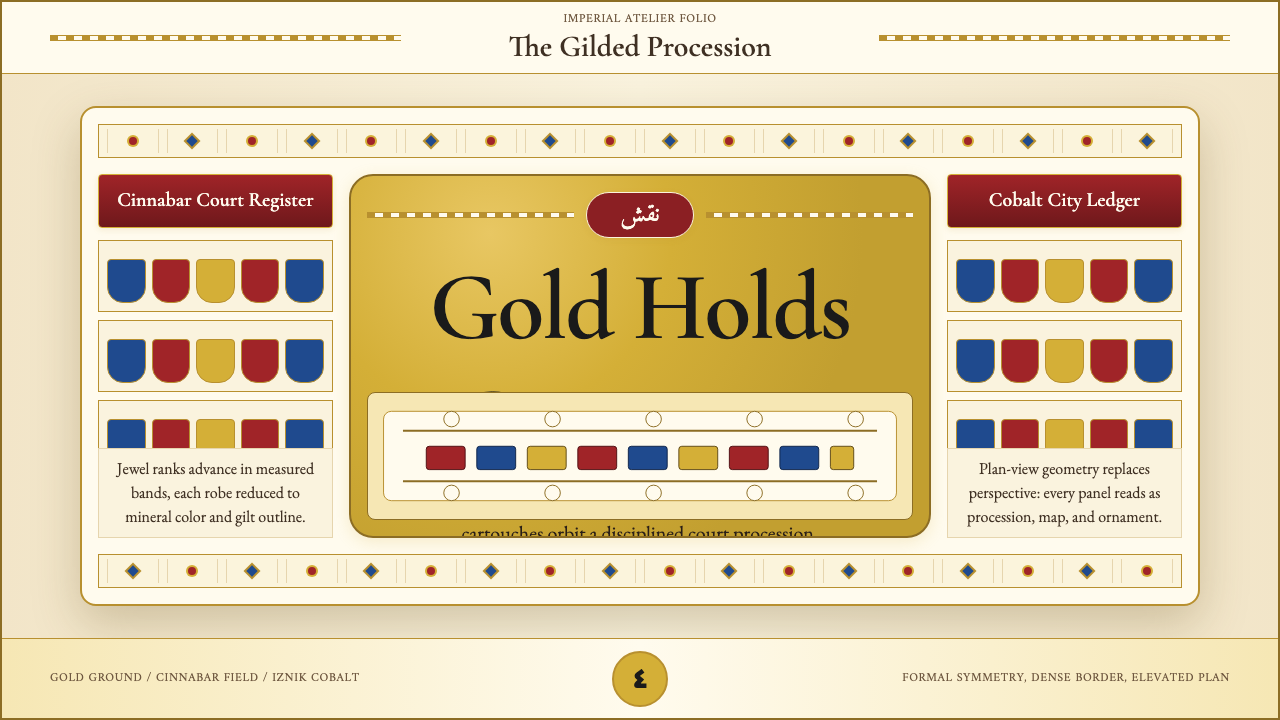 Ottoman Court Miniature (Topkapı)Ceremony made dense. Gold ground, cinnabar cartouches, cobalt procession geom…
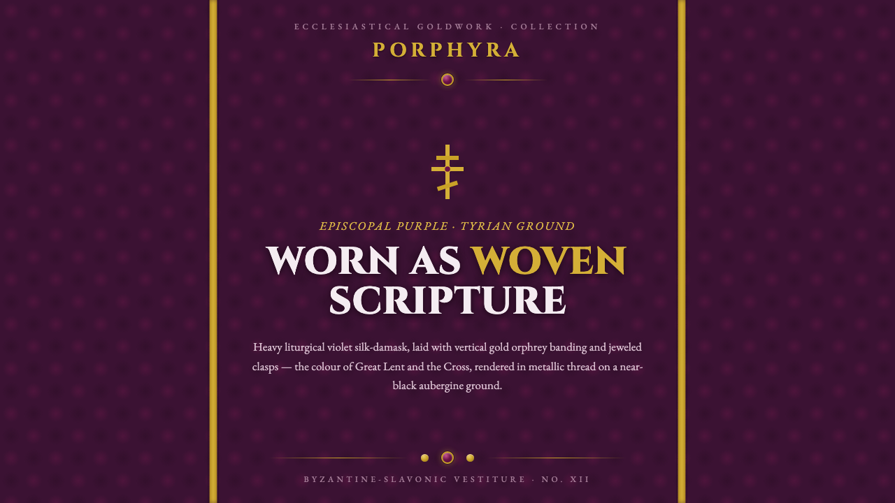 Russian Orthodox VestmentEpiscopal purple as woven sorrow. Aubergine damask, vertical gold orphrey ban…