What is Russian Orthodox Vestment?
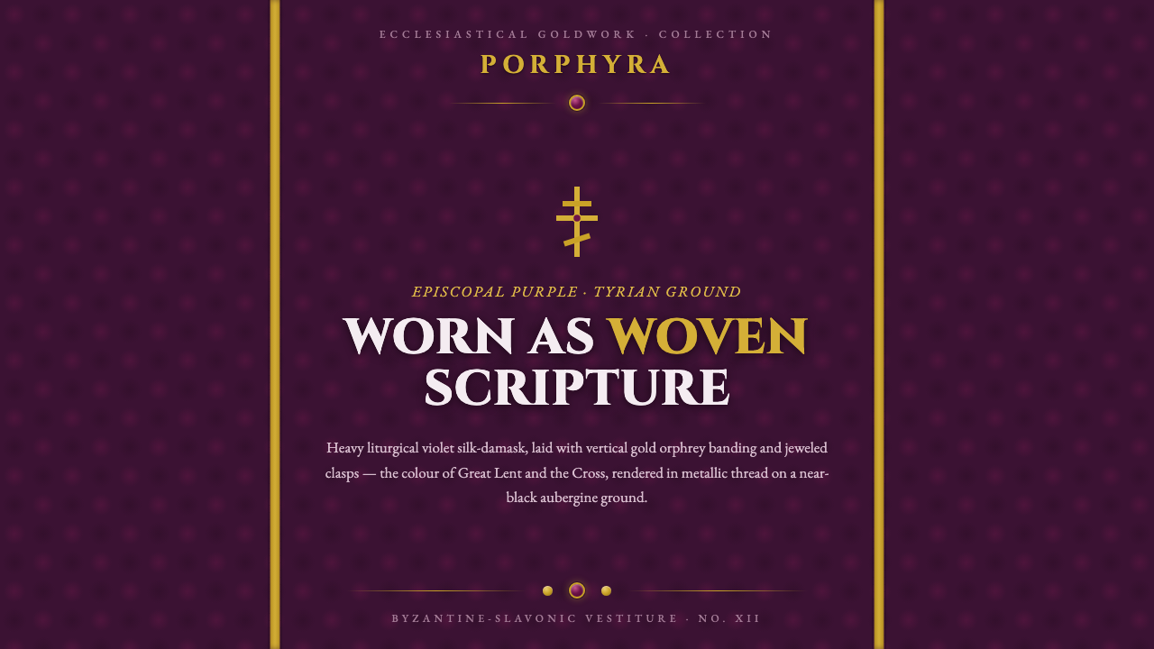
Russian Orthodox Vestment turns episcopal purple into a digital language of woven sorrow, metallic devotion, and solemn symmetry.
Russian Orthodox Vestment in brief
Russian Orthodox Vestment distills the visual gravity of Lenten and bishop’s robes from the Byzantine-Slavonic tradition into a dark, ceremonial design system. Its ground is near-black aubergine violet, imagined as silk damask or brocade rather than a flat digital field. Vertical gold orphrey bands establish the composition, while jeweled clasps and cross motifs punctuate the surface like devotional hardware.
The palette carries emotional and liturgical weight. Deep episcopal purple, descended from historic Tyrian shellfish dye, suggests Christ’s suffering joined to royal sorrow. Gold does not behave as decoration alone: it marks authority, frames the sacred field, and catches the eye like metallic thread. Gem points introduce concentrated moments of light without weakening the surrounding darkness.
The style is symmetrical, frontal, and richly framed. Every surface should feel like part of a carefully woven vestment panel: a brocaded ground, disciplined vertical ornament, solemn lettering, and small points of precious brilliance. It is not rustic, folkloric, or merely luxurious. Its character comes from restraint inside richness, where opulence is organized by ritual order.
Where does Russian Orthodox Vestment come from?
The style belongs to the Byzantine-Slavonic liturgical tradition of Eastern Europe, especially the Russian Orthodox context. Its historical horizon is pre-1900, with the canon of vestment color taking shape through the seventeenth to nineteenth centuries. The design language therefore carries the authority of inherited ceremony rather than the novelty of a contemporary fashion trend.
Its visual vocabulary grew from several related practices: Eastern Orthodox liturgical-color tradition, Byzantine-Slavonic brocade vestiture, ecclesiastical orphrey goldwork, and the work of monastic embroidery ateliers. These practices treated vestments as structured fields of textile, color, ornament, and sacred framing. The digital interpretation preserves that sense of a complete panel rather than borrowing isolated decorative motifs.
Purple is central because it joins two symbolic conditions: suffering and sovereignty. In this system, violet is not a cheerful accent or a fashionable jewel tone. It is dense, shadowed, and almost blackened, carrying the gravity of Lent and the dignity of episcopal robes. Gold provides the corresponding language of ceremonial authority, while gems and crosses act as focused signs within the larger textile field.
The tradition was sustained by Orthodox bishops and clergy, ecclesiastical vestment workshops, Byzantine brocade weavers, and monastic embroidery ateliers. Together, these makers established a visual culture in which repetition, symmetry, woven richness, and vertical goldwork could coexist without becoming chaotic. The result is an aesthetic of solemn abundance: richly worked, carefully bounded, and always oriented toward ritual presence.
What defines the Russian Orthodox Vestment look?
Episcopal Purple
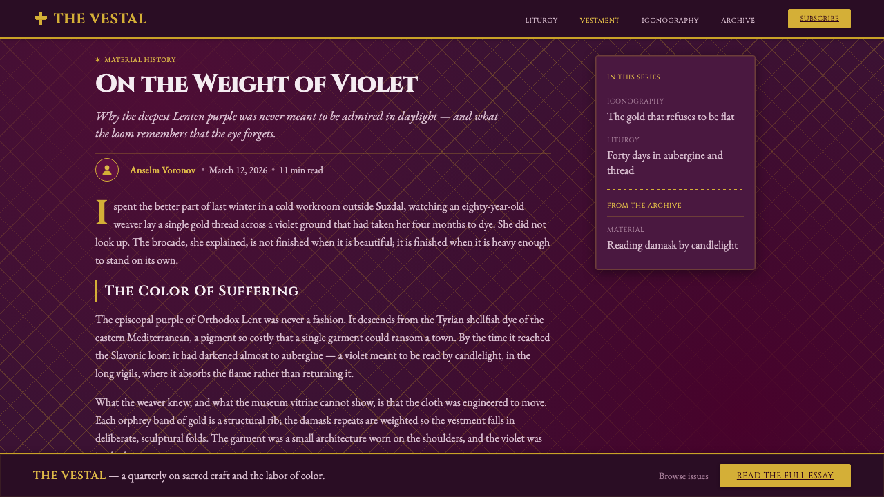
The dominant color is a deep aubergine violet that approaches black without becoming neutral. It should feel historic, dyed, and weighty rather than bright or synthetic. Purple carries the system’s central tension between Christ’s suffering and royal sorrow, so it works best as an enveloping field rather than a small decorative accent.
Brocade Surface
Flat backgrounds should be treated as woven damask or brocade fields. Texture is not added for casual richness; it gives the surface the tactile density of a vestment panel. Patterns remain subordinate to structure, emerging through restrained tonal variation so that the ground feels worked, not noisy.
Orphrey Bands
Gold orphrey bands run vertically and true, providing the main structural rhythm. Their authority comes from alignment and repetition, not from irregular flourish. They can frame a content field, divide a panel, or guide the eye toward a central title, but they should always feel like integral woven bands rather than pasted borders.
Ceremonial Typography
Cinzel majuscule supplies the typographic voice: carved, monumental, and formal. Capital lettering should be treated as inscription rather than conversational text, with generous breathing room and clear alignment. Typography gains power through placement and restraint, especially when set in pale metal against the dark violet ground.
Liturgical Symmetry
Composition is frontal and balanced, with a strong central axis and mirrored framing. Symmetry creates the sense of a ceremonial object presented for viewing. Asymmetry may appear in small gem points or secondary details, but the principal arrangement should remain calm, ordered, and unmistakably processional.
Gold and Gem Points
Metallic gold thread and jeweled clasps provide concentrated highlights within the dark field. Gold should read as woven or burnished, while gems should appear as precise points of reflected light. Both are strongest when used sparingly; if every element sparkles, the sacred hierarchy collapses into generic luxury.
Who shaped Russian Orthodox Vestment?
Orthodox bishops and clergy are the human presence most directly associated with the style. Their robes establish the relationship between episcopal purple, ceremonial framing, and public ritual. In design terms, they represent authority expressed through disciplined color and textile structure rather than through personal ornament.
Ecclesiastical vestment workshops translate liturgical requirements into complete textile panels. Their work suggests a design discipline in which surface, border, band, clasp, and emblem belong to one coherent object. They are a useful model for digital systems that need richness without losing hierarchy.
Byzantine brocade weavers embody the logic of pattern held inside a structural ground. Their contribution is not merely decorative intricacy; it is the sense that repeated motifs, woven density, and metallic thread can make a surface feel ceremonial while remaining ordered.
Monastic embroidery ateliers represent patient, concentrated craft and the devotional labor embedded in the style. Their presence explains why the digital treatment should feel made rather than merely rendered. Texture, repetition, and precise ornament should imply time spent constructing a sacred surface.
How do you use Russian Orthodox Vestment today?
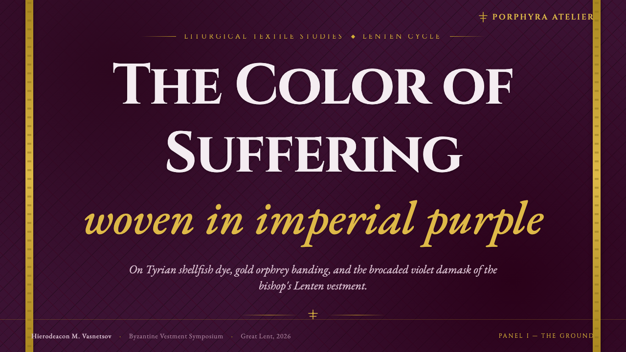
For presentation slides, use the style most decisively on the cover and title moments. A near-black aubergine field can carry a centered Cinzel majuscule title, framed by vertical gold bands and a restrained cross or jeweled clasp. Content slides should preserve the same ceremonial axis: clear central alignment, brocade texture kept quiet behind text, and gold reserved for headings, rules, or moments of emphasis. Data slides can treat charts as embroidered insignia, using purple as the field, gold as the primary signal, and gem-like highlights only for exceptional values.
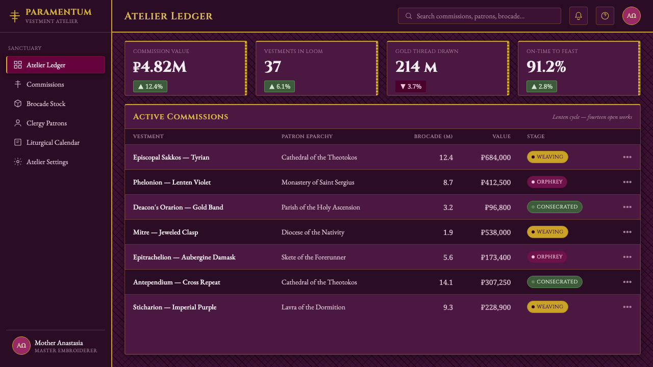
For web interfaces, Russian Orthodox Vestment suits dashboards, analytics tools, and pricing pages that need authority, depth, and a sense of formal distinction. Use the dark violet ground as the containing environment, then organize panels with vertical gold framing and centered titles. Interactive states should feel like changes in precious material: a clasp catching light, a gold thread becoming visible, or a gem point appearing against the field. The interface must remain readable; ornament should frame information rather than compete with it.
For editorial and marketing work, the style supports stories about heritage, ceremony, craft, and premium distinction. Article pages can use a broad dark field with narrow, carefully aligned reading areas, while section transitions take the form of gold bands or embroidered emblems. Marketing pages benefit from a strong opening panel, solemn typographic statements, and close views of brocade-like texture. The visual promise is not casual luxury but inherited authority, patient workmanship, and symbolic depth.
For product identity, the system works best when every component appears to belong to the same vestment object. A button can read as a jeweled clasp, a divider as an orphrey band, and a title block as an embroidered panel. This translation should remain structural: repeated framing, consistent verticals, and a controlled relationship between dark ground and gold signal. If each component invents its own ornament, the system loses the coherence that makes the source tradition powerful.
The common mistake is confusing ecclesiastical richness with indiscriminate decoration. Excessive texture, constant gold, scattered gems, and unrelated symbols turn the style into generic fantasy luxury. Another failure is treating the purple as a bright jewel color instead of a near-black liturgical field. The strongest application keeps the ground quiet, makes symmetry do the organizing work, and allows only a few metallic or jeweled details to carry the visual charge.
Russian Orthodox Vestment — FAQ
Is Russian Orthodox Vestment simply a dark purple luxury style?
No. Its defining quality is the relationship between liturgical purple, woven surface, vertical goldwork, and ceremonial symmetry. Remove that structure and the result becomes generic luxury. The style depends on purple carrying sorrow and authority, gold functioning as organized framing, and texture suggesting a worked vestment panel rather than a fashionable backdrop.
What are orphrey bands in this design language?
Orphrey bands are the vertical gold bands that organize the vestment field. In digital design they can frame a panel, divide a content area, or establish a central axis. Their purpose is structural as much as decorative: they make the composition feel woven, formal, and ceremonially bounded.
Can this style use a light background?
It can be adapted, but the dark aubergine field is central to its identity. A light ground removes much of the contrast between episcopal purple, gold thread, and jewel points, and can make the result feel ornamental rather than liturgical. If a lighter variation is necessary, preserve the vertical gold structure, solemn typography, and restrained symmetry so the system retains its ceremonial character.
How should texture be used without overwhelming the interface?
Treat texture as the woven ground, not as an independent visual event. It should be felt before it is noticed, with tonal variation kept subordinate to text and layout. Let gold bands, titles, and gem points provide the sharper signals. When the brocade becomes the first thing users see, it is no longer supporting the hierarchy.
Related design styles
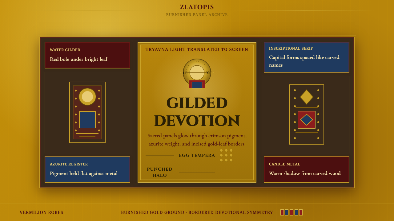 Bulgarian Orthodox IconSacred metal holds still. Burnished gold, crimson panels, and punched halos f…
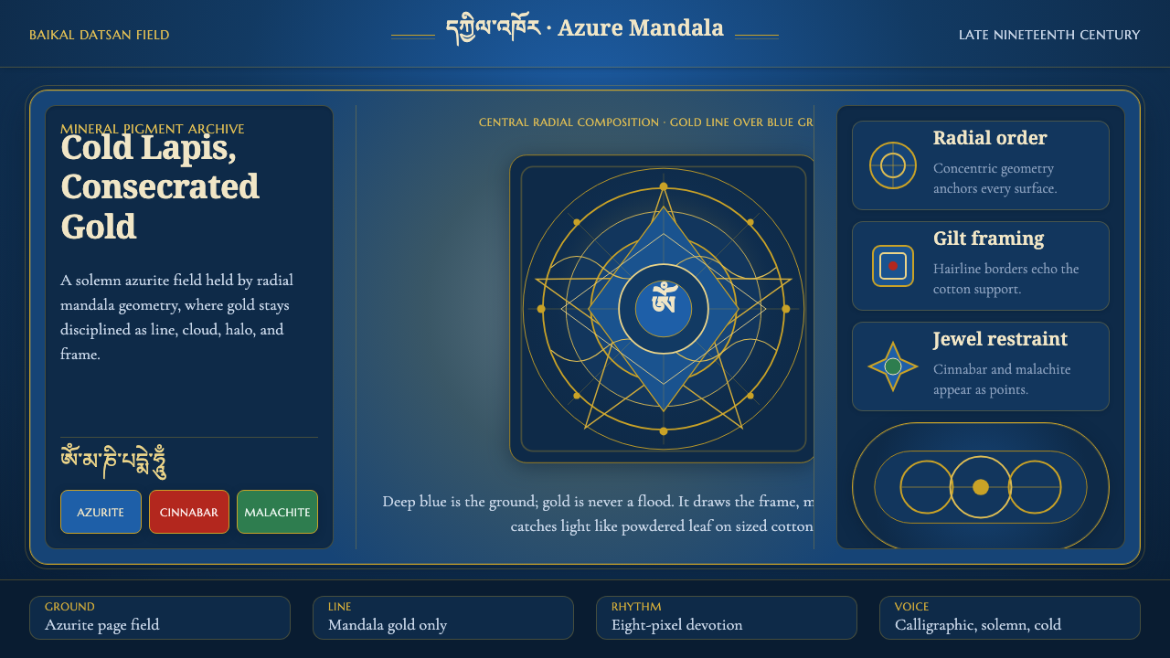 Buryat Buddhist Datsan ThangkaCold lapis holds silence. Gold mandala lines frame a solemn azurite field.
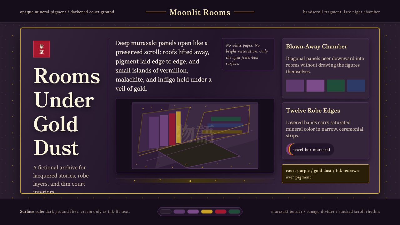 Heian Genji ScrollAged court opulence. Murasaki ground, gold dust, and stacked scroll panels.
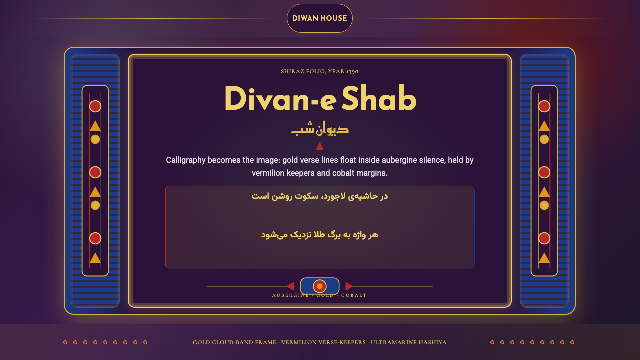 Iranian Shiraz Poetry Divan 1390Midnight manuscript glow. Aubergine fields, gold Kufi type, cobalt margins.
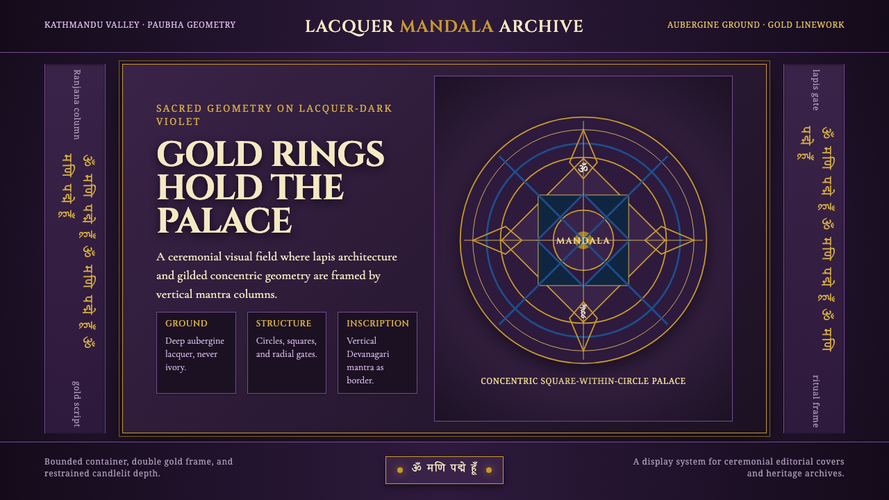 Newari Ranjana-Script MandalaCeremonial darkness. Gold mandala rings and lapis gates glow on aubergine lac…
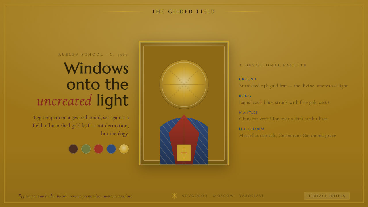 Russian Orthodox IconBurnished gold leaf as divine light. Lapis and cinnabar saints, incised halos…