What is Russian Orthodox Icon (Rublev school)?
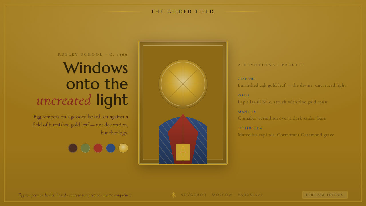
Burnished in gold and earth, the Rublev-school icon turns a devotional image into a field of uncreated light, where color, material, and perspective all serve presence rather than decoration.
Russian Orthodox Icon (Rublev school) in brief
The Russian Orthodox icon of the Rublev school is a panel image painted in egg tempera on a gessoed linden board, set against burnished gold leaf. The gold is not a neutral background: it signifies divine, uncreated light. Saints in lapis-blue and cinnabar robes stand within that radiant field, their presence made solemn through color, frontal stillness, and carefully controlled form.
Its visual logic is devotional rather than illustrative. Space does not behave like a window receding away from the viewer; reverse perspective makes the image open toward the person looking at it. Halos are incised and ochre-gold, robes receive assist gilding, and earthy sankir browns give the faces and figures a grounded warmth beneath the radiance.
As a digital design system, this tradition becomes a burnished gold page, ochre-gold linework, lapis and cinnabar accents, and sankir brown for text or secondary structure. The result should feel solemn, warm, and luminous, never cream or stark white, never glossy in a modern luxury sense, and never reduced to a decorative gold texture.
Where does Russian Orthodox Icon (Rublev school) come from?
The Russian Orthodox icon tradition belongs to pre-1900 Eastern Europe, with roots in medieval Rus' and important regional references in Novgorod, Moscow, and Yaroslavl. It continued across centuries rather than belonging to a single brief fashion. The Rublev school therefore names a visual inheritance: a way of organizing sacred figures, luminous grounds, and material surfaces so that the image feels continuous with devotion.
The medium is central to the style's identity. A gessoed linden board supplies the prepared ground; egg tempera builds the painted image; burnished gold leaf establishes the field of divine light. These are not interchangeable production details. Together they create the style's particular tension between earth and radiance: a warm, tactile support carrying colors that appear concentrated, deliberate, and spiritually charged.
Andrei Rublev, who lived approximately from 1360 to 1430, is the defining name attached to this school. His place in the source tradition gives the system its central measure of calm, balance, and luminous restraint. Theophanes the Greek is another named reference within the same field of Orthodox iconography, keeping the style connected to a broader Eastern European and Byzantine visual inheritance without turning the design into historical quotation.
The Moscow icon school and Novgorod icon school provide regional lenses through which this tradition is understood. They are not interchangeable labels for a single surface treatment; they locate the visual language within the geography of medieval Rus'. A digital adaptation can honor that inheritance by preserving the essential relationships: gold as light, colored robes as sacred presence, reverse perspective as spatial behavior, and material honesty as the source of visual authority.
What defines the Russian Orthodox Icon (Rublev school) look?
Divine Ground
Gold is the primary field, and it must read as light rather than luxury. A burnished warm gold carries the entire composition, giving figures and symbols an atmosphere of radiance. In digital use, the page should feel gilded and quietly reflective, with enough visual depth to suggest a worked surface without becoming metallic decoration.
Sacred Palette
The palette is concentrated and symbolic: lapis blue, cinnabar red, ochre gold, and sankir brown revolve around the gold ground. Blue and red belong to the saints' robes, while brown supplies an earthy counterweight. Colors should feel mineral, dense, and temperate, never pastel, fluorescent, or casually multicolored.
Incised Halos
Halos are not soft atmospheric glows. They are ochre-gold forms articulated by incised lines, giving sacred presence a clear boundary and a crafted surface. In interface design, a halo can become a ring, ruled enclosure, or quiet circular emphasis, provided it remains structural and visibly drawn rather than blurred.
Reverse Perspective
Reverse perspective changes the direction of attention. Instead of making the viewer look into a distant scene, the composition seems to open outward toward the viewer. Digital layouts can express this through forms that widen toward the reading position, radiating alignments, and spatial relationships that feel welcoming rather than cinematic or recessive.
Sankir Modeling
Sankir brown gives the system its earthly register. Against gold and saturated robe colors, it keeps faces, labels, and supporting forms from becoming weightless. Use it for text, outlines, secondary panels, or tonal transitions that need warmth and gravity. Its role is not muddy neutrality but a deliberate bridge between body and light.
Material Continuity
The digital version should preserve the logic of the physical icon: prepared ground, layered pigment, worked gold, and visible line. Assist gilding becomes restrained gold marks over robes or key interface elements. Texture may suggest board, gesso, or burnishing, but every surface should remain purposeful and quiet enough for the devotional hierarchy to hold.
Who shaped Russian Orthodox Icon (Rublev school)?
Andrei Rublev, c. 1360–1430, is the central named reference for this style. His name gives the system its standard of quiet balance: gold should radiate without shouting, color should carry spiritual weight, and figures should feel present without theatrical movement. The design language should therefore favor composure, luminous restraint, and carefully measured relationships.
Theophanes the Greek is a named figure within the Orthodox iconographic field that surrounds the Rublev-school reference. In a design article, his importance is connective: he keeps the visual system from being treated as an isolated palette and places its gold, sacred figures, and disciplined spatial language within a wider Eastern European inheritance.
The Moscow icon school represents the Moscow regional lens within the tradition. Its presence in the source material encourages a digital interpretation that feels organized and continuous rather than eclectic. Gold, lapis, cinnabar, and sankir should operate as a coherent devotional vocabulary, not as unrelated decorative samples.
The Novgorod icon school anchors the tradition in another named region of medieval Rus'. Its role is geographic as well as visual: it keeps the style connected to a living field of Eastern European icon painting. Use regional reference as depth and context, never as an excuse for arbitrary ornament or invented symbolism.
How do you use Russian Orthodox Icon (Rublev school) today?
This style is best suited to experiences that need solemnity, warmth, cultural depth, and a sense of luminous continuity. It can give a product the feeling of a considered artifact rather than a disposable interface. The essential test is whether the subject can carry stillness and symbolic color; if the content depends on speed, irony, or visual noise, the system's devotional gravity may become a mismatch.
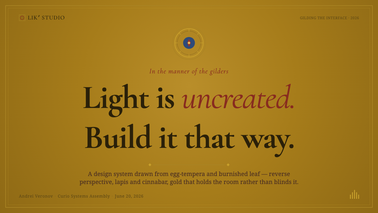
For presentation slides, let the cover behave like a single icon field: a warm-gold ground, one dominant sacred color, and a calm title treated as an inscription rather than a promotional headline. Content slides should preserve generous breathing room, strong vertical presence, and clear halos or ruled enclosures around important ideas. Data slides can translate figures into concentric forms, radiating relationships, or restrained blocks of lapis and cinnabar against gold, keeping the information legible without breaking the contemplative tone.
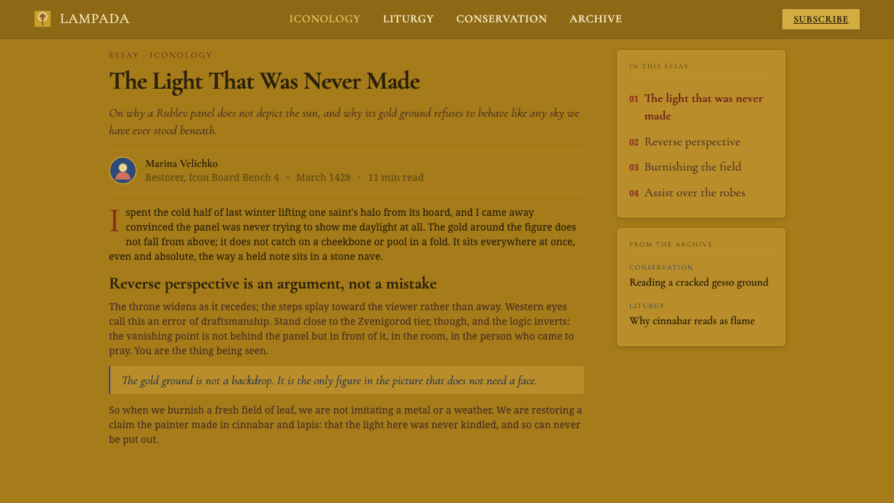
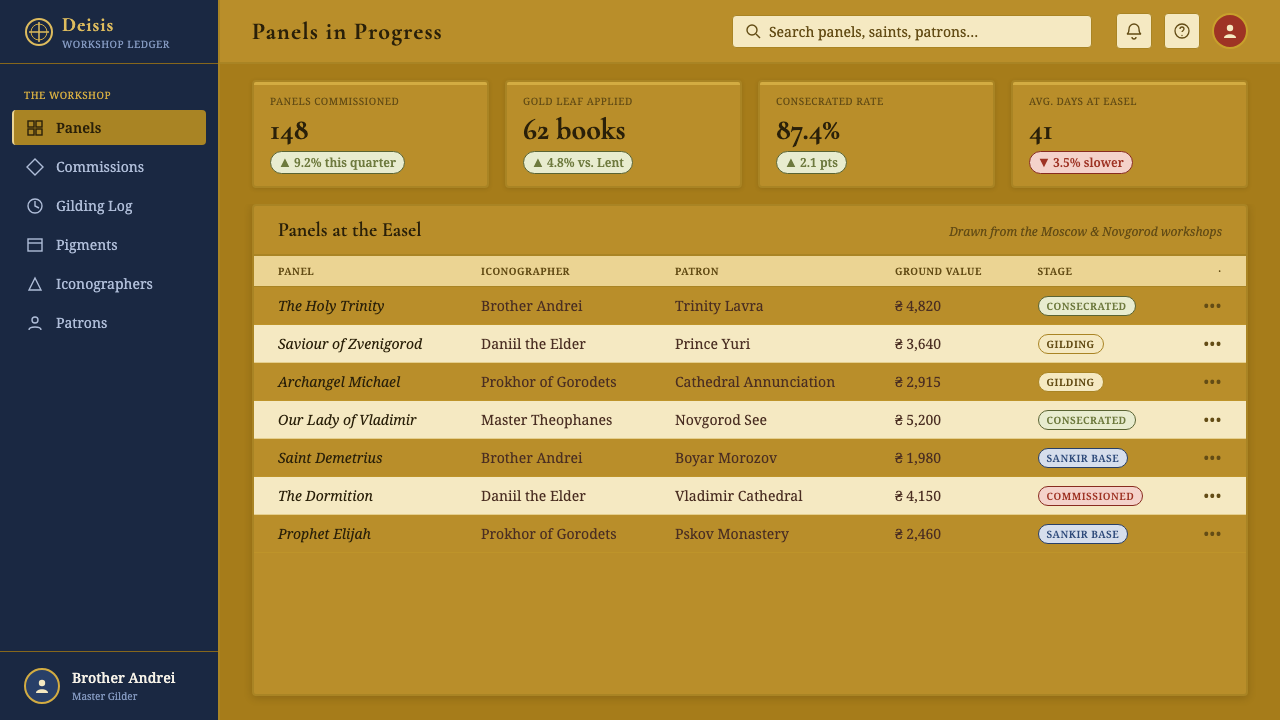
For web interfaces, the system works especially well for dashboards, archives, cultural platforms, and pricing pages that want authority without coldness. Use the burnished gold as the environmental field, sankir brown for primary text and structural lines, and lapis or cinnabar for selected states and distinctions. Cards should feel like inset panels within a sacred surface, not floating white tiles. Navigation benefits from clear, inscription-like labels and quiet circular markers.
For editorial and marketing work, the style supports a strong sense of provenance. An article can open with a luminous field, a single centered emblem, and a measured column of text, then use ochre-gold lines to mark sections or draw attention to quotations. Marketing pages can treat products as crafted objects, pairing warm gold with one robe color and using assist-gilding marks for calls to action, captions, or key claims. The mood should be intimate and enduring rather than ornate.
The common mistake is to use gold, blue, and red as a generic luxury palette while discarding the icon's material and spatial logic. A glossy gold gradient, stark white card, soft atmospheric halo, or crowded collection of jewel colors will make the result fashionable but spiritually empty. Another mistake is adding invented religious symbols. Preserve the relationships supplied by the tradition—gold as light, robes as presence, sankir as earth, and reverse perspective as invitation—and let restraint do the work.
Russian Orthodox Icon (Rublev school) — FAQ
Is this style simply a gold, blue, and red palette?
No. Those colors matter because they participate in a complete visual system. Gold is the field of divine light; lapis and cinnabar belong to sacred figures; sankir brown grounds the composition; incised halos and reverse perspective organize presence and space. Remove those relationships and the result is only a decorative jewel palette, not a Rublev-school interpretation.
Why should the digital version avoid cream and stark white?
The source system depends on a warm, burnished field that reads as light with material depth. Cream can make the surface feel merely pale, while stark white breaks the relationship between gold, earth, and sacred color. The page should feel gilded and warm from the beginning, so the content enters an atmosphere rather than being placed on a neutral document.
How can reverse perspective be expressed in a digital interface?
Treat it as a direction of invitation rather than a literal perspective effect. Alignments, borders, and grouped forms can widen or radiate toward the reading position, making the layout feel as if it opens outward. Avoid turning the idea into a dramatic three-dimensional scene. The important quality is that space addresses the viewer instead of pulling the viewer into a distant illusion.
What does assist gilding contribute to the style?
Assist gilding is the worked gold laid over robes or selected painted areas. It gives the clothing a second register of light: the lapis or cinnabar remains visible, but gold marks articulate folds, emphasis, and sacred radiance. Digitally, this can become sparse gold linework or small gilded accents. Its strength depends on restraint; if every surface is gilded, nothing remains an accent.
Does the Rublev-school style suit every product?
No. It is strongest when a product values contemplation, heritage, ceremony, cultural memory, and durable authority. It can support archives, cultural publishing, educational interfaces, and carefully positioned institutional work. It is less suitable for products that need playful speed, stark technological neutrality, or constant visual stimulation. The style asks the audience to slow down, so the product should have a reason to invite that attention.
Related design styles
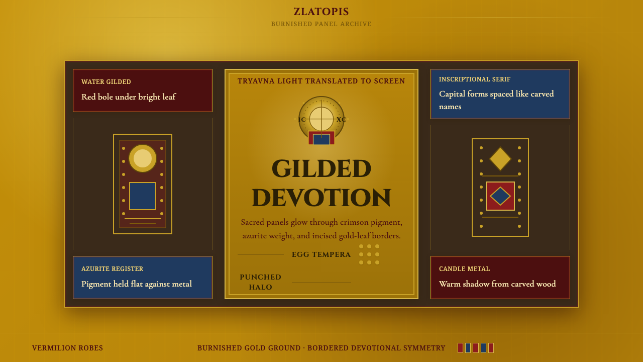 Bulgarian Orthodox IconSacred metal holds still. Burnished gold, crimson panels, and punched halos f…
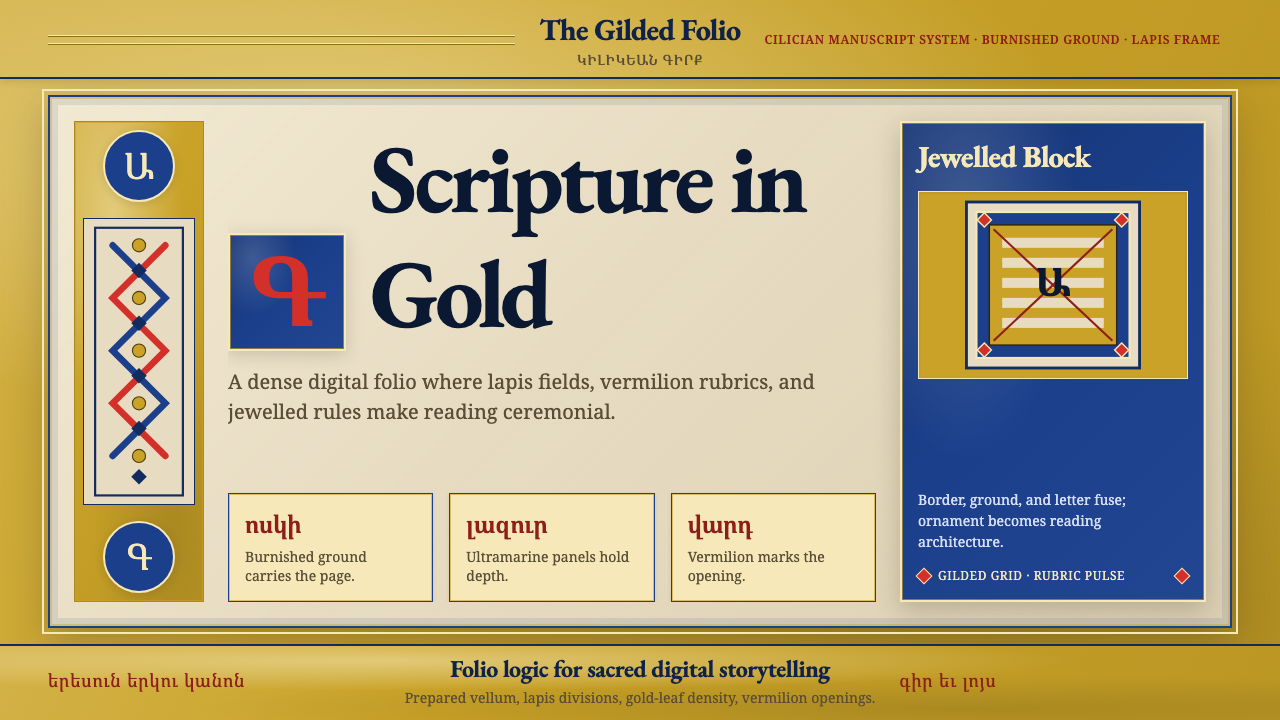 Armenian Illuminated ManuscriptGilded maximalism. Burnished gold, lapis frames, and vermilion initials build…
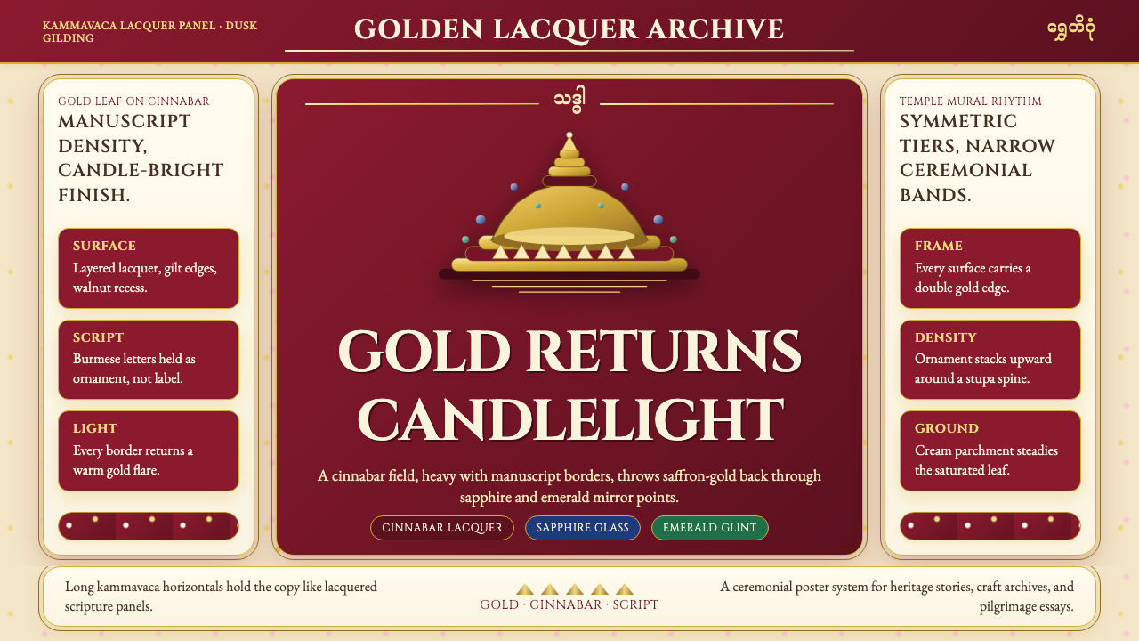 Burmese Shwedagon Gold-LacquerOpulence catches fire. Gold-leaf gradients on cinnabar panels frame a stupa s…
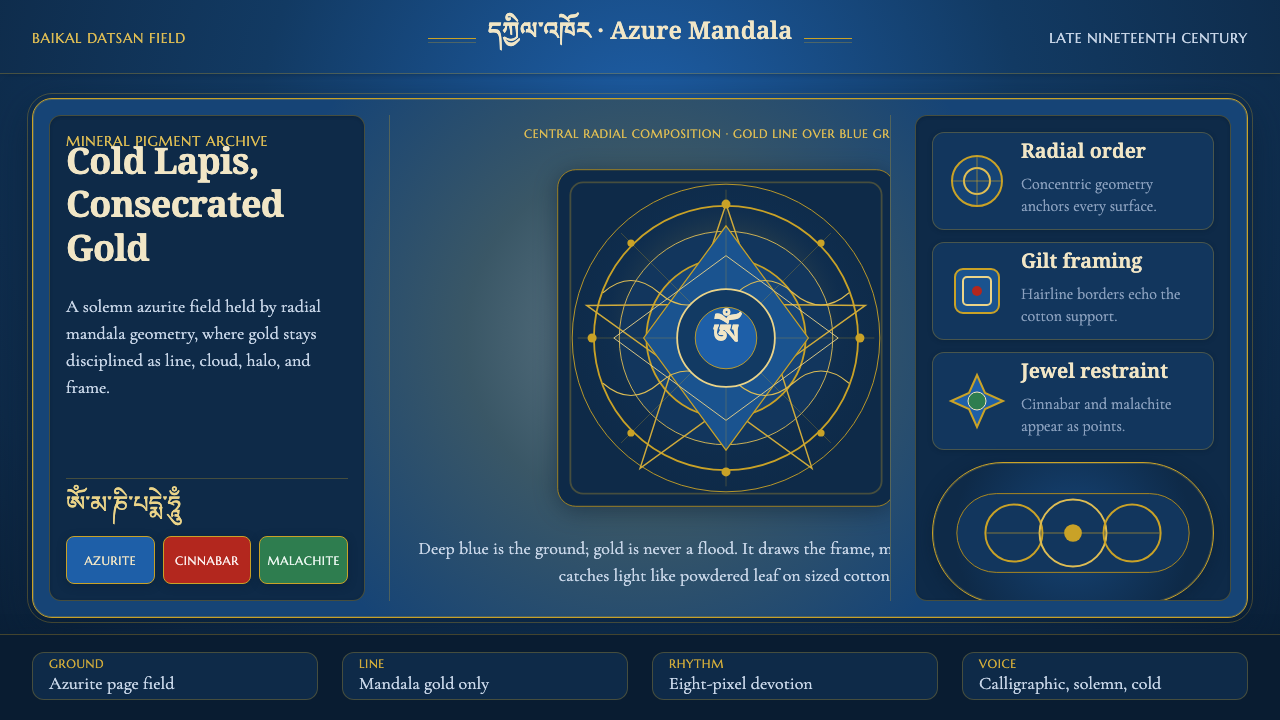 Buryat Buddhist Datsan ThangkaCold lapis holds silence. Gold mandala lines frame a solemn azurite field.
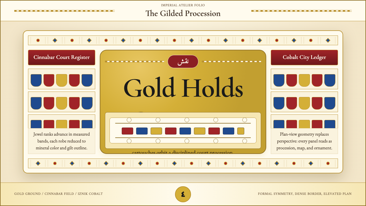 Ottoman Court Miniature (Topkapı)Ceremony made dense. Gold ground, cinnabar cartouches, cobalt procession geom…
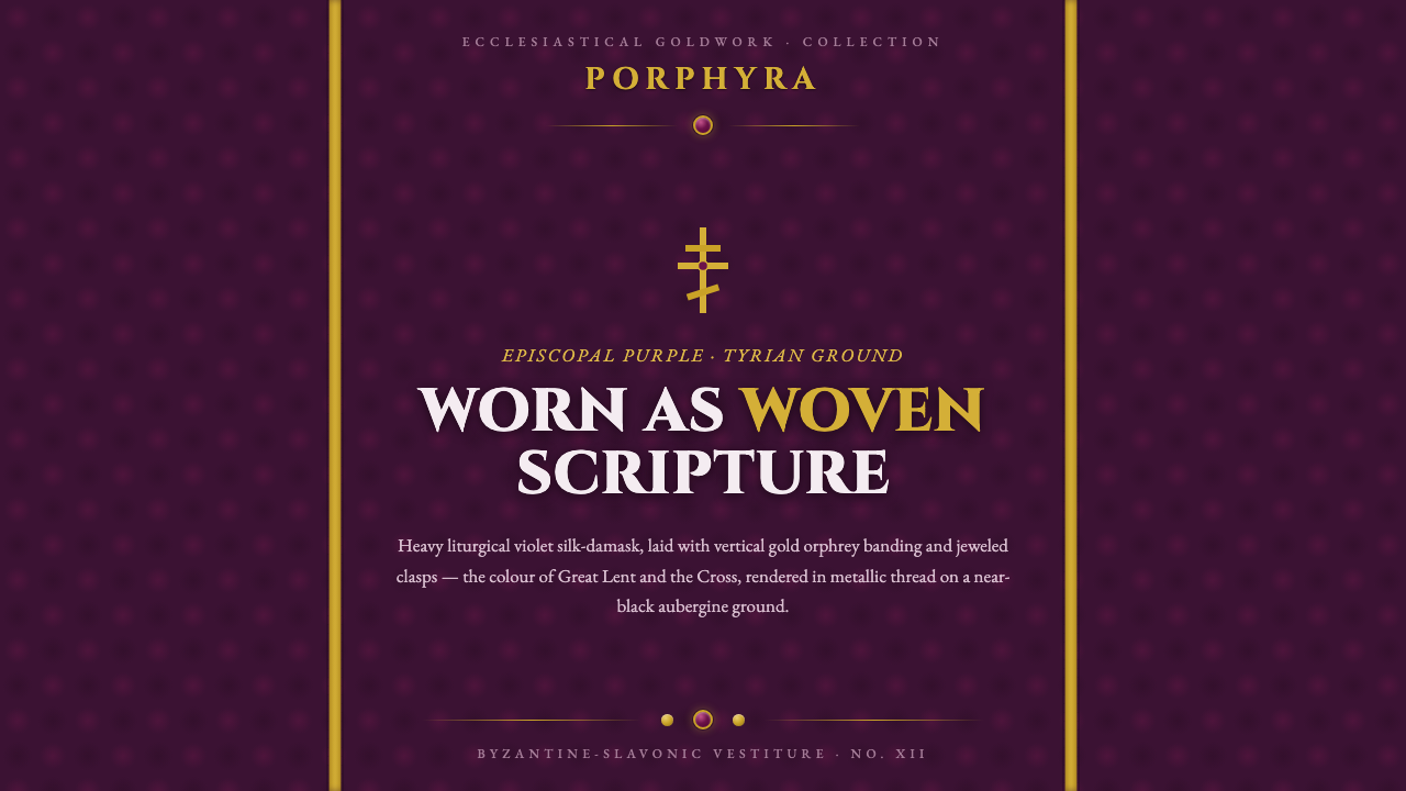 Russian Orthodox VestmentEpiscopal purple as woven sorrow. Aubergine damask, vertical gold orphrey ban…