What is Buryat Buddhist Datsan Thangka?
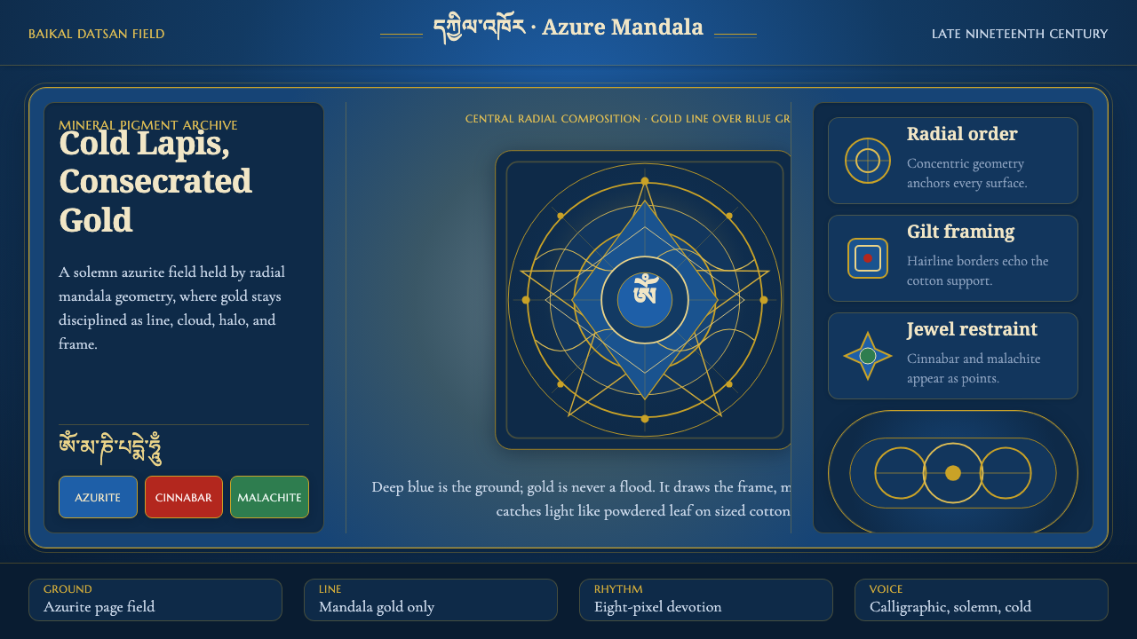
Cold azurite holds the silence of Lake Baikal, while disciplined gold lines turn the page into a solemn field of ritual geometry.
Buryat Buddhist Datsan Thangka in brief
Buryat Buddhist Datsan Thangka is a visual language drawn from the mineral-pigment paintings made on sized cotton in the late nineteenth-century datsans around Lake Baikal in Siberia. Its character begins with a cold, saturated blue ground: azurite and lapis are reduced to pigment and allowed to dominate the field. Against that blue, gold leaf and gold powder trace cloud scrolls and the fine geometry of a central mandala.
The style is not simply a dark interface with metallic decoration. Its power comes from the relationship between a deep, nearly silent ground and lines that appear deliberate, ceremonial, and exact. Blue carries the visual weight of the whole page; gold does not compete with it, but frames, organizes, and reveals. The result is solemn rather than luxurious, concentrated rather than ornamental.
In digital form, the system translates this material logic into a deep azurite page, gold linework, central radial geometry, and calligraphic type that honors the Tibetan Buddhist script tradition as adapted by the distinct Buryat school. Every element should feel placed within a composed field. Space is not empty background; it is the silence that allows the geometry and lettering to register.

Where does Buryat Buddhist Datsan Thangka come from?
The source tradition belongs to Buryatia and the Lake Baikal region of Siberia, within a Central Asian cultural geography shaped here by Tibetan Buddhist thangka painting. The relevant manner is associated with the late nineteenth century, when the Buryat Baikal-datsan school developed its own visual identity. The paintings were made on sized cotton rather than on a neutral digital surface, so the image began with a prepared ground designed to receive dense mineral color.
Mineral pigment is central to the style rather than a secondary technical detail. Azurite and lapis create the cold blue that governs the composition, giving the field a saturated but restrained intensity. Gold leaf and gold powder provide the counterpoint, drawing cloud scrolls and the fine lines of the mandala. The contrast is material as well as chromatic: crushed stone establishes the ground, while gold marks the structure that moves across it.
The Buryat school is connected to the wider Tibetan Buddhist thangka tradition, but the source material identifies it as a distinct local adaptation. That distinction matters for design interpretation. The goal is not to imitate a generic Himalayan visual language or to reproduce isolated religious motifs. It is to preserve the combination of cold mineral blue, precise gold drafting, radial order, and calligraphic expression associated with the Buryat datsan context around Lake Baikal.
The digital system is therefore a distillation rather than a literal reconstruction. It carries the solemn azurite field into the background, converts gold leaf and powder into fine luminous linework, and treats the central mandala as an organizing geometry. Calligraphic type extends the connection to the Tibetan Buddhist script tradition adapted through the Buryat school. What survives the translation is the relationship between ground, line, center, and silence.
What defines the Buryat Buddhist Datsan Thangka look?
Azurite Ground
The ground is a deep, cold blue derived from azurite and lapis. It should feel mineral rather than electronic, saturated rather than bright, and solemn rather than dramatic. The blue occupies the largest visual territory and gives every lighter element a clear field of opposition. It is not a backdrop added after the composition; it is the condition that makes the composition legible.
Gold Linework
Gold functions as a drawn structure, not as a broad decorative fill. Fine lines define the mandala, frame passages, and suggest cloud scrolls without overwhelming the blue field. Its presence should feel precious because it is controlled. When every surface becomes gold, the material contrast disappears; when gold is reserved for decisive contours, it retains the authority of a mark made by hand.
Radial Mandala
The central mandala supplies the system with a radial center and a sense of ordered expansion. Geometry should unfold from a focal point rather than scatter across the page. The mandala may remain fine and partially implied, allowing the surrounding field to breathe, but its organizing presence should be perceptible. It turns decoration into orientation and gives the interface a ritual center.
Calligraphic Type
Typography should honor the Tibetan Buddhist script tradition adapted into the Buryat school without turning the interface into an unreadable artifact. Calligraphic qualities belong in titles, labels, or ceremonial moments, while supporting text should remain calm and clear. The contrast is one of voice and function: expressive lettering establishes lineage, and restrained text preserves access to information.
Cloud Scrolls
Cloud scrolls act as connective ornament, linking isolated areas of the composition through a continuous gold vocabulary. They should remain light, fine, and directional rather than becoming a dense pattern. Used carefully, they soften the strictness of the mandala without weakening its order. Their role is to make the field feel inhabited by movement while keeping the overall atmosphere still.
Solemn Depth
Depth comes from the relationship between the dark mineral field and the luminous marks placed upon it, not from glossy effects or simulated realism. The page should feel deep because the blue recedes and the gold advances with measured clarity. This is a restrained depth: no element needs to shout, because contrast, centering, and material suggestion already establish hierarchy.

Who shaped Buryat Buddhist Datsan Thangka?
These painters represent the human craft behind the visual language. Their work is associated with mineral-pigment painting on sized cotton in the late nineteenth-century datsan context around Lake Baikal. In the design system, their legacy appears through the disciplined blue ground, the careful gold drafting, and the sense that every mark belongs to a composed field rather than to spontaneous surface decoration.
The Baikal-datsan iconographers anchor the style in a specific regional setting rather than an abstract idea of Buddhist imagery. Their collective presence connects the cold azurite field, gold cloud scrolls, and fine mandala lines to the datsans ringing Lake Baikal. For digital work, they provide the reference point for keeping the system solemn, local, and materially grounded.
The school is the collective visual intelligence that makes this style distinct. It belongs to the wider movement of Tibetan Buddhist thangka painting while adapting that tradition into a Buryat form around Lake Baikal. Its importance for contemporary design lies in the balance between inherited script, mineral color, radial geometry, and a regional identity that should not be flattened into generic ornament.
How do you use Buryat Buddhist Datsan Thangka today?
For presentation slides, use the azurite field as the primary stage and let gold establish the reading path. A cover can place a central or partially cropped mandala behind a solemn calligraphic title, with cloud scrolls entering from the margins as connective marks. Content slides should reduce the ornamental vocabulary and preserve a clear field for text. Data slides can treat charts as radial or framed instruments, using gold for the most important structure and keeping secondary information quiet against the blue.
For web interfaces, the style is especially suited to dashboards, pricing pages, and focused portals that need authority and concentration. A dashboard can use the radial mandala as a subtle organizing device while reserving gold for active states, key metrics, and decisive boundaries. A pricing page can place each tier within a quiet field, using gold to identify the selected or most consequential option rather than turning every card into a metallic object. The interface should feel composed, not theatrical.
For editorial and marketing work, the system supports a strong sense of occasion. Long-form articles can use generous dark fields, gold rules, calligraphic section markers, and restrained cloud-scroll accents to separate passages without breaking continuity. Campaign pages can treat the mandala as a visual anchor and let the blue-and-gold contrast carry the identity. Product or institutional messaging benefits when the style is used to communicate seriousness, lineage, craft, or contemplative attention.
For data-heavy communication, preserve the hierarchy between ground and mark. The blue should remain the stable visual environment, while gold identifies the lines, rings, boundaries, or values that deserve attention. Avoid turning every data series into a different bright color family, because that would replace the mineral discipline with visual noise. The style works best when the structure of the information is strong enough that the gold can remain selective.
The common mistake is to treat the theme as a luxury surface: dark blue everywhere, gold on every border, ornate lettering in every label, and a mandala used as a decorative watermark. That approach loses the source logic. Gold must organize rather than coat, calligraphic type must be balanced by readable supporting text, and the mandala must provide orientation rather than compete with content. The atmosphere comes from restraint, not from the quantity of motifs.

Buryat Buddhist Datsan Thangka — FAQ
Is this simply a generic dark blue and gold theme?
No. The palette is only the visible starting point. The identity comes from the relationship between mineral blue, controlled gold linework, radial mandala geometry, cloud-scroll continuity, and calligraphic type connected to the Buryat adaptation of the Tibetan Buddhist script tradition. Remove the material and structural logic, and the result becomes generic luxury styling rather than Buryat Buddhist Datsan Thangka.
Can the style work without showing a literal mandala?
Yes, provided the radial logic remains present. A mandala can be partial, implied, or translated into centered rings and measured divisions rather than shown as a complete emblem. What matters is that the page has a perceptible center and that surrounding elements expand from it with discipline. If the geometry becomes scattered, the design loses the organizing role that the mandala provides.
How should gold be used in a digital interface?
Use it as line, signal, and emphasis. Gold can define a boundary, trace a radial division, mark an active state, or identify a key figure. It should not cover every surface or make all text equally luminous. Its authority depends on scarcity and precision. Against the azurite ground, a small amount of carefully placed gold can carry more meaning than a page saturated with metallic effects.
Does calligraphic typography mean the interface should sacrifice readability?
No. The source system calls for typography that honors the script tradition, not for every sentence to become ornamental lettering. Use the calligraphic voice where lineage and ceremony matter, such as a title or section marker, then let supporting text remain calm and open. The contrast between expressive display type and accessible information is part of the system's discipline.
What makes this style feel solemn rather than merely dark?
Solemnity comes from composition and material suggestion. The azurite and lapis ground creates a cold, saturated field; gold lines introduce measured illumination; the mandala establishes a center; and calligraphic type adds a sense of inherited practice. Darkness alone only reduces brightness. This style feels solemn because every visible mark appears to belong to an ordered field with a deliberate relationship to silence.
Related design styles
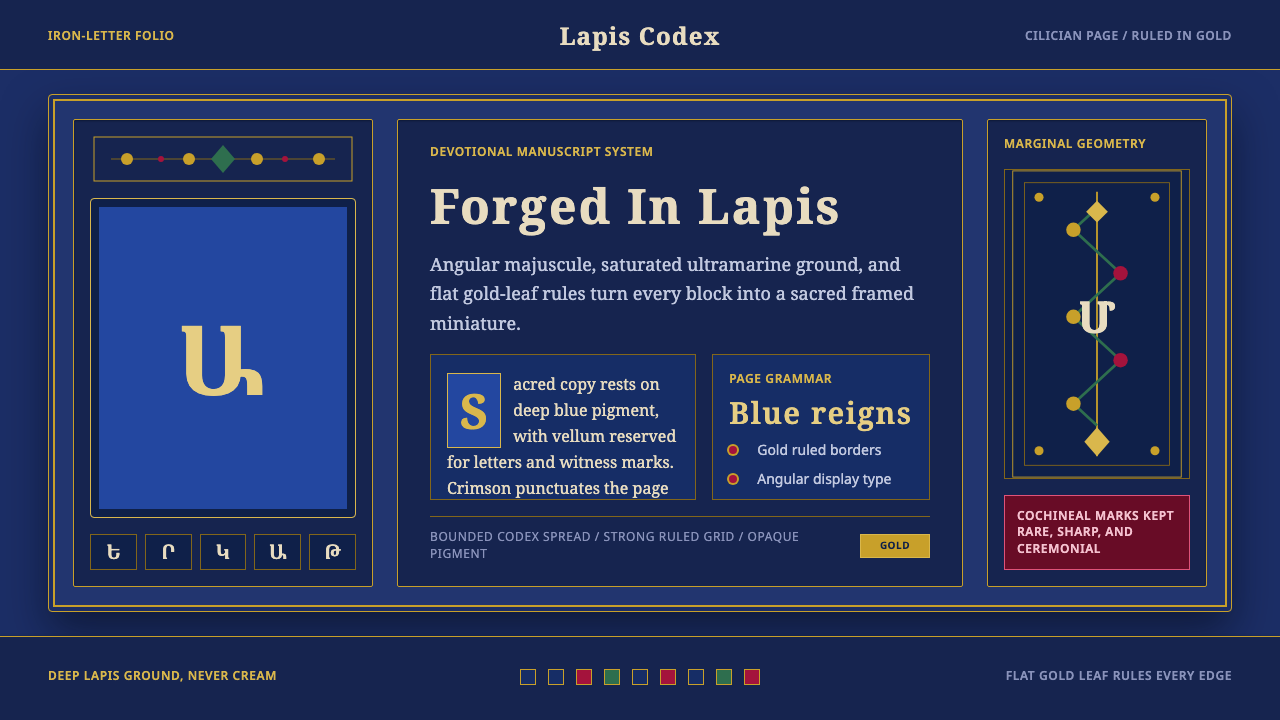 Armenian ErkatʿagirDevotional lapis reigns. Gold rules and angular serif glyphs frame a sacred g…
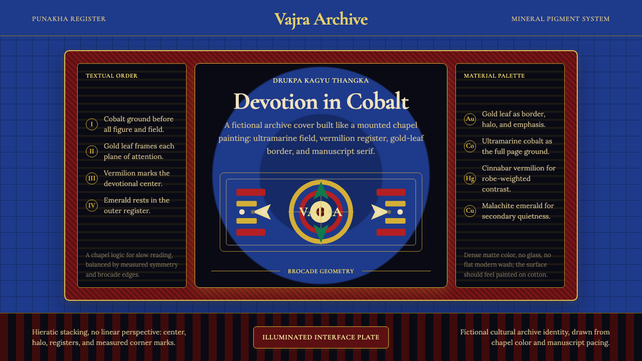 Bhutanese Drukpa Kagyu ThangkaDevotion made cobalt. Gold frames, Cormorant serif, and vermilion marks hold…
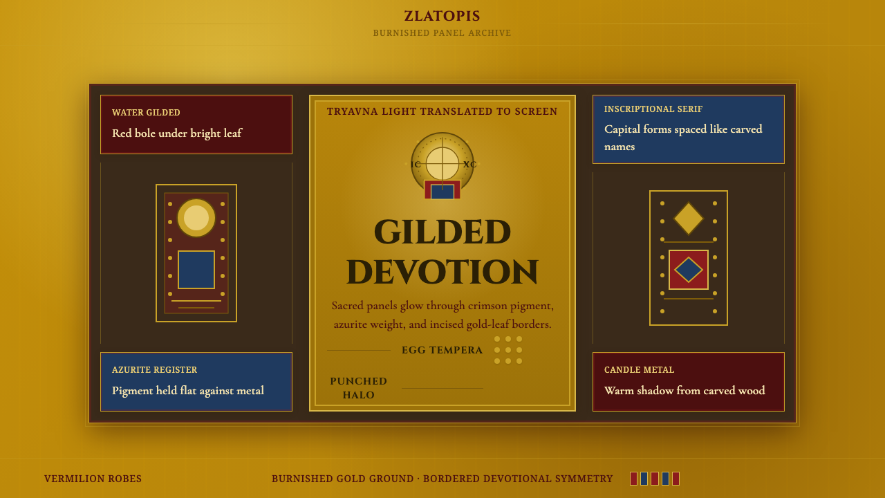 Bulgarian Orthodox IconSacred metal holds still. Burnished gold, crimson panels, and punched halos f…
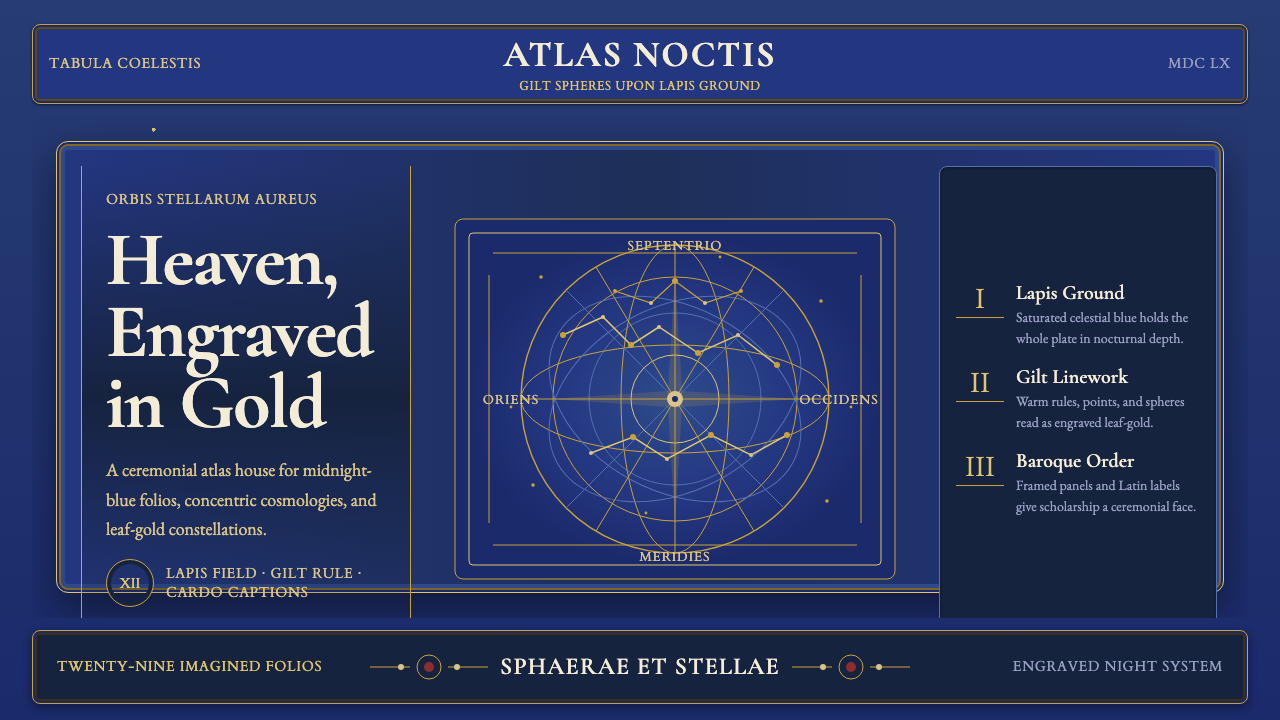 Cellarius Celestial AtlasCelestial luxury on lapis. Gilt serif type, star fields, and concentric chart…
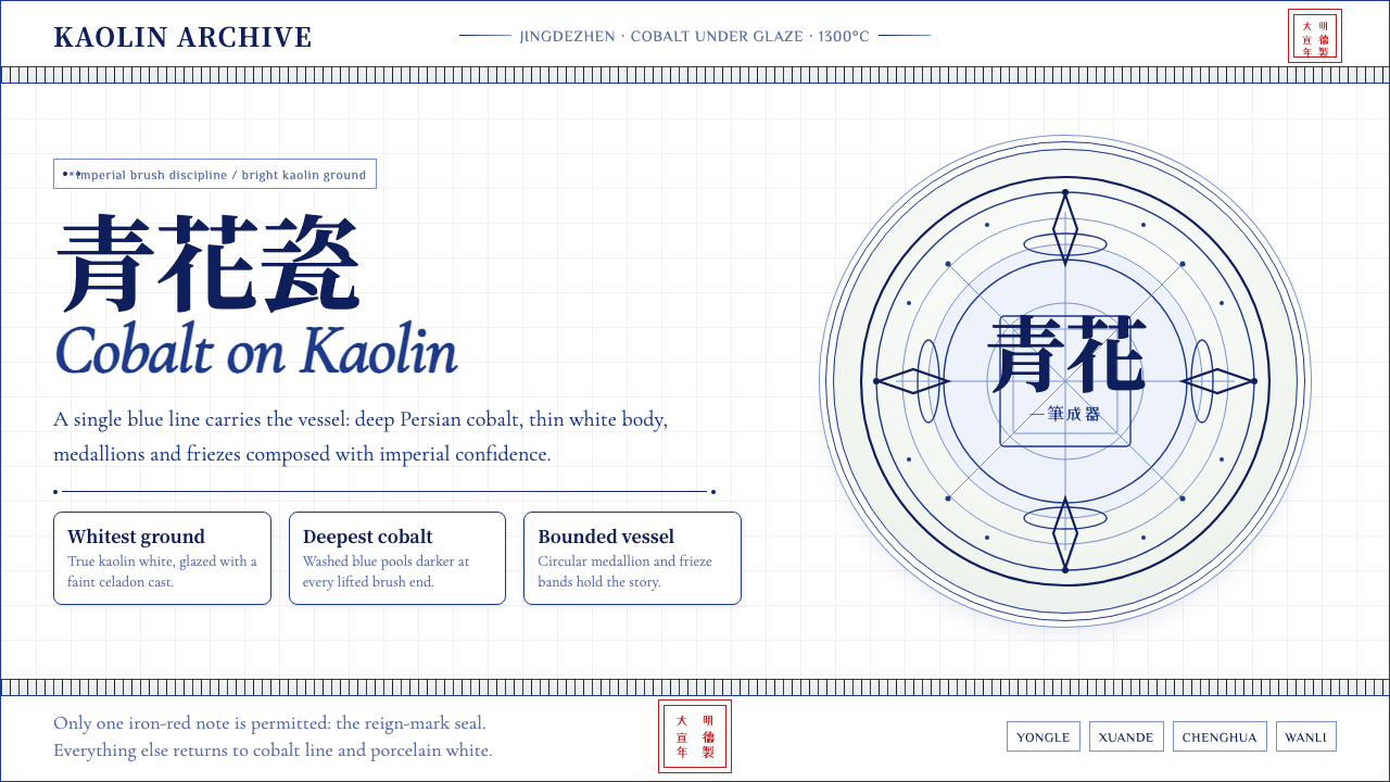 Ming Blue-and-White PorcelainImperial restraint sings. Deep cobalt hairlines circle kaolin white with one…
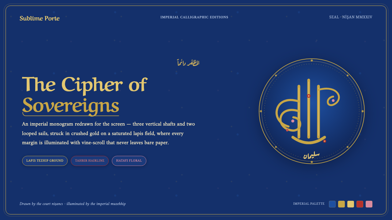 Ottoman Tughra SealEvery surface is a state seal. Gold tughra cipher on lapis, Aref Ruqaa script…