What is Ottoman Tughra Seal?
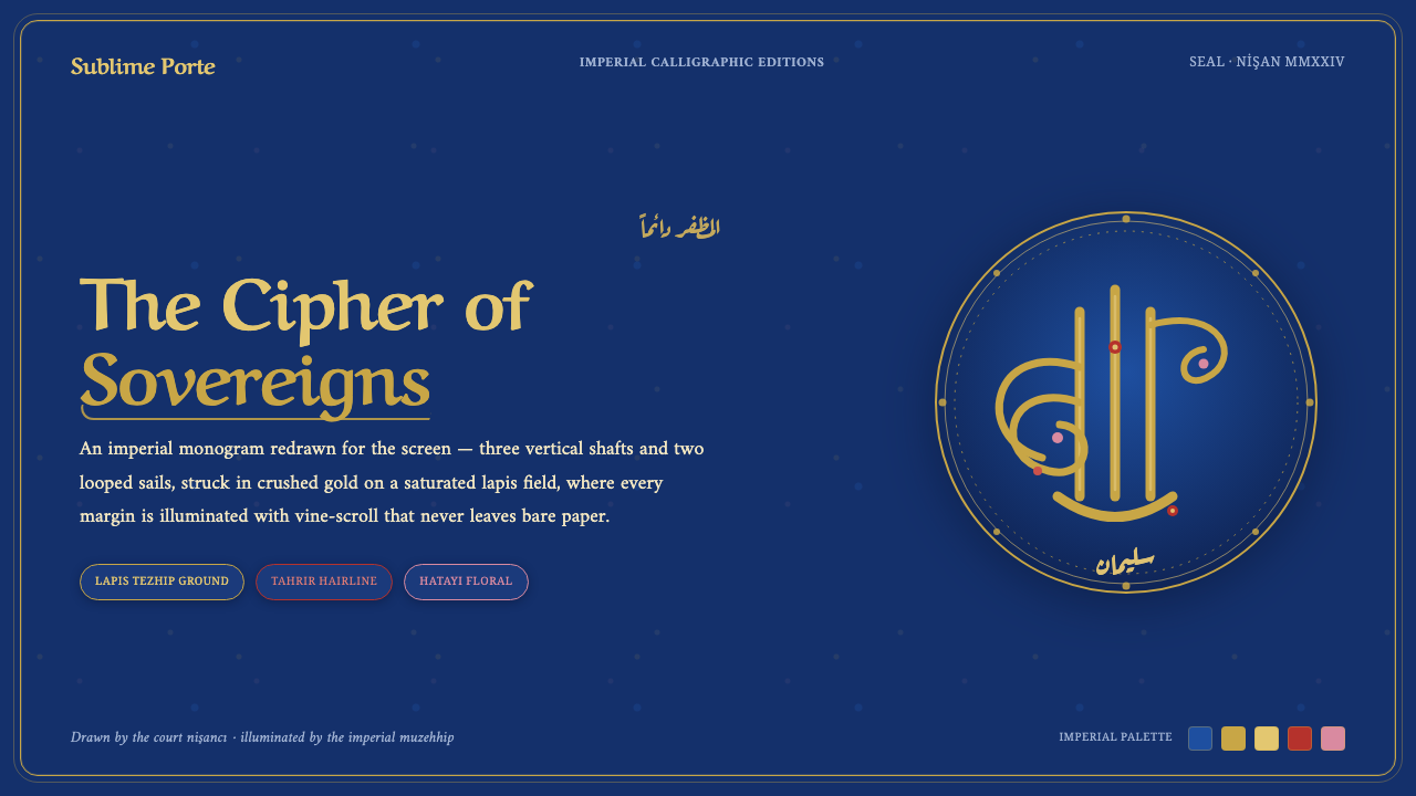
Ottoman Tughra Seal turns the screen into an illuminated imperial document: a deep lapis field, crushed gold ornament, and calligraphic authority with no unclaimed surface.
Ottoman Tughra Seal in brief
Ottoman Tughra Seal is a digital design language distilled from the Ottoman sultanic tughra: the imperial calligraphic monogram used as a state seal. Its central visual idea is not a logo placed on a neutral canvas, but an entire surface treated as a ceremonial field. The tughra itself is a sweeping cipher built around three upright shafts and looped, sail-like movements. In this style, that sense of concentrated authority becomes a system for framing titles, navigation, panels, and decorative boundaries.
The style begins with a saturated deep-lapis ground rather than bare paper. Across it runs a dense illuminated vocabulary: crushed-gold vine scrolls, fine floral accents in red and pink, blue-and-gold stems, blossoms, and cloud bands. Gold does not behave like a casual accent color. It acts as an outlining, binding, and ceremonial material, giving the interface the feeling of letters and ornament that have been carefully worked into a single official artifact.
Arabic-script calligraphy provides the style’s rhythm and dignity. The intended reference is Ottoman Naskh-thuluth calligraphy together with the fine tahrir-like outlining associated with illuminated tughras. Whether a digital composition uses Arabic content, transliteration, or Latin-language supporting text, it should preserve calligraphic qualities of sweep, contrast, enclosure, and measured repetition. The result is not minimal or neutral. It is deliberately saturated, formal, and continuously inhabited by meaning.
Where does Ottoman Tughra Seal come from?
The origin of this visual language lies in the classical Ottoman period and in Istanbul, where the sultanic tughra functioned as an imperial calligraphic cipher. A tughra gathered sovereign identity into a distinctive drawn form rather than a conventional written signature. Its three vertical shafts and looping sails made authority visible through movement, balance, and disciplined line. The seal was therefore both an identifier and an image of rule: compact enough to belong to an official document, yet elaborate enough to command the entire page around it.
Sultan Suleiman the Magnificent is the key historical reference supplied by this theme. His tughra demonstrates the close relationship between calligraphy and illumination. Gold letters, outlined in tahrir, enclose spiraling blue-and-gold scrolls made of stems, blossoms, and cloud bands. The important lesson is that writing and ornament are not separate layers subsequently combined for decoration. The calligraphic cipher creates the governing enclosure, while illumination fills and activates the spaces generated by its strokes.
This work depended on distinct courtly practices. The court nişancı, or cipher calligrapher, shaped the tughra as an official monogram. The muzehhip, or imperial illuminator, developed the surrounding and enclosed ornament through Ottoman illumination known as tezhip. Naskh-thuluth calligraphy supplied a written tradition capable of combining legibility, vertical authority, and flowing breadth. Together, these practices made the seal read as a fully authored state artifact rather than as text with a decorative border.
For digital use, the historical source should be understood as a visual principle rather than a prompt to simulate an antique manuscript literally. Its lasting contribution is the conviction that a high-status communication can make every surface intentional. Deep lapis establishes a ceremonial ground; gold articulation preserves hierarchy; florals and scrollwork carry continuity across open areas; and calligraphic motion turns identity into structure. The style is strongest when these parts remain inseparable, as they are in an illuminated tughra.
What defines the Ottoman Tughra Seal look?
Illuminated Ground
The defining rule is the rejection of bare paper. A deep-lapis field should feel inhabited from edge to edge by tonal movement, fine ornament, framing devices, or calligraphic presence. Dense does not mean indiscriminate: the ground remains a coherent field that supports the seal-like composition above it. Empty space is permitted only when it reads as a deliberate pause inside an illuminated system, never as an unfinished default.
Lapis and Gold
Deep lapis is the principal atmosphere, while gold performs the structural work. Gold may trace letterforms, define borders, gather scrolling stems, and pull focal elements forward from the blue field. Its visual character should be granular, precious, and hand-worked rather than smooth, metallic, or glossy. The contrast is ceremonial: lapis provides depth and gravity; gold gives the surface a sense of inscription and official finish.
Tughra Motion
Composition borrows its energy from the tughra’s upright shafts and looping sails. Strong vertical gestures establish command, while curved returns, enclosed loops, and sweeping diagonals prevent the layout from becoming rigid. A central emblem, headline treatment, or ornamental frame can echo this motion without attempting to counterfeit a historic seal. The essential quality is controlled expansion: line rises, turns, gathers, and returns to a stable center.
Vine Scroll and Floral Detail
Spiraling stems, blossoms, cloud bands, and small red or pink florals supply continuity between major elements. They should travel through margins, corners, enclosures, and quiet zones as a connected ornamental ecology, not as isolated stickers. Fine detail carries richness at close view, while its larger purpose is compositional: it joins gold, blue, and calligraphy into one uninterrupted fabric.
Calligraphic Hierarchy
Typography should carry the poise of Ottoman Naskh-thuluth calligraphy: dignified verticality, ample sweep, and carefully judged contrast between principal inscription and supporting information. Arabic-script calligraphy is the primary cultural reference, but supporting text must still feel subordinate to the main gesture rather than competing with it. Titles belong to the ceremonial center; labels, captions, and controls should behave like annotations attached to a precious document.
Ceremonial Density
This is a maximal surface language, but it needs hierarchy to remain legible. The eye should first encounter the seal or principal message, then gold articulation, then the slower discovery of floral and scrolling detail. Borders, panels, dividers, and decorative fields should feel commissioned for a single ceremonial whole. The aim is lavish concentration, not visual noise: every embellishment must reinforce status, enclosure, or direction.
Who shaped Ottoman Tughra Seal?
Suleiman the Magnificent is the central historical reference for this theme because his tughra exemplifies the illuminated imperial seal. Its gold letters, fine outlining, and blue-and-gold scrollwork show how sovereign identity, calligraphy, and ornament can occupy a single coherent field. For contemporary designers, the lesson is not to reproduce the seal as a logo, but to preserve its union of authority and intricate surface treatment.
The court nişancı represents the cipher calligrapher responsible for shaping the official tughra. This role matters because it locates the seal in disciplined authorship rather than spontaneous ornament. The nişancı’s contribution suggests that the leading visual gesture must remain exact, recognizable, and structurally decisive even when the surrounding surface is rich with illumination.
The muzehhip, or imperial illuminator, represents the practice of tezhip that gives the tughra its gold-lined vines, blossoms, and decorative continuity. Their work prevents illumination from becoming a secondary afterthought. In this style, ornament is a designed environment for the cipher: it frames authority, fills its intervals, and makes the document’s value visible before a word is read.
How do you use Ottoman Tughra Seal today?
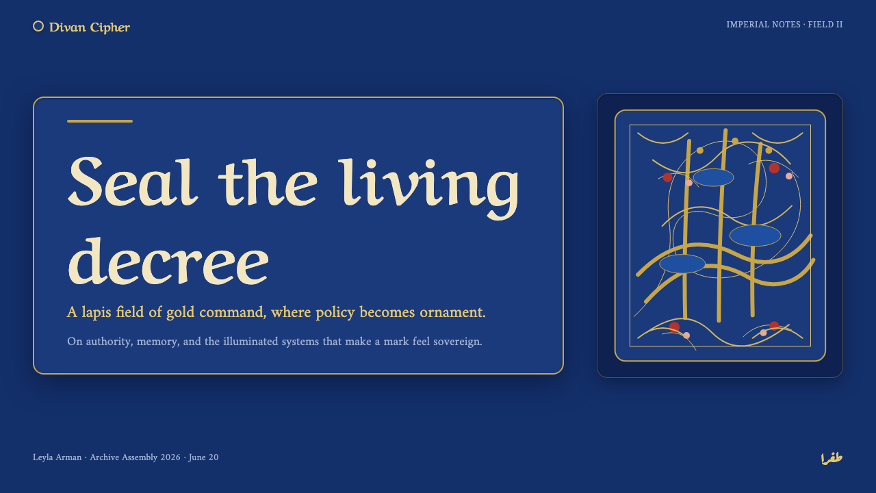
For presentation slides, use the style most assertively on the cover. Let a seal-like central gesture, calligraphic title treatment, or gold-framed inscription command the lapis field, while vine-scroll detail moves through corners and edges. The cover should feel issued rather than merely designed. On content slides, reduce the ornamental density enough for reading, but retain the illuminated ground through restrained borders, gold separators, and a continuing floral thread that connects headings with supporting material.
Data slides require a more disciplined translation. Treat charts, figures, and categories as material placed within a ceremonial document rather than as generic dashboard components. Gold outlining can establish primary structure, deep blue can hold the field, and fine floral marks can identify secondary groupings without crowding the data. Preserve a calm reading path from headline to key finding to evidence. If the chart loses legibility under ornament, the hierarchy has failed and the ornament must recede.
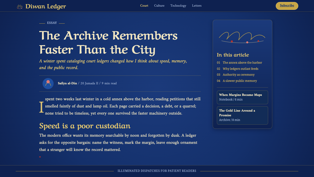
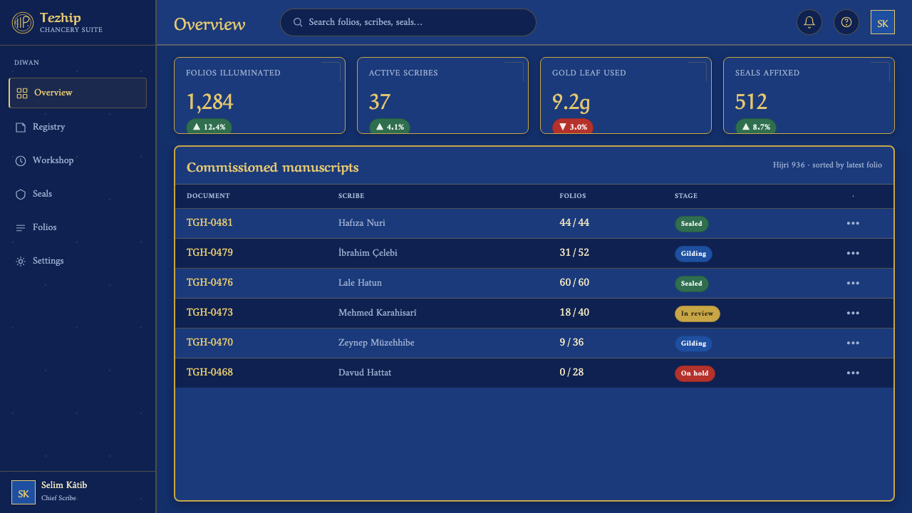
For web interfaces, the style is especially effective for dashboards, archives, cultural platforms, prestige memberships, and pricing pages that benefit from formality and perceived value. Use the deep-lapis ground as the continuous world of the interface, with panel edges, dividers, active states, and key actions articulated in gold. Navigation should feel inscribed into the surface, not detached as a contemporary utility bar. Repeated vine-scroll motifs can mark section changes and establish continuity across long pages.
In editorial and marketing work, Ottoman Tughra Seal can turn an announcement, collection page, campaign, or long-form feature into an immersive ceremonial object. Build clear zones for the principal message, explanatory copy, imagery, and calls to action, then use ornament to stitch those zones together. The florals are particularly useful in margins and transitions, where they can soften a change in content without weakening the overall authority. The effect should suggest an illuminated document unfolding, not a collage of historical motifs.
The common mistake is to confuse maximal decoration with authenticity. Filling every interval with unrelated gold marks, overusing florals, or placing calligraphy as a generic exotic flourish destroys the disciplined relationship between cipher, illumination, and ground. Another mistake is to introduce large neutral areas that sever the ceremonial field. Begin with one governing seal-like gesture, establish lapis and gold as the structural relationship, then let scrollwork and floral detail serve that order. Density must feel authored, not accumulated.
Ottoman Tughra Seal — FAQ
Is Ottoman Tughra Seal simply an Arabic-calligraphy style?
No. Arabic-script calligraphy is essential to its rhythm and authority, but the style is specifically organized around the Ottoman sultanic tughra as an illuminated imperial cipher. Its identity comes from the union of upright shafts, looping movement, deep lapis ground, gold outlining, tezhip scrollwork, and floral detail. Using calligraphic text alone without this relationship produces a different visual language.
Why should the background avoid looking blank?
The source image is an illuminated state seal, not an isolated mark on paper. The deep-lapis field and its ornament establish the ceremonial environment in which the tughra has force. A large untreated neutral area weakens that premise by separating the cipher from the visual world that authorizes and enriches it. The background can breathe, but it should still belong to the illuminated whole.
Can the style work for data-heavy dashboards?
Yes, provided ceremonial density does not outrank comprehension. Use illumination to establish the larger frame, hierarchy, and section transitions, then let data remain the clearest element in its local area. Gold lines and lapis panels can make a dashboard feel coherent and valuable, while floral detail should stay in margins, borders, and secondary identifiers. The interface succeeds when the user can read the evidence before noticing the ornament.
How should non-Arabic text be used?
Non-Arabic text can carry practical information, but it should respect the hierarchy established by the calligraphic reference. Reserve the most ceremonial treatment for the central identity or title, and make supporting copy quieter, orderly, and clearly attached to that central gesture. Do not imitate sacred or official calligraphy carelessly; use the style’s principles of sweep, enclosure, and measured hierarchy rather than pretending ordinary text is a historic tughra.
What makes ornament feel ceremonial rather than excessive?
Ceremonial ornament has a job. In this style, vine-scroll frames an inscription, gold tahrir-like lines clarify its edge, florals carry continuity through an interval, and cloud bands extend a controlled direction of movement. Excess begins when detail no longer supports the cipher, hierarchy, or ground. Ask whether each decorative passage encloses, connects, or dignifies something essential. If it does none of these, it is likely noise.
Related design styles
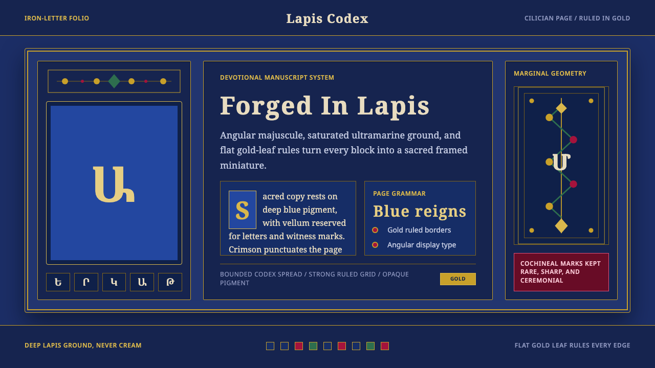 Armenian ErkatʿagirDevotional lapis reigns. Gold rules and angular serif glyphs frame a sacred g…
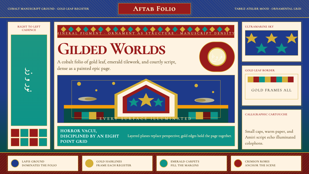 Persian Miniature (Shahnameh era)Manuscript luxury turns maximal. Cobalt ground, gold borders, and Cormorant S…
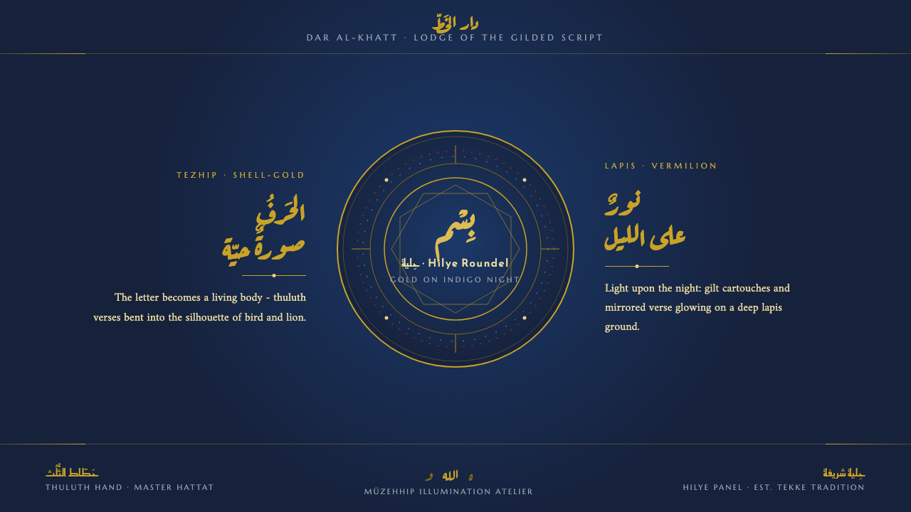 Sufi Zoomorphic CalligraphySacred script made flesh. Shell-gold thuluth on indigo-night grounds, framed…
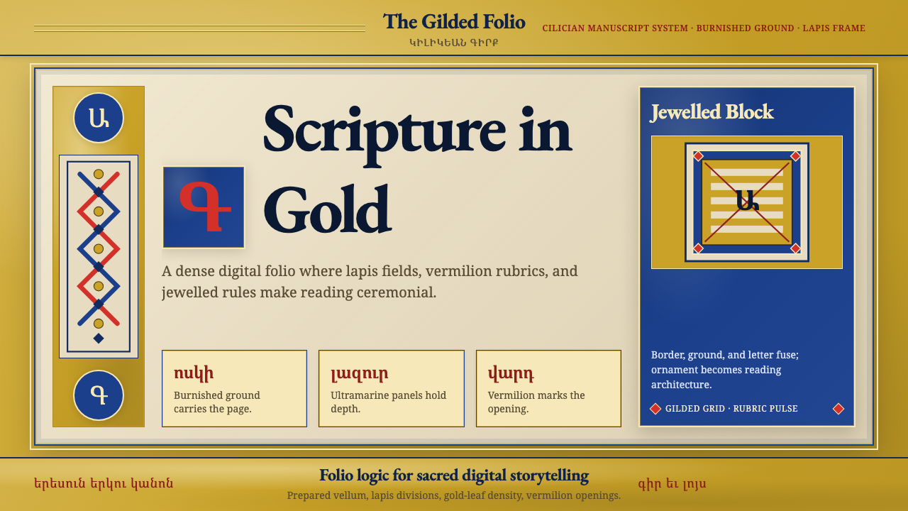 Armenian Illuminated ManuscriptGilded maximalism. Burnished gold, lapis frames, and vermilion initials build…
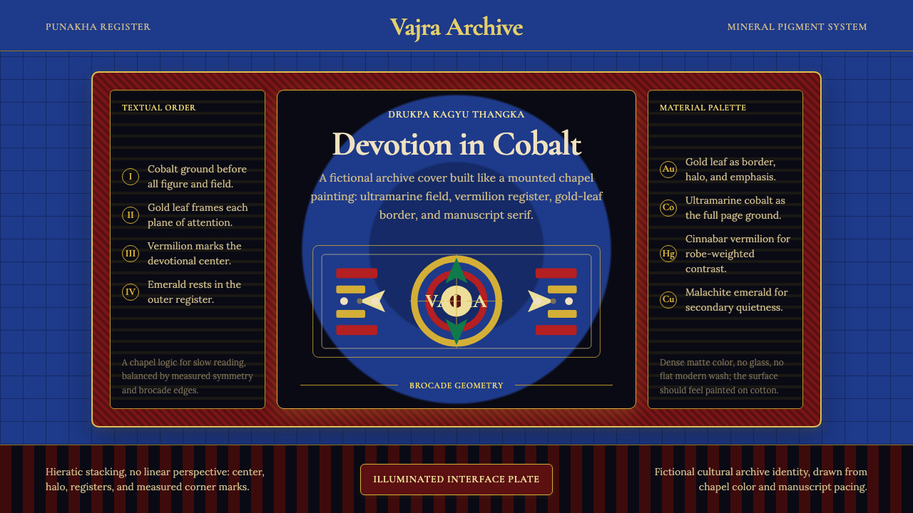 Bhutanese Drukpa Kagyu ThangkaDevotion made cobalt. Gold frames, Cormorant serif, and vermilion marks hold…
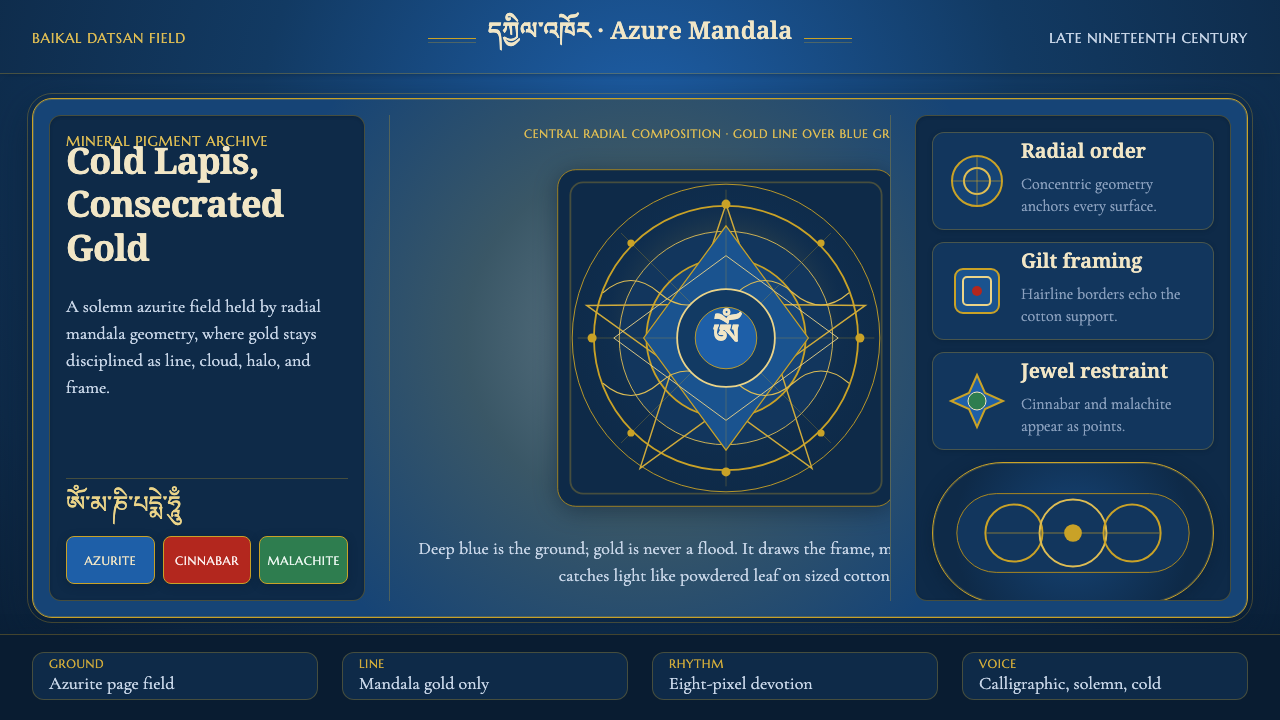 Buryat Buddhist Datsan ThangkaCold lapis holds silence. Gold mandala lines frame a solemn azurite field.