What is Sufi Zoomorphic Calligraphy?
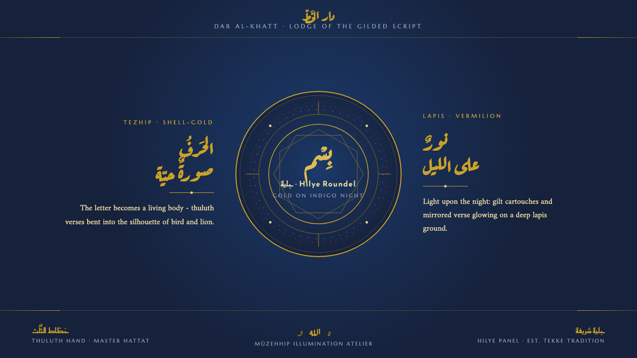
Here, sacred Arabic script is not placed beside an image but made into one: shell-gold thuluth becomes bird, lion, and horse against an indigo night.
Sufi Zoomorphic Calligraphy in brief
Sufi zoomorphic calligraphy is a mystical art in which sacred Arabic script is shaped into living forms. Verses written in thuluth, a flowing and architecturally powerful script tradition, bend into the bodies of birds, lions, and horses. The image is therefore not an illustration carrying text; the text itself becomes the anatomy of the image.
The practice belongs to the devotional world of tekke lodges and hilye panels, where calligraphic discipline meets tezhip illumination. Its digital translation keeps that devotional luminosity intact: shell-gold lettering and gilt ornament glow against deep indigo and lapis grounds. The field is always nocturnal and saturated, never paper-white or cream.
The resulting visual language is ceremonial rather than casual. Illuminated cartouches, leaf-and-vine borders, gilt roundels, and mirrored compositions create a sense of concentration and inward stillness. Gold is not a decorative accent scattered across a neutral interface; it is the material through which sacred form becomes visible.
Where does Sufi Zoomorphic Calligraphy come from?
The tradition belongs to the Ottoman and Persian classical periods before 1900, within the wider Islamic world of Ottoman Turkey, Persia, and neighboring cultural regions. It grew from a visual culture in which writing was not merely a carrier of information but a disciplined art with spiritual weight. The script had to remain recognizable, measured, and beautiful even when it was asked to describe a creature rather than a line of ordinary text.
Its calligraphic foundation draws on established thuluth and kufic traditions, alongside Persian naskh practice. Ottoman hattat masters of thuluth supplied the authority of the flowing monumental script, while Persian naskh calligraphers represent a parallel commitment to proportion, legibility, and controlled rhythm. In zoomorphic work, this discipline becomes especially demanding because every curve must serve both the letter and the larger silhouette.
The imagery was completed through Ottoman tezhip illumination. Ottoman müzehhip illuminators brought gilt borders, leaf-and-vine ornament, illuminated cartouches, and concentrated fields of color into dialogue with the script. Hilye devotional panels provided a particularly important setting: a framed surface in which sacred text, ornament, and visual order could be contemplated together rather than consumed as ordinary decoration.
The tradition also belongs to the living dervish-lodge world associated with Bektashi dervish orders. Tekke spaces gave the work a devotional setting, while the panel format encouraged frontal, centered, and meditative compositions. The digital design system carries these conditions forward by treating the screen as a dark illuminated panel: a field for sacred form, bordered ornament, and quiet attention.
What defines the Sufi Zoomorphic Calligraphy look?
Night Ground and Shell Gold
The palette begins with deep indigo, lapis, and night-blue grounds rather than light paper. Shell-gold script provides the principal light, while vermilion and azure may appear as restrained glints within the illumination. The contrast is solemn and mineral, closer to a gilded devotional panel than a bright decorative interface. Gold should feel embedded in the darkness, not pasted on top of it.
Script as Body
Typography is treated as an image-making discipline. Thuluth letterforms stretch, curl, and gather into anatomical contours, so stroke rhythm matters as much as verbal meaning. Headings can feel ceremonial and sculptural, while supporting text remains quieter and more controlled. The essential rule is that lettering must retain dignity and coherence even when it participates in a figurative silhouette.
Zoomorphic Transformation
Birds, lions, and horses are not inserted as separate illustrations. Their bodies are assembled from sacred script, with the creature emerging through the arrangement of letters and curves. This creates a productive tension between reading and seeing: the viewer first encounters a recognizable form, then discovers that its structure is language. The effect is mystical because image and text remain inseparable.
Tezhip Illumination
Illumination supplies the surrounding world of the script: gilt leaf-and-vine borders, radiant cartouches, and controlled color fields that make the central form feel preserved and honored. Ornament should be intricate but never noisy. Its role is to lead the eye inward, establish a devotional frame, and make the gold lettering appear as the culmination of a larger ceremonial surface.
Mirrored Order
Compositions rely on frontal balance and mirrored relationships rather than casual asymmetry. Roundels, borders, and central calligraphic forms create a visual axis that supports contemplation. This symmetry is not mechanical repetition; it is a way of giving the panel stillness. Even when the zoomorphic figure is expressive, the surrounding structure should feel held, deliberate, and inwardly centered.
Devotional Framing
The panel is understood as a complete field, not an unbounded collection of components. A frame, cartouche, or roundel marks a threshold between ordinary viewing and sacred attention. Digital surfaces should therefore feel enclosed and composed, with ornament gathering around meaning rather than competing with it. The design language is strongest when every boundary seems to protect the central text.
Material Contrast and Restraint
The visual richness comes from the contrast between a quiet night field and a concentrated metallic light. It does not depend on visual clutter, simulated paper texture, or a collection of unrelated ornamental effects. Indigo gives the eye rest; gold gives it direction; illuminated color marks the sacred center. Restraint is what allows the surface to feel luxurious without becoming theatrical.
Who shaped Sufi Zoomorphic Calligraphy?
These Ottoman calligraphic masters represent the disciplined foundation of the style. Their thuluth practice supplies the flowing, monumental script that can be extended into animal contours while retaining visual authority. In this design system, their legacy appears whenever lettering is treated as a sacred structure rather than ordinary interface copy.
Persian naskh calligraphers embody the parallel values of proportion, rhythm, and controlled legibility within the wider Islamic script tradition. Their place in the source tradition reminds designers that mystical expression still depends on technical command. Even the most figurative composition must be built from letters that remain internally coherent.
Ottoman müzehhip illuminators represent the art of surrounding sacred writing with gilt ornament and composed color. Their work gives the panel its ceremonial enclosure: leaf-and-vine borders, cartouches, and illuminated fields that make the central script feel protected, radiant, and complete.
Bektashi dervish orders locate the tradition within the living devotional culture of the tekke. They stand for the spiritual and communal setting in which calligraphy, panel making, and contemplation belong together. Their presence keeps the style from becoming a purely exotic surface: its darkness, symmetry, and gold are tied to attention and devotion.
How do you use Sufi Zoomorphic Calligraphy today?
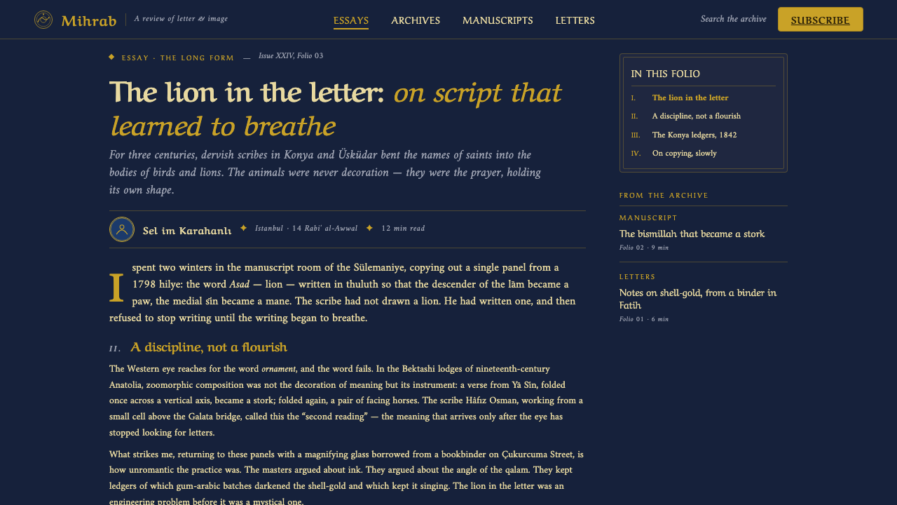
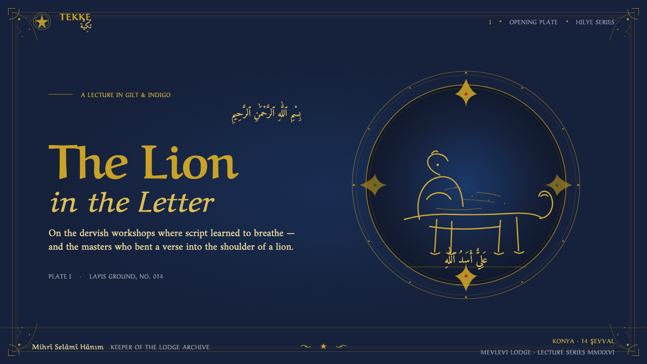
For presentation slides, use the opening slide as a devotional panel: a deep indigo ground, a restrained shell-gold title, and a central roundel or zoomorphic silhouette that establishes the subject before any explanation begins. Content slides should preserve the same framed discipline. Let illuminated cartouches introduce sections, keep text blocks quiet, and use gold rules or small gilt markers to guide movement through the argument. Data slides can treat diagrams as illuminated emblems: centered, enclosed, and carefully separated from the decorative border so information remains legible.
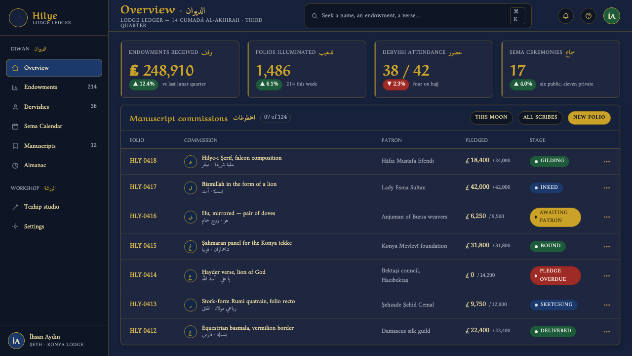
For web interfaces, the style suits dashboards and pricing pages that want to feel specialized, ceremonial, or deeply considered. A dashboard can use night-blue surfaces as quiet chambers, shell-gold for active states and primary figures, and lapis or vermilion for restrained distinctions. Pricing tiers should feel like related panels within one devotional system rather than competing sales cards. Borders, roundels, and cartouches can establish hierarchy, but the central action must remain clear and accessible.
For editorial and marketing work, Sufi zoomorphic calligraphy creates a strong sense of cultural depth and occasion. Feature articles can open with a dark framed field, a large calligraphic image, and a short introduction set with generous breathing room. Section transitions may use illuminated bands or gilt ornament instead of generic dividers. Marketing pages benefit from the style when the product has a craft, ritual, heritage, or premium character; the palette can make a launch feel like an unveiling rather than a routine announcement.
The common mistake is to treat the style as an exotic ornament kit: add dark blue, scatter gold lines, place a random animal beside ordinary text, and call the result mystical. That breaks the central idea. The script must participate in the form, the ornament must frame meaning, and the dark field must create concentration. Avoid mixing bright contemporary colors, casual asymmetry, unrelated icons, or excessive decorative borders. If every element demands attention, the work loses the stillness that gives the style its authority.
Sufi Zoomorphic Calligraphy — FAQ
Is Sufi zoomorphic calligraphy simply Arabic calligraphy placed next to animal imagery?
No. Its defining gesture is transformation: the sacred script itself becomes the body of the bird, lion, or horse. A separate illustration beside ordinary lettering may borrow the atmosphere, but it does not reproduce the central relationship between language and form. The letters must remain structurally active inside the silhouette.
Can this style use a light or cream background?
The design system is built around deep indigo, lapis, and night-blue grounds, with shell gold as the principal light. A pale ground would change the mood and weaken the sense of illuminated darkness that defines the style. If a lighter treatment is necessary, it should remain subordinate to the nocturnal identity rather than becoming a paper-like reinterpretation.
How can the design remain readable when the script becomes an animal?
Treat the zoomorphic form as a focal emblem and keep explanatory text separate, calm, and carefully ordered. The figurative script can invite recognition and contemplation, while supporting typography carries direct information. Do not force every heading or paragraph into a creature. Selective transformation preserves both the mystical image and the practical clarity of the surrounding experience.
Does the style suit every kind of product?
It is best suited to work that values ceremony, heritage, craft, spirituality, or premium concentration. It can make a cultural archive, specialist publication, ritual object, or considered launch feel distinctive. It is less suitable for products that depend on cheerful informality, playful abundance, or extremely fast utility. The style asks users to pause, so the product should have a reason for asking them to do so.
How can gold feel devotional rather than merely luxurious?
Gold needs a structural and ceremonial role. Use it to reveal the central script, establish a frame, mark a sacred focal point, or guide the eye through an ordered composition. If gold is spread equally across every surface, it becomes generic luxury. Against a quiet indigo field, concentrated gold has direction and meaning; restraint turns brightness into reverence.
Related design styles
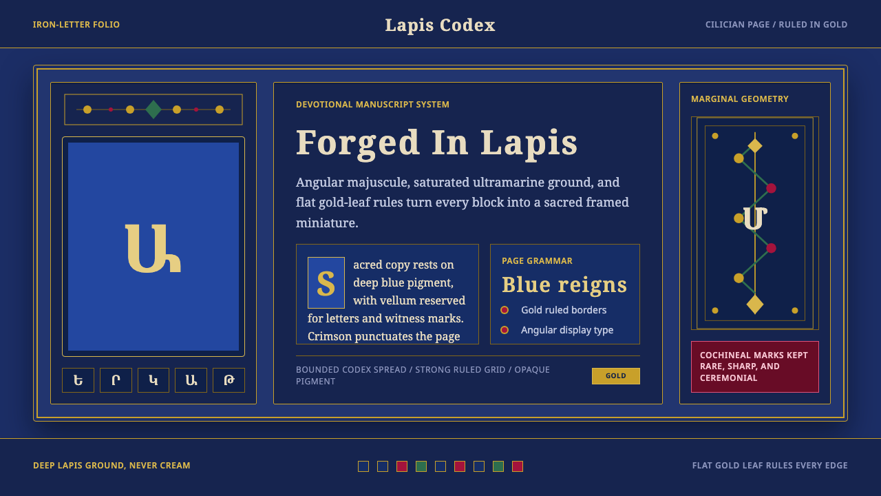 Armenian ErkatʿagirDevotional lapis reigns. Gold rules and angular serif glyphs frame a sacred g…
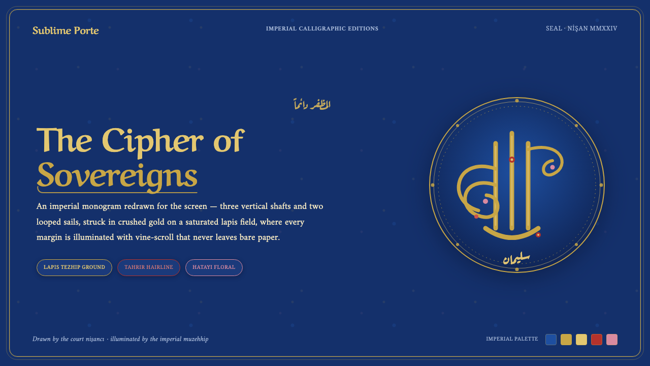 Ottoman Tughra SealEvery surface is a state seal. Gold tughra cipher on lapis, Aref Ruqaa script…
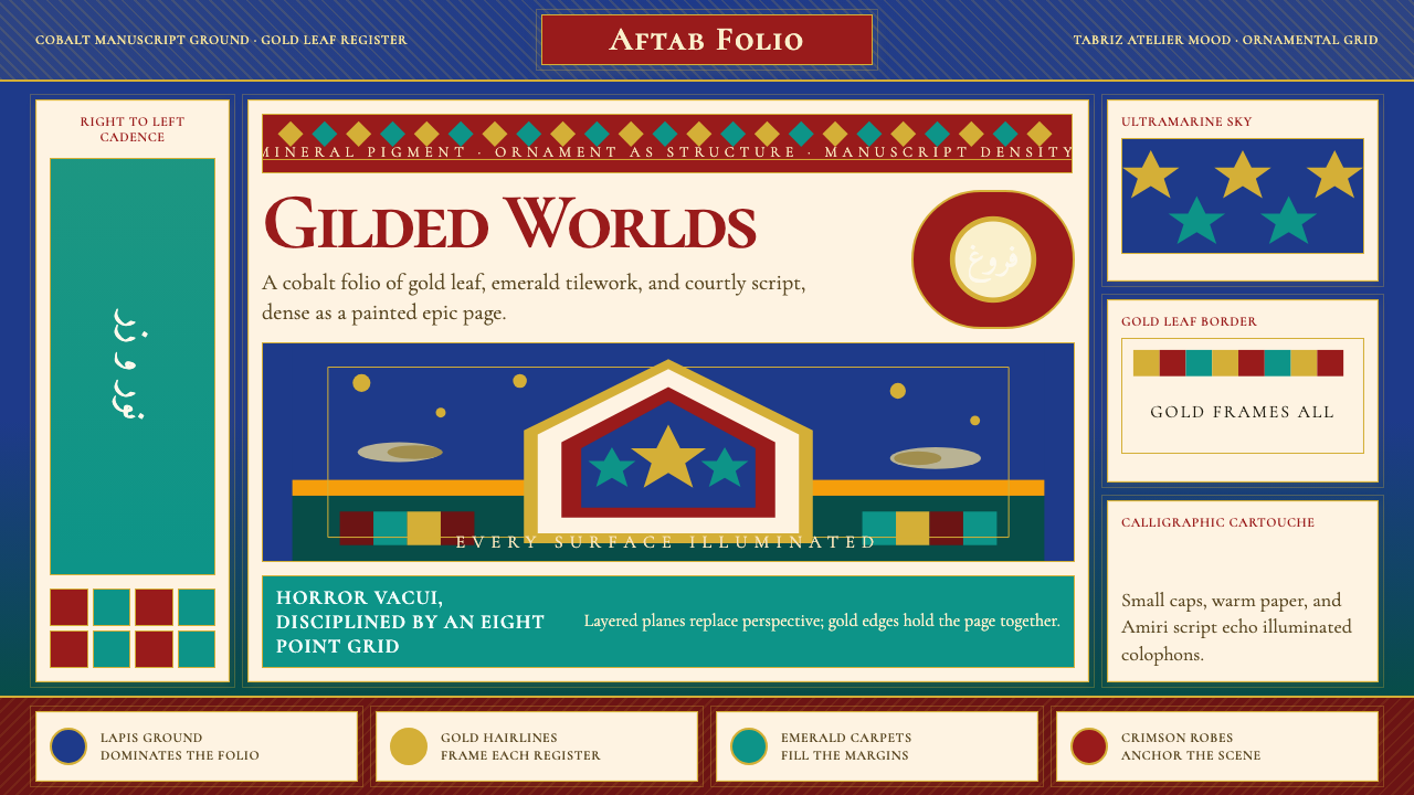 Persian Miniature (Shahnameh era)Manuscript luxury turns maximal. Cobalt ground, gold borders, and Cormorant S…
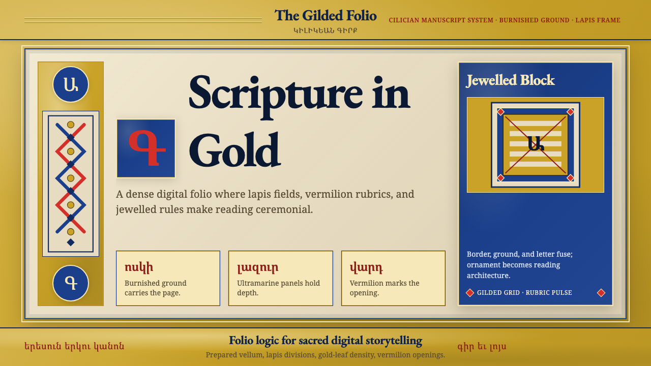 Armenian Illuminated ManuscriptGilded maximalism. Burnished gold, lapis frames, and vermilion initials build…
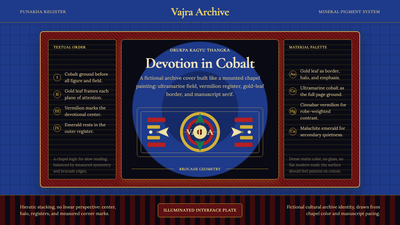 Bhutanese Drukpa Kagyu ThangkaDevotion made cobalt. Gold frames, Cormorant serif, and vermilion marks hold…
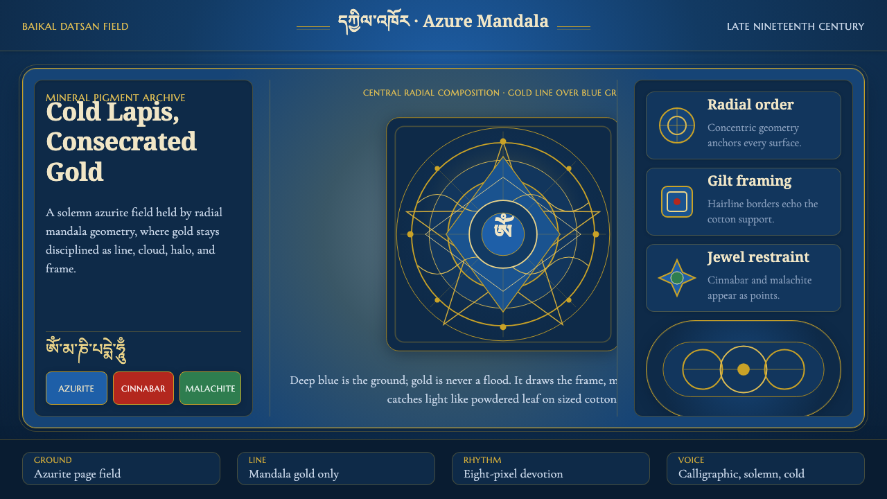 Buryat Buddhist Datsan ThangkaCold lapis holds silence. Gold mandala lines frame a solemn azurite field.