What is Kandy Esala Perahera?
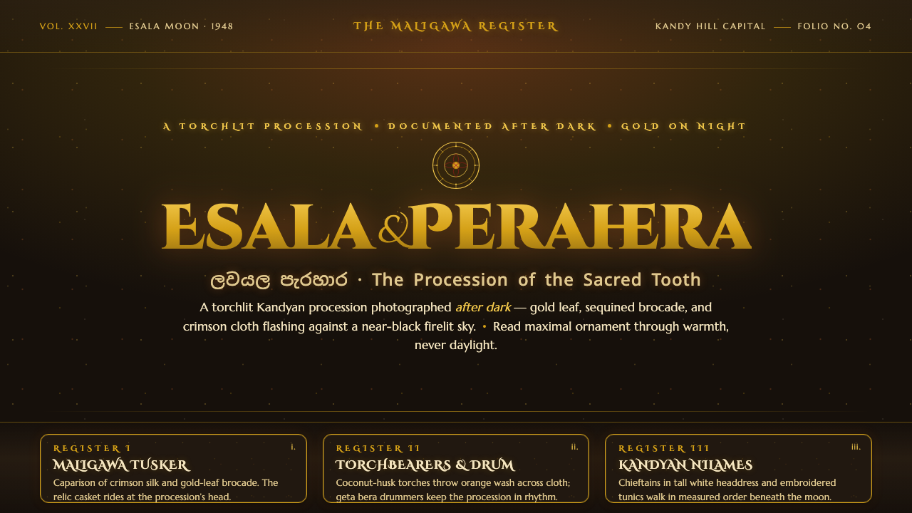
Kandy Esala Perahera turns darkness into a stage — torchlight, gold, crimson brocade, and ceremonial movement gathered against a warm near-black night.
Kandy Esala Perahera in brief
Kandy Esala Perahera is a torchlit Buddhist procession that winds through Kandy at night, led by the Maligawa Tusker beneath a gold-and-crimson sequined caparison. Fire-dancers, whip-crackers, Kandyan chieftains, and drummers move through a field of warm flame-glow. As a design language, it is not a daytime festival poster but a procession photograph: darkness carries the composition, while every illuminated detail becomes an event.
The visual system depends on contrast between a warm near-black ground and concentrated flashes of gold, fire-orange, and deep crimson. Gold appears as leaf, fleck, thread, and sequined reflection rather than as a broad metallic surface. Crimson belongs to cloth and brocade, giving the composition ceremonial weight. Orange belongs to flame, creating the sense that the page is lit from within by moving torches.
Its richness is deliberately active. Surfaces should feel layered, woven, embroidered, and caught in motion, while the surrounding darkness gives each bright fragment room to register. The result is opulent without becoming evenly decorative: the eye travels from flame to fabric, from drum to tusker, from figure to glint. Kandy Esala Perahera is defined by procession, not stillness; by luminous interruption, not uniform brightness.
Where does Kandy Esala Perahera come from?
The style is rooted in Kandy, Sri Lanka, at the Temple of the Sacred Tooth Relic, also known as Sri Dalada Maligawa. Its historical reference is the documented Kandyan procession pageantry of the period from 1900 to 1950. The visual character is therefore tied to a specific place and ceremonial setting: a Buddhist procession moving through city streets after dark, with the temple as its spiritual and visual point of reference.
Two traditions provide the underlying vocabulary: Sinhalese Buddhist temple pageantry and the Kandyan ceremonial procession tradition. Together they produce a language of ordered movement, formal dress, rhythmic sound, fire, and collective spectacle. The design should preserve that sense of a procession assembled from distinct roles rather than reduce it to a generic festival mood. Every element belongs to a larger ceremonial passage.
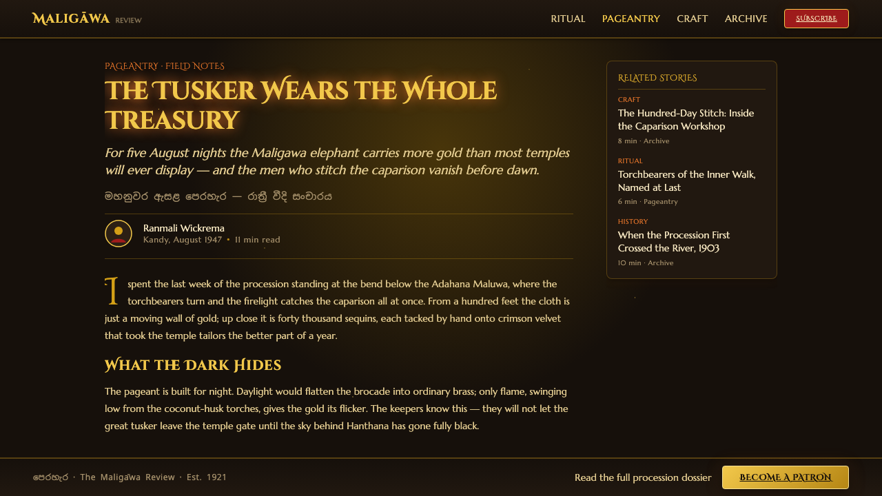
The Maligawa Tusker gives the composition its central emblem. The gold-and-crimson sequined caparison turns the animal into a moving field of textile, ornament, and reflected firelight. Around it, Kandyan chieftains, fire-dancers, whip-crackers, and drummers create changing bands of texture and rhythm. The style comes from their relationship: the central figure establishes gravity, while the surrounding performers create movement and visual punctuation.
Light is the defining historical and aesthetic condition. Torchlight does not illuminate everything evenly; it selects details and lets the rest recede. Gold catches the flame, crimson absorbs and returns it, and the near-black sky gathers the procession into a concentrated band of presence. This is why the design language feels photographic and nocturnal. Its drama depends on what remains hidden as much as on what is revealed.
What defines the Kandy Esala Perahera look?
Warm Near-Black Ground
The background is not a cold, empty black. It should feel like night air warmed by torchlight, deep enough to absorb detail but never sterile. This near-black field gives the procession its depth and makes gold, crimson, and flame-orange accents appear to glow. Large areas of darkness are structural, not leftover space: they create the night through which the ceremonial forms travel.
Gold as Fleck and Reflection
Gold should arrive in fragments: sequins, leaf-like flashes, embroidered threads, and small reflections caught by moving fire. It is a luminous accent rather than a flat metallic background. Concentrated gold gives the eye something to follow through the dark and suggests the caparison without turning every surface into ornament. Its power comes from interruption and scarcity.
Crimson Brocade
Crimson supplies the visual language of cloth, ceremony, and weight. It should feel dense and textile-rich, closer to brocade or folded ceremonial fabric than to a bright digital red. Against near-black, crimson becomes a zone of warmth and authority. Used in panels, bands, or fabric-like fields, it anchors the composition while allowing gold highlights to read as embroidery and reflected light.
Flame-Driven Illumination
Orange belongs to the flame and should behave like an active light source. It can pool around figures, cut across a dark field, or appear as a scattered series of torchlit marks. The glow must remain warm and localized. If orange spreads evenly across the page, the procession loses its nocturnal tension; if it appears only as a decorative accent, it loses the sense of fire illuminating real movement.
Ceremonial Movement
The composition should imply a route, not a collection of isolated objects. Figures, fabric, drums, flames, and bright marks should appear to pass through the frame in a measured sequence. Repetition can suggest rhythm, while staggered groupings create the impression of a procession advancing through darkness. The arrangement may be ornate, but it must still have direction and collective momentum.
Material Splendor
Kandy Esala Perahera depends on the contrast between tactile surfaces and surrounding darkness. Brocade, sequins, gold leaf, and ceremonial cloth should feel materially different from the matte night behind them. The effect is not a general preference for texture everywhere. It is a selective concentration of richness, so that a glint or fold carries more visual authority than a fully illuminated surface would.
Who shaped Kandy Esala Perahera?
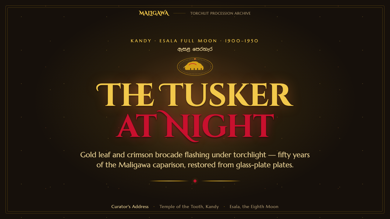
The Maligawa Tusker is the procession's central visual presence, wrapped in a gold-and-crimson sequined caparison. In the design system, it functions as a moving emblem of ceremonial gravity: large, richly surfaced, and most legible when framed by darkness. Gold should gather around its ornament while crimson gives the form a sense of textile depth.
Kandyan chieftains, or Nilames, represent formal authority within the procession. Their presence can be expressed through ordered silhouettes, ceremonial bands, and controlled spacing rather than portrait detail. They help establish the procession's hierarchy, giving the surrounding spectacle a composed center of order.
Kandyan fire-dancers bring the strongest sense of kinetic light. Their role is not merely to add orange accents but to connect flame to the movement of bodies. In layouts, scattered fire marks and directional groupings can carry their energy through the composition, making the page feel illuminated by action.
Kandyan drummers provide the procession's rhythmic structure. Their repeated forms, instruments, and clustered presence can be translated into visual cadence: recurring marks, bands, and intervals that guide the eye. They keep the style from becoming a static luxury treatment by giving its ornament a beat.
How do you use Kandy Esala Perahera today?
For presentation covers, treat the slide as a slice of night rather than a title card. Let the warm near-black field dominate, place the title in a restrained light tone, and use a concentrated gold or flame-orange cluster as the visual entry point. Content slides should preserve the same hierarchy: dark atmosphere, one ceremonial focal area, and crimson or gold used to mark the important material rather than decorate every edge.
Data slides can borrow the procession's rhythm without turning charts into ornament. Use near-black as the field, crimson as the main structural grouping, and gold or flame-orange for the values that deserve attention. Repeated bars, dots, or bands can echo drums and sequins, but the data must remain legible. The visual goal is a lit sequence moving across darkness, not a crowded festival of competing highlights.
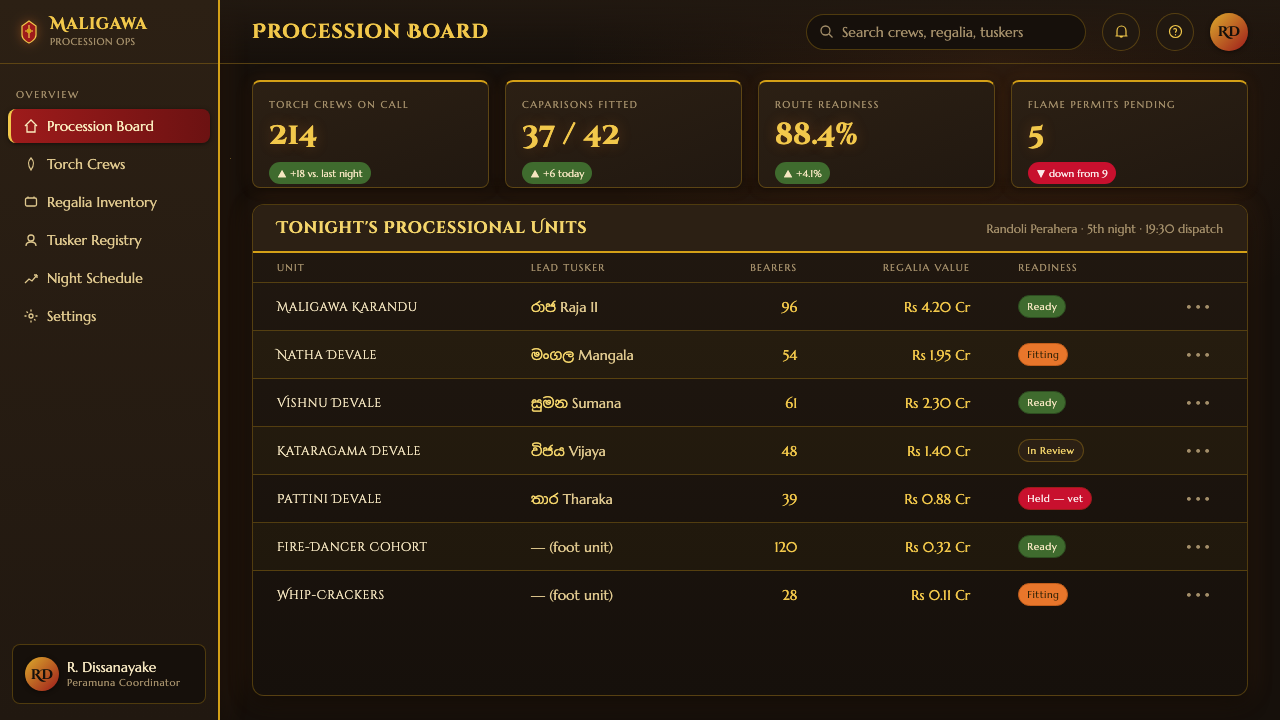
For web interfaces, the style suits dashboards, event platforms, cultural archives, and premium pricing pages that benefit from atmosphere and strong focus. Keep navigation and body text quiet against the warm dark ground. Use gold for selected states or key actions, crimson for grouped sections, and orange only where an action should feel illuminated. Cards should feel like framed patches of fabric or light, with clear edges and enough darkness around them to preserve depth.
Editorial and marketing work can use the style to create a sense of occasion. A feature page might open with a near-black field, a large ceremonial image, and a narrow band of crimson brocade carrying the section label. Campaign blocks can alternate between deep darkness and concentrated gold or flame accents, while pull quotes and metadata behave like small torchlit interruptions. The composition should feel assembled for a procession, with each section entering the reader's view in sequence.
The common mistake is treating the style as a generic luxury palette: black background, gold text, and crimson decoration everywhere. That produces a static premium look and loses the source language. Kandy Esala Perahera needs movement, selective illumination, and material contrast. Use darkness as active space, reserve gold for flashes, let crimson carry fabric and ceremony, and make orange behave like fire. Without those relationships, the colors remain fashionable but the procession disappears.
Kandy Esala Perahera — FAQ
Is Kandy Esala Perahera a dark luxury style?
It can appear luxurious, but luxury is not its organizing principle. The style is built around a torchlit procession: darkness, movement, ceremonial hierarchy, and flashes of material richness. Gold and crimson feel powerful because they emerge from the near-black field and participate in the sense of passage. If the same colors are spread evenly across a static composition, the result becomes generic luxury rather than Kandy Esala Perahera.
Can this style work on a light background?
A light variation is possible, but it changes the central experience. The source language depends on a warm near-black ground that allows fire, gold, and brocade to appear selectively. On a light background, those relationships become flatter and the sense of night recedes. If a lighter application is necessary, retain concentrated dark framing, deep crimson material cues, and small areas of flame-like warmth so the procession remains present.
How should gold be used without making the design feel decorative?
Use gold as a flash, reflection, thread, or sequined interruption. It should guide attention through the dark and suggest ceremonial material, not coat every surface. Pairing gold with near-black gives it luminosity; pairing it with crimson gives it textile and ritual weight. The less uniformly gold the composition is, the more each illuminated fragment can carry.
What kind of imagery belongs in a Kandy Esala Perahera layout?
Imagery should feel like a night procession caught in torchlight: ceremonial figures, moving flames, richly surfaced cloth, drums, and the decorated Maligawa Tusker. Cropping should preserve the impression of passage through darkness rather than present everything evenly. Avoid bright daylight scenes or isolated decorative objects with no relation to movement. The image should carry atmosphere, material, and collective ceremony together.
Does the style suit every kind of product or interface?
No. It is strongest where ceremony, cultural atmosphere, eventfulness, or premium focus are useful values, such as procession-related communications, cultural platforms, editorial features, and carefully staged commerce. It is less suitable for products that require a neutral, quiet, universally utilitarian mood. Its richness also demands discipline: without selective lighting and clear hierarchy, the design can quickly become heavy, theatrical, or difficult to scan.
Related design styles
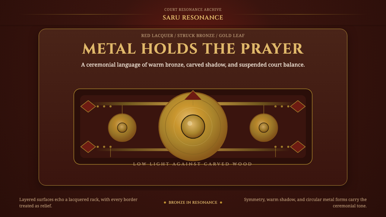 Gamelan BronzeCeremony in low light. Bronze circles glow inside red lacquer and gold-leaf f…
 Qawwali DevotionalSacred warmth glows. Emerald cloth, zari gold borders, and Nastaliq rhythm ho…
 Sikh Golden TempleReverent gold in dark water. Teal ground, Gurmukhi type, marble rules hold th…
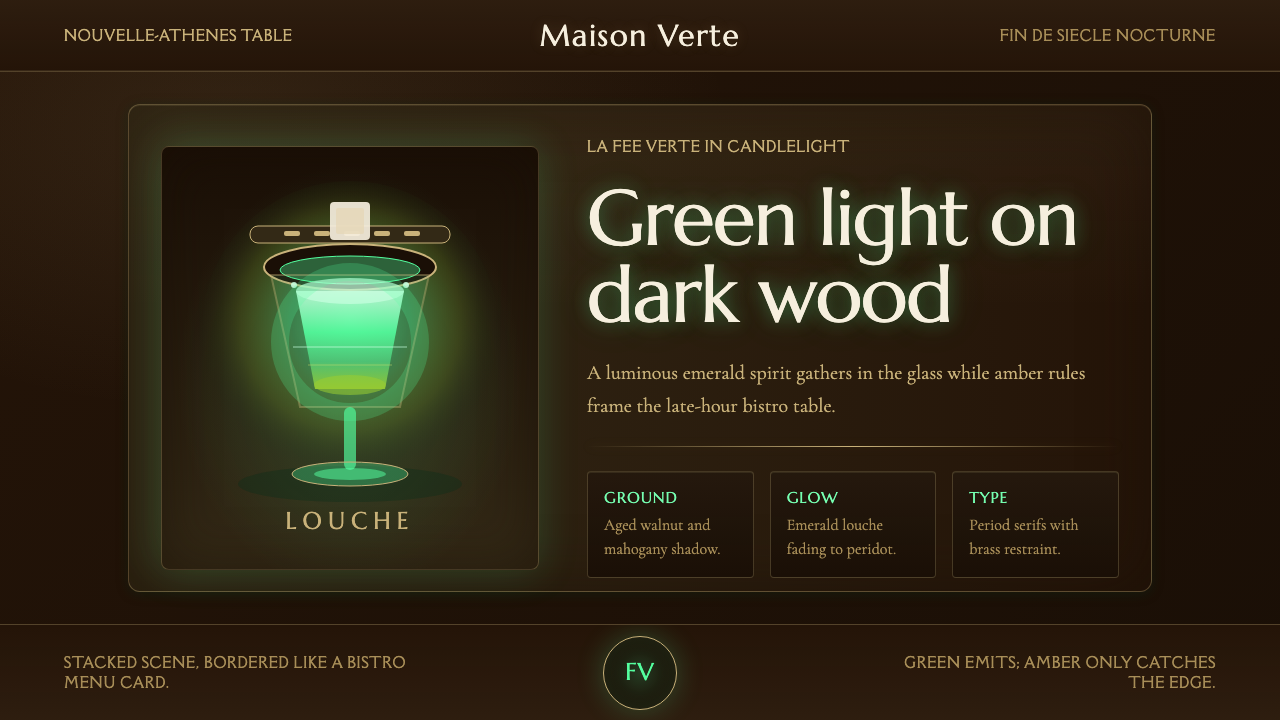 Absinthe Green Fairy GlowDarkness makes the fairy glow. Emerald louche on mahogany, framed by amber se…
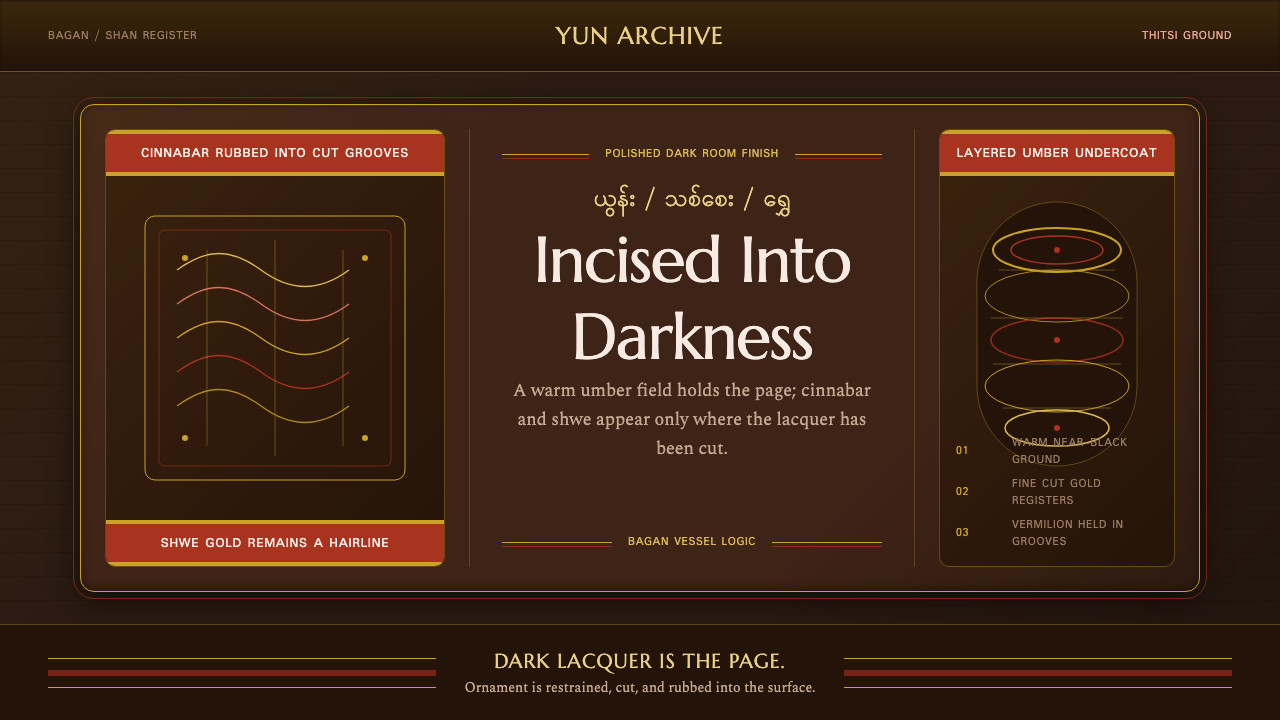 Burmese Shan Lacquer BrownDark lacquer leads. Cinnabar bands and shwe hairlines cut across a warm umber…
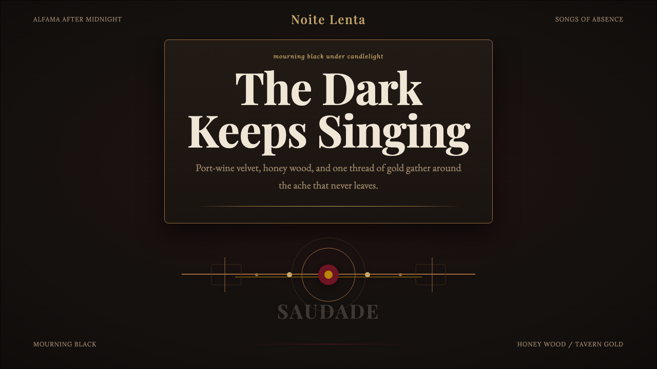 Fado SaudadeSaudade in shadow. Mourning black holds wine red, honey wood, and one gold li…