What is Qawwali Devotional?
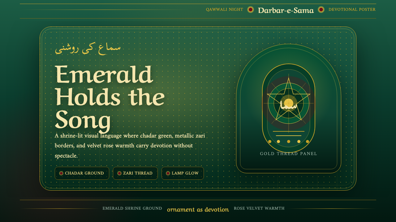
Qawwali Devotional carries the glow of a shrine chadar into the screen — emerald cloth, gold thread, and the ecstatic rhythm of Sufi devotional song rendered as a visual system.
Qawwali Devotional in brief
Qawwali Devotional takes its entire visual logic from a single recurring object: the chadar, the ceremonial cloth pilgrims drape over a Sufi saint's tomb. That cloth is almost always a deep, sacred green, embroidered with metallic gold zari thread, and scattered with rose petals left by devotees. The style treats this as a ground rather than a decoration — the deep shrine green is the base surface itself, not a tint applied over something neutral.
Against that green, two other tones do the emotional work: a warm metallic gold that catches lamplight the way real zari thread does, and a velvet rose-maroon that carries the warmth of devotion and ceremony without tipping into gaudiness. The palette is deliberately restrained to these three registers — sacred green, shrine gold, devotional maroon — because a shrine's visual authority comes from consistency and repetition, the same way a qawwali performance builds through repeated, intensifying refrain rather than variation.
The typographic and ornamental vocabulary reinforces the devotional context: Nastaliq and Arabic calligraphic letterforms, cusped multi-lobed arches borrowed from shrine architecture, arabesque vine borders, and soft halos suggestive of oil-lamp glow. The overall effect is meant to be read as an illuminated shrine panel — ornate, warm, and luxurious, but never cluttered, because every ornamental element traces back to an actual devotional object rather than being invented decoration.
Where does Qawwali Devotional come from?
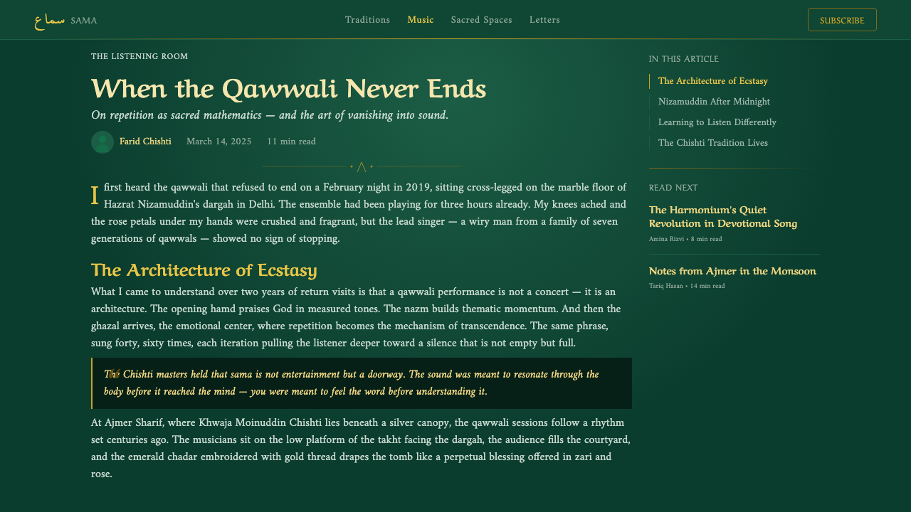
Qawwali is a devotional musical form rooted in the Chishti order of Sufism, one of the major mystical brotherhoods of South Asian Islam. Tradition credits the poet, musician, and courtier Amir Khusrau — active in the Delhi Sultanate in the thirteenth and fourteenth centuries — with fusing Persian, Arabic, Turkic, and local Indic musical elements into the form that became qawwali. Khusrau was also a devoted disciple of the Sufi saint Nizamuddin Auliya, and the shrine complex around Nizamuddin's tomb in Delhi remains one of the great living centers of qawwali performance to this day.
The music itself is performed at dargahs — shrine complexes built around the tombs of Sufi saints — most famously at the dargah of Khwaja Moinuddin Chishti in Ajmer, India, founder of the Chishti order in South Asia, and at the Nizamuddin dargah in Delhi. Qawwali sessions (mehfil-e-sama) are built around cyclical, intensifying repetition of devotional verse, often addressed to God, the Prophet, or a saint, with the goal of inducing a trance-like spiritual absorption (wajd) in both performers and listeners. The visual environment of these shrines — draped chadars, oil lamps, marble courtyards, calligraphic inscriptions — developed alongside the music as part of the same devotional culture.
In the twentieth century, the singer Nusrat Fateh Ali Khan became qawwali's most globally recognized voice, carrying a Punjabi qawwali lineage (his family's gharana had performed at shrines for generations) onto international concert stages from the 1980s through the 1990s. His collaborations with Western musicians introduced qawwali's soaring, layered vocal structure — call, response, and building intensity — to audiences who had never encountered a Sufi shrine, while never severing the music from its devotional origin.
The offering of green chadars embroidered with gold thread at Sufi tombs is itself a centuries-old ritual practice across the Indian subcontinent, particularly at the shrines of Nizamuddin Auliya and Moinuddin Chishti. Green carries deep symbolic weight in Islamic devotional contexts generally, and the specific combination of shrine green, gold zari embroidery, and scattered rose petals — often accompanied by incense and oil-lamp light — forms a recognizable visual signature of South Asian Sufi shrine culture that predates, and continues alongside, the qawwali performances held within these spaces.
What defines the Qawwali Devotional look?
Color
The palette is anchored entirely in shrine green as the deep base ground — never a bright or techy green, but the muted, weighted tone of aged ceremonial cloth. Metallic gold and a velvet rose-maroon act as the two accent registers, used the way real chadar embroidery uses gold thread against fabric: sparingly, along edges and borders, not as broad fills.
Typography
Nastaliq-inspired and Arabic calligraphic letterforms carry the devotional weight of the system, their flowing, cursive rhythm echoing the cadence of sung verse. Latin text, where present, is set to defer to this calligraphic hierarchy rather than compete with it, keeping the shrine-panel illusion intact.
Ornament
Cusped, multi-lobed arches drawn from shrine architecture and flowing arabesque vine borders provide the system's structural framing. These are never invented flourishes — each ornamental motif traces back to an actual element of dargah architecture or textile embroidery, which keeps the ornateness feeling authentic rather than decorative-for-its-own-sake.
Light
A soft, warm halo effect suggests the glow of oil lamps lighting a shrine interior at dusk. Light in this system is always warm and diffuse rather than sharp or cool — it is meant to evoke lamplight falling across draped cloth and metallic thread, not a stage spotlight.
Texture
Surfaces read as draped, folded cloth rather than flat digital planes — the sense of fabric weight and fold is carried through even where no literal textile image appears, giving every panel a soft, tactile quality rather than a hard graphic one.
Composition
Layouts favor a centered, symmetrical framing that recalls the way a chadar is laid squarely over a tomb, or a shrine facade is approached head-on. This ceremonial symmetry gives the system a sense of reverence and stillness even when used for functional interface elements.
Restraint within opulence
Despite the richness of gold and embroidery-inspired detail, the system never becomes cluttered — ornament is concentrated at borders, halos, and framing devices, leaving the center of any composition calm. This mirrors how a shrine interior, however richly decorated at its edges, keeps its central devotional space clear and uncluttered.

Who shaped Qawwali Devotional?
The most globally celebrated qawwali singer of the twentieth century, Nusrat Fateh Ali Khan carried a generations-old Punjabi qawwali lineage onto international stages from the 1980s onward. His soaring, cyclically building vocal performances brought the emotional architecture of shrine devotional music to audiences worldwide without severing it from its dargah roots.
The founder of the Chishti Sufi order in South Asia, Moinuddin Chishti settled in Ajmer in the twelfth century and established the dargah that remains one of the subcontinent's most visited Sufi shrines. The chadar-offering rituals and qawwali traditions associated with his tomb helped define the visual and musical culture this style draws from.
A thirteenth- and fourteenth-century poet, musician, and courtier in the Delhi Sultanate, Khusrau is traditionally credited with fusing Persian, Arabic, and Indic musical traditions into the form that developed into qawwali. He was also a devoted disciple of Nizamuddin Auliya, linking musical innovation directly to shrine devotion.
How do you use Qawwali Devotional today?
Qawwali Devotional is a style built for warmth, ceremony, and emotional intensity rather than for cool utility — applying it well means preserving that sense of reverence rather than flattening it into generic 'ornate gold' decoration.
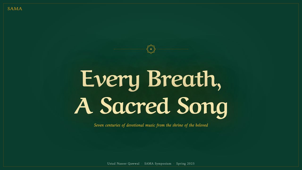
For presentation slides, this style is well-suited to cover pages and moments of ceremonial emphasis: a title slide can use the deep shrine green as a full ground with a centered, symmetrical composition and gold-toned framing along the edges, letting the calligraphic-inspired display type carry the emotional weight. Content slides should keep the ornamental border treatment consistent but restrained — a thin gold rule or arch-derived corner motif rather than a full decorative frame on every page — so the richness doesn't fatigue across a long deck.
For web interfaces, the style translates naturally to hero sections, storytelling pages, and any product with a cultural, heritage, or ceremonial framing — a music platform, a cultural archive, a wellness or meditation product drawing on devotional traditions. Dashboards and dense data tables are a poor fit: the symmetrical, ornament-framed composition logic does not compress well into small, repetitive UI rows, and the warmth of the palette reads oddly against clinical data.
For editorial and marketing work, the style is strongest as a full-bleed atmospheric treatment — a landing page hero, a magazine feature opener, an event poster — where the centered symmetry and lamplit glow can breathe. It pairs naturally with long-form storytelling about music, ritual, or heritage, where the reader is meant to slow down rather than scan quickly.
A common mistake is treating the gold as a generic 'luxury' accent divorced from its source — scattering gold flourishes everywhere flattens the style into a stock 'ornate Eastern' cliché. The gold should behave like embroidery thread: concentrated along edges, borders, and focal points, never as a broad fill, and always in service of the green ground rather than competing with it.
Qawwali Devotional — FAQ
Is Qawwali Devotional a religious style that should only be used for Islamic or Sufi contexts?
The style is drawn directly from a specific devotional tradition — Sufi shrine culture and qawwali performance — and that origin carries real cultural and religious weight. It is best applied to contexts that genuinely engage with that heritage: music platforms covering South Asian devotional traditions, cultural heritage projects, or products explicitly framed around this history. Using it purely as a generic 'ornate gold and green' decorative skin, detached from any acknowledgment of its source, misses what makes the style meaningful and risks feeling like appropriation rather than homage.
Why is green so central to this palette rather than just an accent color?
Green carries deep symbolic weight in Islamic devotional culture generally and is specifically the color of the ceremonial chadar cloth draped over Sufi tombs. Treating green as the base ground — rather than a small accent against a neutral background — reflects how the physical shrine environment actually looks: the chadar is the dominant visual field a visitor sees, not a small detail.
How does this style differ from generic 'Middle Eastern' or 'Arabian Nights' ornamental design?
Generic Orientalist ornamental design tends to borrow motifs loosely from many unrelated cultures and eras and mix them for exotic effect. Qawwali Devotional is anchored to one specific, traceable devotional practice — the green-and-gold chadar offering tradition at South Asian Sufi dargahs, particularly those associated with the Chishti order — and every visual element (arch shape, calligraphic style, lamp glow) can be traced back to that specific context rather than a vague pan-regional aesthetic.
Can this style work in a light, bright layout, or does it require a dark ground?
The style is defined as a dark-ground system — the deep shrine green is meant to be read as a saturated, low-key ground, similar to how the actual chadar cloth reads in dim shrine lighting. Flattening it onto a bright white background loses the lamplit, nocturnal shrine atmosphere that gives the style its emotional character; if a lighter treatment is needed, it's better to lighten the green itself slightly rather than swap to a white base.
What kind of typography best complements the calligraphic elements without clashing?
Because the calligraphic Nastaliq and Arabic letterforms carry strong visual rhythm and flourish, any accompanying Latin text should stay quiet and structural — simple, restrained letterforms that provide legibility for functional content without introducing a second competing decorative voice. The calligraphy should always read as the star of the composition, with supporting text acting purely as scaffolding.
Related design styles
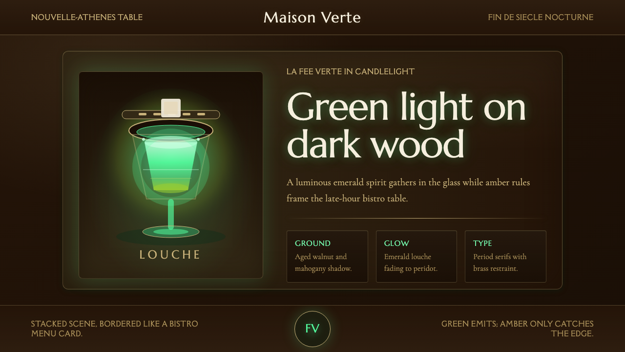 Absinthe Green Fairy GlowDarkness makes the fairy glow. Emerald louche on mahogany, framed by amber se…
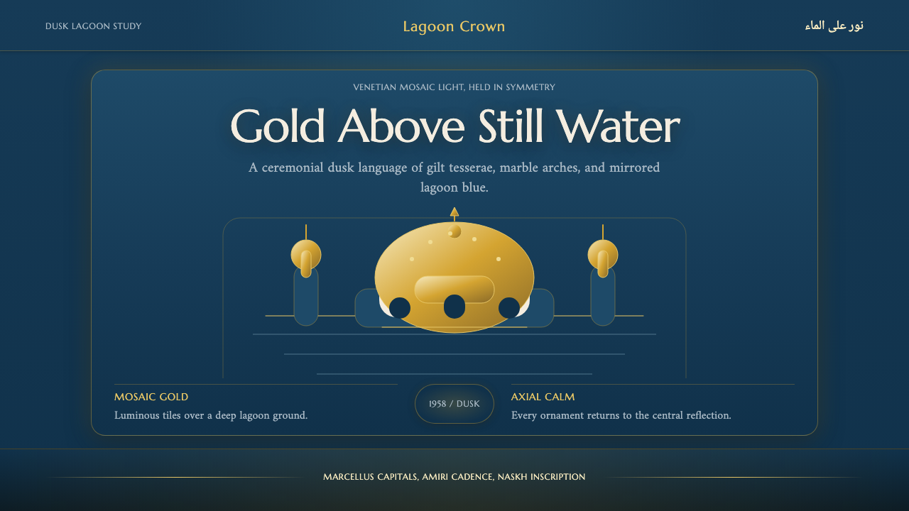 Brunei Omar Ali MosqueRegal dusk, mirrored. Lagoon blue frames luminous gold mosaics and axial symm…
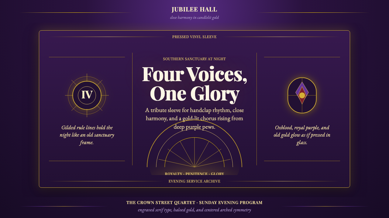 Gospel QuartetReverent and radiant. Liturgical purple, Playfair serifs, and arched gold rul…
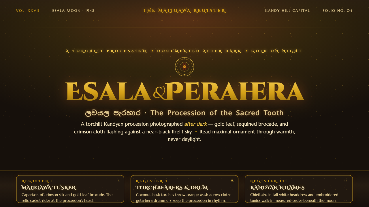 Kandy Esala PeraheraA torchlit night procession, not a poster. Gold flecks and crimson brocade fl…
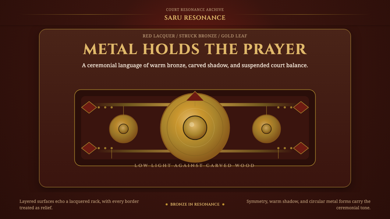 Gamelan BronzeCeremony in low light. Bronze circles glow inside red lacquer and gold-leaf f…
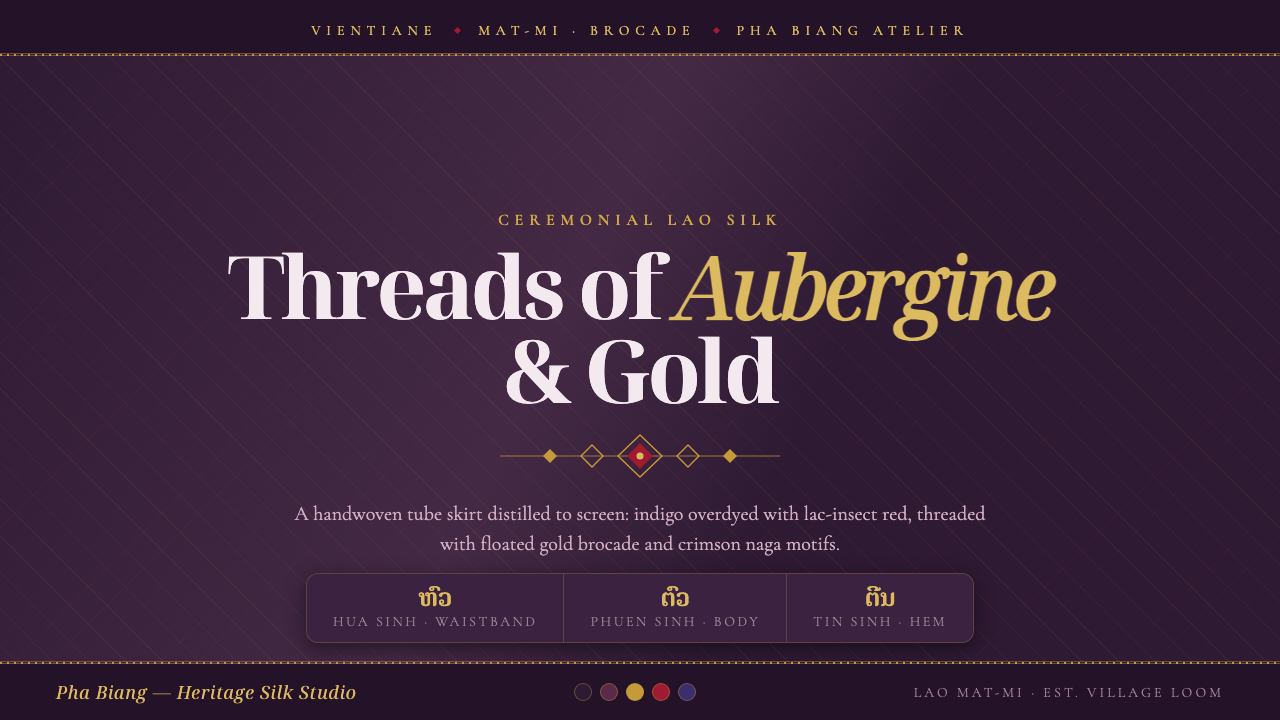 Lao Sinh Silk WeaveCeremonial Lao silk on screen. Dark aubergine ground threaded with gold mat-m…