What is Gospel Quartet?
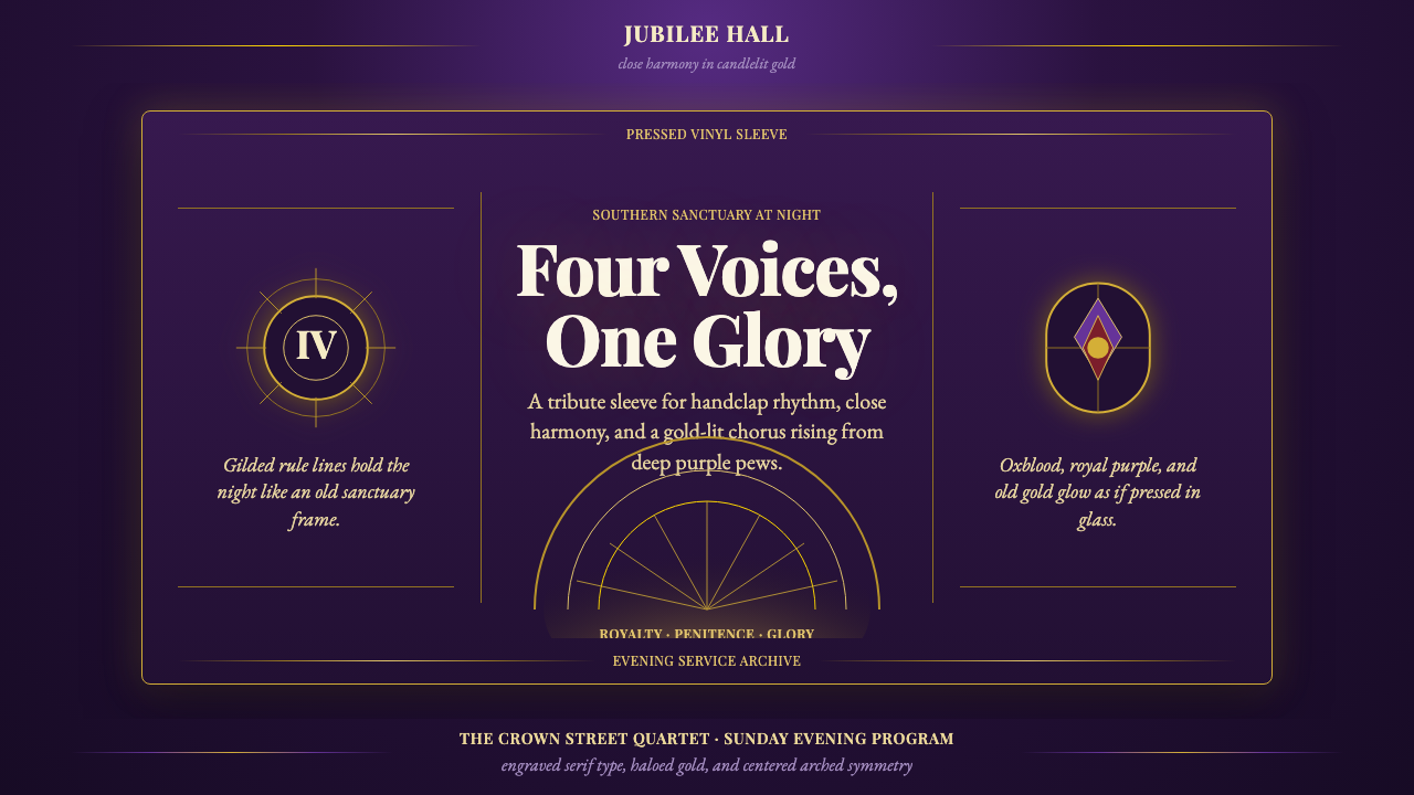
Gospel Quartet takes the visual world of the Black gospel record sleeve — liturgical purple, gilded light, engraved serif lettering — and turns a Sunday-night church service into a design system.
Gospel Quartet in brief
Gospel Quartet is a design style drawn from the golden age of Black gospel quartet music, roughly 1950 through 1980, and the record labels that carried it — Peacock, Specialty, Vee-Jay, Savoy. Its palette centers on a deep, saturated purple, the color of vestments and royal cloth, set alight by gilded gold accents that stand in for candle flame and stained glass. Nothing in this system is pale or washed out; everything is meant to glow, the way pressed vinyl and foil-stamped sleeves once caught the light on a record-store shelf.
The visual grammar leans on symmetry and reverence rather than casual arrangement. Labels and covers from this era were built around a centered, often arched composition — the kind of shape you would expect over a chapel doorway — radiating light-rays fanning outward from a focal point, and rule lines in gold marking off sections the way a hymnal marks off verses. Type is engraved-looking serif, cut into printing plates rather than typed, giving every label the weight of something formally consecrated rather than casually printed.
The emotional register is the key to using the style correctly: it is not simply 'purple and gold,' it is purple carrying the weight of both majesty and penitence, and gold carrying the weight of both divinity and glory. A gospel quartet record sleeve was selling a feeling — transcendence, communal uplift, four voices in tight harmony testifying in a packed church — and the visual system exists to deliver that feeling before a single needle drops.
Where does Gospel Quartet come from?
Black gospel quartet singing grew out of the jubilee quartet tradition that took shape at historically Black colleges in the late nineteenth century, most famously the Fisk Jubilee Singers, and matured through decades of church singing conventions across the American South before crystallizing into its classic quartet form by the mid-twentieth century. By 1950, groups like the Soul Stirrers, the Dixie Hummingbirds, and the Swan Silvertones had turned close-harmony gospel singing into a touring, recording, competitive art form, with lead singers trading improvised runs over tight background harmony — a vocal architecture that would go on to shape the sound of soul music in the following decade.
The labels that recorded these groups were themselves part of the story. Peacock Records, founded in Houston in 1949 by Don Robey, became one of the most important gospel labels in the country and a rare instance of a Black-owned record company competing directly with white-owned labels for a national gospel audience. Specialty Records in Los Angeles, Vee-Jay in Chicago, and Savoy in Newark rounded out the field, each pressing quartets onto vinyl and dressing the sleeves in the visual vocabulary of the church rather than pop music — because the audience buying these records recognized that vocabulary instinctively from a lifetime of Sunday mornings.
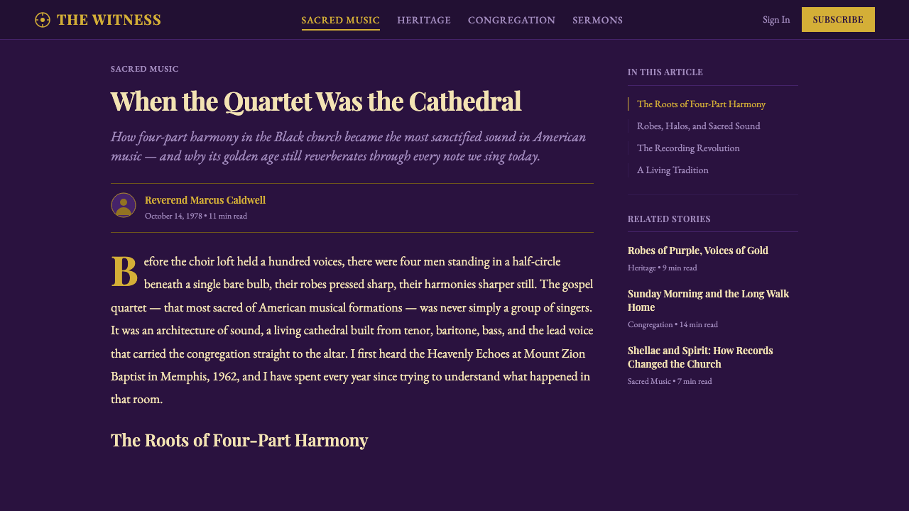
That visual vocabulary did not come from advertising trends of the day; it came from the sanctuary itself. Stained glass windows, their leaded outlines glowing when backlit, taught congregations to associate radiant, jewel-toned color with the sacred. Gilded objects — collection plates, altar trim, the edges of a hymnal's pages — taught the same congregations to associate gold with anything set apart as holy. Record-sleeve designers working for gospel labels drew directly on this shared visual memory, using arched, symmetrical layouts that echoed chapel architecture and rule lines that echoed the ruled staves of hymnals.
Figures like R.H. Harris, who helped define the smooth, ornamented lead-singing style that Sam Cooke would later carry into secular music, and Claude Jeter of the Swan Silvertones, whose falsetto influenced generations of soul singers, gave the era its musical identity; the visual identity around them — purple and gold, engraved type, radiating light — became inseparable from that sound, so that decades later the imagery alone is enough to summon the genre before a note plays.
What defines the Gospel Quartet look?
Color
The palette is built on a deep, saturated purple as its dominant field — closer to a bishop's vestment than to a pastel or lavender — paired with a radiant, warm gold used for line work, framing, and light effects. Black anchors the darkest depths, giving the purple somewhere to recede into, while gold is reserved for anything meant to read as sacred or illuminated: rules, halos, lettering edges. The two colors are almost never softened toward each other; the contrast between deep purple and bright gold is the entire point.
Typography
Lettering follows the logic of engraved record labels: formal serif letterforms with the crisp, slightly ornamented quality of type cut into a printing plate rather than set from a modern digital face. Headlines and group names are typically centered, reinforcing the symmetrical, altar-like composition of the layout. Type is treated as an emblem to be centered and framed, not as a flowing column of reading text.
Symmetry and Arches
Composition is centered and frequently arched, echoing chapel doorways, stained-glass windows, and the proscenium of a church stage. This is not casual bilateral balance; it is a deliberate architectural quotation, placing whatever sits at the center of the layout — a name, a symbol, a photograph — in the position a congregation would expect an altar to occupy. Elements radiate outward from that center rather than being scattered freely across the frame.
Radiant Light
Light-rays fanning outward from a focal point are a signature device, standing in for beams passing through stained glass or the glow imagined around a halo. These rays are drawn as distinct, structured lines rather than a diffuse glow — light here is an emblem drawn with rule lines and gold, not a soft photographic effect. The device gives even a static, printed layout a sense of radiant motion, as though caught mid-illumination.
Gold Rule Lines
Thin gold rules divide and frame sections much as a hymnal's ruled staves divide verses, or as gilded trim marks off the edge of a sacred object. These lines are structural more than decorative: they tell the eye where one part of the composition ends and the next begins, and their gold color signals the division is worth noticing, not merely functional.
Engraved Ornament
Where ornament appears, it takes the crisp, incised quality of engraving — the visual language of pressed metal plates and foil stamping — rather than the soft quality of hand-painted or airbrushed illustration. Borders and framing devices around a name or symbol read as formally cut rather than casually drawn, reinforcing the sense that the object bearing them has been consecrated rather than dashed off.
Glow Over Flatness
Nearly every surface in this system is treated as if it is catching light rather than sitting flat under even illumination — deep purple grounds recede into shadow while gold elements feel lit from within. This is the opposite instinct from a flat, matte design system: here, glow and contrast between dark and radiant are structural to the mood, standing in for candlelight in a darkened sanctuary rather than daylight in an open room.
Who shaped Gospel Quartet?
Harris sang lead for the Soul Stirrers and pioneered a smooth, melismatic lead-vocal style within the quartet tradition — trading improvised vocal runs over tight background harmony rather than simply singing a fixed melody. That vocal architecture, developed and recorded during the genre's classic era, became the template that his successor in the group, Sam Cooke, would carry across into secular soul music, making Harris one of the most influential architects of the quartet sound even though his commercial recognition outside gospel circles remained limited.
Cooke joined the Soul Stirrers as Harris's successor and became gospel quartet music's most famous crossover figure, eventually leaving the genre to build a landmark career in secular soul and pop. His gospel-era recordings on Specialty Records sit at the exact historical and visual intersection this style draws from — the label sleeves, the quartet harmonies, the church-derived vocal ornamentation — before that same vocabulary was carried into a different commercial context.
Jeter led the Swan Silvertones and was renowned for a high, controlled falsetto that became one of the most imitated vocal textures in gospel and, later, soul and R&B singing. His falsetto lines, often floating above the group's tight harmony, exemplify the same lead-over-background structure central to the quartet tradition, and his influence is widely cited as a direct antecedent to falsetto styles used across later popular music.
One of the longest-running and most celebrated groups in the quartet tradition, the Dixie Hummingbirds recorded across several of the era's key labels and helped define the touring-and-recording circuit that turned gospel quartet singing into a national art form. Their sustained career makes them a useful reference for the genre's visual continuity — the same purple-and-gold, arched, engraved sleeve vocabulary recurs across their catalog.
Robey founded Peacock Records in Houston in 1949, building it into one of the most important gospel labels in the country and one of the few Black-owned record companies of the era to compete directly with white-owned labels for a national audience. As a label owner rather than a performer, Robey shaped the business and visual infrastructure — sleeve design, distribution, marketing — that carried the quartet sound to a national audience.
How do you use Gospel Quartet today?
Applying Gospel Quartet correctly means treating purple and gold as a hierarchy of reverence rather than a decorative color pair, and leaning into symmetry and radiance rather than the casual, off-center compositions common to most contemporary interfaces.
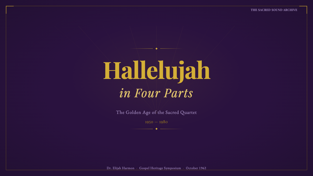
For presentation slides, the style is strongest on cover and title slides, where a centered, arched composition with radiating gold lines around a title gives an opening slide real ceremonial weight — appropriate for keynotes or anything meant to open with gravity rather than energy. Content and data slides should keep the deep purple as background and let gold carry all emphasis: gold rule lines to separate sections, gold numerals to mark key data points, so charts and lists read like illuminated manuscript pages rather than ordinary business slides.
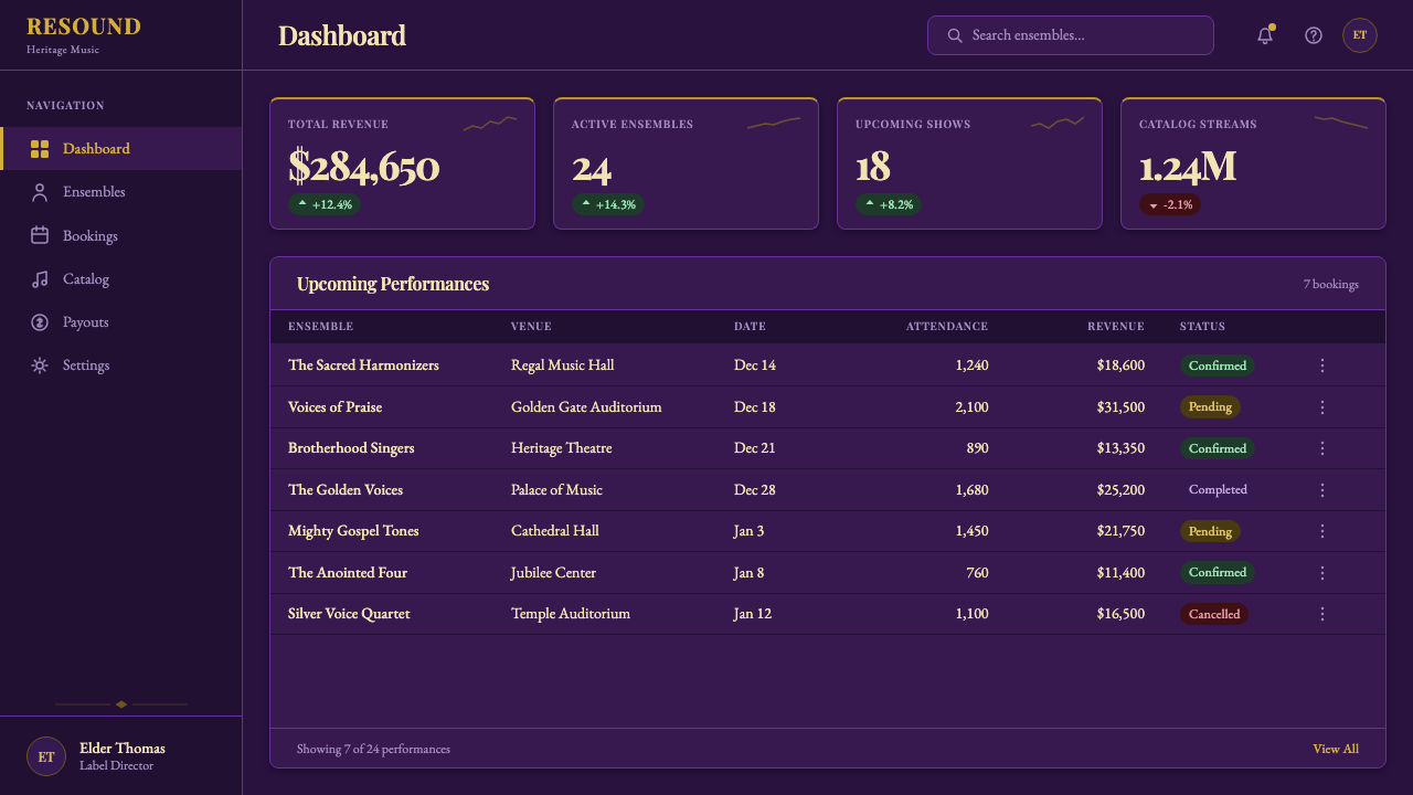
For web UI, dashboards can use the deep purple as a rich dark-mode background with gold reserved strictly for primary actions and key metrics — the same discipline a church interior uses, where gold appears only on what deserves to be noticed. Pricing pages benefit from the style's built-in sense of hierarchy: a centered, arched card for the premium tier, framed in gold rule lines, immediately reads as the 'consecrated' choice without needing an explicit 'Most Popular' badge.
For editorial and marketing work, the style suits anything that wants to feel like an occasion — anniversary announcements, heritage storytelling, music or culture features, ceremonial branding. A centered masthead with radiating gold lines, generous dark-purple space, and engraved-style headline type can carry a full-bleed marketing page the way a record sleeve carried a shelf display, signaling importance before a reader processes a single word.
The most common mistake is treating this as a generic 'purple and gold' palette without the symmetry, arches, and radiant light that give it meaning — a scattered, asymmetric layout in the same two colors reads as a birthday party rather than a sanctuary. A second common mistake is softening the contrast, using muted lavender or dull bronze instead of deep, saturated purple and true radiant gold; the style depends on that dark-to-glowing contrast, and flattening it removes the sense of illumination the system is built around.
Gospel Quartet — FAQ
Is Gospel Quartet a religious style, or can it be used in secular contexts?
The style is drawn from religious visual culture — stained glass, vestment color, hymnal ruling — but its source use case was commercial: record sleeves sold in stores to a general audience. It works well in secular contexts that call for reverence or heritage, such as anniversary branding or music and culture features, without requiring an explicitly religious subject. It is a poor fit for casual, everyday consumer contexts, where its formality reads as heavy-handed.
How is Gospel Quartet different from a generic 'royal purple and gold' luxury palette?
A generic luxury palette typically pairs purple and gold with polished, symmetrical elegance aimed at signaling wealth — think perfume packaging. Gospel Quartet carries a more specific emotional charge: the purple evokes both majesty and penitence, the gold both divinity and glory, and the composition draws directly on church architecture — arches, radiating light, hymnal-like rule lines — rather than generalized luxury. The result should feel closer to stained glass and a record sleeve from a specific era than to a hotel lobby.
Does this style require actual religious imagery, like crosses or figures?
No. The style is built from structural and atmospheric cues — deep purple grounds, radiant gold light-rays, arched symmetrical composition, engraved serif type, gold rule lines — none of which require an explicit religious symbol to read correctly. Many classic gospel quartet sleeves relied on exactly this kind of abstracted, architectural reverence rather than literal iconography.
What kind of imagery pairs well with Gospel Quartet, if photography or illustration is needed?
Group portraiture in the style of classic quartet record sleeves — formally posed, high-contrast, often set against a dark ground with light falling on the subjects — fits naturally. Architectural photography or illustration of church interiors, stained glass, or gilded ornament also pairs well. What to avoid is casual candid photography, bright even lighting, or busy multi-color backgrounds, all of which undercut the formal, radiant mood the style depends on.
Is this style limited to music-related products, or can it work for other industries?
While its origin is musical, the underlying visual logic — reverence, ceremony, illuminated contrast between dark and gold — transfers to any brand that wants to signal heritage or occasion: award ceremonies, legacy brands, hospitality aiming for old-world grandeur, or cultural institutions such as archives and museums. It is a poor fit for products that need to feel fast, casual, or youthful, since the style's vocabulary is built around slowing a viewer down toward reverence rather than urgency.
Related design styles
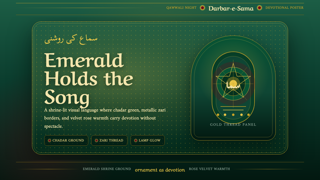 Qawwali DevotionalSacred warmth glows. Emerald cloth, zari gold borders, and Nastaliq rhythm ho…
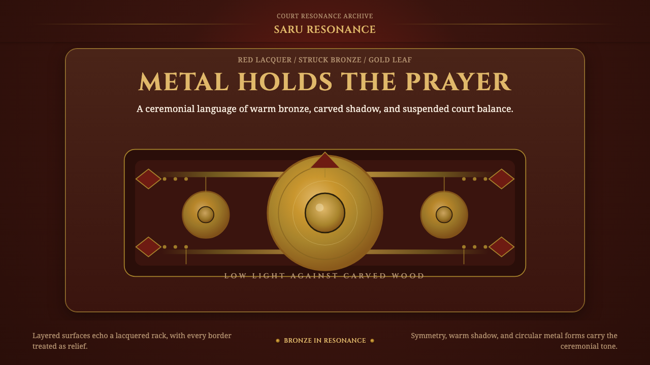 Gamelan BronzeCeremony in low light. Bronze circles glow inside red lacquer and gold-leaf f…
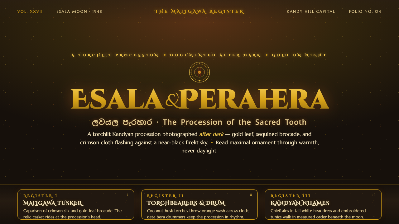 Kandy Esala PeraheraA torchlit night procession, not a poster. Gold flecks and crimson brocade fl…
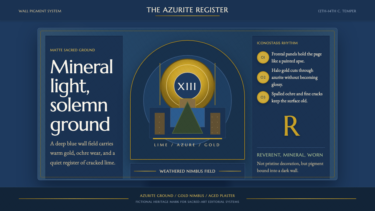 Serbian Medieval FrescoSacred wear becomes structure. Azurite fields, gold halos, and cracked plaste…
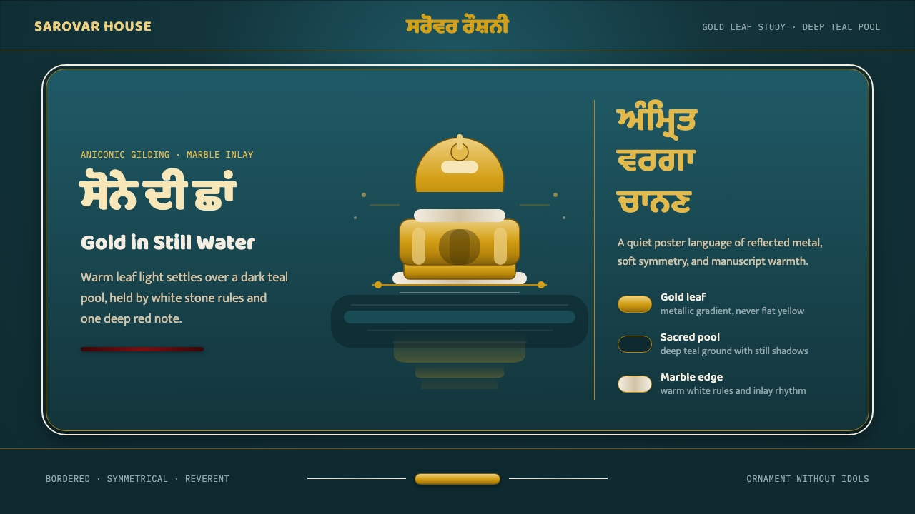 Sikh Golden TempleReverent gold in dark water. Teal ground, Gurmukhi type, marble rules hold th…
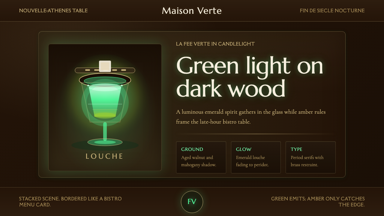 Absinthe Green Fairy GlowDarkness makes the fairy glow. Emerald louche on mahogany, framed by amber se…