What is Dim Sum Cart?
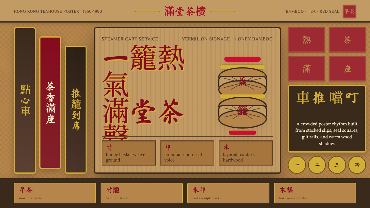
Dim Sum Cart is the design language of the Hong Kong teahouse in its golden era — a visual world built from honey-toned bamboo, tea-stained hardwood, vermilion chop-seal red, and imperial gold, where warmth and communal clutter are not flaws to be corrected but the whole point.
Dim Sum Cart in brief
Dim Sum Cart captures the sensory world of the Hong Kong 茶樓 — the yum cha teahouse — as it existed from the 1950s through the 1990s. In those decades, the teahouse was the social anchor of Cantonese urban life: a cavernous, high-ceilinged room where families settled in for hours, bamboo steamers arrived stacked on rattling metal carts, and the din of conversation competed with the clatter of porcelain. The design system distills this atmosphere into a visual language built from natural materials, warm tones, brush-script lettering, and a deliberate density of pattern and color that mirrors the teahouse experience itself.
The palette is anchored in materials rather than abstract color theory. Bamboo — the material of steamer baskets, furniture, and ceiling panels — supplies a warm honey gold as the base register. Hardwood tables and tiled floors in tea-stained browns give the mid-tones. Against these naturalistic grounds, two accent colors carry the voice: vermilion red, borrowed from the chop-seal tradition of Chinese official and commercial documents, and a deep imperial gold used for auspicious inscriptions and decorative borders. Red and gold together signal festivity, prosperity, and welcome — the same pairing found on New Year banners and restaurant fascias throughout Cantonese-speaking communities.
The style is typographically exuberant. Brush-script Chinese characters — modeled on the hand-painted signage of teahouse facades and menu boards — are used at large scale and treated as visual elements in their own right, not merely as text. Stacked vertical text, traditional right-to-left reading direction, and the layering of multiple text sizes and scripts (Chinese characters alongside romanized labels) give the typographic field the same productive density as the teahouse floor itself. This is a style that celebrates legible abundance rather than minimalist clarity.
Where does Dim Sum Cart come from?
The teahouse as an institution reaches back centuries in Guangdong province, where yum cha — the practice of drinking tea accompanied by small dishes — was already established by the nineteenth century as a morning ritual that doubled as a marketplace for business and gossip. But the design character associated with Dim Sum Cart is more precisely the post-war Hong Kong teahouse, which developed its own visual identity between the 1950s and 1980s. The influx of Shanghainese capital and Guangdong migrants after 1949 fueled the construction of a new generation of large-scale teahouses — institutions like Lin Heung Tea House (est. 1926, but expanded and rebuilt in the post-war years) and Luk Yu Tea House (est. 1933) — that combined traditional Cantonese material culture with a slightly more theatrical, urban grandeur.
The material palette of the post-war Hong Kong teahouse was determined by what was locally available, affordable, and suited to humidity. Bamboo was ubiquitous: steamer baskets, tray liners, chair weave, and ceiling panels all relied on it, giving the teahouse interior a consistent warm yellow baseline. Marble-top tables — a fixture of the Hong Kong teahouse that distinguishes it from its mainland cousins, which more often used bare wood — introduced a cool grey veined surface that contrasted with the bamboo warmth. Lacquered wood panels in deep reddish-brown provided the architectural framing. The color combination that resulted — warm bamboo, cool marble, deep lacquer, and the red-gold of signage and chop-seal stamps — was not a designed system but an ecology of materials that became inseparable from the teahouse atmosphere.
The cart itself is central to the identity. From the 1960s onward, the defining service mode of the large Hong Kong teahouse was the trolley system: women (almost always women) wheeling aluminum or stainless-steel carts stacked with bamboo steamers, navigating between tightly packed tables and calling out dish names in Cantonese. The cart's rattling approach — heard before it was seen — became an acoustic and kinetic signature of the teahouse experience. In design terms, the cart represents the style's governing logic: maximum abundance in a compact, mobile form, layers upon layers, everything visible and selectable at once.
By the 1990s, the traditional trolley-service teahouse was already beginning to decline in Hong Kong, replaced by more efficient table-order systems and newer restaurant formats. Beloved institutions like Luk Yu and Lin Heung survived partly as living heritage sites, partly as tourist destinations. This sunset gave the visual language of Dim Sum Cart its retrospective warmth: it is not a contemporary style but a preserved one, carrying the specific texture of a urban social world that no longer fully exists. Contemporary designers who draw on it are working with cultural memory as much as visual form.
What defines the Dim Sum Cart look?
Color Palette
The palette is warm and material-derived: honey bamboo occupies the base and largest surface areas; tea-stained hardwood brown and lacquer red-brown give the mid-tones; vermilion red — the saturated hue of the traditional chop-seal stamp — serves as the primary accent; deep imperial gold appears in inscriptions, borders, and auspicious details. The overall effect is rich without being garish, because the warm neutrals carry so much of the visual weight and the saturated accents are used purposefully rather than pervasively.
Texture and Pattern
Unlike modernist design languages that treat texture with suspicion, Dim Sum Cart embraces it as a primary carrier of warmth and cultural identity. Woven bamboo patterns, wood grain, marble veining, and the deliberate imperfections of hand-painted surfaces all contribute to a sensory richness that reads immediately as handcrafted and lived-in. Geometric latticework and circular longevity-symbol medallions appear as structural decorative elements — not purely ornamental, since they serve as dividers, borders, and focal points — but chosen for their cultural resonance as much as their visual function.
Typography
Brush-script Chinese characters are the typographic heart of the style. These letterforms — modeled on the hand-painted fascia boards, menu boards, and teahouse signage of Hong Kong's mid-century teahouses — have an expressive looseness that balances the dense material environment. At large display sizes, individual characters become sculptural. Vertical text setting is traditional and appropriate; horizontal setting works but can feel less culturally grounded. Where bilingual labels appear — a common feature of Hong Kong commercial signage — the juxtaposition of Chinese characters with roman letterforms in a contrasting weight or style adds visual complexity without becoming illegible.
Density and Layering
The teahouse aesthetic is explicitly anti-minimalist: the experience depends on a productive density of people, sounds, objects, and surfaces. In design terms, this translates to a willingness to layer multiple visual registers simultaneously — background texture, mid-ground pattern, foreground text and icons — without requiring each layer to be spatially separated. The organizing principle is not negative space but material hierarchy: the eye navigates by reading warm-to-cool, matte-to-glossy, light-to-dark rather than by following a stripped-back spatial grid.
Iconography and Motifs
The decorative vocabulary is drawn directly from Cantonese visual culture and the material world of the teahouse: bamboo stalks and leaves, lotus flowers, chrysanthemum roundels, longevity characters (壽), double-happiness symbols (囍), auspicious cloud scrolls, and the geometric latticework of window screens and room dividers. These motifs are not arbitrary ornament — each carries meaning in the Cantonese tradition of symbolic decoration — but in contemporary applications they are typically used more loosely, chosen for their visual texture and cultural warmth rather than their specific symbolic content.
Light and Atmosphere
Post-war Hong Kong teahouses were lit with warm incandescent light filtered through paper lanterns and smoky ceilings — a quality of light that was intimate and amber-tinged despite the large, public scale of the room. In two-dimensional design, this translates to warm-leaning color temperatures, a preference for off-white or cream over pure white for background surfaces, and a general softening of hard contrast in favor of mid-tone richness. The effect is the visual equivalent of patina — surfaces that look as though they have been inhabited rather than installed.
Compositional Logic
Dim Sum Cart composition does not rely on the modernist grid of equal columns and strict alignment. Instead, it follows the more organic spatial logic of the teahouse itself: zones of activity cluster and overlap, hierarchy is communicated through size and material contrast rather than spatial separation, and the eye is drawn in a centripetal rather than linear path. Focal points — a large chop-seal emblem, a dominant brush-script headline, a prominent pattern medallion — anchor the composition while the surrounding density provides context and warmth.
Who shaped Dim Sum Cart?
Established in 1926 in the Western District of Hong Kong, Lin Heung is one of the last surviving teahouses to maintain traditional trolley service. Its interior — high ceilings, marble-top tables, bamboo steamers, a permanent amber haze — is among the purest surviving examples of the post-war Hong Kong teahouse aesthetic in material and spatial form. Lin Heung has become both a functioning restaurant and a living archive of the physical design language that Dim Sum Cart draws from.
Founded in 1933 in Central Hong Kong, Luk Yu is the most celebrated historical teahouse in Hong Kong and a reference point for understanding the visual design of the mid-century yum cha experience. Its interior — lacquered screens, carved wood partitions, stained-glass windows, and the original furniture intact — represents the more genteel, slightly more formal register of the teahouse aesthetic, where the same warm palette and cultural motifs are deployed with a greater emphasis on craftsmanship and deliberate ornament.
The dim sum cart servers — colloquially called 推車姐姐 or 點心妹 — were the human embodiment of the teahouse's logic of abundance and circulation. Their expertise in navigating crowded floors, their memorization of an ever-changing cart inventory, and their vocal projection in calling out dish names were not incidental to the experience but constitutive of it. In design terms, the trolley server represents the principle that the style's density should feel navigable and generous rather than overwhelming — guided abundance, not chaos.
The visual language of mid-century Hong Kong street commercial signage — hand-painted characters on wood or zinc boards, red and gold on dark lacquered grounds, stacked vertical text on narrow vertical panels — is a direct antecedent of Dim Sum Cart's typographic character. The sign painters who produced this work were trained in classical Chinese calligraphy but adapted their letterforms for legibility at distance and in variable lighting, producing a vernacular brush-script that became one of the most recognizable visual signatures of the city.
Yum cha — literally 'drink tea,' though the food is as important as the beverage — is the Cantonese practice of gathering at a teahouse for a long, unhurried shared meal. As a social form, it shaped the teahouse's spatial and visual design: the large round tables accommodated extended families; the communal service style of the cart encouraged sharing and eye contact; the warm, high-contrast interior supported long occupation without fatigue. Understanding yum cha as a social ritual helps explain why Dim Sum Cart as a design style values density and warmth over clarity and efficiency.
How do you use Dim Sum Cart today?
Dim Sum Cart is most effective for contexts where warmth, cultural richness, and a sense of communal welcome are primary values — restaurant brands, food platforms, cultural festivals, heritage experiences, or any product that wants to signal handcrafted quality and a specifically Cantonese or broader East Asian cultural grounding. It is not a neutral style: it carries the specific emotional signature of a place and a social ritual, and it works best when that emotional register aligns with the product's actual values.
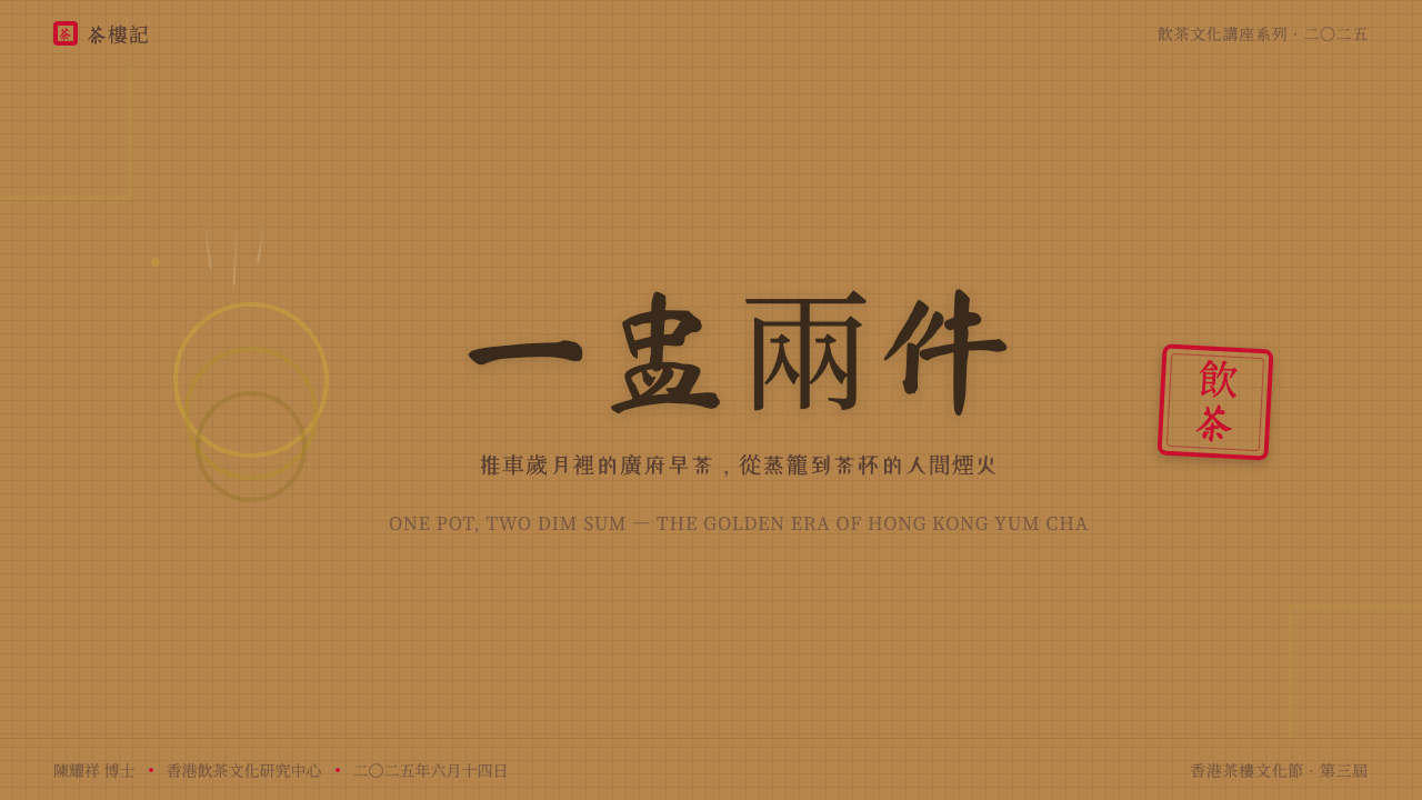
For presentation slides, Dim Sum Cart works well on cover pages that need to evoke warmth and festivity — an event invitation, a brand launch, a cultural program overview. A cover might use deep lacquer red as the background, with a large central chop-seal emblem in gold and a brush-script title in cream or white. Content slides should be simpler: warm off-white ground, high-contrast deep brown or black body text, and bamboo-weave textures used sparingly as decorative borders rather than full-bleed backgrounds. Data slides can use the red-and-gold pair as a high-low accent system, with bamboo cream as the neutral baseline for chart grounds.
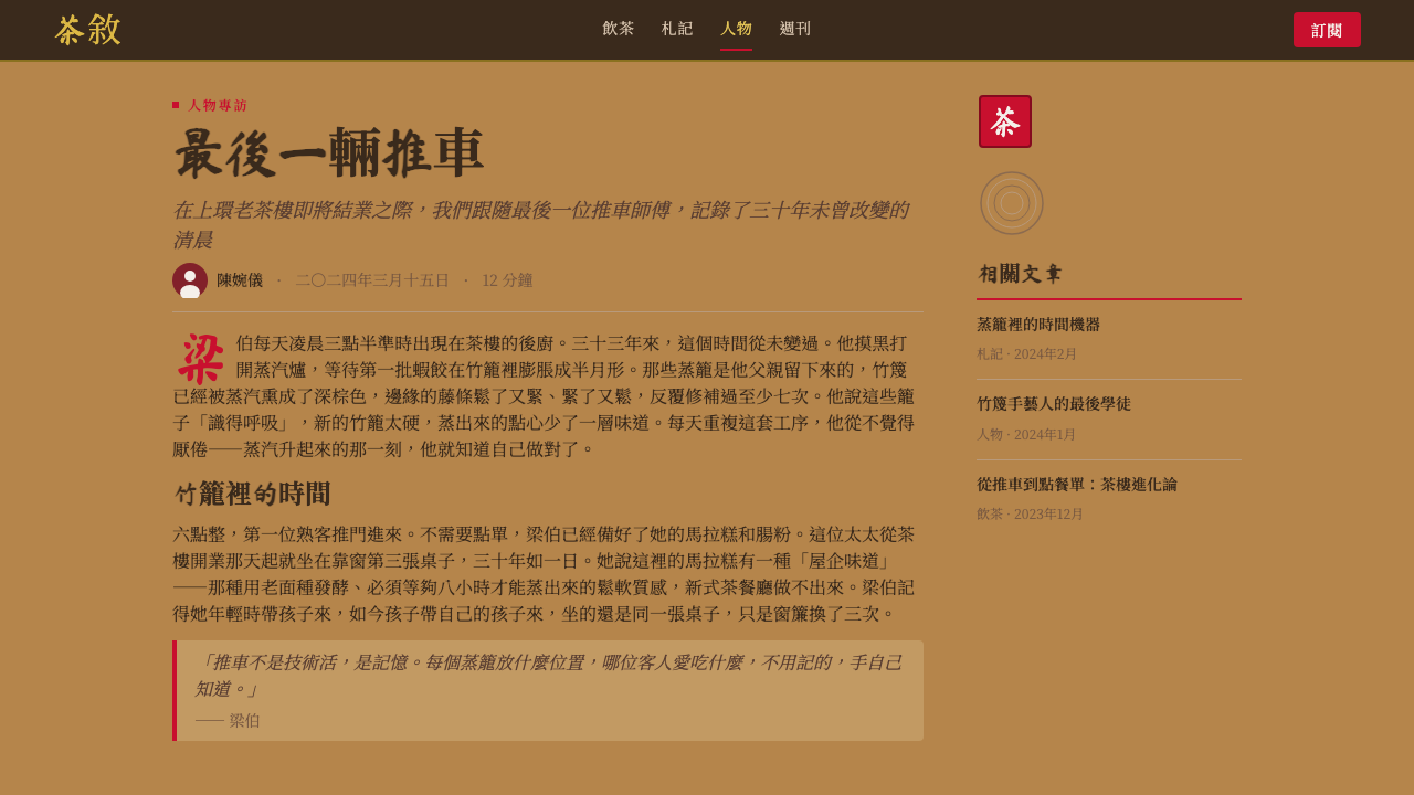
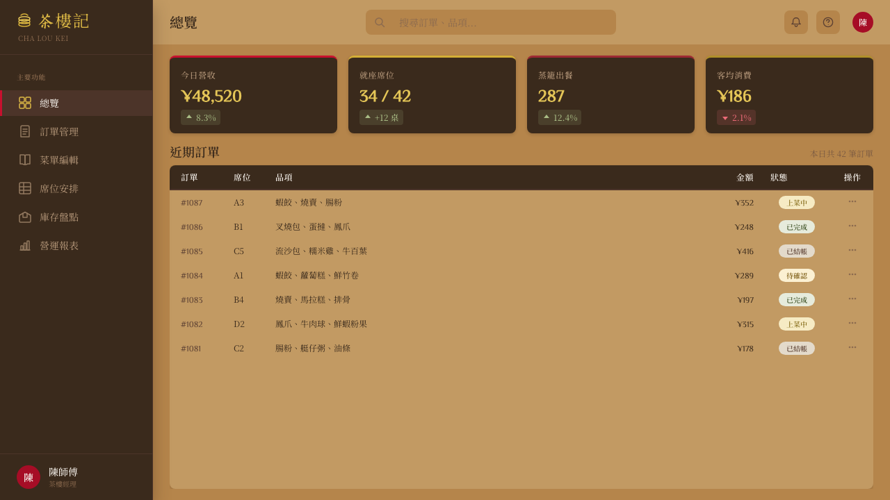
For web interfaces, the style is best suited to restaurant websites, food delivery platforms, cultural tourism applications, or Cantonese heritage projects where immersion in the aesthetic is the goal rather than an incidental quality. Navigation and UI chrome should be restrained — dark lacquer brown or near-black, with gold or vermilion for active states — while content areas carry the visual richness. Avoid using the full material density of the style in functional UI elements like forms and tables, where the warmth becomes noise; reserve it for hero sections, category headers, and feature imagery.
For editorial and marketing work, Dim Sum Cart supports a distinctively celebratory register. Menus, programs, and printed collateral are natural fits: the vertical text tradition, the red-and-gold festive palette, and the layered pattern vocabulary all translate naturally to print. In digital editorial contexts, a section header styled as a stamped-seal motif and a pull quote set in large brush-script Chinese characters are highly effective at breaking up body text while reinforcing cultural identity. Marketing campaigns for food brands can use the style's inherent warmth to suggest freshness, generosity, and a sense of occasion.
The most common mistake when applying Dim Sum Cart is treating it as generic 'Asian design' or flattening it into a stereotyped red-and-gold combination without the material grounding, typographic character, and specific cultural specificity that give it depth. The style is about a particular place — Hong Kong teahouses of a particular era — and works best when that specificity is honored rather than generalized. The second most common error is overloading every layer at once: the style tolerates density, but density requires material hierarchy to function. If every surface is equally patterned and every color equally saturated, the result is exhausting rather than welcoming.
Dim Sum Cart — FAQ
Is Dim Sum Cart the same as general Chinese restaurant design?
No. Dim Sum Cart is specifically rooted in the post-war Hong Kong teahouse tradition, which has a distinct material palette, typographic character, and social logic that distinguishes it from mainland Chinese restaurant design, Taiwanese tea culture, or generalized 'pan-Asian' aesthetics. The bamboo-and-marble combination, the trolley-service format, the Cantonese brush-script tradition, and the specific festive palette of vermilion and imperial gold are all characteristic of Hong Kong yum cha culture rather than Chinese restaurant design in general. Using the style correctly requires respecting this specificity rather than treating it as a catch-all for East Asian visual reference.
How do I use the density of this style without it becoming visually overwhelming?
Material hierarchy is the key. The teahouse itself navigates density by assigning different roles to different registers: the bamboo floor and ceiling are warm neutral grounds, the tables are cool mid-tones, the signage and steam cart labels are the high-contrast focal points. In design, the equivalent discipline is to restrict the full material complexity to a few key areas — hero images, section headers, decorative borders — while keeping body text areas and functional UI zones in the simpler warm-neutral register. Density should feel generous and inviting at the focal points, not evenly distributed across every surface.
Can this style work for dark-mode interfaces?
Yes, and arguably better than many historical styles, because the teahouse aesthetic is already grounded in deep, warm darks — lacquer red-brown, dark hardwood, ink-black calligraphy. A dark-mode Dim Sum Cart interface would use deep lacquer brown or near-black as the primary surface, with the bamboo warm gold moving from a background tone to a foreground accent. Vermilion works well on dark grounds. The key adjustment is to reduce the marble-cool elements, which read as harsh on dark backgrounds, and lean more heavily on the lacquer-warm register. Brush-script typography in cream or warm gold on a deep lacquered background is a natural dark-mode expression of the style.
Is this style appropriate for non-food or non-cultural contexts?
It can work outside its native context, but the stretch requires intention. The style's warmth and communal resonance translate well to hospitality, events, community platforms, and cultural education — anywhere that shared experience and generosity are central values. It is less suited to contexts that depend on precision, clinical neutrality, or technological authority: analytical tools, healthcare, financial services, or products where the user expects the design to communicate efficiency and control. The cultural specificity of the style also means that using it outside Cantonese or broadly Chinese cultural contexts requires care — it should enrich rather than appropriate, and the connection to the style's origins should be acknowledged rather than dissolved into generic decoration.
How does Dim Sum Cart relate to other Hong Kong or East Asian design traditions?
Dim Sum Cart sits within a broader family of Cantonese vernacular visual traditions but is distinct from the slicker, more international commercial aesthetic of contemporary Hong Kong graphic design, which absorbed Swiss International Style influence heavily from the 1960s onward. It is also distinct from the ink-wash and scholar-garden traditions of classical Chinese aesthetics, which prize restraint and negative space over material richness. The closest relatives are other Hong Kong vernacular traditions — neon signage, wonton shop hand-lettering, mahjong parlor tiles — that share the same warm, hand-crafted, communally embedded sensibility. As a designed style, Dim Sum Cart should be understood as a conscious revival and formalization of a vernacular tradition rather than a direct continuation of a living design culture.
Related design styles
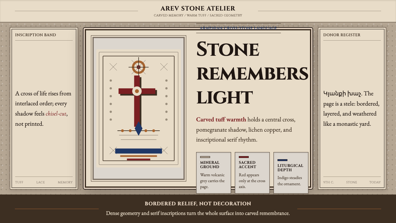 Armenian Khachkar Cross-StoneStone becomes memory. Tuff grey, pomegranate red, and carved borders hold the…
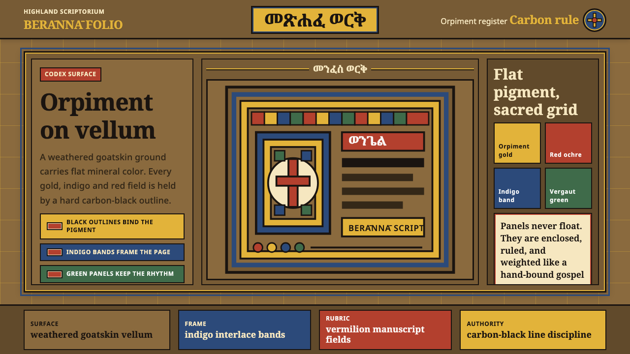 Ethiopian Geez GospelSacred color held in line. Orpiment gold and indigo panels sit on weathered v…
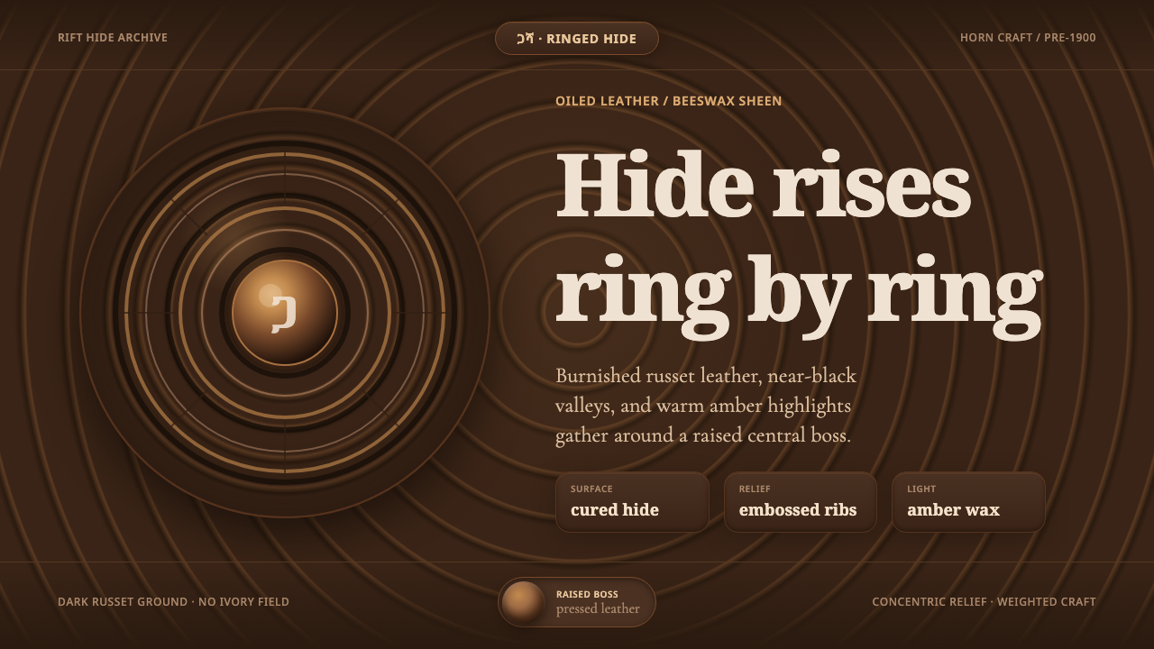 Ethiopian Hide ShieldDark hide speaks in relief. Russet rings and amber beeswax light rise from ne…
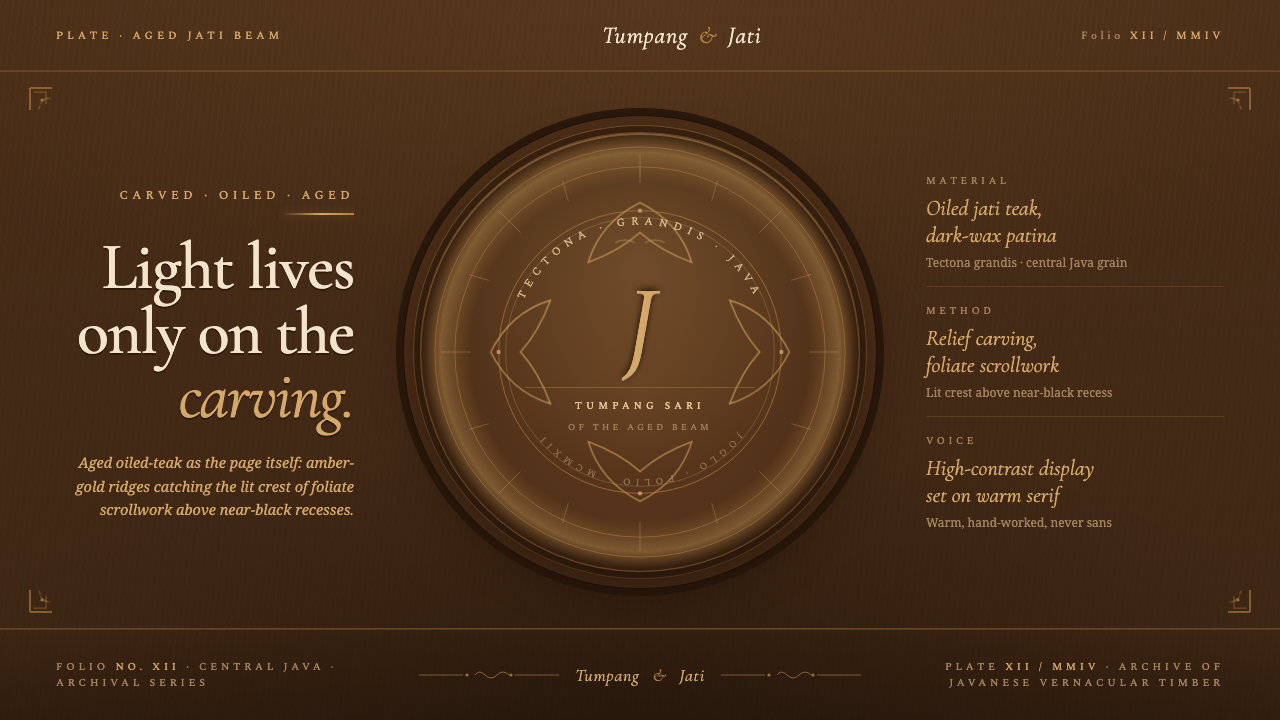 Javanese Teak JogloCarved warmth rules the page. Oiled teak-brown ground, near-black recesses, a…
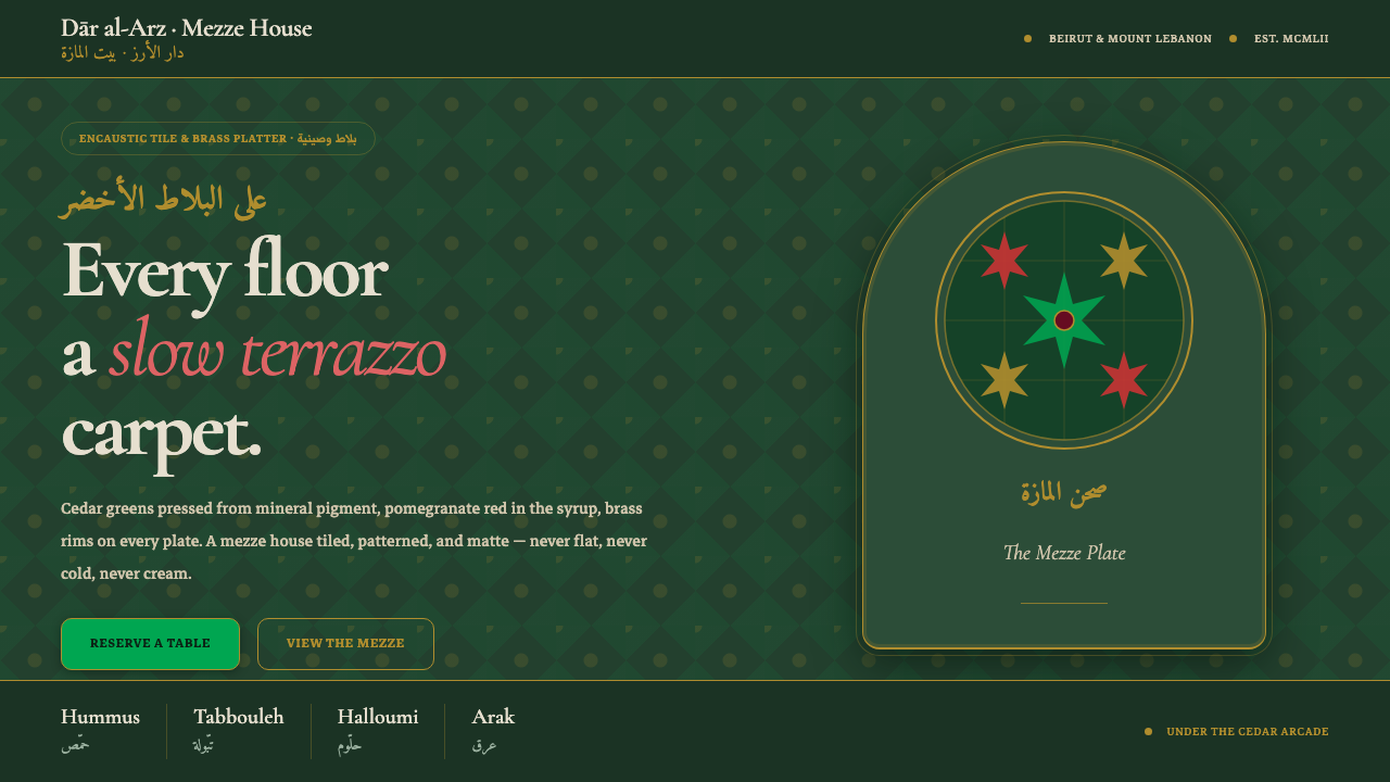 Lebanese Mezze Tile TavernA slow terrazzo carpet. Deep cedar greens, brass-rimmed plates, pomegranate r…
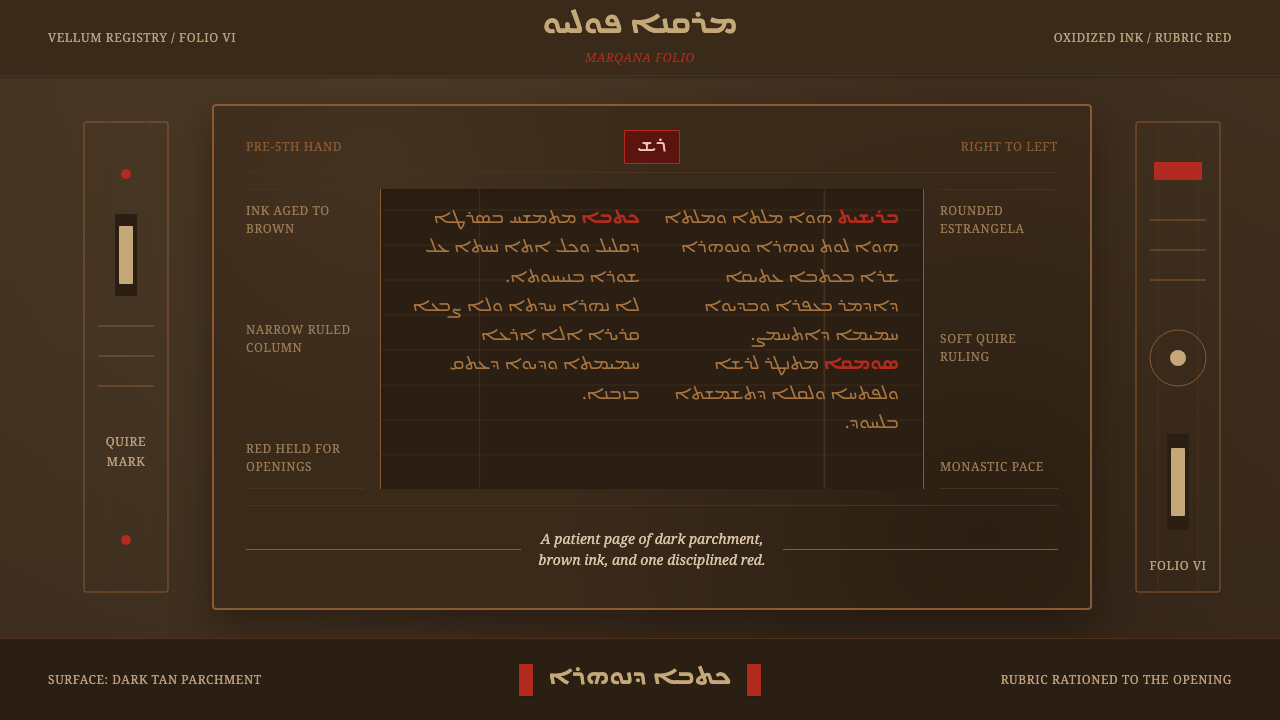 Syriac EstrangelaAncient warmth survives. Brown parchment, right-to-left columns, rationed rub…