What is Nuremberg Lebkuchen?
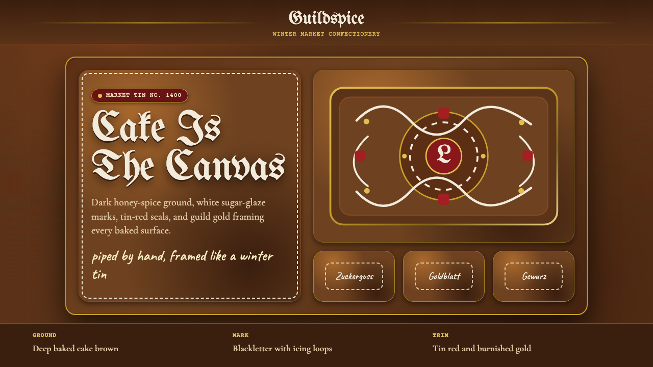
Nuremberg Lebkuchen turns the baked cake itself into the ground — a deep spiced brown canvas piped in confectioner's white, trimmed in tin-box red and gold.
Nuremberg Lebkuchen in brief
Nuremberg Lebkuchen is a design language lifted directly from the confectioner's bench rather than the printing press or the drafting table. Its defining move is unusual among design systems: the ground is not paper, canvas, or screen — it is the baked good itself. A honey-and-spice dough is pressed onto a pale wafer base (Oblaten) and baked until it darkens to a deep caramel-brown, and that browned surface becomes the canvas everything else sits on. No cream, no ivory, no neutral gray stand-in — the base is always a warm, toasted, spiced brown, edge to edge.
Over that dark ground, the confectioner works the way a scribe works over vellum: white sugar-glaze (Zuckerguss) is piped in looping, controlled lines that read as ornament but also as a kind of handwriting. Festive red appears in short, decisive bursts — the color of a Christmas biscuit tin rather than a warning color — and gold leaf or gold-toned foil is used sparingly, the way a guild might finish a ceremonial object. The overall letterforms and border motifs draw on a medieval Nuremberg blackletter sensibility, giving even a simple label or wrapper the weight of an old guild document.
The system reads instantly as seasonal and edible, but its underlying logic is transferable: a dark, saturated ground; a single bright accent applied with restraint and precision, as if piped rather than printed; and a typographic voice pitched somewhere between medieval guild signage and hand-lettered confectionery. It is a style built on contrast between weight and delicacy — a dense, dark, substantial base carrying a light, fine, deliberate line.
Where does Nuremberg Lebkuchen come from?
Nuremberg's association with spiced honey cake is documented from the medieval period, and the city's Lebküchner — a dedicated guild of gingerbread bakers — is recorded from the 1400s onward. Nuremberg's position mattered as much as its bakers: the city sat at the crossroads of major medieval trade routes, giving it early and reliable access to imported spices — cinnamon, cloves, cardamom, anise — that were prohibitively expensive elsewhere in Central Europe. Honey, the other essential ingredient, was gathered from the extensive pine forests surrounding the city, so Nuremberg had both halves of the recipe within easy reach at a time when most of Europe had neither.
Bavarian monastery bakers were early practitioners of honey-cake baking as well, since monasteries often controlled beekeeping and had access to both the imported spice trade and the literacy needed to preserve recipes across generations. The guild structure that formalized around Lebkuchen production in Nuremberg gave the craft a formal, almost civic status — bakers who earned the Lebküchner designation were bound by strict standards, and the cakes became closely associated with the city's identity, presented as gifts to visiting dignitaries and produced in ceremonial batches for civic festivals.
The visual conventions that define the style today — the pale Oblaten wafer base, the deep-baked spiced dough, and the white Zuckerguss icing worked in decorative lines — had settled into a recognizable canon well before 1900, meaning the look is the end point of centuries of incremental refinement, not a modern confectionery invention. Ornate tin packaging, produced for the Christmas market trade, layered a second decorative tradition on top of the baked good itself, carrying the same blackletter-and-gold visual grammar found on the cakes inside.
Because the style grew out of a guild craft tied to a specific city and a specific religious calendar — Christmas markets remain its primary present-day context — its visual vocabulary carries associations of both civic pride and seasonal ritual. It belongs to the broader tradition of Bavarian Christmas-market baking heritage, sitting alongside other regional confectionery customs, but its guild-documented history and its distinctive baked-ground construction set it apart as a design system with a genuinely traceable, centuries-deep lineage rather than a generic 'holiday' look.
What defines the Nuremberg Lebkuchen look?
Ground Color
The base is always a deep, warm, baked brown — the color of dough that has spent real time in the oven, never a flat neutral or a designer's beige. This ground reads as substantial and slightly caramelized, closer to the color of dark toast or roasted spice than to any generic 'brown' swatch. Because the ground is meant to evoke a baked surface, it should feel warm rather than cool, and slightly uneven or organic rather than perfectly flat — the visual opposite of a crisp digital neutral.
Icing Accent
White appears only as icing — a bright, slightly glossy, confectioner's white rather than a paper white or a cool gray-white. It is applied the way a piping bag applies glaze: in continuous looping lines, dots, and small decorative flourishes, never as a large flat fill. The white should feel drawn or piped rather than printed — thin, controlled, and following a hand-worked line rather than sitting inside a hard geometric shape.
Festive Red
Red is used sparingly and always in a festive, tin-box register — closer to the red of a decorative Christmas biscuit tin than to a corporate or warning red. It appears in small, punctuating amounts: a ribbon, a border line, a single ornamental detail, never as a dominant field color. The restraint is deliberate — red's job here is to mark an occasion, not to carry the composition.
Gold Ornament
Gold is used the way a guild would finish a ceremonial object — burnished, warm-toned, and reserved for a small number of high-value details rather than spread across the composition. It functions as a marker of craft and status: a border, a seal-like emblem, a fine decorative line. Gold should never compete with the icing-white for the role of primary accent; it is a rarer, more precious note layered beneath or alongside it.
Blackletter Voice
Lettering and border motifs carry a medieval Nuremberg blackletter spirit — dense, upright, slightly ornamental strokes that recall guild documents and old civic seals rather than modern sans-serif neutrality. This does not mean every word must be set in true blackletter; it means the overall letterforms should feel weighted, historical, and hand-finished, with any flourish concentrated at terminals and corners rather than spread evenly across a line.
Piped Composition
Decorative elements follow the logic of a piping bag rather than a printing press: motifs are built from continuous curved lines, dots, and small repeated flourishes rather than hard geometric fills. Composition favors a dense, centered ornamental field — a border, a medallion, a looping frame — over the open asymmetric grids common to modern systems. The overall impression should be of something worked by hand, slowly, one line at a time.
Material Warmth
Every element should read as edible and warm rather than industrial or synthetic — surfaces suggest baked dough, glossy sugar glaze, and burnished metal leaf, never plastic sheen or matte digital flatness. This material warmth is what keeps the system from collapsing into a generic 'brown and gold' palette; the brown must feel baked, the white must feel glazed, and the gold must feel like foil or leaf rather than a flat metallic tint.
Who shaped Nuremberg Lebkuchen?
The Lebküchner guild, documented in Nuremberg from the 1400s, formalized gingerbread baking into a regulated civic craft rather than a household one. Guild membership carried strict standards for ingredients and technique, and guild-produced Lebkuchen became closely tied to Nuremberg's civic identity — presented in large ceremonial batches at festivals and offered as gifts to visiting dignitaries. The guild's insistence on consistent, high-quality technique over centuries is a large part of why the visual canon settled so early and held so firmly.
Monastic bakeries were among the earliest practitioners of honey-and-spice cake baking in Bavaria, largely because monasteries controlled beekeeping and had privileged access to both the imported spice trade and the scribal literacy needed to preserve recipes across generations. Their early recipes and techniques fed directly into what the Nuremberg guild later formalized.
Nuremberg's role as a hub on major medieval trade routes is itself a formative part of this style's history — access to imported spices such as cinnamon, cloves, cardamom, and anise, combined with honey from the surrounding pine forests, made large-scale, high-quality Lebkuchen production possible in the first place. Without that geographic advantage, the ingredients that define the style's warmth would have stayed a luxury for the wealthiest households rather than a civic specialty.
The ornate tin packaging developed for the Christmas-market trade added a second, complementary decorative layer — printed and embossed tins that echoed the same blackletter lettering and gold ornament found on the cakes themselves. This tradition is why the style translates so naturally beyond the food itself, turning the baked good's visual logic into a portable, giftable, branded object centuries before anyone spoke of design systems.
How do you use Nuremberg Lebkuchen today?
Nuremberg Lebkuchen is a strong choice wherever a brand wants to feel handmade, warm, and a little precious — but applying it well means resisting the temptation to flatten it into a plain 'brown and gold' holiday palette. The system's identity comes from the interplay of a substantial baked ground with a fine, piped accent.
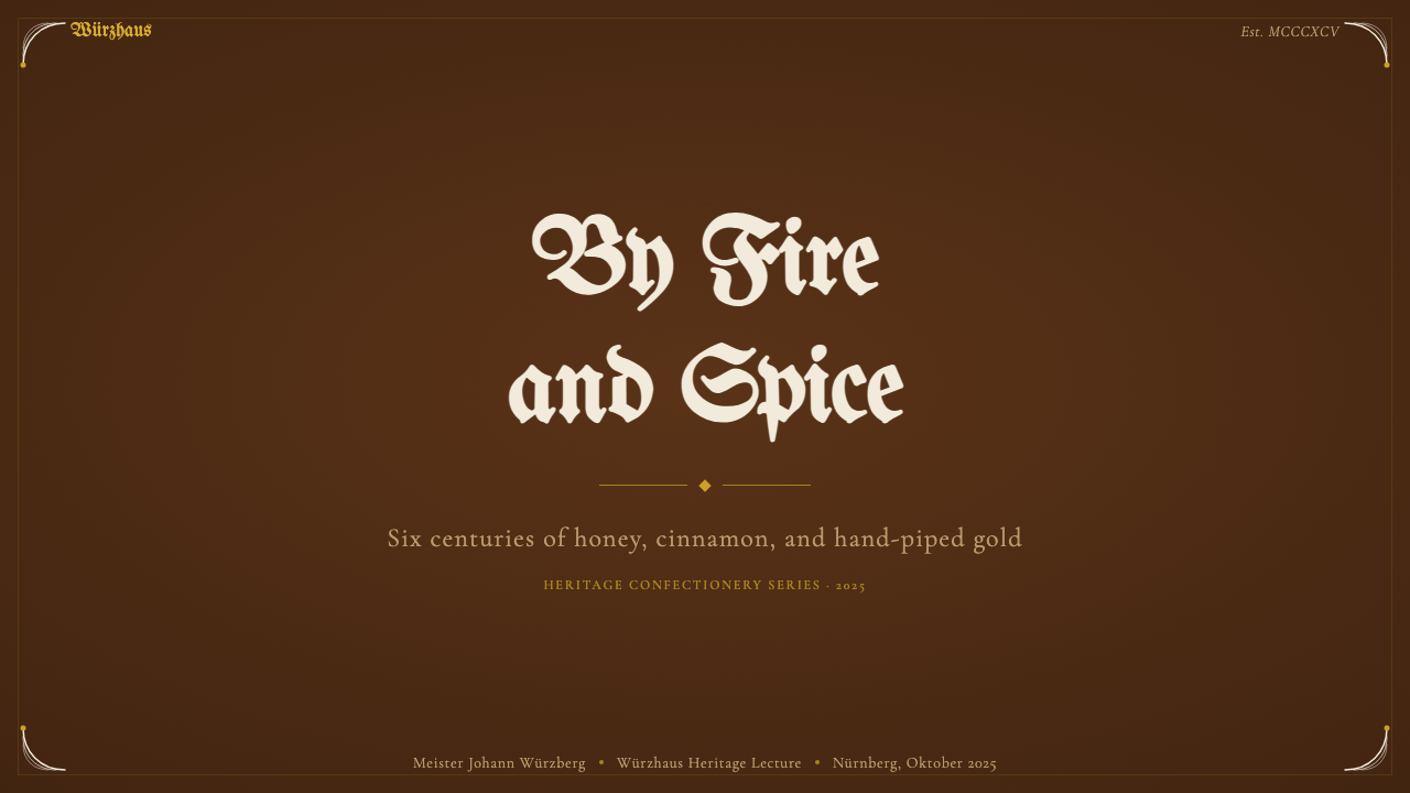
For presentation slides, the style suits cover pages and section dividers especially well: a full-bleed deep spiced-brown field with a centered or bordered white ornamental motif reads immediately as warm and crafted. Content and data slides should keep the dark ground but pull most working text into a lighter, glaze-adjacent tone for legibility, reserving true icing-white and any gold accent for headers or callout numbers — treating data points the way a confectioner treats a final flourish, not the way a spreadsheet treats a grid.
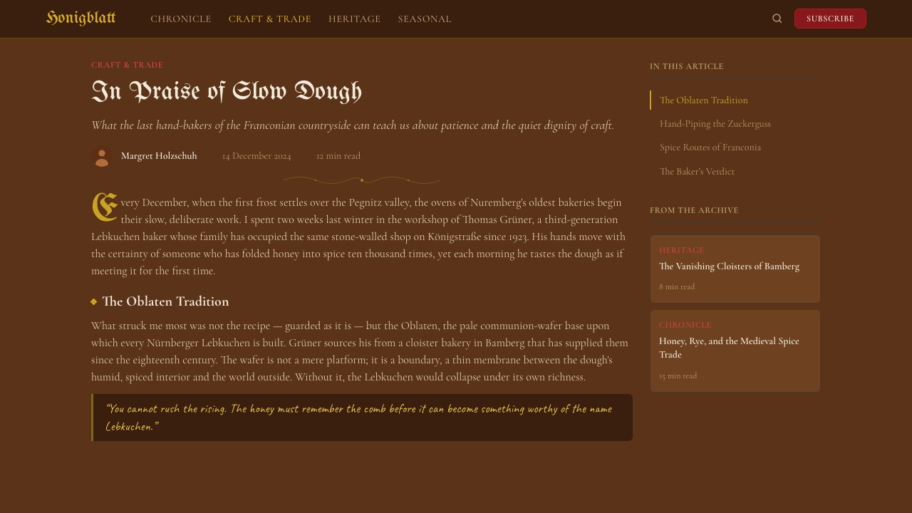
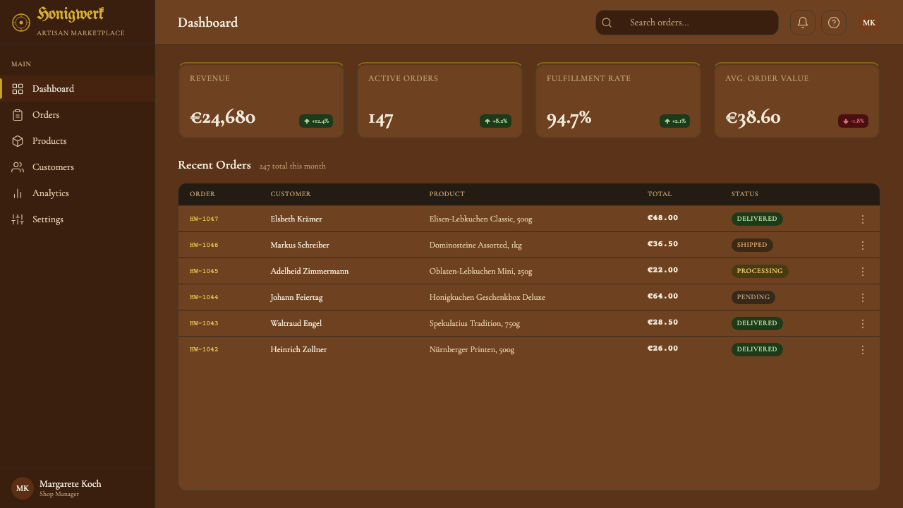
In web UI, the style works well for dashboards and pricing pages that want to feel premium and seasonal rather than clinical: a dark warm-brown surface for cards and navigation, a bright glaze-white for primary actions and key metrics, and red or gold reserved strictly for status highlights or a single call-to-action — never spread across the whole interface. Because the ground is dark, legibility needs real attention; body copy should sit in a softened, warm off-white rather than true glaze-white, keeping the brightest white for short marks the way icing is piped rather than poured.
For editorial and marketing work, the style suits seasonal campaigns, gift guides, and any brand story that benefits from a sense of tradition and craft — feature spreads can use the dark baked ground as a dominant field with headlines rendered in icing-white, bordered the way a decorative tin would be. Marketing pages benefit from treating white ornament as a rare, considered gesture rather than a recurring pattern at every section break.
A common mistake is treating this style as simply 'brown plus gold plus a decorative font' — that reading strips out what makes it recognizable: the sense that the brown ground has actually been baked (warm, slightly uneven, never a flat corporate neutral) and the sense that the white is piped rather than printed (thin, looping, hand-worked lines rather than blocky icons). Overusing red or gold as large background fields, rather than small punctuating details, also collapses the restraint that gives the style its festive-but-composed character.
Nuremberg Lebkuchen — FAQ
What makes Nuremberg Lebkuchen different from a generic 'gingerbread' or holiday palette?
A generic gingerbread palette is usually just brown, red, and green applied decoratively. Nuremberg Lebkuchen is more specific and more historically grounded: the ground color is meant to evoke an actual baked, spiced surface rather than a flat brown swatch, the white accent is meant to look piped rather than printed, and green is absent entirely — gold and festive red are the only accents, alongside white. It is also tied to a documented guild craft with a real geographic and trade history, rather than a purely decorative seasonal convention.
Can this style work outside of food or seasonal branding?
Yes, though it requires abstracting the relationship rather than the literal ingredients: a dark, warm, substantial ground; a fine, restrained, hand-worked light accent; and a small number of festive punctuation colors used sparingly. Applied this way, it suits any brand wanting to feel crafted, premium, and a little traditional — gift and hospitality products, artisanal goods, or contexts where warmth matters more than modern minimalism.
Why is the icing always described as white rather than cream or off-white?
Because the contrast between the dark baked ground and the icing is the style's core structural relationship — a cream or off-white icing would blur into the warm brown ground and lose the crisp, deliberate mark-making that defines Zuckerguss piping. The icing needs to read as distinctly brighter and cooler than the ground so the piped lines stay legible as ornament.
How should gold be used differently from the icing-white accent?
Gold should be rarer and more ceremonial than white. Where white icing carries the bulk of the ornamental linework — borders, loops, small flourishes — gold is reserved for a smaller number of high-value marks: a seal, an emblem, a single decorative edge. If gold is used as generously as white, the composition loses the hierarchy that makes it feel precious.
Does this style suit a dark-mode interface particularly well, given it already has a dark ground?
It suits dark-mode contexts more naturally than most historical styles, but the ground still needs to read as warm-baked brown rather than neutral charcoal — swapping in a cool dark gray for a standard dark-mode palette erases the style's identity. Body text should sit in a softened warm off-white rather than stark pure white, saving the brightest icing-white for short accents rather than long passages of copy.
Related design styles
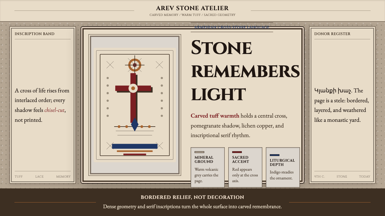 Armenian Khachkar Cross-StoneStone becomes memory. Tuff grey, pomegranate red, and carved borders hold the…
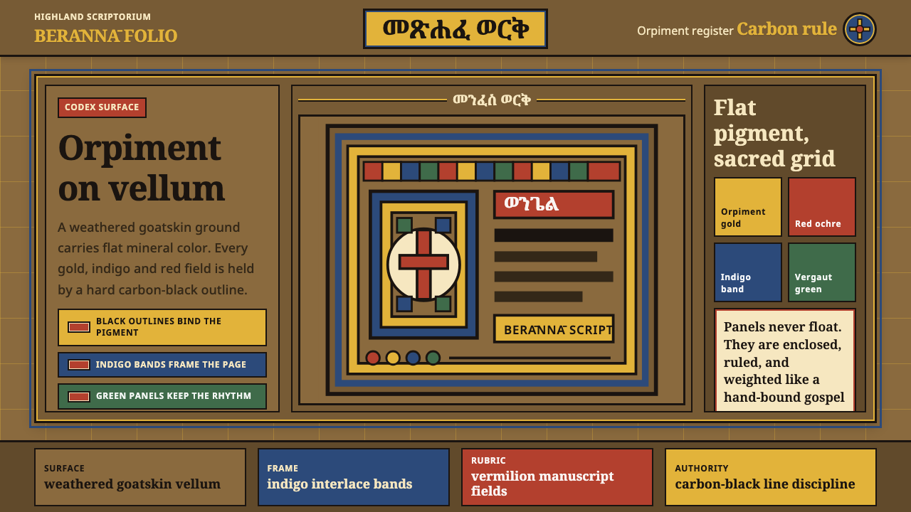 Ethiopian Geez GospelSacred color held in line. Orpiment gold and indigo panels sit on weathered v…
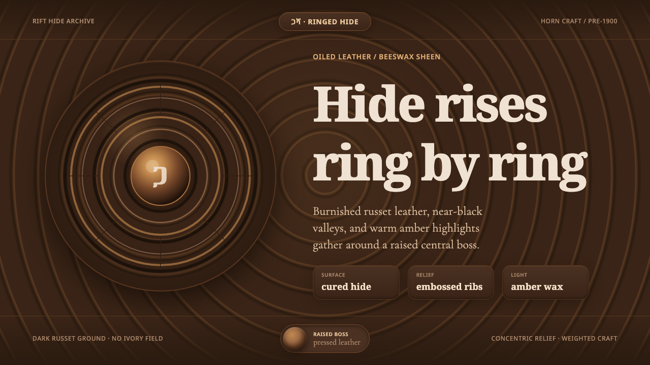 Ethiopian Hide ShieldDark hide speaks in relief. Russet rings and amber beeswax light rise from ne…
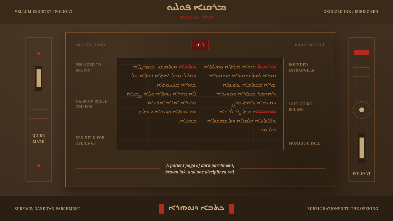 Syriac EstrangelaAncient warmth survives. Brown parchment, right-to-left columns, rationed rub…
 Afghan Baluchi Prayer RugDevotional darkness glows. Plum field, oxblood mihrab, and camel borders surf…
 Alchi Monastery MuralDevotional depth. Lapis fields and coffered grids glow on terracotta plaster.