What is Cuban Habano Cigar?
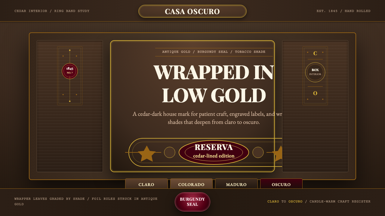
Cuban Habano Cigar translates the cedar-lined ritual of a Havana cigar box into a screen aesthetic: tobacco-brown grounds, antique gold rules, burgundy seals, and the slow, candlelit gravity of colonial-era engraved labels.
Cuban Habano Cigar in brief
Cuban Habano Cigar is a dark-luxury design aesthetic rooted in the visual culture of nineteenth-century Havana cigar manufacturing. Its palette runs from claro (pale honey tobacco) through maduro to oscuro (deep espresso brown), with antique gold as the sole brightness and burgundy as the ceremonial accent. Every surface suggests hand-pressed paper, embossed foil, and the warm grain of cedar — materials that carry age, craft, and colonial prestige.
The visual logic is additive and layered rather than subtractive or minimal. Oval cartouches, engraved border rules, ribbon seals, and portrait medallions are the structural vocabulary. Unlike modernist styles that strip decoration away, this aesthetic argues that ornament is the product: the richness of the surface is the message, signaling that what lies inside is rare, patient, and worth the ceremony.
Typographically, the style is anchored by ornamented serif letterforms — condensed display faces with bracketed serifs, swash capitals, and tight letterspacing that reads as formality rather than tightness. Gold lettering on dark grounds is the dominant relationship. Body text, where it appears, is set small and respectfully, deferring to the emblem work that surrounds it.
Where does Cuban Habano Cigar come from?
The design language of the Cuban habano emerged in the mid-nineteenth century as Havana's tobacco industry consolidated into large centralized factories called manufacturas. The Vuelta Abajo region of western Cuba had produced fine tobacco for Spanish colonial export since the early 1600s, but it was not until the 1840s that Havana cigar houses — notably H. Upmann (founded 1844), Partagás (1845), and Romeo y Julieta (1875) — began competing on presentation as vigorously as on leaf quality. The cedar-lined box, the printed lithographic label, and above all the ring band became the primary design battleground.
The ring band itself — the narrow paper sleeve banded around each cigar — is one of the most concentrated design objects ever made. Accounts differ on its exact origin, but by the 1850s it had standardized into a format: a gold-bordered oval cartouche bearing the house name, a founding date or royal patent, and sometimes a portrait medallion. The printing technology was lithographic, capable of producing fine hatching and simulated engraving at small scale, which is why the visual language mimics intaglio even though the production method was industrial.
Cuban cigar culture acquired its association with luxury consumption through a combination of geopolitics and celebrity. Queen Victoria's court, the British aristocracy, and later American industrialists made Havana cigars a standard accessory of power and leisure in the second half of the nineteenth century. The visual identity of the cigar box had to perform in those drawing rooms and smoking clubs — it needed to look like it belonged alongside silver plate and leather-bound books. The dark tobacco grounds and gold embellishments were calibrated for candlelight and gaslight.
After the Cuban Revolution of 1959, the major Habano houses were nationalized into Habanos S.A., but the historic visual identity was deliberately preserved as both brand equity and cultural heritage. This means the aesthetic has remained remarkably consistent from the 1840s to the present day — an unusually long design lineage. Contemporary digital products that draw on this vocabulary are therefore reaching back across nearly two centuries of visual culture, not just a passing period style.
What defines the Cuban Habano Cigar look?
Color and Tone
The palette is built around the spectrum of cured tobacco leaf itself. Grounds range from warm honey-brown through dark espresso, with the dominant tone being a mid-range tobacco brown that reads as grounded and serious without tipping into black. Antique gold — never bright yellow — is reserved for rules, borders, and lettering, and it is always treated as aged rather than polished. Burgundy and dark sienna serve as accents, creating a color relationship that is simultaneously warm and weighty. Pure white is absent; near-cream or aged ivory appears only in the lightest background bands.
Ornamentation and Engraving
Ornament is not supplementary here — it is the structural system. Oval cartouches frame the central emblem; concentric border rules define field edges; foil-effect rules separate hierarchical zones; ribbon banners carry secondary text. The visual grammar derives directly from intaglio printmaking: fine parallel hatching suggests dimensional form, crosshatching creates tonal depth, and stippling renders texture. These engraving conventions give every surface a handcrafted quality even when reproduced digitally.
Typography
Display typography favors ornamented serifs — condensed faces with bracketed serifs, ink-trap details, and swash capitals that would have been at home in a Victorian foundry specimen book. Lettering is typically centered within its cartouche, set in all capitals or small capitals for the house name, with date and descriptor lines in smaller complementary weights. The hierarchy reads formally: primary name large and gold, secondary information smaller and in a contrasting light tone, tertiary details even smaller and often in a serif italic.
Depth and Layering
This is a deeply layered aesthetic. A typical composition might contain a dark ground, a mid-tone background texture suggesting aged paper or wood grain, a bordered field, a cartouche inside that field, an emblem inside the cartouche, and gold rule lines at every boundary. This nesting of frames within frames creates genuine visual depth without any perspective or three-dimensional illusion — the depth is achieved through layering alone, which keeps the overall composition flat even as it feels rich.
Texture and Material Suggestion
Unlike modernist digital design that suppresses texture in favor of flat color, this aesthetic actively simulates material surfaces: aged paper grain, cedar wood, pressed foil, embossed leather. These textures are typically subtle overlays — a slight noise or grain on the tobacco-brown ground, an embossed-edge effect on the cartouche border — rather than dominant features. The goal is patina rather than realism: the surface should read as aged and considered, not photographic.
Gold as the Sole Brightness
In this palette, gold performs the role that white plays in modernist systems — it is the high point on the value scale, the element that draws the eye first, the marker of primary hierarchy. But unlike white, gold is warm and aged rather than neutral and clean. This means the contrast relationship between ground and highlight is warm-on-warm rather than cold-on-warm, which gives the entire system a unified tonality. Bright silver or chrome would read as foreign; contemporary metallic colors would undermine the colonial-era register entirely.
Ceremonial Hierarchy
The visual hierarchy is organized like a ceremony: there is a clear sequence of introduction, presentation, and detail. The house name or emblem is sovereign and centered. Founding date and royal patents are secondary honors, positioned below and at reduced scale. Descriptors, origin statements, and grade classifications occupy the tertiary ring. This hierarchy is not merely typographic — it is spatial, with each zone of the composition clearly delineated by rules, frames, or tonal shifts.
Who shaped Cuban Habano Cigar?
Founded in Havana in 1845 by Jaime Partagás, this manufacturer is one of the oldest continuously operating Habano houses and a primary carrier of the ring-band and box-label visual tradition. Its red-and-gold identity — dense with portrait medallions, royal crests, and engraved border work — became one of the most imitated models in cigar packaging design. The Partagás factory building on Industria Street in Old Havana, still producing today, is a physical emblem of the aesthetic's continuity.
Established one year before Partagás by German banker Hermann Upmann, H. Upmann introduced the practice of shipping cigars in individual cedar boxes sealed with the manufacturer's label — a practice that formalized the box as a designed luxury object rather than mere protective packaging. The Upmann visual identity, with its blue-and-gold palette and heraldic crest, represents a slightly more formal, almost diplomatic register within the Habano tradition, reflecting its German banking origins.
The master rollers (torcedores) of Cuba's Vuelta Abajo region are not individual designers but a collective craft tradition whose physical practice shaped the aesthetic logic of Habano presentation. The lector — a person hired to read aloud to workers during rolling — was a fixture of Habana factory culture, and the cigar names that resulted (Romeo y Julieta, Montecristo) reflect a literary sensibility that feeds directly into the ornate, story-bearing quality of the labels. The torcedor's patience and manual precision is the cultural model that the design vocabulary seeks to project.
Though a relatively late addition to the Habano tradition — founded in Havana in 1935 and named after Dumas's novel — Montecristo became one of the most recognized cigar identities in the world and a significant influence on the global perception of what Habano packaging should look like. Its crossed-swords-over-fleur-de-lis emblem, heavy gold rules, and black-and-gold color relationship are among the most frequently cited visual references when designers attempt to evoke serious, aged luxury without being overly specific about Cuba.
Treated as a collective design artifact rather than any single designer's work, the evolution of the Habano ring band from the 1850s to the early twentieth century constitutes one of the richest case studies in luxury micro-packaging. Within a strip rarely wider than a human thumb, generations of anonymous lithographers and engravers produced compositions that balanced heraldic convention, typographic formality, and material simulation at a scale that demanded extraordinary precision. The band format's constraints — extreme aspect ratio, printing on a curved surface, need for legibility at a glance — shaped design decisions that remain the template for the aesthetic.
How do you use Cuban Habano Cigar today?
Applying Cuban Habano Cigar to a digital product is fundamentally about surface depth and ceremonial hierarchy — not about adding cigars or Cuban imagery. The aesthetic works when every element has a clear place in a nested, frame-within-frame compositional structure, and when the palette stays entirely within the tobacco-gold-burgundy range without introducing modern brights.
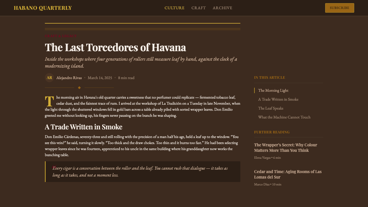
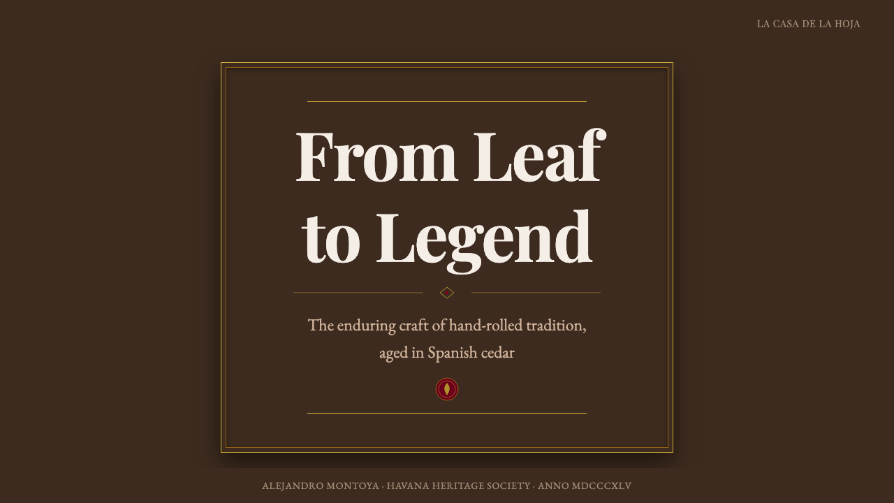
For presentation slides, the style is strongest on cover and divider pages. A cover built in this language uses a dark tobacco-brown field as the ground, introduces the subject name in gold display type within a centered cartouche, and frames that cartouche with a double or triple concentric border rule in antique gold. Content pages should resist the temptation to carry the full ornamental load — they work better as restrained versions: a narrow gold top rule, body text in a warm cream or near-white against the dark ground, and section labels in small gold caps. Data slides in this style are challenging; the palette is poor for multi-series visualization, so where data must appear, limit it to simple single-series charts and use warm cream and gold as the two data colors.
For web interfaces, the style is best suited to landing pages, about pages, membership portals, and e-commerce experiences for genuinely premium physical goods — whisky, leather, aged cheese, watches. The pattern is: dark background, a central content zone framed with a thin gold rule, display headlines in an ornamented serif face, and body text in a warm light tone against the dark ground. Navigation should be typographic and minimal within the ornamental frame — the chrome stays quiet while the content zone is rich.
For editorial and marketing work, the aesthetic produces strong hero sections and cover treatments. Full-width dark grounds with centered gold-cartouche compositions work for event invitations, premium brand announcements, and luxury product reveals. The challenge in longer editorial pieces is sustaining the richness over multiple pages; the approach is to concentrate the ornamental vocabulary at section boundaries and keep the body text zones clean, so the reader's eye has a clear rhythm between density and rest.
The most common mistake when working with this aesthetic is confusing it with generic dark-luxury or steampunk. Dark-luxury in contemporary design tends toward deep blue or charcoal with silver accents and a glossy finish — none of which appear in the Habano vocabulary. The tobacco ground is specifically warm and brown, not cool or grey; the gold is antique and matte or satin, not shiny chrome; the ornament is engraving-derived, not mechanical or industrial. The other frequent error is over-ornamentation: every element trying to carry the full cartouche treatment simultaneously collapses the hierarchy the style depends on. One dominant emblem zone, supported by quieter secondary ornament, is the correct proportion.
Cuban Habano Cigar — FAQ
Is this aesthetic appropriate for digital products, or does it only work in print?
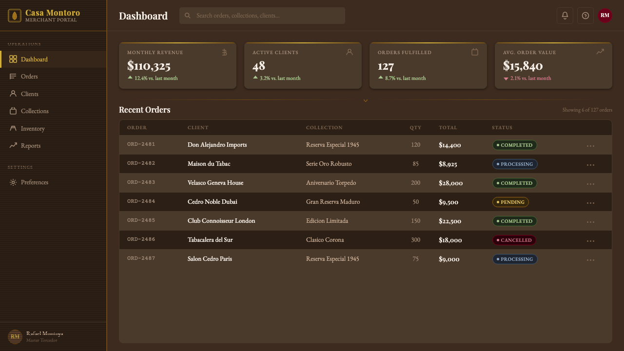
It works in digital, but the translation requires deliberate adaptation rather than direct copy. In print — especially offset or letterpress with foil stamping — the physical properties of embossed foil and matte paper do much of the perceptual work. On screen, those properties have to be suggested through carefully layered textures, matte gold tones calibrated for display rendering, and the discipline to avoid the glossy or saturated treatments that screens naturally encourage. The aesthetic is most successful in digital contexts that are slow and considered — membership sites, premium e-commerce, invitation experiences — rather than fast-interaction interfaces like navigation menus or data dashboards.
How is this different from other dark-luxury aesthetics like Art Deco or Victorian Gothic?
The distinctions are in palette, geometry, and cultural register. Art Deco is cool-toned — blacks and deep navies with platinum, chrome, or bright gold and sharp geometric fan and sunburst motifs. Victorian Gothic brings ecclesiastical ornament, pointed arches, and a predominantly black-and-deep-purple palette derived from mourning culture. Cuban Habano is specifically warm-toned with organic oval cartouche shapes rather than angular geometric forms; it is colonial rather than ecclesiastical, tropical in its warmth rather than northern-European in its gravity. The engraving-derived ornament style is also distinctly different from both: it derives from commercial lithography rather than architectural stone carving or machine-age geometry.
Can this style be used for a light-background layout?
Yes, but the light-background version is a fundamentally different proposition. The canonical Habano palette is dark-ground — the tobacco brown provides the weight and warmth that hold the gold lettering. On a light or cream ground, gold rules and gold type still work, but the overall register shifts from candlelit drawing room to daylight archive: it becomes more documentary, less atmospheric. This version — think antique paper with printed border ornament and dark sepia ink rather than gold on espresso — has its own historical basis in vintage cigar-box interior prints and label backs. It can be effective for editorial applications where extended reading is needed, while the dark-ground version works better for first impressions and hero moments.
What is the relationship between this style and Cuban national identity?
The relationship is real but mediated. The Habano visual tradition is genuinely Cuban in origin — it developed in Havana, it encodes the tobacco-leaf spectrum of western Cuba, and it was shaped by the cultural labor of Cuban torcedores and the Spanish colonial commercial system. But it was also designed to appeal to the European luxury market, and it was nationalized and globally standardized after 1959 through Habanos S.A. So what we call the 'Cuban cigar aesthetic' is in part a curated projection of Cuban craft identity toward an international premium audience. Designers using the vocabulary should be aware they are citing a colonial-era commercial tradition, not folk art or vernacular culture, and should apply it with that specificity rather than treating it as generic 'Latin luxury'.
Which contemporary brands successfully use this aesthetic as a reference?
The most successful contemporary references tend to be in premium spirits, aged tobacco products, and old-world luxury food — categories where heritage and patience are core brand values. Many single-malt Scotch whisky labels borrow the oval cartouche and gold rule vocabulary from Habano packaging, often combined with clan crests. Some luxury coffee brands and aged rum producers reference it directly. In digital design, the aesthetic appears in invitation and event platform interfaces built for weddings, galas, or premium private clubs. The brands that use it effectively are those for whom the reference is thematically coherent — aged, crafted, patient things — rather than those that borrow the visual surface for products whose values actually point toward speed, transparency, or accessibility.
Related design styles
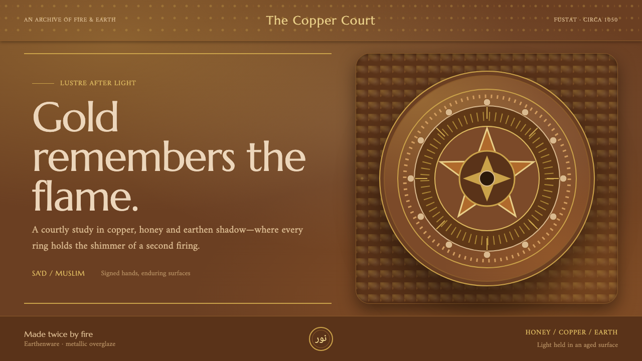 Fatimid LustrewareOpulence fired into earth. Copper-gold lustre glows through dense medallions…
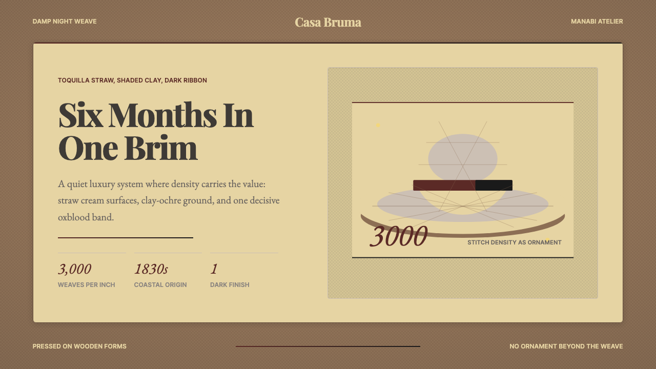 Ecuadorian Montecristi Panama HatLuxury disappears into density. Straw cream, clay ochre, and one oxblood ribb…
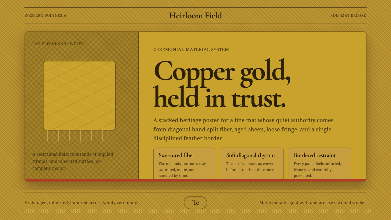 Samoan ʻIe Tōga Fine MatCeremony in restraint. Copper-gold weave, loose fringe, one red feather line.
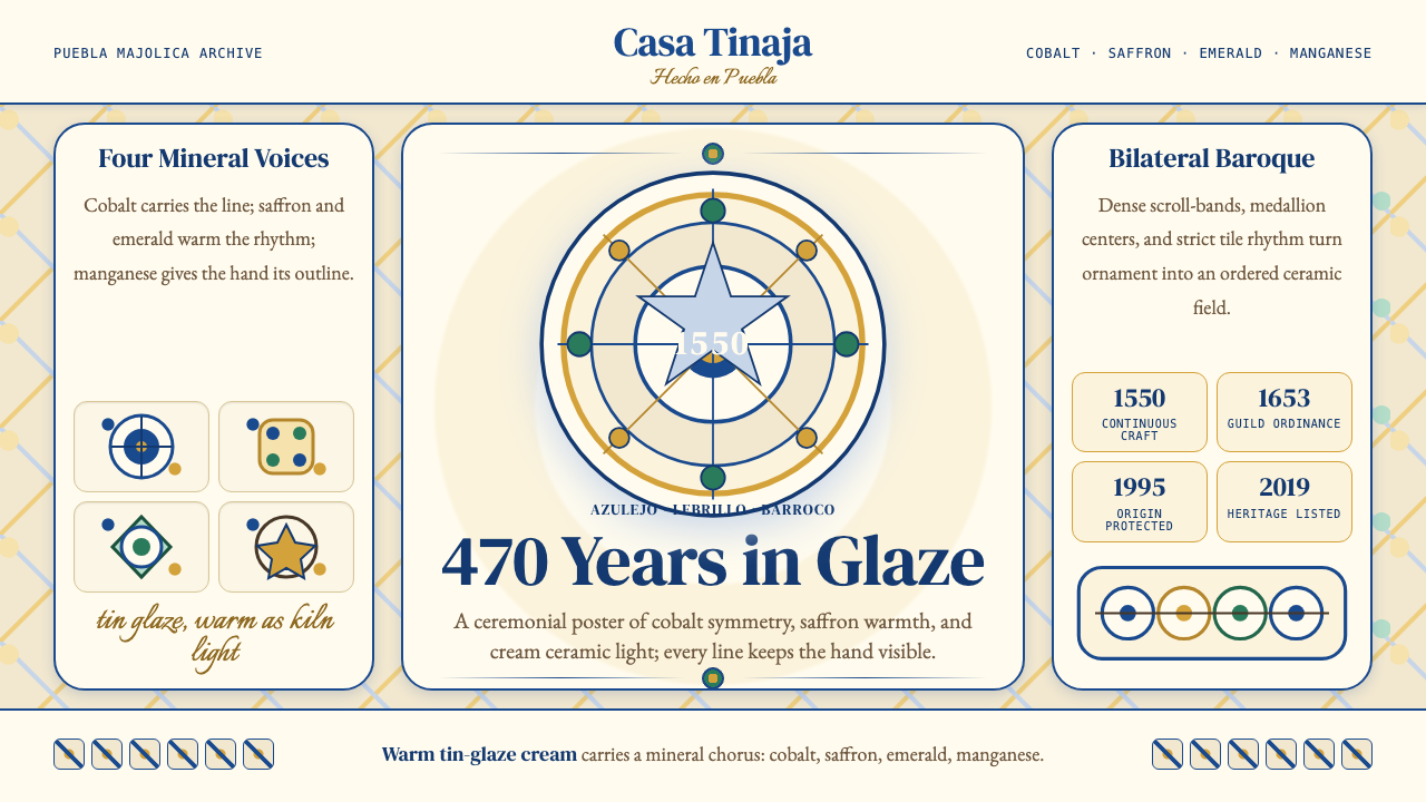 Talavera Poblana CeramicBaroque craft breathes. Cobalt scrollwork on warm tin-glaze cream frames stri…
 Yemeni Jambiya Curved DaggerLamp-lit status. Indigo-black fields, butter-yellow horn, and silver filigree…
 Burmese Shan Lacquer BrownDark lacquer leads. Cinnabar bands and shwe hairlines cut across a warm umber…