What is Talavera Poblana Ceramic?什么是 Talavera Poblana Ceramic?
Talavera Poblana is five centuries of Spanish, Moorish, and Mexican Baroque craft fused into warm tin-glaze cream painted with saturated cobalt, saffron, emerald, and manganese — a living tradition still governed by guild law and UNESCO recognition.塔拉维拉陶瓷是五个世纪西班牙、摩尔与墨西哥巴洛克工艺的熔合——温润的锡釉米底上,钴蓝、藏红、翡翠绿与锰黑手绘其上,至今仍受行会规章与联合国非遗认证共同守护的活态传统。
Talavera Poblana Ceramic in briefTalavera Poblana Ceramic 速览
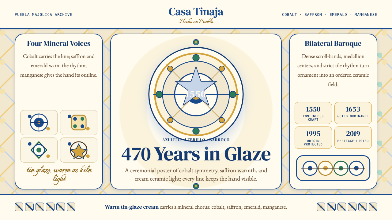
Talavera Poblana is the tin-glazed majolica ceramic tradition produced continuously in Puebla, Mexico, since around 1550. Its visual signature is immediately recognizable: a warm cream ground that reads as neither stark white nor beige, overlaid with hand-painted motifs in a disciplined palette of cobalt blue, saffron yellow, emerald green, and manganese black, sometimes accompanied by an iron-orange accent. The imagery draws on Baroque floral scrollwork, figural scenes, birds, and geometric interlace — all executed with slight brush irregularity that marks every piece as human-made.塔拉维拉陶瓷是约自1550年起在墨西哥普埃布拉延续至今的锡釉陶器传统。其视觉特征一望可辨:一种既非亮白也非米黄的温润奶色釉底,其上以钴蓝、藏红黄、翡翠绿、锰黑——有时辅以铁锈橙——手绘图案。图像语言承袭巴洛克卷草、人物场景、飞鸟与几何交织纹,每一笔触都带着工匠手腕微微颤动的痕迹,宣告这是人手所造之物,非机器所能复制。
The aesthetic system operates under strict self-imposed constraints. Certified Talavera Poblana pieces use no more than five colors on any given surface, achieve a hard tin-glaze finish that produces a particular depth and sheen distinct from ordinary earthenware, and exhibit bilateral or radial symmetry as the dominant organizational grammar. The symmetry is never mechanical — the hand of the painter is always legible — which is precisely the quality that distinguishes authentic Talavera from industrial imitation. Motifs repeat and mirror, but they breathe.这套美学体系在严格的自我约束中运作。经认证的塔拉维拉作品每件表面的用色不超过五种,锡釉烧成后呈现出有别于普通陶器的特有深度与光泽,整体构图以双侧对称或放射对称为主要语法。这种对称从不机械——画师的手始终清晰可感——正是这一特质将真品与工业仿制品区别开来。纹样在对称中重复镜像,却带着呼吸感。
Because Talavera Poblana holds a Mexican Denominación de Origen (DO) since 1995 and was inscribed on the UNESCO Representative List of the Intangible Cultural Heritage of Humanity in 2019, the name itself carries legal weight. Only pieces produced by certified workshops in the states of Puebla and Tlaxcala, following documented traditional methods including natural mineral pigments and double-firing, may legally carry the Talavera designation. This heritage context shapes how the aesthetic should be handled in digital work: the visual language deserves the same respect as a protected geographical indication.由于塔拉维拉陶瓷自1995年起持有墨西哥原产地名称保护(Denominación de Origen),并于2019年列入联合国教科文组织非物质文化遗产名录,这个名称本身具有法律效力。只有普埃布拉州与特拉斯卡拉州的认证作坊,遵循包括天然矿物颜料与二次烧制在内的传统工艺所制作的器物,才可合法冠以「塔拉维拉」之名。这一遗产背景决定了该视觉语言在数字创作中应受到的尊重——它应当被视为受保护的地理标志,而非随意借用的异域风情。
See the Talavera Poblana Ceramic design system查看 Talavera Poblana Ceramic 完整设计系统
Where does Talavera Poblana Ceramic come from?Talavera Poblana Ceramic 从何而来?
The roots of Talavera Poblana are a palimpsest of three continents. The tin-glaze technique itself — applying an opaque white glaze containing tin oxide to earthenware before painting — originated in the Islamic ceramic world, traveled through Persia and North Africa into Moorish Spain, and settled in Andalusia. From there it crossed the Mediterranean into Renaissance Italy, producing the celebrated Faenza majolica (from which the word 'faience' derives) and the parallel tradition of Talavera de la Reina in the Toledo region of Castile. When Spain began colonizing the Americas in the sixteenth century, Castilian potters carried both the technique and the visual vocabulary with them.塔拉维拉陶瓷的根系是一页三大洲叠写的羊皮纸。锡釉技术本身——在绘画前于陶胎上施以含氧化锡的不透明白釉——起源于伊斯兰陶瓷世界,经波斯、北非传入摩尔统治的西班牙,落脚于安达卢西亚。由此它又越过地中海进入文艺复兴时期的意大利,孕育出举世闻名的法恩扎锡釉陶(「faience」一词即由此而来),以及卡斯蒂利亚托莱多地区的塔拉维拉德拉雷纳平行传统。十六世纪西班牙开始殖民美洲时,卡斯蒂利亚陶工将这门技艺连同其视觉语汇一并带往新世界。
Puebla de los Ángeles — founded by the Spanish Crown in 1531 as a planned colonial city — became the center of New World majolica production for reasons of both geography and policy. The surrounding Tlaxcalan highlands offered deposits of high-quality clay and lead, and the city's position on the trade route between Veracruz and Mexico City made it a natural manufacturing hub. By the second half of the sixteenth century, Dominican friars had established tile workshops there to supply the region's many churches and convents. Spanish immigrant potters, bringing techniques from Talavera de la Reina and Seville, settled in Puebla and began training local mestizo and indigenous apprentices.天使城普埃布拉——1531年由西班牙王室规划建立的殖民城市——因地理与政策双重因素成为新世界锡釉陶的生产中心。周边特拉斯卡拉高原出产优质陶土与铅矿,城市位于韦拉克鲁斯至墨西哥城贸易要道上的地位使其天然成为制造业枢纽。十六世纪下半叶,多明我会修士在此设立瓷砖作坊,为该地区众多教堂和修道院供货。来自塔拉维拉德拉雷纳和塞维利亚的西班牙移民陶工在普埃布拉定居,开始培训本地混血与原住民学徒。
The colonial guilds formalized practice early. A 1653 guild ordinance — the first of its kind in the Americas — established quality standards, regulated the number of masters and apprentices, and specified which pigments were permissible. This guild structure was the seedbed of the formal protected-status system that exists today. During the Baroque peak of roughly 1650 to 1750, Puebla workshops produced the large decorative tiles (azulejos) that still cover the facades and kitchen interiors of the city's colonial buildings, as well as the iconic Talavera vessels — platters, pitchers, holy-water fonts, and apothecary jars — exported throughout New Spain. The imagery in this period blended Castilian botanical and heraldic motifs with Chinese blue-and-white (imported via the Manila Galleon trade), indigenous florals, and scenes from Catholic hagiography.殖民地行会早早将技艺规范化。1653年颁布的行会规章——美洲第一部同类规范——确立了质量标准,规定了师傅与学徒的人数,并明确了许可使用的颜料种类。这一行会结构是今日保护体系的制度原型。在大约1650至1750年的巴洛克鼎盛期,普埃布拉作坊生产了大量装饰瓷砖(azulejos),至今仍铺满该城殖民建筑的立面与厨房内壁,同时也出产标志性的塔拉维拉器皿——大盘、水罐、圣水瓶与药剂师罐——销往整个新西班牙。这一时期的图像将卡斯蒂利亚植物与纹章母题、经马尼拉大帆船贸易引入的中国青花风格、原住民花卉纹,以及天主教圣徒故事融合在一起。
After Mexican independence in 1821, the workshops entered a long period of contraction as European industrially produced ceramics undercut local prices. The Uriarte family workshop, established in Puebla in 1824, became one of the crucial continuity nodes, maintaining hand production and traditional firing methods through the nineteenth and twentieth centuries. The late twentieth century brought deliberate revival: craft museums, academic documentation of historical techniques, and eventually the Denominación de Origen decree of 1995, which created a formal Regulatory Council (Consejo Regulador de la Talavera) to certify workshops and authenticate pieces. The 2019 UNESCO inscription, shared jointly with Spain's Talavera de la Reina tradition, confirmed the tradition's status as living world heritage rather than historical artifact.1821年墨西哥独立后,随着欧洲工业化陶瓷以低价冲击市场,各作坊进入漫长的收缩期。1824年在普埃布拉创立的乌里亚尔特家族作坊,成为延续手工生产与传统烧制方法贯穿十九、二十世纪的关键节点之一。二十世纪末,有意识的复兴运动兴起:工艺博物馆、对历史技术的学术记录,以及最终于1995年颁布的原产地名称保护法令——该法令设立了正式的塔拉维拉监管委员会,负责认证作坊与鉴定器物。2019年与西班牙塔拉维拉德拉雷纳传统联合申报的联合国非遗认定,将这一传统的地位从历史遗产确立为活态世界文化遗产。
What defines the Talavera Poblana Ceramic look?Talavera Poblana Ceramic 的视觉特征是什么?
Palette Discipline色彩纪律
Certified Talavera Poblana limits itself to five colors derived from natural mineral pigments: cobalt blue, saffron yellow, emerald green, manganese black, and an iron-derived orange-red. The warm cream of the tin-glaze ground functions as an implicit sixth tone — never stark white, always with a fired warmth — and serves as the breathing space between painted motifs. This restricted palette creates immediate visual coherence across wildly varied subject matter; whether the piece depicts birds, flowers, or saints, the same five colors bind everything into a unified world.经认证的塔拉维拉陶瓷严格限定于五种天然矿物颜料:钴蓝、藏红黄、翡翠绿、锰黑和铁质橙红。锡釉底色的温润奶白作为隐性的第六色——从不是刺眼的纯白,始终带着窑温赋予的暖意——在绘制图案之间提供呼吸空间。这套受限色板在题材千变万化的器物间制造即时的视觉凝聚力:无论画的是鸟、花还是圣徒,同样的五种颜色都将一切凝聚为一个统一的世界。
Bilateral and Radial Symmetry双侧与放射对称
Symmetry is the structural backbone of Talavera Poblana composition. Circular pieces — plates, bowls, tiles — typically organize their decoration in radial panels that mirror and repeat around a central focal motif. Elongated forms such as pitchers and vases use bilateral symmetry, with mirrored floral or figural arrangements flanking a central axis. This symmetry is never mechanically perfect: the human hand introduces slight asymmetries in brushstroke weight and curve, and it is precisely this imperfection that distinguishes hand-painted Talavera from printed facsimiles.对称是塔拉维拉陶瓷构图的结构脊梁。圆形器物——大盘、碗、瓷砖——通常以放射状面板组织装饰,围绕中央焦点纹样镜像重复。水罐、花瓶等纵向器形则采用双侧对称,以镜像的花卉或人物排列夹持中央轴线。这种对称从不机械完美:人手在笔触力度与曲线上引入微小的不对称,而正是这种不完美将手绘塔拉维拉与印刷复制品区别开来。
Baroque Figural and Floral Vocabulary巴洛克人物与花卉图像语言
The motif library of Talavera Poblana is dense and syncretic. Castilian Baroque contributed spiraling acanthus scrollwork, heraldic eagles, and pomegranate borders. The Manila Galleon trade introduced Chinese-derived peony blossoms, cloud bands, and fish. Indigenous Mexican artisans layered in local flora — particularly passionflowers and marigolds — as well as deer, rabbits, and pre-Columbian geometric interlace. Catholic iconography provided saints, angels, and sacred monograms. These elements co-exist on the same surface without hierarchy, producing a visual richness that is encyclopedic rather than chaotic, bound together by the consistent palette and symmetrical grammar.塔拉维拉陶瓷的图案库密集而混融。卡斯蒂利亚巴洛克贡献了螺旋茛苕卷草、纹章鹰与石榴边框;马尼拉大帆船贸易引入了中国式牡丹、云纹与鱼纹;墨西哥原住民工匠叠入了本土植物——尤其是西番莲与万寿菊——以及鹿、兔与哥伦布前时代的几何交织纹;天主教图像提供了圣徒、天使与神圣字母组合。这些元素在同一器面上共存,不分主次,产生一种百科全书式而非混乱的视觉丰富性,由一致的色板与对称语法将其凝聚成整体。
Hand-Painted Brush Presence手绘笔触的存在感
Unlike transfer-printed or industrially decorated ceramics, authentic Talavera Poblana makes the painter's hand visible. Brushstrokes have variable pressure — the entry and exit of a stroke differ from its middle passage. Lines that appear straight are slightly alive. Floated washes of cobalt show subtle pooling at edges. This visible human agency is not a flaw to be minimized but the central authenticating quality of the tradition. In digital interpretation of the aesthetic, textures that evoke this quality — slight surface variation, hand-drawn linework over geometric structure — carry more fidelity to the original than perfect computer-generated symmetry.不同于贴花纸或工业装饰的陶瓷,真正的塔拉维拉陶瓷让画师的手可见。笔触有轻重变化——起笔与收笔有别于中段行程。看似笔直的线条微微带着生命感。钴蓝的罩染在边缘可见细微的积色。这种可见的人类主体性不是需要最小化的瑕疵,而是这一传统最核心的鉴别特质。在对这种美学进行数字诠释时,能唤起这种质感的手法——轻微的表面变化、叠压在几何结构上的手绘线条——比计算机生成的完美对称更忠实于原作。
Tin-Glaze Ground Warmth锡釉底色的温润感
The foundation of the entire visual system is the tin-glaze ground itself — a fired ceramic surface that is opaque, slightly granular in texture, and warm in tone. It is not the bright white of modern porcelain or printer paper but an off-white with an almost imperceptible amber undertone that comes from the firing process. Against this ground, even the coolest cobalt reads as warm. Reproducing this quality in digital contexts means choosing background tones that are cream rather than white — backgrounds with warmth baked in, not cold neutral grounds with a warm overlay.整套视觉系统的基础是锡釉底面本身——一种经过烧制、不透明、表面略带粒感、色调温润的陶瓷表面。它既不是现代白瓷或打印纸那种明亮的纯白,而是一种微微带有琥珀底调的乳白,那股暖意来自烧制过程本身。在这个底色上,即便是最冷调的钴蓝也会显得温暖。在数字语境中重现这种质感,意味着选择奶白而非纯白的背景色调——一种将暖意烧入肌理的底色,而非在冷中性底上叠加暖色调。
Hard-Fired Finish and Color Depth高温烧成的光泽与色彩深度
Talavera Poblana undergoes two firings: a bisque firing that hardens the clay body, and a second glaze firing at a higher temperature that fuses the tin-glaze and the painted mineral pigments into a glassy, durable surface. This double-firing gives the colors a particular luminous depth — the pigments sit within the glaze rather than on top of it, so they appear to glow from inside the surface. The cobalt in particular achieves an intensity that shifts from near-black in dense areas to a luminous blue in thinly applied passages. This quality of depth and inner light distinguishes Talavera color from surface-printed color.塔拉维拉陶瓷需经过两次烧制:素烧固化坯体,二次高温釉烧将锡釉与矿物颜料熔融为光洁耐久的玻璃质表面。这道双重烧制赋予色彩特殊的发光深度——颜料沉入釉层内部而非附着其上,因而看似从表面内部发光。钴蓝尤为如此:厚涂处接近黑色,薄涂处则呈现一种流光溢彩的蓝。这种深度与内在光芒的特质,将塔拉维拉的色彩与表面印刷色彩区别开来。
Guild Craft and Regulated Authenticity行会手工艺与受规管的真实性
Since 1995, the visual and material standards of Talavera Poblana are legally defined by the Denominación de Origen regulations and enforced by the Consejo Regulador de la Talavera. Each certified piece is individually inspected and receives a seal of authenticity. This regulatory framework means that the aesthetic system is not merely a historical style but an ongoing living practice with enforceable standards. For designers working with the Talavera visual language, this context implies a responsibility of informed interpretation — using the forms and color logic thoughtfully, in ways that acknowledge their cultural origin rather than flattening them into generic decorative pattern.自1995年起,塔拉维拉陶瓷的视觉与材料标准由原产地名称保护法规明确界定,并由塔拉维拉监管委员会执行。每件经认证的器物均接受逐一检验并获颁真品认证标志。这一监管框架意味着这套美学体系不仅仅是一种历史风格,而是具有可执行标准的持续活态实践。对于运用塔拉维拉视觉语言的设计师而言,这一背景意味着知情诠释的责任——以审慎的方式使用其形态与色彩逻辑,以承认其文化源头而非将其扁平化为泛泛装饰纹样的方式。
See the Talavera Poblana Ceramic design system查看 Talavera Poblana Ceramic 完整设计系统
Who shaped Talavera Poblana Ceramic?谁塑造了 Talavera Poblana Ceramic?
The Uriarte workshop is the oldest continuously operating certified Talavera workshop in Puebla and the most important institutional anchor of the tradition through the difficult nineteenth and early twentieth centuries, when European industrial ceramics threatened to displace hand production entirely. Founded in 1824, the workshop maintained traditional double-firing techniques, natural mineral pigments, and apprenticeship training across multiple generations. Today it functions as both a working production facility and a museum, and its historical archive of designs and techniques was instrumental in establishing the documentary basis for the 1995 Denominación de Origen.乌里亚尔特作坊是普埃布拉现存最古老的持续运营认证塔拉维拉作坊,也是在欧洲工业陶瓷威胁手工生产的十九、二十世纪初这一艰难时期,支撑这一传统最重要的制度锚点。创立于1824年的作坊历经数代,坚持传统双重烧制、天然矿物颜料与学徒培训体系。如今它既是运营中的生产工坊,也是一座博物馆,其历史图案与技艺档案为1995年原产地名称保护法令的文献依据发挥了关键作用。
The unnamed Spanish immigrant potters from Talavera de la Reina who settled in Puebla in the latter half of the sixteenth century are the direct technical progenitors of the Pueblan tradition. They brought the tin-glaze formula, the pigment preparation methods, the kiln-building knowledge, and the visual conventions of Spanish Baroque majolica. Working alongside Dominican friars who needed tiles for their churches and local indigenous craftspeople who supplied their own formal instincts, these potters created the hybrid workshop culture from which all subsequent Talavera Poblana descended. The 2019 UNESCO inscription recognized their role by designating both the Puebla tradition and the surviving Talavera de la Reina tradition in Spain as a single, shared heritage element.十六世纪下半叶定居普埃布拉的来自塔拉维拉德拉雷纳的西班牙移民陶工——尽管大多无名可考——是普埃布拉传统直接的技艺先祖。他们带来了锡釉配方、颜料制备方法、窑炉建造知识,以及西班牙巴洛克锡釉陶的视觉规范。他们与需要教堂用砖的多明我会修士、以及带来自身形式本能的本地原住民工匠协作,创造了混融的作坊文化——此后所有塔拉维拉陶瓷皆由此而来。2019年的联合国非遗认定通过将普埃布拉传统与西班牙现存的塔拉维拉德拉雷纳传统指定为单一共享遗产项目,承认了他们的历史作用。
Ventosa is among the key figures in the late-twentieth-century scholarly and institutional effort to document, standardize, and protect the Talavera Poblana tradition. His work contributed to the technical and historical groundwork that informed the 1995 Denominación de Origen regulations. The regulatory framework he helped build — specifying permitted pigments, required techniques, geographic boundaries, and quality inspection protocols — transformed what had been a surviving folk craft into a formally protected and internationally recognized heritage category.文托萨是二十世纪末记录、规范和保护塔拉维拉陶瓷传统的学术与制度努力中的关键人物之一。他的工作为1995年原产地名称保护法规提供了技术与历史依据。他参与构建的监管框架——规定许可颜料、要求的技艺、地理边界与质量检验规程——将一门幸存的民间手艺转化为受到正式保护、国际认可的遗产类别。
The Talavera de la Reyna workshop in Puebla is one of the few contemporary certified workshops that has made a deliberate effort to engage international audiences with the living practice of Talavera, offering public demonstrations of hand-painting, pigment preparation, and kiln firing. Its work illustrates how the tradition adapts within its strict constraints: new figurative subjects and contemporary design commissions are accommodated while the Denominación de Origen requirements for palette, technique, and materials remain non-negotiable. The workshop represents the tradition's ability to remain culturally alive rather than becoming a museum artifact.普埃布拉的塔拉维拉德拉雷纳作坊是少数几个有意识地向国际受众展示塔拉维拉活态实践的认证当代作坊之一——开放手绘、颜料制备与烧窑的公开示范。其工作展示了这一传统如何在严格约束内进行适应:新的具象主题与当代设计委托在色板、技艺与材料的原产地法令要求不可妥协的前提下得到吸纳。这家作坊代表了这一传统保持文化活力而非成为博物馆文物的能力。
The Dominican religious order was the institutional catalyst for industrial-scale Talavera production in colonial Puebla. The order's ambitious building program — convents, churches, hospital chapels — created sustained demand for the large format decorative tiles and utilitarian vessels that gave the workshops their economic basis. Friars also served as intermediaries between Spanish immigrant potters and indigenous craft communities, creating the institutional conditions under which the syncretic visual language of Talavera Poblana could develop. The kitchens of the convent of Santa Rosa de Lima, entirely covered in Talavera tile, remain the most visited single expression of the tradition's early colonial golden age.多明我修道会是推动殖民地普埃布拉塔拉维拉规模化生产的制度催化剂。修道会雄心勃勃的建筑计划——修道院、教堂、医院礼拜堂——为大幅装饰瓷砖与实用器皿创造了持续需求,奠定了各作坊的经济基础。修士们还充当西班牙移民陶工与原住民工艺群体之间的中介,创造了塔拉维拉混融视觉语言得以发展的制度条件。利马圣罗莎修道院的厨房——整面内壁全以塔拉维拉瓷砖铺就——至今仍是这一传统早期殖民黄金时代最广为人知的单一表达。
How do you use Talavera Poblana Ceramic today?今天怎么用 Talavera Poblana Ceramic?
Talavera Poblana translates into digital design work through a set of specific, historically grounded choices: a warm cream ground rather than neutral white, a palette of no more than four or five saturated mineral-derived tones, bilateral or radial symmetry as the structural grammar, and decorative motifs that are dense without being chaotic because they are organized by symmetry and bounded by the restricted color set. The style suits any project where warmth, craft heritage, cultural depth, and visual richness are desirable — not as decoration layered on top of function, but as function expressed through ornament.塔拉维拉陶瓷美学转化为数字设计时,需要一套有历史依据的具体选择:温润的奶白底色而非中性白,不超过四五种饱和矿物质感色调的色板,以双侧或放射对称为结构语法,以及靠对称组织、靠受限色板约束、密而不乱的装饰图案。这种风格适合任何以温暖感、手工遗产、文化深度与视觉丰富性为诉求的项目——不是叠加在功能之上的装饰,而是通过装饰表达的功能。
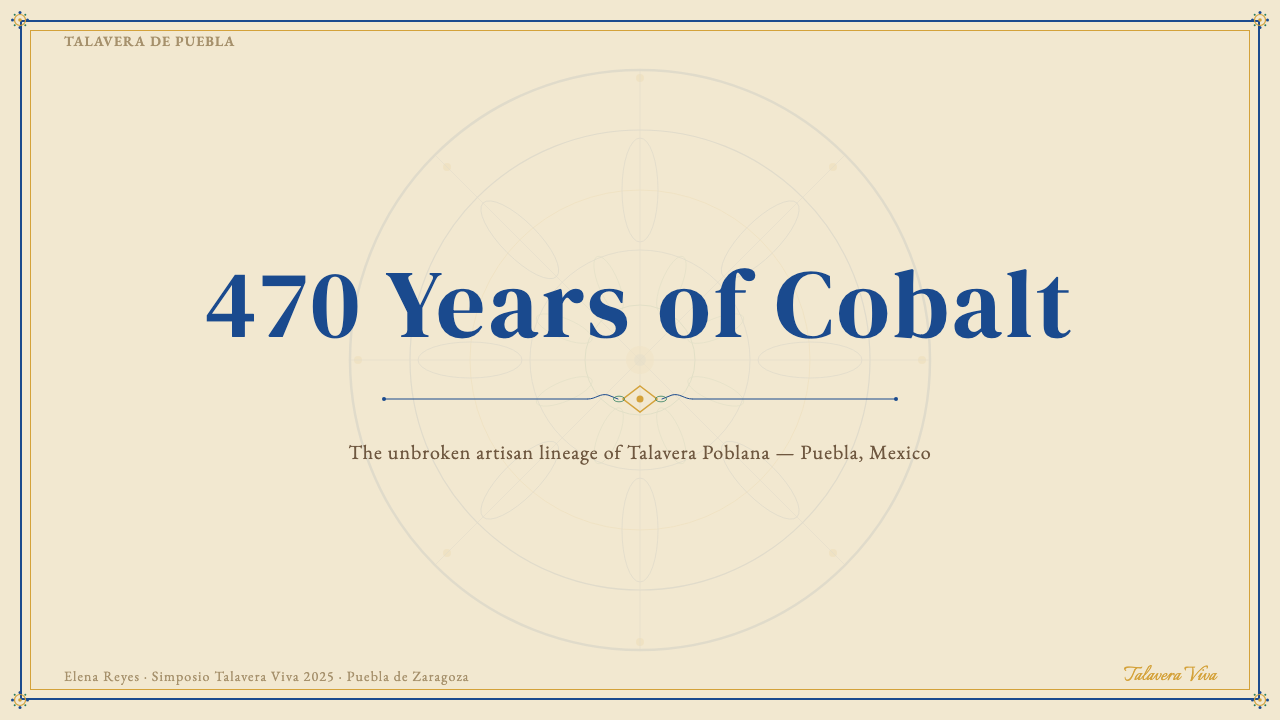
For presentation slides, Talavera's visual logic works best when the cover slide is treated like a decorated ceremonial plate: a centrally organized composition with the title occupying the visual center, flanked by symmetrical decorative borders drawn from the floral and scrollwork vocabulary. Section divider slides can echo the tile panel format — a warm cream field subdivided into a radial or grid arrangement of smaller decorative units, with the section title placed as the central medallion. Content slides should step back from dense decoration: use the warm cream ground, the restricted palette for accent colors in data visualization and callouts, and reserve the full decorative vocabulary for moments that signal transition or emphasis.在演示文稿中,塔拉维拉的视觉逻辑在封面页被当作装饰礼仪盘处理时效果最佳:以标题占据视觉中心的居中构图,两侧配以从花卉和卷草图案中提取的对称装饰边框。章节分隔页可以呼应瓷砖面板格式——一片温润奶白底被划分为放射状或网格状小装饰单元,章节标题作为中央徽章居中摆放。内容页应从密集装饰中退后:使用奶白底色,将受限色板中的颜色用于数据可视化和引用文字的强调色,将完整装饰语汇保留给标示转场或强调的时刻。
For web interfaces — particularly dashboards, pricing pages, and cultural-sector sites such as museum platforms or artisan marketplace pages — Talavera offers a distinctive alternative to cold neutral design systems. A Talavera-informed dashboard places data within a visual context that feels handcrafted and warm: card components with cream backgrounds and cobalt or saffron accent borders, navigation bars that use the cream-and-cobalt pairing, and chart visualizations that draw from the five-color palette. The symmetry principle informs grid structure — a centered or balanced layout rather than a hard left-anchored one. This aesthetic is particularly effective for products that want to communicate cultural authenticity, artisanal quality, or heritage value.对于网页界面——尤其是仪表板、定价页面,以及博物馆平台或手工品市场页面等文化领域网站——塔拉维拉提供了冷中性设计系统之外的独特替代方案。受塔拉维拉启发的仪表板将数据置于一个感觉手工制作、温暖有质感的视觉语境中:奶白底色配钴蓝或藏红装饰边框的卡片组件,采用奶白与钴蓝配色的导航栏,以及从五色色板中取色的图表可视化。对称原则影响网格结构——采用居中或平衡布局,而非硬性左对齐布局。这套美学对于希望传达文化真实性、手工质量或遗产价值的产品尤为有效。
For editorial and marketing work, Talavera's richness makes it suitable for feature articles, cultural brand campaigns, and packaging design in the premium artisan food, spirits, and craft goods categories. A Talavera-derived editorial layout uses a warm cream page ground, section headers set against cobalt or saffron bands, and ornamental rule lines drawn from the tradition's geometric interlace patterns as structural dividers. Marketing materials — posters, social cards, packaging — work well with the tradition's poster-like combination of symmetrical composition and high-saturation color: the warm cream ground prevents the saturated tones from reading as garish, and the symmetry provides immediate visual calm amid the richness.对于编辑与营销工作,塔拉维拉的丰富性使其适用于专题文章、文化品牌推广,以及优质手工食品、烈酒与工艺品品类的包装设计。塔拉维拉风格的编辑版面使用温润的奶白页底,章节标题设置于钴蓝或藏红色带之上,以传统几何交织纹为原型绘制的装饰性分割线作为结构划分。营销材料——海报、社交卡片、包装——适合这一传统海报式的对称构图与高饱和色彩组合:奶白底防止饱和色调显得俗气,而对称性在丰富之中提供即时的视觉平静。
A common mistake when applying the Talavera aesthetic is treating it as a license for maximum color and pattern — piling on all five colors simultaneously at full saturation across the entire surface, or adding decorative motifs without the underlying symmetrical structure that gives the tradition its coherence. Authentic Talavera work always has negative space: the cream ground breathes between painted motifs, and the symmetry organizes density into legibility. In digital applications, the equivalent discipline means not every component needs decoration, not every color needs to appear on every screen, and the warm ground itself — spacious and undecorated — is an active part of the design. Restraint within richness is what separates a thoughtful Talavera-inspired design from a superficial pastiche.应用塔拉维拉美学时最常见的错误,是将其视为最大化色彩与图案的许可——在整个画面上同时以最高饱和度堆叠全部五种颜色,或在缺乏底层对称结构的情况下随意添加装饰图案。真正的塔拉维拉作品始终有留白:奶白底在绘制的图案之间呼吸,对称性将密度组织为可读性。在数字应用中,对应的自律意味着:不是每个组件都需要装饰,不是每种颜色都需要出现在每个页面上,温润宽阔、未经装饰的底色本身就是设计的积极组成部分。丰富中的克制,才是一个深思熟虑的塔拉维拉风格设计区别于表面仿作的所在。
See the Talavera Poblana Ceramic design system查看 Talavera Poblana Ceramic 完整设计系统
Talavera Poblana Ceramic — FAQTalavera Poblana Ceramic · 常见问题
What makes Talavera Poblana different from other blue-and-white ceramic traditions like Delftware or Chinese porcelain?塔拉维拉陶瓷与代尔夫特陶器或中国瓷器等其他青花传统有何不同?
All three traditions descend, at some remove, from the same Islamic blue-and-white ceramic lineage, but they diverged significantly in technique, palette, and cultural content. Chinese porcelain uses a translucent, hard-fired kaolin body that produces a bright white, ringing ground — quite different from Talavera's earthenware body with its warm, slightly absorbent tin-glaze. Delftware developed in the Netherlands from the late sixteenth century largely in response to the Chinese import trade and tends toward cooler blues on a brighter white ground with a more pictorial, landscape-scene tradition. Talavera Poblana is distinctive for its multi-color palette (Delftware is predominantly blue-and-white; Talavera uses four to five colors), its explicitly Baroque figural and floral vocabulary fused with indigenous Mexican motifs, and its continuous living tradition under protected-designation status. The warm ground tone is also diagnostic: Talavera cream is unmistakably warmer than Delft or Chinese white.三者在某种程度上都源于同一伊斯兰青花陶瓷传统,但在技艺、色板和文化内容上已发生显著分化。中国瓷器使用半透明、高温烧制的高岭土胎体,产生明亮洁白、叩之有声的底色——与塔拉维拉陶土胎体上温润、略有吸收性的锡釉大相径庭。代尔夫特陶器从十六世纪末在荷兰发展起来,主要是对中国进口贸易的回应,倾向于在更明亮的白底上呈现更冷调的蓝,并带有更具图画性的风景场景传统。塔拉维拉陶瓷的独特性在于:多色色板(代尔夫特以青花为主,塔拉维拉用四至五种颜色)、明确的巴洛克人物与花卉图案和墨西哥原住民母题的融合,以及在受保护名称制度下延续至今的活态传统。底色的暖调也是鉴别特征:塔拉维拉的奶白色比代尔夫特或中国瓷器的白色明显更暖。
Can the Talavera aesthetic work for dark-background digital designs?塔拉维拉美学能用于深色背景的数字设计吗?
The canonical Talavera ground is warm cream — not dark — and inverting the system to a dark background fundamentally changes the aesthetic logic. On a dark ground, the warm intimacy and glowing depth that characterize the tradition are difficult to preserve; the colors that read as rich and saturated against cream can become garish or over-bright against black. A dark-mode adaptation is possible, but it works better as a reinterpretation than a direct inversion: treat a deep warm charcoal or near-black with warm undertones as the ground, use the cobalt and saffron sparingly as accent elements rather than primary motif colors, and reduce the decorative density significantly. The result will feel more like a nocturnal reference to the tradition than an authentic expression of it.塔拉维拉经典底色是温润奶白——而非深色——将系统反转为深色背景从根本上改变了美学逻辑。在深色底上,这一传统所特有的温馨亲密感与内发光的深度难以保留;在奶白底上显得丰富饱和的颜色,在黑色底上可能变得俗艳或过于刺眼。深色模式改编是可行的,但作为再诠释比直接反转更奏效:以带有暖底调的深暖炭灰或近黑色作为底色,将钴蓝与藏红作为点缀元素而非主要图案色加以克制使用,并显著降低装饰密度。结果将更像是对这一传统的夜间致意,而非真实表达。
How do I reference the Talavera aesthetic without it reading as cultural appropriation?如何援引塔拉维拉美学而不使其显得像文化挪用?
The distinction between informed interpretation and appropriation lies in attribution, depth of understanding, and context. Using the Talavera color logic and symmetrical grammar in a digital product that openly references and credits the tradition — perhaps noting the Denominación de Origen, the Pueblan origin, or the UNESCO heritage status — is very different from stripping the visual surface and using it as generic 'Mexican-looking' decoration without acknowledgment. Understanding why the palette is restricted, why symmetry governs the composition, and what the motifs historically mean is also part of responsible use. For commercial products that use the tradition's full visual vocabulary extensively, engaging directly with Puebla-based certified workshops for actual creative collaboration is the most straightforward way to ensure the relationship is one of partnership rather than extraction.知情诠释与挪用之间的区别在于归因、理解深度与使用语境。在一个明确援引并致谢这一传统的数字产品中使用塔拉维拉色彩逻辑与对称语法——或许标注其原产地名称保护、普埃布拉起源或联合国非遗地位——与剥离视觉表面、在不加承认的情况下将其用作泛泛的「墨西哥风格」装饰,性质截然不同。理解色板为何受限、对称为何统治构图、图案历史上意味着什么,也是负责任使用的组成部分。对于大量使用这一传统完整视觉语汇的商业产品,直接与普埃布拉认证作坊开展真实的创意合作,是确保这种关系是伙伴关系而非提取关系最直接的方式。
Is there a meaningful difference between Talavera Poblana and other Mexican ceramic traditions like Talavera-style pottery from Guanajuato?塔拉维拉陶瓷与瓜纳华托等地出产的「塔拉维拉风格」陶器之间有实质区别吗?
Yes, and the distinction is legally defined. The Denominación de Origen restricts the use of the name 'Talavera' — without a qualifying modifier — to pieces produced by certified workshops in Puebla and Tlaxcala following the regulated traditional process. Pottery from Guanajuato and other Mexican states that uses similar visual conventions may be described as 'Talavera-style' or 'majolica' but cannot legally be labeled Talavera. The difference extends beyond naming: certified Talavera Poblana uses double firing and natural mineral pigments, while unregulated Talavera-style ware often uses synthetic pigments, single firing, and transfer-printed decoration. The visual result can be superficially similar but lacks the depth of color and slight surface texture that the regulated process produces. For designers, this means that sourcing actual photographic references from certified workshops, rather than from generic internet searches for 'Talavera pattern,' will produce more accurate and respectful source material.是的,而且这一区别由法律明确界定。原产地名称保护法规将「塔拉维拉」这一名称——不加限定语——限定给普埃布拉与特拉斯卡拉认证作坊遵循规管传统工艺所生产的器物。来自瓜纳华托等其他墨西哥州、使用类似视觉惯例的陶器,可以被描述为「塔拉维拉风格」或「锡釉陶」,但不能合法标注为塔拉维拉。区别不止于命名:经认证的塔拉维拉陶瓷使用双重烧制与天然矿物颜料,而未受监管的塔拉维拉风格陶器往往使用合成颜料、单次烧制与贴花纸装饰。视觉结果表面上可能相似,但缺乏规管工艺所产生的色彩深度与表面细微质感。对于设计师而言,这意味着从认证作坊获取真实的摄影参考资料——而非在网络上泛搜「塔拉维拉图案」——将产生更准确、更尊重原作的素材来源。
Does Talavera Poblana work for minimalist or modern product aesthetics, or is it only suited to maximalist contexts?塔拉维拉陶瓷适合极简或现代产品美学吗,还是只适合繁复风格的语境?
The tradition itself is not minimalist, but its underlying principles — a restricted palette, structured symmetry, and a warm cream ground — are entirely compatible with restrained modern applications. The key is selective deployment: take the palette and ground, but use only one or two motif elements rather than the full decorative vocabulary; use the symmetry principle as a composition guide without filling every zone with pattern; let the warm cream ground do more work and the painted elements do less. A pricing page that uses cobalt card borders and a cream background is Talavera-informed without being Baroque in density. The tradition's constraints are actually assets in a modern context: because the palette is already limited and the compositional logic is already clear, you can borrow the parts that serve your context without having to reproduce the full ornamental density of a decorated plate.这一传统本身不是极简主义,但其底层原则——受限色板、结构性对称与温润奶白底色——与克制的现代应用完全兼容。关键在于选择性部署:取用色板与底色,但只使用一到两个图案元素而非完整装饰词汇;将对称原则作为构图指引,而不在每个区域填满图案;让温润奶白底色做更多工作,让绘制元素做更少。一个使用钴蓝卡片边框与奶白背景的定价页面,是受塔拉维拉启发的,而不需要呈现巴洛克式的密度。这一传统的约束在现代语境中实际上是资产:因为色板已经有限,构图逻辑已经清晰,你可以借用适合你语境的部分,而无需复制整只装饰盘的全部繁复。
Related design styles相关设计风格
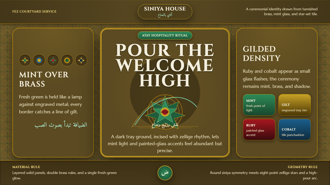 Moroccan Mint TeaCeremony glows in brass. Mint green, Cinzel type, and zellige geometry frame…黄铜中发光的仪式:薄荷绿、Cinzel字形与泽里吉几何围合全场。
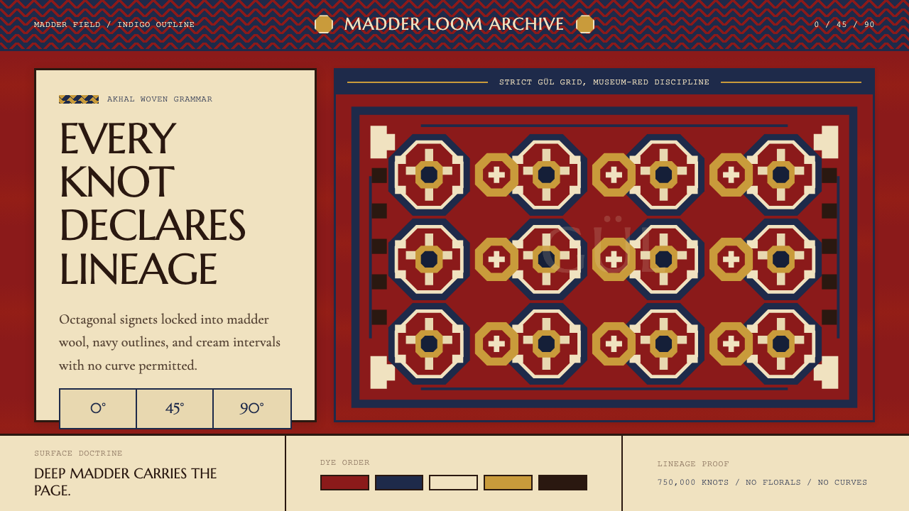 Turkmen Tekke Carpet (Gül Medallion)Disciplined red geometry. Madder field, indigo outlines, cream gül grid.红色几何有纪律。茜草红底、靛蓝线、奶白格尔阵列。
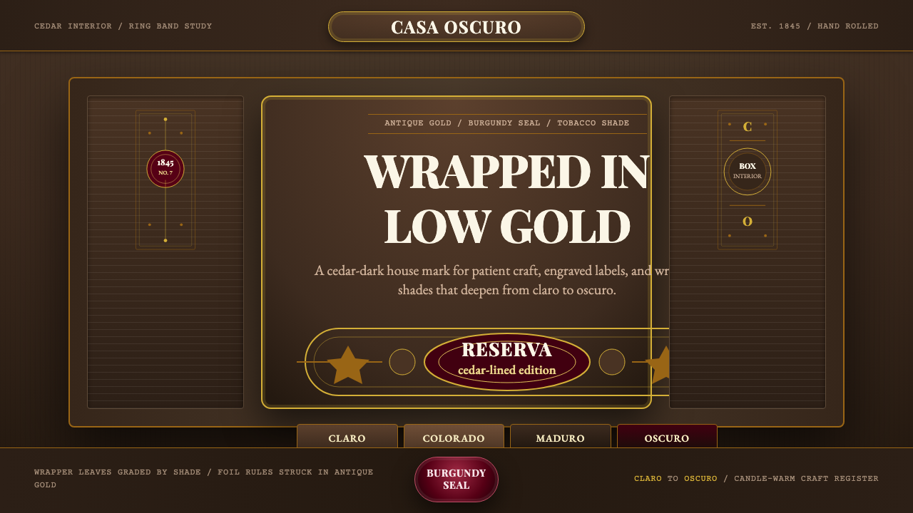 Cuban Habano CigarLuxury sleeps in shadow. Tobacco brown, antique gold rules, and burgundy seal…奢华沉在阴影里。烟草棕、古董金线与酒红封印定调。
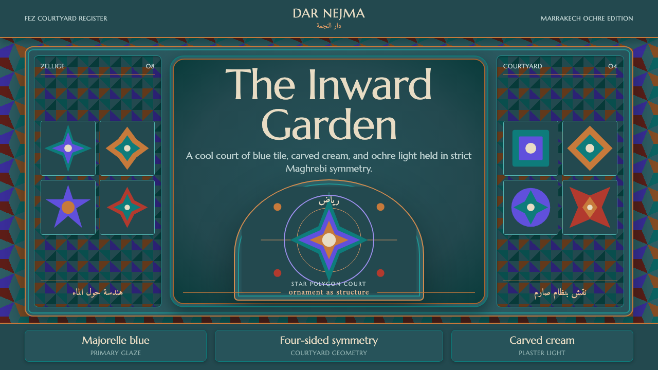 Moroccan RiadOrnament is structure. Majorelle blue and teal zellige frame a symmetrical ar…纹样即结构。马若雷勒蓝与青绿瓷砖围合对称拱庭。
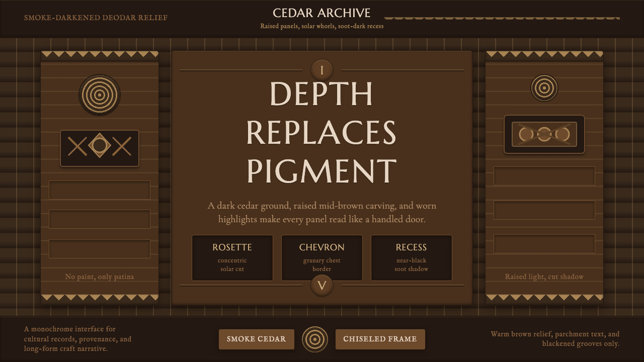 Nuristani Carved CedarDepth replaces pigment. Smoke cedar, chevrons, and rosettes carve light from…以深度取代颜料:烟熏雪松底、折纹与玫瑰花结从暗槽中凿出光。
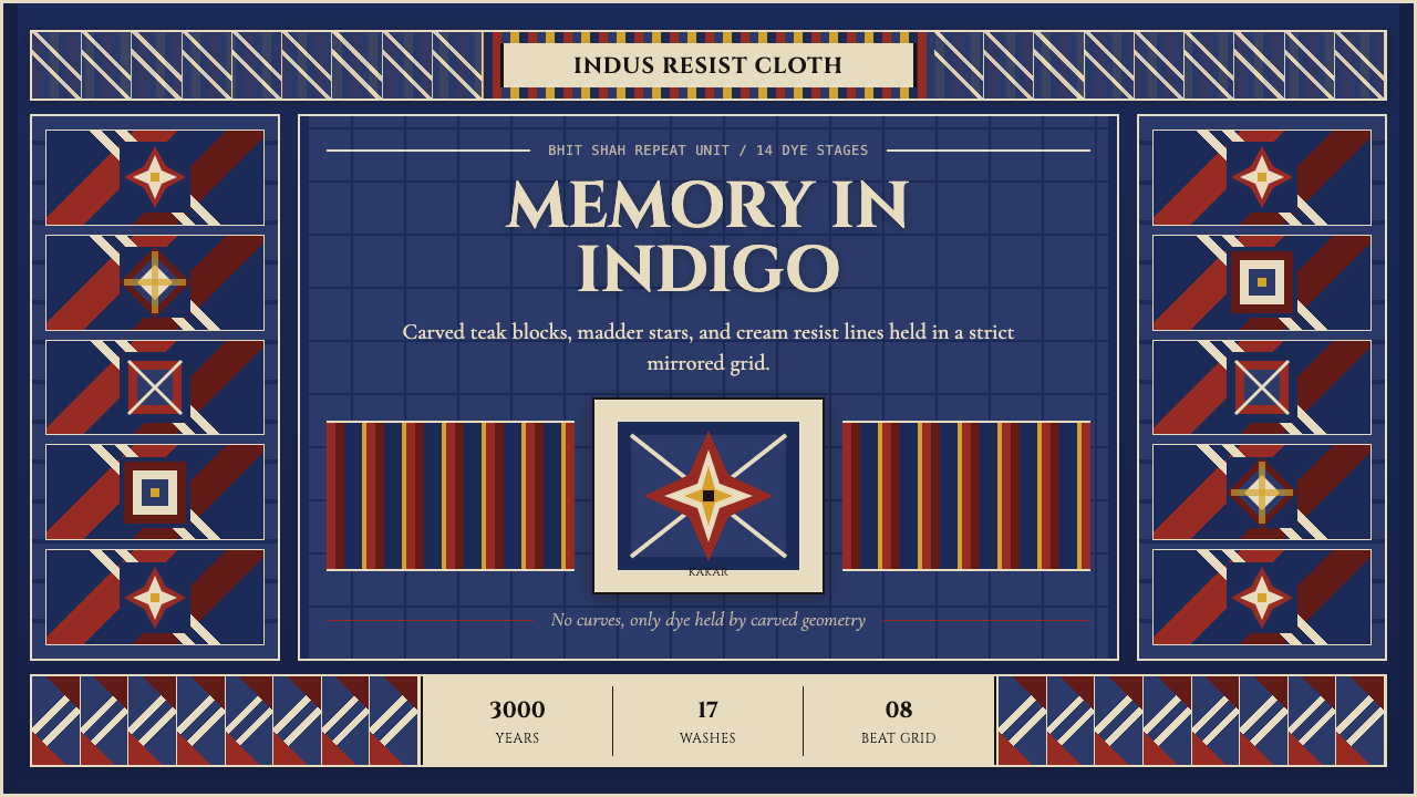 Sindh Ajrak Block PrintAncient cloth feels exact. Indigo fields, madder stars, and cream grids repea…古老棉布也精准。靛蓝底、茜红星、米白格反复如雕版。