Design style guide设计风格指南
What is Turkmen Tekke Carpet (Gül Medallion)?什么是 Turkmen Tekke Carpet (Gül Medallion)?
The Tekke carpet's octagonal gül medallion is one of design history's most disciplined geometric systems — a tribal signet woven in madder red and indigo that turns repetition itself into a monument.特克地毯的八角格尔徽章,是设计史上最严谨的几何体系之一——以茜草红与靛蓝编织而成的部落签章,将重复本身铸成了一座纪念碑。
Turkmen Tekke Carpet (Gül Medallion) in briefTurkmen Tekke Carpet (Gül Medallion) 速览
The Turkmen Tekke carpet is the signature textile tradition of the Tekke tribe, the largest and most prestigious of the Turkmen confederations. Its visual identity rests on a single, endlessly iterated motif: the gül, an octagonal or hexagonal medallion built from interlocking geometric subforms, arranged in a strict grid across a field of saturated madder red. The carpet is not a picture of anything — it is a statement of identity, ownership, and tribal authority rendered entirely through geometric discipline.土库曼特克地毯是特克部落的标志性纺织传统——特克部落是土库曼各联盟中规模最大、地位最显赫的一支。其视觉识别建立在单一的、无限重复的母题上:格尔(gül),一种由相互咬合的几何子形构成的八角形或六角形徽章,以严格的网格阵列铺满饱和茜草红的底面。这不是任何事物的图像,而是用几何纪律全然呈现的身份、归属与部落权威的宣告。
What distinguishes the Tekke tradition from other Central Asian weaving schools is the absolute precision of its geometry and the severity of its color logic. The madder-dyed field is not decorative background; it is the dominant voice. Indigo outlines give each gül its crisp internal structure, while small accents of undyed cream wool provide the only visual relief in an otherwise unbroken field of red. The palette is restricted to three tones — deep crimson, navy, and natural cream — applied with a consistency that approaches the rigidity of a typographic system.特克传统有别于中亚其他织造流派之处,在于其几何精度的绝对性与色彩逻辑的严峻性。茜草染就的底面不是装饰性背景,而是主导性的声音。靛蓝勾边赋予每个格尔清晰的内部结构,少量未染色的奶白羊毛点缀则是这片无间断红色底面上唯一的视觉喘息。色板限于三种色调——深绯红、海军蓝与天然奶白——以接近排版体系般的一致性施用。
The gül itself is a tribal marker that functioned somewhat like a heraldic device: different Turkmen tribes used recognizable gül variants, and the Tekke gül — with its characteristic quartered internal structure and secondary minor güls filling the interstices — is among the most formally sophisticated. Every element inside the medallion is geometric: stepped diamonds, reciprocating hooks, and small cross-like forms, all constructed on a strict diagonal grid that permits only forty-five-degree angles outside of the vertical and horizontal axes.格尔本身是一种部落标记,功能类似纹章图徽:不同的土库曼部落使用各自可辨认的格尔变体,而特克格尔——以其特有的四象限内部结构与填充间隙的次级小格尔为标志——是形式上最为精妙的一种。徽章内部的每个元素都是几何的:阶梯式菱形、相互呼应的钩形、小型十字形,全部构建于严格的对角网格之上,在垂直与水平轴之外只允许四十五度角的存在。
Where does Turkmen Tekke Carpet (Gül Medallion) come from?Turkmen Tekke Carpet (Gül Medallion) 从何而来?
The Tekke tribe's homeland lies across the Akhal oasis near present-day Ashgabat and the Merv oasis in southern Turkmenistan, regions where settled irrigated agriculture met the open steppe grazing routes used by nomadic pastoralists. The carpet tradition likely crystallized in its recognizable form during the eighteenth century, though the weaving practices that produced it — using wool from the fat-tailed Karakul sheep, natural dyes sourced from madder root, indigo, and pomegranate rind, and the asymmetric Persian knot tied around warps of handspun wool — are substantially older.特克部落的故土横跨今土库曼斯坦首都阿什哈巴德附近的阿哈尔绿洲与南部的梅尔夫绿洲——在那里,定居灌溉农业与游牧牧民使用的开阔草原路线相互交汇。这一地毯传统大约在十八世纪定型为可辨认的形态,但产生它的织造实践——以卡拉库尔肥尾绵羊的羊毛为原料,使用茜草根、靛蓝与石榴皮提炼的天然染料,以不对称波斯结打结于手纺羊毛经线之上——历史要古老得多。
The nineteenth century, and especially the period between roughly 1850 and 1900, is regarded as the golden age of Tekke weaving. Before the Russian conquest of Merv in 1884, which ended effective Tekke political independence, the tribe maintained a sophisticated internal economy in which fine carpet weaving was the primary medium of stored wealth. A single large carpet could represent months of labor by multiple weavers, and the density of knotting in the finest pieces — sometimes exceeding one hundred thousand knots per square foot — functioned as a demonstration of collective skill and tribal resources.十九世纪,尤其是大约1850年至1900年间,被视为特克织造的黄金时代。在1884年俄国征服梅尔夫、终结特克人实际政治独立之前,该部落维持着一套成熟的内部经济体系,其中精细地毯织造是储存财富的主要媒介。一块大型地毯可能凝结数名织工数月的劳动,最精良作品中打结密度之高——有时每平方英尺超过十万个结——本身就是集体技艺与部落资源的展示。
Russian and then Soviet administration brought radical change. The conquest opened Central Asian textiles to European commercial markets, creating demand for larger formats and, eventually, pressure to alter the traditional palette toward colors more fashionable in European interiors. Aniline dyes, which produced brilliant but unstable colors, entered the regional market in the late nineteenth century, and their adoption by some weavers marks a visible degradation in the collector's record. The finest pre-conquest pieces, with their deep mineral madder reds and stable indigo navies, are distinguished from later work precisely by the quality of color that time has only deepened.俄国乃至苏联的统治带来了根本性的变革。征服打开了中亚纺织品通往欧洲商业市场的通道,催生了对更大尺幅的需求,并最终产生了向欧洲室内装饰流行色调调整传统色板的压力。苯胺染料在十九世纪末进入地区市场,产生鲜艳但不稳定的颜色;部分织工采用苯胺染料,在收藏记录中标志着肉眼可见的品质下降。前征服时期最精良的藏品,以其深沉的矿物质茜草红与稳固的靛蓝,与后期作品形成鲜明区别——岁月只令那些颜色愈发深沉。
Scholarly documentation of the Tekke tradition was a largely Western enterprise. Aleksandr Felkerzam, a Baltic German scholar working in the Russian Imperial court's collection, produced early systematic descriptions of Turkmen tribal types. Werner Loges and later Jon Thompson brought rigorous structural analysis to the field, establishing the vocabulary of gül identification — main gül, minor gül, elem border, outer guard stripe — that remains in use today. Thompson's work in particular helped reframe Turkmen carpets not as decorative curiosities but as complex semiotic systems whose geometry encoded social and political information legible to a tribal audience.特克传统的学术记录主要是西方学者的事业。波罗的海德意志学者亚历山大·费尔克尔扎姆在俄国皇家宫廷收藏中工作,留下了对土库曼部落类型的早期系统性描述。维尔纳·洛格斯与后来的乔恩·汤普森为这一领域带来了严格的结构分析,建立了格尔识别的词汇体系——主格尔、次格尔、边端元素、外围护条——这套词汇至今仍在使用。汤普森的工作尤为重要,它帮助重新定位了土库曼地毯的性质:不是装饰性的稀罕物,而是复杂的符号系统,其几何语言编码了部落受众可读懂的社会与政治信息。
What defines the Turkmen Tekke Carpet (Gül Medallion) look?Turkmen Tekke Carpet (Gül Medallion) 的视觉特征是什么?
Color Field底色场域
The dominant tone is a deep, saturated crimson produced from madder root — a warm, slightly orange-leaning red that has none of the coolness of modern synthetic reds. It reads as mineral and ancient rather than vibrant or decorative. This red is not background; it is the primary material of the composition, with the geometric ornament understood as a layer applied over it. A digital interpretation should use a single deep red as the commanding ground tone, with all other elements understood as figures against that field.主导色调是由茜草根提炼的深沉饱和绯红——一种温暖、略带橙调的红,与现代合成红的那种凉感截然不同。它传达的是矿物质感与古老气息,而非鲜活或装饰性的光彩。这片红色不是背景,而是构图的主体材料;几何纹饰被理解为覆盖其上的一层。数字诠释应以单一深红作为支配性的底色,所有其他元素均以映衬于这片底场的图形来理解。
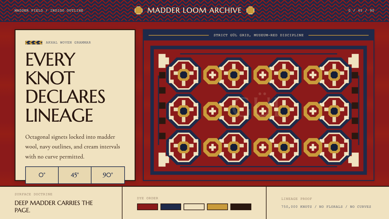
Gül Medallion Grid格尔徽章网格
The gül medallions are arranged in a strict offset grid — each row aligned horizontally and vertically, with the spacing between medallions precisely regulated so that secondary minor güls fill the interstices with equal visual weight. The repetition is not monotony; it is the formal argument of the piece. Each individual medallion is internally complex, built from quartered symmetry and layered geometric subforms, yet the grid enforces a larger order that transforms the individual unit into a tessellating whole.格尔徽章以严格的偏移网格排列——每排水平垂直对齐,徽章间距精确规范,使次级小格尔以均等视觉分量填满间隙。这种重复不是单调;它是作品的形式论点。每个单独的徽章内部结构复杂,由四象限对称与多层几何子形构成,然而网格强制执行着一种更大的秩序,将单个单元转化为密铺的整体。
Diagonal Geometry Only纯对角几何
Every internal line within the gül resolves to a vertical, horizontal, or forty-five-degree diagonal. Curves do not exist in this system. This constraint is partly technical — the square-knotted grid of warps and wefts makes true curves impossible — but it also defines the style's visual character completely. The result is a design vocabulary of stepped forms: staircase diagonals that resolve into hook shapes, reciprocating V-patterns, and interlocked saw-teeth. Softness enters only through the optical blending of closely spaced tones, never through curved line.格尔内部的每一条线都解析为垂直、水平或四十五度对角线。弧线在这个体系中不存在。这一限制部分出于技术原因——经纬线的方格编结网格使真正的曲线无从实现——但它同时完整地定义了这种风格的视觉性格。结果是一套由阶梯形式构成的设计词汇:化解为钩形的阶梯对角线、相互呼应的V形纹、咬合的锯齿。柔和感只通过紧密间隔色调的光学融合进入,从不借助弧线。
Indigo Outline Structure靛蓝勾边结构
Indigo navy serves as the outlining and structural color throughout the composition. It defines the boundaries of each gül against the red field, delineates the internal subforms within each medallion, and anchors the multiple border bands that frame the carpet's perimeter. The navy reads as the system's logic made visible — wherever the geometry needs to resolve, indigo is the agent of resolution. It never appears as a field or a background, only as line, edge, and structure.靛蓝海军色在整个构图中充当轮廓与结构色。它界定每个格尔在红色底面上的边界,勾勒每个徽章内部子形的轮廓,并锚定框住地毯周边的多道边条。海军蓝被读解为体系逻辑的可见化——凡几何需要收束之处,靛蓝便是收束的执行者。它从不以底面或背景的面貌出现,只以线条、边缘与结构的形式存在。
Cream Accent奶白点缀
Undyed natural cream wool appears as a minor but critical accent — used for specific subforms within the gül, for highlight lines within the border bands, and occasionally for the ground of the minor güls. Against the deep red field and navy outlines, the cream registers with surprising prominence despite its sparse use. It provides the composition's only warm neutral relief and prevents the red-and-navy combination from becoming oppressive. In digital translation, a warm off-white — not a cold white — is the correct equivalent.未染色的天然奶白羊毛以少量但关键的点缀角色出现——用于格尔内特定子形、边条内的高光线,偶尔也用作次级小格尔的底色。在深红底面与靛蓝轮廓的映衬下,奶白色尽管用量稀少,却以出人意料的突出感注册于视觉。它提供了构图中唯一的温暖中性缓冲,防止红与蓝的组合变得压迫。在数字转化中,暖调米白——而非冷调纯白——才是正确的对应。
Border System边条体系
Every Tekke carpet is framed by a hierarchical series of border bands: a wide main border containing its own geometric ornament — often a stylized vine rendered in pure angular steps — flanked by narrow guard stripes of reciprocating diagonal hooks. The border is not a decorative frame; it is a structural container that defines the field as a closed, bounded system. The transition from field to border is managed by a narrow transitional stripe, preserving the visual separation between the field's repeating grid and the border's continuous running pattern.每件特克地毯都由一系列层级化的边条框围:一道宽阔的主边条承载自己的几何纹饰——通常是以纯粹角步呈现的程式化藤蔓——两侧由带有往复对角钩形的窄护条夹持。边条不是装饰性边框;它是将底面界定为封闭有界系统的结构性容器。从底面到边条的过渡由一道窄幅过渡条管理,维护着底面重复网格与边条连续走纹之间的视觉分隔。
Density and Texture密度与肌理
The finest Tekke pieces are knotted at extraordinary density, producing a surface so tightly packed that individual knots are invisible; the pile reads as a continuous, slightly velvety mineral surface. This material quality translates aesthetically into a sense of weight and permanence — the carpet does not feel improvised or casual, but accumulated, deliberate, and formally complete. A design system derived from this tradition should share that quality of apparent density: patterns that feel thoroughly considered rather than quickly applied.最精良的特克织品打结密度极高,产生的表面紧密到单个绒结不可见;绒面呈现为连续的、略带天鹅绒感的矿物质表面。这种材料品质在美学上转化为一种分量感与永久感——地毯给人的印象不是随兴或随意的,而是积累的、审慎的、形式上完整的。从这一传统衍生的设计系统应当共享这种表观密度的品质:令人感到经过彻底推敲而非仓促施用的纹样。
Who shaped Turkmen Tekke Carpet (Gül Medallion)?谁塑造了 Turkmen Tekke Carpet (Gül Medallion)?
A Baltic German scholar working within the Russian Imperial collection in the early twentieth century, Felkerzam produced some of the first systematic attempts to classify Turkmen carpet types by tribal origin and structural characteristics. His work, though limited by the standards of later scholarship, established foundational categories that subsequent researchers would refine. His access to the Imperial holdings — which included significant Tekke pieces acquired during the Russian Central Asian campaigns — gave him a breadth of comparative material unavailable to contemporaries working from the European art market alone.费尔克尔扎姆是二十世纪初在俄国皇家收藏中工作的波罗的海德意志学者,他最早系统尝试按部落起源与结构特征对土库曼地毯类型加以分类。他的工作虽以后来的学术标准衡量尚属有限,却建立了后续研究者得以深化的基础分类体系。他接触皇家收藏——其中包括俄国中亚战役期间获得的重要特克藏品——使他拥有单凭欧洲艺术市场工作的同时代人所无法企及的比较广度。
Loges brought structural rigor to the study of Turkmen weaving in the mid-to-late twentieth century, developing methods for documenting the internal construction of güls — the precise sequence of subforms, the treatment of outline widths, the handling of transition zones — that allowed for reliable differentiation between tribal types and between production periods. His analytical framework helped transform Turkmen carpet study from an appreciation-based discipline into a structurally grounded field capable of supporting authentication and provenance research.洛格斯在二十世纪中后期为土库曼织造研究带来了结构性的严谨,开发出记录格尔内部构造的方法——子形的精确序列、轮廓宽度的处理、过渡区的应对——使部落类型之间以及不同生产时期之间的可靠区分成为可能。他的分析框架帮助土库曼地毯研究从一门以鉴赏为基础的学科,转变为一个具备结构根基、能够支撑鉴定与溯源研究的领域。
Thompson is among the most influential scholars in the field of Central Asian textile studies, known for insisting that Turkmen carpets be understood as semiotic systems rather than decorative objects. His analytical writing — particularly his work on the structure and social meaning of gül variants — reframed the entire field, arguing that the precision of Tekke geometry was not aesthetic accident but deliberate communicative encoding. Thompson's scholarship helped bring Turkmen textiles into serious art historical discussion, and his influence on the vocabulary and methodology of the field remains foundational.汤普森是中亚纺织品研究领域最具影响力的学者之一,以坚持将土库曼地毯理解为符号系统而非装饰对象著称。他的分析性写作——尤其是关于格尔变体结构与社会意义的研究——重构了整个领域,论证特克几何精度不是美学上的偶然,而是蓄意为之的传达编码。汤普森的学术工作帮助土库曼纺织品进入严肃的艺术史讨论,他对该领域词汇与方法论的影响至今仍构成基础。
The authentic makers of the Tekke tradition were women weavers working within the tribal structure, whose names were almost never recorded by outside observers. The transmission of pattern knowledge — the exact proportions of each gül subform, the specific handling of border transitions, the permissible color relationships — was entirely oral and demonstrative, passed from experienced weavers to younger family members within the tent household. The consistency of Tekke design across generations and across geographically dispersed groups is a testament to the effectiveness of this transmission system, which maintained formal precision without any written documentation.特克传统的真正创作者是在部落结构内工作的女性织工,她们的名字几乎从未被外部观察者记录。纹样知识的传承——每个格尔子形的精确比例、边条过渡的特定处理、允许的色彩关系——完全通过口头与示范完成,在帐篷家庭内由有经验的织工传授给年轻的家庭成员。特克设计在数代之间以及地理上分散的群体之间所保持的一致性,证明了这套无需任何书面文献即能维持形式精度的传承体系的有效性。
How do you use Turkmen Tekke Carpet (Gül Medallion) today?今天怎么用 Turkmen Tekke Carpet (Gül Medallion)?
The Tekke carpet aesthetic is a powerful digital design resource for contexts that require authority, cultural weight, and geometric rigor without resorting to either modernist abstraction or digital-native minimalism. Applying it correctly means committing to the core logic: deep red as the dominant field, indigo as the structural articulator, cream as the only neutral, and diagonal stepping as the only means of drawing anything that is not strictly horizontal or vertical.特克地毯美学是一种强大的数字设计资源,适用于那些需要权威感、文化分量与几何严谨性,却又不愿诉诸现代主义抽象或数字原生极简主义的场景。正确应用它意味着承诺遵循其核心逻辑:深红作为主导底场,靛蓝作为结构阐释者,奶白作为唯一中性色,以及阶梯对角线作为描绘一切非严格水平或垂直线条的唯一手段。
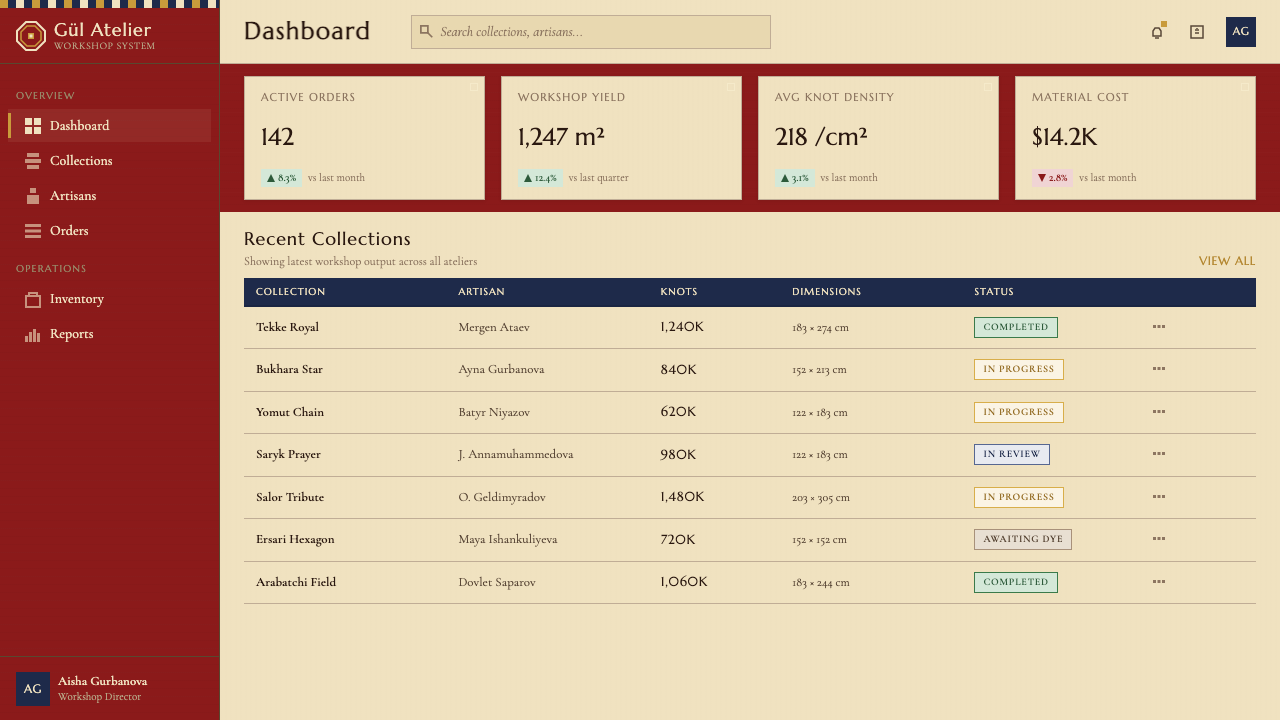
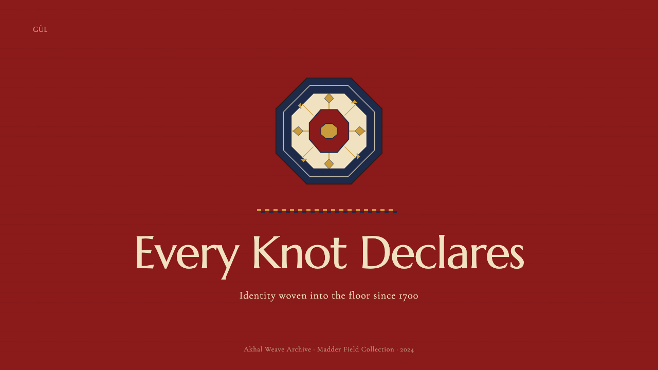
For presentation slides, the Tekke system delivers immediate visual impact on both cover and content pages. A cover page works well with the full field treatment — the entire slide ground in deep madder red, with a central gül-derived geometric device rendered in indigo and cream, and the title in a large, clean sans-serif in cream or near-white. This treatment is especially effective for decks that need to signal cultural depth, craft values, or institutional gravitas. Content slides benefit from a more restrained application: a deep red header band at the top, indigo rules marking section divisions, and body text in near-black on a cream ground — the gül reduced to a small corner ornament or section marker rather than a full-field treatment. Data slides can apply the color logic to chart elements, using deep red bars against a cream ground with indigo axis lines, turning bar charts and area graphs into objects that feel woven rather than plotted.对于演示文稿,特克体系在封面页与内容页上都能带来即时的视觉冲击。封面页适合全底面处理——整张幻灯片以深茜草红为底,中央以靛蓝与奶白绘制格尔衍生的几何图形,标题以大号清晰无衬线字体呈奶白或近白色。这种处理对于需要传达文化深度、工艺价值或机构分量的演讲文本尤为有效。内容页适合更克制的应用:顶部一道深红标题条,靛蓝横线标记段落分隔,正文在奶白底面上以近黑色呈现——格尔缩减为角落装饰物或段落标记,而非全底面处理。数据页可将色彩逻辑应用于图表元素,在奶白底面上使用深红柱条配靛蓝坐标轴线,使柱状图与面积图呈现出一种编织而非绘图的质感。
For web interfaces, the style works best in contexts where deliberate visual authority is appropriate: editorial platforms, cultural institutions, heritage brands, luxury e-commerce, and dashboard applications where the visual weight of the interface needs to signal trustworthiness and depth. The approach for dashboards and pricing pages: use the deep madder red sparingly as an accent or primary call-to-action color against a near-white ground, with indigo used for structural elements like navigation, borders, and data labels. Reserve the full red-field treatment for hero sections or feature callouts where maximum impact is required. Geometric ornament derived from gül subforms — stepped diamonds, hook chevrons, saw-tooth borders — can serve as dividers, icons, or decorative rules at small scale without overwhelming the interface.对于网页界面,这种风格在需要审慎视觉权威感的场景中表现最佳:编辑平台、文化机构、传统品牌、奢侈品电商,以及界面视觉分量需要传达可信度与深度的仪表板应用。仪表板与定价页面的应用思路:在近白色底面上以深茜草红作为稀疏的强调色或主要行动号召色,靛蓝用于导航、边框与数据标签等结构性元素。将全红底面处理保留给需要最大冲击力的英雄区段或特性标注。从格尔子形衍生的几何纹饰——阶梯式菱形、钩形箭头、锯齿边条——可在小尺度上充当分隔线、图标或装饰性横线,而不致淹没界面。
For editorial and marketing work, the Tekke vocabulary supports strong, memorable visual identities. A publication using this system might establish a consistent color code: deep red for primary sections, indigo for secondary taxonomy, cream for body fields. Borders derived from the guard stripe motif — narrow bands of reciprocating diagonal hooks — can articulate article boundaries or pull-quote boxes with a richness that flat rules cannot achieve. Marketing materials benefit from the style's inherent tension between surface density and compositional clarity: dense geometric pattern in a contained zone reads as craftsmanship, while generous white or cream margins preserve legibility and prevent the composition from becoming exhausting.对于编辑与营销内容,特克词汇支持强劲而令人难忘的视觉识别。采用这套体系的出版物可以建立一致的色彩编码:深红用于主要板块,靛蓝用于次级分类,奶白用于正文底面。源自护条母题的边框——带有往复对角钩形的窄条——可以勾勒文章边界或引文框,以平线条无法企及的丰富感呈现。营销物料得益于这种风格固有的表面密度与构图清晰度之间的张力:在有界区域内密集的几何纹样传达工艺感,而慷慨的白色或奶白色边距则保持可读性,防止构图令人疲倦。
A common mistake when drawing on Tekke geometry is treating the gül as isolated decoration — dropping a single medallion motif onto an otherwise neutral layout as a logo-like accent. This misunderstands what the gül means: its power comes from repetition, density, and the field relationship. A single gül floating on white looks like a clip art stamp. The correct application is systemic: the gül exists in a grid, the grid respects the border, the border respects the field. Another frequent error is substituting warmer or brighter reds — coral, tomato, or vermilion — for the deep mineral crimson of authentic madder dye. These lighter reds lose the gravity that makes the tradition work, tipping into decorative cheerfulness when the style calls for mineral weight.从特克几何汲取灵感时最常见的错误,是把格尔当作孤立的装饰物处理——将单个徽章母题像商标图案一样贴在一个其他方面都属中性的版面上。这误解了格尔的意义:它的力量来自重复、密度与底场关系。一个单独的格尔漂浮在白底上,看起来像剪贴画印章。正确的应用方式是系统性的:格尔存在于网格中,网格遵从边条,边条遵从底场。另一个常见错误是用更暖或更亮的红色——珊瑚红、番茄红或朱砂红——替代正宗茜草染料的深沉矿物绯红。这些较浅的红色丧失了使这一传统奏效的分量感,将风格推向装饰性的愉悦,而这种风格要求的是矿物质的重量。
Turkmen Tekke Carpet (Gül Medallion) — FAQTurkmen Tekke Carpet (Gül Medallion) · 常见问题
What makes the Tekke gül different from other Turkmen tribal güls?特克格尔与其他土库曼部落格尔有何区别?
The Tekke main gül is typically quartered — divided into four symmetrical quadrants, each of which contains its own sub-pattern of stepped hooks, small cross-like forms, and diamond clusters. The quartered internal structure gives the Tekke gül a sense of formal complexity that is still legible at a distance because the four-part symmetry provides a clear organizing axis. By contrast, some Yomut güls use a diagonal bi-partite structure, and Ersari güls tend toward more open internal arrangements. The Tekke gül is also distinguished by the minor güls — smaller secondary medallions that fill the spaces between the main güls — which in high-quality pieces are as carefully articulated as the main medallions rather than being simplified filler forms.特克主格尔通常是四象限式的——被划分为四个对称象限,每个象限内含自己的阶梯钩形、小型十字形与菱形组合的子纹样。这种四分内部结构赋予特克格尔一种形式复杂性,即便在远处仍保持可读性,因为四重对称提供了清晰的组织轴线。相比之下,部分约穆特格尔采用对角二分结构,而埃尔萨里格尔则倾向于更开放的内部排布。特克格尔还以次级小格尔著称——填充主格尔之间空隙的较小次级徽章——在高品质藏品中,这些小格尔经过与主徽章同等精心的刻画,而非简化的填充形态。
Why is the madder red so specifically important — can any deep red serve the same purpose?茜草红为何如此特别重要——任何深红都能达到同样的效果吗?
The quality of madder red is specific. Natural madder produces a warm, slightly brownish-red that is technically described as being in the crimson range but with an earthen undertone — not the pure, saturated cool red of modern synthetic dyes, and not orange-red either. Over decades, madder red ages into deeper, richer tones rather than fading, which is why antique Tekke pieces often appear more resonant than newly produced work. In digital translation, the closest equivalent is a deep, slightly muted crimson with an earth undertone — not a coral, not a fire-engine red, and not a burgundy. The temperature of the red determines whether the palette reads as mineral and ancient or simply as bold and modern.茜草红的品质是特定的。天然茜草产生一种温暖、略带棕调的红色,技术上属于绯红范围但带有土质底调——不是现代合成染料那种纯粹饱和的冷红,也不是橙红。经过数十年的岁月,茜草红会深化为更浓郁的色调而非褪色,这正是为什么古代特克藏品往往比新产出的作品显得更为丰富。在数字转化中,最接近的对应是一种深沉、略显克制的绯红,带有土质底调——不是珊瑚红,不是消防车红,也不是酒红。红色的温度决定了色板究竟传达矿物质感与古老气息,还是仅仅显得大胆而现代。
Is this style appropriate for a contemporary brand, or does it read as historical pastiche?这种风格适合当代品牌吗?还是会显得像历史仿作?
Whether a Tekke-derived aesthetic reads as thoughtful appropriation or pastiche depends almost entirely on how the geometric vocabulary is abstracted and applied. Direct reproduction of gül medallions as branded motifs tends toward pastiche — it looks like a rug pattern transplanted wholesale rather than a design language understood and reinterpreted. The more effective approach is to absorb the underlying logic: the commitment to strict diagonal geometry, the deep red field relationship, the structural role of navy outlining, the restrained three-color system. A brand or product that applies these principles without literally reproducing traditional motifs can access the authority and cultural weight of the tradition while making something that feels contemporary and purposeful rather than costume-like.特克衍生美学究竟被解读为深思熟虑的借鉴还是历史仿作,几乎完全取决于几何词汇如何被抽象化与应用。将格尔徽章直接作为品牌母题复现,往往落入仿作——看起来像是整块移植的地毯纹样,而非被理解并再诠释的设计语言。更有效的做法是吸收其底层逻辑:对严格对角几何的承诺,深红底场关系,靛蓝勾边的结构性角色,克制的三色体系。一个品牌或产品若能在不字面再现传统母题的前提下应用这些原则,便能汲取这一传统的权威感与文化分量,同时创造出感觉当代而有目的性、而非戏服化的作品。
How does this style handle typography, given its strong pattern orientation?这种风格在强烈的纹样倾向下如何处理字体排印?
The Tekke weaving tradition has no typographic component — it predates print and exists in a culture where Arabic-script calligraphy was the prestige written form — so any typographic choices in a Tekke-derived digital design system are interpretive rather than historically grounded. The most coherent approach is to look for visual analogies: the system's emphasis on geometric precision and clear hierarchical structure suggests type that is equally geometric, structurally clear, and free of decorative flourish. The tricolor palette dictates that type must work in deep red, indigo, and cream against each other's opposite. Condensed forms handle well in border and label contexts where horizontal space is constrained by the geometric ornament.特克织造传统本身没有排印成分——它早于印刷术,存在于以阿拉伯文书法为书写贵族形式的文化中——因此特克衍生数字设计系统中的任何字体选择都是解释性的,而非历史上有据可查的。最连贯的做法是寻找视觉类比:这套体系对几何精度与清晰层级结构的强调,提示使用同样几何化、结构清晰、无装饰花饰的字体。三色色板规定字体必须在深红、靛蓝与奶白相互映衬的条件下有效运作。压缩体在几何纹饰限制横向空间的边条与标签场景中表现良好。
Does the style work in a light or white-ground version, or is the deep red field essential?这种风格能以浅色或白色底面呈现吗?还是深红底场是不可或缺的?
The deep red field is not merely decorative — it is structurally constitutive of the system. In a Tekke carpet, the gül exists because of the tension between the ornament and the field it sits on. Without the field, the gül becomes isolated pattern; with the field, it becomes figure-ground relationship. A light-ground interpretation is possible but requires significant reorientation: the red shifts from field to figure, deployed as the outlining or pattern color against a cream ground, with indigo as a secondary structural color. This is a legitimate and more commercially accessible variation, but it operates by inversion and will read as derived rather than primary. The full authority of the style comes from committing to the red ground.深红底场不仅仅是装饰性的——它在结构上构成了这个体系。在特克地毯中,格尔存在是因为纹饰与其所在底场之间的张力。没有底场,格尔变成孤立的纹样;有了底场,它才成为图形-底场关系。浅色底面的诠释是可能的,但需要重大的方向调整:红色从底场转移为图形,以勾边或纹样色的形式在奶白底面上部署,靛蓝则作为次级结构色。这是一种合理且商业上更易接受的变体,但它以反转方式运作,看起来像是派生的而非原本的。这种风格的全部权威感来自对红色底面的承诺。
Related design styles相关设计风格
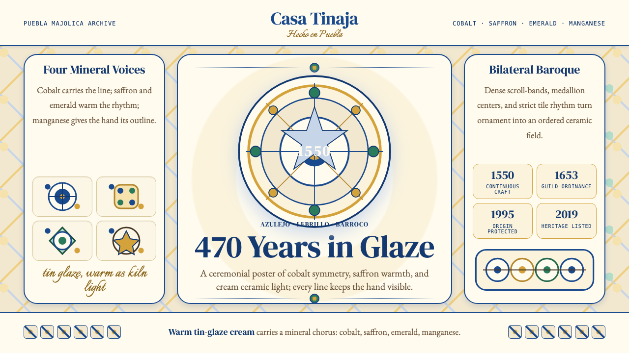 Talavera Poblana CeramicBaroque craft breathes. Cobalt scrollwork on warm tin-glaze cream frames stri…巴洛克手工有呼吸。钴蓝卷草在暖锡釉米底上框出对称。
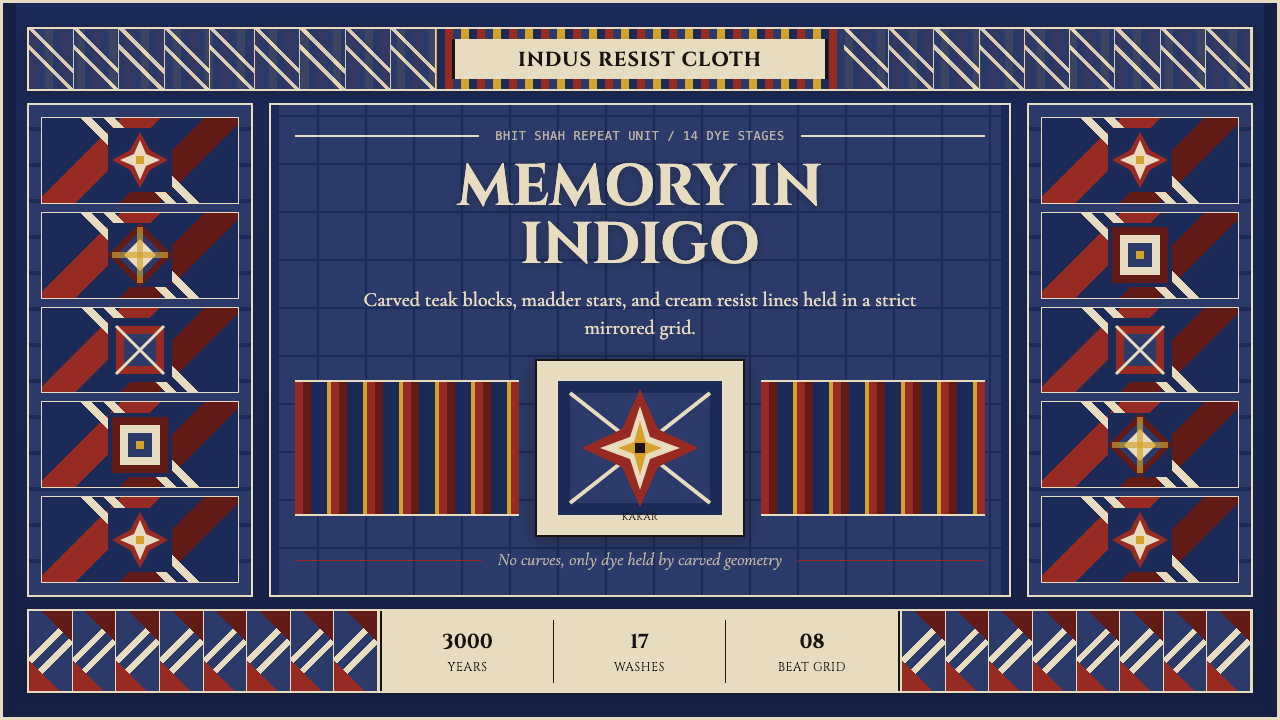 Sindh Ajrak Block PrintAncient cloth feels exact. Indigo fields, madder stars, and cream grids repea…古老棉布也精准。靛蓝底、茜红星、米白格反复如雕版。
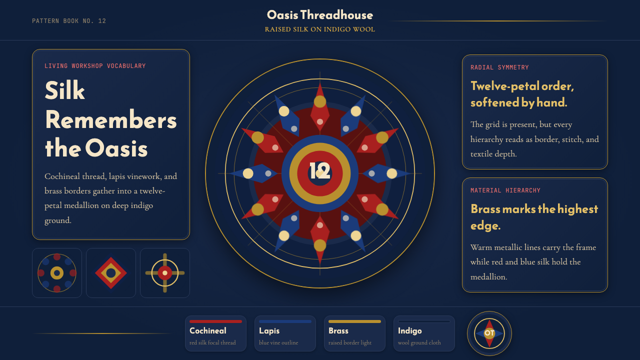 Uyghur Xinjiang Suzani EmbroiderySilk glows like memory. Cochineal and lapis medallions orbit brass on indigo…丝线像记忆发光。靛蓝羊毛上,胭脂红与青金石纹章环绕黄铜。
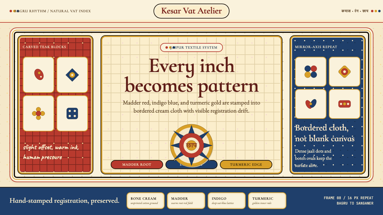 Indian Block PrintPattern claims every inch. Madder, indigo and turmeric stamp dense bordered c…每寸皆成纹:茜草红、靛蓝与姜黄拓印出密集边框布面。
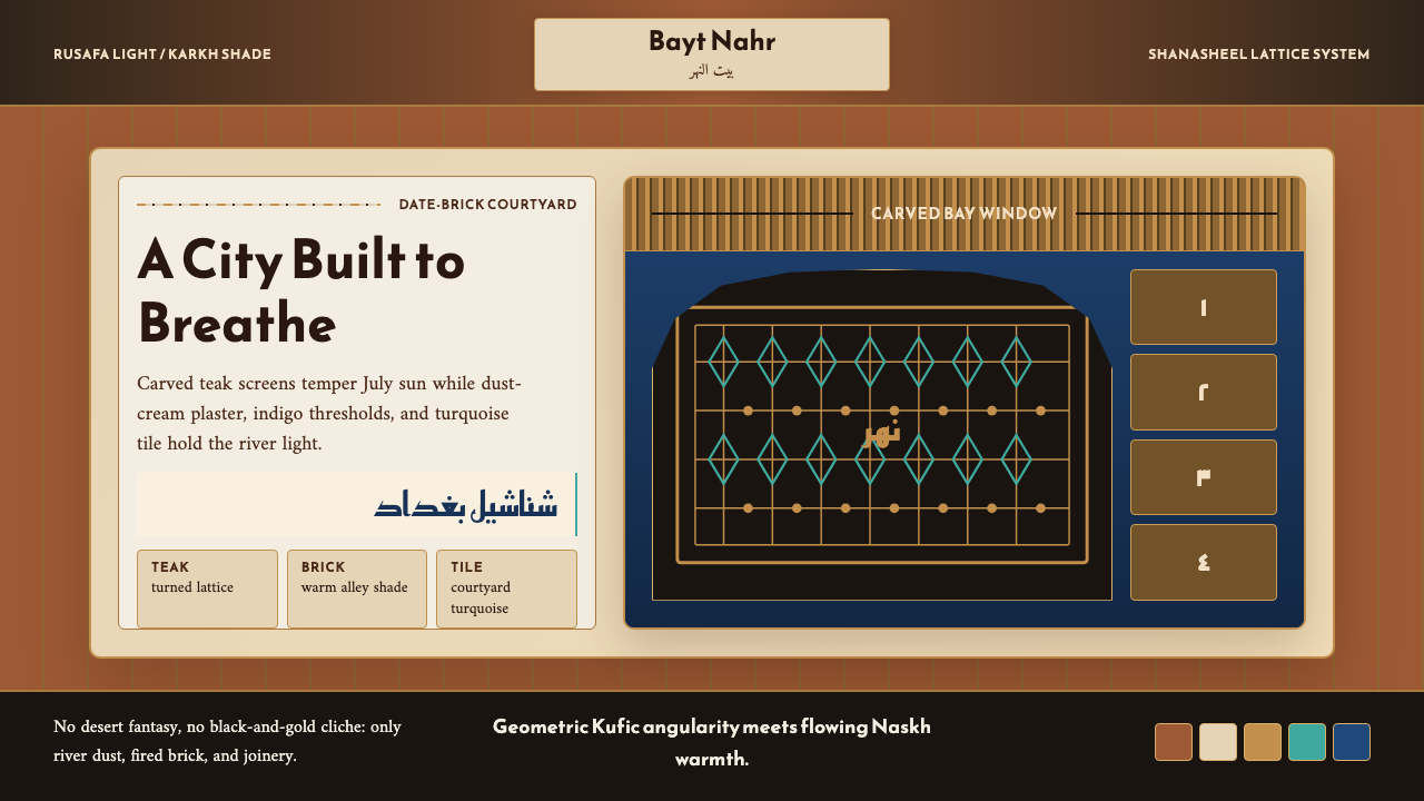 Iraqi Baghdad Shanasheel HouseBreathes through ornament. Date-brick ground, teak lattice, and turquoise til…以纹样呼吸:椰枣砖底、柚木格窗与青绿瓷砖构成边框。
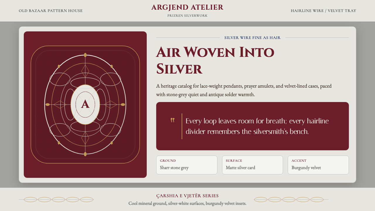 Kosovar Prizren Filigree SilverAir becomes ornament. Burgundy velvet and stone grey frame Cinzel type with c…空气成为纹样:酒红绒面与石灰底托起Cinzel字和盘银几何。