What is Indian Block Print?什么是 Indian Block Print?
Every centimeter of cloth is pattern — Indian hand-block printing brings that millennia-old textile maximalism into interface design through saffron grounds, dense paisley repeats, and the deliberate imperfection of the hand-stamped mark.布面即图面——印度手工木版印花将千年织物装饰观引入界面设计:藏红花橙的底色、密集的佩斯利纹,以及手工拓印刻意保留的细微瑕疵。
Indian Block Print in briefIndian Block Print 速览
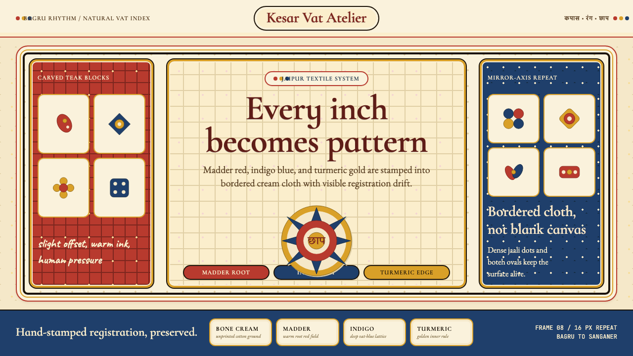
Indian Block Print is a design language rooted in one of the subcontinent's oldest continuous craft traditions: the stamping of carved wooden blocks dipped in natural plant-and-mineral pigments onto cotton and silk cloth. The visual result is dense, border-framed, and pattern-maximalist — every surface is treated as an opportunity for decoration rather than a field to be kept clear. This principle, when translated into graphic and interface design, produces work that feels simultaneously archaic and vivid: warm earthy grounds layered with botanical florals, geometric lattices, and the teardrop-shaped boteh motif that the West came to call paisley.印度木版印花是一套视觉语言,根植于次大陆最古老的连续工艺传统之一:将雕刻柚木印版浸入天然植物矿物颜料,逐块拓印于棉布与丝绸之上。其视觉结果密集、有边框、装饰最大化——每一块表面都被视为装饰的机会,而非需要留白的空间。这一原则移植至平面与界面设计时,产生出同时具有古朴感与鲜活感的作品:温暖的土质色底面上层叠植物花卉、几何格栅,以及西方称之为佩斯利的水滴形波形纹(boteh)。
The aesthetic is defined by a specific relationship between figure and ground. Rather than silhouetting motifs against blank space, Block Print builds pattern on pattern — a floral repeat sits inside a geometric border, which itself rests inside a broader field of secondary repeat. Negative space is almost entirely absent in the textile source, though in interface adaptations a measured amount of breathing room is introduced to preserve legibility. Color is drawn strictly from the plant-and-mineral dyestuff palette: madder root reds, indigo blues, turmeric and saffron yellows, pomegranate-rind tawny, and the undyed ivory of the base cloth. No synthetic neons, no cold grays.这种美学由图形与底面之间的特殊关系所定义。木版印花不是将纹样剪影置于空白之上,而是在图案上叠加图案——花卉纹坐落于几何边框之内,几何边框本身又嵌于更广阔的次级底纹之中。在纺织品原型中,负空间几乎完全缺席;但在界面改编版本中,会引入适度的喘息余地以保障可读性。色彩严格取自植物矿物染料色谱:茜草根红、靛蓝、姜黄与藏红花黄、石榴皮棕褐,以及底布未染色的象牙白。不使用合成霓虹色,不使用冷灰调。
What distinguishes Block Print from other ornamental traditions is the character of its imperfection. Hand-carved teak blocks are inked by hand and pressed by hand; slight misalignment between successive stampings, uneven dye absorption, and the texture of the wooden block's grain all leave visible traces. This quality — called registration variation in textile terms — is not corrected but celebrated. In design systems that reference Block Print, perfectly mechanical repetition reads as wrong; a gentle drift in alignment, a subtle variation in tonal weight, and visible texture in fills are marks of authenticity rather than errors.木版印花区别于其他装饰传统的,是其瑕疵的特质。手雕柚木印版靠手工上墨、手工按压;连续拓印之间细微的错位、不均匀的染料吸收,以及木版纹理留下的印迹,都清晰可见。这种品质——纺织术语称为「套版偏差」——不被修正,而被视为美。在参照木版印花的设计系统中,机械式的完美重复反而显得格格不入;对齐上的轻微漂移、色调重量的细微变化、填充区域可见的纹理,都是真实性的标志,而非错误。
See the Indian Block Print design system查看 Indian Block Print 完整设计系统
Where does Indian Block Print come from?Indian Block Print 从何而来?
The craft of printing cloth with carved wooden blocks arrived in the Indian subcontinent no later than the twelfth century, with some textile historians placing its roots in earlier Persian and Central Asian stamping traditions. The earliest surviving printed textiles from the region show a command of repeat geometry and border articulation that implies a long prior period of development. By the sixteenth century, the workshops of Rajasthan and Gujarat had established the regional identities that persist to this day: Sanganer, just south of Jaipur, became known for fine white-ground floral prints in black and indigo; Bagru, roughly thirty kilometers to the west, developed a distinctively earthy palette using resist-printing with fermented castor oil followed by madder-root overdyeing.以雕刻木版印染布料的工艺在十二世纪之前便已传入印度次大陆,部分纺织品历史学家将其源头追溯至更早的波斯与中亚捺印传统。该地区现存最早的印花纺织品已展现出对几何重复与边框构造的熟练掌握,暗示着此前漫长的发展积累。至十六世纪,拉贾斯坦和古吉拉特的工坊已确立起延续至今的地域风格:斋浦尔以南的桑加内尔以黑色与靛蓝在白色底面上的精细花卉印花著称;以西约三十公里的巴格鲁则发展出独具特色的土质色谱——先以发酵蓖麻油进行防染印花,再以茜草根覆染。
The Mughal period — roughly 1526 to 1707 — brought transformative influence. Mughal court patronage demanded extreme refinement: finer block carving, more complex multi-block registration, and the incorporation of Persian motifs including the boteh, arabesque scrollwork, and the garden-paradise (bagh) as compositional framework. The imperial workshops at Agra, Fatehpur Sikri, and later Delhi set standards of intricacy that provincial centers like Jaipur adapted and democratized. It was during this period that the characteristic density of Indian Block Print — the total-surface coverage, the nested-border logic, the insistence that even background areas carry secondary pattern — was formalized as an aesthetic ideal rather than a practical expedient.莫卧儿时期(约1526至1707年)带来了变革性影响。莫卧儿宫廷赞助要求极致的精细:更细腻的印版雕刻、更复杂的多版套色套准,以及波斯纹样的融入——包括boteh水滴纹、阿拉伯蔓草卷纹,以及作为构图框架的花园天堂(bagh)主题。阿格拉、法塔赫布尔西格里及后来德里的皇家工坊所设立的繁复标准,被斋浦尔等地方中心所吸收并加以普及。正是在这一时期,印度木版印花的标志性密度——全面覆盖的图案、嵌套边框的逻辑、背景区域也必须承载次级纹样的坚持——被正式确立为审美理想,而非实用权宜。
The colonial period (roughly 1757 to 1947) simultaneously damaged and documented the tradition. British machine-printed cottons undercut hand-block printers economically from the mid-nineteenth century onward, collapsing whole regional industries. At the same time, the colonial documentation impulse — exhibitions, pattern books, design surveys conducted for institutions like the Victoria and Albert Museum — preserved detailed records of motifs, block inventories, and dyeing sequences that might otherwise have been lost. Indian design reformers of the late nineteenth century, including those associated with the Arts and Crafts movement's Indian sympathizers, argued for preserving hand-block printing on both economic and cultural grounds.殖民时期(约1757至1947年)既损伤了这一传统,也留下了详细记录。英国机器印花棉布从十九世纪中叶起在经济上击垮了手工木版印刷业,导致整个地区产业的崩溃。与此同时,殖民时代的记录冲动——为维多利亚与阿尔伯特博物馆等机构举办的展览、纹样图集、设计调查——保存了纹样详录、印版清单和染色流程的详细档案,否则这些资料可能早已失传。十九世纪末的印度设计改革者,包括那些与英国工艺美术运动同情者相关联的人士,以经济与文化两重理由为手工木版印花的延续奔走呼号。
The post-Independence revival, from the 1950s onward, restored commercial viability. Government handicraft boards subsidized block-printing cooperatives; design schools in Ahmedabad and Jaipur began treating the tradition as a subject of formal study rather than mere folk production. The decisive moment for international recognition came in the 1970s and 1980s, when designers including John Bissell and Faith Singh at Anokhi, and the French-Indian textile artist Brigitte Singh working from Jaipur, demonstrated that hand-block printed cloth could address international luxury markets without compromising craft authenticity. Their work established the visual grammar that contemporary designers reference: a warm but controlled palette, botanical and geometric motifs in dense repeat, and visible hand-process texture as a positive quality signal.独立后的复兴运动从1950年代起恢复了商业活力。政府手工艺委员会为木版印花合作社提供补贴;艾哈迈达巴德与斋浦尔的设计学校开始将这一传统作为正式学术课题而非民间手艺加以研究。国际认可的决定性时刻出现在1970至80年代:设计师约翰·毕塞尔与菲思·辛格在Anokhi品牌的工作,以及法国裔印度纺织艺术家布里奇特·辛格在斋浦尔的创作,证明了手工木版印花布料在不妥协工艺真实性的前提下可以进入国际奢侈品市场。他们的工作确立了当代设计师所参照的视觉语法:温暖而克制的色板、密集重复的植物与几何纹样,以及手工过程的可见质感作为品质信号。
What defines the Indian Block Print look?Indian Block Print 的视觉特征是什么?
Color色彩
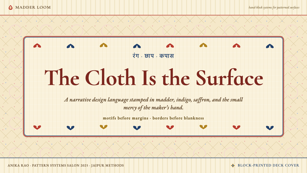
The palette is built entirely from plant-and-mineral dye equivalents: madder-root red (a warm, slightly orange-tinged red), indigo (a deep blue with violet undertones), turmeric yellow, saffron orange, pomegranate tawny, and the undyed ivory of the base cloth. These are colors that absorb light rather than reflect it — muted, complex, never harsh. Madder and indigo are used as ground colors at high saturation on borders or feature panels; saffron and turmeric function as warm accent and highlight. No pure whites or cold grays enter the system; all neutrals are warm ivory or unbleached off-white.色板完全建立于植物矿物染料的对应色上:茜草根红(温暖、略带橙调的红)、靛蓝(带紫调的深蓝)、姜黄黄、藏红花橙、石榴皮棕褐,以及底布未染色的象牙白。这些颜色吸收光线而非反射光线——柔和、层次丰富、从不刺眼。茜草红与靛蓝在边框或特性面板上以高饱和度作为底色使用;藏红花橙与姜黄黄作为暖调强调色与高光色。系统中不引入纯白或冷灰;所有中性色均为温暖的象牙色或未漂白的米白。
Pattern Density图案密度
Block Print operates at maximum pattern density. The design principle is total-surface coverage: primary motifs fill the central field, secondary motifs fill the ground between primary motifs, and borders carry their own independent repeat. In interface applications, this density is modulated — reduced on interactive areas and data-heavy zones to preserve legibility — but the overall visual weight remains substantially higher than most Western digital design conventions. Empty space reads as compositional absence rather than restful breathing room.木版印花以最大图案密度运作。设计原则是全面覆盖:主体纹样填满中心区域,次级纹样填满主体纹样之间的底面,边框则承载独立的自身重复。在界面应用中,这种密度会被调节——在交互区域和数据密集区域适度降低以保障可读性——但整体视觉重量仍远高于大多数西方数字设计惯例。空白区域会被读作构图上的缺失,而非令人舒缓的喘息空间。
Motif Vocabulary纹样词汇
Four motif families dominate. The boteh (paisley) — a teardrop with a curved tip, representing a cypress tree, a leaf, or a Zoroastrian flame — appears at multiple scales simultaneously. Floral medallions (sometimes called buti when small, boota when large) derive from Mughal garden paintings and carry associations with paradise and abundance. Jaali lattices — geometric grids of diamonds, octagons, and stars derived from carved stone architectural screens — provide structural counterpoint to the organic florals. Lotus, mango, and peacock motifs complete the vocabulary. In interface work these motifs appear as authentic silhouettes, never as stylized flat reductions.四个纹样家族占据主导地位。波形纹(boteh/佩斯利)——一个尖端弯曲的水滴形,代表柏树、叶片或琐罗亚斯德教的圣火——以多种尺度同时出现。花卉奖章(小者称buti,大者称boota)源自莫卧儿花园绘画,承载着天堂与丰盈的象征意涵。贾里格栅——从建筑石雕镂空屏风衍生的菱形、八角形与星形几何网格——为有机花卉提供结构性对位。莲花、芒果与孔雀纹样构成词汇的其余部分。在界面设计中,这些纹样以真实的轮廓呈现,而非扁平化的简化版本。
Border Logic边框逻辑
Every panel, card, or compositional unit in Block Print is bounded by one or more decorative borders. The border is not a dividing line but a complete decorative band with its own running repeat — typically a vine scroll, a geometric chain, or a miniature boteh row. Borders nest inside each other: a broad outer border, a narrow inner guard border, and sometimes a second inner border before the main field begins. In interface design, this border logic translates naturally to card components, section dividers, and page frames — though digital borders are generally narrower in weight than their textile counterparts.木版印花中的每个面板、卡片或构图单元都由一条或多条装饰边框所界定。边框不是分隔线,而是拥有自身连续重复纹样的完整装饰带——通常是藤蔓卷叶纹、几何链纹或微型boteh行列。边框相互嵌套:宽阔的外边框、细窄的内护边框,有时在进入主体区域之前还有第二条内边框。在界面设计中,这种边框逻辑自然转化为卡片组件、段落分隔和页面框架——尽管数字边框的宽度通常比纺织品原型更为纤细。
Registration Variation套版偏差
The defining quality of hand-block printing is slight misregistration between successive stamps. Where a mechanical printer would produce perfect alignment, the block-printer's hand produces a drift of a millimeter or two — enough to create a halo effect, a faint double-contour, or a slight color bleed along motif edges. In textile work this is unavoidable; in design work referencing Block Print it is intentionally introduced as a texture signal. Fills gain a faint grain; outlines carry a soft double-edge; color boundaries are slightly fuzzy rather than hard. This quality is what prevents the style from reading as generic ethnic pattern and instead roots it in specific craft process.手工木版印花的定义性品质是连续拓印之间细微的套版偏差。机器印刷会产生完美对齐,而印花工人的手则产生一两毫米的偏移——足以形成光晕效果、隐约的双轮廓,或纹样边缘轻微的颜色渗漏。在纺织品制作中这不可避免;在参照木版印花的设计工作中,这被刻意引入作为质感信号。填充区域带有细微颗粒;轮廓线呈现柔和的双边缘;色彩边界略显模糊而非硬切。正是这种品质使这种风格不会被读作通用民族图案,而是将其根植于特定的工艺过程。
Typography字体排印
Block Print has no native typographic tradition in the way that Western movements produced specific typefaces — the craft was image-first and text-secondary. In contemporary interface applications, typography is chosen to harmonize with rather than compete against the decorative density. Serif letterforms with calligraphic quality — drawn from humanist or transitional traditions — sit more naturally against botanical pattern than geometric sans-serifs do. Headlines can be set in a warm, slightly condensed serif; body text benefits from generous line spacing to provide contrast against the visual richness of surrounding ornament. Type weight is moderate rather than heavy; the ornament does enough structural work.木版印花没有西方运动那样创造特定字体的本土排版传统——这门工艺以图像为先,以文字为辅。在当代界面应用中,字体选择的目标是与装饰密度相互和谐,而非相互竞争。具有书法气质的衬线字形——源自人文主义或过渡型传统——比几何无衬线字体更自然地坐落于植物图案之上。标题可采用温暖、略微紧缩的衬线字体;正文得益于宽松的行距,与周围纹样的视觉丰富性形成对比。字重适中而非粗重;装饰本身已承担了足够的结构工作。
Texture and Surface质感与表面
Smooth, frictionless surfaces are foreign to Block Print. The textile origin means every surface carries the memory of cloth: a slight linen grain in backgrounds, a pressed-ink texture in motif fills, the gentle irregularity of hand-cut block edges on outlines. In digital applications this texture is introduced through noise overlays, subtle grain fields, and slightly rough fill edges — not to simulate cloth literally but to maintain the hand-process warmth that distinguishes Block Print from digital-native ornamental styles. Fully flat digital fills without any surface variation feel sterile within this system.光滑无摩擦的表面与木版印花格格不入。纺织品的起源意味着每个表面都承载布料的记忆:背景中细微的亚麻纹理、纹样填充中的油墨压印质感、手工刻制印版边缘在轮廓上留下的轻微不规则。在数字应用中,这种质感通过噪点叠加、细腻颗粒底场和略显粗糙的填充边缘来引入——不是为了字面上模拟布料,而是为了维持手工过程的温度,正是这种温度将木版印花与数字原生装饰风格区别开来。在这套系统中,完全平滑的数字填充若没有任何表面变化,会显得了无生气。
See the Indian Block Print design system查看 Indian Block Print 完整设计系统
Who shaped Indian Block Print?谁塑造了 Indian Block Print?
The multigenerational printing families of Bagru and Sanganer, villages near Jaipur in Rajasthan, are the living repositories of block-print technique. Sanganer families, working largely in black and indigo on white ground, developed the fine floral repeat associated with refined Mughal taste. Bagru families developed a distinctly earthier approach centered on resist-printing with fermented castor-oil paste (dabu), followed by madder-root overdyeing to achieve characteristic rust and brick-red grounds. Both communities have maintained hereditary craft knowledge across generations despite the economic disruptions of colonial machine competition and post-Independence market shifts.巴格鲁和桑加内尔——拉贾斯坦邦斋浦尔附近的两个村庄——世代印花家族是木版印花技艺的活体存储库。桑加内尔的家族主要在白色底面上使用黑色与靛蓝,发展出与莫卧儿精致审美相关联的细腻花卉重复纹样。巴格鲁的家族则发展出更具土质感的方法:以发酵蓖麻油膏(dabu)进行防染印花,再以茜草根覆染,形成标志性的锈红与砖红底色。两个群体尽管经历了殖民机械竞争的经济冲击与独立后的市场变迁,仍跨越数代维系着世袭工艺知识。
John Bissell, an American who settled in Jaipur in the 1960s, and his collaborator Faith Singh founded Anokhi in 1970, a retail enterprise that positioned hand-block printed cloth for the international design market without displacing the craftsmen who made it. Their model — commissioning from Sanganer printers while maintaining design quality standards — demonstrated that the tradition could be commercially self-sustaining without requiring export of raw blocks or dilution of technique. Anokhi became the template for an entire generation of Indian craft-based brands, and their design archive remains a reference for contemporary designers working in the Block Print vocabulary.1960年代定居斋浦尔的美国人约翰·毕塞尔与其合作者菲思·辛格于1970年创立Anokhi,这家零售企业将手工木版印花布料定位于国际设计市场,同时未取代制作它的工匠。他们的模式——向桑加内尔印花工匠委托制作、同时维持设计质量标准——证明了这一传统无需出口原始印版或稀释技艺,便可实现商业上的自我维持。Anokhi成为整整一代印度工艺品牌的范本,其设计档案至今仍是使用木版印花语汇的当代设计师的参考。
French-born textile designer Brigitte Singh relocated to Jaipur in the 1980s and established a studio working exclusively with Sanganer block-printers to produce cloth for the international luxury market. Her contribution was a refined color sensibility applied to traditional motif vocabularies: she introduced dusty rose, pale sage, and muted terracotta as companions to the classic madder and indigo grounds, extending the palette without departing from its natural-dye character. Her work has been influential in demonstrating that Block Print can be simultaneously faithful to craft origin and legible within international design contexts.法国出生的纺织设计师布里奇特·辛格于1980年代移居斋浦尔,创立工作室,专门与桑加内尔木版印花工匠合作,为国际奢侈品市场生产布料。她的贡献在于将精致的色彩感性运用于传统纹样词汇:她将粉灰玫瑰、淡鼠尾草绿和哑光赤陶色引入经典茜草红与靛蓝底色的体系,在不脱离天然染料特质的前提下拓展了色板。她的工作在证明木版印花可以同时忠实于工艺起源并在国际设计语境中清晰可读方面,具有深远影响。
Founded by Charllotte Kwon in Vancouver, Maiwa is a craft organization and textile importer that has played an unusual role in the global legibility of Indian Block Print: through an extensive documentation program, Maiwa has published detailed technical accounts of natural-dye processes, block-carving sequences, and regional technique variations that are now widely used as teaching materials. Maiwa's workshops have trained textile practitioners across North America and Europe, creating a generation of Western designers and makers with substantive first-hand knowledge of the tradition's material logic — not merely its visual surface.由夏洛特·关在温哥华创立的Maiwa是一家工艺组织与纺织品进口商,在印度木版印花的全球传播中扮演了独特角色:通过广泛的记录项目,Maiwa出版了关于天然染料工艺、印版雕刻流程和地区技艺变体的详细技术记录,这些资料现已被广泛用作教学材料。Maiwa的工作坊培训了北美与欧洲各地的纺织品从业者,培育出一代对这一传统的材料逻辑拥有深厚第一手知识——而不仅仅是其视觉表面——的西方设计师与制作者。
The Khatri community of Kutch in Gujarat maintains the Ajrakh tradition, a form of block printing distinguished by its double-sided printing (both faces of the cloth are registered) and its strict commitment to fully natural-dye processes including indigo vat dyeing and resist printing with natural clays. Ajrakh patterns are more geometrically rigorous than Rajasthani florals, built on eight-pointed star grids and bold medallion compositions that show clear Central Asian influence. The Ajrakh revival following the devastating 2001 Gujarat earthquake — coordinated through craft NGOs and supported by international design buyers — has become a widely cited example of craft resilience and cultural recovery.古吉拉特邦卡奇县的卡特里社区维系着阿杰拉克传统——一种以双面印花(布料两面均精确套准)和对全天然染料工艺的严格坚守著称的木版印花形式,包括靛蓝染缸染色和天然黏土防染印花。阿杰拉克图案比拉贾斯坦花卉纹样在几何上更为严谨,建立在八角星网格与大胆奖章构图之上,呈现出清晰的中亚影响。2001年古吉拉特地震后,在工艺非政府组织的协调与国际设计买家的支持下,阿杰拉克复兴运动已成为工艺韧性与文化复原的广泛引用案例。
How do you use Indian Block Print today?今天怎么用 Indian Block Print?
Indian Block Print is among the most visually generous of historical design styles available to contemporary practitioners — it is pattern-first, color-warm, and texture-rich in ways that no other major tradition quite matches. Applying it well means internalizing what the textile source actually does: it layers decoration, it frames everything with borders, it treats every surface as an opportunity, and it wears its hand-process origins openly. A Block Print-derived layout that uses clean flat fills, cold neutrals, and empty space is not Block Print — it is borrowing the motifs while discarding the logic.印度木版印花是当代从业者可获取的历史设计风格中视觉上最为慷慨的之一——它以图案为先、色调温暖、质感丰富,这些特质是其他主要传统无法匹敌的。出色地应用它意味着内化纺织品原型实际上在做什么:它层叠装饰,它用边框框定一切,它将每个表面都视为机会,它坦率地呈现手工过程的起源。一个使用整洁平面填充、冷调中性色和大量留白的木版印花衍生版面,并不是木版印花——那是在借用纹样的同时抛弃了其逻辑。
For presentation slides, Block Print is most effective when it is applied consistently across the full deck rather than used as decorative garnish on a single cover. Cover slides benefit from a full-bleed boteh or floral medallion pattern on a saffron or madder-red ground, with title text set in a warm serif reversed out in ivory. Section dividers can use a single bold border band — a jaali lattice or a vine scroll — to mark transitions. Content slides should use a warm ivory or off-white ground with decorative border frames on card components; data slides can introduce a gentle background texture to prevent the chart area from reading as a foreign element dropped into a patterned deck. The critical discipline is keeping all type areas clear of heavy pattern so that information hierarchy is not lost in decoration.在演示文稿中,木版印花在整套幻灯片中一致应用时最为有效,而不是作为单张封面上的装饰点缀。封面幻灯片得益于在藏红花橙或茜草红底面上的满版boteh或花卉奖章图案,标题文字以温暖衬线体以象牙白反白呈现。章节分隔页可以使用单一粗犷的边框带——贾里格栅或藤蔓卷纹——来标示过渡。内容幻灯片应使用温暖象牙色或米白底面,在卡片组件上设置装饰边框框架;数据幻灯片可引入柔和的背景质感,防止图表区域在图案化的幻灯片组中显得格格不入。关键纪律是保持所有文字区域远离繁重图案,避免信息层级淹没于装饰之中。
For web interfaces, Block Print translates best to contexts that benefit from cultural richness and warmth: e-commerce for craft and textile brands, cultural institution websites, boutique hospitality, wellness and spa booking interfaces, and editorial platforms covering art, food, or travel. The approach requires a two-tier background strategy: a warm patterned layer at low opacity for broad structural areas (headers, footers, section backgrounds), and a clean light ground for all reading and interaction surfaces (body text areas, form fields, product listings). Navigation and interactive elements should use the motif palette — madder red for primary actions, indigo for secondary — while maintaining clean legibility. Dashboard and data-heavy pages should treat the Block Print elements as framing rather than fill, using borders and header treatments to establish the style without allowing pattern density to compete with information density.对于网页界面,木版印花最适合那些受益于文化丰富性与温度感的场景:工艺与纺织品牌的电子商务、文化机构网站、精品酒店、健康与水疗预订界面,以及涵盖艺术、美食或旅行的编辑平台。这种方法需要双层背景策略:在宽阔的结构性区域(页头、页脚、段落背景)使用低不透明度的温暖图案层,在所有阅读与交互表面(正文区域、表单字段、产品列表)使用干净的浅色底面。导航与交互元素应使用纹样色板——茜草红用于主要操作,靛蓝用于次要操作——同时保持清晰的可读性。数据密集的仪表板页面应将木版印花元素作为框架而非填充,使用边框和页头处理来建立风格,而不让图案密度与信息密度相互竞争。
For editorial and marketing work, Block Print offers strong possibilities for campaign identity, packaging, and brand collateral. A brand built on Block Print typically leads with a hero motif — a single large boteh or floral medallion — used at scale on hero images, packaging, and environmental graphics, with secondary pattern fields used at reduced scale in supporting materials. Marketing page layouts work well with an alternating structure: full-width pattern-ground sections for brand statements, clean ivory-ground sections for product information or feature details. Editorial layouts benefit from using Block Print borders as section markers and pull-quote frames rather than as background fills, keeping long-form text readable while maintaining visual identity.对于编辑与营销工作,木版印花为活动视觉识别、包装和品牌辅助材料提供了强有力的可能性。以木版印花为基础构建的品牌通常以一个主角纹样为主导——一个大型单一boteh或花卉奖章——在主视觉图像、包装和环境图形中大尺度使用,次级图案场在辅助材料中以缩小尺度呈现。营销页面版面在交替结构中表现良好:全宽图案底色段落用于品牌声明,干净象牙色底色段落用于产品信息或功能细节。编辑版面得益于将木版印花边框用作段落标记和引文框架,而非背景填充,在保持长文本可读性的同时维系视觉识别。
The most common mistake when applying Block Print is pattern promiscuity: using too many different motif families simultaneously at similar scale and weight. Authentic block-printed cloth typically organizes its density through hierarchy — a dominant primary motif, a clearly secondary fill, a tertiary ground — and contemporary design applications should observe the same principle. A second common error is substituting digital geometric patterns for actual Block Print motifs: clean vector lattices and flat diamond repeats do not carry the hand-process character that makes the style recognizable. A third pitfall is applying the style's color palette without its texture — madder red and indigo on ivory, rendered as perfectly flat solid fills, reads as vaguely South Asian decoration rather than Block Print specifically. The warmth and specificity of the tradition require surface variation even in digital contexts.应用木版印花时最常见的错误是纹样滥用:同时使用太多不同纹样家族,且在相似的尺度与重量上展开。真实的木版印花布料通常通过层级来组织其密度——一种主导性的主要纹样、一种清晰次级的填充纹样、一种三级底纹——当代设计应用应当遵守同样的原则。第二个常见错误是以数字几何图案替代真实的木版印花纹样:干净的矢量格栅和平面菱形重复不具备使这种风格得以辨认的手工过程特质。第三个陷阱是应用这种风格的色板而不引入其质感——茜草红与靛蓝在象牙色上,若以完全平滑的实色填充呈现,读来像是模糊的南亚装饰,而非具体的木版印花。这一传统的温度与特殊性即使在数字语境中也需要表面变化。
See the Indian Block Print design system查看 Indian Block Print 完整设计系统
Indian Block Print — FAQIndian Block Print · 常见问题
How is Indian Block Print different from other South Asian pattern traditions like ikat or batik?印度木版印花与伊卡特、蜡染等其他南亚图案传统有何不同?
The differences are rooted in process, and process shapes aesthetics. Block print is additive and stamp-based: a carved block applies color to cloth in discrete, repeating units. This produces crisp-edged motifs with slight registration variation between units. Ikat is a resist-dyeing process applied to the yarns before weaving, which means the pattern is built into the cloth's structure rather than printed on its surface — the characteristic blurred or feathered edge of ikat is a structural artifact, not an error. Batik uses wax resist applied by pen or stamp to control dye penetration; the crackling of the wax creates the characteristic vein lines that identify the style. In design terms: block print has the crispest motif definition, ikat has the softest edges, and batik has the most distinctive surface micro-texture from wax crackle.差异根植于工艺,而工艺塑造美学。木版印花是叠加式的、基于印章的:雕刻印版以离散的、重复的单元将颜料施于布料,产生边缘清晰、单元之间有轻微套版偏差的纹样。伊卡特是在纱线织造前施加的防染工艺,这意味着图案被建构于布料的结构之中而非印刷于表面——伊卡特标志性的模糊或羽毛状边缘是结构性产物,而非错误。蜡染用笔或印章涂抹蜡质防染剂以控制染料渗透;蜡的龟裂产生了标识这种风格的特征性纹路。在设计术语上:木版印花具有最清晰的纹样轮廓,伊卡特边缘最柔软,而蜡染因蜡裂具有最独特的表面微质感。
Can Block Print work effectively in a minimal or sparse layout, or does it always require pattern density?木版印花能在简洁或稀疏的版面中有效运用吗,还是它始终需要图案密度?
It can, but with significant constraint. The tradition's visual logic is density-forward, and sparse application tends to produce results that feel unresolved — as if pattern was planned but not delivered. The most successful minimal applications concentrate the pattern into a single strong area (a full-bleed header, a prominent card border, a repeating sidebar element) and let that area do the representational work for the whole composition. The remaining space can be clean ivory or off-white. What does not work is scattering individual motifs at low density across a neutral ground — isolated boteh or floral elements on white tend to read as generic 'ethnic' decoration rather than as a considered design system. The key is commitment: either use pattern at meaningful density in designated zones, or let motifs be bold and singular rather than multiplied and sparse.可以,但有重大限制。这一传统的视觉逻辑以密度为先,稀疏应用往往产生未完成感——好像图案被计划了却未被实现。最成功的简洁应用将图案集中于单一强势区域(满版页头、突出卡片边框、重复侧栏元素),让该区域为整个构图承担代表性工作,其余空间可以是干净的象牙色或米白。不奏效的是在中性底面上以低密度散布单个纹样——白底上孤立的boteh或花卉元素往往被读作通用的「民族风」装饰,而非经过深思熟虑的设计系统。关键在于承诺:要么在指定区域以有意义的密度使用图案,要么让纹样大胆而单一,而非繁复而稀疏。
Is it culturally appropriate for designers outside India to use Block Print as a design style?印度以外的设计师使用木版印花作为设计风格,在文化上是否适当?
The question of cultural appropriation versus appreciation is real and worth taking seriously. Block Print is a living craft tradition practiced by identifiable communities whose economic livelihoods depend on recognition and demand for their work. Design that references the tradition meaningfully — attributing it accurately, understanding the regional and community specificity (Bagru vs. Sanganer vs. Ajrakh are meaningfully different), and if commercially applied, considering sourcing relationships with actual block-print producers — is substantively different from design that takes the visual surface while erasing the human origin. Using generic 'Indian' motifs without acknowledging the specific tradition, or applying the style to products that compete with or undercut actual craft producers, sits in more problematic territory. The minimum standard: know what you are referencing specifically, and communicate it accurately rather than generically.文化挪用与文化欣赏之间的问题是真实存在的,值得认真对待。木版印花是一门有明确社群实践的活态工艺传统,这些社群的经济生计依赖于对其工作的认可与需求。以有意义的方式参照这一传统的设计——准确归因、理解地区与社群的特殊性(巴格鲁、桑加内尔与阿杰拉克之间存在有意义的差异)、若用于商业应用则考虑与实际木版印花生产者的采购关系——与那些借用视觉表面而抹去人类起源的设计,存在实质性的不同。使用通用的「印度」纹样而不承认特定传统,或将这种风格应用于与实际工艺生产者竞争或压低其价格的产品,则处于更具争议的领域。最低标准:具体地了解你所参照的对象,准确而非笼统地传达它。
How do I avoid Block Print looking dated or clichéd in a contemporary digital product?如何避免木版印花在当代数字产品中显得过时或陈腐?
The cliché version of Block Print in digital design typically involves generic paisley borders on a white background, applied without commitment to the tradition's actual visual logic. Avoiding this requires three things. First, depth of reference: use authentic motif vocabulary (boteh, floral medallions, jaali lattice, vine border) rather than generic exotic pattern, and understand the difference between Bagru earthy grounds and Sanganer white-ground florals. Second, system-thinking: apply the style as a coherent visual system with consistent color, consistent border logic, and consistent texture approach — not as decorative garnish on an otherwise generic layout. Third, contemporary purpose: Block Print works best when the product genuinely aligns with the tradition's values — craft, warmth, handmade quality, cultural specificity — rather than using it as purely surface styling for a product whose content is unrelated. A fintech dashboard in Block Print feels incongruous; a craft marketplace, a cultural travel platform, or a textile brand's editorial site feels resolved.数字设计中木版印花的陈腐版本通常涉及白色背景上的通用佩斯利边框,应用时对这一传统实际视觉逻辑毫无承诺。避免这种情况需要三件事。其一,参照的深度:使用真实的纹样词汇(boteh、花卉奖章、贾里格栅、藤蔓边框),而非通用异域图案,并理解巴格鲁土质底色与桑加内尔白底花卉之间的区别。其二,系统性思维:将这种风格作为连贯的视觉系统来应用,具有一致的色彩、一致的边框逻辑和一致的质感处理——而非在其他方面通用的版面上作为装饰点缀。其三,当代目的:当产品真正与这一传统的价值观对齐时,木版印花最为有效——工艺感、温度、手工品质、文化特殊性——而非将其纯粹作为表面造型应用于内容毫不相关的产品。金融科技仪表板采用木版印花会显得格格不入;工艺品市场、文化旅行平台或纺织品牌的编辑网站则显得顺理成章。
What is the difference between Bagru and Sanganer block print, and does it matter for design applications?巴格鲁印花与桑加内尔印花有何不同,这对设计应用有影响吗?
It matters both historically and practically. Sanganer printing is characterized by fine white or cream grounds with detailed floral and botanical repeat in black, indigo, and occasionally soft pink or red — the work is delicate, intricate, and associated with refinement. Bagru printing uses resist-printing with dabu paste (fermented castor oil and earth pigments) before overdyeing with madder root, producing characteristic earthy rust, brick-red, and ochre grounds with bold geometric and floral overlay — the work is more robust, more textural, and visually earthier. In design applications: Sanganer's vocabulary is more appropriate for fine, refined contexts — luxury goods, cultural editorial, intimate hospitality; Bagru's vocabulary reads better in rustic, craft-forward, or robustly earthy contexts — artisan food brands, sustainable fashion, cultural tourism. Mixing the two without acknowledging their difference tends to produce generic 'Indian' results rather than the specific character of either tradition.无论从历史还是实践角度,这种区别都是重要的。桑加内尔印花的特征是精细的白色或奶油底面,以黑色、靛蓝,偶尔配以柔和粉色或红色呈现详尽的花卉与植物重复纹样——作品精致、繁复,与精细审美相关联。巴格鲁印花在用茜草根覆染之前,先以dabu膏(发酵蓖麻油与土质颜料)进行防染印花,产生标志性的土质锈色、砖红和赭石底色,配以粗犷的几何与花卉叠压——作品更为厚重、质感更强、视觉上更具土质感。在设计应用中:桑加内尔的语汇更适合精致细腻的场景——奢侈品、文化编辑、私密酒店;巴格鲁的语汇在朴实、工艺感强或浓郁土质感的场景中更为有效——手工食品品牌、可持续时尚、文化旅游。在不承认两者差异的情况下混用,往往产生通用的「印度风」效果,而非两者任一传统的特定气质。
Related design styles相关设计风格
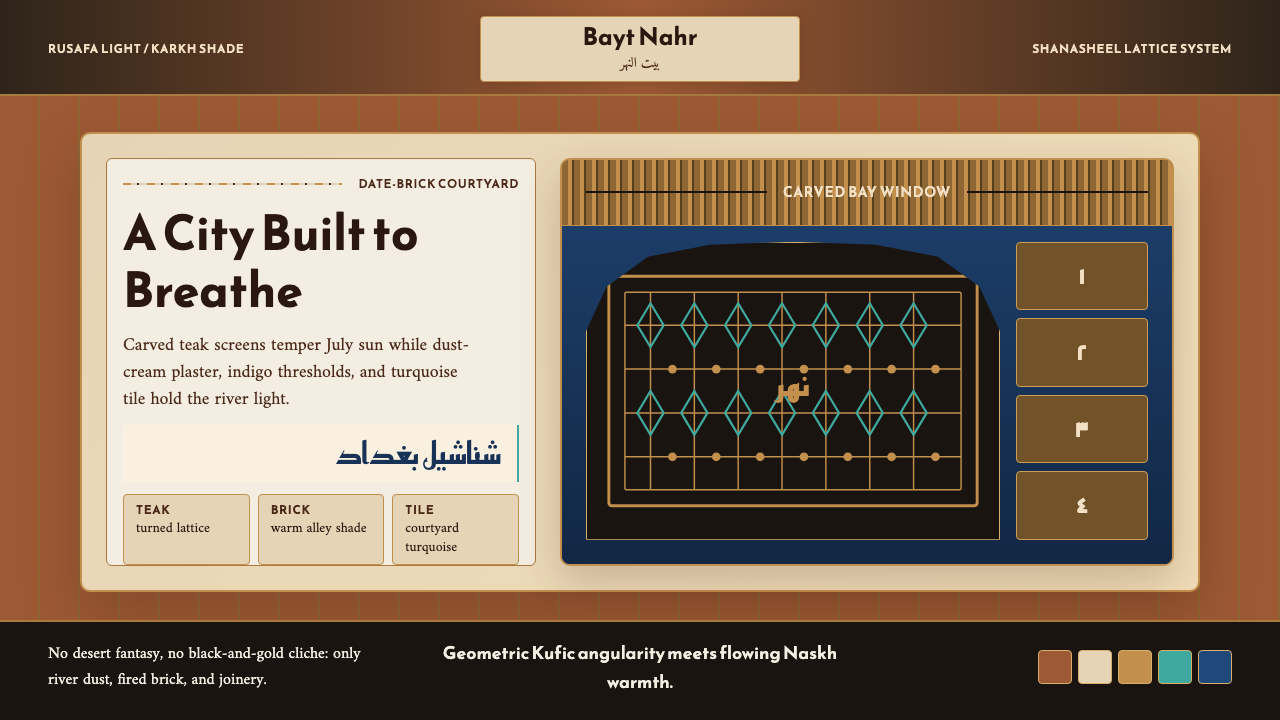 Iraqi Baghdad Shanasheel HouseBreathes through ornament. Date-brick ground, teak lattice, and turquoise til…以纹样呼吸:椰枣砖底、柚木格窗与青绿瓷砖构成边框。
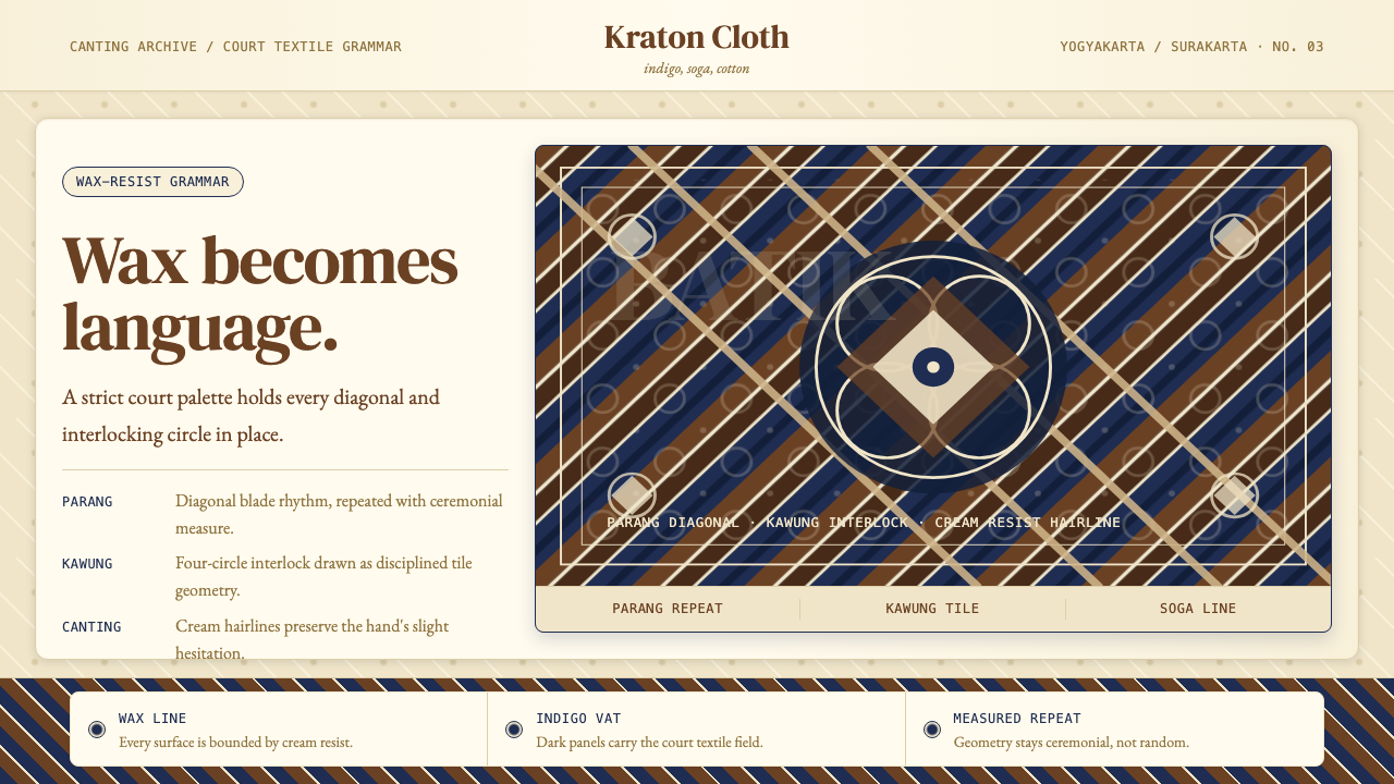 Javanese BatikCeremonial repetition. Indigo, soga, and cream frame a tiled canting motif.庄重重复。靛蓝、梭加棕与米色构成瓷砖纹样。
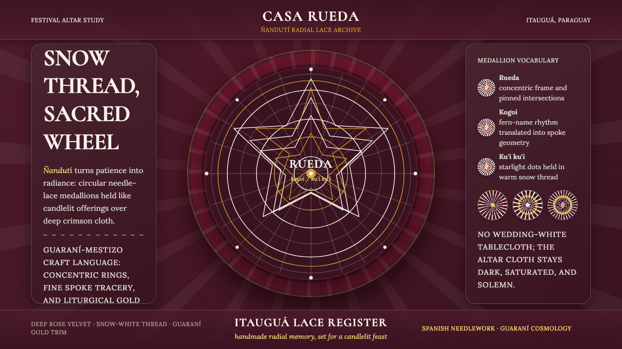 Paraguayan Itauguá Ñandutí Spider LaceReverent craft glows. Snow lace medallions radiate over rose velvet with Guar…庄严手作发光:雪白蕾丝勋章在玫瑰绒面上放射,金色收边。
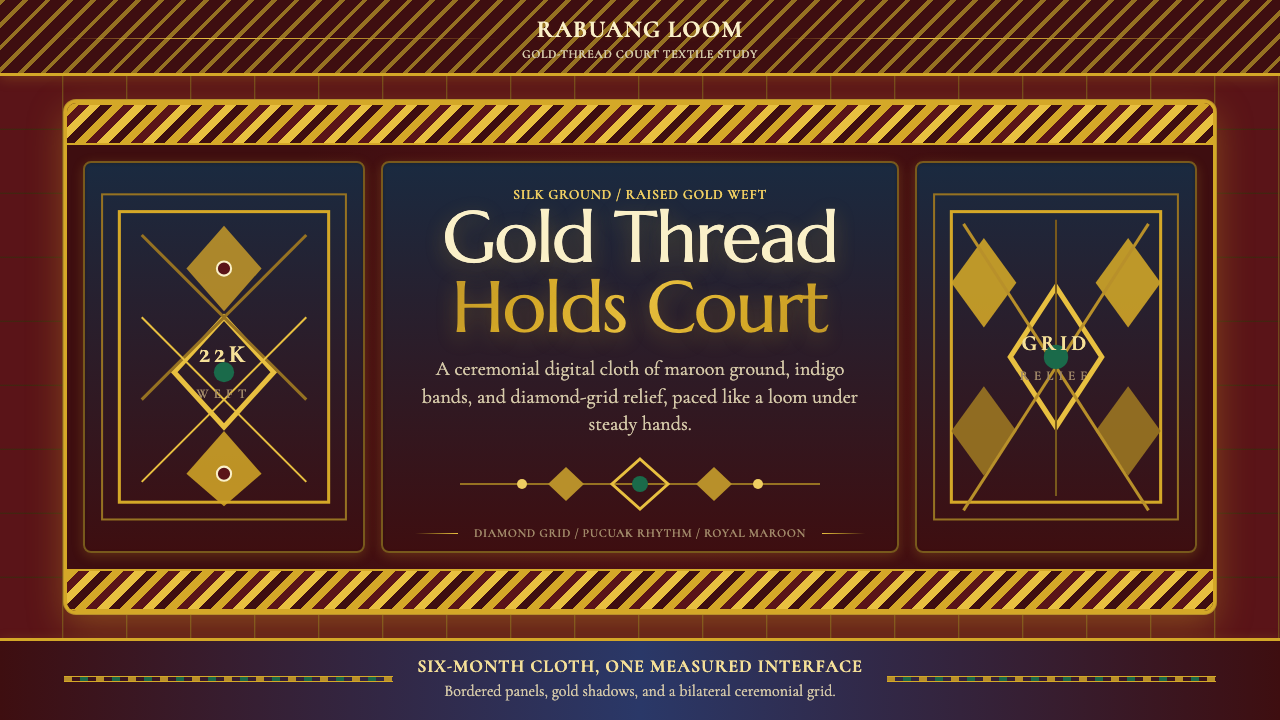 Sumatran Songket (Pandai Sikek)Courtly weight glows. Maroon silk, Cormorant small caps, and gold diamond gri…宫廷重量在发光:酱红丝地、Cormorant 小型大写与金色菱格。
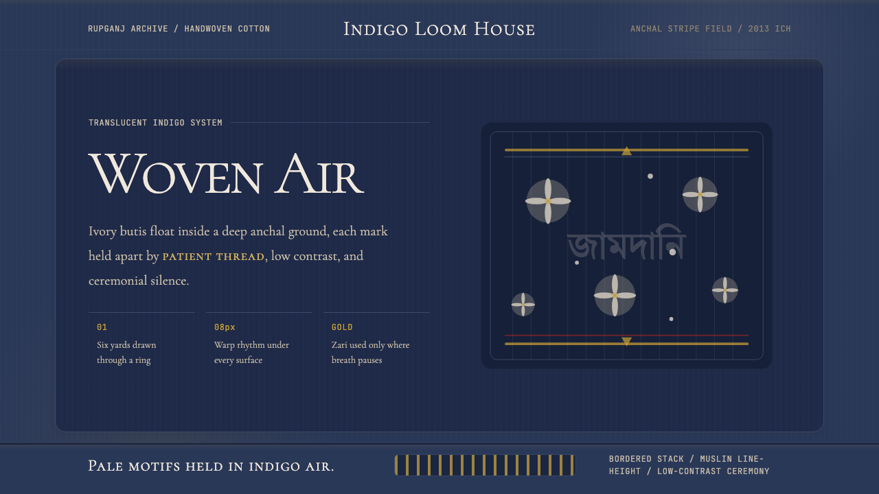 Bengali Jamdani MuslinBreathes like woven air. Indigo ground, ivory butis, and threadline borders s…如织空气般呼吸:靛蓝底、象牙布蒂与细线边框保持低对比。
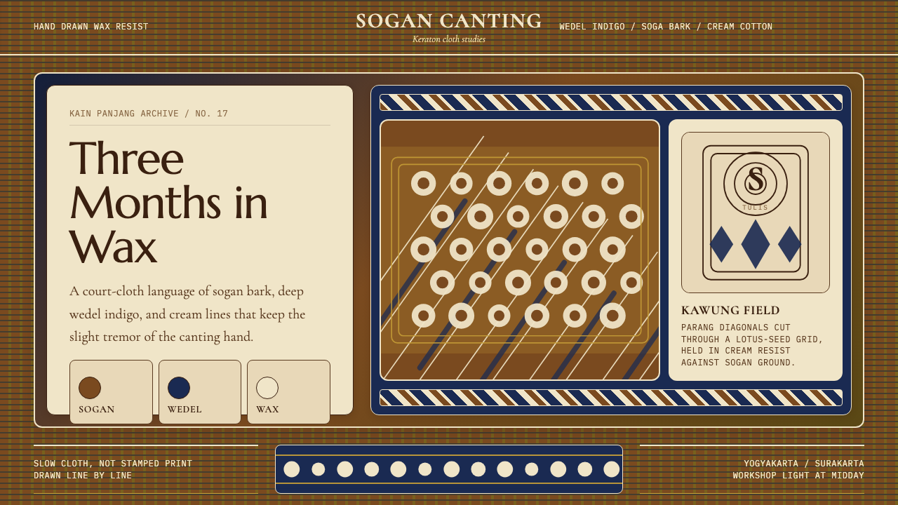 Javanese Batik Tulis (Keraton Sogan)Patience made visible. Sogan brown, indigo, and cream wax-lines form dense co…耐心可见:梭罗褐、靛蓝与奶白蜡线织成密集宫廷网格。