What is Yemeni Jambiya Curved Dagger?
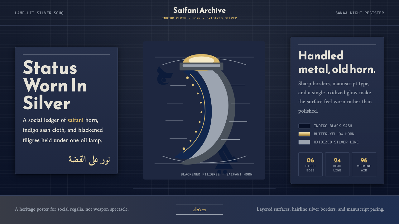
The jambiya is not a weapon but a social document — a curved silver-and-horn object worn at the waist that announces tribe, lineage, and standing before a single word is spoken. The design language it inspired is nocturnal, tactile, and deeply layered: indigo-black grounds, the warm yellowing of saifani horn, oxidized silver that flares at unexpected angles, and Arabic letterforms that have lived in both stone inscription and manuscript ink.
Yemeni Jambiya Curved Dagger in brief
The Yemeni Jambiya Curved Dagger design system is rooted in the visual culture of old Sanaa's silver souqs — the lamp-lit workshops where Yemeni Jewish silversmiths practiced filigree, granulation, and niello inlay for three centuries before Operation Magic Carpet carried most of them to Israel in 1949. The aesthetic draws from a specific intersection: Islamic geometry meeting tribal regalia, Arabesque ornament subordinated to structural hierarchy, and a nocturnal palette dictated by oil-lamp light and oxidized metal.
What distinguishes this system from generic 'Arabian Nights' pastiche is specificity and restraint. The palette is not broadly warm or golden — it is the particular cold luminescence of oxidized silver against near-black indigo cloth, punctuated by the narrow warmth of butter-yellow horn. Surface ornament is always structural: filigree borders define edges and frames; granulated silverwork marks status zones; niello inlay reads as dark line drawing against bright metal. Nothing decorates for its own sake.
Typography in this system treats Arabic and Latin letterforms as equal partners. Reem Kufi's geometric clarity, derived from early Kufic stone inscriptions, serves the titling register. Amiri's manuscript warmth, shaped by centuries of Yemeni and Levantine calligraphic tradition, handles running text. The tension between inscription and manuscript — between permanence and flow — is the typographic core of the entire system.
Where does Yemeni Jambiya Curved Dagger come from?
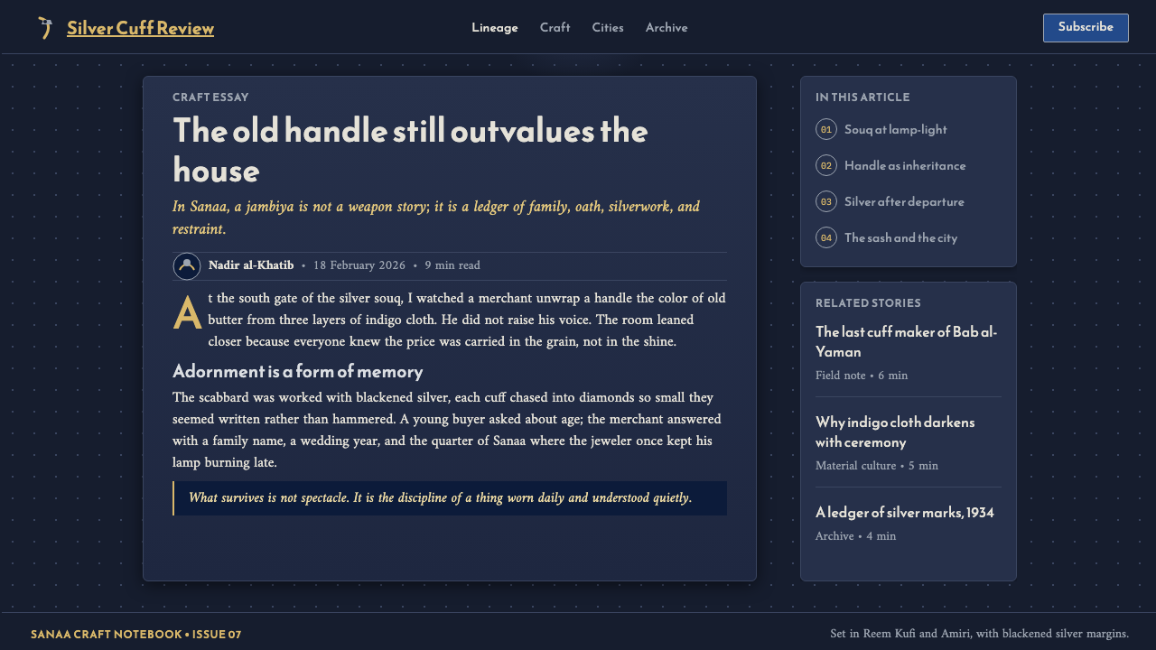
The jambiya as a cultural object predates Islam, though its most recognizable form — the sharply curved blade, the distinctive H-shaped hilt, the elaborately worked silver scabbard — crystallized during the late Ottoman and Imamate periods of the seventeenth through twentieth centuries. In Yemeni society, the jambiya was and remains a non-weapon: it is presented to boys at adolescence as a marker of manhood, given as bride-price, awarded as honor, and read at a glance to determine its wearer's tribe, social class, and geographic origin. The handle material tells the sharpest story: saifani rhino horn, now banned, occupied the apex of the hierarchy, its deep butter-yellow translucency marking the wearer as elite. Below it came other horn materials, then carved water-buffalo bone, then resin composites — each with its own social meaning legible to any Yemeni viewer.
The silver craft that produced jambiya scabbards and belts was concentrated among Yemeni Jewish communities, particularly families such as the Bawsani and Habshush, who maintained workshops in Sanaa's Jewish quarter for generations. This arrangement was partly economic — silversmithing was a profession that Islamic restrictions on certain trades left more open to Jewish craftsmen — and partly social, since Jewish silversmiths could work across tribal lines in ways that Muslim craftsmen sometimes could not. The filigree technique they practiced — twisting fine silver wire into open-lattice patterns and soldering it to a backing — required extreme patience and eyesight; the oil-lamp light of the workshop meant that much of the finest work was done in near-darkness by feel as much as by sight.
Operation Magic Carpet (1949–1950) airlifted approximately 49,000 Yemeni Jews to the newly established State of Israel, emptying the silver souqs almost overnight. The craft did not disappear — Yemeni silversmithing traditions transplanted to Israel, particularly in towns like Rehovot and Petah Tikva where Yemeni Jewish communities settled — but the specific social ecosystem of Sanaa, with its interplay between Muslim patrons and Jewish craftsmen, ended abruptly. Scholar Marjorie Ransom documented this tradition extensively, and the Bawsani family in particular continued working in Israel, maintaining continuity with techniques that might otherwise have been lost.
Contemporary Yemen's political fragmentation since 2015 has made the jambiya even more charged as a symbol of pre-war cultural identity. Collectors, scholars, and diaspora communities have worked to document and preserve examples, and the visual grammar of jambiya silverwork — filigree, granulation, the specific proportions of scabbard decoration — has entered a second life in international craft, jewelry, and design contexts far from its Sanaani origin.
What defines the Yemeni Jambiya Curved Dagger look?
Palette: Nocturnal and Oxidized
The dominant ground is indigo-black — not a neutral dark but the specific depth of aged indigo-dyed cloth, holding traces of deep blue within the near-black field. Against this ground, two materials assert themselves: the warm butter-yellow of saifani horn, which reads almost amber in lamplight, and the cold luminescence of oxidized silver, which flares at unexpected angles and settles into grey in shadow. Together these three tones — near-black, warm yellow, cool silver — exhaust the functional palette. Any additional color should be used with extreme spareness, as a marker of hierarchy rather than decoration.
Surface: Filigree Logic
The organizing principle of surface ornament is structural density: borders are worked in filigree, status zones receive granulated silverwork, and the open field between is allowed to breathe. Filigree patterns are not freeform — they follow the mathematical relationships of Islamic geometric tradition, based on star polygons and interlocking regular forms. Borders contain the composition; they do not escape it. In digital application, this translates to ruled frames with internal pattern, section dividers rendered as thin geometric tracery, and never a decorative element placed mid-field without a structural rationale.
Typography: Inscription Meets Manuscript
Kufic-derived geometric letterforms — angular, constructed, spatially authoritative — belong to the titling and display register. This is the language of stone and coin inscription, of enduring marks meant to be read at distance. Manuscript forms — more fluid, more compressed, with the pen-angle variation that comes from centuries of copying — belong to running text and extended reading. The contrast between these two registers is not a typographic accident but a cultural truth: Arabic script has always held both modes simultaneously, switching between carved permanence and flowing record. Bilingual layouts should keep each language in its appropriate register rather than forcing parallel treatment.
Light: Raking and Directional
Oil-lamp light is raking, directional, and low — it grazes surfaces from one angle, creating hard shadow on the opposite side and revealing surface texture that overhead light would flatten. This quality should inform how depth cues are applied in interface work: shadows are directional and cast from a consistent low angle, never ambient or diffuse; reflective elements — silver-toned icons, metallic borders — catch light from one direction only; and texture, when used, is revealed by shadow rather than by hue variation. The goal is the visual sensation of weight and handled-object quality rather than the flatness of screen-native design.
Hierarchy: Status Legibility
In jambiya culture, hierarchy is immediately readable: handle material, scabbard silverwork density, and belt ornament width all broadcast rank without ambiguity. The design system inherits this insistence on clear, unambiguous hierarchy. Primary content is marked by the warmest and most luminous element — the horn-yellow accent — against the deepest ground. Secondary content lives in oxidized-silver tones. Tertiary information recedes into the near-black field. Ambiguity in the visual hierarchy is a failure of communication, not a design virtue. There is no 'secondary primary' or 'softer hero' — rank is rank.
Ornament: Contained, Not Scattered
One of the most common misreadings of Islamic decorative traditions in design is treating them as wallpaper — continuous pattern applied without structural logic. Authentic jambiya silverwork never operates this way. Pattern is concentrated at joints, borders, and zones of structural transition — the point where scabbard meets belt, where the throat of the scabbard ends and the body begins. Open metal between pattern zones is not neglect; it is relief, the visual pause that makes the patterned zone readable. The same discipline applies in digital work: use geometric tracery at structural boundaries only, never as background fill or mid-content decoration.
Motion: Deliberate and Weighted
Objects made of metal and horn do not spring or bounce — they turn and settle, with the rotational authority of something substantial. Motion in this design system follows the same logic: transitions are deliberate, weighted, and slightly slower than contemporary defaults. A reveal feels like lifting a cloth from a silver tray. Elements do not slide in casually; they emerge. The moment of arrival is held briefly before the next action is possible. Easing curves favor slow acceleration and decisive arrival over symmetrical ease-in-ease-out. Nothing in the system should feel light, bouncy, or playfully casual.

Who shaped Yemeni Jambiya Curved Dagger?
The Bawsani family, including the silversmith Hadi Bawsani, were among the most prominent Jewish silversmithing dynasties in Sanaa. Working across generations in the Jewish quarter's workshops, they developed and refined techniques of filigree and granulation that became defining features of Sanaani jambiya scabbards. After the family's migration to Israel in 1949–1950, they continued practicing silversmithing in their new communities, maintaining a direct lineage from the Yemeni tradition and ensuring that the technical knowledge survived the disruption of Operation Magic Carpet.
The Habshush family represented another major lineage in Sanaani Jewish silversmithing, known particularly for niello inlay work — the technique of filling incised silver designs with a black metal alloy to create the dark-line-against-bright-metal effect central to jambiya aesthetics. Their output documented the interplay between Jewish craft tradition and the demands of Muslim tribal clients, producing objects that had to satisfy both the aesthetic expectations of the wearer's tribe and the technical ambitions of the craftsman's tradition.
An American scholar who produced the most comprehensive English-language documentation of Yemeni silversmithing traditions, including detailed accounts of jambiya construction, the social meaning encoded in different handle and scabbard materials, and the specific techniques practiced by Jewish silversmiths before and after their migration to Israel. Her research drew on fieldwork in both Yemen and Israel and constitutes the primary scholarly record linking the Sanaani workshop tradition to its post-1949 continuation in the Israeli diaspora community.
Not a person but a material lineage: saifani horn — believed to derive from black rhinoceros horn, now an internationally banned substance — defined the apex of jambiya handle hierarchy for centuries. Its deep butter-yellow translucency, its ability to be carved into smooth organic curves, and the warmth it radiates under lamp or sunlight made it irreplaceable in social terms. The craft tradition around shaping and finishing saifani horn developed independently of the silversmithing tradition, with its own masters and techniques, yet the two traditions co-existed in the same object — horn hilt above, silver scabbard below — and must be understood together to understand the jambiya as a designed form.
The physical site where this visual tradition was produced: the Jewish quarter of Sanaa, known as Al-Qa' or Al-Qa'a, which functioned as the concentrated center of silversmithing, weaving, and other crafts serving the broader Yemeni market. The quarter's spatial organization — narrow covered lanes, workshops open to the street, the oil-lamp light that defined the working conditions — directly shaped the craft tradition it housed. Understanding the workshop's physical conditions (the low light, the handled objects, the accumulated patina of generations of work) is necessary for understanding why the aesthetic turned out the way it did.
How do you use Yemeni Jambiya Curved Dagger today?
The Yemeni Jambiya system is suited to products where authority, craft heritage, and nocturnal richness are assets rather than liabilities: premium cultural institutions, collectors' platforms, high-end e-commerce with artisanal positioning, editorial publications covering Middle Eastern or Islamic art and culture, and any interface where the sensory quality of the physical object is central to the brand identity. It is not suited to applications requiring clinical clarity, bright accessibility standards, or casual approachability.
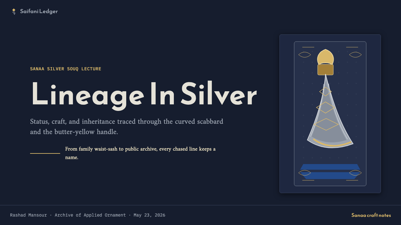
For presentation slides, the system works best when the cover is treated as a silver tray: deep indigo-black ground, title in Reem Kufi-weight geometric lettering positioned with deliberate asymmetry, a single element in horn-yellow as the composition anchor, and the remaining space left uncluttered. Content slides should use a two-column structure with content on the right and metadata or contextual annotation on the left in a smaller, lighter weight — echoing the way a jambiya scabbard places the primary form at the center with silverwork annotations at the edges. Data visualizations should use the three tones of the palette — near-black, warm yellow, cool silver — as the only categorical colors, never expanding into additional hues.
For web interfaces, the style is most appropriate for product detail pages, portfolio showcases, and gallery views where one large-scale image can occupy the dominant position against a near-black ground, with typographic content in the secondary column. Navigation should be restrained and typographic — no icon-heavy toolbars, no color-coded navigation items. Interactive states should use the horn-yellow accent as the single indicator of selection or hover, never a color change in the ground or a brightness increase in the silver elements.
For editorial and marketing work, the system rewards full-page compositions: a single large object — a photograph of a jambiya, an enlarged detail of filigree, an architectural fragment from old Sanaa — occupying sixty to seventy percent of the field, with the text block positioned at one edge in a narrow column, set in a manuscript-weighted typeface. Pull-quotes and section headers earn the geometric Kufic register. Do not use the system for advertising-style busy layouts; it is architecturally sparse and requires visual restraint from all collaborators.
The most common mistake when working with this system is over-pattern: adding geometric tracery as a background fill, tiling Islamic star-polygon motifs across large surface areas, or placing decorative borders around every content block. In authentic jambiya work, pattern is concentrated at structural joints and transitions — not spread as wallpaper. A second common mistake is warming the palette beyond its prescribed range: adding orange, deep red, or golden tones to 'enrich' the composition. The system's power comes precisely from the restraint of its three tones — near-black, butter-yellow, oxidized silver — and warming beyond that boundary collapses the distinction between this system and generic Middle Eastern pastiche.
Yemeni Jambiya Curved Dagger — FAQ
How is this different from other Islamic or Arabic design styles?
Most 'Arabian' or 'Islamic' design styles in contemporary practice draw from Ottoman court aesthetics, Moroccan tile tradition, or generic calligraphic ornament — all of which tend toward warm golds, jewel-toned color fields, and broadly geometric surface coverage. The Jambiya system is specifically Yemeni, specifically nocturnal, and specifically rooted in metalwork rather than tile or textile. Its palette is cooler and darker than typical Middle Eastern design; its ornament is more structurally disciplined; its typography privileges Kufic geometric forms over the more decorative Naskh or Thuluth scripts that dominate most 'Arabic' branding. The specificity is the point — this is not a generic regional aesthetic but a precise tradition from a particular time, place, and craft.
Can this system be used on a light background?
With significant adaptation, yes — but the dominant mode is dark-ground, and any light-background variant needs to be treated as a deliberate inversion rather than a neutral alternative. In a light inversion, the near-black elements become the foreground definition, the horn-yellow accent becomes the primary spot color, and the silver elements must be rerendered in a darker oxidized tone — pale silver on white is invisible. The structural logic of lamp-lit darkness is part of the system's identity; removing it produces something technically legible but aesthetically depleted. Consider using the light variant only for contexts where accessibility requirements make the dark ground impractical.
How should photographs be integrated into this design system?
Photography works in this system when it is treated as a found object placed on a surface rather than as a window into a scene. This means: high contrast with deliberate shadow, cropped to emphasize material texture and surface quality rather than environmental context, and processed to bring out the silver and near-black tones of the system's palette rather than corrected toward neutral daylight accuracy. Close-up details of filigree, horn grain, oxidized metal, and carved surface patterns integrate naturally. Wide-angle environmental photography — a market scene, an architectural exterior — can work if the image is toned to align with the nocturnal palette, but should be used sparingly. Lifestyle photography with bright ambient lighting is almost always in conflict with the system and should be avoided.
Is this system appropriate for interfaces that need to meet modern accessibility standards?
The core palette — near-black ground with butter-yellow and silver accents — presents contrast challenges for body text and interactive states. Horn-yellow against near-black achieves sufficient contrast for large display text and icon-level elements, but may require adjustment for small body text to meet WCAG AA thresholds. The silver-tone elements are the most problematic: mid-grey on near-black can fall short of minimum contrast requirements and should never be used for essential information or interactive affordances without testing. In accessibility-constrained contexts, the most pragmatic approach is to reserve the deep nocturnal palette for decorative and structural elements, use near-white text for all essential content, and treat the horn-yellow accent as the primary high-contrast interactive signal.
What makes this system feel authentic versus generic 'Arabian' pastiche?
Authenticity in this system comes from specificity in four areas. First, palette specificity: the near-black and butter-yellow are not interchangeable with generic Middle Eastern warm golds or deep reds — they are the particular tones of indigo cloth and saifani horn under oil-lamp light. Second, ornament discipline: pattern belongs at structural joints and borders, not spread as wallpaper across open fields. Third, typographic specificity: Kufic-derived geometric forms in display, manuscript forms in text — not generic decorative Arabic script used as visual seasoning without structural role. Fourth, material reference: the visual logic of oxidized silver — directional light catch, hard shadow, cold luminescence — rather than simulated gold or generic metallic sheen. When any of these four are compromised, the system starts to collapse toward the generic, and no amount of additional detail will recover the lost specificity.
Related design styles
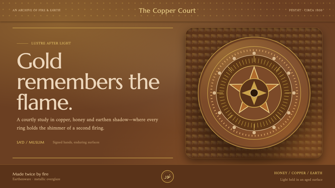 Fatimid LustrewareOpulence fired into earth. Copper-gold lustre glows through dense medallions…
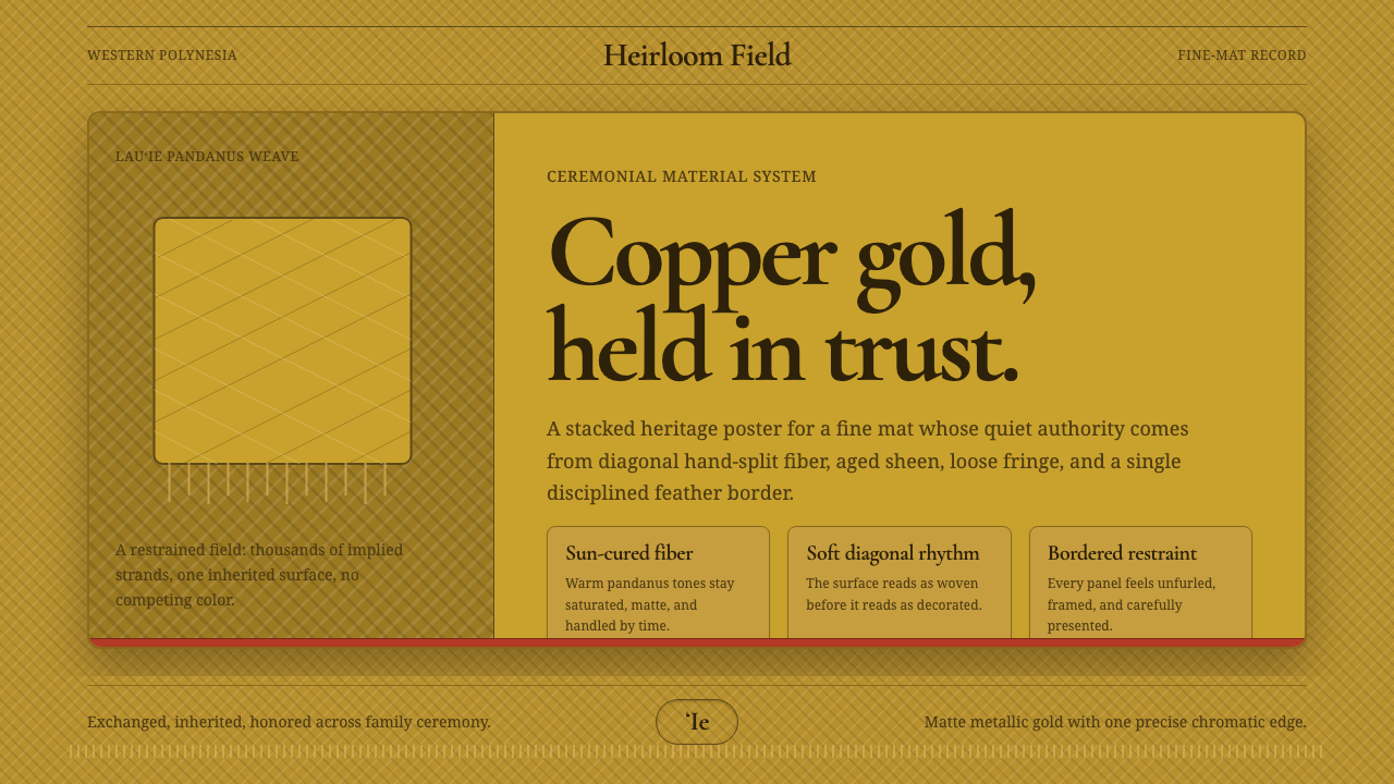 Samoan ʻIe Tōga Fine MatCeremony in restraint. Copper-gold weave, loose fringe, one red feather line.
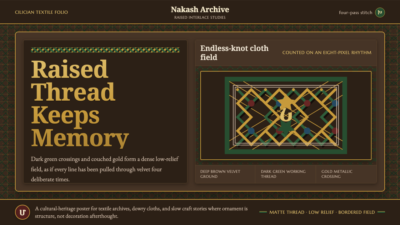 Armenian Marash Interlace EmbroideryDense memory in raised thread. Green-gold interlace locks over deep brown clo…
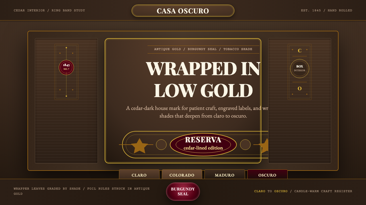 Cuban Habano CigarLuxury sleeps in shadow. Tobacco brown, antique gold rules, and burgundy seal…
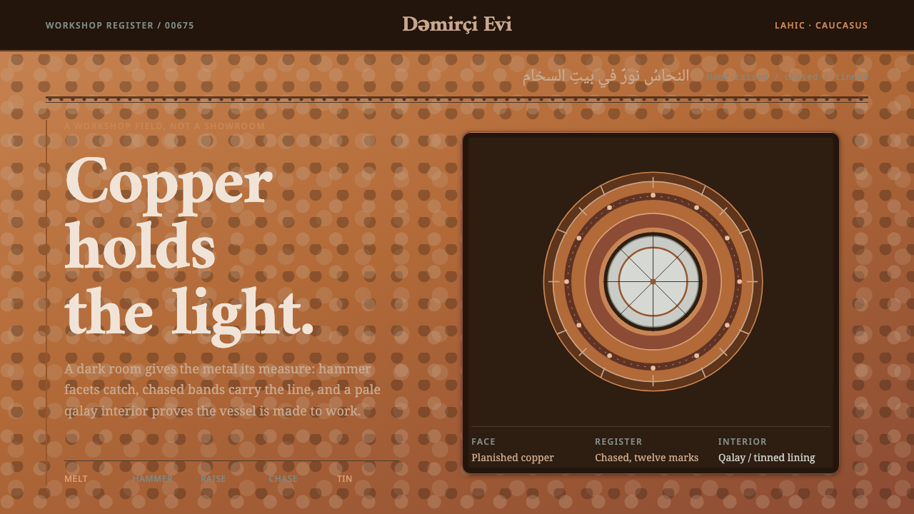 Lahic CoppersmithCopper becomes light. Soot-black bands, Amiri type, hammer facets and tin rev…
 Lao Sinh Silk WeaveCeremonial Lao silk on screen. Dark aubergine ground threaded with gold mat-m…