What is English Saddlery Tan?
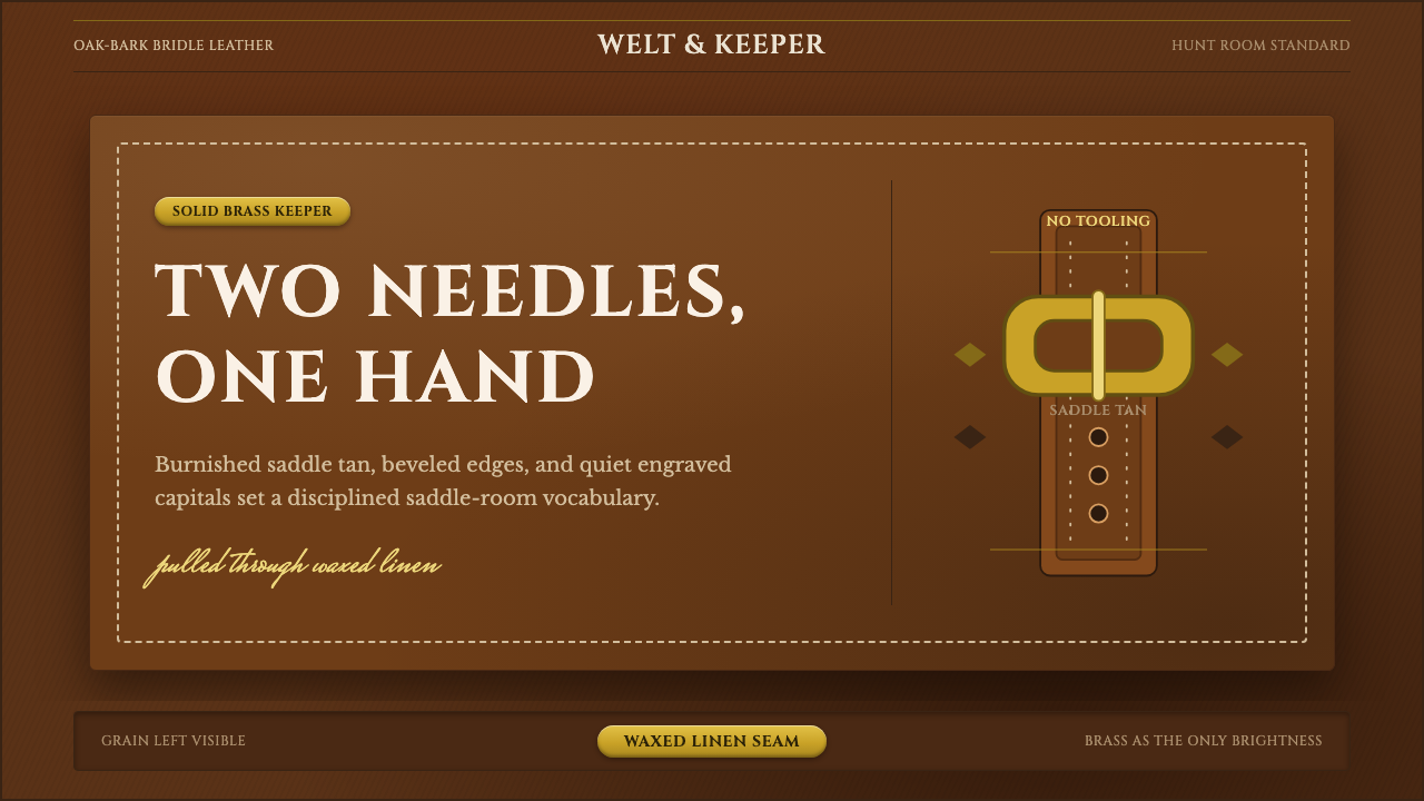
English Saddlery Tan takes its entire vocabulary from a bridle-maker's bench — burnished leather, a single brass fitting, and stitches pulled tight by hand.
English Saddlery Tan in brief
English Saddlery Tan is a design language lifted directly from the surface of oak-bark tanned bridle leather — the same hide English saddlers have cut, skived, and stitched for riding tack since before the twentieth century. The defining color is not a generic brown but a specific, genteel saddle tan: warm, slightly reddish, deepened by years of dressing and handling, and never bleached toward cream or white. Solid brass hardware, edges that have been beveled and burnished to a soft shine, and visible waxed-linen stitching complete the vocabulary. Nothing here is invented for the screen; every visual cue is a direct transcription of a physical object that already existed.
The style belongs to a specific and narrower tradition than most people assume when they hear 'leather aesthetic.' This is the English hunt-and-dressage saddler's craft, not the tooled, ornamented Western saddle with its floral stamping and contrasting inlays. Where Western tack is expressive and decorative, English saddlery is closer to a uniform: understated, built for function first, and judged by the quality of its materials and the precision of its construction rather than by surface flourish. The restraint is not an absence of care — it is the opposite. A saddler who can be trusted with a rider's safety communicates that trust through consistency, not embellishment.
Visually, the style reads as quiet and materially rich rather than loud. The leather grain is meant to be legible — you can see it, almost feel it, even in a flat image. Brass appears exactly once as an accent, never repeated in multiple competing metals. Lettering, where it appears, tends toward engraved-looking capitals reminiscent of a hallmark stamped into metal or tooled into leather. Stitch lines run in pairs, evenly spaced, looking as though they were pulled through two holes at a time by a saddler's awl and needle rather than machine-produced in a single unbroken pass.
Where does English Saddlery Tan come from?
The English bridle-leather tradition predates the twentieth century and grows out of a specific tanning method: oak-bark, vegetable tanning, in which hides are cured slowly in pits using tannins drawn from crushed oak bark rather than the fast chrome-tanning chemistry that came to dominate the leather industry later. Oak-bark tanning is slow — historically taking the better part of a year per hide — and it produces leather that is denser, more water-resistant, and capable of taking on a rich, deepening tan color as it ages and absorbs dressing. This slowness was never a marketing story; it was simply how durable equestrian leather was made before industrial shortcuts existed, and saddlers built their entire craft around its particular properties.
The craft is tied to a specific English institution: the master saddler, a tradesman whose trust was earned over a career because the tack he built had to hold a rider's weight at speed over jumps and rough ground. This is a materially different mandate from decorative leatherwork. A hunt or dressage saddle, bridle, or set of straps could not afford ornamental weakness — every stitch line, every edge, every buckle placement had a structural reason to exist. Firms in the Sedgwick tradition of English oak-bark bridle tanning became reference points for this kind of leather specifically because their hides held up under the exact stresses riding demanded, not because of how they photographed.
This tradition sits within a broader English equestrian culture — hunting and dressage — that itself carried strong class and craft associations. Tack was commissioned, fitted, and maintained over decades; a good bridle or saddle was expected to outlive its first owner. That expectation shaped an aesthetic in which visible wear and patina were not flaws to be hidden but signs of a well-made object doing its job over time. The tan deepens, the brass dulls and is polished back up, the leather softens — and none of this is disguised.
Unlike many design movements that emerged from a single manifesto or named founder, English Saddlery Tan has no singular origin moment — it is a craft tradition refined collectively over generations by working saddlers, tanners, and the institutions that depended on their output. Its continuity into the present is unusually direct: the same tanning methods, the same saddle-stitch technique, and the same restrained material vocabulary that defined nineteenth-century English tack are still practiced today, making it one of the few design languages in general circulation that has never needed a revival — it simply never stopped being made.
What defines the English Saddlery Tan look?
Color
The palette centers on a single, specific saddle tan — warm and slightly reddish, closer to a well-worn conker or chestnut than to a generic 'brown.' This tan is treated as a base material color rather than a decorative choice, meaning it should look like it comes from a tanned hide, not a flat digital swatch: capable of reading darker in creases and lighter across raised grain. Supporting neutrals stay close to the leather itself — deep near-black shadow tones and a warm ivory or bone for contrast — with brass functioning as the only accent color in the entire system.
Material Surface
Grain is not optional texture here — it is the single most important visual signal the style carries. The leather surface should read as something with pores, faint creasing, and the slightly irregular sheen of hide that has been dressed and handled rather than printed. Beveled, burnished edges — where a flat leather edge has been rounded and polished to a soft glow — appear as a consistent finishing detail on any bordered shape, echoing exactly how a saddler finishes the edge of a strap or panel.
Brass Hardware
Brass is used the way a saddler uses it: sparingly, structurally, and exactly once per composition as the accent that draws the eye. A buckle, a rivet, a stamped fitting — solid brass, warm rather than silvery, with a soft worn glow rather than a mirror shine. The discipline is in restraint: introducing a second metal tone, or repeating brass so often that it becomes wallpaper, undoes the effect entirely. One brass moment reads as considered; brass everywhere reads as costume jewelry.
Stitching
Waxed-linen saddle stitching is the style's most distinctive linear motif: two parallel rows of evenly spaced, slightly raised stitches, each one reading as a discrete pulled thread rather than a continuous machine seam. Stitch lines should look hand-set — occasional, barely perceptible unevenness in spacing is more authentic than perfectly mechanical regularity. This detail typically borders panels, straps, or major shape divisions, functioning the way a rule or divider line would in a more conventional layout, but carrying tactile, handmade connotations no straight line can.
Typography
Lettering leans toward engraved-looking serif capitals — the kind of letterform you would expect stamped into a brass plaque or tooled into a leather panel, rather than a soft contemporary sans. Letterforms carry weight and formality without becoming ornate; this is closer to a hallmark or a maker's stamp than to display typography designed to be decorative. Restraint extends to hierarchy: a single confident header treatment does more work than a large type system with many competing weights.
Composition and Restraint
Layouts favor generous, quiet space around a small number of confidently placed elements, mirroring how a well-made piece of tack presents itself: nothing crowded, nothing competing for attention. Ornament for its own sake is absent — every visual element should be traceable back to an actual physical component of bridle leather goods (a stitch line, an edge, a buckle, a grain pattern), not invented purely for visual interest. This is the same discipline that governs the English saddler's actual craft: the object earns attention through material quality and precision, not through added decoration.
Who shaped English Saddlery Tan?
Not a single named designer but a lineage of tradespeople whose collective standards defined the aesthetic. A master saddler's reputation rested on decades of tack that had to perform under real physical stress — carrying riders safely at speed — which meant every stitch, edge, and fitting had to be functionally justified. This craft-guild model, where authority comes from demonstrated durability rather than personal branding, is why the style reads as anonymous and institutional rather than attributed to an individual visionary.
A reference lineage of English tanneries specializing in slow, vegetable oak-bark tanning for bridle leather — the specific process that produces the deep, warm saddle-tan color and dense, durable hide this style is built around. Their significance is technical rather than stylistic: the tanning method itself, more than any individual design decision, is what gives English Saddlery Tan its defining material color and surface behavior, including how the leather ages and deepens with handling.
The end users whose practical demands shaped the craft from the outside in. Hunt riding (fast, over variable and often rough terrain) and dressage (precise, formal, closely scrutinized) placed different but equally exacting demands on tack — durability under stress for one, visual correctness and fit for the other. The aesthetic's restraint and material honesty exist because both disciplines required tack that performed reliably and looked appropriately understated in a tradition that valued quiet competence over display.
How do you use English Saddlery Tan today?
English Saddlery Tan applies best wherever a brand wants to signal quiet, earned credibility rather than loud confidence. Applying it correctly means treating every visual choice as if it had to justify itself the way a stitch line or buckle placement would on real tack — restraint is the discipline, not an afterthought layered on top of a brown color scheme.
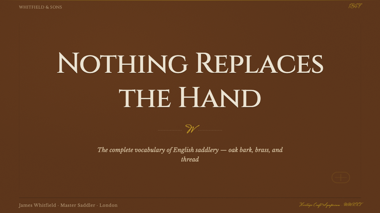
For presentation slides, the style suits cover and content pages that need to feel considered rather than corporate-generic. A cover page benefits from a single confident brass-accented mark against the deep tan ground, with engraved-style capitals for the title. Content and data slides should keep the cues subtle: a grain-textured panel background, one stitched border treatment used consistently, and charts in the tan-and-ivory palette with brass reserved for the single most important data point, not every highlight.
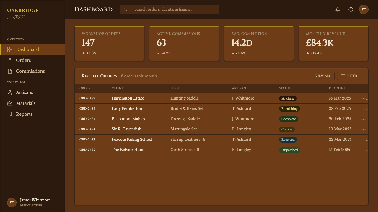
For web interfaces, the style works well on dashboards and pricing pages aimed at a discerning, quality-conscious audience — financial services, premium memberships, heritage goods, and similar contexts where trust is the selling point. Cards can carry a subtle leather-grain surface and stitched-edge borders; buttons and key actions get the single brass accent, while everything else stays within the tan-ivory-near-black range. Pricing tiers should differentiate through material weight, not louder color.
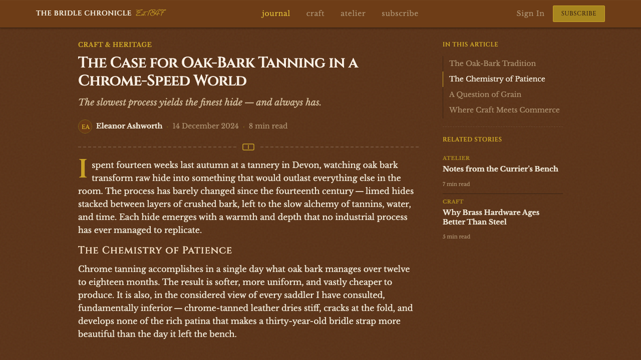
For editorial and marketing work, the style rewards a slow pace: generous margins, a narrow measure for body text, and section breaks marked with a stitched-line motif rather than a plain rule. Pages that lean on heritage or quality-over-quantity positioning benefit most — a full-bleed grain-textured hero, one brass-accented call to action, and copy that does not need to shout because the material cues already do that work.
A common mistake is overloading the palette with multiple metal tones or leather colors in one composition — a saddler would never mix brass with silver hardware, or tan leather with a contrasting black panel. Another frequent error is making the surface too smooth and glossy, which reads as vinyl rather than tanned hide. When in doubt, apply the test a saddler would: does this element have a reason to exist, and could it actually be cut from a hide.
English Saddlery Tan — FAQ
Is English Saddlery Tan the same as generic 'leather texture' design?
No. Generic leather texture is a surface effect applied for warmth or richness without a specific material or cultural referent. English Saddlery Tan is anchored to one exact tradition — English bridle leather, oak-bark tanned to a specific saddle-tan color, finished with beveled burnished edges, brass hardware, and waxed-linen saddle stitching. The difference shows up in restraint: generic leather design often piles on multiple textures, colors, and metal tones for richness, while authentic saddlery styling behaves like the craft it references, using exactly one accent and letting the material carry the rest.
How is this different from a Western or tooled-leather aesthetic?
They come from different craft lineages with opposite values. Western tooled leather is expressive and decorative — floral stamping, contrasting inlays, visible ornament as a point of pride. English saddlery is closer to a uniform: understated, judged by material quality and construction precision rather than surface flourish. Applying English Saddlery Tan means resisting the urge to add tooled patterns or decorative stamping; the restraint itself is the signal of authenticity, not a lack of imagination.
Can this style work in a light, bright layout, or does it need to stay dark?
The style is naturally suited to a deeper, richer ground because the saddle-tan color itself reads best against darker or warm-neutral surroundings, similar to how the leather looks in dim tack-room light rather than under flat daylight. A lighter application is possible — using the tan and brass as accents against an ivory or bone field rather than as the dominant ground — but it should still avoid becoming a pastel or cheerful palette. The material references (grain, stitching, beveled edges) matter more than whether the base is light or dark; lose those, and the style stops reading as saddlery regardless of value.
What kinds of brands or products does this style suit, and where does it struggle?
It suits contexts where quiet, earned credibility is the desired value: heritage goods, financial and professional services, premium memberships, and any product wanting to signal durability over trend-chasing. It struggles where playfulness or fast-moving trend cycles matter — the style's whole logic is slowness and permanence, which reads as stiff next to a brand trying to feel current or fun. It also does not suit products with no plausible connection to craftsmanship; forcing leather-and-brass cues onto a children's game will read as costume rather than substance.
Why does the brass accent appear only once instead of throughout the design?
Because that is exactly how a real saddler uses it. Brass hardware on a bridle or saddle marks a specific functional point — a buckle, a rivet — not a decorative pattern repeated for effect. A single, well-placed brass accent draws the eye precisely because it is scarce; repeat it across every element and it stops reading as considered hardware and starts reading as gold trim on costume jewelry. The scarcity is the source of its authority, and that logic carries directly from the physical object into any digital application of the style.
Related design styles
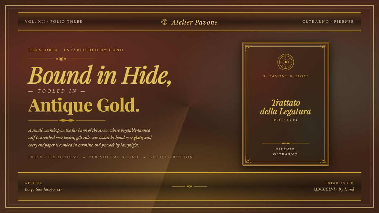 Florentine Leather BinderyRenaissance craft as luxury. Tanned hide, antique gold tooling, carmine-and-p…
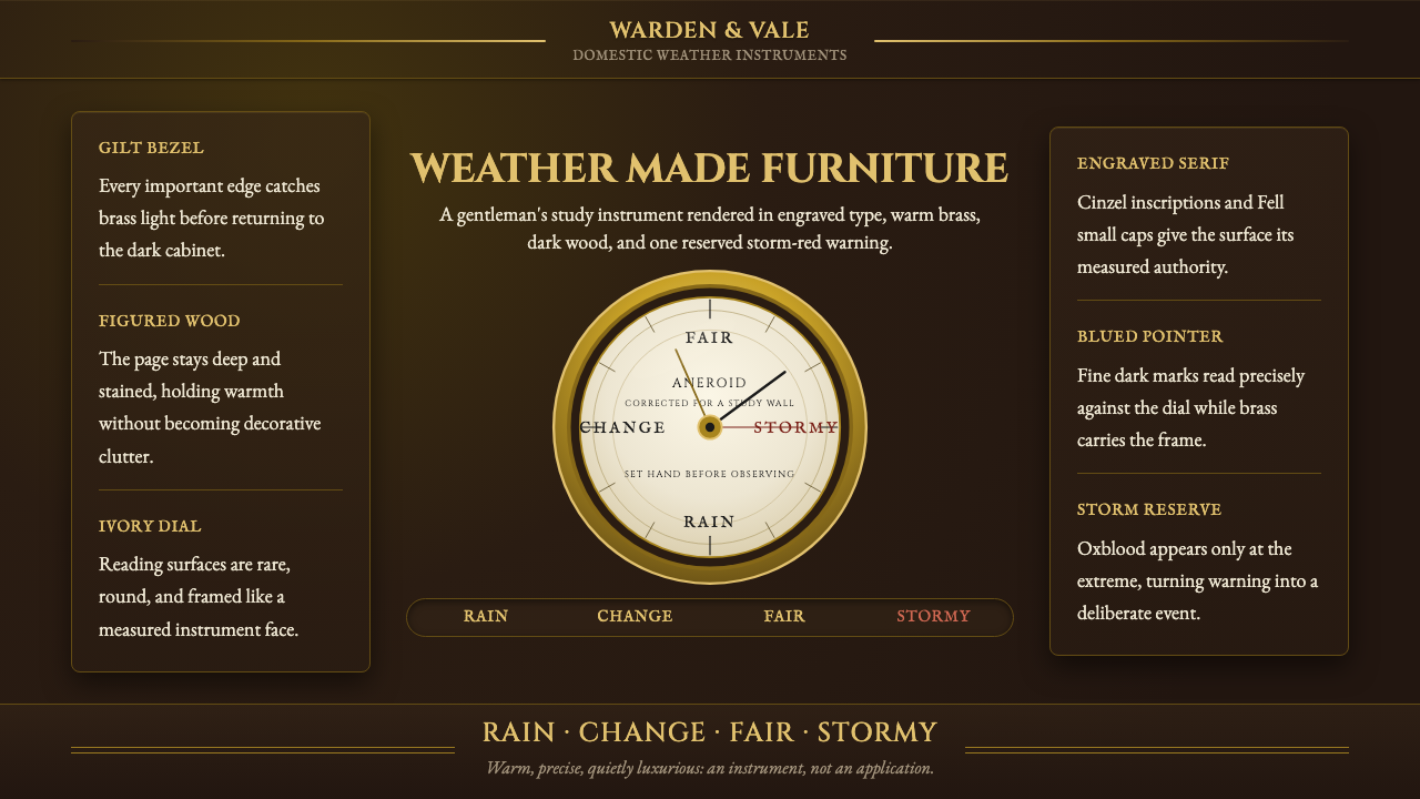 Aneroid BarometerMeasures weather as furniture. Gilt rings and Cinzel engraving glow on dark w…
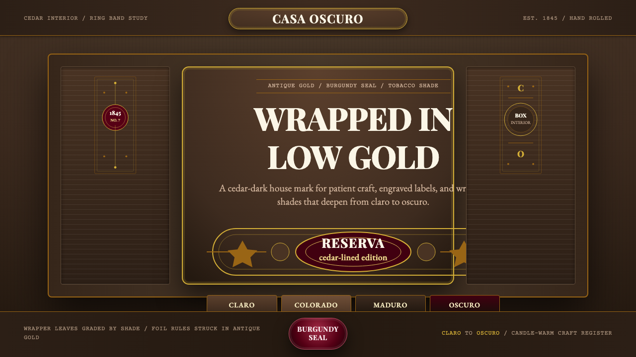 Cuban Habano CigarLuxury sleeps in shadow. Tobacco brown, antique gold rules, and burgundy seal…
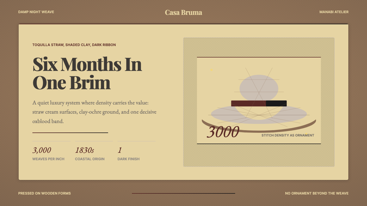 Ecuadorian Montecristi Panama HatLuxury disappears into density. Straw cream, clay ochre, and one oxblood ribb…
 Single Malt ScotchSolemn amber gravity. Thin gold rules and Cinzel capitals glow on peat-black.
 Belarusian SolomkaOne harvest, a tonal ladder. Straw diamonds turn pale gold to scorched brown…