What is Gilt Leather Binding?
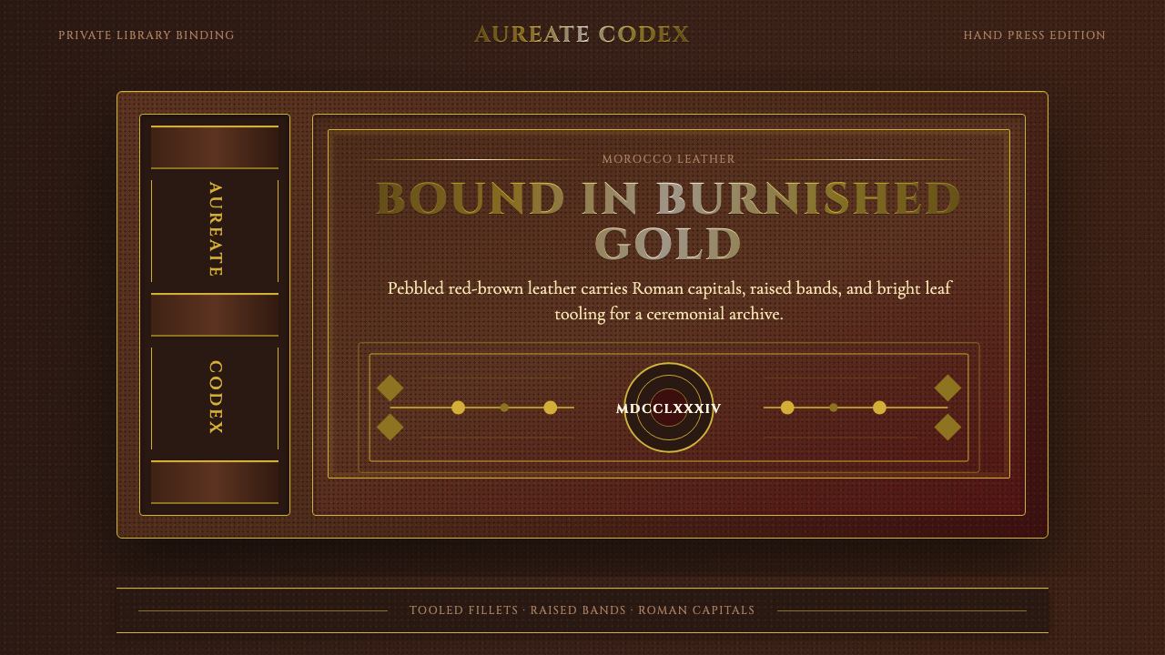
Gilt Leather Binding treats a screen or a page like the cover of a rare book — dyed hide, hammered gold, and lettering that looks struck rather than printed.
Gilt Leather Binding in brief
Gilt Leather Binding takes its visual language from the fine bookbinding tradition of pre-1900 Europe, specifically the hand-press era when a book's cover was as much a craft object as its contents. The ground is never paper or flat color — it is leather: Morocco goatskin, vegetable-tanned, pebble-grained, dyed deep red-brown or crimson, with a surface that reads as tactile and slightly irregular rather than smooth and manufactured.
Onto that leather ground, decoration is applied the way a binder would apply it — not printed, but tooled. Heated brass tools stamp patterns into the hide, and real gold leaf is burnished into the impressions left behind. The result is ornament with genuine relief and a metallic sheen that catches light unevenly, unlike a flat gold color swatch. Raised bands run across the spine, corner pieces are embossed, and rules are struck as thin gilt fillets rather than drawn as digital lines.
The overall effect is weight without noise. Nothing about this style is loud or high-key; it is dark, dense, and quiet, but every surface carries evidence of labor — hand tooling, hammered metal, burnished finish — so that restraint reads as luxury rather than emptiness. It rewards close looking rather than a quick glance.
Where does Gilt Leather Binding come from?
Fine bookbinding as a decorative craft predates the printing press, but the specific vocabulary this style draws on — Morocco leather grounds, gold tooling, raised-band spines with Roman-capital lettering — crystallized across the sixteenth through nineteenth centuries as Europe's most important books stopped being merely protected and started being displayed. A bound volume commissioned for a monarch, a bishop, or a wealthy collector was a status object in its own right, and the binder's tooling was the primary way that status was communicated before anyone opened the cover.
Jean Grolier, a French bibliophile and treasurer to King Francis I in the sixteenth century, is among the earliest names associated with the elevation of binding into a prestige art form; his commissioned bindings, often marked with his own motto, set a template for interlaced gilt strapwork that later binders continued to reference. In England, Thomas Berthelet served as royal binder under Henry VIII and helped establish gold tooling as an expected feature of court-commissioned books rather than an occasional flourish.
The craft reached a further peak in Restoration-era England with Samuel Mearne, royal binder to Charles II, whose workshop is credited with popularizing elaborate all-over gilt patterns — dense, symmetrical tool-work covering nearly the entire cover rather than being confined to a border. By the height of the hand-press era, English fine binding produced its own celebrated name in Roger Payne, working in the second half of the eighteenth century, whose meticulous, restrained tooling and careful attention to spine lettering and finishing detail are still cited as a benchmark for the craft's technical ceiling.
What unites these figures is not a single workshop or school but a shared standard: leather chosen and dyed with care, decoration executed by hand with heated tools and real gold, and spine lettering set in Roman capitals rather than any decorative or blackletter alternative. That combination — hide, hammered gold, and classical letterforms — is what this style abstracts into a reusable visual system, long after the hand-press era that produced it has passed.
What defines the Gilt Leather Binding look?
Ground and Material
The base is never a flat digital color; it reads as dyed, grained leather — Morocco goatskin in a deep red-brown or crimson, with a surface that carries subtle irregularity and directional texture rather than uniform smoothness. Even where a screen or page cannot literally be leather, the palette and surface treatment should imply hide: warm, saturated darks rather than neutral or cool ones, and a faint suggestion of grain rather than a perfectly even fill.
Gilt Ornament
Gold appears as tooled, burnished metal rather than a flat gold-colored highlight. It should look struck into the surface — carrying faint relief, catching light unevenly along an edge or fillet rather than glowing uniformly. Ornament takes the form of fine gilt rules, floral rolls, and embossed corner pieces, always disciplined and repeating rather than freehand or organic; the gold is a finishing accent applied with restraint, never a dominant field color.
Typography
Lettering favors Roman capitals in the manner of classical spine lettering — upright, evenly weighted, dignified rather than casual. Letterforms should feel carved or stamped rather than typed: generous letter-spacing in display contexts evokes the way a binder spaced out capitals along a narrow spine. Body reading text can be quieter and more contemporary, but headings and labels should retain that stamped, classical bearing.
Rules and Borders
Borders are struck as thin gilt fillets — single or paired fine lines framing a field, echoing the way a binder tooled a border just inside the edge of a cover. These are precise and geometric, never soft or feathered, and they typically frame rather than divide: a bordered panel reads as a plaque or a cartouche, a bounded field of honor for a title or an image, rather than a casual content divider.
Structure and Panels
Compositions should recall the panelled construction of a book cover: a central field bordered by a frame, with corner ornaments anchoring the four corners and a spine-like vertical band carrying identifying text. This gives even a flat digital layout a sense of physical construction — front board, spine, corner pieces — rather than a borderless, continuous surface.
Depth and Sheen
Where depth appears, it should suggest tooled relief and burnished metal rather than soft ambient lighting. A highlight along a gilt line should feel like light catching hammered gold at an angle — a narrow, directional glint — rather than a broad soft glow. Surfaces otherwise stay matte and dense; the leather ground itself absorbs light rather than reflecting it, so contrast is concentrated almost entirely in the gilt elements.
Restraint
Despite the density of ornament, the overall impression is disciplined rather than cluttered. Fine binders worked within a limited repertoire of motifs repeated with precision, not an accumulation of varied decoration. A correct application of this style uses gilt ornament sparingly and consistently — one or two motifs repeated with control — rather than covering every surface with competing flourishes.

Who shaped Gilt Leather Binding?
A sixteenth-century French bibliophile and treasurer to King Francis I, Grolier is among the earliest patrons credited with elevating binding into a personal prestige art. His commissioned volumes, often tooled with interlaced gilt strapwork and his own motto, established a template that later fine binders across Europe continued to reference for centuries.
Serving as royal binder under Henry VIII in the early sixteenth century, Berthelet helped make gold tooling an expected feature of court-commissioned books rather than an occasional embellishment, formalizing the link between fine binding and royal or institutional prestige in England.
Royal binder to Charles II during the English Restoration, Mearne's workshop is credited with popularizing dense, all-over gilt tooling patterns that covered nearly the entire cover in symmetrical repeating motifs, moving the craft beyond bordered decoration alone.
Working in the second half of the eighteenth century, Payne is one of English fine binding's most celebrated names, known for meticulous, restrained tooling and exacting attention to spine lettering and finishing detail. His work is still cited as a benchmark for the technical ceiling of hand gilt tooling.
How do you use Gilt Leather Binding today?
Gilt Leather Binding is a style built for occasions where a product wants to feel earned rather than casual — heritage brands, private members' clubs, rare-object marketplaces, whisky or wine labels, legal and financial institutions trading on gravitas. Applying it correctly means treating every surface as a bound cover: a dark leather-toned ground, a disciplined gilt border, and lettering that reads as struck rather than typed.
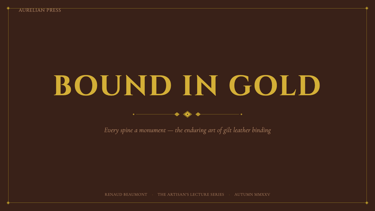
For presentation cover slides, this style rewards restraint at scale: a single deep leather-toned field, a fine gilt border framing the whole slide like a book cover, and a title set in wide-spaced Roman capitals along the vertical axis, echoing spine lettering. Content and data slides should keep the same dark ground and gilt rule-work for structure, but let data be presented plainly within bordered panels — a chart or table sits inside a gilt-framed field the way an illustration plate sits within a bound page, without competing gold ornament fighting for attention against the data itself.
For web interfaces, dashboards and pricing pages benefit from treating cards and pricing tiers as panels bordered by fine gilt rules, with the highest tier singled out by slightly more elaborate corner ornament rather than a louder color or a badge. Buttons and interactive states should stay quiet and dark, reserving the metallic gilt accent for the border or a hover state rather than for large filled surfaces — gold should mark an edge, not fill a shape.
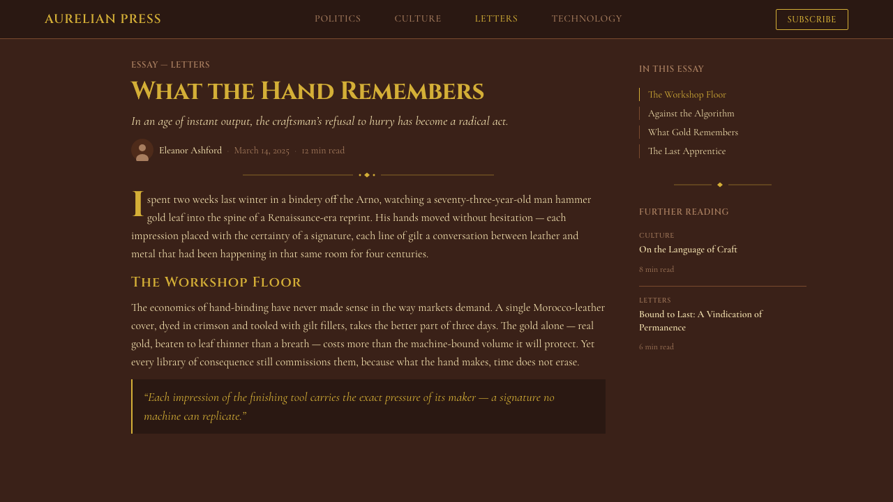
For editorial and marketing work, this style is well suited to long-form storytelling that wants to feel authoritative and collectible — think a feature on craftsmanship, a limited-edition product announcement, or an about page for a heritage brand. Pull quotes and section breaks can be set inside gilt-bordered panels functioning like decorative plates, and a hero section can use a large bordered field the way a book's frontispiece frames its title page.
A common mistake when applying this style is treating gold as a base color rather than a finishing accent — filling large areas with a flat gold tone instead of reserving gilt for fine lines, rules, and small ornament against a dark leather ground. Equally common is over-decorating: piling multiple competing gilt motifs onto one surface rather than repeating one or two with the discipline a real binder would have used. The style depends on restraint; the gold should always look rare against the leather, never abundant.
Gilt Leather Binding — FAQ
Is Gilt Leather Binding the same as a generic 'luxury dark mode' theme?
No. A generic dark luxury theme typically relies on a near-black neutral background with a metallic accent color used broadly. Gilt Leather Binding is more specific and more restrained: the ground must read as dyed, grained leather rather than a neutral dark surface, and gold must appear as tooled, burnished ornament confined to fine rules, borders, and small motifs — never as a broad accent fill. The difference is craft specificity versus generic moodiness.
What kind of typography pairs well with this style?
Display text and headings should carry the bearing of classical spine lettering — upright Roman capitals, generously spaced, feeling stamped rather than typed. Body text can be quieter and more contemporary in feel, but should avoid casual or highly rounded letterforms that would undercut the formality of the gilt ornament around it. The goal is a header that could plausibly have been tooled into a spine, sitting above reading text that stays out of the way.
Can this style work in a light, non-dark layout?
It is possible but demands care, since the style's identity depends heavily on a dark, saturated leather ground against which burnished gold reads as rare and precious. A lighter application should still anchor key panels — a header band, a bordered plaque, a cover field — in the deep leather tone, using lighter surrounding space only as neutral breathing room rather than replacing the leather ground altogether. Removing the dark ground entirely tends to strip the style of its identity.
How much gilt ornament is too much?
A useful test is to ask whether the ornament could plausibly have been tooled by hand within a reasonable amount of time. Real fine binders repeated a small set of motifs with precision rather than inventing new decoration for every inch of cover. If a layout uses more than one or two gilt motifs, or if gold ornament competes directly with content for attention, it has likely crossed from disciplined tooling into clutter.
What kinds of products or brands should avoid this style?
This style struggles wherever a brand wants to feel fast, casual, playful, or accessible to a broad mass audience — consumer social apps, children's products, budget or discount-positioned services, or anything trying to signal approachability over gravitas. Its density and formality can also slow down interfaces that need to prioritize quick scanning over considered reading, since the style is built to reward a slower, more deliberate look rather than a glance.
Related design styles
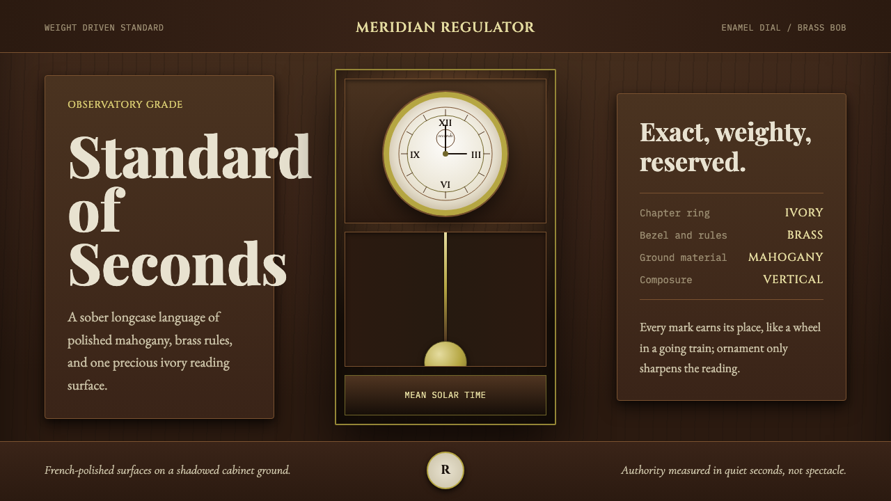 Regulator ClockSober authority. Brass rings and ivory dial lock mahogany into symmetry.
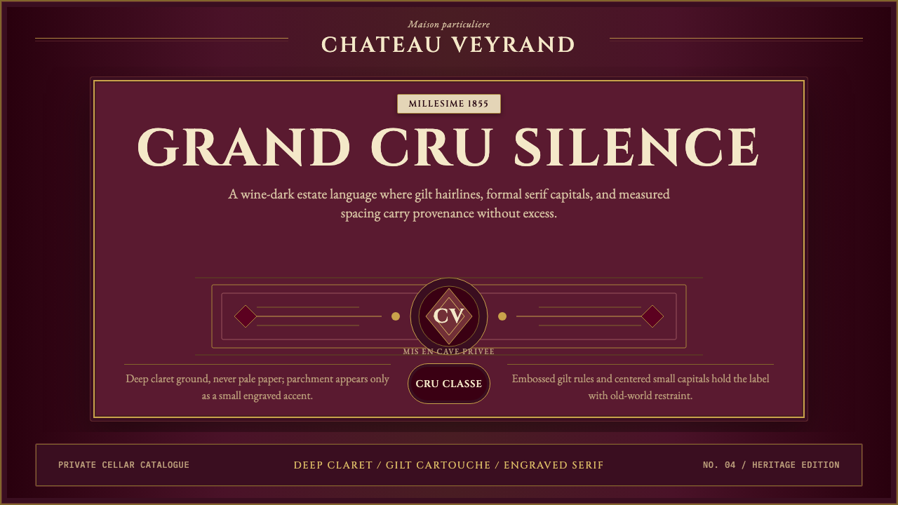 Bordeaux Wine ChâteauAged claret authority. Cinzel capitals, gilt rules, and label symmetry on win…
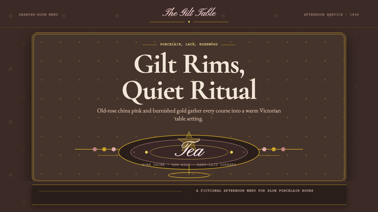 English Afternoon TeaOrnament is the ritual. Old-rose porcelain, gilt rims, and script rest on ros…
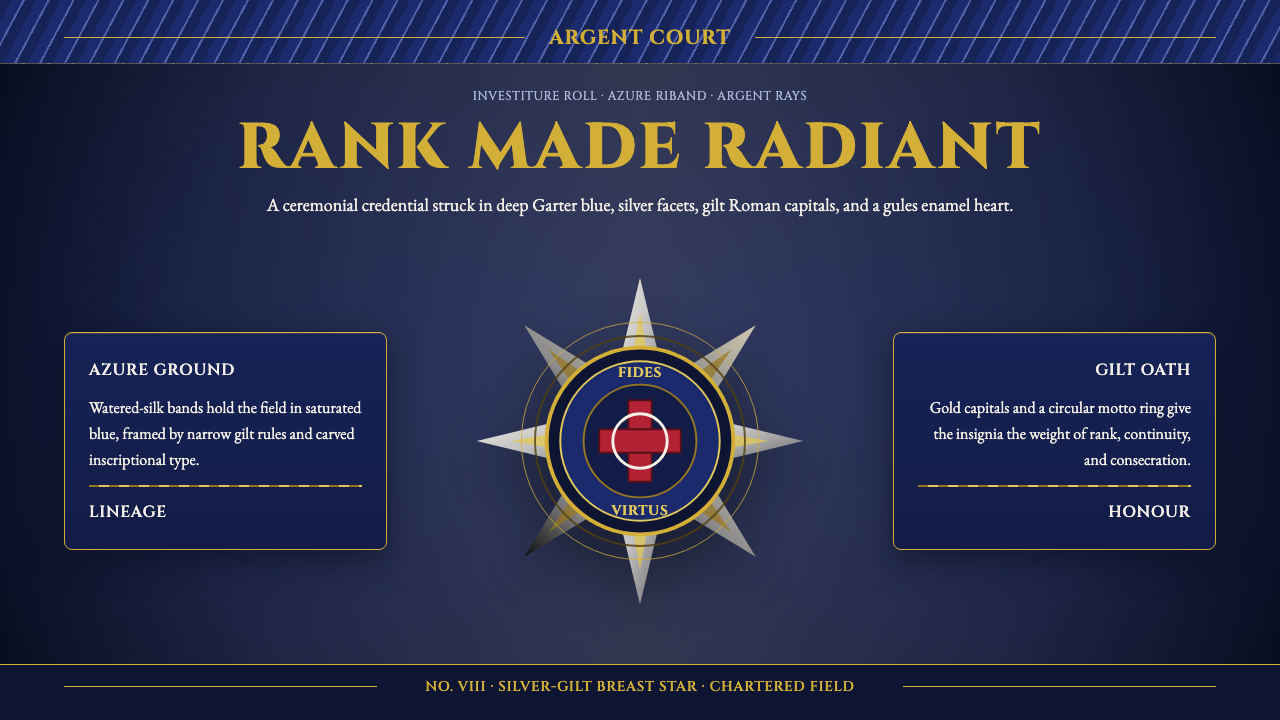 Order of Chivalry StarCeremony made metal. Garter blue, gilt Cinzel, and argent rays form a ranked…
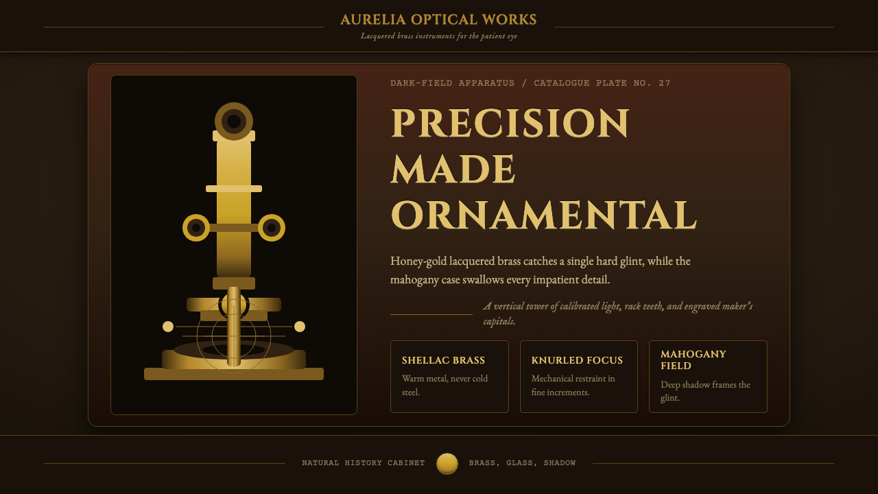 Victorian Brass MicroscopePrecision glows in shadow. Honey brass geometry rises from a mahogany dark-fi…
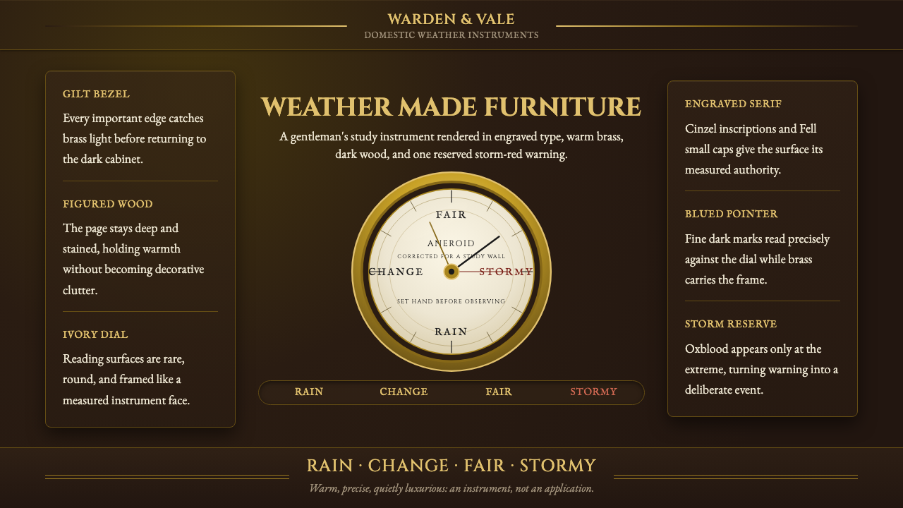 Aneroid BarometerMeasures weather as furniture. Gilt rings and Cinzel engraving glow on dark w…