What is Order of Chivalry Star?
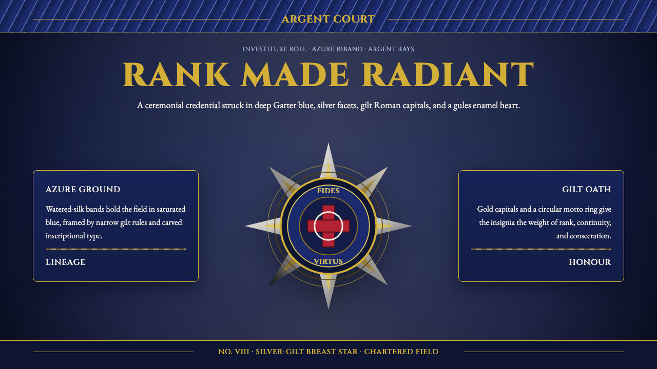
Order of Chivalry Star renders the breast star of a great chivalric honor as a design system — argent rays, gilt Roman capitals, and Garter blue arranged with the single-glance clarity of a herald reading a coat of arms.
Order of Chivalry Star in brief
Order of Chivalry Star draws its entire visual vocabulary from a single physical object: the breast star worn by members of a high Western European order of chivalry, a faceted silver-gilt jewel with rays radiating outward from a central enameled cross, pinned to a broad watered-silk riband worn diagonally across the chest. Nothing in the system is invented for decorative effect — every element corresponds to a part a herald or jeweler would actually recognize on a real insignia.
The color language is heraldic rather than merely pretty: a deep Garter blue anchors the ground, gold stands in for the gilt metal of the star itself, and silvery argent renders the radiating rays. These are the historical tinctures of Western heraldry — azure, or, and argent — rendered here in the dimensional, faceted materials of an actual medal rather than flat printed color.
Everything in the system reads as carved, embossed, or cast rather than drawn flat. Roman capital letterforms recall inscriptions cut into stone or struck into metal; a circular motto garter frames a central device the way it frames the cross on a real star; watered-silk texture ripples across the ground the way moiré ribbon catches light. The intended effect is instant legibility of rank and consecration — the visual equivalent of a herald reading lineage and honor from a coat of arms in a single glance.
Where does Order of Chivalry Star come from?
The chivalric orders that this style draws from are among the oldest continuously functioning honors systems in the Western world. The Order of the Garter, founded in England in 1348 by Edward III, is the most senior order of chivalry still active today, and its badge — a blue garter bearing a gold motto, encircling a device — is the direct ancestor of the circular motto garter seen throughout the system. Membership was and remains extremely restricted, reserved for the sovereign, a small number of royal family members, and a fixed number of Knights and Ladies Companion.
The breast star itself, worn pinned to clothing rather than hung from a neck ribbon or sash alone, developed as chivalric orders needed a way to display rank and membership on formal dress without the full regalia of collar and mantle. Later orders, such as the Order of the Bath, established in its modern form in 1725, adopted and adapted this convention, each order developing its own combination of ray pattern, central device, and motto while keeping the same underlying grammar: a radiating star bearing a cross or badge at its center, in silver-gilt, pinned to a broad silk riband in the order's specific color.
The visual language of these stars is inseparable from heraldry, the centuries-old system used by the College of Arms and its continental equivalents to formally identify individuals and lineages through coats of arms. Heraldic tincture rules — a fixed vocabulary of colors (azure, gules, vert) and metals (or, argent) applied according to strict conventions of contrast and legibility — govern how color is used across the whole system, not just on the star itself. This is why the palette reads as considered and rule-bound rather than arbitrarily decorative.
Knights-Companion of the Garter and Knights of the Bath were the men (and, for the Garter, occasionally women in the sovereign's own right) who actually wore these insignia at court and in state ceremony, making the star a working object of real courtly life rather than a purely symbolic emblem invented after the fact. Its design had to survive close inspection at formal occasions, which is part of why every element — from the facet cut of the rays to the weight of the Roman lettering — was made to read clearly at both a distance and up close.
Membership in these orders was, and largely remains, an honor conferred rather than earned through competition or purchase, which is precisely why the insignia had to communicate legitimacy instantly. A courtier encountering an unfamiliar noble at a state occasion could read rank, order, and standing from the star and riband alone, without needing to ask — the same function a uniform's insignia or a diploma's seal performs today. This is why the system treats every mark as authentication rather than decoration: a badge that could be easily counterfeited or misread would fail at the one job it was designed to do.
What defines the Order of Chivalry Star look?
Heraldic Color
Color follows heraldic tincture rules rather than free decorative choice: a deep Garter blue ground, gold for the gilt metal elements, and silvery argent for the radiating rays. These three carry the formal weight of azure, or, and argent — the historical language of Western coats of arms — and are never substituted with arbitrary hues.
Radiating Star Form
The central compositional device is a multi-pointed star radiating from a fixed center, echoing the faceted argent rays of a real breast star. This form organizes hierarchy visually — the center holds the most important device, and importance falls off along each ray toward the edge — giving the system a built-in focal structure.
Roman Capital Inscription
Text is treated as carved or struck inscription rather than printed copy — set in Roman capital letterforms reminiscent of lettering cut into stone or struck into metal medals. This gives even short labels a monumental, permanent quality appropriate to an honor meant to be conferred once and worn for life.
Motto Garter
A circular band bearing an inscribed motto frames the central device throughout the system, directly recalling the Garter itself. This ring acts as a formal seal of authenticity around any element it encircles — a badge, a monogram, a rank indicator — the way it authenticates the cross at the center of a real star.
Watered-Silk Texture
Ground surfaces carry the rippling, light-catching texture of moiré or watered silk, the material a real order's riband is woven from. This texture is dimensional rather than flat, giving even large areas of solid color a subtle shimmer and movement consistent with fine ceremonial fabric.
Dimensional Rendering
Elements are rendered with weight and facet rather than flat vector simplicity — rays catch and reflect light at slightly different angles, metal surfaces show highlight and shadow, enamel reads as glossy rather than matte. This dimensionality is central to the system: flattening it removes the jeweled, cast-metal quality the style depends on.

Who shaped Order of Chivalry Star?
The extremely small, fixed circle of individuals who actually held membership in the Order of the Garter, England's most senior order of chivalry founded in 1348. Their formal dress and insignia, including the breast star, set the template that most subsequent chivalric orders across Europe adapted for their own regalia.
Members of the Order of the Bath, established in its modern form in 1725, whose insignia adapted the general breast-star convention with the order's own central device and motto, demonstrating how a shared underlying grammar of ray, cross, and garter could be reused across different orders.
The officials responsible for regulating and recording heraldry in England, whose strict rules governing tincture, contrast, and composition underpin the entire color and layout logic of this style — the same conventions that let a herald read a coat of arms accurately at a glance.
How do you use Order of Chivalry Star today?
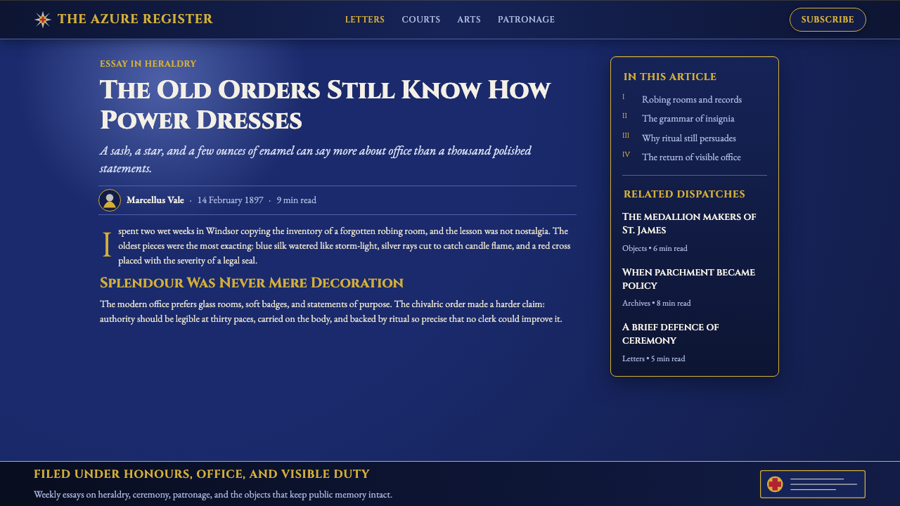
Order of Chivalry Star reads as ceremony made metal, and applying it well means treating every element as if it must survive close inspection at a formal occasion — nothing should look printed or flat when it could plausibly be cast, struck, or woven instead.
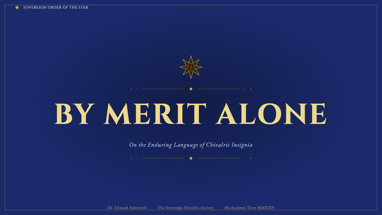
On presentation slide covers, the style suits a composition built around a single dimensional star device centered or slightly offset, with the title set in Roman capitals beneath or beside it like an inscription rather than a headline. Content slides benefit from a motto-garter frame around key callouts, giving even a simple statistic the formal weight of an official seal. Data visuals can be dressed as medals in their own right — a key metric presented inside a small radiating star device reads as an award rather than a plain number.
For web interfaces, the palette and dimensionality suit premium tiers, achievement systems, certifications, or membership products where formality and earned status are the point — a pricing page's top tier, a badge system, or a credentialing dashboard. Garter blue works well as a rich dark ground, with gold reserved strictly for the single most prestigious action or status indicator on a screen, since overuse of gold quickly cheapens the ceremonial effect.
In editorial and marketing contexts, the system suits content about honors, institutions, heritage brands, or formal achievement, where the reader should feel the material has been conferred rather than merely printed. Long-form layouts benefit from treating section breaks like formal seals — a small motto-garter device rather than a plain rule — while marketing pages should use the star device sparingly, as a single mark of distinction rather than a repeating pattern.
The most common mistake is using the heraldic palette and Roman capitals as generic 'luxury' or 'royal' branding without the underlying structural logic of rays, garter, and dimensional metal — this produces something that looks vaguely regal but has no formal grammar behind it. The system only holds together when the composition genuinely behaves like an insignia: a clear center, radiating structure, and a framing device that reads as authentication rather than ornament.
Order of Chivalry Star — FAQ
Is this style just 'royal' gold-and-blue branding?
No — the color combination is only the surface of the system. What actually defines Order of Chivalry Star is the underlying grammar of a real breast star: a radiating multi-pointed form, a central device authenticated by a circular motto garter, dimensional rather than flat rendering, and Roman capital inscription. Gold and blue applied without that structural logic reads as generic luxury branding rather than as a genuine chivalric insignia.
Why does the system insist on dimensional, faceted rendering instead of flat modern shapes?
Because the object it is drawn from is a physical jewel — a real breast star is cast and faceted metal with enamel inlay, meant to catch light from multiple angles as its wearer moves through a formal room. Flattening the star into a simple vector shape removes the very quality that made it legible and impressive at court: the play of light across its facets. The system's dimensional rendering is a direct reference to that physical materiality, not a stylistic preference for its own sake.
Can this style be used with a lighter, pastel color scheme?
It resists that direction, because the entire system depends on the historical weight of heraldic tinctures — azure, or, and argent applied at full, formal saturation, the way they would have been rendered in enamel and precious metal rather than diluted pigment. A pastel version would read as decorative rather than ceremonial, undermining the sense of consecrated rank the style exists to convey. Where a lighter touch is needed, it is better achieved by reducing the density of ornament rather than by desaturating the core heraldic colors.
What kind of content or products should avoid this style?
The style is a poor match for anything casual, playful, or egalitarian in tone — youth-oriented products, informal community platforms, or brands built around accessibility and approachability will feel undercut by the deliberate formality and hierarchy the system projects. It also does not suit fast-moving, high-density interfaces, since its dimensional detail and heraldic rules reward slow, considered viewing rather than quick scanning. It is best reserved for content genuinely about earned status, formal recognition, or institutional heritage.
Related design styles
 Babylonian Ishtar GateMonumental by procession. Lapis brick, gold registers, and carved capitals ho…
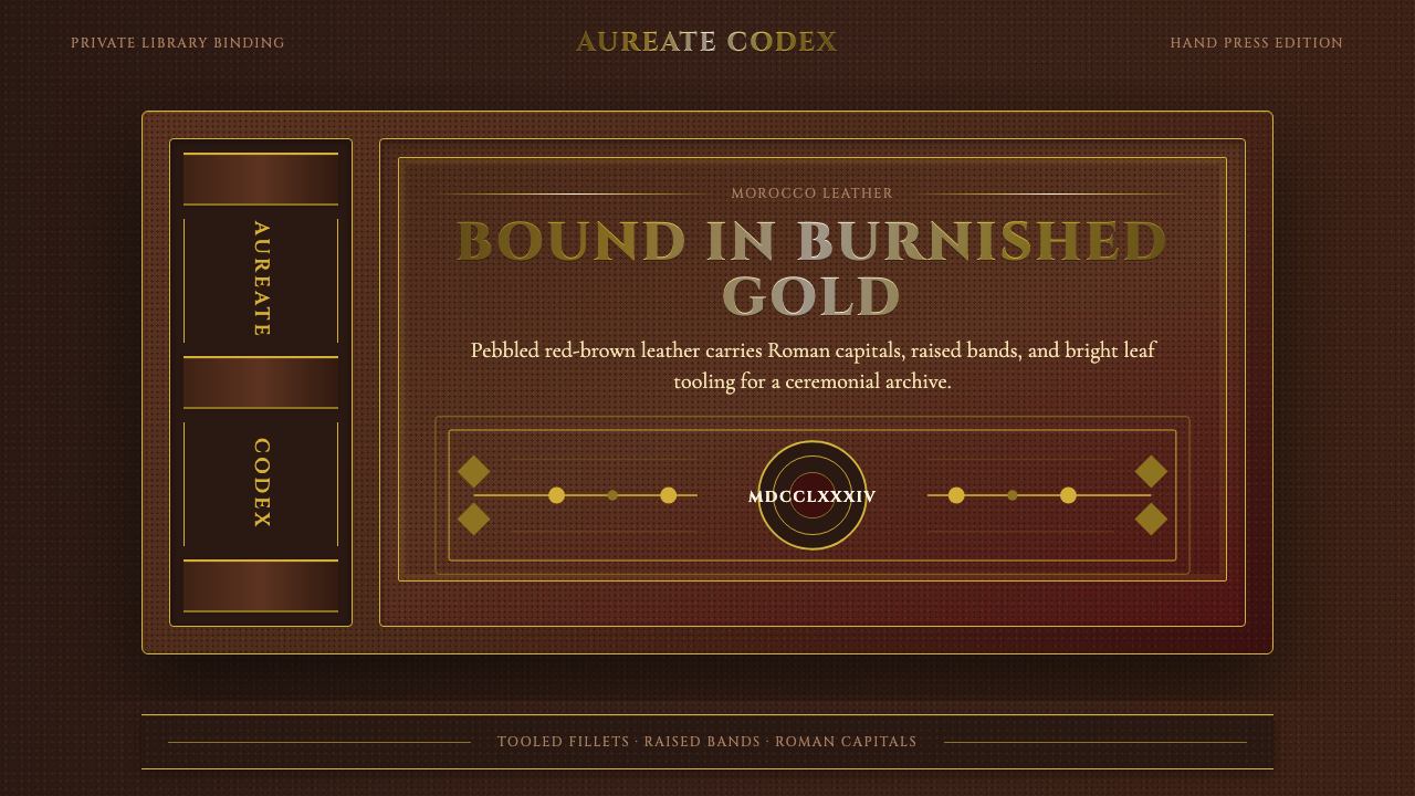 Gilt Leather BindingWeight without noise. Deep Morocco leather, Cinzel capitals, and burnished gi…
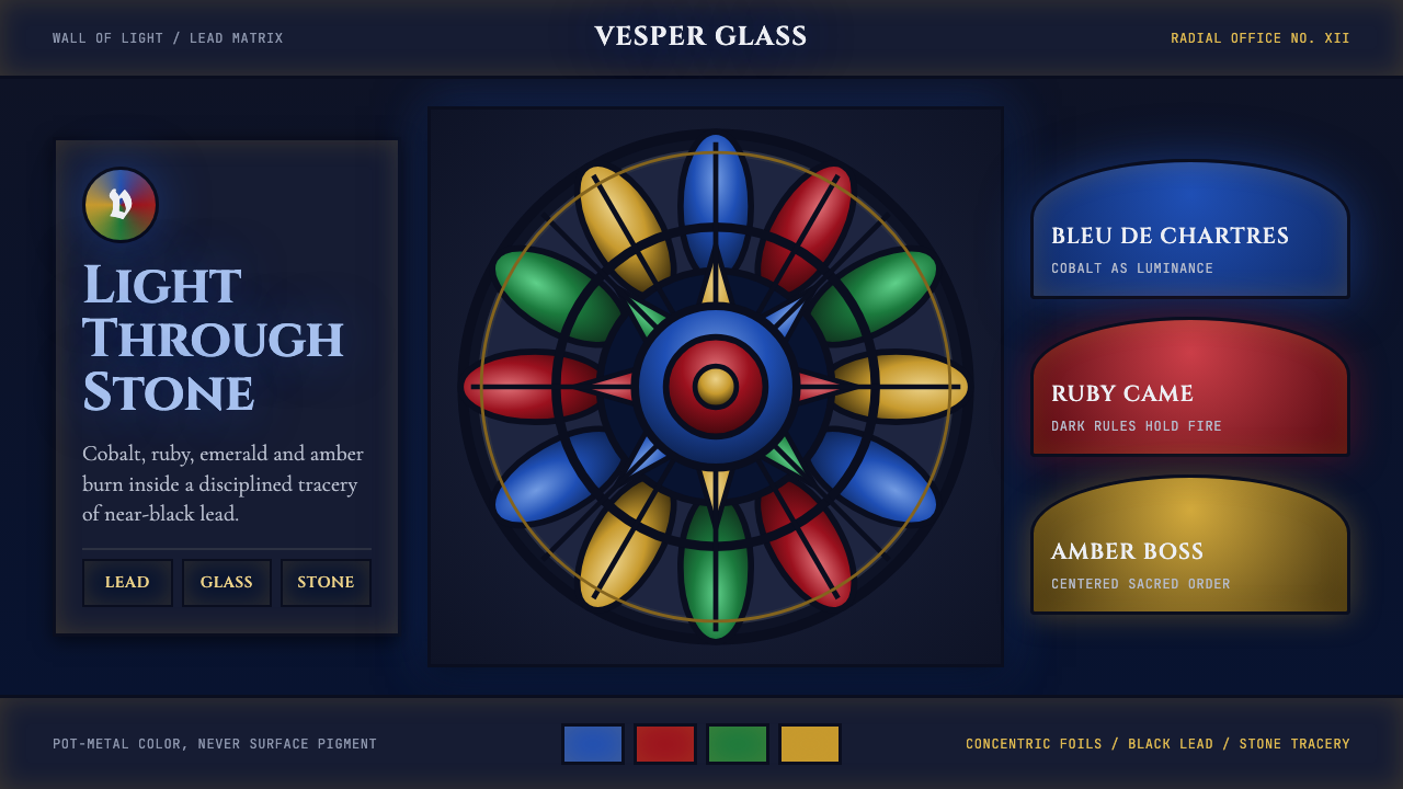 Gothic Rose WindowDarkness becomes light. Cobalt glass, ruby foils and black lead form a radial…
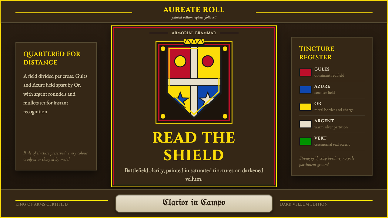 Heraldic BlazonCommand at a glance. Gules, Azure and Or quartering lock into a gilt shield o…
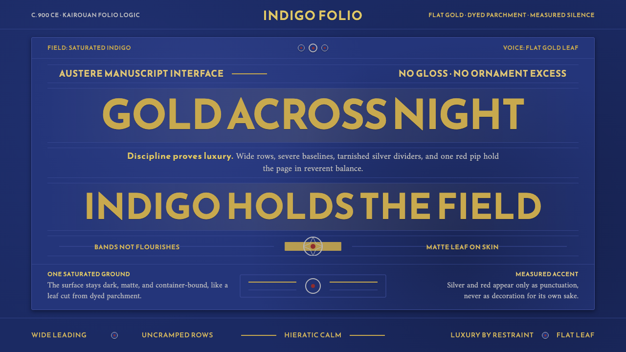 Abbasid Blue QuranLuxury by restraint. Flat gold Kufic bands cross an indigo parchment field.
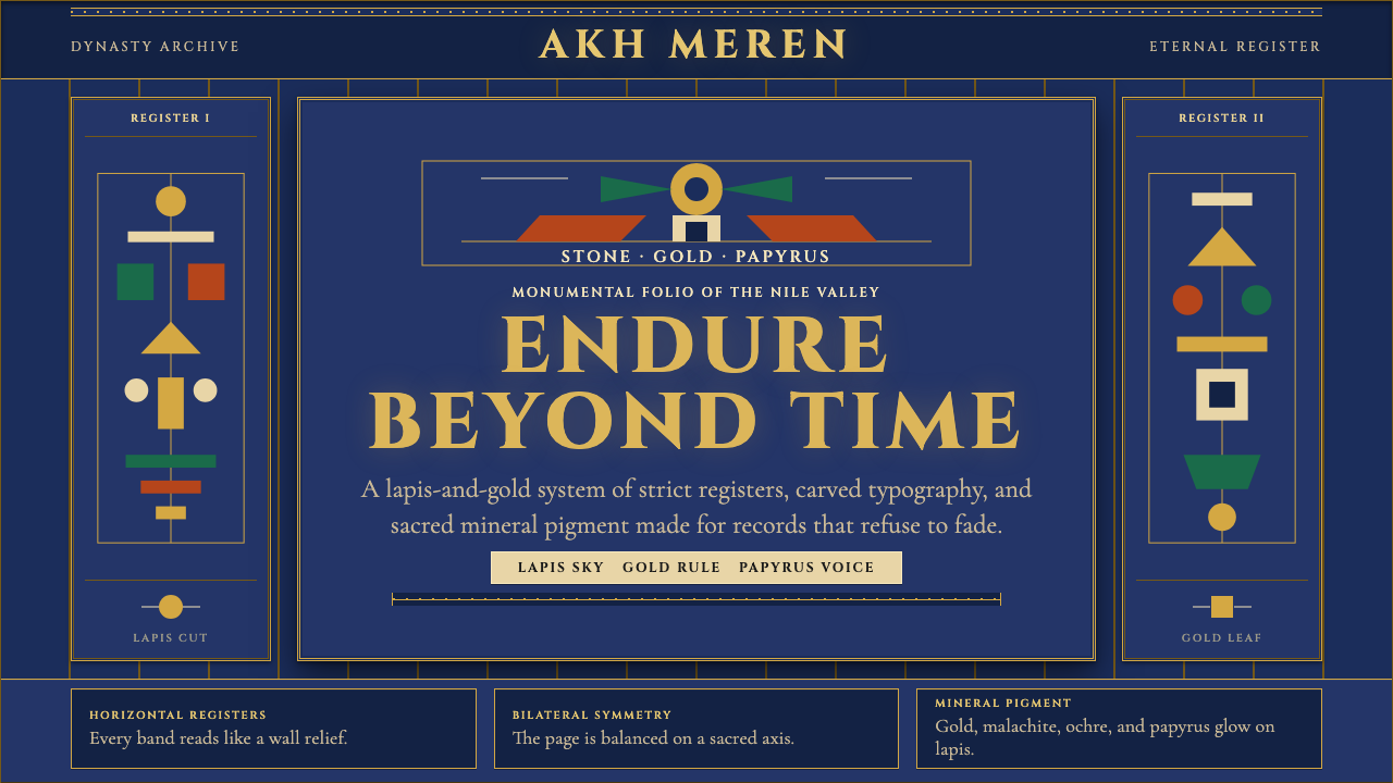 Egyptian PharaonicRegal permanence. Gold rules and Cinzel capitals carve papyrus registers into…