What is Regulator Clock?
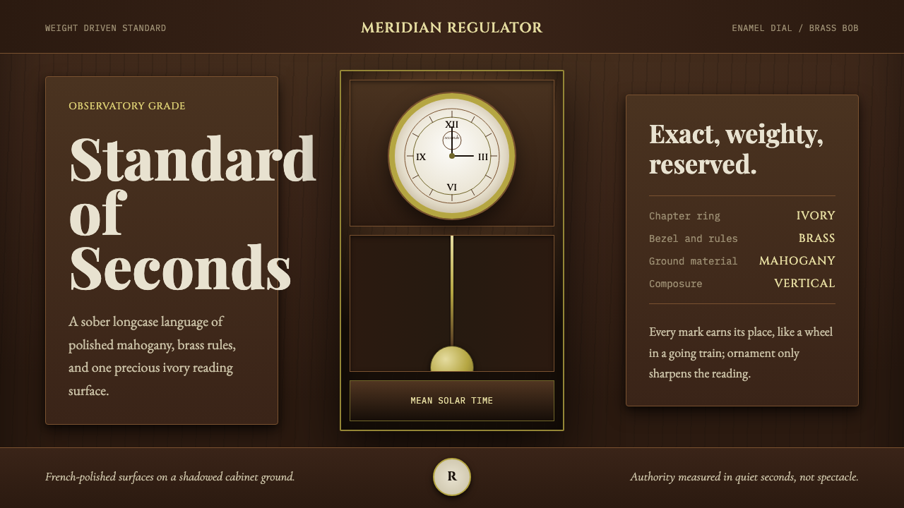
The precision regulator is the clock other clocks were set by — dark mahogany, brass, and an ivory dial locked into a sober symmetry that this style carries directly onto the page.
Regulator Clock in brief
Pendulum Clock Regulator is a style drawn from a specific and demanding category of timepiece: the precision regulator clock, a weight-driven longcase instrument built not for the parlor but for the observatory and the railway office, where its entire purpose was to keep time more accurately than any other clock nearby so that everything else could be set against it. The style translates this instrument's material and formal logic — dark polished wood, brass fittings, an ivory-enamel dial, and a swinging brass-bobbed pendulum — into a visual system built around authority and exactness.
Everything about the regulator's appearance follows from its function. The case is built from dense, dark, French-polished mahogany because a heavy, stable case resists vibration and temperature swings that would throw off the mechanism's accuracy. The dial is finished in aged ivory enamel — a single bright, legible reading surface set against the dark case — because a regulator clock exists to be read precisely, not glanced at casually. Roman numerals are rendered crisp and black, without embellishment, because clarity of the time reading was the entire point of the object.
The overall tone is sober, exact, and richly material rather than playful or ornamental. Composition is vertical, symmetrical, and classical, echoing the actual physical form of a longcase clock standing upright against a wall. Every element in the system earns its place the way every wheel and pinion in the movement does — nothing is present purely for decoration, and the restraint itself becomes the source of the style's gravity.
Where does Regulator Clock come from?
Pendulum clocks trace back to the mid-seventeenth century, when Christiaan Huygens applied the pendulum's regular swing to clockwork, dramatically improving timekeeping accuracy over earlier verge-and-foliot mechanisms. Over the following two centuries, clockmakers steadily refined pendulum-driven mechanisms, but ordinary domestic clocks remained subject to friction, temperature-driven expansion and contraction, and irregular escapement action that limited their accuracy to several seconds of error per day at best.
The precision regulator emerged as a distinct category specifically because certain institutions — astronomical observatories tracking celestial motion, and later railways coordinating schedules across vast distances — needed timekeeping accurate to within a fraction of a second per day, far beyond what an ordinary clock could offer. English clockmaker George Graham, working in London in the early eighteenth century, made foundational contributions to this pursuit, developing the deadbeat escapement — a mechanism that eliminated the small backward jolt of the pendulum found in earlier escapements, allowing it to swing with far greater regularity and dramatically improving precision. Graham's innovations, along with refinements to compensation pendulums designed to counteract the way temperature changes cause metal rods to expand and contract, set the technical foundation on which the regulator clock category was built.
The pursuit of ever-greater accuracy continued through the nineteenth century and reached its zenith with the German clockmaker Sigmund Riefler, whose patented escapement design and rigorously engineered movements, developed in the late nineteenth century, produced clocks accurate to a hundredth of a second per day or better — a level of precision that made Riefler regulators the standard instrument used by major astronomical observatories, including institutions responsible for maintaining official national time standards, for decades before electronic and atomic timekeeping eventually superseded mechanical clocks entirely.
The Royal Observatory at Greenwich, England, stands as perhaps the most historically significant home for precision regulator clocks: as the institution responsible for establishing what became the world's standard reference time (Greenwich Mean Time) and the prime meridian itself, Greenwich relied on a succession of precision regulators to maintain the master clock against which ships' chronometers, railway schedules, and eventually entire national timekeeping systems were checked and calibrated. This period — roughly 1715 through 1890, spanning Graham's early innovations through Riefler's late-century refinements — represents the golden age of the mechanical precision regulator, an era when the physical clock in an observatory tower was, quite literally, the authority against which the rest of the world set its watches.
What defines the Regulator Clock look?
Deep Mahogany Case
The dominant surface is a dense, dark, French-polished reddish-brown wood, functioning as the ground the entire composition sits within. This deep case tone is not merely decorative — a heavy, stable material was essential to shielding the mechanism from vibration, and the visual weight of the color carries that same sense of stability onto the page.
Ivory Enamel Dial
A single bright, aged-ivory surface breaks the dark case — the one reading area on the whole instrument, reserved exclusively for the dial. This should function as a rare focal point rather than a recurring background tone: the composition's single moment of brightness, exactly as the dial is the regulator's single moment of legibility against its dark surroundings.
Brass Fittings as Ornament
Warm metallic brass appears only at structural and functional points — hinges, weights, the pendulum bob, decorative moulding edges — never as a large field color. Brass is the ornament layer of the system, present in careful, deliberate accents rather than covering broad surfaces.
Crisp Black Roman Numerals
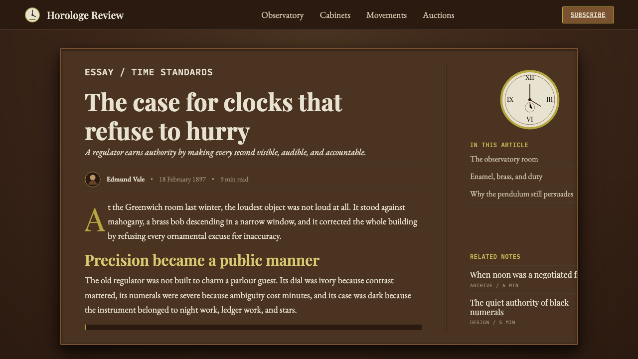
Numerals are rendered in unembellished, high-contrast black against the ivory dial, favoring classical Roman numeral form over any decorative script. Clarity of reading takes absolute precedence over expressive letterform — every mark exists to be read at a glance, precisely and without ambiguity.
Vertical Symmetrical Composition
Layout is organized as a tall, upright, mirror-symmetrical structure, echoing the physical form of a longcase clock standing against a wall. This verticality and balance communicates formality and permanence rather than the horizontal, casual feel of a typical modern layout.
Restraint and Purposefulness
Every element in the composition should feel as though it earns its place functionally, the way every wheel in a precision movement serves the mechanism's accuracy. Nothing appears purely for visual flourish; the discipline of 'no wasted parts' is itself the source of the style's authority.
Swinging Pendulum Motion
Where motion is used at all, it should evoke the steady, metronomic swing of a brass-bobbed pendulum — even, unhurried, and perfectly regular, never quick or bouncy. This measured rhythm reinforces the sense of an instrument governed by exact, unwavering mechanical law.
Who shaped Regulator Clock?
Working in London in the early eighteenth century, Graham developed the deadbeat escapement, which eliminated the backward jolt found in earlier pendulum mechanisms and allowed for dramatically improved regularity of swing. His innovations, alongside refinements to temperature-compensating pendulums, laid the essential technical groundwork for the precision regulator clock category.
A German clockmaker working in the late nineteenth century, Riefler developed a patented escapement and rigorously engineered movements that pushed mechanical clock accuracy to a hundredth of a second per day or better. His regulators became the standard instrument for major astronomical observatories, representing the technical peak of the entire precision-regulator category before electronic timekeeping arrived.
As the institution responsible for establishing Greenwich Mean Time and the prime meridian, the Royal Observatory relied on a succession of precision regulator clocks as its master timekeeping reference. Its role cemented the cultural image of the regulator clock as the authoritative instrument other clocks — and eventually an entire world's schedules — were set against.
How do you use Regulator Clock today?
Pendulum Clock Regulator suits any product wanting to project sober authority, precision, and permanence — financial services, legal and professional institutions, heritage brands, and anything positioned around trustworthiness earned through exactness rather than flair.
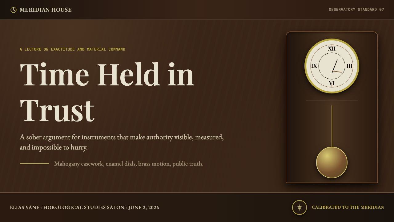
For presentation slides, a cover page benefits from the style's vertical symmetry: a tall, centered composition with a single bright ivory-toned focal area against the dark mahogany field communicates gravity before a word is read. Content slides should keep the dark ground consistent and reserve brass accents for structural moments only — dividers, key figures, section markers — so that restraint itself signals the content's seriousness.
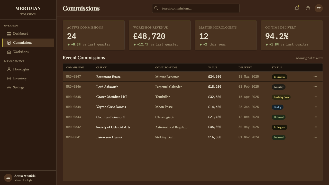
For web interfaces, the style is well suited to financial dashboards, legal and compliance tools, and premium professional services where trust is built through precision rather than warmth. A dark, stable ground with a single bright reading surface for the most important number or status, and brass-toned accents reserved for interactive states, communicates competence and permanence. Pricing pages benefit from the same restraint — plain, classical numeral treatment for prices rather than playful display type reinforces an impression of exactness.
For editorial and marketing work, the style favors long-form content about institutions, engineering heritage, craft, or history. A feature article can use the deep mahogany tone as a section-opening field with a single ivory-toned pull-quote panel, echoing the dial as the one bright reading surface in an otherwise dark, weighty composition.
A common mistake is over-ornamenting with brass — spreading the metallic accent across large areas rather than confining it to structural points turns the sober authority of the style into something closer to gaudy antique decoration. Another is losing the vertical, symmetrical discipline in favor of a casual, asymmetric modern layout, which undercuts the classical formality the style depends on.
Regulator Clock — FAQ
What made a 'regulator' clock different from an ordinary household clock of the same era?
A regulator was purpose-built for maximum accuracy rather than general household use — it typically omitted features like striking mechanisms or calendar dials that would introduce friction and complexity, focusing entirely on a stable, well-compensated pendulum and a refined escapement. Ordinary household clocks prioritized convenience and modest cost; regulators prioritized precision alone, often accurate to within a fraction of a second per day where an average household clock might drift by many seconds.
Why is brass reserved for small accents rather than used throughout?
In the actual instrument, brass appears only where mechanical function demands metal — the movement itself, weights, the pendulum bob, and select fittings — while the visible case remains dark wood. Spreading brass across large visual areas breaks that functional logic and shifts the impression from 'precision instrument with purposeful metal parts' toward decorative antique furniture, which undermines the sober, engineered authority the style depends on.
Does this style require a literal clock or dial to appear on the page?
No. The underlying principles — a dark, stable ground, a single bright reading surface reserved for the most important information, restrained brass accents at structural points, and vertical symmetrical composition — can be applied without any literal clock face present. A dashboard's key metric can occupy the role the ivory dial plays, functioning as the one bright, legible focal point against an otherwise dark, sober field.
Is this style suitable for playful or casual consumer brands?
Generally not. Its entire visual logic is built around sobriety, exactness, and earned authority — qualities that sit uneasily with a playful, casual tone. Brands wanting warmth, spontaneity, or fun are usually better served by a lighter, less formal style; Pendulum Clock Regulator works best where an audience specifically values precision and institutional trustworthiness above approachability.
How does this style differ from a generic 'vintage' or 'antique' aesthetic?
A generic vintage aesthetic often reaches for aged textures, worn patinas, or nostalgic clutter without a specific functional logic behind them. Pendulum Clock Regulator is anchored to one real category of object built for a specific, demanding purpose — keeping the most accurate possible time — and every visual choice traces back to that purpose: the dark case for stability, the bright dial for legibility, the restrained brass for mechanical necessity. That functional specificity, not simply an old-fashioned look, is what defines the style.
Related design styles
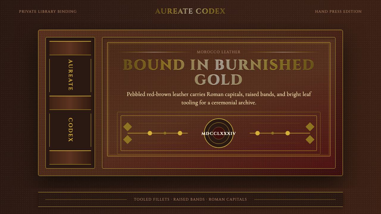 Gilt Leather BindingWeight without noise. Deep Morocco leather, Cinzel capitals, and burnished gi…
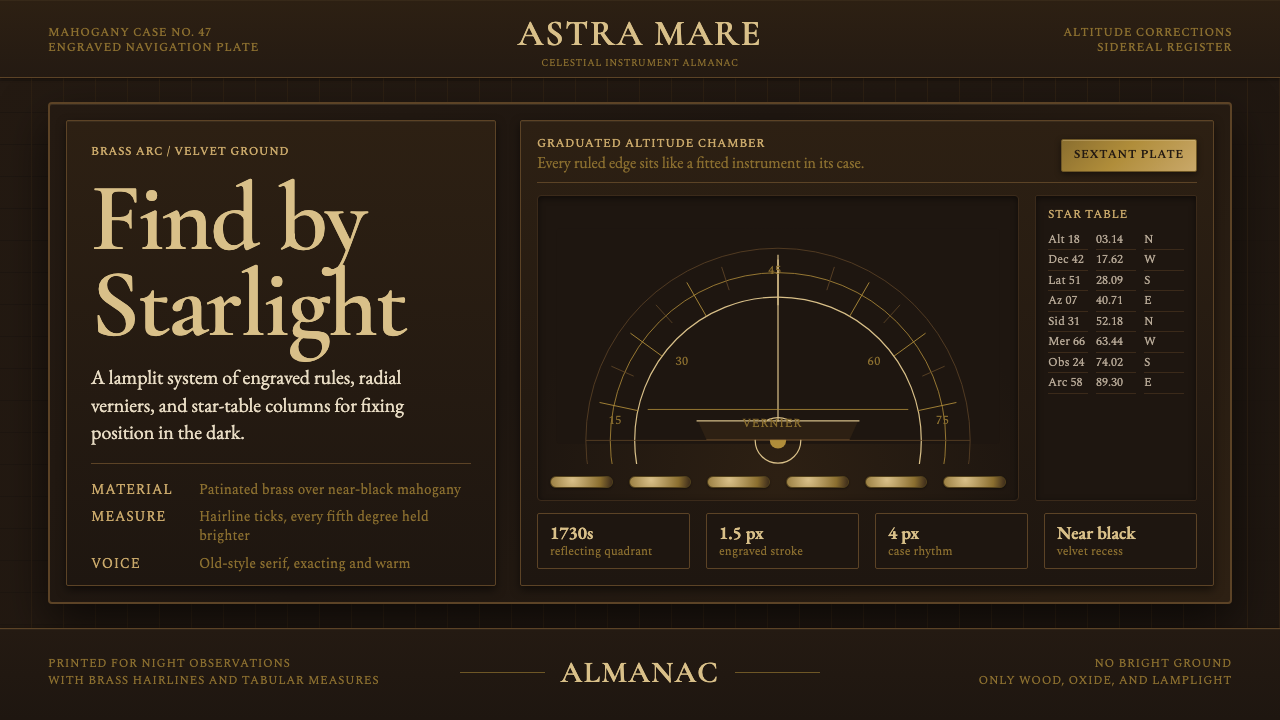 Sextant NavigationPrecision feels ceremonial. Brass ticks and mahogany grids chart the dark by…
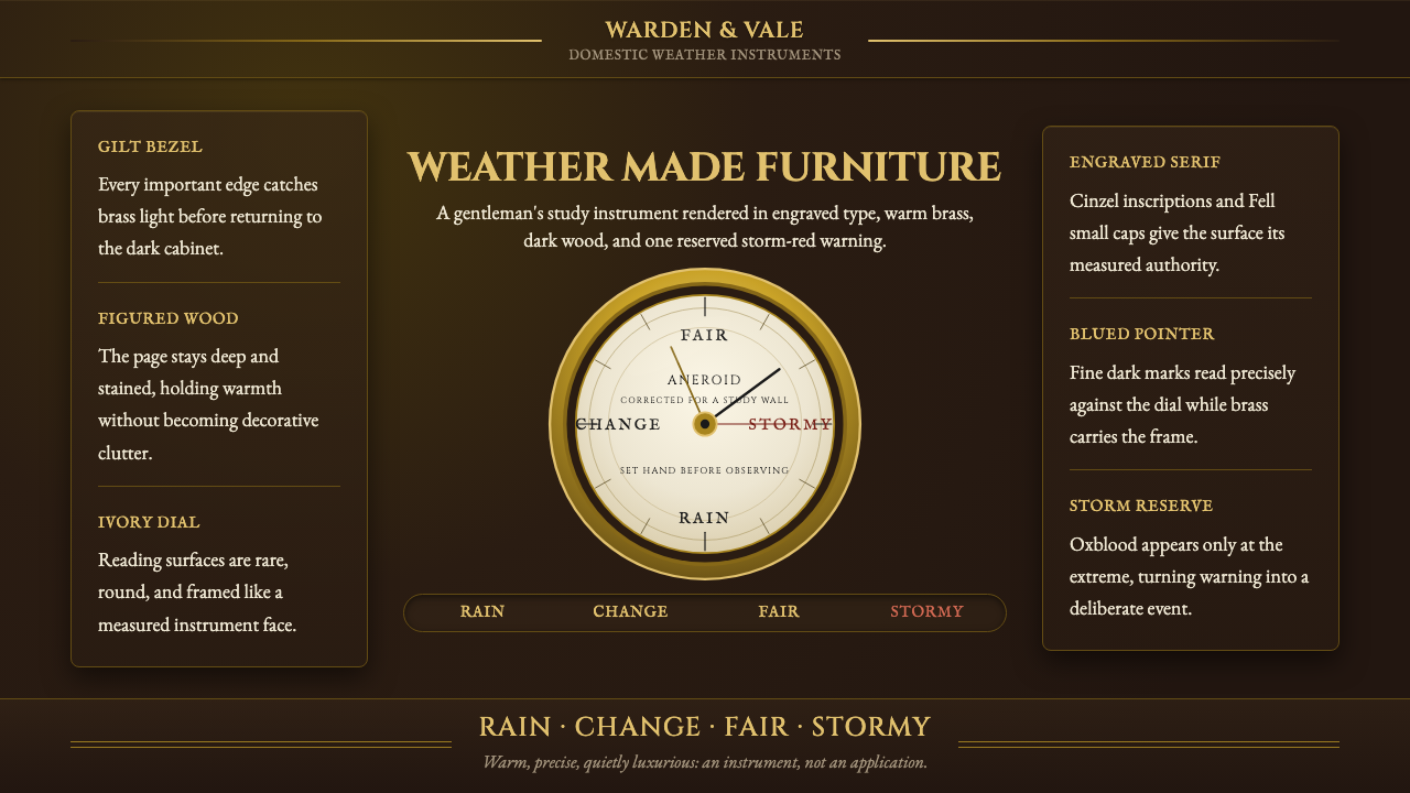 Aneroid BarometerMeasures weather as furniture. Gilt rings and Cinzel engraving glow on dark w…
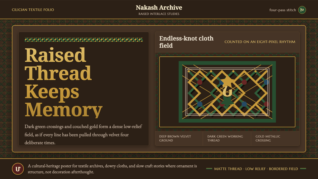 Armenian Marash Interlace EmbroideryDense memory in raised thread. Green-gold interlace locks over deep brown clo…
 Bhutanese Tiger's Nest Cliff MonasterySacred altitude, mineral-dark. Cinnabar tiers and bronze rules climb charcoal…
 Bordeaux Wine ChâteauAged claret authority. Cinzel capitals, gilt rules, and label symmetry on win…