What is Armenian Marash Interlace Embroidery?
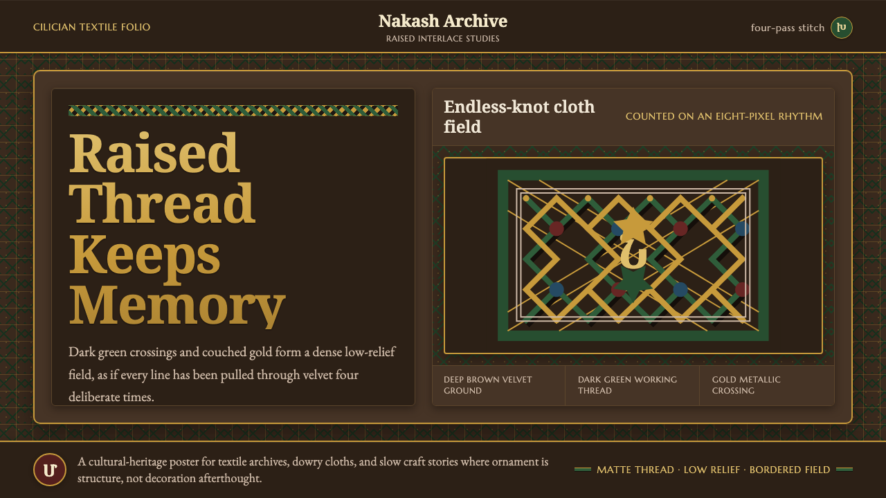
Marash embroidery turns thread into architecture: dark-green interlace, gold ornament, and raised knots holding dense memory over deep brown cloth.
Armenian Marash Interlace Embroidery in brief
Marash embroidery is a nineteenth-century Armenian needlework tradition from Cilicia, associated with Armenian communities in historic Marash. Its defining visual logic is interlace: thread does not merely outline a motif or fill an area, but repeatedly crosses and locks into itself until the surface reads as a compact woven field.
Its central technique is the nakash stitch. A thread travels over the same route four times, producing raised linked crosses and lattices that resemble endless knots. The result is not a flat ornamental drawing transferred onto cloth. It is a low-relief structure, where repeated crossings give the pattern weight, continuity, and a distinctly tactile presence.
As a contemporary design language, Marash interlace begins with a deep brown, velvet-like ground. Dark green carries the primary pattern, while metallic gold works as ornament and emphasis; deep red and indigo support the field without competing with it. The governing impression is matte, dense, and hand-built: every motif should feel stitched upward from the cloth rather than printed onto it.
Where does Armenian Marash Interlace Embroidery come from?
Marash embroidery belongs to the Armenian needlework tradition of Anatolia-Cilicia. Its historical setting is the Armenian communities of Marash, and its classic surviving period is generally placed between about 1850 and 1915. Within that setting, embroidery was not an abstract style category: it was a practiced textile language made through sustained handwork.
The tradition is identified with Armenian women embroiderers of Marash, whose work developed and carried the interlacing nakash stitch. Their technique depends on repetition with discipline. Returning the thread over an established route transforms a simple line into a connected structure, so the pattern gains density through process rather than through an added illustrated effect.
This origin matters when the style is adapted for screens. The digital version should preserve the craft’s construction logic: a dark cloth-like ground, a primary interlace that feels raised, and metallic ornament that follows the system rather than floating independently. Its visual authority comes from accumulated crossings and restrained material contrast, not from generic ornamental decoration.
What defines the Armenian Marash Interlace Embroidery look?
Raised Interlace
The nakash stitch is the visual engine. Repeated crossings make the thread appear to sit above the ground, creating linked crosses and continuous lattice paths. Flat linework misses the point: the pattern should suggest compressed textile relief, with every crossing visibly belonging to the next.
Deep Cloth Ground
The foundation is a deep brown ground with the visual softness of velvet cloth. It is not empty background space. It is the material field against which thread can rise, absorb light, and acquire weight. The surface should feel matte and textile-like rather than glossy or digital.
Green as the Main Voice
Dark green is the principal voice of the interlace. It establishes the broad pattern before ornament appears, giving the composition a cool, dense, grounded character. It works best as an extensive structural thread, not as a small accent scattered without a continuous path.
Gold Thread Ornament
Gold-metallic thread provides ornament and selective emphasis. Its purpose is to catch the eye at turns, crossings, or chosen motifs, much as a different thread would interrupt a woven field. Gold should feel embedded in the embroidery system, never applied as a detached luxury effect.
Supporting Depth
Deep red and indigo support the main relationship between brown cloth, green interlace, and gold ornament. They introduce tonal richness without changing the hierarchy. Their role is secondary and material: they should deepen the woven field, not introduce a separate visual theme.
Dense, Matte Tactility
This style depends on density. Motifs accumulate closely, leaving little sense of open, airy display space. Yet density should remain legible because the interlace follows ordered paths. Matte treatment is essential: shine would make the pattern feel printed or polished instead of worked by thread.
Who shaped Armenian Marash Interlace Embroidery?
The named makers behind the tradition are the Armenian women embroiderers of Marash. Their sustained handwork carried the nakash interlacing stitch and established the dense, raised visual character associated with Marash embroidery.
Nakash is the defining making system rather than a separate artist. By taking thread across the same route four times, it produces linked crosses and lattice structures that make the embroidery read as woven low relief.
Classic pieces from roughly 1850 to 1915 provide the historical frame for the style. They locate the visual language in nineteenth-century Cilicia and preserve its essential relation between cloth ground, interlaced thread, and ornamental emphasis.
How do you use Armenian Marash Interlace Embroidery today?
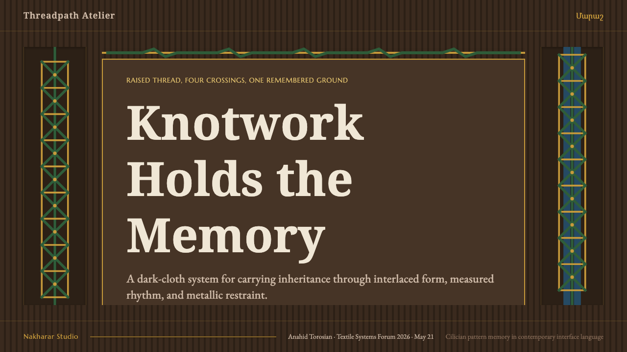
For presentation covers, use the style as a concentrated textile field rather than a collection of decorative icons. Let a deep brown ground hold a large dark-green interlace, then reserve gold for selected crossings or title-adjacent ornament. The title should read as part of the cloth’s hierarchy, not as a clean modern label placed on top of an unrelated pattern.
Content slides need stronger control than covers. Keep the dense embroidery language at margins, headers, dividers, or one anchored panel so body text remains readable. Data slides can use interlace to frame a chart or distinguish sections, but charts themselves should remain clear information structures; the thread texture is context, not a substitute for comparison.
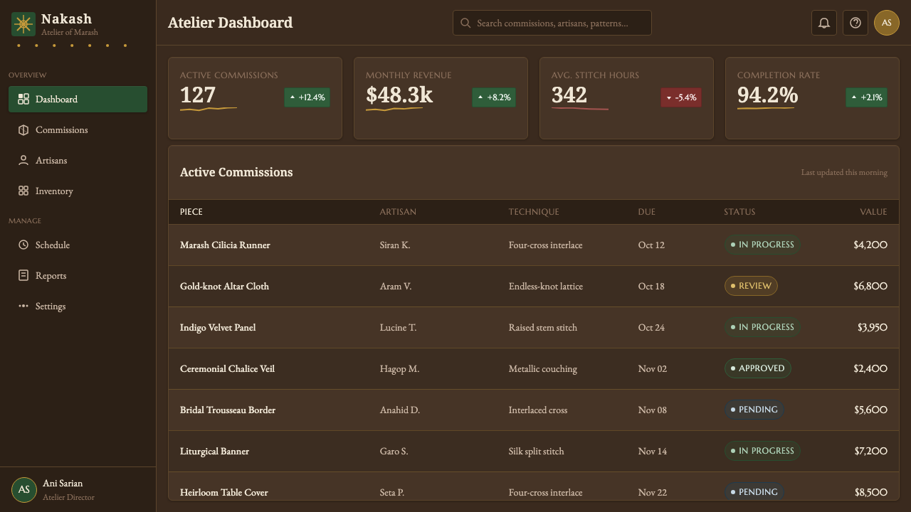
For web interfaces, the style is strongest in dashboards, membership pages, and pricing experiences that benefit from depth, ceremony, or cultural texture. Use the cloth ground and green lattice to establish a stable visual atmosphere, then let gold identify important actions, selected states, or premium moments. Dense ornament should not obstruct navigation, fields, or tables.
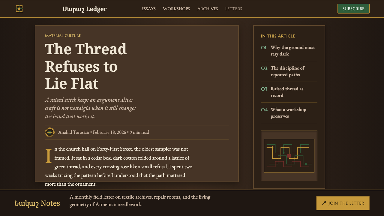
Editorial and marketing layouts can use Marash interlace as a border system, chapter field, campaign background, or tactile feature panel. Deep red and indigo can distinguish related editorial sections while preserving the central green-and-gold relationship. The most useful compositions treat pattern as constructed continuity, allowing it to wrap, turn, and connect across a page rather than merely repeating as wallpaper.
The common mistake is to reduce the style to a dark palette plus generic gold flourishes. That loses the craft’s essential logic. If the pattern is flat, loosely scattered, glossy, or unrelated from one crossing to another, it may look ornate but it will not read as Marash interlace. Begin with the repeated path and the raised woven effect; color follows structure.
Armenian Marash Interlace Embroidery — FAQ
What makes Marash embroidery different from a flat repeating pattern?
Its defining quality is construction. In the nakash stitch, thread crosses the same path four times, building raised linked forms and lattices. A flat repeating pattern may borrow similar motifs, but it lacks the sense that every line is physically locked into a continuous woven route.
Why are dark brown, dark green, and gold central to the screen adaptation?
They preserve the material hierarchy described by the design system: deep brown acts as the cloth ground, dark green is the primary interlace, and gold-metallic thread provides ornament. Deep red and indigo can enrich the field, but the main relationship should remain immediately legible.
Should the pattern leave generous empty space?
No. The intended character is densely filled, tactile, and accumulated. That does not mean every functional surface must become difficult to read. In practical layouts, concentrate the embroidery where it can act as a field or boundary, while protecting text, controls, and data from unnecessary visual pressure.
Can gold be used as the dominant color?
Gold is described as ornament, so it is most convincing when it remains selective. If it overtakes the brown ground and green interlace, the material hierarchy collapses and the result becomes a general metallic decoration. Use it to clarify chosen turns, crossings, and moments of emphasis.
Related design styles
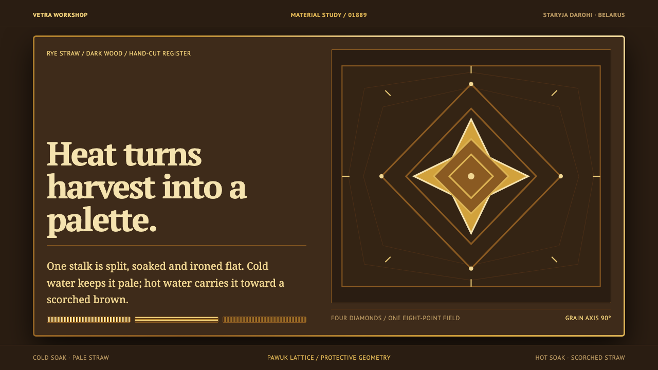 Belarusian SolomkaOne harvest, a tonal ladder. Straw diamonds turn pale gold to scorched brown…
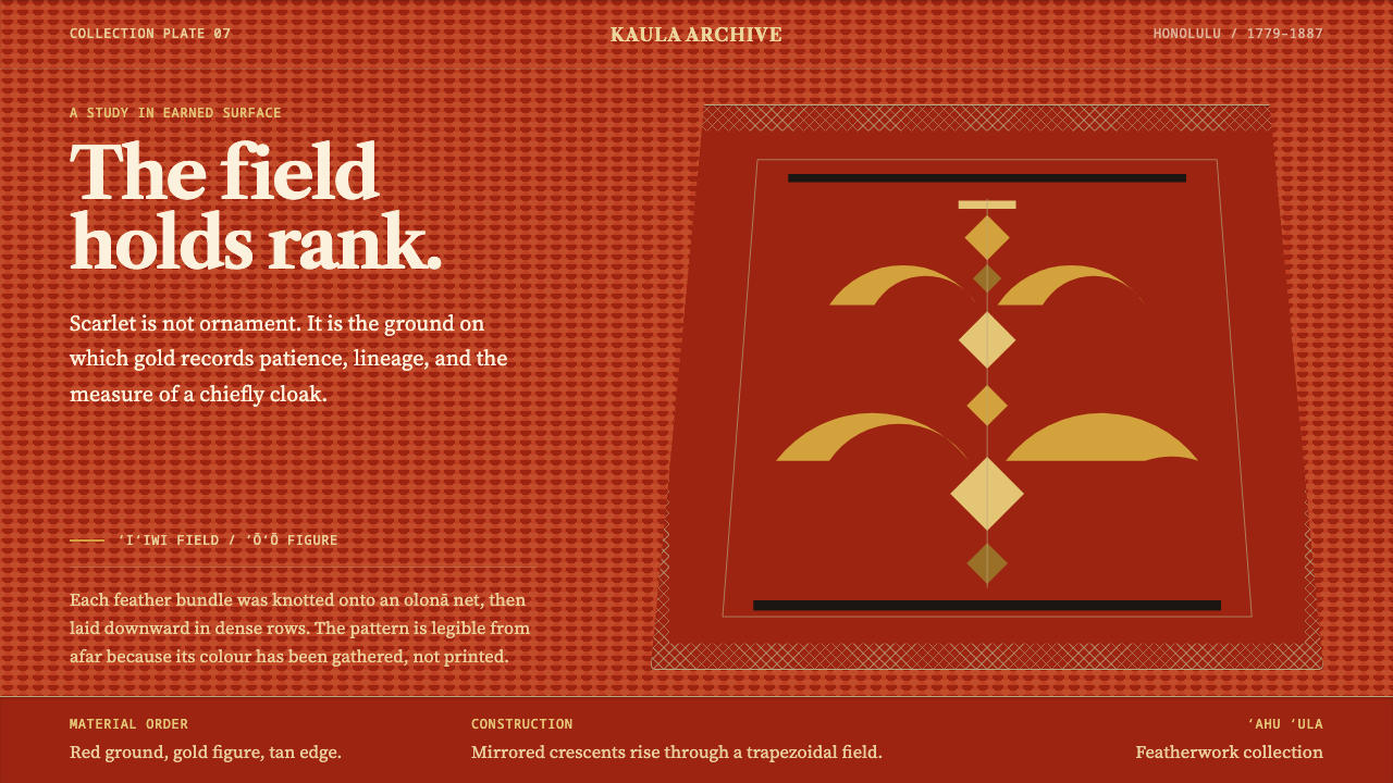 Hawaiian ʻAhu ʻula FeatherworkRank becomes a field. Scarlet nap carries sparing gold crescents in a mirrore…
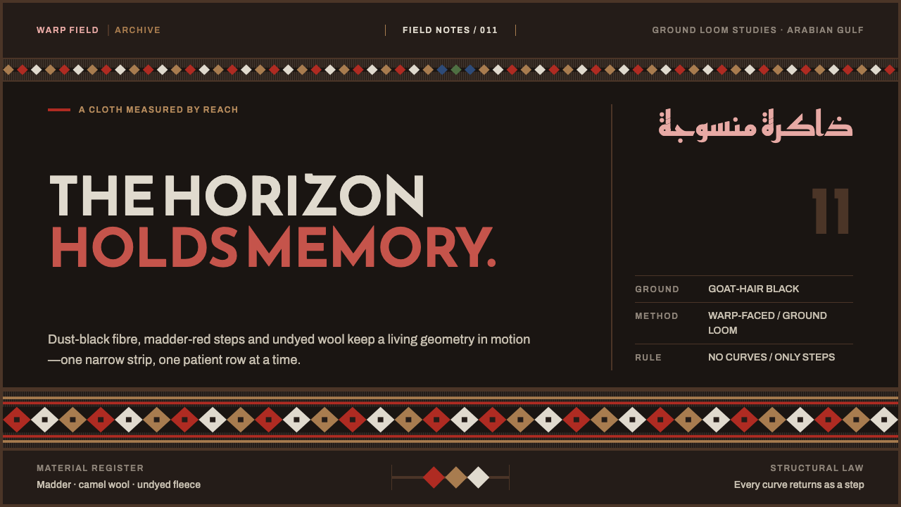 Emirati Sadu WeavingMemory runs in bands. Madder steps cross dusty goat-hair black with no curve…
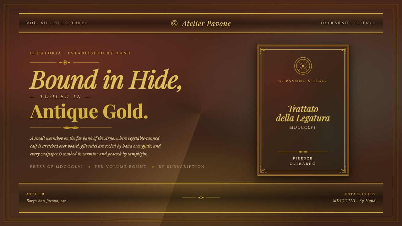 Florentine Leather BinderyRenaissance craft as luxury. Tanned hide, antique gold tooling, carmine-and-p…
 Lahic CoppersmithCopper becomes light. Soot-black bands, Amiri type, hammer facets and tin rev…
 Persian Nastaliq CalligraphyGold script breathes in darkness. Afshan flecks, lapis cartouches, and sloped…