What is Persian Nastaliq Calligraphy?
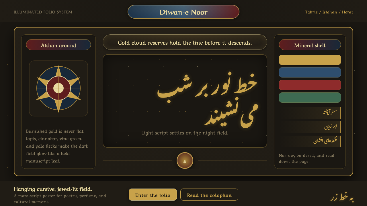
Persian Nastaliq makes writing feel suspended in air: gold script descends across darkness, gathering poise, rhythm, and radiance before it settles.
Persian Nastaliq Calligraphy in brief
Nastaliq is the “hanging” cursive of Persian book arts. Its defining movement is diagonal rather than upright: lamp-black letters flow down a slope, swing outward in delicate arcs, and return to the line with controlled grace. The result is neither a rigid inscription nor an informal hand. It is writing composed as choreography, where the relation between letters matters as much as the form of any single letter.
In this presentation system, Nastaliq is treated at its most ceremonial and luminous. Burnished gold script glows over a near-black afshan ground scattered with gold flecks, while illuminated cloud bands create a softer, atmospheric counterpoint to the calligraphic stroke. Gold and lapis cartouches announce important passages, and vines with polychrome flowers turn the surrounding field into a cultivated ornamental garden.
The visual power of the style comes from contrast held in equilibrium. Darkness makes the gold feel alive rather than merely decorative; the sloped script introduces motion without disorder; lapis gives the composition depth without competing with the writing. Ornament does not sit outside the text as a separate frame. It enlarges the text’s aura, making reading feel like entering a carefully illuminated page.
Where does Persian Nastaliq Calligraphy come from?
Nastaliq belongs to the Persian calligraphic tradition and is associated here with Persia’s cultural centers of Tabriz, Isfahan, and Herat. Its formative period is described as the Timurid–Safavid perfection of the script around 1500. That setting matters because the style was not simply a way to write words clearly; it was part of a book-art culture in which script, illumination, painted ornament, and the page itself were understood as a single visual whole.
The Safavid ateliers of Tabriz and Isfahan are central to the style’s deep presentation value. There, Nastaliq reached a prized refinement through masters including Mir Emad al-Hasani. The source material presents this refinement as a convergence of calligraphic mastery and manuscript illumination: the descending rhythm of the script becomes more vivid when set against a dark ground, gilded cloud bands, and the concentrated splendor of gold and lapis.
Mir Ali Tabrizi, Mir Emad al-Hasani, and Sultan Ali Mashhadi are the key figures named in this lineage. Their presence establishes Nastaliq as a tradition carried through masterful practice rather than an anonymous decorative manner. In a Nastaliq-led composition, the writer’s command is visible in balance, suspension, pressure, and release: visual authority emerges from the living relation between strokes, not from mechanical regularity.
The flourishing of album, or muraqqa, arts in the sixteenth and seventeenth centuries expanded the setting in which this calligraphy could be encountered. An album page encourages concentrated viewing: a passage of writing, a cartouche, an illuminated cloud form, a scatter of afshan, and floral detail can each be read closely while contributing to one continuous atmosphere. Contemporary applications draw from that condition of attentive, jewel-like presentation rather than reducing the tradition to an ornamental surface.
What defines the Persian Nastaliq Calligraphy look?
Suspended Diagonal
Nastaliq is organized by descent and suspension. Letter groups appear to lean and float across an implied diagonal, creating a cadence that feels poised rather than unstable. Preserve this sense of controlled falling: the writing should seem carried by a gentle current, with room around its most expressive sweeps.
Gold in Darkness
The signature contrast is burnished gold against a near-black ground. Gold functions as the bearer of language and light, while darkness gives it depth, quiet, and ceremonial focus. The field should feel nocturnal and absorbent, never flatly black or aggressively theatrical.
Afshan Ground
Afshan flecks animate the dark field with dispersed glints. They should read as a breathable atmosphere rather than a repeating pattern or a glitter effect. Their purpose is to make emptiness tactile and precious, allowing the page to carry visual life even where no letter or floral form appears.
Cloud Bands
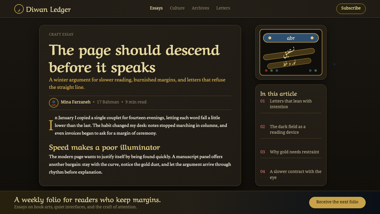
Illuminated abr cloud bands soften the composition without weakening its structure. Their contours introduce a drifting, celestial rhythm that answers the calligraphy’s sloped motion. Use them as transitions, enclosures, or moments of visual rest, not as generic background ornament.
Cartouche Hierarchy
Gold-and-lapis cartouches establish hierarchy through containment and contrast. A cartouche is not merely a label holder: it concentrates attention, gives a passage ceremonial status, and provides a visual threshold before or within the larger field. Its ornament should feel precise, dignified, and integrated with the script.
Floral Illumination
Vines and polychrome flowers add cultivated intricacy around the script. Their role is to frame, accompany, and enrich rather than overwhelm. The best effect comes from a clear hierarchy: calligraphy remains the voice, while flowers and vines become its setting, echo, and lingering afterimage.
Who shaped Persian Nastaliq Calligraphy?
Mir Ali Tabrizi is named among the key figures of Persian Nastaliq calligraphy. Within this visual lineage, his name anchors the script in Persia’s calligraphic culture rather than treating it as a detached decorative motif. A Nastaliq-inspired design should therefore give primary importance to the living direction and balance of writing.
Mir Emad al-Hasani is identified as one of the masters through whom Nastaliq was perfected in the Safavid ateliers of Tabriz and Isfahan. His place in the source material connects the script’s high prestige to disciplined mastery, making restraint as important as splendor in any contemporary interpretation.
Sultan Ali Mashhadi appears among the key figures associated with Persian Nastaliq. Together with the other named masters, he situates the style within a lineage of calligraphic practice. This lineage is why the script should lead the composition rather than being reduced to a decorative border, texture, or emblem.
How do you use Persian Nastaliq Calligraphy today?
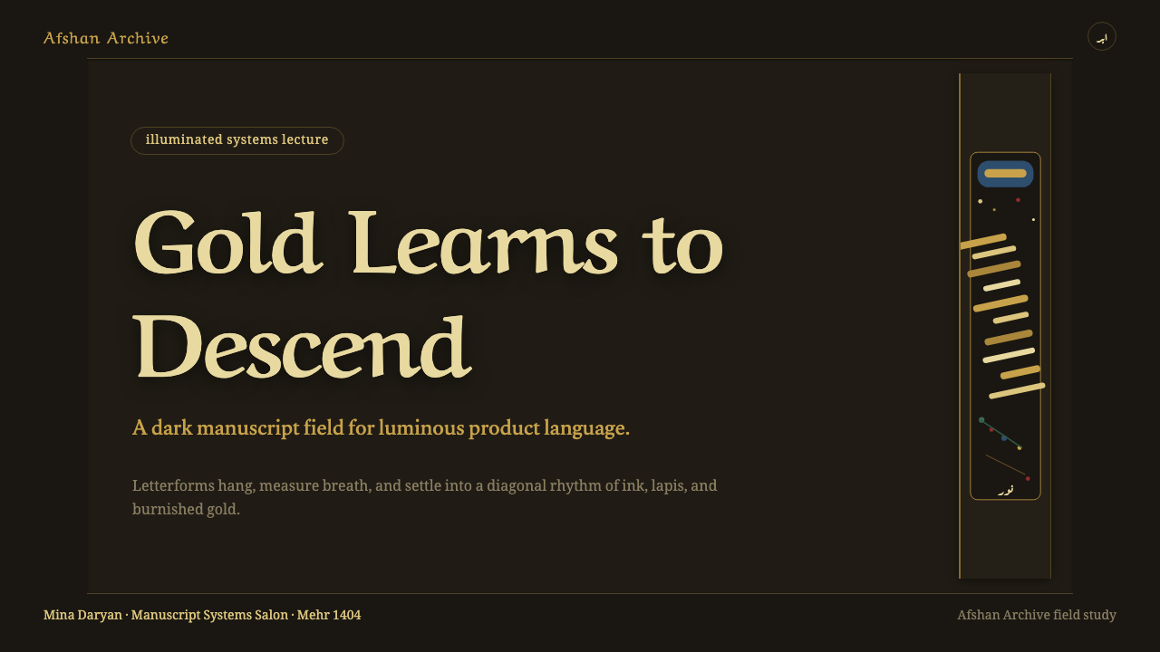
For presentation covers, treat the page as an illuminated opening rather than a conventional title slide. Let a single sloped Nastaliq passage or title command the field, with a gold-and-lapis cartouche carrying secondary information. The near-black afshan ground should create silence around the writing, while cloud bands and floral illumination remain concentrated at the edges or around key transitions.
For content and data slides, translate the manuscript logic into a stable hierarchy. Use the cartouche as a section marker, keep explanatory text in quiet, legible blocks, and reserve gold script-like gestures for titles or pull quotes rather than dense information. Charts should remain restrained and readable; use the dark ground, gold emphasis, and lapis grouping to clarify relationships, not to turn data into ornament.
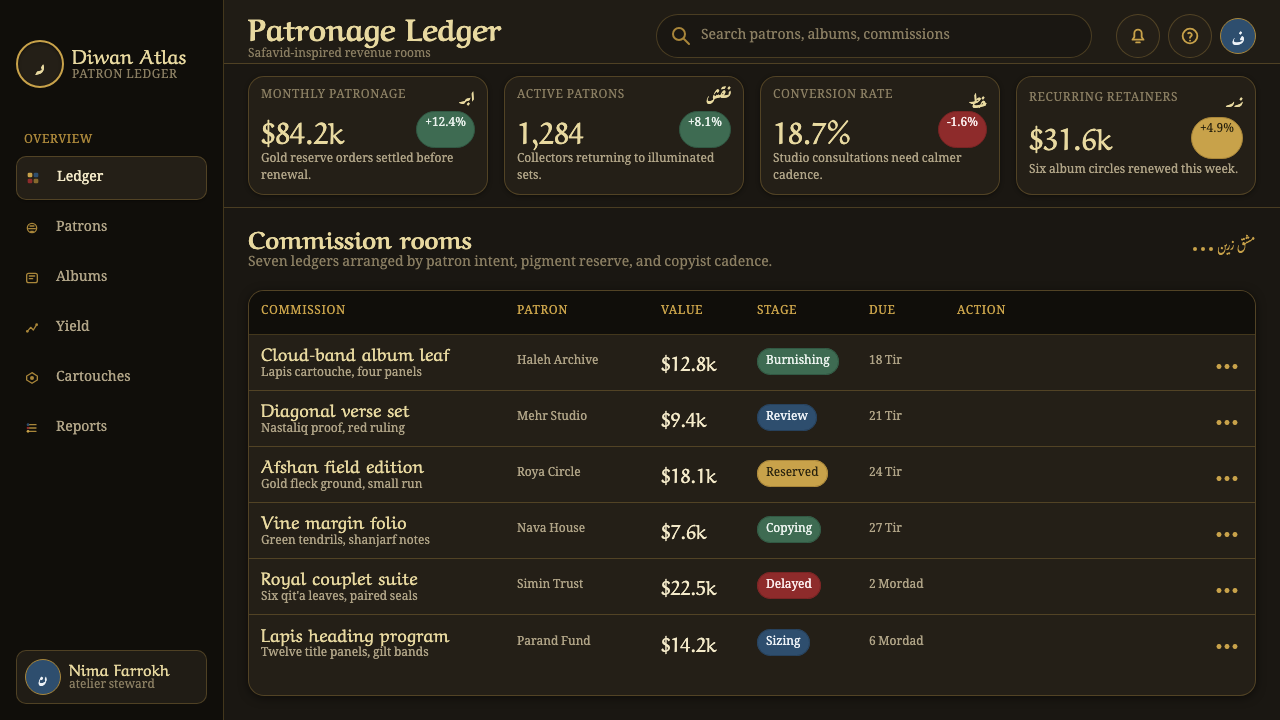
For web interfaces, this style is strongest in editorial readers, cultural archives, exhibition pages, premium collections, and storytelling experiences where sustained attention is welcome. A dashboard or pricing page can use the language selectively: the dark ground can frame a focused area, cartouches can identify tiers or modules, and gold accents can guide important actions. Preserve clear interface behavior beneath the atmosphere; a rich visual field should never obscure navigation, status, or comparison.
For editorial and marketing work, let the style create a sense of encounter. Long-form pages can alternate quiet text areas with illuminated passages, while campaign pages can use a large calligraphic gesture as the emotional center of a composition. Floral detail and cloud bands work especially well as transitions between sections, provided they follow the content’s rhythm instead of filling every available space.
The most common mistake is using gold, dark backgrounds, and floral motifs without preserving Nastaliq’s hierarchy. Gold flecks can become generic luxury decoration, lapis can become a loud accent, and ornamental vines can swallow the text. Begin with the suspended calligraphic movement and the page’s breathing space; add afshan, cartouches, cloud bands, and flowers only when they deepen that central act of writing.
Persian Nastaliq Calligraphy — FAQ
Is Nastaliq primarily a type of ornament?
No. Ornament is part of the presentation system, but Nastaliq is first a calligraphic script. Its sloped rhythm, suspended letter groups, and controlled flow are the composition’s central logic. Afshan, cloud bands, cartouches, vines, and flowers should support that logic rather than replace it.
Why is a near-black ground so effective for this interpretation?
The dark afshan ground makes gold lettering and illumination feel internally lit. It also gives the downward motion of Nastaliq a spacious field in which to breathe. The effect is not simply luxury: darkness concentrates attention, while scattered gold flecks prevent the field from becoming empty or inert.
How should lapis be used beside gold?
Use lapis as a deep counterweight and a device for hierarchy, especially within cartouches. Gold carries brilliance and emphasis; lapis supplies enclosure, depth, and calm. When both are allowed to compete everywhere, the page loses the measured focus that makes the illuminated manuscript mood persuasive.
Can this style work for practical information design?
Yes, when the calligraphic and illuminated layers are assigned clear roles. Cartouches can label sections, dark fields can create focus, and gold accents can direct attention. Practical text, controls, and data still need a calm, legible structure; the manuscript atmosphere should intensify meaning, not make information harder to find.
Related design styles
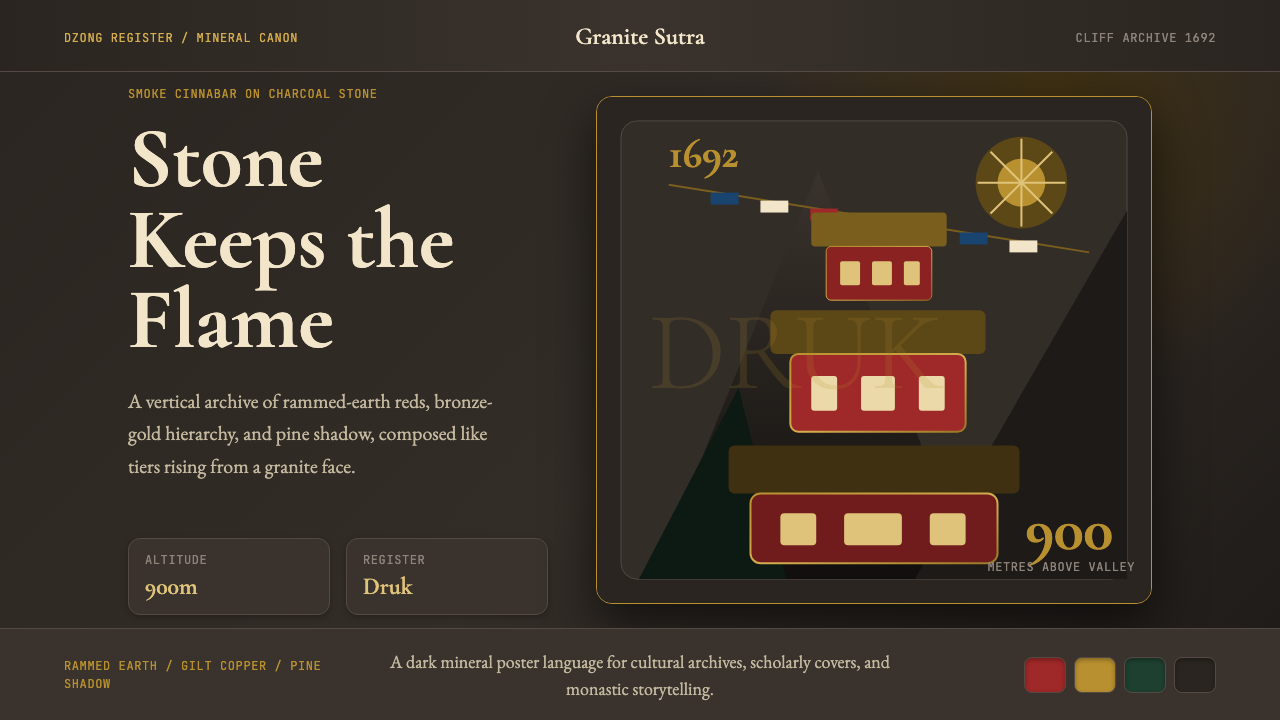 Bhutanese Tiger's Nest Cliff MonasterySacred altitude, mineral-dark. Cinnabar tiers and bronze rules climb charcoal…
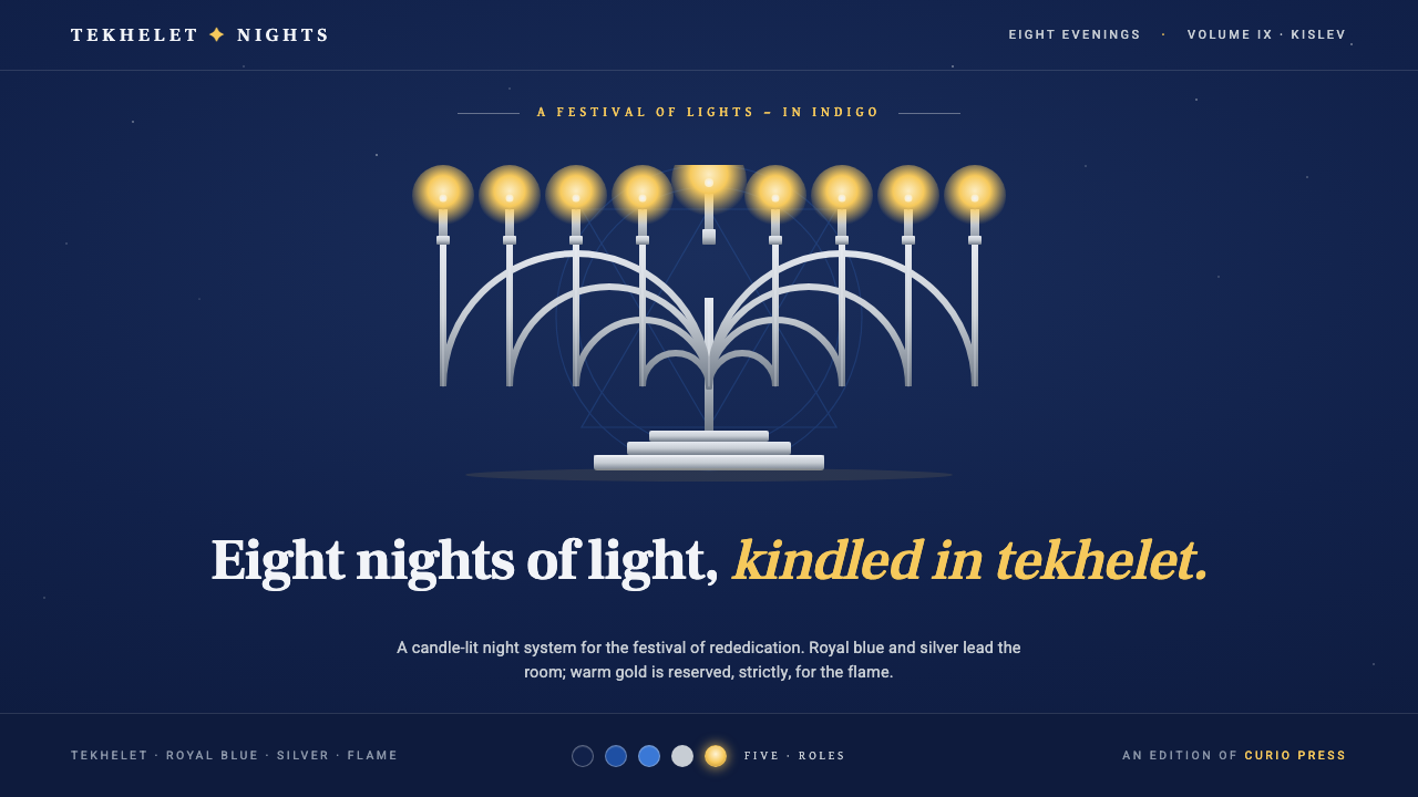 Hanukkah MenorahEight nights kindled in tekhelet. Royal blue and silver hold the dark room; g…
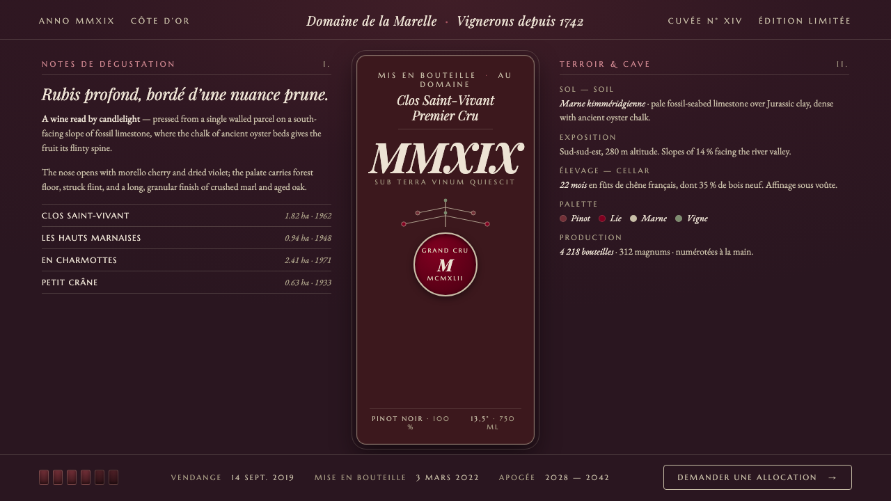 Burgundy VineyardRead by candlelight in a wine-lees cellar. Aged purple-red Pinot on near-blac…
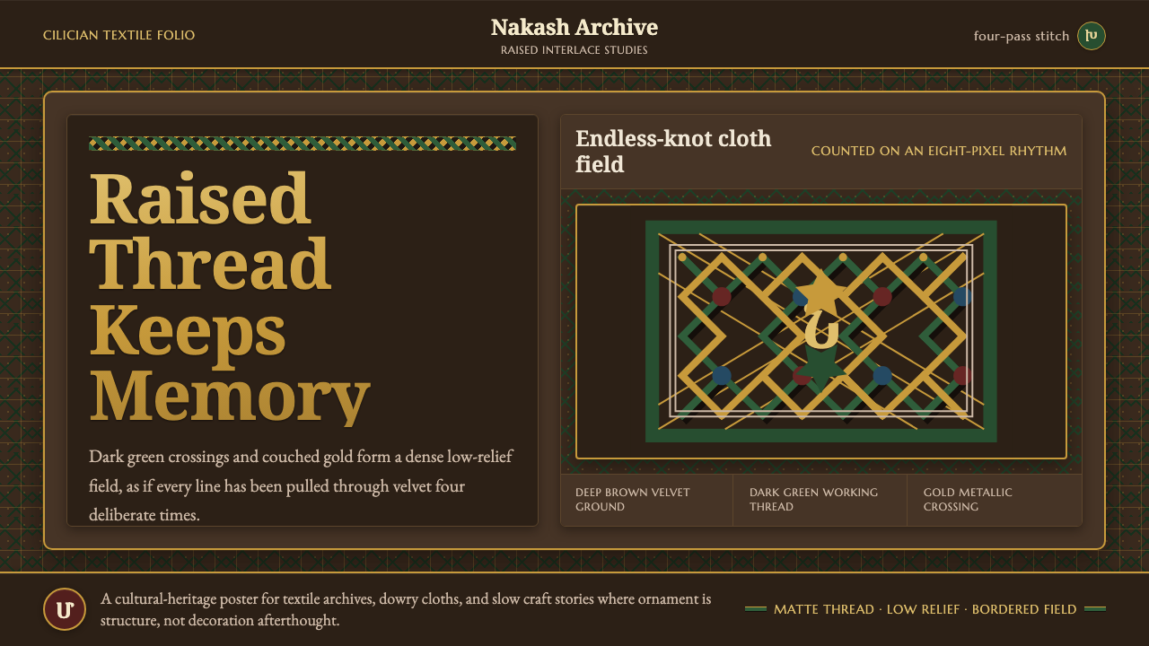 Armenian Marash Interlace EmbroideryDense memory in raised thread. Green-gold interlace locks over deep brown clo…
 Babylonian Hammurabi SteleAuthority carved in stone. Basalt-black grids, parchment panels, and imperial…
 Jaipur Pink City RajasthanRoyal warmth, ordered by decree. Pink sandstone, cream jali, emerald borders.