What is Hanukkah Menorah?
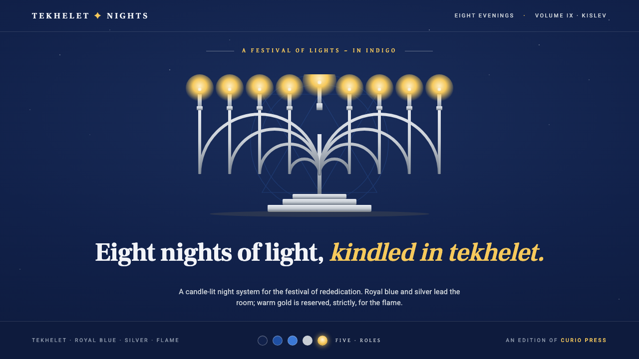
Eight nights are kindled against an indigo darkness, where silver gives the ritual its form and gold belongs only to the living flame.
Hanukkah Menorah in brief
Hanukkah Menorah is a dark ceremonial design language centered on the image of a silver nine-branched menorah glowing within a deep indigo room. Its visual story is one of light returning gradually to darkness across eight nights. Royal blue and silver establish the environment, while warm gold is reserved for the candle flames. This strict separation makes illumination feel meaningful rather than merely decorative.
The system draws together three strands of Jewish visual heritage: the Maccabean rededication of the Second Temple in the second century BCE, the ancient lineage of tekhelet blue dye, and the modern blue-white-silver palette associated with Hanukkah. These elements do not function as interchangeable ornaments. The menorah supplies the ritual center, indigo establishes historical and nocturnal depth, and the sequence of flames carries the narrative.
Visually, the style depends on disciplined contrast. Hebrew serif typography gives written language a formal, inherited presence, while Star-of-David geometry introduces recognizable structure around the central lamp. Silver surfaces remain cool and quiet; blue creates the surrounding field; gold appears only where light is being kindled. Cream, pure white, and Christmas red and green are excluded because they would weaken the specifically nocturnal and Jewish character of the system.
Where does Hanukkah Menorah come from?
The historical foundation of the style lies in the Maccabean rededication of the Second Temple in the second century BCE. Within the source tradition, the Maccabees and Judah Maccabee stand at the beginning of the Hanukkah narrative. The contemporary image of the menorah therefore carries more than festive recognition: it points backward to an act of rededication and forward to the repeated household ritual through which the story is remembered.
The palette reaches into another ancient lineage through tekhelet, the blue dye heritage associated with Jewish tradition and the Land of Israel. In this design system, deep indigo is described as the color of an ancient tekhelet room. It is not a generic dark-mode background or a fashionable navy surface. It creates a historical night: deep enough to hold silence, cool enough to distinguish itself from the flame, and saturated enough to make silver forms visible without turning the room pale.
The familiar blue-white-silver Hanukkah palette is modern by comparison, taking recognizable shape around the twentieth century. Hanukkah Menorah adapts that palette by darkening its atmosphere and narrowing its roles. Royal blue becomes the dominant chromatic field, silver articulates the lamp and supporting details, and white is interpreted through cool silver light rather than exposed as a pure background. Gold is removed from borders, lettering, and general luxury cues so that it can retain an exclusive relationship with fire.
The style is ultimately sustained not by a single designer but by observant households kindling the menorah. Their repeated act gives the visual system its sequence, orientation, and emotional logic. The image is never simply a symmetrical candelabrum displayed all at once; it belongs to a narrative of nights, additions, and returning light. Modern design inherits that rhythm whenever it reveals information gradually, treats the lamp as an active ritual object, and allows darkness to remain present around the growing illumination.
What defines the Hanukkah Menorah look?
Nocturnal Palette
Deep indigo and royal blue hold nearly the entire composition. They should feel enveloping rather than empty, creating the impression of a room after daylight has withdrawn. Silver supplies cool definition within that field, while warm gold is confined to flame. Cream grounds, exposed pure white, and red-green holiday combinations disrupt the intended cultural and nocturnal identity and should not enter the palette.
Flame as the Sole Warmth
Gold is not a general accent, a luxury finish, or a method for making headings look important. It signifies kindled light. Restricting warmth to the flames creates a clear visual law: every warm mark implies illumination, presence, or ritual action. If gold spreads into frames, stars, icons, or typography, the flame loses its exceptional status and the central narrative becomes decorative pageantry.
Silver Menorah
The nine-branched menorah is the compositional anchor. Rendered in silver, it remains distinct from both the blue environment and the golden fire. Its branching form should be readable as a complete ritual object, not reduced to an ambiguous row of candles. Symmetry can establish dignity, but slight variations in the flames and surrounding light keep the image from becoming static or merely heraldic.
Hebrew Serif Typography
Hebrew serif typography gives the design an inherited, textual gravity that complements the ritual object. Letterforms should feel composed and deliberate, with enough openness to remain legible against a dark field. Typographic hierarchy is best achieved through contrast in scale, placement, and silver-blue tonal emphasis. Ornamental lettering or generic festive scripts would compete with the menorah and blur the cultural specificity of the voice.
Star-of-David Geometry
Star-of-David geometry provides a secondary structural vocabulary of intersecting directions and balanced points. It can organize frames, sectional relationships, or subtle background constellations, but it should remain subordinate to the menorah. Repetition works best when sparse and measured. Filling every open area with stars turns a meaningful geometric sign into pattern noise and deprives the dark field of its necessary stillness.
Eight-Night Sequence
The design carries time as well as form. Eight nights imply progression, anticipation, and accumulation, so repeated modules should reveal a growing rather than mechanically uniform rhythm. A sequence may move from darkness toward increasing flame, or from sparse information toward fuller illumination. The important quality is continuity: each stage should feel connected to what came before and expectant of what will follow.
Darkness with Purpose
Negative space is treated as darkness awaiting or surrounding light, not as an area that must be filled. Broad indigo fields allow the silver menorah and individual flames to command attention without excessive enlargement. The darkness should remain chromatically alive through blue depth, yet visually quiet. Unrelated textures, bright ornaments, and crowded borders weaken the symbolic relationship between the unlit room and the kindled lamp.
Who shaped Hanukkah Menorah?
The Maccabees form the collective historical foundation of the Hanukkah narrative supplied for this style. Their association with the rededication of the Second Temple in the second century BCE gives the menorah its commemorative depth. In design terms, that lineage argues for seriousness and ritual focus: the central lamp represents inherited memory rather than a generic seasonal decoration.
Judah Maccabee is the named individual at the historical center of the Maccabean lineage. His presence connects the broader collective story to a recognizable human figure without turning the visual system into portraiture. The design language preserves that emphasis indirectly, through the rededicated lamp, the disciplined ceremonial atmosphere, and the movement from darkness toward renewed light.
Observant households are the continuing custodians of the image because they kindle the menorah across the eight nights. Their practice turns history into repeated present action. For designers, these households represent an essential corrective to purely decorative interpretation: the menorah is not only an icon to display, but an object activated through sequence, attention, gathering, and the deliberate addition of light.
How do you use Hanukkah Menorah today?
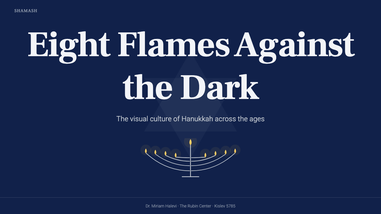
For presentation slides, the style is strongest when the cover behaves like a dark ceremonial threshold. Place the silver menorah or a restrained fragment of its branches as the primary anchor, surround it with generous indigo darkness, and allow a limited flame glow to draw the eye toward the title. Content slides should preserve the same hierarchy through cool silver text, measured Hebrew-serif headings, and sparse geometric divisions derived from the Star of David rather than unrelated decorative lines.
Data slides should translate the eight-night narrative into progression without converting the ritual into a novelty chart. Sequential markers, cumulative series, and staged comparisons can move from dim silver-blue states toward illuminated gold endpoints. Gold should identify culmination, activation, or the decisive piece of evidence, not every positive value. Charts remain legible when the surrounding field stays quiet and when silver supplies the ordinary framework against which the warm highlight becomes meaningful.
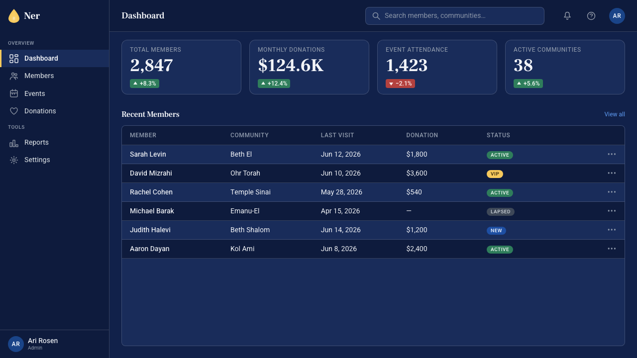
For web interfaces, Hanukkah Menorah suits focused dashboards, event pages, cultural archives, and pricing presentations that benefit from a formal nocturnal atmosphere. Royal blue can organize navigation and major surfaces, while silver differentiates panels, controls, and supporting information. Pricing tiers should not all compete with golden accents; reserve the flame color for the selected action or the point of commitment. Star geometry may guide grouping, but familiar interaction patterns must remain clearer than the symbolism.
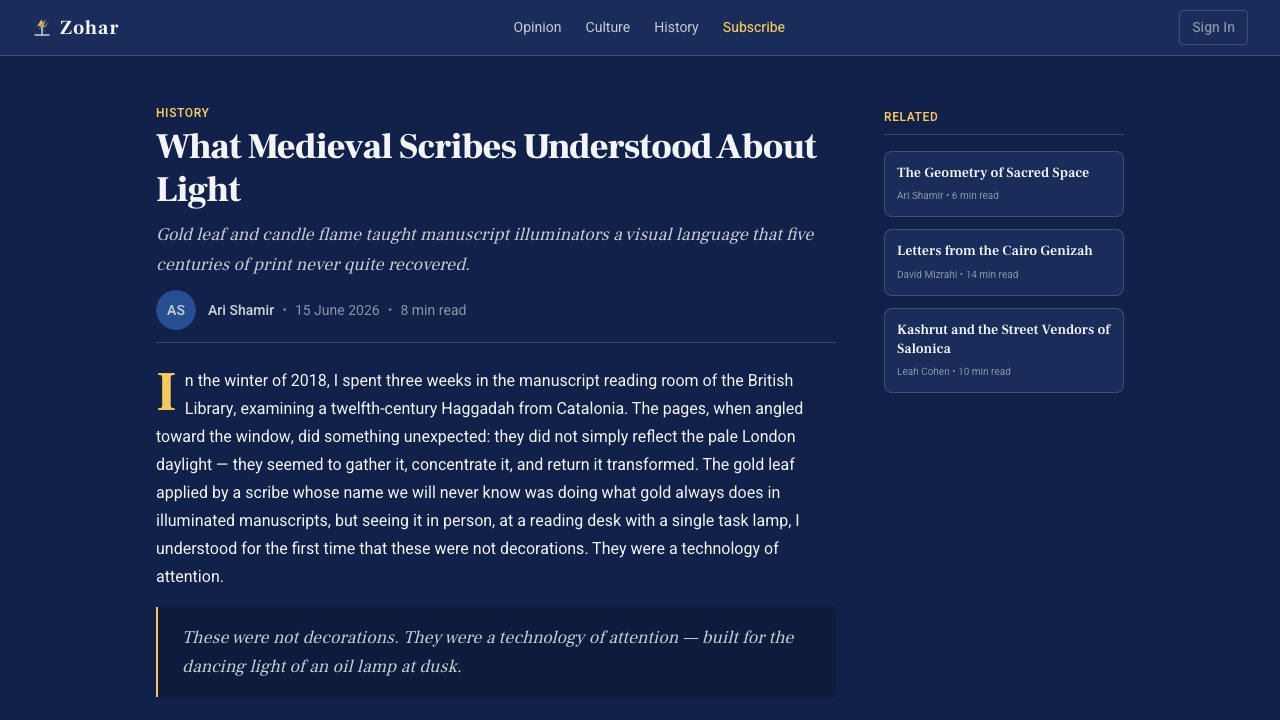
Editorial and marketing layouts can use the style to frame historical narratives, festival programs, household guides, and reflective campaigns. Long-form articles benefit from dark blue fields interrupted by silver textual passages and occasional flame-led moments of emphasis. Marketing compositions should treat the menorah as a narrative center rather than a corner badge. A sequence of sections can echo successive nights, allowing information and warmth to accumulate while the blue environment remains continuous.
The most common mistake is confusing Hanukkah Menorah with a general winter-holiday luxury style. Scattering gold across typography, combining blue with cream, introducing red and green, or filling the page with glowing stars removes the discipline that gives the system meaning. Another error is displaying all symbols at equal intensity. The hierarchy must remain unmistakable: darkness is the setting, silver is the structure, the menorah is the ritual center, and gold is the flame.
Hanukkah Menorah — FAQ
Why does the menorah have nine branches if Hanukkah lasts eight nights?
The supplied visual tradition defines the Hanukkah menorah as a nine-branched ritual object while the festival narrative unfolds across eight nights. Design should preserve both facts rather than simplifying the lamp into an eight-part symbol. The apparent difference is visually productive: the complete object anchors the composition, while the eight-night sequence supplies progression, anticipation, and the changing pattern of kindled light.
Is every blue-and-gold holiday design a Hanukkah Menorah design?
No. The identity comes from the relationship among deep tekhelet indigo, royal blue, silver structure, the nine-branched menorah, Hebrew serif typography, Star-of-David geometry, and the eight-night narrative. Gold alone does not establish the style; in fact, widespread gold usually weakens it. The warm color must remain tied to flame, while the rest of the system stays cool, dark, and ceremonially ordered.
Can the style use a light background?
A light treatment would change the central metaphor. Hanukkah Menorah is explicitly a night system in which an indigo room holds a silver lamp and the flames provide the only warmth. Pure white and cream grounds are excluded from the approved palette. If greater readability is needed, increase tonal distinction within the blue-silver range and open the composition with space, rather than replacing the darkness with a pale surface.
How should Star-of-David geometry be used without overwhelming the menorah?
Treat it as supporting structure rather than the principal emblem. Its intersecting directions can align text, define restrained divisions, or establish a faint geometric field behind content. Keep repetitions sparse and cooler than the flames. The menorah should remain the clearest complete object, because it carries the ritual action; the star geometry supplies cultural and compositional context without competing for narrative leadership.
What makes the style specifically appropriate for sequential interfaces?
Its source narrative already contains time: light is kindled across eight nights rather than presented as a single instantaneous spectacle. That makes the system naturally compatible with staged disclosures, progress views, chapter sequences, and cumulative data. The interface should express growth through additional illumination or warmer emphasis while preserving the surrounding indigo continuity. Sequence feels authentic when each state remembers the darkness from which it emerged.
Related design styles
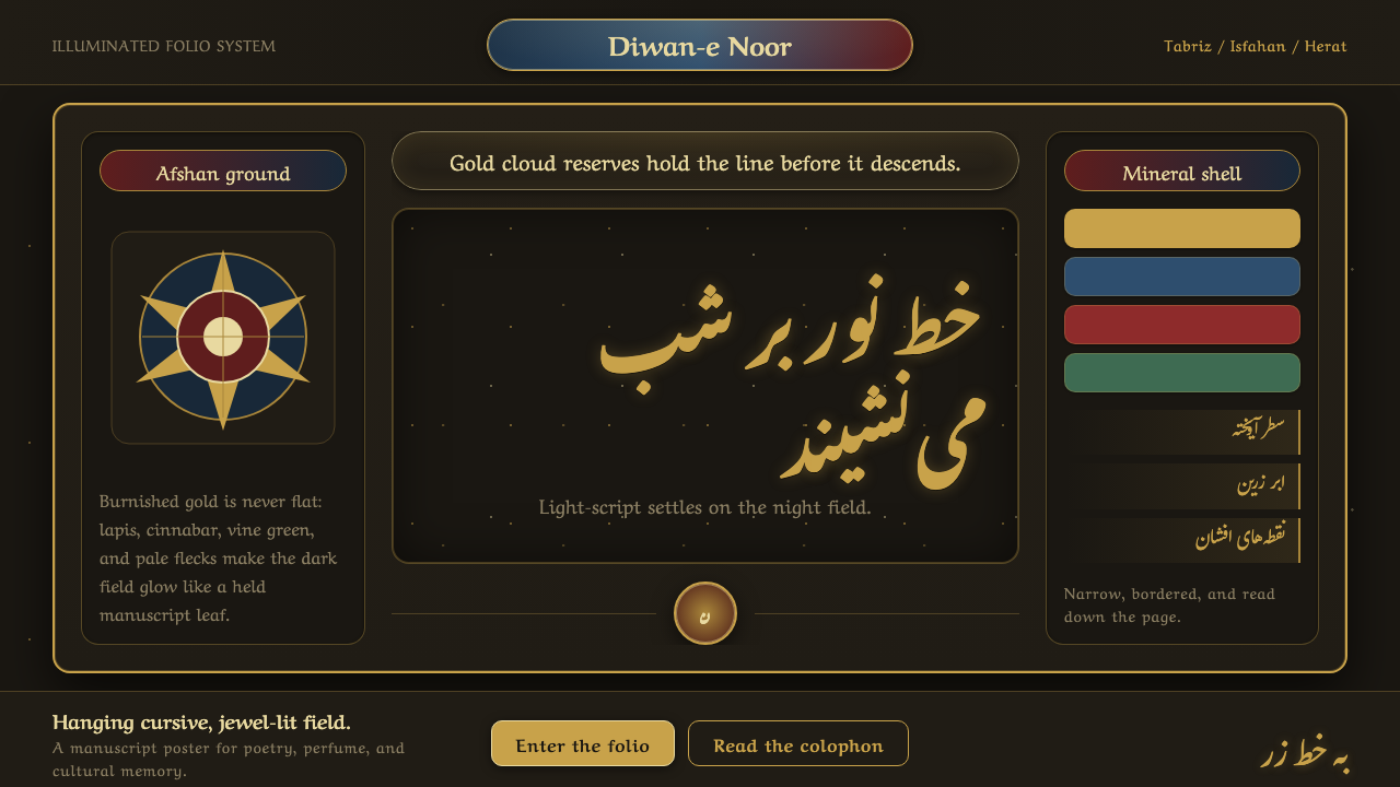 Persian Nastaliq CalligraphyGold script breathes in darkness. Afshan flecks, lapis cartouches, and sloped…
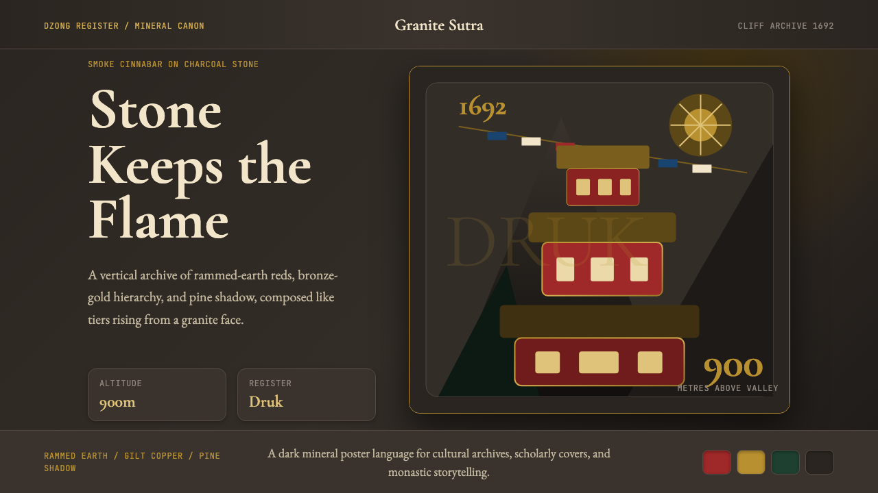 Bhutanese Tiger's Nest Cliff MonasterySacred altitude, mineral-dark. Cinnabar tiers and bronze rules climb charcoal…
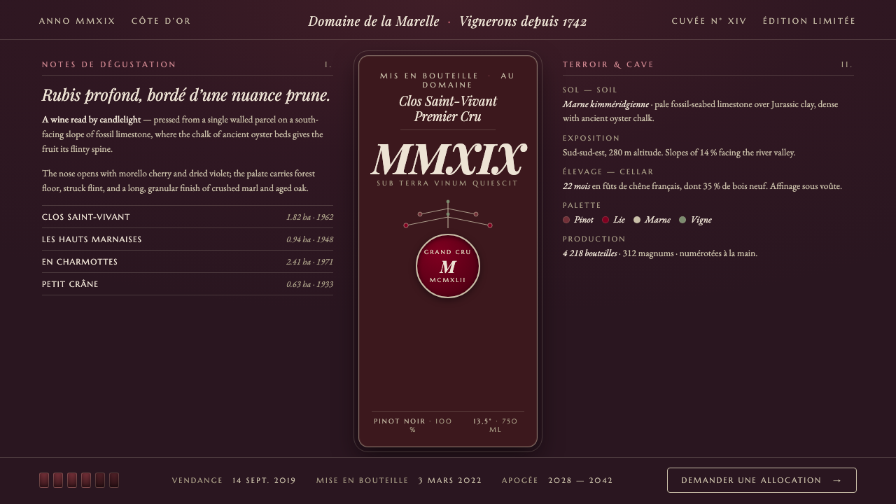 Burgundy VineyardRead by candlelight in a wine-lees cellar. Aged purple-red Pinot on near-blac…
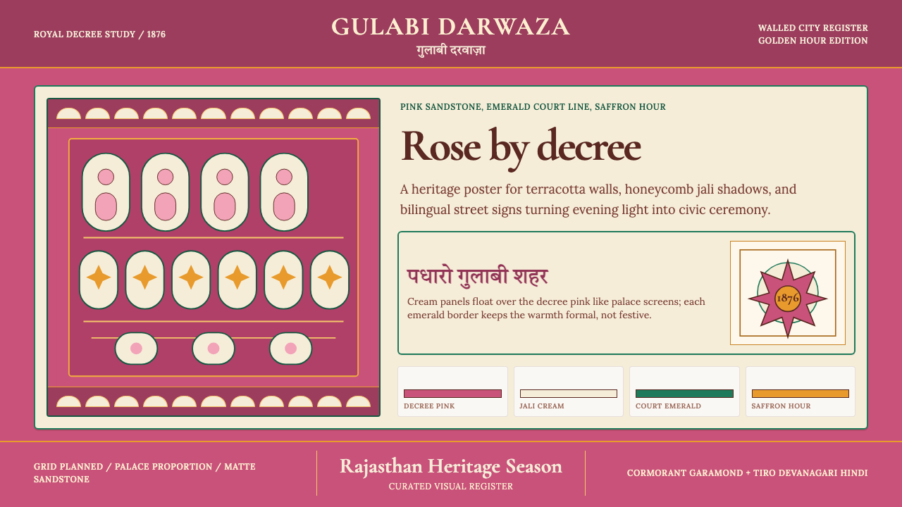 Jaipur Pink City RajasthanRoyal warmth, ordered by decree. Pink sandstone, cream jali, emerald borders.
 Mysore Gesso Gold PaintingGold that glows, never glitters. Matte burnished leaf over gesso on deep maro…
 Sasanian Silver PlateRegal metal, held in silence. Tarnished silver frames one restrained gold rel…