What is Burgundy Vineyard?
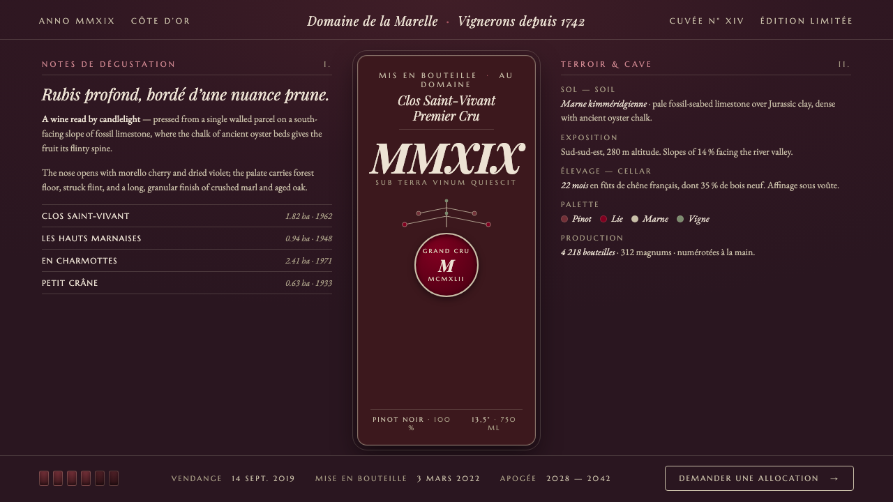
Burgundy Vineyard is a cellar-lit design language: aged Pinot purple-red, chalky marl, dark oak, and the quiet authority of a wine label kept for decades.
Burgundy Vineyard in brief
Burgundy Vineyard distills the visual atmosphere of pre-1900 Bourgogne winemaking into a dark, editorial design system. Its setting is not the bright vineyard at harvest, but the cellar: stained oak, bottle glass, wine lees, cool stone, and labels examined under a small pool of warm light. The result should feel mature rather than theatrical. It carries the gravity of a classified bottle, a handwritten cellar record, or a merchant’s paper seal without turning into generic luxury decoration.
The dominant field is a near-black purple-brown, drawn from wine-stained timber and the depth of old glass. Its signature accent is the aged purple-red associated with Pinot Noir: ruby at heart, touched by purple, warm in character and never icy or blue. Pale Kimmeridgian marl supplies the necessary lift. That chalky, fossil-seabed material gives the system a dry, mineral highlight rather than a bright metallic shine, while restrained vine green reconnects the cellar interior to the climat parcels above ground.
Typography gives the style its historical voice. French heritage serifs suggest printed wine labels, estate ledgers, and merchant catalogues; inscriptional capitals introduce the dignity of a cartouche, capsule, or seal. The composition should feel made for reading, cataloguing, and provenance. Decorative details are permitted only when they behave like evidence of a label-making tradition: a fine rule, an oval enclosure, a restrained crest-like frame, or a small seal mark. Burgundy Vineyard is not about excess. It is about patina, lineage, and the confidence to let darkness hold the page together.
Where does Burgundy Vineyard come from?
The style begins with Bourgogne as a wine landscape shaped over centuries by monastic and estate viticulture. In Côte d’Or and Chablis, wine was never simply a drink detached from place. Its identity was tied to ground, slope, cultivation, cellar practice, and the particular parcel from which fruit came. Burgundy Vineyard translates that way of thinking into design: the page should make provenance legible. Material, hierarchy, and label-like notation matter because they imply that what is being presented has an origin worth naming.
The Cistercian monks associated with Clos de Vougeot and the Cluniac monks form the deepest cultural reference in the source tradition. Their relevance is not a license for medieval pastiche. It is the idea of patient observation: land worked over generations, distinctions noticed and retained, and records that turn cultivation into a shared memory. A Burgundy Vineyard layout can therefore feel archival without becoming dusty. It should have the composure of a document whose value has accumulated through use.
The climat tradition is central to the system’s logic. A climat is not merely a scenic vineyard view or a broad regional identity; it is a way of understanding place through meaningful distinction. That logic appears visually through careful naming, ordered metadata, and boundaries that clarify rather than decorate. Fine marl-like lines, contained labels, and deliberate spacing can suggest parcels, strata, or cellar inventory. The atmosphere remains intimate, but the information architecture must be precise enough to feel trustworthy.
Kimmeridgian marl geology, cellar affinage, and barrel aging complete the material vocabulary. Marl brings pale limestone-and-clay restraint against the darkness; barrel aging contributes the sense of stained oak and gradual integration; cellar affinage supplies silence, shadow, and time. Bourgogne vignerons provide the human scale: not anonymous luxury, but practice, stewardship, and close attention to a living product. The style is strongest when these references become a coherent sensory world rather than a collection of wine-themed motifs.
What defines the Burgundy Vineyard look?
Cellar Darkness
The background should feel like the depth of wine lees, stained oak, and bottle glass rather than a neutral dark interface. Its purple-brown cast matters: it makes the composition feel warm, enclosed, and aged. Large dark fields create the room in which labels, rules, and pale text can breathe. Avoid a stark digital black, which strips away the cellar’s organic density and makes the style feel technical rather than vinous.
Aged Pinot Accent
Purple-red is the emotional center of Burgundy Vineyard. It should read as aged wine, not as a synthetic violet or a cool berry tone. Use it to establish focal points: a vintage marker, an important title, a seal, a selected state, or a decisive editorial gesture. When it appears broadly, the surrounding field must stay quiet enough for its warmth and depth to register.
Marl and Mineral Light
Pale marl is the style’s clarifying agent. It should resemble chalk, limestone dust, or a dry cellar wall, never polished silver or bright white display light. Use it for body text, fine rules, restrained borders, and small factual annotations. Its dryness is important: Burgundy Vineyard achieves contrast through mineral restraint, not through glossy shine.
Heritage Typography
French heritage serifs carry the main reading voice, with inscriptional capitals used where the composition needs ceremonial weight. The effect should recall a vintage label or estate register without becoming ornate calligraphy. Let contrast in scale, case, and spacing establish hierarchy. Titles may feel engraved or printed; supporting copy should remain calm, literate, and unmistakably readable.
Cartouche and Seal
Enclosures are useful when they behave like label infrastructure. A cartouche can hold an estate name; an oval or seal-like device can mark provenance, selection, or a special release; a hairline border can turn a content block into a bottle-label fragment. These devices should organize information and add ceremony in equal measure. If they multiply without purpose, the page becomes costume rather than heritage.
Vine Green Restraint
Vine-foliage green is a secondary note, not a competing identity. It reconnects the dark cellar to the climat parcels and should appear sparingly in metadata, small indicators, botanical accents, or navigational states. Its job is to make the system feel cultivated and alive. It should never overwhelm the purple-red wine accent or dilute the dark, mineral atmosphere.
Who shaped Burgundy Vineyard?
The Cistercian monks associated with Clos de Vougeot represent the tradition of sustained vineyard observation and cultivation. Within Burgundy Vineyard, they stand for disciplined stewardship rather than decorative monastic imagery. Their legacy supports the style’s emphasis on provenance, restrained record-keeping, and distinctions that emerge through long attention to place.
The Cluniac monks belong to the centuries-long monastic foundation of Bourgogne viticulture. Their role in the theme is cultural and structural: they evoke institutions through which land, practice, and memory could be maintained. This makes archival typography and measured label conventions feel appropriate, provided they remain useful to the information being presented.
The climat tradition is the theme’s most important organizing figure, even though it is not a single individual. It frames Bourgogne as a landscape of named and meaningful distinctions. For designers, its lesson is direct: hierarchy must communicate origin and relation. A label, rule, margin, or annotation should help users understand what belongs where and why it matters.
Bourgogne vignerons provide the style with its practical human dimension. They keep the theme from becoming an abstract language of prestige by grounding it in cultivation, cellar work, and care for a changing product. Their presence favors tactile materials, specific naming, and modest claims over glossy spectacle or anonymous luxury cues.
How do you use Burgundy Vineyard today?
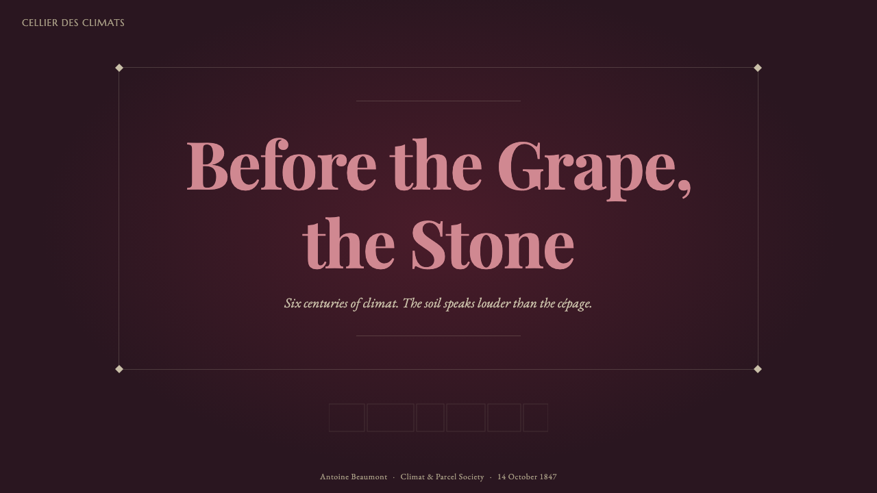
For presentation covers, Burgundy Vineyard works best when the page behaves like a bottle label seen in a cellar. Let the dark wine-lees field carry most of the visual weight, then place one decisive purple-red title, seal, or vintage-like marker within a pale marl framework. Keep supporting information discreet and exact. Content slides should retain that mood but become more editorial: a heritage-serif heading, calm pale copy, fine mineral dividers, and room around each block make dense material feel collected rather than crowded.
Data slides should use the style’s material hierarchy rather than merely recoloring charts. Treat the pale marl as the legible baseline, the purple-red as the central series or key finding, and vine green as a restrained comparative note. Labels, sources, and categories should look like cellar records: clear, ordered, and subordinate to the data. Avoid glossy dimensional charts, bright decorative highlights, or visual effects that make numerical information feel less trustworthy.
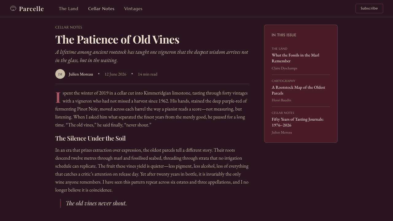
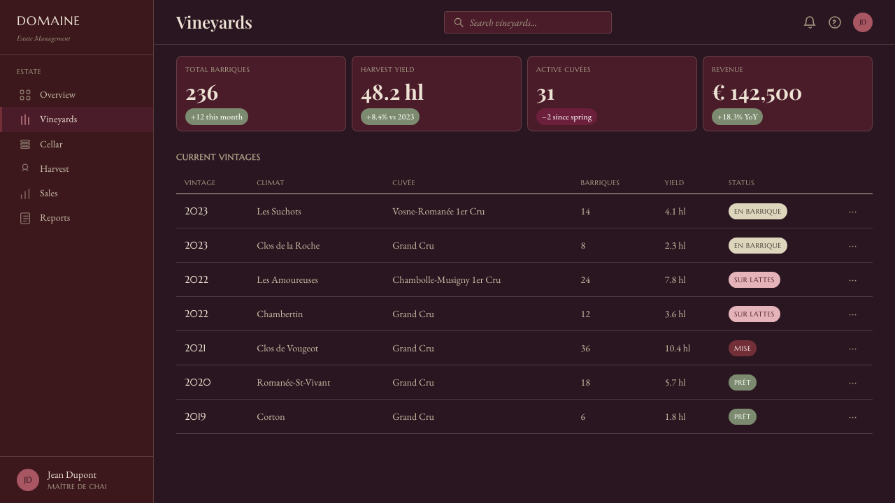
For web interfaces, Burgundy Vineyard suits dashboards, catalogues, membership areas, and pricing pages that benefit from provenance and deliberate hierarchy. The dark field can create a strong environment for inventory, collections, account tiers, or curated selections. Use cartouche-like panels to group meaningful records, not every isolated control. Inputs, filters, navigation, and status indicators should remain plainly usable; the historical voice belongs in framing and typography, while interface actions need immediate clarity.
For editorial and marketing work, the style excels at long-form stories about craft, collections, hospitality, food, heritage, and luxury with substance. An article can pair a pale, inscriptional section marker with wide dark breathing space and warm purple-red emphasis. Marketing pages should move between expansive cellar-dark moments and quieter information panels, allowing product details, origin notes, and calls to action to feel selected rather than shouted. Photography, if used, should favor texture, glass, oak, stone, labels, and cultivated land over generic celebratory imagery.
The common mistake is to equate Burgundy Vineyard with wine-red decoration on a black background. That produces a nightclub or cosmetics mood, not Bourgogne. The system depends on the relationship among warm darkness, mineral restraint, historical typography, and information that feels tied to place. Another frequent error is overusing seals, crests, script-like lettering, and ornamental borders. Use only enough label language to establish provenance; when every element claims pedigree, none of it feels earned.
Burgundy Vineyard — FAQ
Is Burgundy Vineyard simply a wine-themed luxury style?
No. Luxury is only a possible outcome, not the system’s foundation. Burgundy Vineyard is built from terroir, cellar affinage, marl geology, label conventions, and the climat tradition of meaningful distinction. It should communicate care, provenance, and maturity. If the design relies only on dark surfaces, rich red accents, and decorative crests, it loses the specific cultural logic that makes it feel Bourgogne rather than generically premium.
Can the style work without wine imagery?
Yes. The strongest applications often use no literal bottle, grape, or barrel imagery at all. Its identity can emerge from the cellar-dark field, aged purple-red accent, chalky mineral contrast, French heritage typography, and careful provenance-like hierarchy. This makes the style useful for any subject that benefits from a sense of cultivation, archival care, or mature selection.
How should Burgundy Vineyard use pale text on a dark page?
Use the pale marl note as a reading material, not as a glare source. It should feel dry, chalky, and slightly softened by the surrounding cellar darkness. Reserve the brightest contrast for the most important reading tasks, while allowing secondary metadata and rules to recede. Strong readability comes from clear hierarchy and generous breathing room, not from making every line equally bright.
What role does vine green play in the palette?
Vine green is the link between cellar and parcel. It adds a cultivated, living note to a palette otherwise dominated by aged wine, oak darkness, and mineral chalk. Use it as a small supporting signal for categories, status, botanical details, or navigation. It should remain secondary to the warm purple-red, because the design’s central story is the wine’s aged depth rather than the vineyard’s surface freshness.
Where does Burgundy Vineyard struggle?
It can struggle where speed, cheerful immediacy, or broad casual accessibility is the main value. A highly transactional consumer flow, a playful children’s product, or an interface requiring constant high-density alerts may find its dark, ceremonial mood too heavy. It also fails when content has no meaningful story of origin, process, collection, or care. The style needs something to age around; without that substance, its patina becomes affectation.
Related design styles
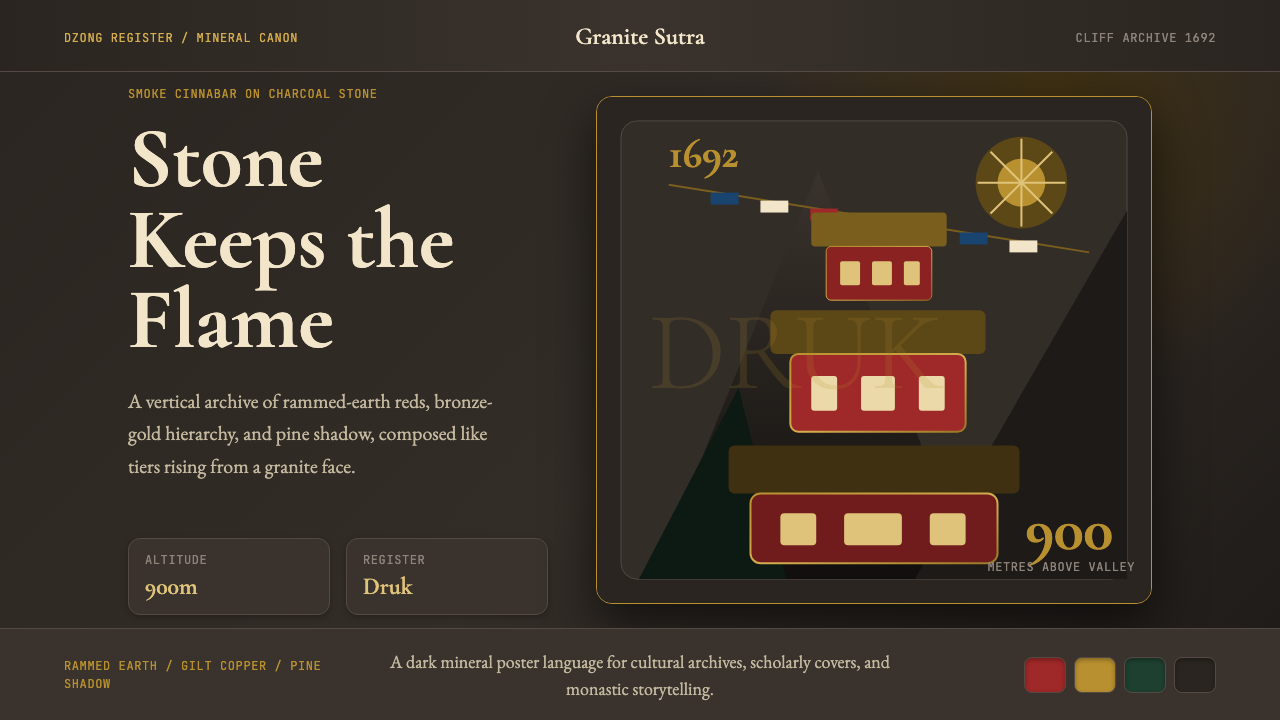 Bhutanese Tiger's Nest Cliff MonasterySacred altitude, mineral-dark. Cinnabar tiers and bronze rules climb charcoal…
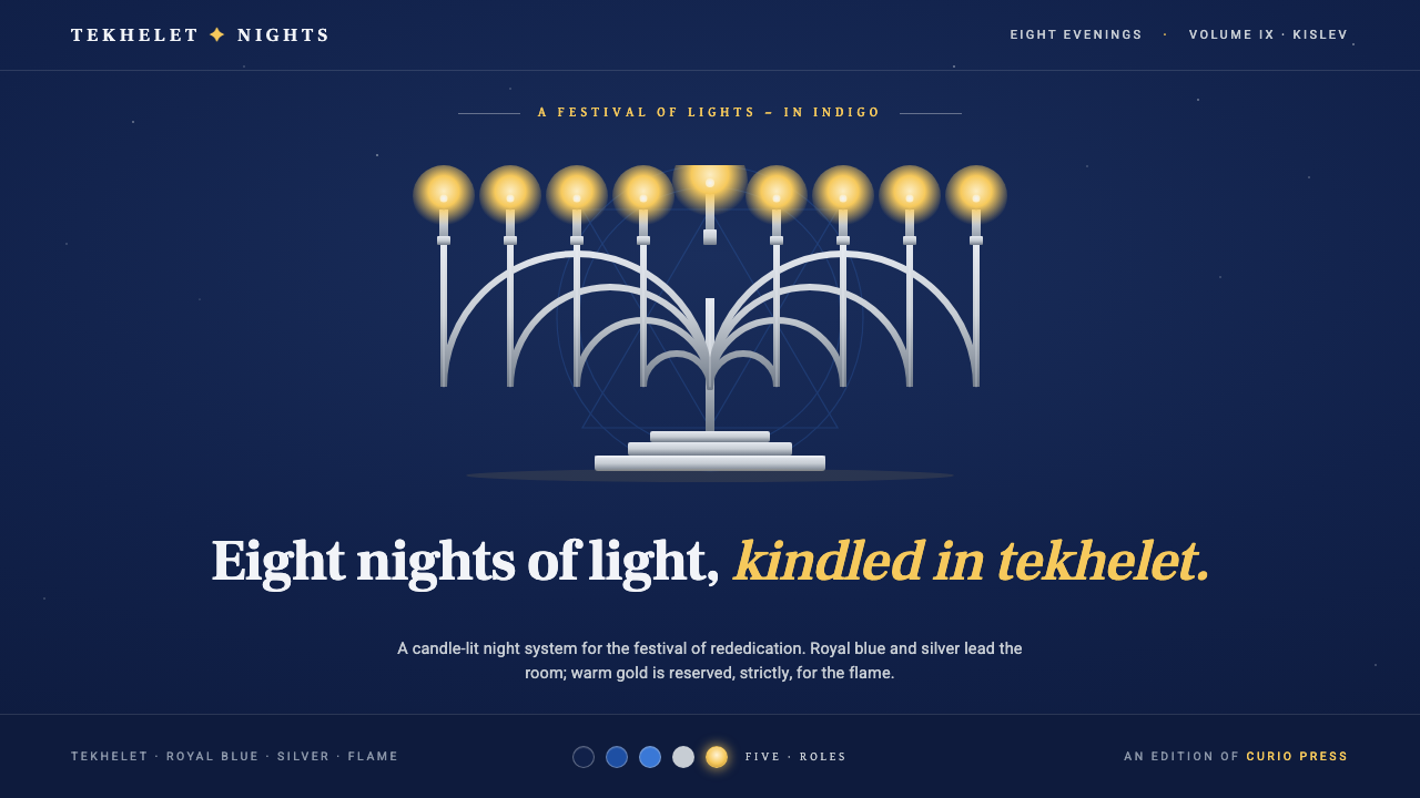 Hanukkah MenorahEight nights kindled in tekhelet. Royal blue and silver hold the dark room; g…
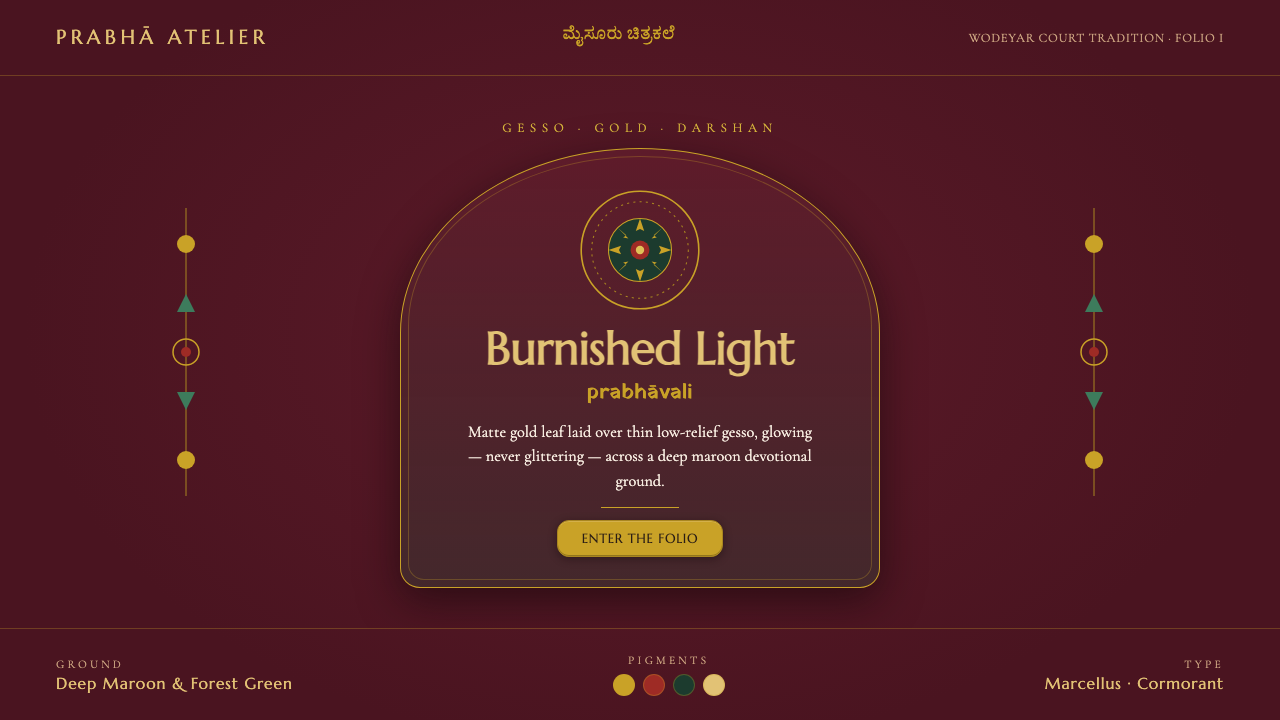 Mysore Gesso Gold PaintingGold that glows, never glitters. Matte burnished leaf over gesso on deep maro…
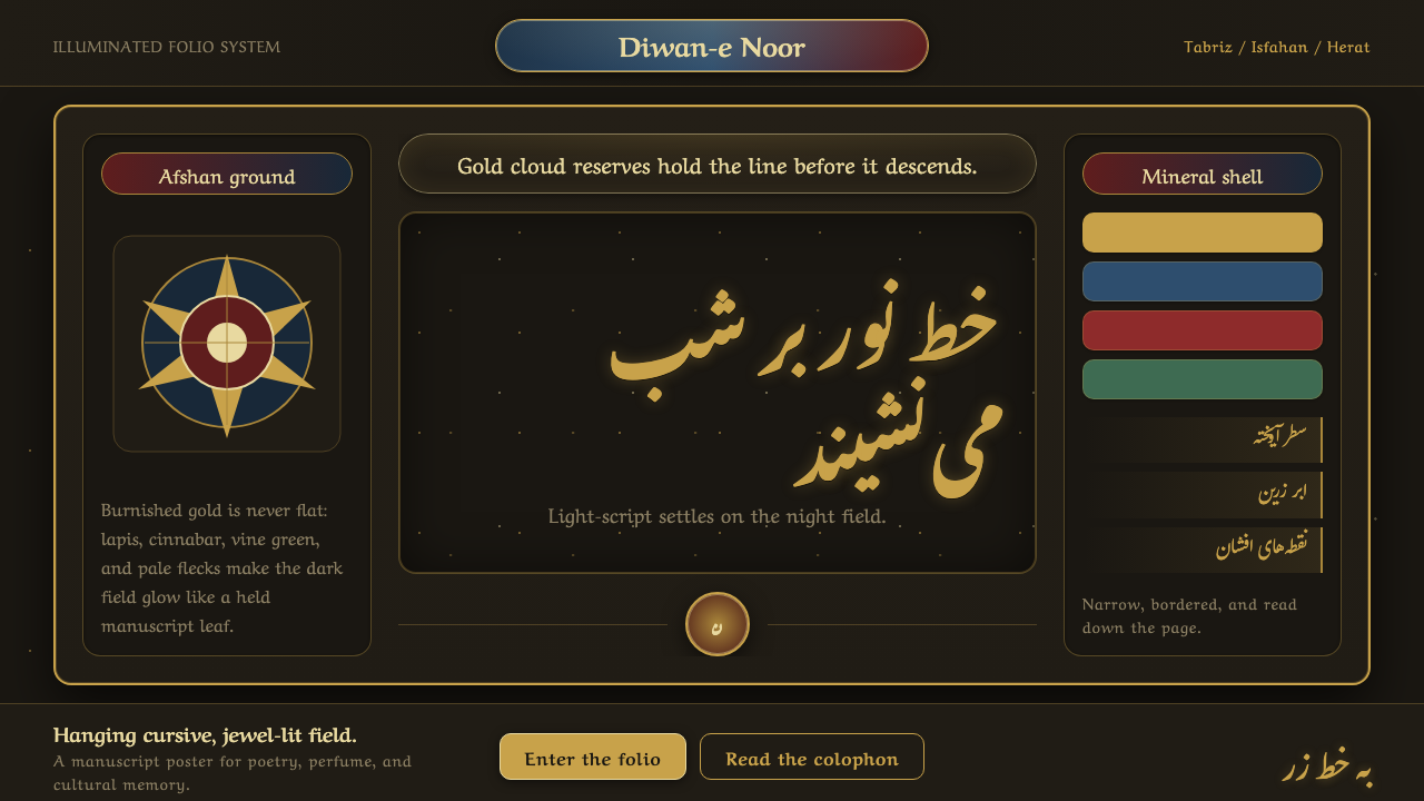 Persian Nastaliq CalligraphyGold script breathes in darkness. Afshan flecks, lapis cartouches, and sloped…
 Whisky CooperageBuilt for the long dark. Charred black grounds copper hoops and engraved seri…
 Chartreuse Liqueur GreenAcid glow rules the cellar. Cormorant Garamond and brass hairlines frame yell…