What is Mysore Gesso Gold Painting?

Mysore Gesso Gold Painting makes gold behave like devotion: softly burnished, quietly radiant, and held in stillness against deep ceremonial color.
Mysore Gesso Gold Painting in brief
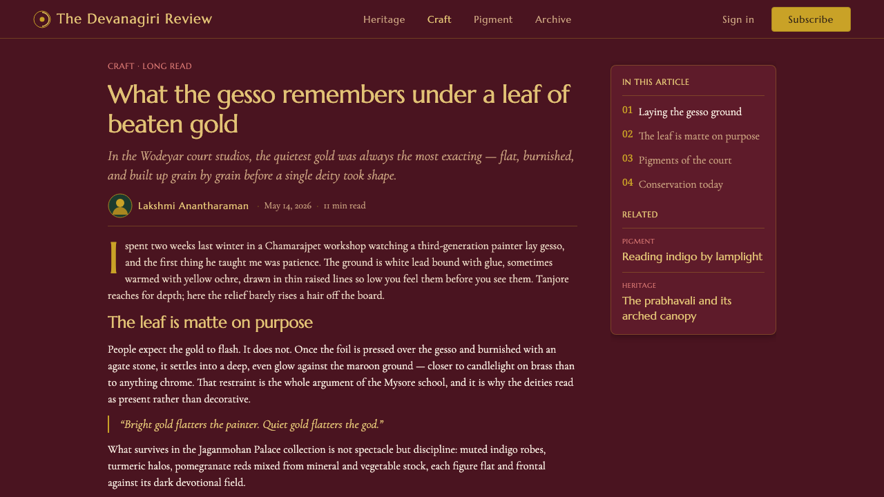
Mysore Gesso Gold Painting is a devotional court-art tradition from Mysore in Karnataka, India, associated with the Wodeyar kingdom. Its images center on deities and richly colored figures, arranged with calm ceremonial clarity against deep maroon and dark-green grounds. The visual atmosphere is reverent rather than theatrical: figures appear composed, frontal, and self-contained, while the dark field around them makes each face, garment, ornament, and halo feel deliberately attended to.
Its defining material language is thin, low-relief gesso covered with matte burnished gold leaf. Gold is not used as a spectacle of sparkle. It is softened, pressed, and polished until it seems to retain light rather than scatter it. The result is a glow that belongs to the painted surface itself, not a transient glitter imposed on top of it. This distinction gives the style much of its devotional gravity: gold signals sacred presence, but it does so with restraint.
Mysore painting is often understood through its contrast with the thicker raised work associated with Tanjore. Mysore is subtler and flatter. Its relief remains delicate, its ornament remains integrated with the image, and its jewel-like richness is moderated by muted mineral and vegetable pigments such as indigo, turmeric, and pomegranate. Rather than making every detail compete for attention, the style lets gold, dark ground, and controlled color work together as a unified field of contemplation.
Where does Mysore Gesso Gold Painting come from?
The tradition belongs to Mysore, Karnataka, and to the courtly devotional culture of the Wodeyar kingdom. Its pre-1900 history is described as a Wodeyar court tradition consolidated from the seventeenth through the nineteenth centuries. That setting matters because the style does not separate image-making from ceremony. Its sacred figures, dark grounds, controlled ornament, and luminous gold all belong to a courtly visual language in which dignity and reverence are inseparable.
Mysore Gesso Gold Painting also stands within Vijayanagara-derived court art. The phrase identifies a lineage rather than a single isolated invention: the Mysore-school approach carries forward a courtly vocabulary of sacred representation, formal figure placement, rich color, and ornament with devotional purpose. In this context, gold is not merely a luxury material. It gives form to sanctity, framing and elevating what the image asks the viewer to regard with attention.
The Wodeyar court painters were central custodians of this language. Their role was not simply to decorate a surface, but to sustain a recognizably Mysore approach in which the painted figure, the low gesso relief, the burnished leaf, and the dark surrounding field remain mutually dependent. The style gains its authority from that interdependence. Remove the devotional stillness, or replace the restrained gold with decorative glitter, and the work may retain familiar ingredients while losing the tradition's essential character.
Jaganmohan Palace painting traditions are named among the key anchors of the Mysore lineage. They point to a continuing courtly setting in which painting could be preserved, recognized, and practiced as a distinct cultural form. The consolidation of the tradition over several centuries helps explain why its visual system feels disciplined. It is not a loose collection of exotic motifs; it is a stable relationship between subject, ground, pigment, relief, and gold, refined within an identifiable Mysore-school devotional practice.
What defines the Mysore Gesso Gold Painting look?
Deep Devotional Grounds
Deep maroon and dark green are not passive backdrops. They create the quiet visual chamber in which a deity or jewel-toned figure can appear with authority. Their darkness absorbs visual noise and gives the gold leaf a low, warm radiance. A successful ground feels dense and ceremonial, never merely blackened for drama.
Matte Burnished Gold
The signature gold is laid over thin gesso relief and burnished into a matte glow. It should read as accumulated light, not metallic flash. This makes gold a sacred structural accent: it crowns, frames, and clarifies important forms without breaking the painting's stillness through excessive shine.
Low-Relief Gesso
Gesso gives selected details a restrained physical presence. Its relief is thin and controlled, creating tactile distinction without turning the surface into a display of thickness. Compared with more heavily raised devotional painting, the Mysore approach remains flatter, allowing painted color and gold to stay in close conversation rather than separating into competing layers.
Muted Jewel Pigments
Indigo, turmeric, and pomegranate suggest a color world that is rich without becoming loud. The palette has the depth of jewel tones, but its mineral and vegetable sources support a softened, earthy restraint. Color should enrich the figure and deepen the ground, not turn the image into a bright decorative pattern detached from devotion.
Sacred Stillness
Mysore painting organizes visual attention through composure. The figure is given room to remain present, while ornament and color reinforce rather than interrupt that presence. The effect is contemplative: the viewer is invited to dwell on a concentrated image instead of being pushed through a cascade of visual events.
Integrated Ornament
Ornament is meaningful when it supports sacred hierarchy. Gold, relief, and jewel-toned detail gather around what deserves emphasis, rather than filling every vacant area. The style therefore rewards disciplined abundance: richness is present, but each enriched passage remains accountable to the devotional image as a whole.
Who shaped Mysore Gesso Gold Painting?
The Wodeyar court painters are the key artistic custodians identified for the tradition. Their importance lies in sustaining the Mysore-school relationship between devotional subject, deep ground, restrained pigment, low gesso relief, and burnished gold. They represent the court setting through which the style became recognizable as a coherent visual practice.
The painting traditions associated with Jaganmohan Palace are a named anchor for Mysore Gesso Gold Painting. They matter as a site of continuity: a courtly framework in which the devotional image and its material conventions could be preserved as a tradition rather than treated as isolated decoration.
Vijayanagara-derived court art identifies the broader lineage from which the Mysore-school devotional language emerges. It situates the tradition within a continuing courtly inheritance of sacred representation, formal richness, and visual order, rather than presenting Mysore painting as a style detached from earlier artistic culture.
How do you use Mysore Gesso Gold Painting today?
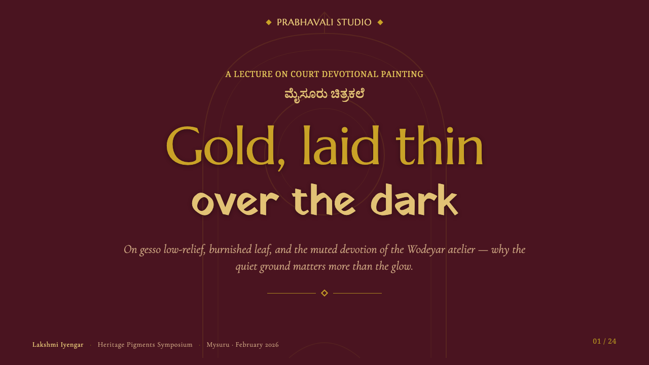
For presentation covers, use Mysore Gesso Gold Painting as an atmosphere of focused reverence rather than an inventory of motifs. Let a deep maroon or dark-green field establish the page, then give one central emblem, title, or framed figure the visual privilege of restrained gold. Keep supporting text quiet and widely spaced in feeling. The cover should resemble an illuminated devotional panel: concentrated, dignified, and unwilling to rush the viewer.
For presentation content and data slides, translate the style into hierarchy rather than literal religious imagery. Use the dark ground as a stable field, reserve gold-like emphasis for titles, totals, or the single conclusion that matters most, and use muted jewel colors to distinguish groups without making every chart segment equally urgent. Data should feel placed with ceremony. A chart can become calmer and more legible when its dominant value is treated as the illuminated subject and secondary values recede into the field.
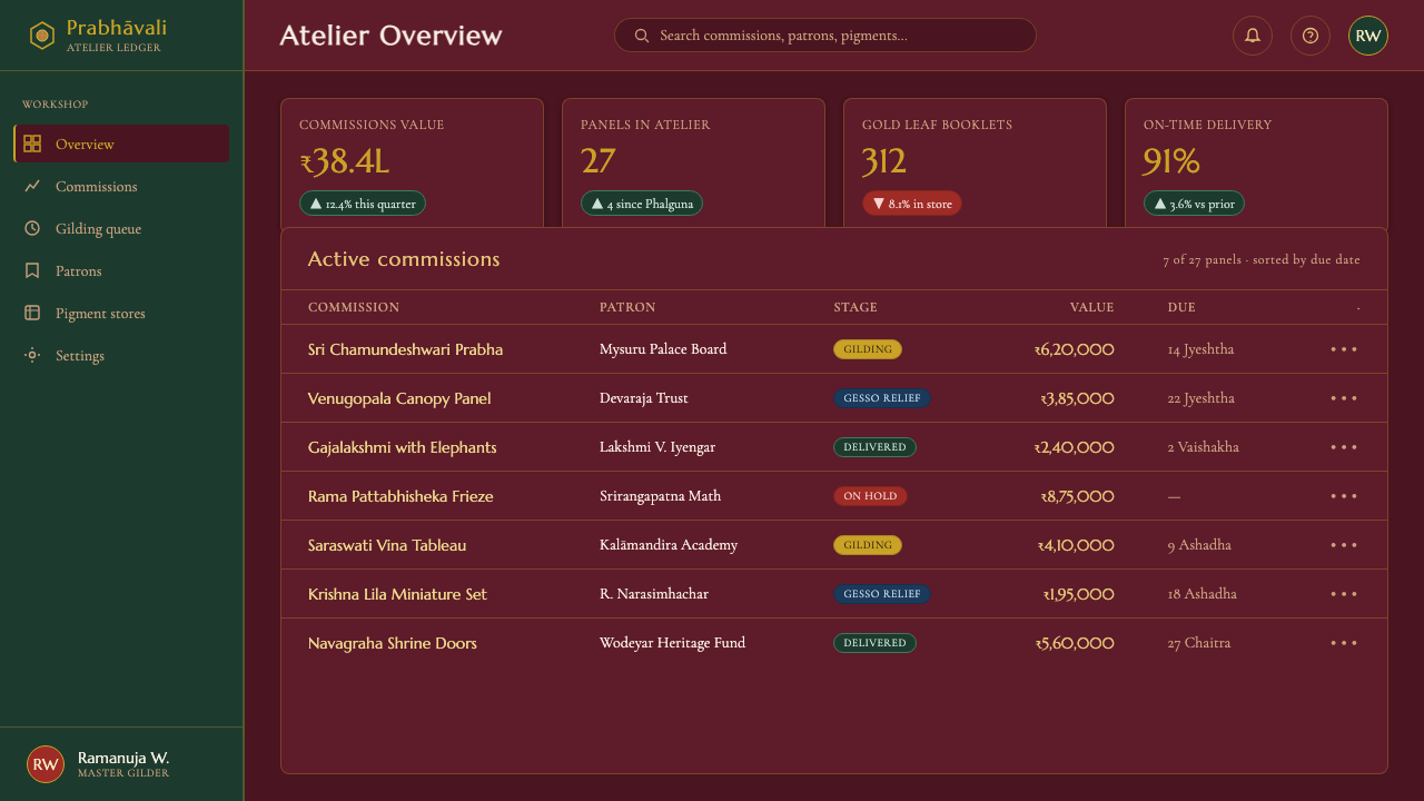
For web interfaces, the style is best suited to premium archives, cultural collections, heritage storytelling, reflective tools, and dashboards where gravity is a feature rather than a liability. A dark interface can use maroon or dark green to create depth, with a restrained gold treatment for key navigation, active states, status moments, or a featured object. Panels should feel like carefully prepared surfaces, not glossy luxury cards. Keep interaction clear, but do not fill the interface with shimmering accents or ornamental borders.
Editorial and marketing applications benefit from the style's capacity for slow attention. A long-form feature can open with a dark title field, gold-toned editorial emphasis, and muted jewel imagery, then alternate rich visual pauses with readable text sections. For marketing, use it to communicate craftsmanship, ceremony, permanence, or cultural care. It is particularly effective when the message needs to feel considered and material, not merely expensive.
The common mistake is to equate Mysore painting with generic gold luxury. Bright metallic effects, mirror-like surfaces, dense sparkle, thick theatrical relief, and indiscriminate jewel colors move the result away from the tradition. Another mistake is borrowing sacred visual cues for a trivial message. The style works when gold remains softly burnished, relief stays subtle, color remains restrained, and the whole composition protects a sense of devotional stillness.
Mysore Gesso Gold Painting — FAQ
How is Mysore Gesso Gold Painting different from Tanjore painting?
The supplied distinction is material and visual: Mysore is subtler and flatter than Tanjore's thick raised work. Mysore relies on thin low-relief gesso and matte burnished gold, so its gold glows quietly within a composed painted field. A Tanjore-like result will feel more emphatically raised and more overtly ornamental; a Mysore result depends on restraint, surface unity, and devotional calm.
Why should the gold look matte rather than glittery?
Because the tradition's signature is gold that glows rather than glitters. Matte burnishing makes the leaf feel integrated with gesso and pigment, allowing it to hold a soft radiance against the dark ground. Glitter turns gold into a moving surface effect, while Mysore painting uses it as a stable sign of sacred emphasis.
Can this style be used without depicting deities?
Its historical identity is devotional and centered on deities and sacred figures, so contemporary adaptation should preserve that seriousness even when the subject changes. The transferable elements are the deep ceremonial ground, restrained burnished-gold hierarchy, low-relief tactility, and muted jewel pigment logic. Using these elements for cultural, archival, or reflective subjects is more faithful than treating them as a decorative shortcut.
What colors best support a Mysore-inspired composition?
Begin with deep maroon or dark green as the devotional ground, then use gold with restraint and build figure color from muted jewel-toned pigments. Indigo, turmeric, and pomegranate are named sources for the tradition's color character. The key is not to maximize saturation everywhere; the dark ground must remain spacious enough for the burnished gold and colored figure to breathe.
Where does a Mysore-inspired visual system struggle?
It struggles when speed, novelty, or playful abundance are the main goals. Highly animated product launches, dense consumer dashboards, and messages built around urgency can conflict with its quiet devotional character. It also weakens when every interface element receives gold treatment. The style needs selective emphasis and darkness with room to remain dark; otherwise its material dignity becomes generic ornament.
Related design styles
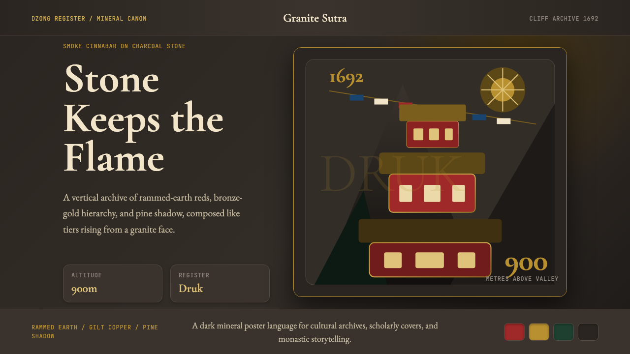 Bhutanese Tiger's Nest Cliff MonasterySacred altitude, mineral-dark. Cinnabar tiers and bronze rules climb charcoal…
 Burgundy VineyardRead by candlelight in a wine-lees cellar. Aged purple-red Pinot on near-blac…
 Jaipur Pink City RajasthanRoyal warmth, ordered by decree. Pink sandstone, cream jali, emerald borders.
 Hanukkah MenorahEight nights kindled in tekhelet. Royal blue and silver hold the dark room; g…
 Persian Nastaliq CalligraphyGold script breathes in darkness. Afshan flecks, lapis cartouches, and sloped…
 Andhra Cheriyal Scroll PaintingSaturated oral memory. Mineral red registers, mustard diamonds, and serif son…