What is Whisky Cooperage?
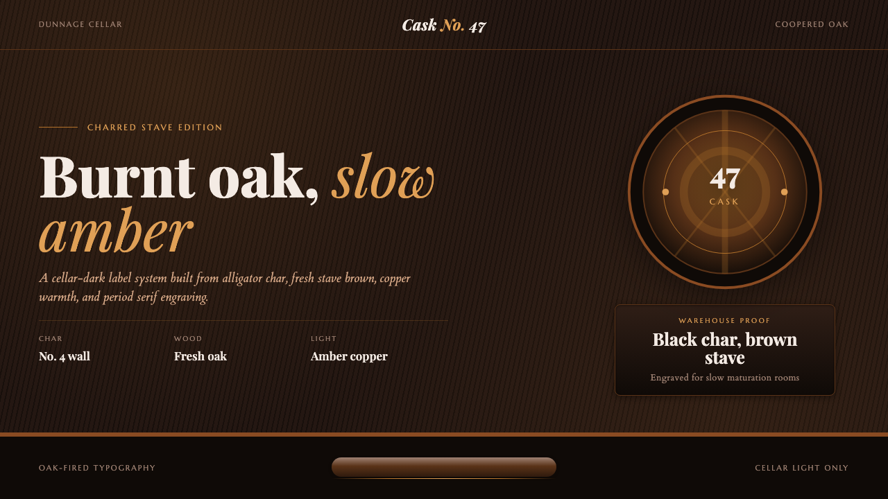
Whisky Cooperage is built for the long dark: charred oak, amber spirit, copper sheen, and the quiet authority of a cask sleeping in a low-lit warehouse.
Whisky Cooperage in brief
Whisky Cooperage is a dark, materially driven visual style drawn from the dunnage cellar: the low-lit maturation warehouse where Scotch rests in oak casks for years. Its defining contrast is not between bright colors and white paper, but between carbonized black wood, fresh stave brown, glowing amber liquid, and the warm metallic sheen of copper. The atmosphere is deliberate, slow, and tactile. A surface should suggest a barrel interior, a warehouse beam, a cooper’s workbench, or a distillery label kept intact through decades of handling.
The system combines early-twentieth-century Scottish cask craft with period distillery branding. High-contrast serif lettering supplies ceremony and provenance; hoop-band dividers give the page the structural rhythm of a barrel; engraved cartouches and barrel-end roundels frame names, dates, and classifications as if they belonged on a cask head or a printed bottle label. The resulting work feels less like a modern screen decorated with whisky motifs than an object drawn from the same material world as cooperage itself.
Its central principle is material legibility. Dark grounds must read as char rather than generic black, brown fields as oak rather than ordinary earth tones, bright amber as liquid rather than a decorative highlight, and copper as warm equipment rather than a fashionable metallic effect. The style gains its authority from this restraint. It is richly atmospheric, yet it does not need visual clutter: every band, edge, line, and engraved flourish should appear to have a physical job in the imagined construction.
Where does Whisky Cooperage come from?
Whisky Cooperage takes its historical frame from the period between 1900 and 1950, when cooperage and warehouse maturation craft sat visibly at the center of the modern Scotch industry. The underlying tradition is far older, but this era supplies the particular visual memory: working casks, low warehouse light, formal distillery names, and printed labels whose authority came from craft, continuity, and physical handling. The style is rooted in Western Europe, especially the Speyside and Lowland distilleries and their dunnage warehouses.
The dunnage warehouse is essential to the aesthetic because it establishes the proper setting. It is not a bright retail shelf or a polished cocktail bar. It is a dark ground built intentionally for long storage, moisture, wood, and time. Within that environment, a cask’s carbonized interior, raw oak exterior, dark bands, and amber contents become a complete visual vocabulary. The mood is not theatrical gloom for its own sake; darkness gives the materials their contrast and allows small warm details to carry disproportionate presence.
Master coopers form the craft foundation of the system. Their work turns separate staves and metal hoops into a vessel whose identity is inseparable from joinery, pressure, charring, and surface condition. Cask charrers add the blackened interior that gives the palette its deepest register, while distillery warehousemen maintain the practical world of stored casks. Together, these roles suggest an aesthetic where marks of labor are not defects to be cleaned away but evidence that an object belongs to a working tradition.
The style also inherits the graphic language of period distillery branding and engraved label lettering. Rather than treating labels as neutral containers for product copy, that tradition makes typography, border work, circular seals, and formal divisions part of the object’s character. Speyside maltmasters complete the narrative layer: their presence connects the cask and warehouse to a named spirit rather than an abstract rustic atmosphere. Whisky Cooperage therefore sits between craft process and brand ceremony, using each to strengthen the other.
What defines the Whisky Cooperage look?
Charred Darkness
The ground is intentionally near-black and should feel absorbed rather than empty. It evokes the carbonized inner wall of an oak cask: dense, dry, and slightly irregular in implication, even when rendered cleanly. This darkness is the stage for the rest of the palette. It makes amber feel luminous, oak feel warm, and copper feel hand-worked. A pale page can borrow the motifs, but it loses the cellar logic that makes the style coherent.
Oak and Amber
Brown and amber are not interchangeable accents. Oak brown carries stave grain, restraint, and structural body; amber carries spirit, depth, and a contained inner glow. Their relationship should resemble wood holding liquid, not two decorative colors placed beside one another. Amber works best in reserved moments: a seal, a rule, a highlighted age statement, or a narrow glint that draws the eye through the darkness.
Copper Apparatus
Copper is the warm metallic note of the style, recalling the sheen of a pot still and the hardware of cask craft. It should be used with the moderation of actual equipment: as a hoop-like divider, a fine outline, a badge edge, or a restrained decorative turn. Its purpose is to warm the composition and add a sense of durable apparatus, not to flood the interface with glamour or reflective spectacle.
Engraved Serif Type
Typography should have the vertical contrast, formal poise, and label-like dignity associated with period engraving. A high-contrast serif is most convincing when it is allowed room to stand alone, particularly for distillery names, product titles, and framed statements. Supporting text should remain clear and subordinate. The goal is not ornate unreadability but an impression that words have been stamped, cut, or printed with deliberate pressure.
Hoops, Bands, and Roundels
Structural decoration comes from the barrel itself. Horizontal bands suggest metal hoops; circular roundels suggest barrel ends, seals, and inspection marks; cartouches make key information feel issued rather than merely displayed. These forms should organize content, frame a hierarchy, or signal provenance. Repeated without purpose, they become costume. Used sparingly, they give the layout the tension and containment of a coopered vessel.
Patina and Restraint
Whisky Cooperage can imply age through dark grounds, engraved detail, and the contrast between raw wood and warm metal, but it should not become a collage of damage. The style is about maintained craft, not abandonment. Avoid excessive scratches, stains, smoke effects, or faux distress that competes with information. The strongest result feels handled and durable: a working label, a stored cask, a tool with a long service life.
Who shaped Whisky Cooperage?
Master coopers are the central craft figures behind the style’s structural imagination. Their work makes the barrel legible as an engineered object: staves held in tension, hoops serving a purpose, and wood treated as a vessel rather than rustic decoration. In a Whisky Cooperage composition, the authority of bands, cartouches, and contained circular forms comes from this practical logic of assembly.
Cask charrers supply the aesthetic’s deepest material reference: the blackened inner wall of oak. Their contribution explains why the style begins with darkness rather than applying darkness as an afterthought. Char is not simply a moody backdrop; it is the visual condition that gives the oak, amber, and copper elements their intensity and their sense of enclosed depth.
Distillery warehousemen represent the slow operational world that the style seeks to preserve. Their setting is storage, order, moisture, casks, and long attention rather than display. This lends Whisky Cooperage its disciplined mood: information can feel catalogued, inspected, and kept in trust. The style works best when it retains that practical warehouse calm beneath its ceremonial label details.
Speyside maltmasters provide the final connection between material process and a named whisky. Their place in the narrative prevents the style from collapsing into generic wood-and-metal nostalgia. The amber highlight, formal title, and cask-like framing all become ways of speaking about a spirit shaped through maturation, selection, and a particular distillery tradition.
How do you use Whisky Cooperage today?
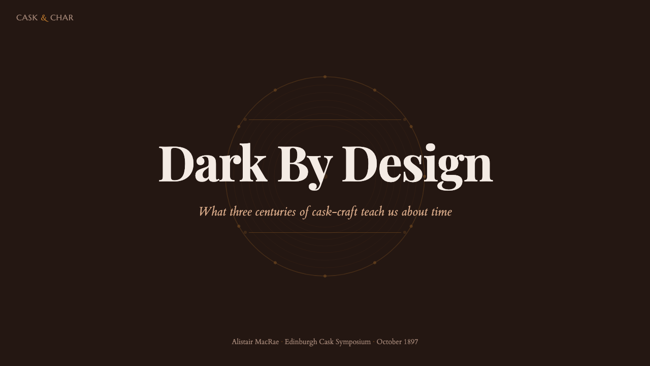
For presentation covers, Whisky Cooperage is most effective when the title is treated as a label rather than a headline floating on a generic dark field. Let a dark charred ground hold one formal serif name, with an amber or copper accent used as a seal, rule, or small cartouche edge. A roundel can anchor a date or category, while hoop-like bands establish a horizontal rhythm. The cover should feel like an invitation into a cellar, not an advertisement shouting across a shelf.
Content and data slides benefit from the style’s capacity for containment. Use a period serif for the principal statement, then give explanatory text a quieter supporting role. Divide sections with measured bands and fine engraved rules instead of bright panels. For data, charts should preserve the dark-ground hierarchy: oak-like forms can carry the structural series, amber can identify the most important signal, and copper can mark secondary distinctions. Treat labels, legends, and annotations as parts of an inventory or cask record, not as detached interface furniture.
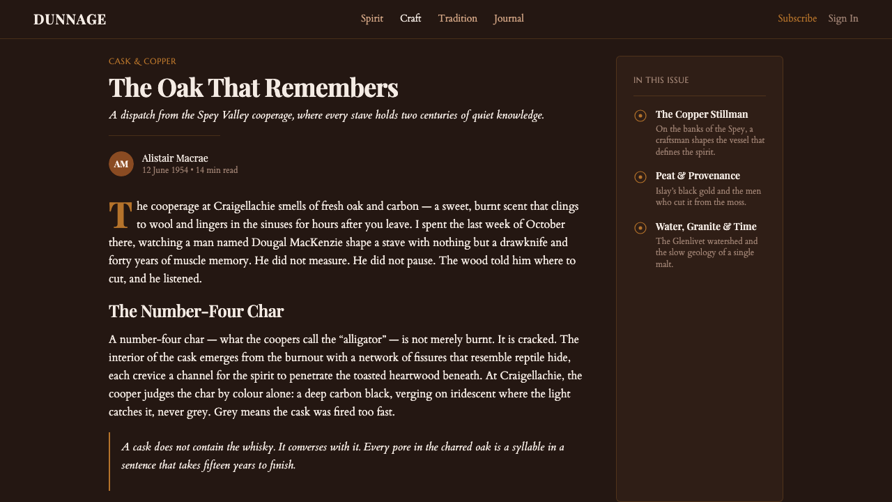
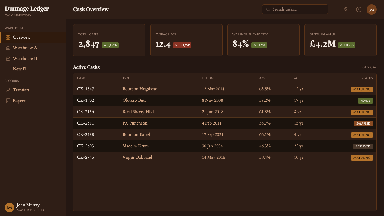
For web interfaces, the style suits dashboards, membership areas, provenance pages, and pricing experiences where depth, trust, and categorization matter. A dashboard can use framed modules that resemble labels or cask records, with roundels for status and hoop dividers for section boundaries. A pricing page can turn each offering into a formal bottling card rather than a pale commodity panel. The dark environment demands careful readability: the atmosphere must support navigation, controls, and comparison rather than hiding them behind texture or ceremonial detail.
In editorial and marketing work, Whisky Cooperage is strongest when it gives narrative material a sense of lineage. Long-form pages can use formal section titles, narrow engraved dividers, and reserved callouts that resemble archival label fields. Campaigns can alternate dense charred fields with warmer oak or amber moments to create the movement of entering and leaving warehouse light. Photography, if present, should sit comfortably with the material world of casks, copper, wood, and stored spirit instead of introducing a slick, unrelated luxury language.
The common mistake is to reduce the style to black backgrounds plus gold-like decoration. That produces generic premium branding, not Whisky Cooperage. The distinction lies in the relationship among char, oak, amber, copper, and cask structure. Do not cover every surface in faux distress, ornamental borders, or glowing metallic effects. Let the barrel logic decide where a band belongs, let the engraved type carry the ceremony, and reserve the warm highlights for moments that genuinely need to be found in the dark.
Whisky Cooperage — FAQ
Is Whisky Cooperage simply a luxury whisky style?
No. It can feel premium, but its source is craft and maturation rather than luxury display. The visual authority comes from charred oak, coopered structure, warehouse darkness, engraved lettering, and the practical life of the cask. If the design relies mainly on polished metallic ornament and generic darkness, it has shifted into a broader luxury language and lost the specific craft logic that defines Whisky Cooperage.
Can the style work without whisky imagery?
Yes. It does not require a bottle, a glass, or literal barrel illustration. The style can be carried by its underlying system: dark charred grounds, oak-and-amber hierarchy, copper restraint, hoop divisions, roundels, and engraved serif typography. It is especially useful for subjects involving provenance, stored value, craft process, archival records, or long-term stewardship, provided the material references remain coherent.
How should imagery be handled in a Whisky Cooperage layout?
Imagery should reinforce the cellar material world. Casks, oak surfaces, copper apparatus, warehouse interiors, and amber spirit belong naturally because they share the style’s physical vocabulary. Images should feel contained by the composition through labels, rules, or surrounding darkness, rather than opening into a bright lifestyle scene. When no image is necessary, typography and structural ornament are sufficient to create atmosphere.
Why are hoop bands and circular seals so important?
They translate the physical grammar of the cask into layout structure. Hoop bands imply tension, containment, and assembly; roundels recall barrel ends, seals, and inspection marks. Used well, they tell the viewer how to read the page while making the style feel built rather than decorated. Their value is structural, which is why they should frame information and divide sections instead of appearing as random vintage embellishment.
Where does Whisky Cooperage struggle?
It struggles where lightness, playfulness, rapid scanning, or broad emotional warmth are the primary product values. Children’s experiences, airy wellness products, highly casual social tools, and situations requiring a bright neutral baseline may find its darkness and ceremony too heavy. It also requires discipline in dense operational interfaces: the style can support dashboards, but only if readability and task flow remain more important than atmospheric detail.
Related design styles
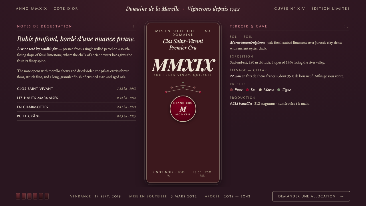 Burgundy VineyardRead by candlelight in a wine-lees cellar. Aged purple-red Pinot on near-blac…
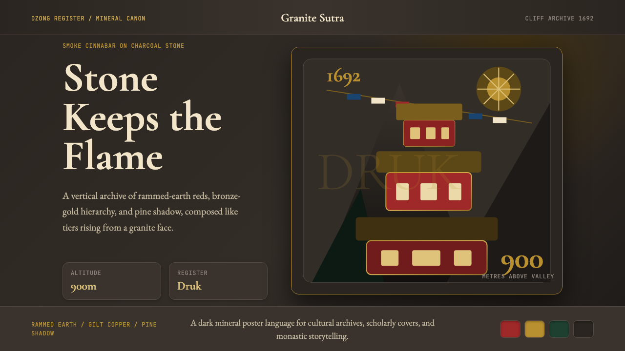 Bhutanese Tiger's Nest Cliff MonasterySacred altitude, mineral-dark. Cinnabar tiers and bronze rules climb charcoal…
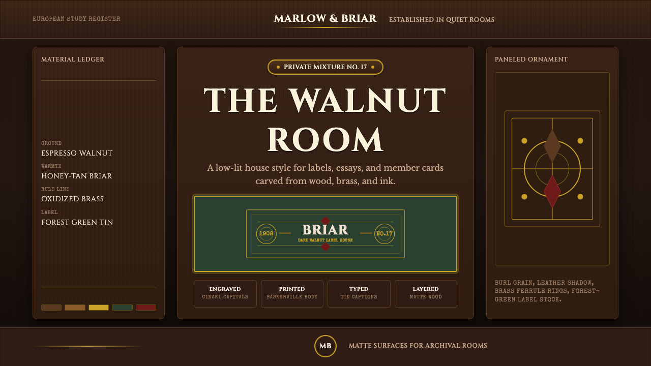 Briar Pipe & TobaccoWarm gloom, precisely aged. Brass rules and Cinzel capitals sit on espresso w…
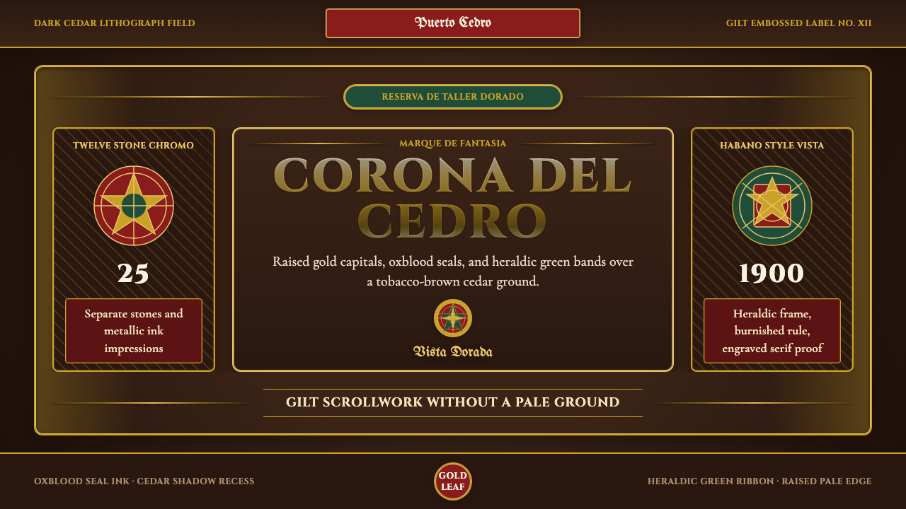 Cigar Box LabelGilt maximalism glows. Gold Cinzel capitals lock into a tobacco-brown framed…
 Fado SaudadeSaudade in shadow. Mourning black holds wine red, honey wood, and one gold li…
 French PâtisserieOrnament is the luxury. Celadon ground, gilt cartouches, Garamond and script…