What is Fado Saudade?
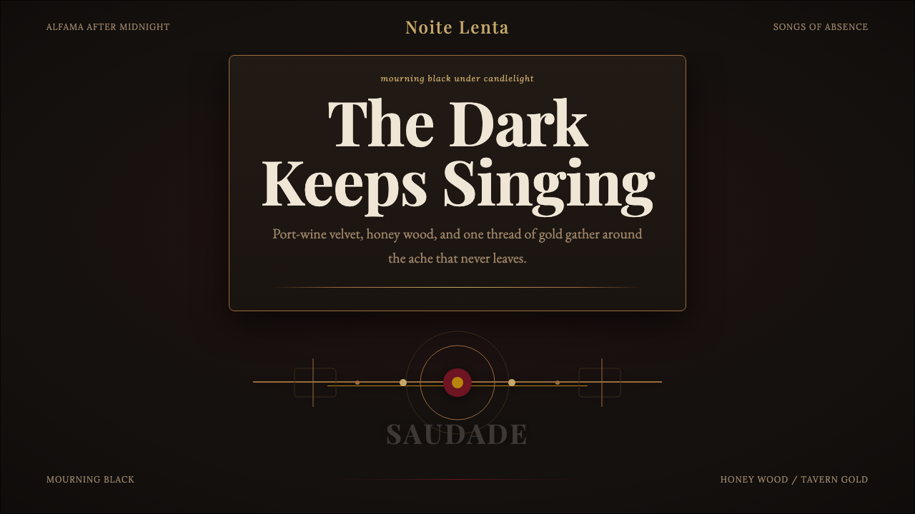
Fado dresses a design in mourning black and lets only a few things survive the dark — wine red, honeyed wood, and a single flame of gold.
Fado Saudade in brief
Fado is the design language distilled from Portugal's national song of longing — a musical tradition built around saudade, the untranslatable ache of missing something lost, or something that never quite arrived. Visually, the style takes its cue from the classic casa de fado: a small tavern in Lisbon's old quarters, lit by almost nothing, where a singer performs beneath a single overhead lamp while the rest of the room dissolves into shadow.
The palette is therefore built around near-total darkness, with warmth allowed to surface only in small, deliberate doses. Where Bauhaus removes ornament because ornament is waste, Fado removes light because light is precious — every warm tone that appears has to earn its place against the black, the way a single candle earns the attention of an entire room. The effect is somber and intimate rather than bright and declarative.
What keeps the style from reading as simply 'dark mode' is its literary weight. Fado lyrics are poetry first, sung second; the tradition carries an entire vocabulary of loss, the sea, absent lovers, and fate. A Fado-derived design should feel like it is holding a story, not just dimming its background — texture and material stand in for words the way a shawl, a guitar, and a glass of wine stand in for an entire unspoken history in a fado performance.
Where does Fado Saudade come from?
Fado's classical era runs roughly from 1900 to 1950, though the song form itself is older, tracing back to the working-class neighborhoods of Lisbon in the early nineteenth century — Alfama, Mouraria, and the docks along the Tagus river. Its earliest documented star was Maria Severa Onofriana, a nineteenth-century singer whose short life and tavern performances fixed Fado's association with the demimonde: sailors, the urban poor, and a nightlife lived largely after dark. That origin in low light and modest rooms is not incidental to the aesthetic — the style was never staged for grand daylight venues, and its visual identity still carries the memory of the tavern.
The genre's defining modern figure is Amália Rodrigues, whose career from the 1940s onward carried Fado from neighborhood taverns to concert halls and international stages without softening its core mood. Rodrigues performed in a xaile preto, a black shawl, which became as much a part of the Fado image as the songs themselves — a singer in unadorned black, holding a room through voice and stillness rather than spectacle. Guitarist and composer Alfredo Marceneiro shaped Fado's instrumental language alongside her, and Carlos do Carmo later carried the tradition into the second half of the twentieth century, updating its arrangements while preserving its emotional core.
Central to the sound, and to the visual world built around it, is the guitarra portuguesa — a pear-shaped, twelve-string instrument distinct from the classical Spanish guitar, prized for its bright, ringing tone and often finished in a warm, honey-toned wood with delicate mother-of-pearl inlay around the soundhole and headstock. In the dim room of a casa de fado, that instrument is frequently the only object catching light besides the singer's face — its polished wood grain and pale inlay becoming small islands of detail in an otherwise dark frame.
Fado was inscribed on UNESCO's Representative List of the Intangible Cultural Heritage of Humanity in 2011, formal recognition of a tradition that had, for over a century, encoded a particular way of being Portuguese: reserved, melancholic, proud of endurance rather than triumph. The design language inherited from this history is not costume-drama Portugal of tile and sunlight, but its nocturnal, interior counterpart — the Lisbon of narrow stairways and closed shutters, where the important things happen in rooms too dark to photograph well.
What defines the Fado Saudade look?
Color
The ground is a near-total mourning black, closer to the inside of a shuttered room than to a neutral dark gray — it should read as absence, not as a design neutral. Against it, only a few warm tones are allowed to exist: a deep wine or garnet red recalling tavern wine and velvet upholstery, a honeyed mahogany brown recalling polished guitar wood, and a slow, low-saturation gold recalling candlelight rather than metallic shine. These warm tones never compete with each other for dominance in the same area — one leads, the others recede.
Light and Contrast
Because the aesthetic is built on the memory of a single overhead lamp in a dark tavern, contrast should behave like stage lighting rather than even illumination — one focal area catches warmth and detail while everything surrounding it fades toward black. Rather than distributing brightness evenly across a layout, a Fado-derived composition concentrates it, so the eye is pulled toward one place the way it is pulled toward a singer under a single bulb.
Typography
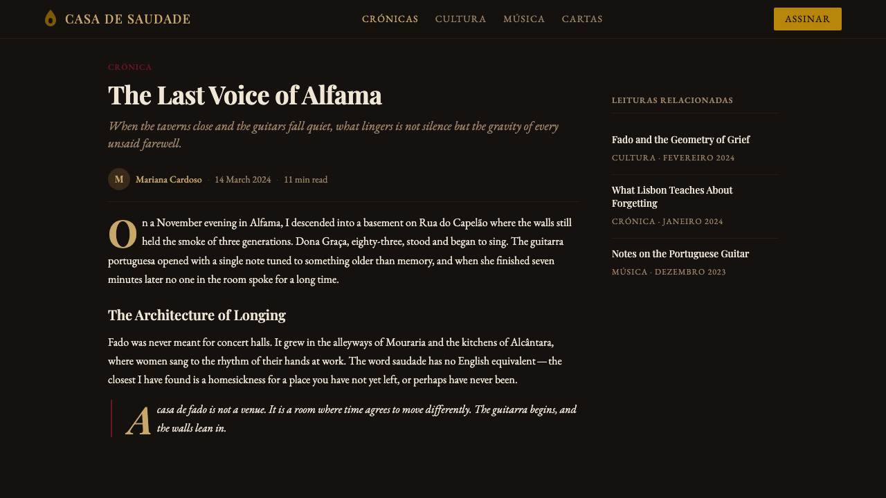
Type should feel literary and unhurried rather than mechanical — the visual equivalent of sung poetry rather than a printed notice. A serif or humanist letterform suits the mood better than a geometric sans, and generous line spacing lets each line of text sit apart the way a sung verse pauses before the next. Headlines can afford quiet drama through scale or a touch of gold, but body copy should stay restrained and legible, closer to a printed songbook than a poster.
Material and Texture
Where a flat, digital-native style rejects simulated materials, Fado leans into a handful of specific, tactile ones: polished wood grain, worn velvet, soft candle glow, and the pale gleam of mother-of-pearl inlay. These materials should appear sparingly and always attached to a meaningful surface — a card border finished like inlay, a divider that behaves like a wood grain edge — rather than applied as a generic decorative texture across the whole layout.
Composition and Space
Space in a Fado layout functions like the dark air of a tavern room — it is not empty, it is atmosphere. A composition should feel intimate rather than expansive: content clustered toward one warm focal point, with generous dark space around it standing in for the unlit corners of the room. This differs from ordinary negative space in flat design, which reads as clean efficiency; here, the dark space carries mood and should feel inhabited by shadow rather than simply unused.
Ornament and Restraint
The style is intimate, not opulent — gold appears as a single accent line, a thin border, or a small detail catching light, never as a gilded surface or a repeated decorative motif. The temptation with a mourning-and-candlelight palette is to overuse gold as a signal of luxury; authentic Fado restraint treats gold the way a single candle treats a room — as the one thing burning, not as wallpaper.
Mood and Emotional Register
Every decision in this system should be tested against a single question: does it feel like saudade, or does it just feel dark? A Fado-derived design is somber and reflective, carrying weight without becoming morbid, and warm without becoming celebratory. It should never tip into generic gothic drama or into the cheerful glow of a candlelit romance-brand aesthetic — the emotional register sits specifically in longing, memory, and quiet endurance.
Who shaped Fado Saudade?
Rodrigues carried Fado from Lisbon's neighborhood taverns to concert halls and international audiences from the 1940s onward, becoming the genre's defining voice. Her signature black shawl, the xaile preto, fused the song tradition with a single, unadorned visual image — a performer in mourning black under a solitary light — that remains the aesthetic's most direct visual reference point.
Regarded as Fado's earliest documented star, Severa performed in the taverns of nineteenth-century Lisbon and helped establish the genre's lasting association with tavern life, the urban working class, and a nocturnal, unpolished world rather than a formal concert setting. Her legend fixed Fado's origins firmly in dim rooms rather than grand stages.
A guitarist and composer central to shaping Fado's instrumental language, Marceneiro helped define the sound that the guitarra portuguesa contributes to a performance — bright, ringing, and precise against the otherwise vocal-led, sparse arrangement. His work underlines why the instrument itself, and its honey-toned wood, became such a central visual and material reference for the style.
Carrying the Fado tradition into the second half of the twentieth century, do Carmo updated its arrangements and brought it to new audiences while preserving its emotional core of longing and restraint. His career demonstrates the tradition's capacity to evolve without abandoning the somber, intimate mood at its center.
How do you use Fado Saudade today?
Fado is a style built for content that needs to feel weighted, personal, and a little melancholic — it works best where a brand or a story wants to feel remembered rather than announced. Applying it well means resisting the urge to brighten it up for the sake of conventional readability; the darkness is the point, and warmth should always feel earned rather than default.
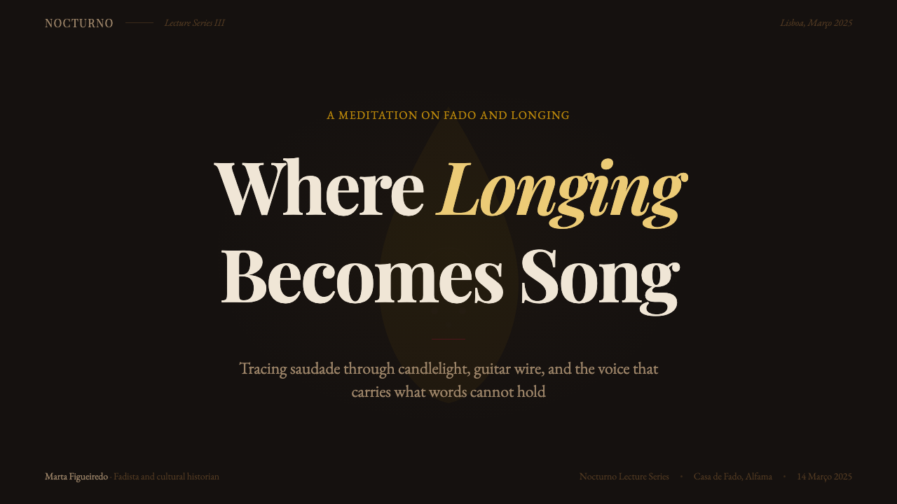
For presentation slides, Fado suits cover pages built around a single warm focal element — a title picked out in a low-saturation gold against a black field, perhaps with a thin wine-red rule beneath it, with the rest of the slide left in shadow rather than filled with supporting graphics. Content and data slides should keep the same discipline: one warm accent color for emphasis or key figures, generous dark space between blocks of information, and restrained, literary type rather than bold geometric labels. A chart on a Fado slide should look like a small lit object in a dark room, not a bright infographic competing for attention.
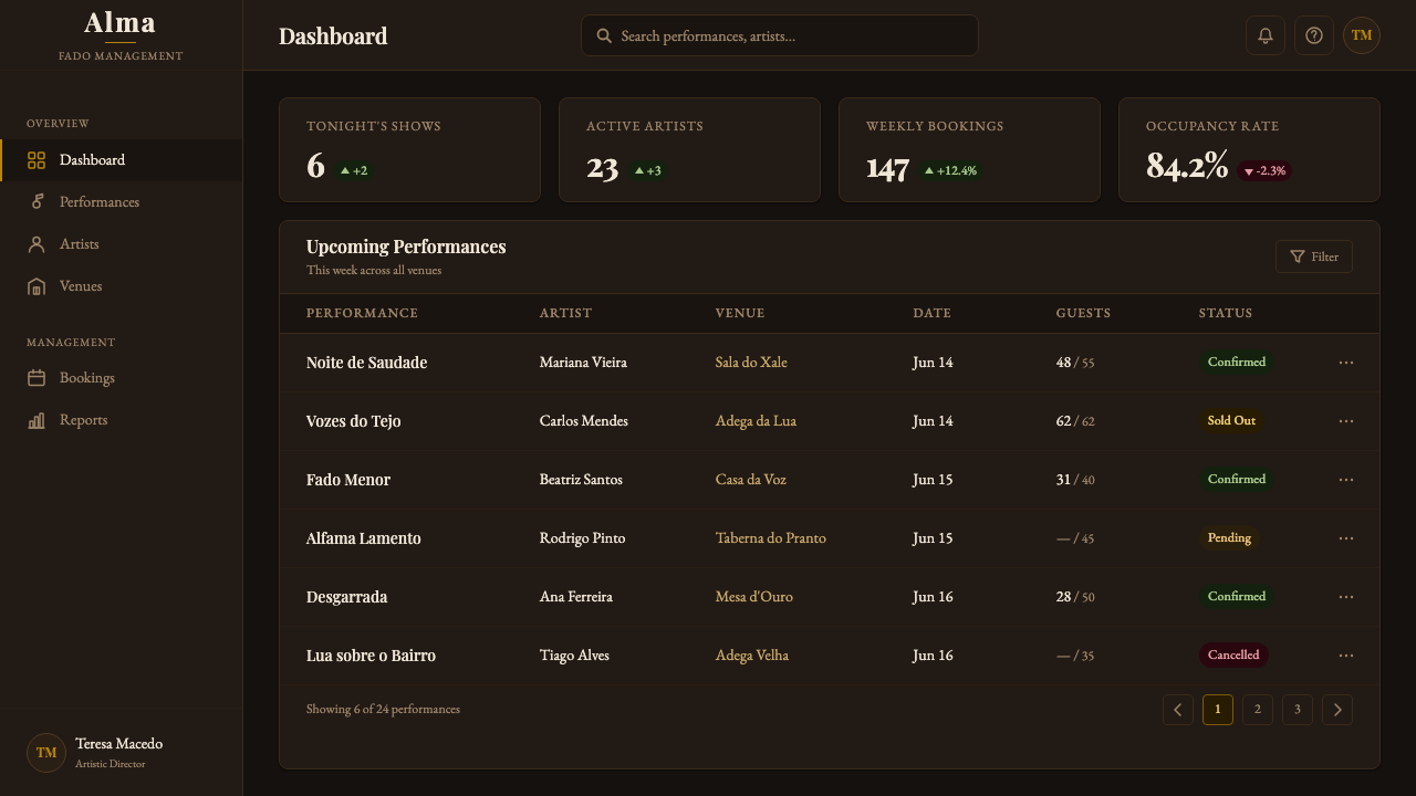
For web interfaces, the style translates well to dashboards and pricing pages that want to feel premium and considered rather than energetic — a near-black background, wine-red or honey-toned accents reserved for primary actions or highlighted tiers, and gold used sparingly for a single call-to-action or a top-tier plan marker. Card components benefit from a subtle inlay-like border rather than a bright drop shadow, and navigation should stay quiet — typographic, low-contrast, present but not competing with the one warm focal point on the page.
For editorial and marketing work, Fado is well suited to storytelling that leans on memory, heritage, or craft — travel content about Lisbon, brand narratives about tradition and longevity, or any long-form piece that benefits from a slower, more reflective reading rhythm. A marketing page might alternate long stretches of near-black space with small, warmly lit feature blocks, using restraint itself as the persuasive device: the reader's attention is drawn precisely because so little is competing for it.
A common mistake when applying Fado is treating it as ordinary dark mode with a red accent swapped in — flooding the layout with mid-tone reds or golds until the design loses its near-total darkness and starts to look festive or gothic instead of mournful. Authentic Fado work keeps warmth scarce and concentrated: one dominant dark ground, one warm accent doing most of the emotional work, and a second warm tone appearing rarely, if at all, exactly the way a single candle — not a chandelier — lights the room.
Fado Saudade — FAQ
Is Fado just a dark mode with red and gold accents?
No — the difference is scarcity and mood, not just color choice. Ordinary dark mode distributes contrast evenly for readability and treats accent colors as interchangeable brand signals. Fado concentrates warmth into one or two deliberately scarce elements against a mourning-black ground, the way a single candle or lamp lights a tavern room, and the whole composition is built to feel intimate and melancholic rather than simply low-light. If every element gets an equal share of red or gold, the style collapses into generic dark UI.
Can Fado work for a bright, cheerful brand?
Generally no, at least not without contradicting the style's core mood. Fado is built specifically around saudade — longing, melancholy, and quiet endurance — and its visual restraint exists to serve that emotion. Forcing it onto a cheerful, high-energy brand tends to produce a design that looks somber for no reason, which reads as confusing rather than sophisticated. The style is better suited to brands or content that are comfortable being read as reflective, intimate, or a little wistful.
How much gold is too much gold in a Fado layout?
If gold is doing more than marking one focal point — a single accent line, a highlighted call-to-action, a small detail catching light — it is likely too much. The reference image is one candle in a dark room, not a chandelier: gold should feel like the single warmest, brightest note in the composition, not a repeated decorative color applied to borders, icons, and headings all at once. When gold starts appearing everywhere, the design loses the sense of scarcity that makes the single point of light meaningful.
What kind of imagery fits a Fado-derived design?
Imagery that itself embraces low light works best — photography with a single visible light source, deep shadow occupying most of the frame, and warm tones emerging only where the light falls, echoing the way a casa de fado is lit by one lamp over the performer. Images that are evenly lit, high-key, or brightly colored tend to fight the palette rather than support it. Close, intimate framing — an instrument, a hand, a half-lit face — suits the mood better than wide, brightly lit establishing shots.
Does Fado work well for data-heavy interfaces like dashboards?
It can, but it requires more discipline than pure dark UI. A Fado-derived dashboard should still make data legible first — body text and key figures need enough contrast against the black ground to read easily — but should reserve its wine-red and gold accents for a small number of genuinely important signals: a highlighted metric, a primary action, a top-tier plan. Used carelessly, with warm accents scattered across every chart and label, it becomes harder to read and harder to feel anything from.
Related design styles
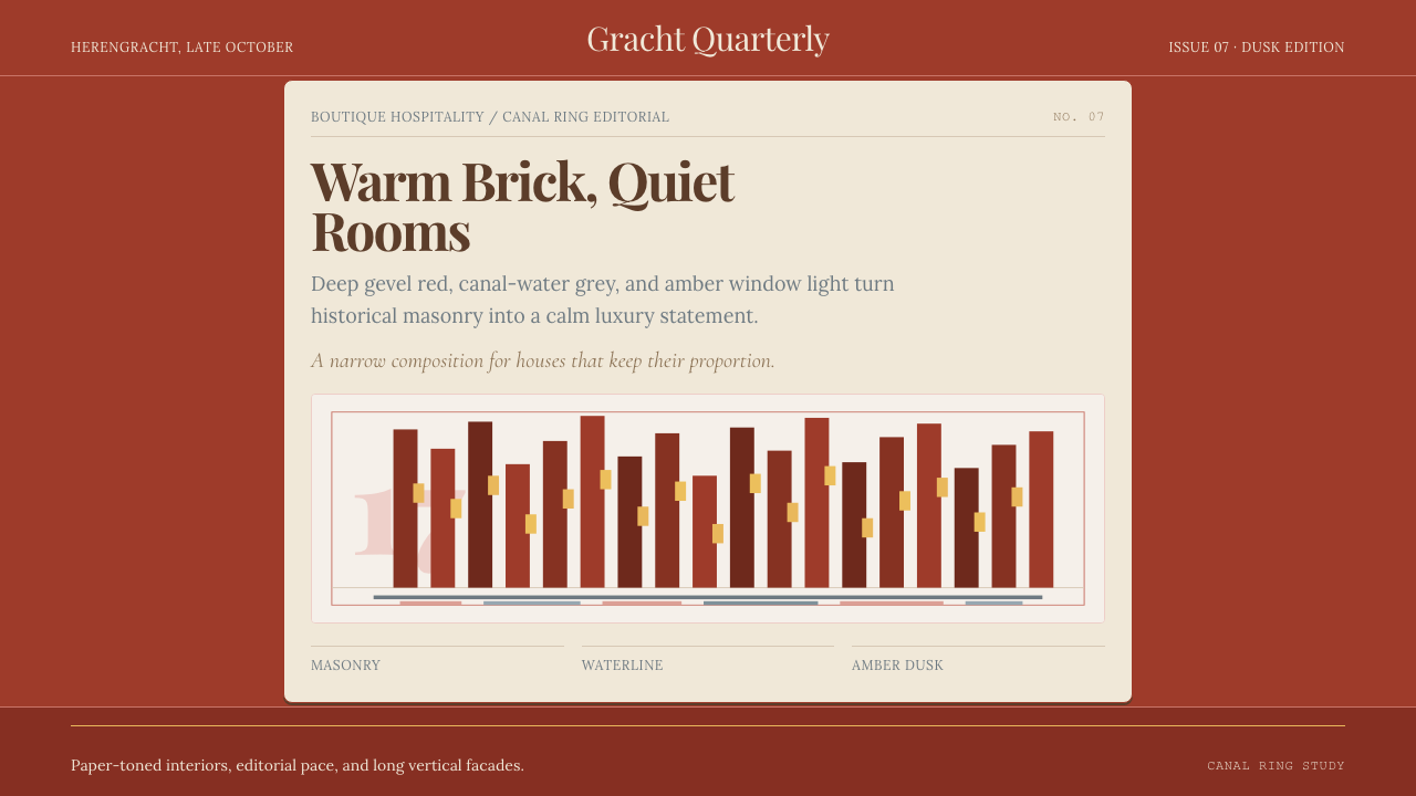 Amsterdam Canal HouseQuiet luxury in brick and cream. Playfair serif, narrow columns, amber window…
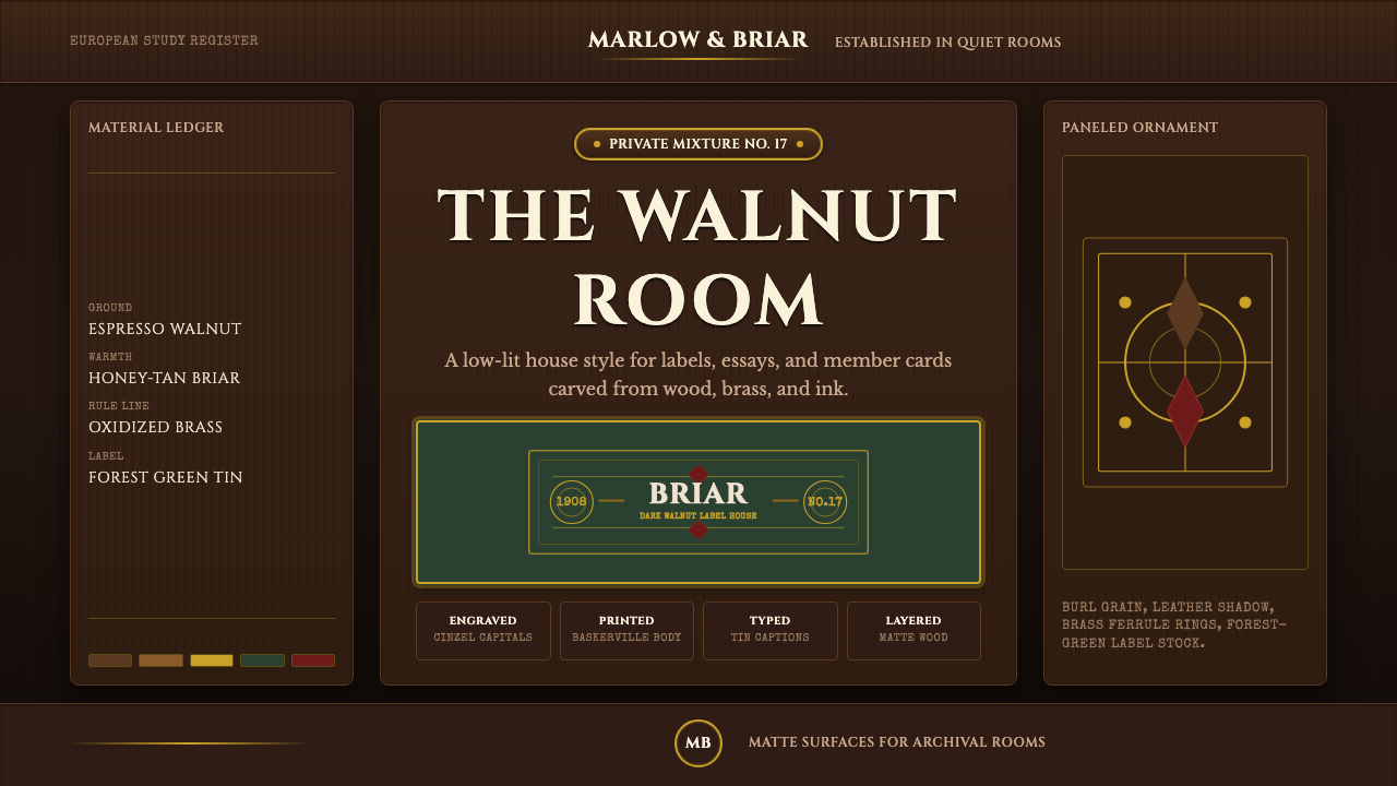 Briar Pipe & TobaccoWarm gloom, precisely aged. Brass rules and Cinzel capitals sit on espresso w…
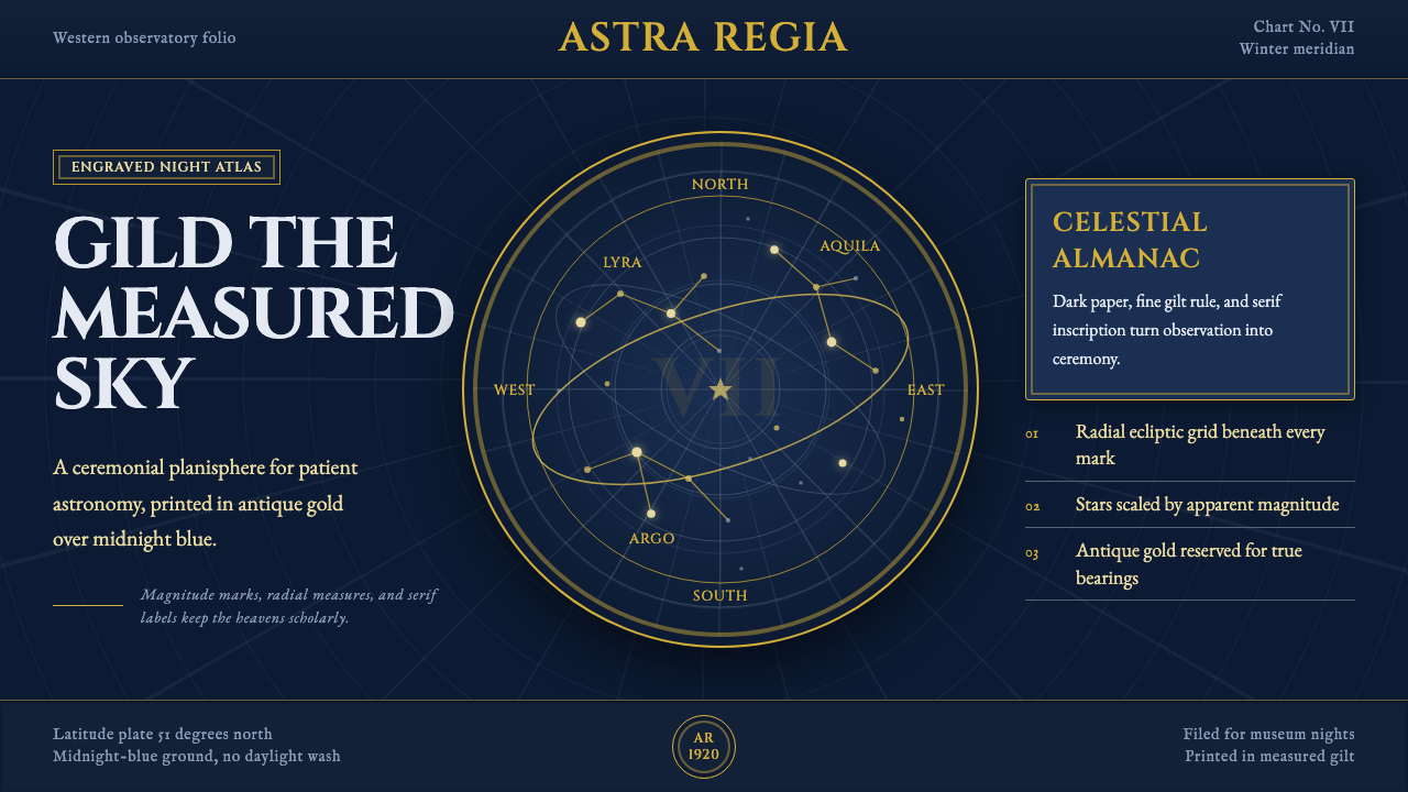 Vintage Star ChartScholarly night, gilded. Cinzel caps orbit gold grids and magnitude stars.
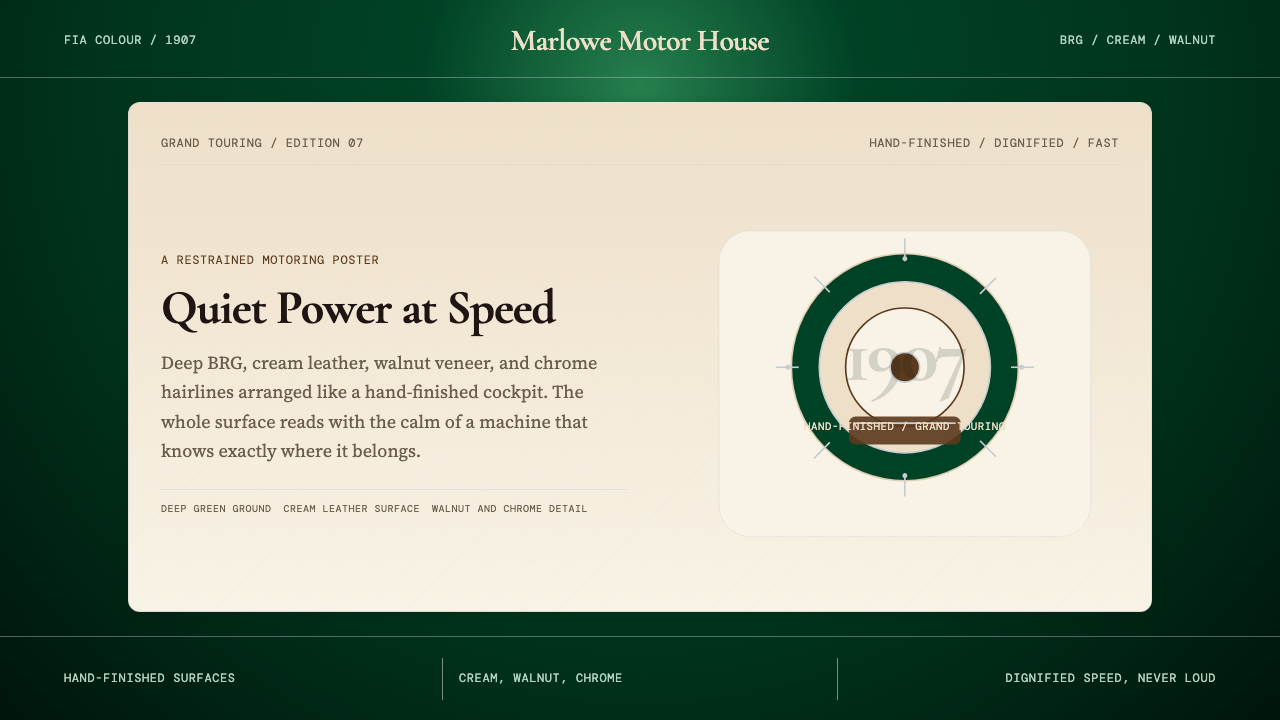 British Racing Green (Motorsport, 1907)Quiet authority at speed. Deep BRG, cream leather, walnut, and chrome hairlin…
 Dior New Look (1947)Couture speaks softly. Cream ground, navy Didot capitals, and gold hairlines…
 Kandy Esala PeraheraA torchlit night procession, not a poster. Gold flecks and crimson brocade fl…