What is Vintage Star Chart?
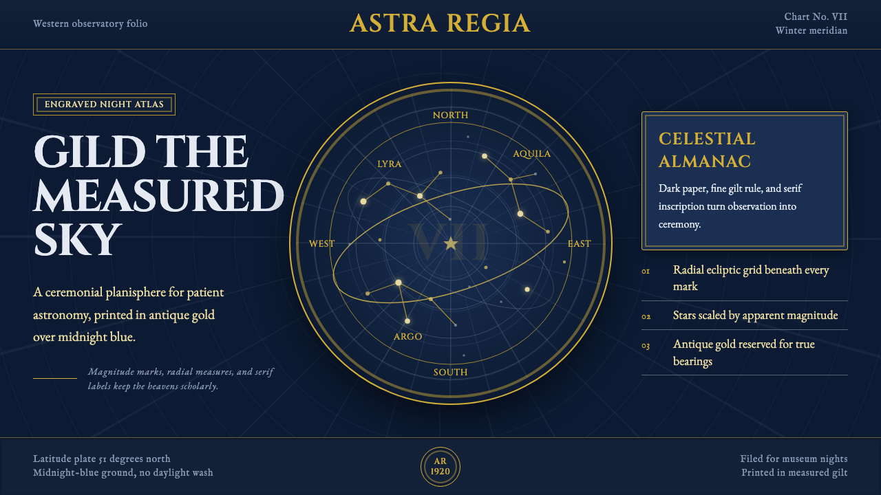
A vintage star chart turns the night sky into an instrument — gilded constellations, magnitude-graded stars, and the hushed authority of an antique planisphere.
Vintage Star Chart in brief
Vintage Star Chart is the decorative celestial planisphere reimagined as an interface: a deep midnight-blue dome printed over with fine gold linework, mythological beasts traced in delicate engraved contours, and star points whose size steps down in careful gradation to mark magnitude — the brightest stars drawn as bold dots, the faintest as barely-there pricks of light. Radial grid lines, standing in for the ecliptic and the celestial equator, sweep across the sky and quietly remind the eye that this is a measured dome, not a random scattering of light.
The overall effect sits between science and ornament. Nothing about the chart is soft or atmospheric — every constellation figure, every grid arc, every numeral is drawn with the same fine, confident engraved line, as if cut into copper rather than painted. Gold is used the way a bookbinder uses gilt edging: as a controlled, antique accent that catches light without ever behaving like a modern glow or a neon highlight. The ground never lightens; a star chart that loses its darkness stops reading as night and becomes just another decorated surface.
What distinguishes this style from generic 'space' or sci-fi visual language is restraint and age. There is no lens flare, no nebula gradient, no futuristic glow — only the calm, exact vocabulary of an eighteenth- or nineteenth-century engraver mapping what could actually be seen, dressed in the warm metallic finish that popular planisphere publishers added for the parlour and the schoolroom in the early twentieth century.
Where does Vintage Star Chart come from?
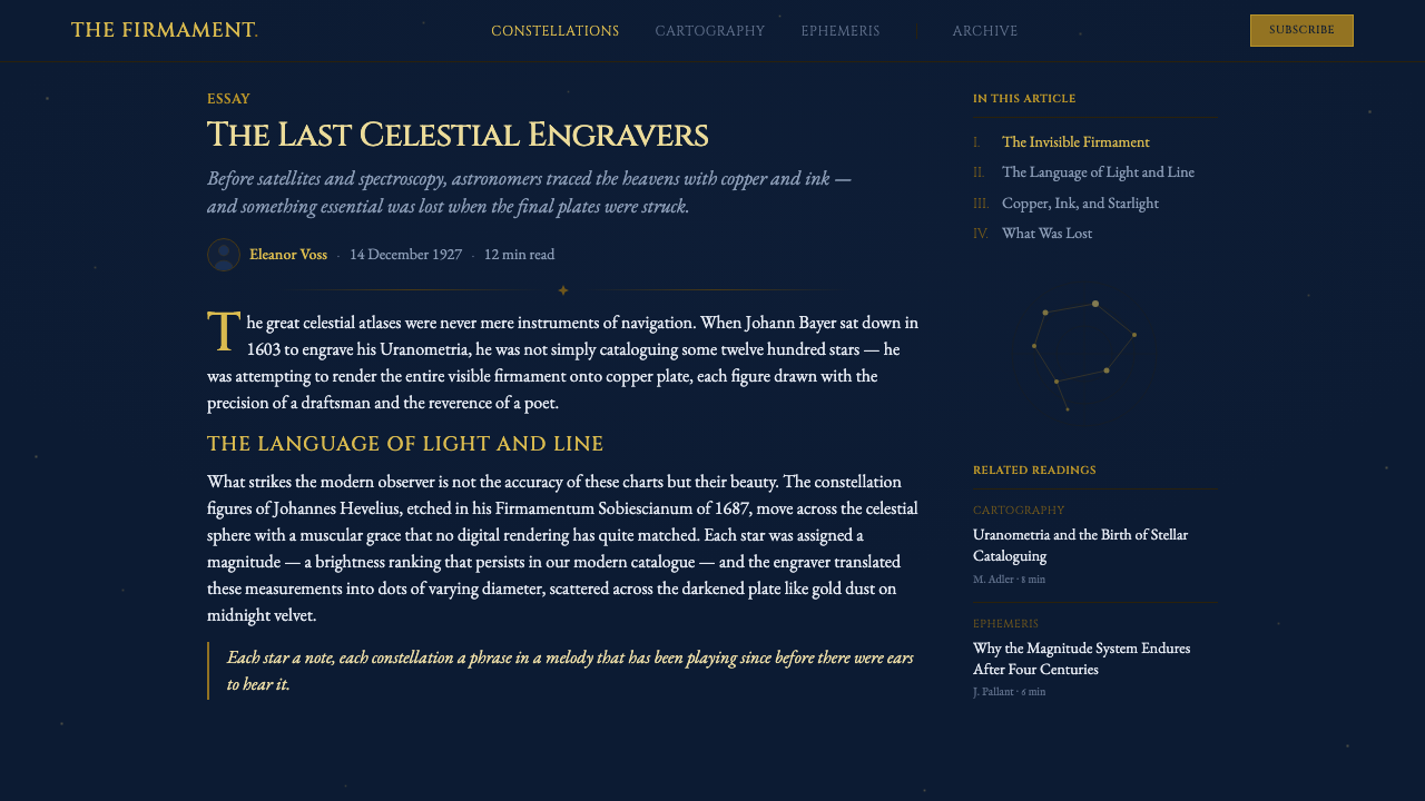
The decorative planisphere descends directly from the great age of printed star atlases, and its earliest landmark is Johann Bayer's Uranometria, published in Augsburg in 1603. Bayer, a German lawyer and amateur astronomer, produced the first atlas to map the entire visible sky — both hemispheres — on a consistent, uniform scale, using finely engraved copperplates and assigning Greek letters to stars within each constellation in rough order of brightness, a labeling convention still known today as a Bayer designation. Uranometria set the visual template that every later star atlas would answer to: mythological constellation figures drawn with careful anatomical and textural detail, stars plotted with geometric precision, and the whole composition bordered by measured coordinate lines.
Later in the seventeenth century, the Danzig brewer-turned-astronomer Johannes Hevelius extended this tradition with his own naked-eye observations, compiled and published posthumously as Firmamentum Sobiescianum in 1687. Hevelius engraved his own plates by hand, and his constellation figures are prized for their lively, almost painterly linework — animals and mythological beings rendered with more movement and individuality than Bayer's more static forms. Hevelius also mirrored his star maps, presenting the sky as seen from outside the celestial sphere rather than from below it, a convention that shaped how later atlas-makers thought about orienting a printed sky.
The tradition reached its most elaborate expression with the German astronomer Johann Bode's Uranographia, published in 1801. Uranographia was, for its era, an extraordinarily dense and ambitious undertaking — thousands of stars plotted across dozens of oversized copperplate sheets, crowded with constellation figures both ancient and newly invented. It represents the last great flowering of the illustrated star atlas as a working scientific tool, produced just before professional astronomy began to strip away decorative figures in favor of plain coordinate grids and catalog numbers.
The specific navy-and-gold aesthetic belongs to a later, more popular chapter: the decorative planispheres sold across Western Europe between roughly 1900 and 1950, epitomized by the Philip's-brand star charts and their many imitators. These were not working instruments for professional observatories but affordable, attractively printed sky-guides meant for the amateur, the student, and the home library. Their publishers kept the engraved figures and coordinate grids inherited from Bayer, Hevelius, and Bode, but recast them in a warm, gilded palette against a deep night-blue ground — trading scientific austerity for a display-worthy, faintly luxurious object that still carried three centuries of cartographic authority behind it.
What defines the Vintage Star Chart look?
Color
The palette is built from a single deep, cool night-blue ground paired with a narrow range of warm antique gold and brass tones used only for linework, lettering, and accents. There is no secondary bright color and no neon: gold is meant to read as old metal catching candlelight, never as a glowing highlight. The contrast between the cool ground and the warm accent is what gives the style its sense of hushed, after-dark authority.
Typography & Lettering
Titles and labels favor a classical, engraved capital letterform — the kind of stately, evenly-weighted lettering cut by hand into copperplate atlas title pages — generously spaced rather than tightly set. Smaller annotations, such as constellation names or coordinate figures, drop to a plainer, more workmanlike letterform, echoing the way historic atlases mixed a ceremonial title face with a quieter labeling face for dense technical detail.
Iconography & Line Work
Constellation figures are drawn as fine, continuous engraved contours — mythological animals and heroes traced with the same delicate, confident line whether describing a wing, a claw, or a fold of drapery. Cross-hatching and stippling stand in for shading rather than any soft gradient. Stars themselves are rendered as simple dots stepped through several sizes, the size difference doing all the work of signaling brighter versus fainter — a wholly graphic, non-photographic way of representing light.
Composition & Grid
The organizing structure is radial rather than rectilinear: concentric circles and straight lines fanning out from a central point stand in for the ecliptic and equatorial coordinate systems, dividing the dome into measured wedges the way a compass rose divides a map. Constellation figures are arranged to follow this radial logic, their bodies bending around the curve of the chart rather than sitting in a flat rectangular frame.
Ornament & Gilding
Ornament is present but disciplined: a bordering ring, a compass-style rose marking cardinal points, a title cartouche framed with restrained flourishes. These flourishes never compete with the star field for attention — they behave like the tooled edges of an old book cover, marking the object as crafted and valuable without spilling decoration into the sky itself.
Ground & Darkness
The night-blue ground must stay dark everywhere it appears, including in secondary surfaces like cards, panels, or navigation bars. Lightening the ground even slightly breaks the illusion of night and turns the chart into a flat decorative pattern rather than a sky. Depth and separation between elements come from line weight and gold density, never from lightening or brightening the background itself.

Who shaped Vintage Star Chart?
A German lawyer and amateur astronomer, Bayer published Uranometria in 1603 — the first atlas to chart the entire sky on a consistent scale using precisely engraved copperplates. His system of labeling stars within a constellation with Greek letters, roughly in order of brightness, remains in astronomical use today and set the visual and organizational template that every subsequent decorative star atlas, including this style's direct ancestors, would follow.
A Danzig brewer turned astronomer, Hevelius built his own observatory and engraved his own copperplates by hand, publishing his star atlas Firmamentum Sobiescianum posthumously in 1687. His constellation figures are notable for their lively, almost sculptural linework, and his practice of mirroring the sky as seen from outside the celestial sphere influenced how later mapmakers oriented printed star charts.
The German astronomer Johann Bode produced Uranographia in 1801, one of the largest and most densely detailed star atlases ever printed, plotting thousands of stars across dozens of oversized engraved sheets. It marks the high point of the illustrated star atlas as a working scientific instrument, produced just before professional astronomy moved decisively toward plain coordinate grids and abandoned decorative constellation figures.
An American schoolteacher and popularizer of astronomy, Burritt published Geography of the Heavens in 1833 alongside an accompanying atlas aimed squarely at students and general readers rather than professional observatories. His work helped establish the tradition of the affordable, decoratively engraved sky-atlas for the home and classroom — the same popular market that the twentieth-century gilded planisphere, and this style, ultimately grew out of.
How do you use Vintage Star Chart today?
Vintage Star Chart transfers well anywhere a designer wants to borrow the quiet authority of an antique scientific instrument without tipping into science-fiction spectacle. Because its vocabulary is graphic and rule-based — a dark ground, graded dot sizes, radial grids, restrained gold linework — it can be applied to subjects that have nothing to do with astronomy, as long as the underlying content can be reorganized around a radial or point-based logic. The style rewards patience: its authority comes from precision and restraint, not from filling every inch of the dark ground with detail.
On presentation slides, the style suits a cover built around a single radial burst of gilded lines and a title set in classical engraved capitals against the night-blue ground. Content slides work best when a small number of ideas are arranged like constellations — a handful of graded dots connected by fine gold lines — rather than dense bullet lists. Data slides benefit especially: a scatter of figures can be redrawn as a star field where magnitude-style dot sizing communicates relative importance, and a coordinate ring can double as an axis or a category wheel.
In web interfaces, the palette suits dark-mode dashboards and premium pricing pages where a small gold accent should read as the highlighted or recommended option against an otherwise composed, dark surface. Dividers and card borders work best as thin, engraved-feeling hairlines rather than soft shadows, and iconography should stay close to the fine constellation-line style rather than switching to flat modern glyphs, which breaks the antique illusion immediately.
For editorial and marketing work, the style is well suited to long-form storytelling with a strong sense of occasion — anniversary announcements, luxury or heritage branding, planetarium and observatory promotion, astrology-adjacent content, or any feature that benefits from a night-sky hero image. A gilded initial letter or a radial diagram opening a long article does the same work that a full-page illuminated star map once did for a book's frontispiece.
The most common mistake is treating the gold as a bright accent color rather than an antique metal — pushing it toward a flat, saturated yellow makes the whole composition read as generic 'space' branding instead of an engraved atlas. A second frequent error is overcrowding the dark ground with too many stars or too many constellation figures at once, which erases the careful hierarchy of magnitude and turns a measured sky into visual noise; a genuine chart earns its density slowly, star by star.
Vintage Star Chart — FAQ
Can Vintage Star Chart work with a light background instead of dark?
Not really, and not without losing the point of the style. The chart's entire logic depends on gold linework catching the eye against a dark ground, the way engraving catches candlelight on a night-blue page. On a light background the same linework simply reads as thin black-and-gold decoration with no sense of night or sky, and the style collapses into generic vintage ornament rather than a celestial instrument.
How do I keep the zodiac or astrology references from feeling kitschy?
Treat any zodiac figure exactly the way the historical atlases treated it: as one constellation among many, drawn with the same fine engraved line and the same restrained gold as every other figure on the chart, never enlarged, colored differently, or set apart with a glowing outline. The moment a single sign is singled out and given special decorative treatment, the chart stops looking like a scientific instrument and starts looking like a horoscope graphic.
Does this style suit subjects that have nothing to do with astronomy, like finance or data reporting?
It can, as long as the content can be reorganized around points and connections rather than bars and columns. A portfolio of holdings, a set of key metrics, or a network of relationships can all be redrawn as a 'star field,' with magnitude-style dot sizing standing in for scale or importance and fine gold lines standing in for relationships. It suits contexts that want to feel authoritative, considered, and a little exclusive; it is a poor fit for anything that needs to feel fast, casual, or playful.
What's the difference between this and a generic neon 'outer space' theme?
A generic space theme borrows from science fiction: glowing nebulae, lens flares, saturated purples and blues meant to suggest distance and technology. Vintage Star Chart borrows from cartography: it is flat, engraved, and historically specific, built from the same graphic vocabulary an eighteenth-century printer would have used to describe a sky that could actually be seen with the naked eye. Where the sci-fi version wants to feel infinite and futuristic, this style wants to feel measured, printed, and old.
How many stars or connecting lines is too many before the composition feels cluttered?
Historical atlases kept the eye moving by leaving generous dark space between figures, even on their most crowded pages — density came from careful detail within a constellation, not from packing constellations edge to edge. As a working rule, if the dark ground is more than roughly a third covered by stars, lines, and figures, the composition has likely tipped from a measured sky into visual noise, and elements should be thinned or grouped into fewer, clearer figures.
Related design styles
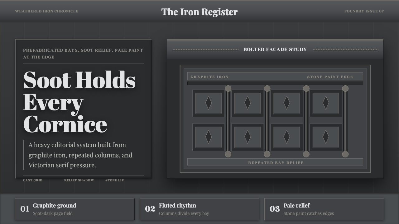 Cast Iron SoHo FacadesIron remembers the city. Graphite bays, Didone type, and pale stone-paint edg…
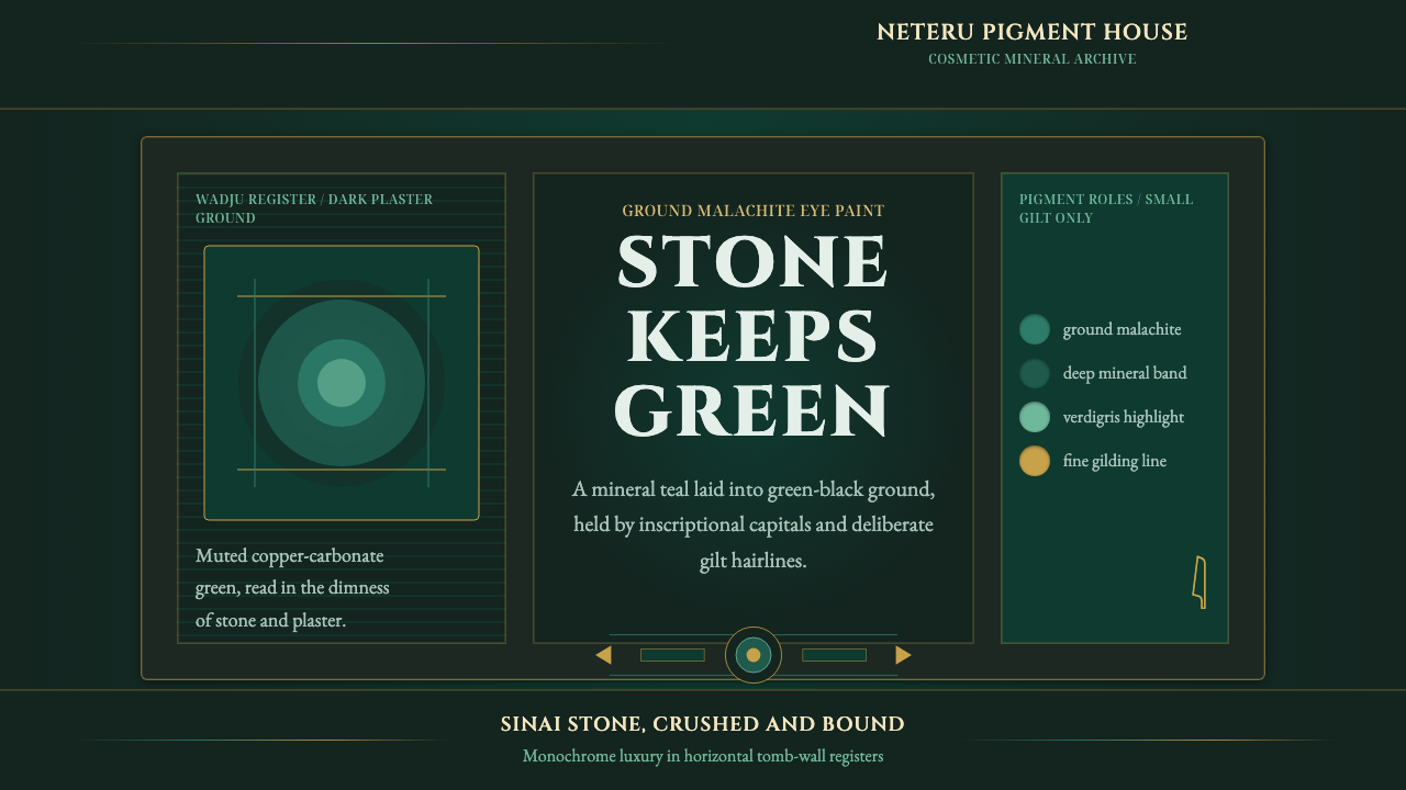 Egyptian Malachite PigmentGrave mineral green. Muted malachite bands on green-black stone, cut by fine…
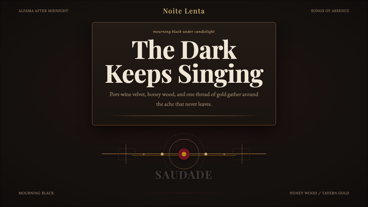 Fado SaudadeSaudade in shadow. Mourning black holds wine red, honey wood, and one gold li…
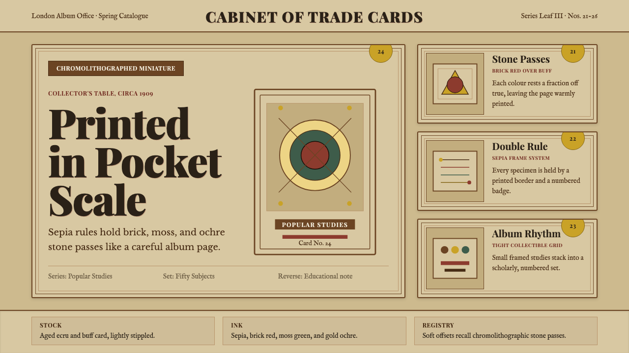 Cigarette Card SetCollectible scholarship. Sepia double-rules, buff stock, and ochre badges fra…
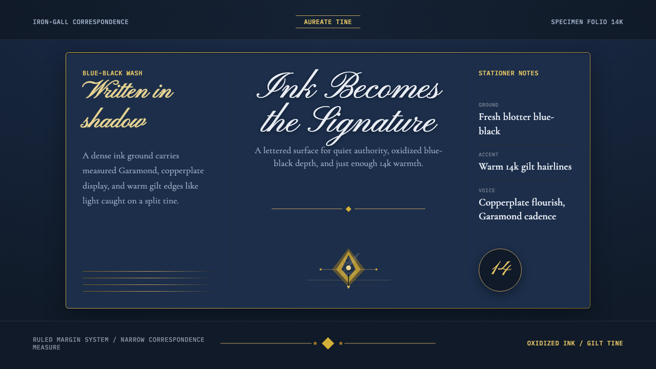 Fountain Pen & InkInk holds the room. Blue-black wash, Pinyon script, and 14k gilt rules do the…
 Herero Victorian Dress (Namibia)Memorial wears structure. Red, indigo, green pleats frame gilt brass on dark…