What is Fountain Pen & Ink?
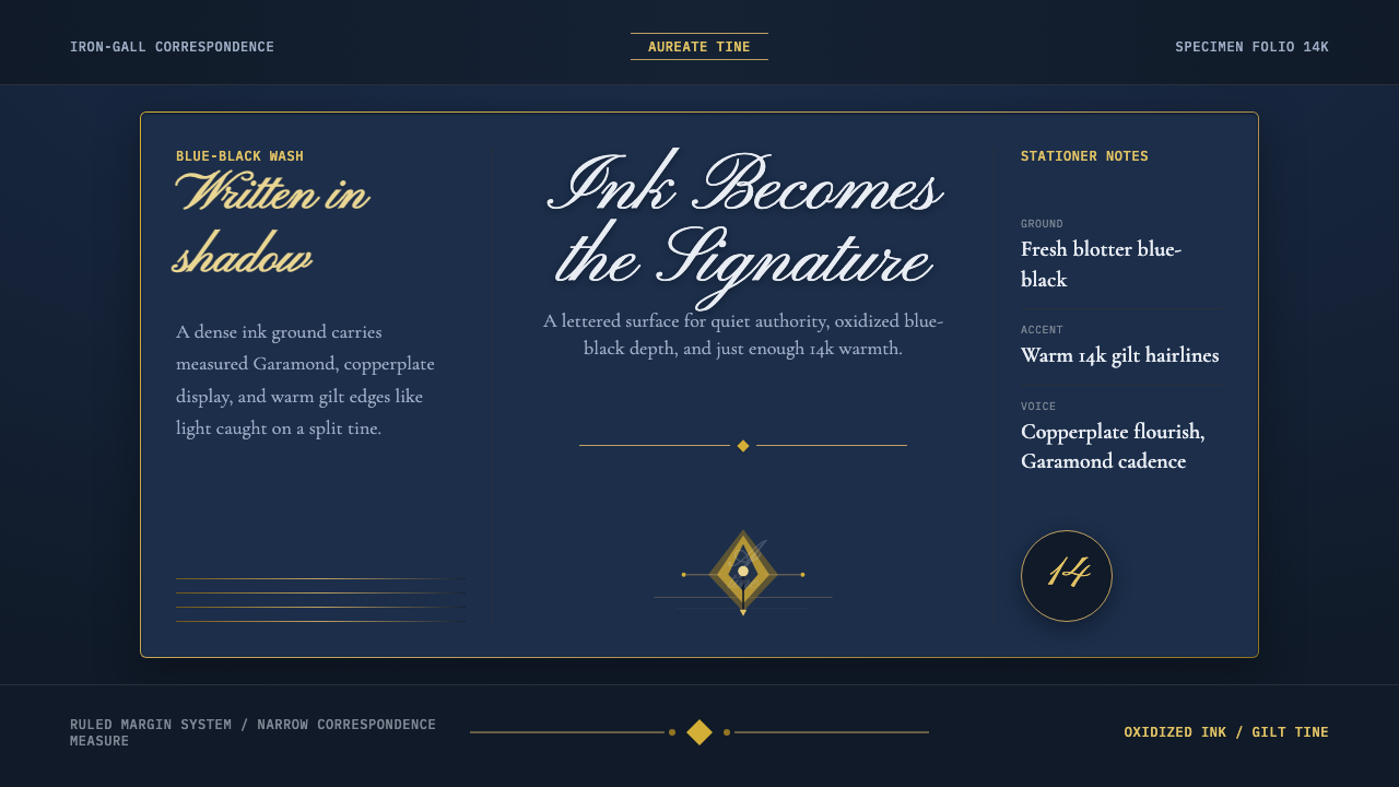
Fountain Pen & Ink treats the page as if it had just been written on — a wash of blue-black ink, a gold nib's warmth, and the unhurried cadence of a handwritten letter.
Fountain Pen & Ink in brief
Fountain Pen & Ink is a design language built around the early-twentieth-century culture of the fountain pen — the ritual of loading iron-gall ink, the scratch of a gold nib across ruled writing paper, the particular blue-black that darkens as it dries. Where most digital styles treat the background as a neutral void to be filled, this one treats it as the most important decision in the whole system: the ground itself is a wash of deep, saturated blue-black, so that a page reads not as blank paper but as paper that has already been written on.
The style pairs that inked ground with a single warm metal — 14-karat gold, the material of a good nib — never cold chrome or silver. Gold appears sparingly, as a rule, a hairline, a highlight catching the light the way a well-used nib catches it when tilted. Everything else is calibrated to sit quietly against the ink: type in a restrained, correspondence-like cadence, ornament kept to the barest flourish, and a general sense that nothing on the page is shouting.
The effect is intimate rather than decorative. This is not stationery-as-pattern — no scattered ink blots or cartoon quills. It is closer to what a genuinely excellent piece of correspondence looks like: considered, legible, quietly confident, and built around the idea that the writing instrument itself has a personality worth designing around.
Where does Fountain Pen & Ink come from?
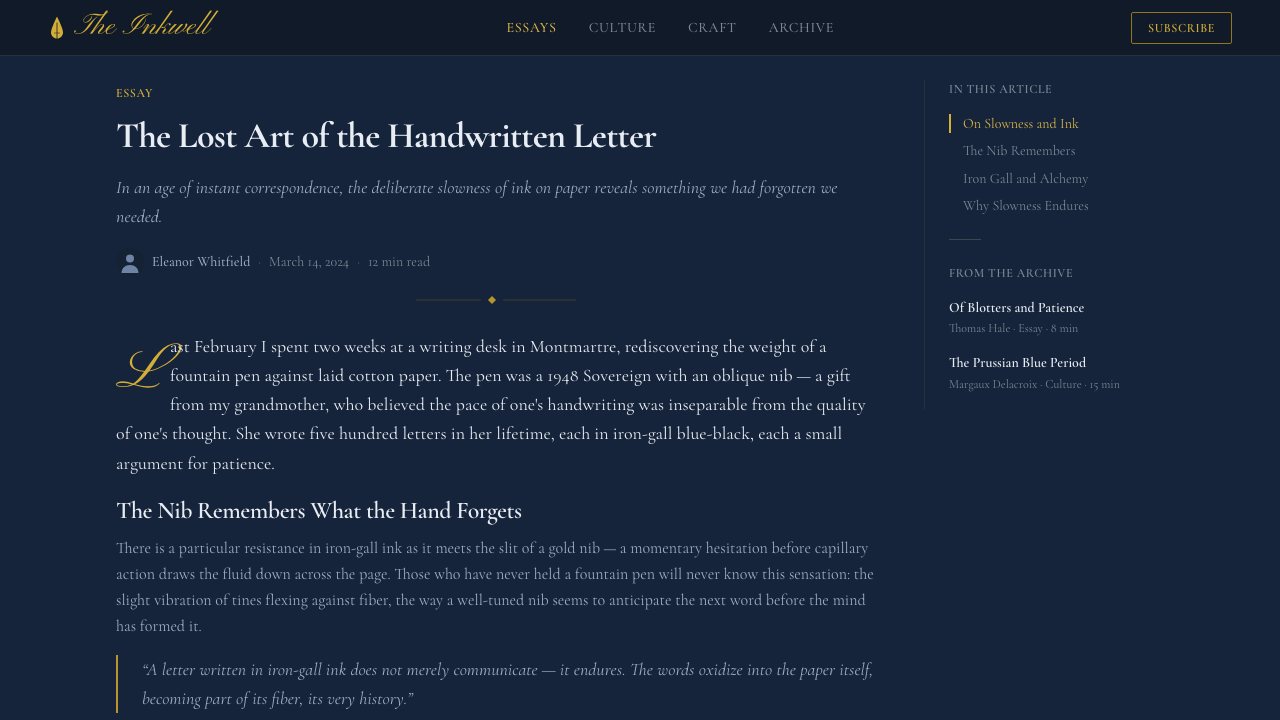
The fountain pen's golden age runs roughly from 1900 to 1950, a half-century in which the pen moved from a novelty for the wealthy to the default writing instrument of the educated, professional, and correspondence-heavy classes across the Western world. This was the era before the ballpoint pen's postwar takeover, when a nib, a reservoir, and a bottle of ink were still the ordinary tools of business letters, diaries, contracts, and love letters alike — and when the choice of pen, ink, and hand said something about the writer.
Lewis Waterman, an American insurance salesman turned inventor, is credited with solving the fountain pen's central engineering problem in the 1880s: a reliable capillary feed that let ink flow to the nib at a controlled rate without flooding or starving the pen. His fix made the fountain pen practical rather than merely possible, and the company he founded became one of the two dominant houses of the coming golden age. The other was built by George Safford Parker, a former telegraphy instructor whose Parker Pen Company refined nib design and marketing into a genuine consumer industry, competing with Waterman for the professional and status-conscious writer through the first half of the century.
The ink itself has its own chemistry and its own history. Iron-gall ink — made from iron salts and tannic acids extracted from oak galls — had been used for centuries before the fountain pen existed, prized because it bonds into the paper fiber rather than merely sitting on the surface, making it resistant to fading and water. Its signature behavior, and the one this style is built around, is that it goes down blue-black and wet, then oxidizes as it dries, deepening toward a darker, almost brown-black. A page in the middle of being written shows both states at once — fresher strokes still blue, older ones settling toward black — which is part of why the ink itself, not the paper, became the visual signature of pen culture.
Alongside the pen and the ink sat the hand that used them. Copperplate and Spencerian script — ornamental, continuously joined handwriting styles taught in American and European penmanship schools through the nineteenth and early twentieth centuries — gave the era its calligraphic vocabulary. Platt Rogers Spencer, an American penman, developed the Spencerian method in the mid-1800s specifically to be written with a flexible steel or gold nib, and it remained the model for elegant business and personal correspondence well into the fountain pen's golden age, its looping flourishes surviving today mainly in the headline lettering of stationery and luxury branding.
What defines the Fountain Pen & Ink look?
Color
The ground is a deep, saturated blue-black — not navy, not slate, but the specific dark wash of iron-gall ink freshly dried on paper. It functions the way a cream or white background functions in most styles, except it is doing the opposite emotional work: instead of neutrality, it signals that the page has already been used, already has ink on it. Warm gold is the only accent color permitted, used the way a nib catches light — as a highlight or a thin rule, never as a fill. There is no room in this palette for a second bright hue; anything competing with the gold breaks the illusion of a single well-kept writing instrument.
Typography
Body text is carried by a measured, classical serif in the register of correspondence — legible at length, unhurried, closer to the typeface of a well-set letter than to a display face. Headings introduce the calligraphic layer: Copperplate- and Spencerian-derived lettering, with looping flourishes and continuous joins, used sparingly and only where a heading or initial genuinely calls for ornament. The two registers are kept distinct on purpose — the flourish belongs to headlines and initials, the serif carries the reading experience, and the two are never blended into a single undifferentiated voice.
Line and Rule
Ruled writing paper is the underlying structural metaphor: thin horizontal guides, evenly spaced, running the width of the page the way ruled stationery runs beneath a letter. These rules are drawn in the warm gold accent, thin and precise, never heavy. They serve the same organizing function that grid lines or dividers serve in other systems, but their source is unmistakably the physical object — a sheet of lined paper — rather than an abstract layout device.
Ornament and Flourish
Ornament is present but heavily rationed. A capital letter might carry a Spencerian loop; a section break might use a single flourished rule rather than a plain line; a gilt border might edge a card the way a fine stationery box is edged. What the style refuses is ornament as texture or wallpaper — no scattered decorative motifs repeated across a surface, no all-over patterning. Every flourish reads as a deliberate, singular gesture, the way a single elegant signature reads differently from a page filled with doodles.
Metal Accent
Gold is specified as warm — the color of an actual 14-karat nib, not a cool metallic or a bright brass. It appears at the edges of things: a rule, a border, a highlight along the split of a nib illustration, a small icon. It is never a fill color and never covers a large area, because gold used generously stops reading as a precious accent and starts reading as gaudy. The restraint with which gold is deployed is itself part of what signals quality — like a real nib, where the gold is a small, functional, expensive detail rather than a decorative sheet.
Texture and Surface
Where texture appears, it reads as ink on paper rather than as a printed-on pattern: a subtle unevenness in the blue-black wash, as if ink had pooled slightly more in one area than another, the way real ink does when it is laid down by hand rather than a machine. This is used with a light touch — enough to keep the ground from feeling like a flat digital fill, not so much that it becomes a visible, distracting texture in its own right.
Mood and Pace
Above all, the style is unhurried. It borrows the pace of letter-writing — a slower, more deliberate mode of communication than a text message or a social post — and translates that pace into layout: generous space around text, a composed rather than urgent rhythm, and a general absence of anything that reads as loud or promotional. The style communicates trust and permanence, the sense of a document meant to be kept rather than glanced at and discarded.

Who shaped Fountain Pen & Ink?
Waterman, an American insurance salesman, is credited with the capillary-feed mechanism in the 1880s that made fountain pens reliably usable rather than prone to flooding or drying out. The company he founded became one of the two dominant houses of the golden-age pen industry, and the reliability his design offered is part of why the fountain pen could become a routine tool of business and correspondence rather than a fussy novelty.
A former telegraphy instructor, Parker founded the Parker Pen Company and turned nib design and pen marketing into a genuine consumer industry. Parker pens competed directly with Waterman for the professional and status-conscious writer throughout the golden age, and the company's emphasis on craftsmanship and presentation helped cement the fountain pen as an object that said something about its owner, not merely a tool that happened to hold ink.
An American penman, Spencer developed the Spencerian method of handwriting in the mid-nineteenth century, designed specifically to be written with a flexible steel or gold nib. Its looping, continuously joined letterforms became the model for elegant business and personal correspondence across America and, later, much of the fountain pen's golden age, and its ornamental flourishes are the direct ancestor of the calligraphic heading style this design language uses.
How do you use Fountain Pen & Ink today?
Fountain Pen & Ink transfers best into contexts where trust, permanence, and a sense of considered craft matter more than speed or novelty — and it rewards restraint in application, since its entire effect depends on the ink ground and gold accent staying rare and deliberate.
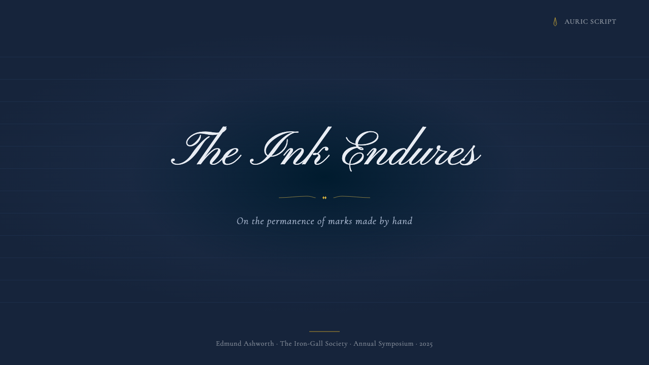
For presentation slides, the style suits cover pages and quiet section breaks especially well: a cover can lean into the full ink-wash ground with a single gold rule and a calligraphic title, letting the darkness of the page itself do the work a bold color usually does elsewhere. Content and data slides should pull back from the ornamental register — body text in the measured serif, ruled gold guides doing the organizing work a grid normally does, and charts rendered as simple, precise line and bar forms rather than glossy infographic treatments, so the data reads like an entry in a ledger rather than a marketing chart.
For web interfaces, the style works well on dashboards and pricing pages that want to signal seriousness and longevity — financial products, professional services, publishing tools, anything positioning itself as an instrument for considered work rather than a quick consumer app. The ink ground carries the page, ruled gold lines substitute for conventional dividers and card borders, and pricing tiers can be differentiated through the calligraphic heading treatment on a plan name rather than through loud color-coding.
For editorial and marketing work, the style is a natural fit for anything invoking correspondence, craft, or heritage — a stationery brand, a letter-writing app, a longform essay series, an invitation or announcement. Layouts should read like a well-composed letter: generous margins, a single flourished initial or heading, gold rules marking section breaks, and body copy set at a measure comfortable for sustained reading rather than skimming.
The most common mistake is treating the ink wash as merely 'a dark background' and pairing it with saturated, competing accent colors — reds, greens, bright blues — the way one might on an ordinary dark-mode interface. That breaks the illusion entirely. The style has exactly one accent, warm gold, and its authority comes from that restriction; introducing a second bright hue makes the page read as a generic dark theme with a gold logo, rather than as a page with ink on it.
Fountain Pen & Ink — FAQ
Is Fountain Pen & Ink just a dark mode with a gold accent?
No, though the confusion is understandable. A generic dark mode treats its background as a neutral void that happens to be dark; Fountain Pen & Ink treats its background as ink that has been applied to paper, with the specific behavior of iron-gall ink — a blue-black wash, subtly uneven, that reads as freshly written rather than as a flat digital fill. The distinction shows up in restraint: dark mode UIs often use several bright accent colors for status and interactive states, while this style permits exactly one accent, warm gold, because introducing a second hue breaks the ink illusion.
Why gold specifically, rather than silver or another metal?
Gold is historically accurate to the object the style is modeled on. The finest fountain-pen nibs of the golden age were made from 14-karat gold, prized for its flexibility and resistance to corrosion from the ink itself — steel nibs existed and were cheaper, but gold was the material of a genuinely good pen. Using a cool metal like silver or chrome would import the wrong material reference entirely, evoking machinery or hardware rather than a warm, personal writing instrument.
How much ornament and flourish is too much?
As a working rule, flourish should appear at moments of genuine emphasis — a title, an initial, a section break — and nowhere else. If a body paragraph, a data table, or a navigation bar starts picking up loops and curls, the style has tipped from restrained correspondence into stationery pastiche. The historical reference point is a well-composed letter, not a decorated greeting card: a good letter might have one elegant flourish on the signature, not ornament scattered across every line.
Does this style work for light-background or print contexts?
The style is built around the dark, inked ground as its defining feature, so a light-background version has to work harder to justify the name — at minimum it should keep the ruled gold lines and the calligraphic heading treatment, and use the blue-black as text and rule color rather than as fill. In print, the style translates naturally to letterpress or foil-stamped stationery, where gold foil against a dark or deeply saturated stock is a real, physical technique rather than a screen simulation — arguably the most authentic context the style can appear in.
What kinds of products should avoid this style?
Anything that needs to feel fast, playful, or immediate will fight against the style's unhurried pace — social apps, gaming interfaces, children's products, or flash-sale marketing all depend on urgency and energy that a letter-writing aesthetic actively works against. The style also struggles wherever a product needs a bright, varied color system to encode information — dashboards with many status categories, for instance — since the one-accent restraint that gives Fountain Pen & Ink its authority leaves little room for a broad functional palette.
Related design styles
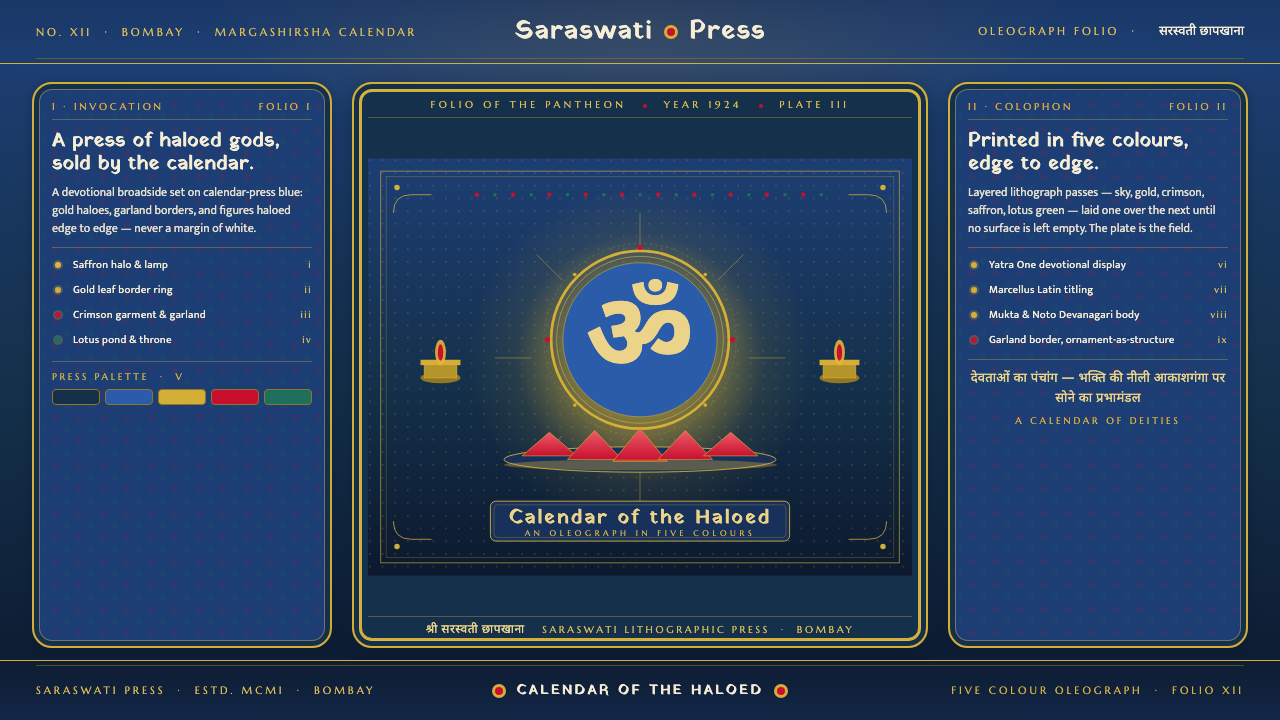 Hindu Pantheon Bazaar PrintDevotional calendar art, edge to edge. Gold halos and garland borders on baza…
 Vintage Star ChartScholarly night, gilded. Cinzel caps orbit gold grids and magnitude stars.
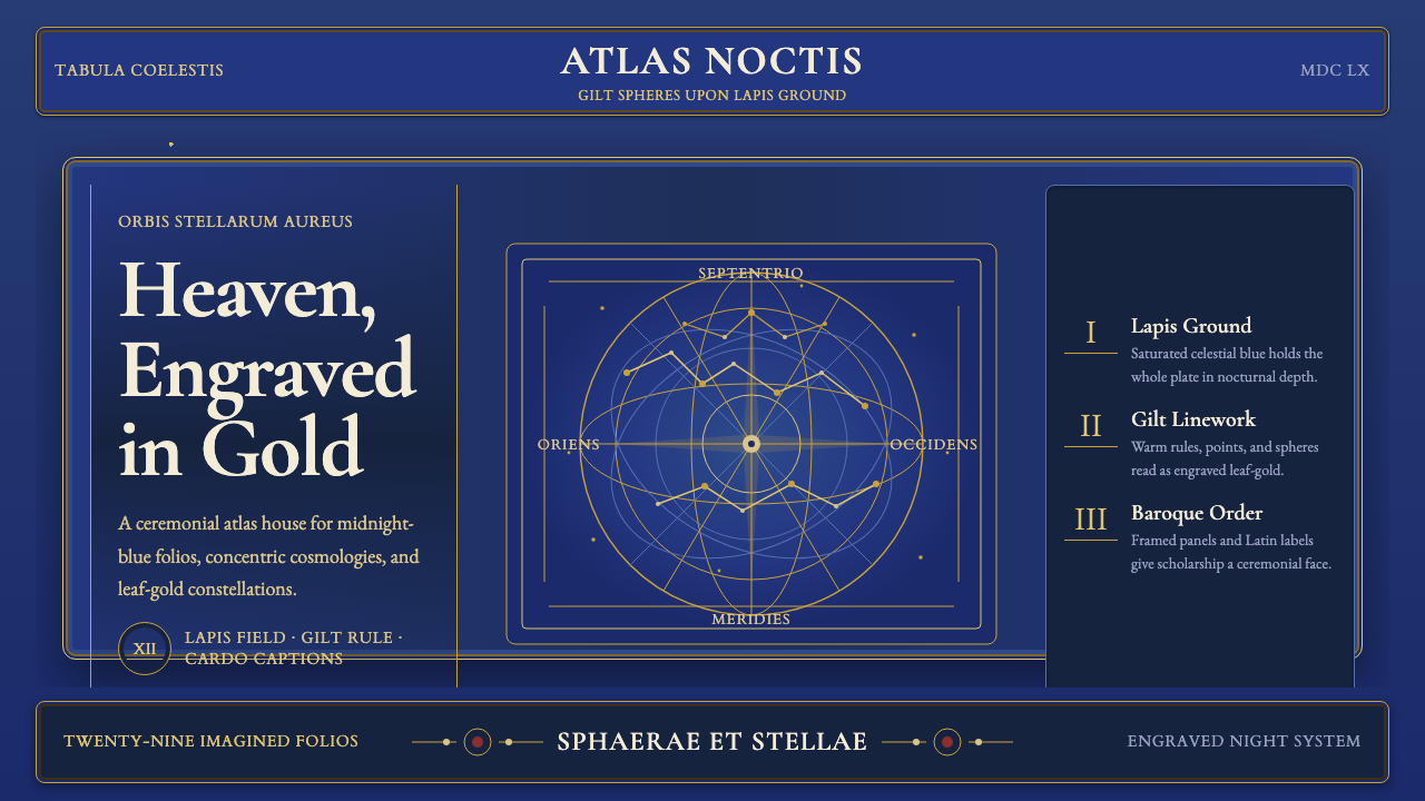 Cellarius Celestial AtlasCelestial luxury on lapis. Gilt serif type, star fields, and concentric chart…
 Kandy Esala PeraheraA torchlit night procession, not a poster. Gold flecks and crimson brocade fl…
 One Thousand and One NightsNight refuses to end. Midnight indigo, lamp-lit gold and star lattice frame e…
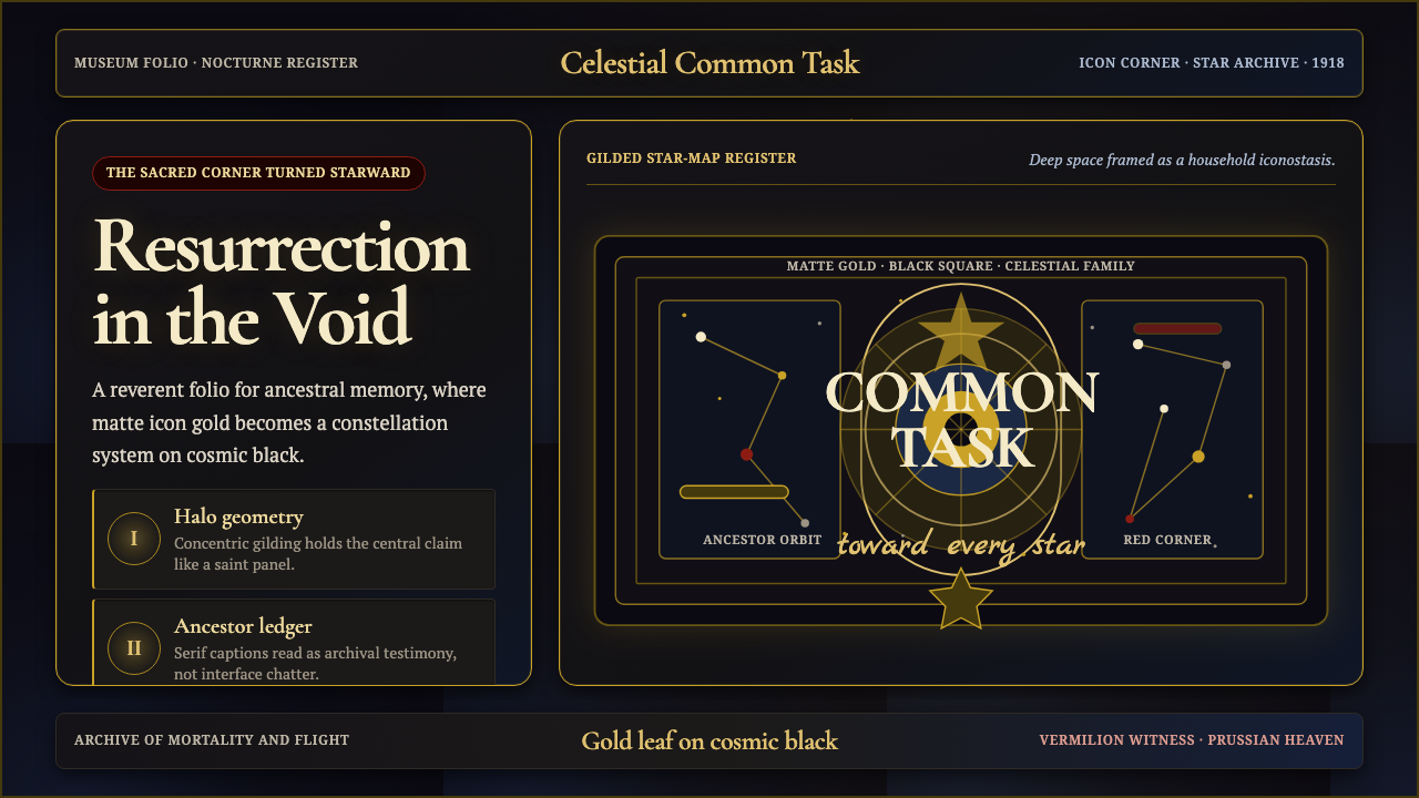 Russian CosmismSacred spaceward longing. Icon gold constellations glow on Malevich-black pan…