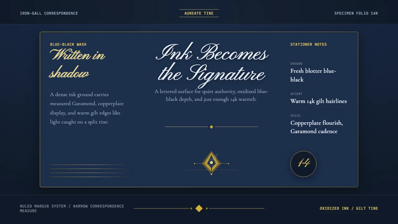
About Fountain Pen & Ink
Fountain Pen & Ink draws on the early-20th-century pen culture built around iron-gall blue-black inks — deep, saturated blues that oxidized toward brown-black as they dried on the page. Laid down by gold nibs across ruled writing paper, the ink itself is the signature: a blue-black wash that reads as a freshly inked blotter, not blank cream paper.
The metal accent is warm 14k gold — the nib, not cold chrome. Copperplate and Spencerian flourishes thread through the headings, while Garamond carries the body in the measured cadence of correspondence. Everything is keyed to the inked surface, with gilt highlights and split-tine detail used sparingly, like reflections caught on a well-used nib.
- Origin
- Western Europe and the broader Western stationery industry
- Era
- 1900–1950 (golden age of the fountain pen)
- Key figures
- Lewis Waterman · George Safford Parker · Platt Rogers Spencer
- Movements
- Penmanship and writing-instrument design · Iron-gall ink chemistry
Fountain Pen & Ink design spec
Colors
Typography
The other 11 sections — buttons, cards, spacing, motion, techniques and more — open once you unlock. Download the DESIGN.md or send it to your AI in one click. Unlock once, yours forever.
Sign up nowStyles similar to Fountain Pen & Ink
Also inspired by print & type, with a close feel.
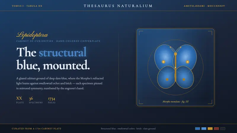 Seba Butterfly CabinetStructural blue, mounted. Iridescent Morpho glows on a slate cabinet ground, framed in ochre.
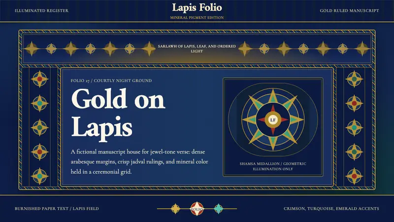 Timurid Manuscript (Herat)Courtly density glows. Lapis ground, Amiri type, and gold jadval geometry hold the folio.
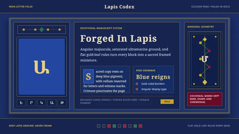 Armenian ErkatʿagirDevotional lapis reigns. Gold rules and angular serif glyphs frame a sacred grid.
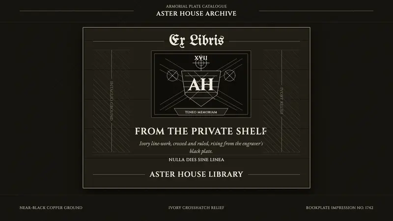 Ex Libris BookplateScholarly ownership, cut in ivory. Cinzel caps and crosshatch rules rise from a black plate.