What is Cigarette Card Set?
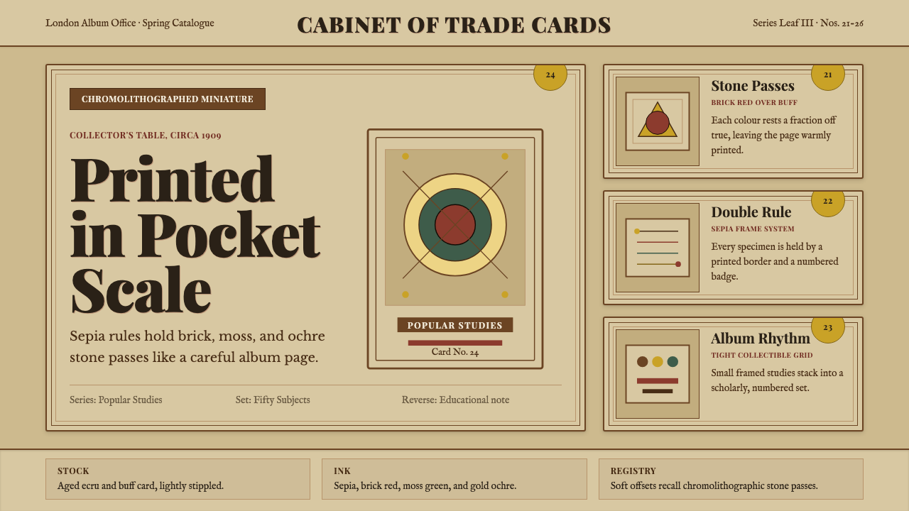
The cigarette card is scholarship in miniature — a century-old print format that turned a slip of buff card stock into a collectible object of genuine learning, its double-rule border, muted earth palette, and numbered series badge encoding a whole culture of popular education.
Cigarette Card Set in brief
The cigarette card aesthetic is defined by the visual language of British chromolithographic trade cards from roughly 1880 to 1940: a warm buff or aged ecru ground, a printed double-rule border in sepia or dark brown, a small central illustration treated with muted brick-red, muted green, and gold-ochre accents, a series-number badge in one corner, and a disciplined title set in period letterforms. The reverse carried educational text — natural history, geography, military history, sport — making each card simultaneously a collectible object and a condensed encyclopedia entry.
What distinguishes this style from other archival aesthetics is its quality of scholarly affection. Cigarette cards were not high art; they were mass-produced inserts, printed in millions by firms like W.D. & H.O. Wills, John Player & Sons, and Imperial Tobacco. Yet they were designed with genuine care — standardized dimensions, consistent typographic hierarchies, numbered sequences — because their entire commercial logic depended on completeness. A collector who had forty-nine cards from a fifty-card set was, by design, highly motivated to buy another pack. The beauty of the system lies in this tension between mass production and the deep human desire for a complete collection.
Visually, the style reads as warm, aged, and studiedly modest. Color is always muted — saturated hues were expensive in chromolithography and read as vulgar beside the buff card stock. Illustration tends toward the diagrammatic: a bird, a fish, a military uniform, a racing car, rendered with enough accuracy to be educational but with the slight flatness and gentle mis-registration of a stone-printed image. Type is period-appropriate, with small caps, serif letterforms, and a considered use of rules and badges to organize the card face.
Where does Cigarette Card Set come from?
The cigarette card as a distinct medium emerged in the 1870s and 1880s, when American and British tobacco companies began inserting small stiffening cards into paper cigarette packs — the soft packaging needed internal support, and the blank cards were a convenient advertising surface. American firms like Allen & Ginter led early innovation, commissioning portrait cards of actors, athletes, and military figures. British manufacturers observed the format's success and adopted it enthusiastically from the mid-1880s onward.
W.D. & H.O. Wills of Bristol is generally credited with establishing the British cigarette card as a serious collectible series rather than a loose promotional insert. Wills began issuing numbered, themed sets — natural history, flags of the nation, military uniforms — with educational text on the reverse, transforming the card from an advertisement into a mini-encyclopaedia. The production method was chromolithography, a painstaking stone-based colour-printing process that allowed for subtle tonal gradation and the characteristic slight mis-registration of colours that became an aesthetic signature of the era.
The golden age of British cigarette cards ran from roughly 1900 to 1940. During this period, publishers commissioned original artwork from illustrators working in a consistent house style: muted, warm palettes derived from the physical limitations of chromolithographic ink on buff card stock; double-rule borders that framed the illustration and gave each card a sense of self-contained completeness; series-number badges in ochre or brick-red that positioned each card within its larger collection. The competitive pressure between tobacco firms — Wills, Player, Ogden, Gallaher — drove constant innovation in subject matter, from natural history and geography to motor cars, aircraft, and film stars.
Production effectively ceased during the Second World War, when paper rationing made the format uneconomical, and it never fully recovered afterward. The postwar tobacco industry shifted toward other promotional mechanisms, and the collectible card market eventually migrated to sports cards, trading cards, and later digital formats. The cigarette card now exists primarily as a collector's antique and as a visual reference for the warm, scholarly, archival aesthetic that its physical characteristics — the aged buff stock, the softened earth palette, the precision of its small typographic systems — made iconic.
What defines the Cigarette Card Set look?
Ground and Paper Tone
The defining base is a warm buff or aged ecru — the actual colour that nineteenth-century card stock acquires as its wood-pulp fibres oxidize over decades. This is not a pure white. It carries a yellow-brown warmth that softens everything placed on it and prevents any colour from reading as harsh or clinical. In contemporary applications, matching this tonal warmth in the background is the single most important decision: a cool white ground will read as modern and will make the same illustrative and typographic elements feel wrong.
Chromolithographic Palette
Colour in the cigarette card system is always muted and earth-derived: brick-red, muted green, gold-ochre, warm sepia, and occasional dusty cobalt. These are the colours that chromolithographic inks naturally produce on buff stock — not vivid primaries, but pigments that read as aged and considered. Saturation is consistently restrained; hues are separated by the cream ground rather than placed in direct contact. The overall palette effect is scholarly and warm rather than decorative or festive.
Double-Rule Border
The double-rule border — two parallel lines of slightly different weight enclosing the card face — is the single most recognizable structural element of the format. It performs several functions simultaneously: it frames the illustration, separates the typographic elements from the image zone, and gives the card a sense of completeness and self-containment. The lines are typically printed in sepia or a dark warm brown, never in black, which would read as too stark against the buff ground. The gap between the two rules is small but consistent, giving the border a refined rather than crude quality.
Series Badge and Numbering
Each card carries a numbered badge — typically a small oval, circle, or rectangle printed in ochre or brick-red — that locates it within its series. This badge is both a typographic and compositional element: it anchors one corner of the card, provides a spot of accent colour, and communicates the card's place in a larger system. The number itself is set in a period numeral style, often with a series title in small caps above or below. The badge is never omitted and never treated as mere administrative detail — it is part of the card's designed identity.
Diagrammatic Illustration
The central illustration in a cigarette card is neither purely decorative nor purely informational — it occupies the space between the two. A bird is depicted accurately enough for identification, but the rendering style is flat and slightly schematic rather than naturalistic and painterly. This is partly a function of the printing process, which rewarded clear contour over subtle tonal modelling, and partly an editorial choice that keeps the image readable at a very small scale. The slight mis-registration of chromolithographic colours — where one ink layer lands a fraction off from another — gives the illustration a soft, hand-made quality that digital reproduction of the style should treat as a feature rather than a defect.
Period Typography
Typographic elements on a cigarette card are modest and functional: a series title in small caps, the card subject in a slightly larger serif, the card number in the badge, and on the reverse, dense educational text in a compact serif body. The type never overwhelms the illustration; it serves to identify and locate, not to advertise or persuade. The letterforms reflect the conventions of late Victorian and Edwardian commercial printing — slightly condensed serifs, restrained use of italic, no display fonts and no sans-serifs. Everything reads as sober and considered.
Stipple and Halftone Texture
The tonal rendering of chromolithographic illustration relied on stipple — small dots of ink laid close together to simulate gradation — and on the slightly grainy, tactile surface of card stock. This gives the shadows and mid-tones of the illustration a distinctive soft granularity rather than the smooth transitions of modern printing. In contemporary reproductions of this aesthetic, reintroducing a subtle paper grain or halftone texture into illustration areas is more historically accurate and more visually convincing than simply desaturating the colours or adding a sepia filter.
Who shaped Cigarette Card Set?
The Bristol tobacco firm, founded in 1786 and eventually part of Imperial Tobacco, is widely credited with establishing the British cigarette card as a serious numbered series with educational intent. Wills issued thousands of cards across hundreds of series — natural history, flags, military uniforms, sporting personalities — and their production standards set the template that competitors followed. Their series 'Wills's British Birds,' 'Wills's Roses,' and 'Wills's Soldiers of the World' are among the most collected examples of the format.
The Nottingham manufacturer, established in 1877 and also part of Imperial Tobacco from 1901, was Wills's primary domestic rival and the other great name in British cigarette card history. Player's cards are often distinguished by a slightly warmer, more golden tone in their illustration palette and by their signature series on motor cars, aircraft, and popular film stars of the 1930s — subjects that brought the format into the modern era. Player's Navy Cut branding made their cards among the most recognizable in the collecting market.
This Richmond, Virginia firm is credited with pioneering the cigarette card concept in the United States in the early 1880s, producing the first widely distributed sets featuring actresses, athletes, and world leaders. Their approach — small chromolithographed portraits in an ornate bordered format — set the visual template that British manufacturers then adapted and systematized. Allen & Ginter's 'World's Champions' series of 1887 is considered a founding document of the collectible-card format.
The Liverpool firm of Ogden's, absorbed into Imperial Tobacco in 1901, was notable for the quality of its natural history series and for the visual refinement of its chromolithographic printing. Ogden's 'Guinea Gold' and 'Tabs' series featured particularly well-observed wildlife illustration, and their production standards — consistent double-rule borders, careful colour registration, informative reverse text — helped codify the visual conventions of the golden-age British cigarette card. They are less celebrated than Wills or Player in collector culture but are regarded by specialists as technically superior in several series.
No single illustrator or designer defined the cigarette card aesthetic — it was produced by an anonymous network of commercial lithographic printers and in-house studio artists working within tight specifications set by the tobacco companies. The visual system's coherence came from standardization rather than authorship: consistent card dimensions, consistent border conventions, consistent reverse layouts, and consistent colour limitations imposed by the printing process. This anonymity is part of what gives the format its collectible character — the cards feel like they belong to a system rather than to any individual creative vision.
How do you use Cigarette Card Set today?
The cigarette card aesthetic is unusually well-suited to contexts where the communication goal is authority, completeness, and a sense that the reader is receiving curated, reliable knowledge — not just content, but scholarship presented with care. Applied correctly, it transforms ordinary information into something that feels worth keeping. The core principle is that every element should feel like it belongs to a complete system: numbered, bordered, consistent.
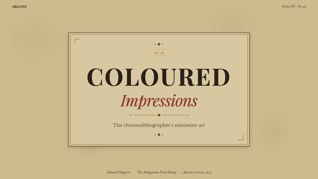
For presentation slides, the style works best when the material is genuinely encyclopedic or curatorial — a series of themed slides where each one could stand alone as a collectible object. A cover slide might frame a central illustration in the double-rule border convention, with a series title in small caps and a slide number treated as the card's badge. Content slides carry dense, considered text at a modest scale, with headings that behave like series labels rather than advertising copy. Data slides take the diagrammatic quality of the original illustrations — each chart or infographic is a small, self-contained study, not a billboard.
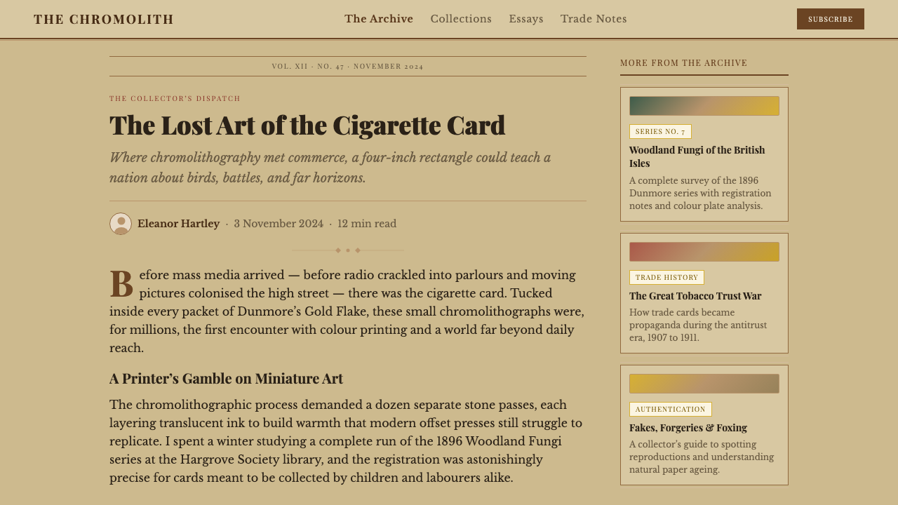
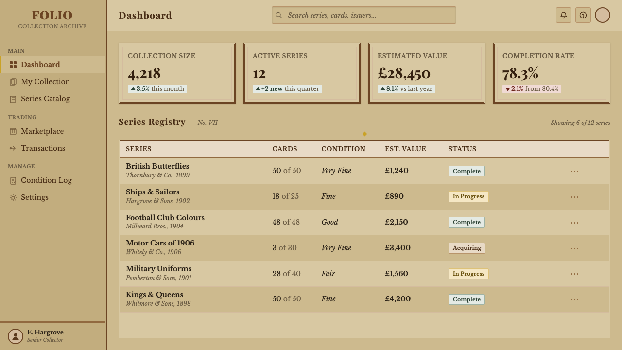
For web interfaces, the style suits editorial and archival contexts: a digital museum collection, a natural history database, a curated content library, an educational reference platform. The visual vocabulary — buff backgrounds, double-rule card containers, ochre or brick-red accent badges, sepia typographic elements — translates naturally to card-based layout systems. Each item in a grid or list can be visually treated as an individual card in a series, with a consistent badge convention to mark type, category, or sequence.
For marketing and editorial work, the style communicates heritage, curation, and the pleasure of completeness. It suits brands that want to position knowledge and collection as their value proposition — a rare-book publisher, a specialty food company with a provenance story, a subscription service built on monthly curated dispatches. The key is avoiding pastiche: the style only convinces when the content itself earns the scholarly register. Decorating generic content in cigarette-card clothing produces a costume rather than a character.
The most common mistake when applying this style is confusing aged appearance with accuracy. Designers often add a sepia overlay or desaturate colours and consider the work done. Authentic cigarette card design is not faded modern design — it is muted by process and material, not by a filter. The warm buff ground, the earth palette, the slight textural granularity of the illustration, and the precision of the small typographic system all need to be present simultaneously for the aesthetic to read as genuine rather than approximate.
Cigarette Card Set — FAQ
Is the cigarette card aesthetic appropriate for digital products, or does it only work in print?
It works well in digital contexts when applied with understanding rather than surface mimicry. The core elements — warm buff backgrounds, bordered card containers, earth-palette accents, dense informative type — translate naturally to screen. What requires care is texture: the grain and slight mis-registration that give physical cards their warmth need to be introduced through illustration style and subtle texture overlays rather than applied as blunt retro filters. The most successful digital applications treat each card unit as a complete, self-contained information object rather than adapting a decorative surface onto a conventional layout.
How does this style differ from other Victorian or Edwardian print aesthetics, such as Art Nouveau or trade-card illustration?
The cigarette card aesthetic is distinctly more restrained and systematic than Art Nouveau, which emphasizes organic line, decorative surface, and the merging of text and image. Art Nouveau borders flow and curve; cigarette card borders are strict double rules. Art Nouveau palettes tend toward complex tonal harmony and botanical colour; cigarette card palettes are simple, earth-bound, and limited by process. The cigarette card is also more compressed than trade-card illustration of the same era — it needs to communicate within a very small format, which forces economy and precision rather than decorative abundance.
Can this style support modern dark-mode interfaces?
With significant adaptation, yes, but the result will feel like a reinterpretation rather than an authentic extension of the style. The cigarette card is fundamentally a light-ground aesthetic — the buff background is not a choice that can be easily inverted. A dark-mode variant would need to reframe the warm base as a dark mahogany or deep sepia rather than a true black, maintain the earth palette's hues but invert their lightness relationships, and treat the card borders in gold-ochre rather than the original sepia. The scholarly warmth can survive this inversion, but the sense of aged paper — which is central to the style's feeling — will be lost and replaced with something more atmospheric and less archival.
What subjects or content types does this style suit most naturally?
The style was invented for natural history, geography, military history, sport, and popular biography — and it still suits these subject areas most naturally. More broadly, it works for any content that benefits from the framing of curated, numbered scholarship: a series of short encyclopedic entries, a categorized reference collection, a set of themed case studies or profiles. It suits content that rewards completeness — where the reader's relationship to the material deepens with each item added to their understanding. It is less well suited to promotional content, urgency-driven messaging, or contexts where warmth and approachability are the primary communication goals.
How literally should the 'collectible series' logic be applied in a contemporary project?
The series logic is the style's most powerful conceptual tool and should be applied structurally, not merely decoratively. A numbered badge on each item is the surface expression; the deeper application is designing a content system where items genuinely belong to named series, where each item is identified by a number within its set, and where the overall structure implies that the collection is not yet complete — that more will come. This incompleteness is a feature, not a deficiency: it creates ongoing engagement. In practice, this might mean labelling a content type as 'Series 3, No. 7' rather than simply dating it, or designing a product feature set as named numbered cards that the user progressively activates or collects.
Related design styles
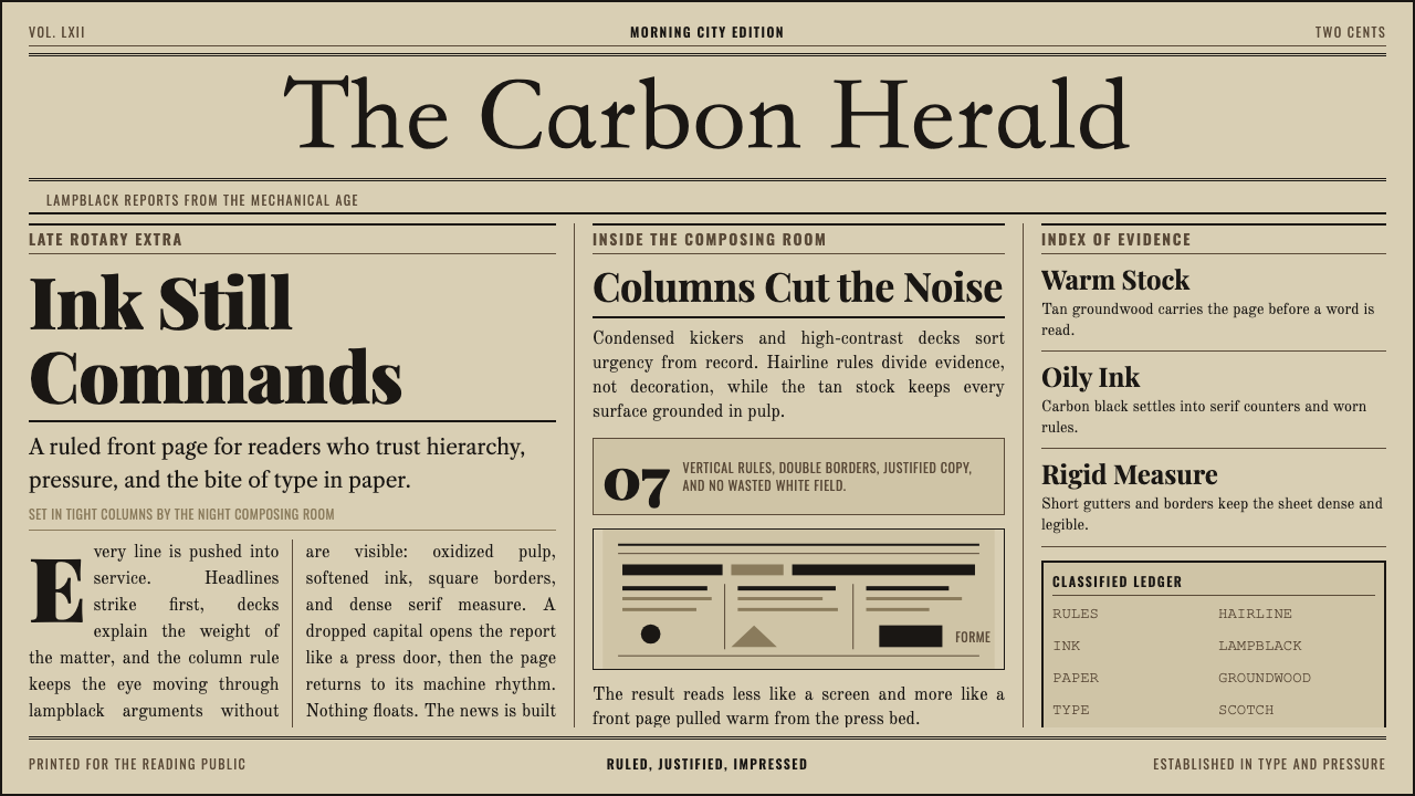 Broadsheet LetterpressAuthority in ink. Lampblack serif decks lock into tan paper with strict ruled…
 Vintage Star ChartScholarly night, gilded. Cinzel caps orbit gold grids and magnitude stars.
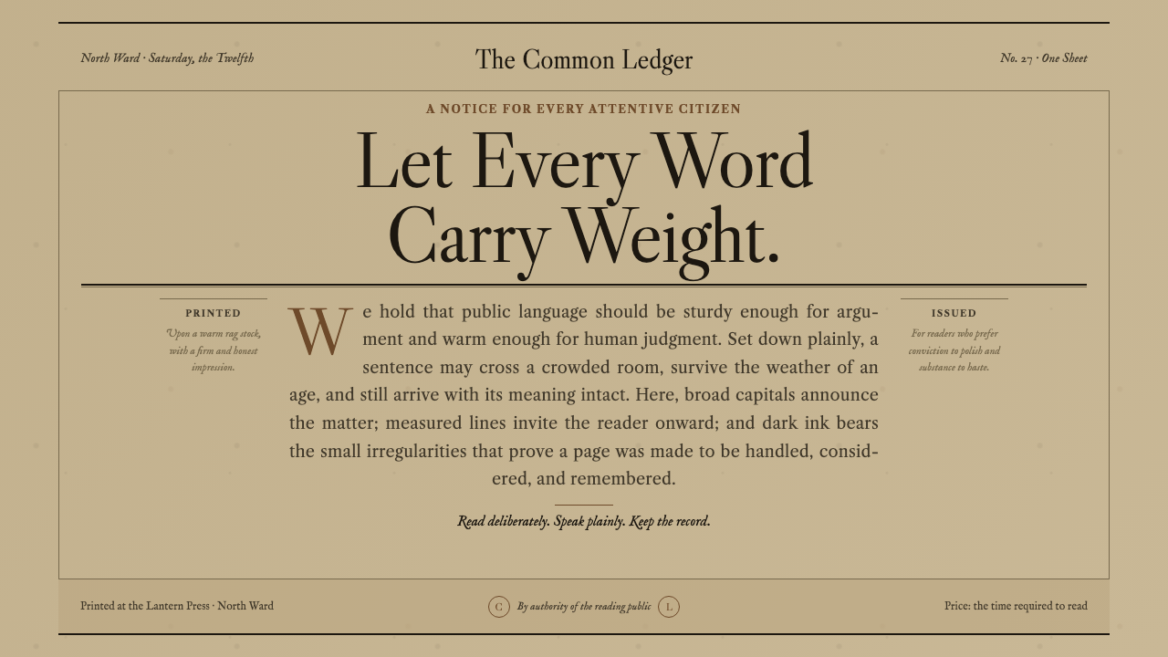 Caslon English Text SerifWarm authority, pressed into paper. Caslon capitals and engraved rules comman…
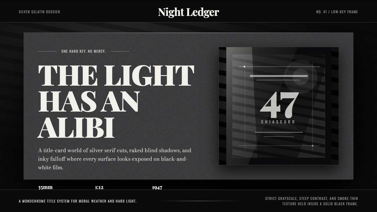 Film Noir ChiaroscuroLight is the crime. Silver serif cards, blind stripes, and grain carve drama…
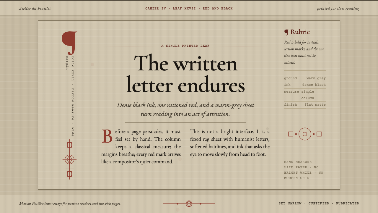 Garamond Old-Style French SerifInk ages with grace. Warm-grey rag paper, Garamond columns, and red rubric ma…
 Herero Victorian Dress (Namibia)Memorial wears structure. Red, indigo, green pleats frame gilt brass on dark…