What is Orient Express?
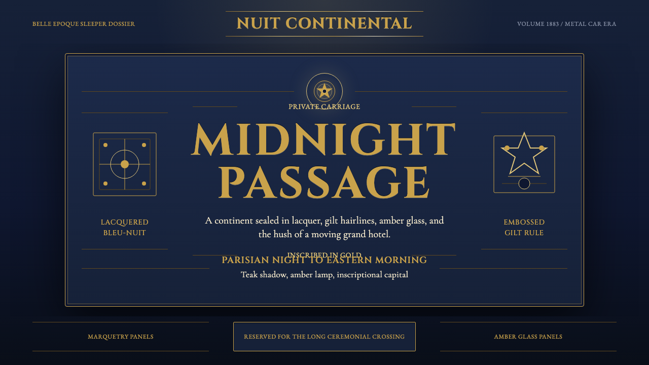
Orient Express renders the golden age of luxury rail travel as a design system — midnight-blue lacquer, embossed gold crests, and inscriptional capitals framing a journey the way carriage marquetry once framed a continent.
Orient Express in brief
Orient Express is a design system built from a specific object and a specific era: the lacquered steel carriages the Compagnie Internationale des Wagons-Lits (CIWL) ran across Europe from 1883 onward, at the height of their opulence during the metal-car era of the 1920s and 1930s. Every element in the system traces back to something a real passenger would have touched, seen, or ridden inside — the exterior lacquer, the gilt crest, the interior marquetry paneling.
The color language centers on bleu nuit, a deep midnight blue that coated the exterior of CIWL carriages, edged with embossed gold detailing and stamped with the company's crown-and-two-lions crest. Inside, the palette shifts to warm materials — dark teak paneling, amber glass, and fine gold hairline rules — evoking the compartment interiors where wood, glass, and metal were combined with restrained precision rather than excess.
Typographically and texturally, the system draws on full Art Deco opulence rendered specifically in lacquer and gilt: inscriptional capital letterforms recall the era's train livery and station signage, fine gold hairlines trace panel edges the way brass fittings traced carriage windows, and symmetrical, restrained composition replaces the looser ornamentation of earlier styles. The overall effect is luxury that announces itself quietly — through material and precision rather than through visual noise.
Where does Orient Express come from?
The Orient Express began operating in 1883, founded by the Belgian engineer and entrepreneur Georges Nagelmackers, who had traveled in the United States and been impressed by George Pullman's sleeping cars, then returned to Europe convinced that a similarly luxurious, continent-spanning rail service could be built to connect Western Europe with the Ottoman capital of Constantinople. Nagelmackers founded the Compagnie Internationale des Wagons-Lits in 1876 and, over the following years, negotiated the complex web of national railway agreements needed to run a single train across multiple countries and rail gauges — an achievement of logistics and diplomacy as much as of engineering.
The service quickly became a byword for elite international travel, carrying diplomats, aristocrats, business magnates, and eventually, in popular imagination, spies and mystery — a reputation later cemented by its use as a setting in detective fiction and film. What made the experience distinct was not merely the route but the completeness of the CIWL's control over it: the company owned and staffed the carriages itself, standardizing service, cuisine, and interior finish to a single high standard regardless of which country's rails the train happened to be crossing.
The visual and material peak of the service arrived with the metal-car era of the 1920s and 1930s, when CIWL commissioned leading French decorative artists to outfit its carriages. René Prou, an interior designer associated with the era's Art Deco movement, produced marquetry paneling — intricate wood inlay work — for CIWL carriage interiors, giving compartments a warm, crafted richness rather than a purely mechanical feel. René Lalique, already celebrated for his glasswork, contributed illuminated glass panels and fixtures whose amber tones glowed against the dark teak surrounding them, turning a train compartment into a showcase of contemporary decorative art.
This period coincided with the broader flourishing of Art Deco as an international style, itself named after the 1925 Paris Exposition Internationale des Arts Décoratifs. The Orient Express and its sister CIWL services became rolling ambassadors for that aesthetic — restrained, geometric, symmetrical, and finished in expensive materials — carrying the style's visual language across borders as literally as they carried their passengers, until the mid-twentieth century's shift toward air travel and changing European politics gradually eroded the golden age the system now evokes.
Part of what made the CIWL experience so consistent was its insistence on uniform standards regardless of national border — a passenger boarding in Paris and disembarking near Istanbul would find the same quality of linen, the same standard of cuisine, and the same finish of marquetry and gilt throughout, even as the train crossed rail networks operated by entirely different national companies. This uniformity is why the visual system reads as a coherent, branded whole rather than a patchwork of regional styles: the crest, the bleu nuit lacquer, and the interior materials were a deliberate corporate identity, consistently applied, decades before that concept had a name in the way modern branding uses it.
What defines the Orient Express look?
Bleu Nuit
A deep midnight blue anchors the system, drawn directly from the lacquered exterior finish of CIWL carriages. It is dark enough to read as nocturnal luxury rather than everyday blue, and it is always paired with gold rather than silver or chrome, matching the historical carriage livery exactly.
Embossed Gold Crest
A crest device — echoing the crown-and-two-lions emblem stamped on real CIWL carriages — appears as a raised, dimensional mark rather than a flat printed logo. This embossed quality signals manufactured prestige: something stamped into metal by a company confident enough in its own standard to mark every carriage identically.
Marquetry Detail
Intricate inlaid-wood patterning, echoing René Prou's carriage interiors, appears as a decorative border or panel treatment rather than a full-surface texture. It signals hand-crafted richness within an otherwise industrial object, the contrast between mechanical transport and artisanal finish that defined the metal-car era's interiors.
Amber Glass Glow
Warm amber tones, echoing René Lalique's illuminated glasswork, appear as accent lighting or glowing detail against dark teak or midnight-blue grounds. This glow reads as ambient interior lighting rather than a flat color choice, giving the system a lived-in warmth against its otherwise cool, formal exterior palette.
Gold Hairline Rules
Fine, precise gold lines trace panel edges and structural divisions throughout the system, echoing the brass fittings and trim that framed real carriage windows and paneling. These lines are always thin and exact, never thick or decorative flourishes, keeping the overall effect restrained rather than gilded excess.
Inscriptional Capitals
Typography favors capital letterforms with the formal, evenly weighted quality of station signage and carriage livery lettering from the era. This lends even short labels the authority of an official mark rather than the informality of a modern sans-serif, keeping text consistent with the system's overall register of restrained ceremony.
Who shaped Orient Express?
The Belgian engineer and entrepreneur who founded the Compagnie Internationale des Wagons-Lits in 1876 and launched the Orient Express in 1883, having been inspired by American Pullman sleeping cars. His negotiation of cross-border railway agreements made a single continuous luxury service across multiple countries possible for the first time.
An interior designer associated with the French Art Deco movement who created marquetry paneling — intricate inlaid-wood decorative work — for CIWL carriage interiors during the metal-car era, giving compartments a crafted, warm richness within an industrial structure.
A glassmaker already celebrated for his Art Deco glasswork, who contributed illuminated glass panels and fixtures to CIWL carriage interiors, their amber tones glowing against dark teak paneling and turning compartments into showcases of contemporary decorative art.
How do you use Orient Express today?
Orient Express reads as regal motion — luxury defined by precision and restraint rather than abundance — and applying it well means keeping ornament sparse, symmetrical, and materially specific rather than piling on generic gold decoration.
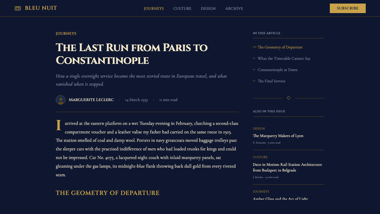
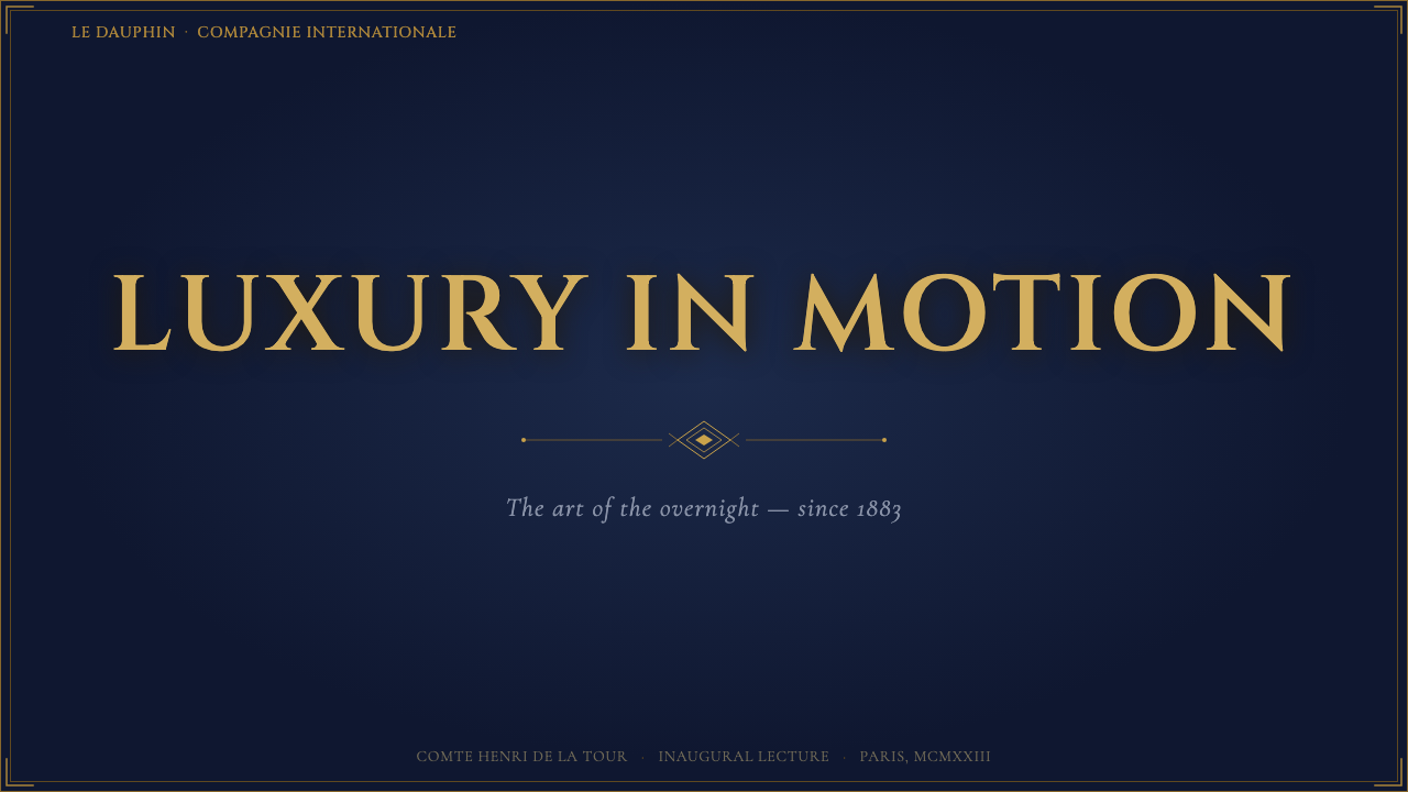
On presentation slide covers, the style suits a composition centered on the embossed crest device against a midnight-blue ground, with the title set in inscriptional capitals framed by a thin gold hairline border, echoing a carriage nameplate. Content slides should use marquetry-style borders sparingly, as a single decorative frame around a key section rather than a repeating pattern across every slide. Data visuals benefit from being rendered in gold-on-midnight-blue, treating a chart or table as if it were inlaid into a compartment panel.
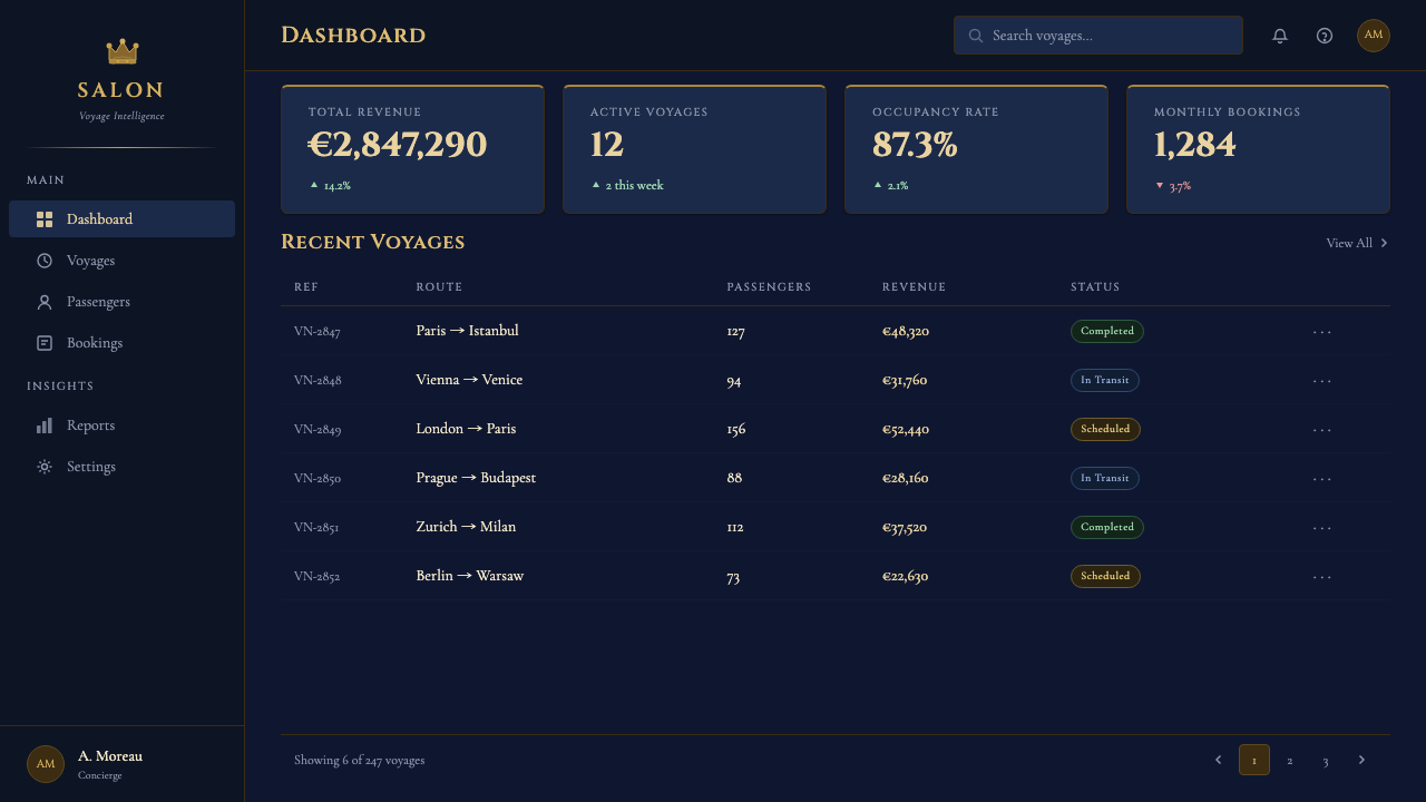
For web interfaces, the palette suits premium travel, hospitality, and membership products where the goal is to evoke considered luxury rather than flashy wealth — a midnight-blue dashboard ground with gold reserved for the single most important call to action, amber-glow accents used only for status or highlight states. Marquetry-style detailing works well as a border treatment on cards or panels, but should not be applied to every element on a screen or it loses its function as a marker of special status.
In editorial and marketing contexts, the system suits content about travel, heritage brands, hospitality, or design history, where the reader benefits from a sense of occasion. Long-form layouts should use gold hairline rules to mark section breaks rather than heavy horizontal bars, and marketing pages should let a single striking crest or marquetry detail carry the luxury signal rather than repeating gold ornament across the whole page.
The most common mistake is treating the system as generic 'vintage travel' nostalgia and layering in unrelated period ephemera — old ticket stubs, sepia photographs, distressed textures — which dilutes the specific, precise Art Deco material language the style is built from. Every gold line, crest, and inlay pattern should feel deliberate and exact, the way a CIWL carriage's finish was engineered to a single high standard, not accumulated like scattered memorabilia.
Orient Express — FAQ
Is Orient Express the same style as general Art Deco?
It is a specific application of Art Deco rather than the movement in general. General Art Deco spans architecture, furniture, jewelry, and graphic design across many countries through the 1920s and 1930s. Orient Express narrows that to a single material context — the lacquered steel carriages, marquetry interiors, and gilt crests of CIWL's luxury trains — which gives it a more specific palette (bleu nuit paired strictly with gold) and a more restrained, symmetrical composition than Art Deco's broader, sometimes more exuberant range.
Why does gold always pair with midnight blue rather than black or white in this system?
Because that pairing reflects the actual, documented livery of CIWL carriages — the exterior lacquer was a deep bleu nuit specifically, edged in embossed gold, not black or another dark color. Substituting black would lose the specific nocturnal, slightly warm quality of true midnight blue, and substituting a white or cream ground would contradict the exterior carriage finish the system is drawn from entirely, shifting it toward a different, unrelated Art Deco context.
Can this style work with bright, saturated accent colors?
It resists that direction, because its luxury signal depends on restraint — a small number of precise materials (lacquer, gold, teak, amber glass) rather than a wide chromatic range. Introducing bright saturated accents alongside the midnight blue and gold undercuts the quiet, considered quality that defines the system and pushes it toward a louder, more generic 'vintage' look. Where more visual interest is needed, it is better achieved through the amber glass glow or marquetry detail rather than new hues.
What kind of content or products should avoid this style?
The style is a poor fit for anything that needs to feel casual, budget-conscious, or fast-moving — discount travel platforms, informal community tools, or brands built around speed and low cost will feel undermined by the deliberate opulence and formality the system projects. It also does not suit content requiring dense, colorful data display, since its restrained palette and precise ornament are built to frame a small number of important elements rather than carry heavy information load.
Related design styles
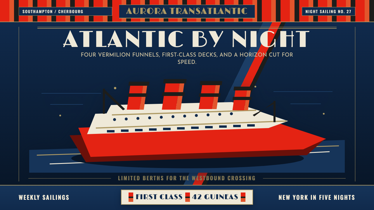 Cunard Liner PosterOceanic grandeur. Vermilion funnels, teak-gold caps, and a marine-blue poster…
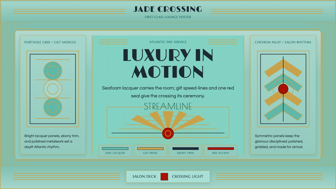 Ocean Liner SeafoamLuxury in motion. Seafoam lacquer, gilt speed-lines, and Deco symmetry frame…
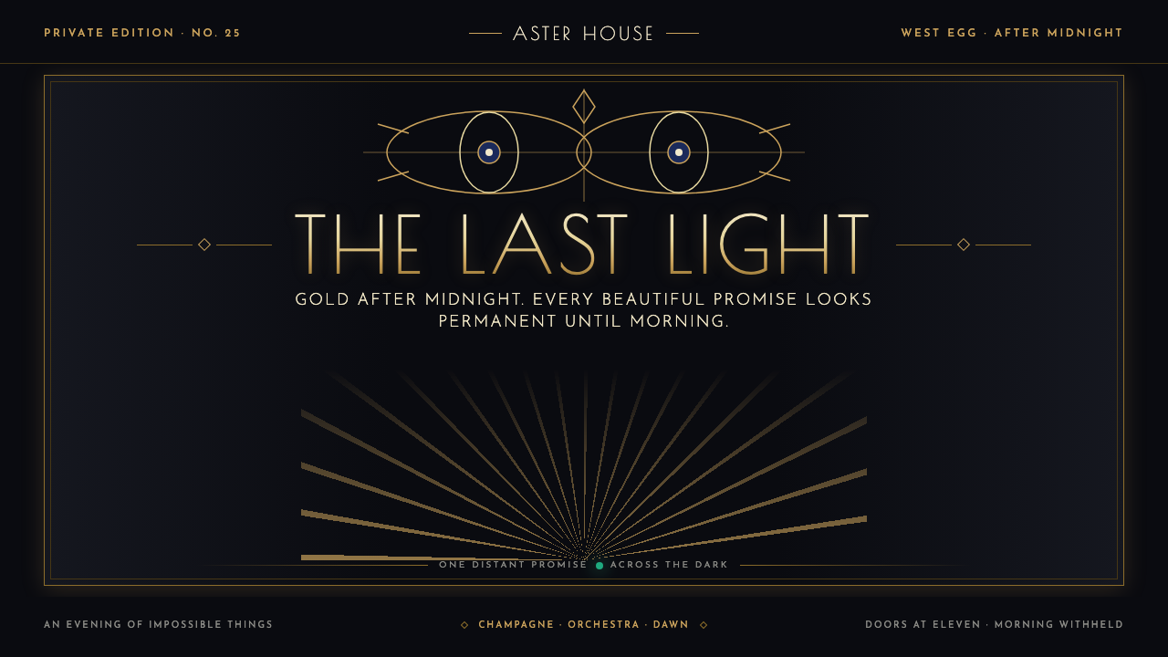 The Great Gatsby (1925)Gilded glamour courts collapse. Deco symmetry burns gold on midnight, with on…
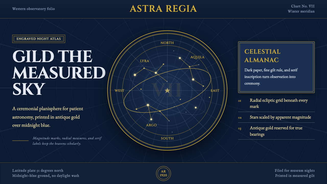 Vintage Star ChartScholarly night, gilded. Cinzel caps orbit gold grids and magnitude stars.
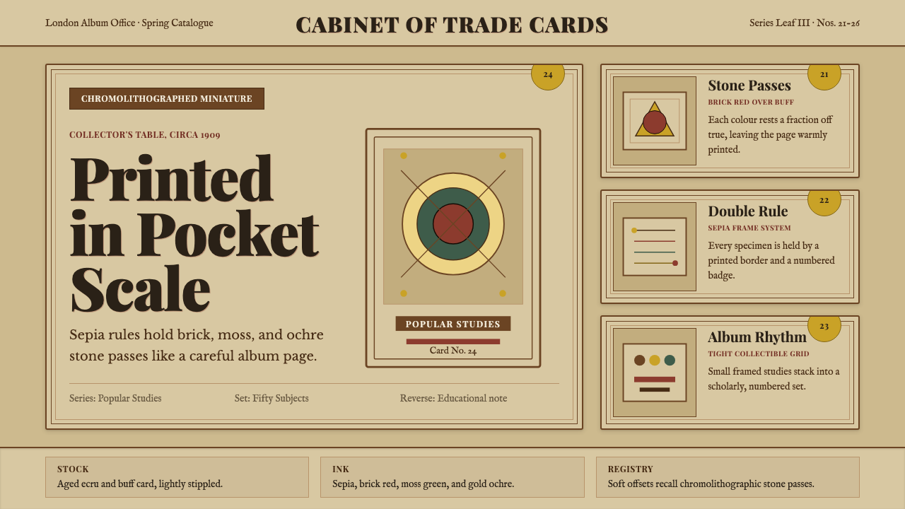 Cigarette Card SetCollectible scholarship. Sepia double-rules, buff stock, and ochre badges fra…
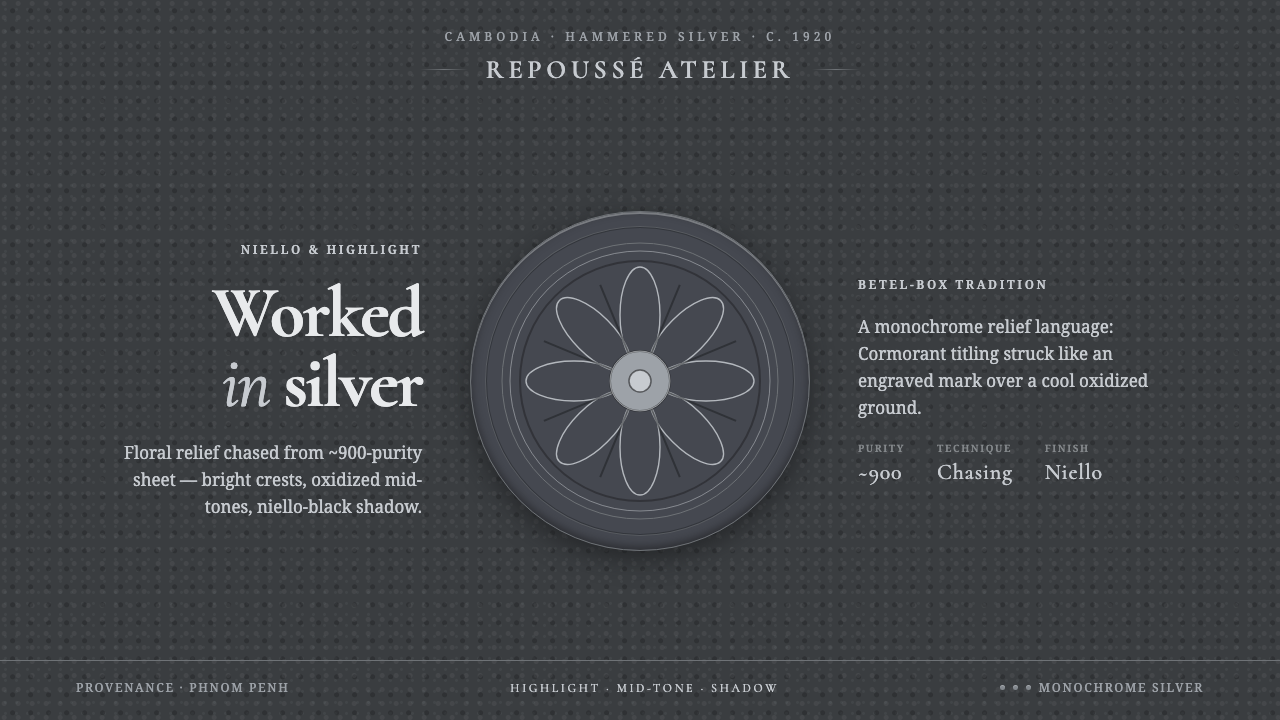 Khmer Silver RepousséHammered silver, on screen. Oxidized ground, bright highlight, niello-black r…