What is Cunard Liner Poster?
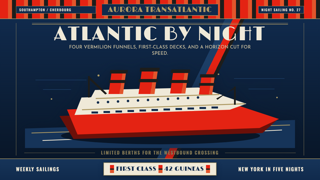
Cunard's interwar travel posters turned a transatlantic crossing into theatre — heroic low-angle liners, four vermilion-and-black funnels riding a field of deep marine-blue night, gold-cream Art Deco capitals stacked above like a monument. Speed and first-class luxury were the message; the ship was the hero.
Cunard Liner Poster in brief
Cunard Liner Poster style refers to the visual language developed by British commercial artists — Walter Thomas, C.E. Turner, Frank Mason, and their contemporaries — for promoting Cunard Line ocean crossings during the interwar decades, roughly 1920 to 1939. The aesthetic is rooted in Art Deco and the golden age of British travel lithography: dramatically low viewpoints, bold silhouettes of enormous steel ships, flat areas of marine blue and midnight black sea, and monumental lettering that announces destination and speed as if carving them into stone.
The defining compositional move is the heroic low angle. The ship's bow is tilted upward and toward the viewer, making the vessel seem to surge out of the picture plane. Multiple funnels — Cunard liners of the era typically carried three or four — are rendered with their distinctive banding in vermilion and black, and their sheer number and scale communicate industrial power without requiring explanation. The sea beneath is treated as a simplified field of deep blue or dark green, rarely turbulent, always subordinate to the ship.
Typography in these posters follows Art Deco conventions pushed toward maximum legibility at distance. Destination names, line identity, and superlatives like 'Fastest' or 'Largest' are set in wide, flat-topped capitals with generous letter-spacing, often in warm gold or cream against the dark background. The type is lithographically flat — no inline strokes, no dimensional effects — and serves as counterweight to the image rather than decoration within it.
Where does Cunard Liner Poster come from?
The Cunard Line, founded in 1839 by Nova Scotian businessman Samuel Cunard with a British mail contract, became the dominant carrier of transatlantic passenger traffic through the Victorian era. By the early twentieth century, the line competed ferociously with White Star Line, Norddeutscher Lloyd, and Hamburg America Line for speed records and passenger prestige. This competition was as much a marketing battle as an engineering one, and it was fought partly through posters. British and continental shipping companies commissioned lithographic travel posters beginning in the 1890s, and by the 1920s the genre had developed into a sophisticated art form with its own conventions, star artists, and collector following.
The interwar period — particularly the 1930s — was the apex of the ocean liner poster. The ships themselves were larger, faster, and more luxurious than anything that had come before: RMS Queen Mary, launched in 1934, and her running mate RMS Queen Elizabeth were cultural events as much as vessels. Cunard's marketing department used poster imagery to position these ships as totems of British engineering supremacy and modern luxury, commissioning artists who could convey both the physical scale of the ships and the aspirational glamour of first-class Atlantic crossing.
The visual style that emerged drew on several converging influences. Art Deco provided the flat color planes, the geometric type, and the taste for monumental scale. The British tradition of poster art — the London Midland and Scottish Railway posters, the London Underground commissions — supplied compositional discipline and respect for the printed surface. Maritime painting brought the low horizon, the sense of atmosphere conveyed in a simplified sky, and the structural prominence given to the hull and funnels. Artists like Walter Thomas synthesized these streams into a house style recognizable across dozens of different Cunard commissions.
The genre's decline coincided with aviation. The opening of commercial transatlantic air service in the late 1930s and its rapid expansion after the Second World War transferred the glamour of speed to the aircraft. Cunard continued commissioning posters into the 1950s and 1960s, but the visual language became more photographic and less pictorial. The classic interwar lithographic style had effectively concluded by 1939; its revival as a design reference has grown steadily since the 1980s, driven by nostalgia for the era and the continuing appeal of the ships themselves as objects of popular culture.
What defines the Cunard Liner Poster look?
Heroic Low Viewpoint
The compositional cornerstone of the genre is a viewpoint placed well below the ship's waterline, causing the hull to rise and swell toward the top of the picture. This angle was rarely available in reality — it required imagining a camera or eye position in the water itself — and was therefore a purely artistic construction. It serves to exaggerate the ship's scale relative to the viewer, to flatten the sea into a simple dark field, and to silhouette the funnels against an open sky. The effect is cinematic before cinema was a dominant cultural force: the ship looms, it advances, it overwhelms.
Vermilion and Black Funnels
Cunard's distinctive funnel livery — alternating bands of deep vermilion-red and black — became among the most recognizable corporate color marks of the early twentieth century. In the posters, these funnels are treated with special care: the banding is rendered clearly enough to read at a glance, the number of funnels visible communicates the size class of the ship, and the red of the funnels is often the warmest and most saturated note in an otherwise cool, dark palette. Against the marine-blue night sky and the dark hull, the funnels act as a structural focal point — the visual confirmation that this ship belongs to Cunard.
Marine Blue and Midnight Palette
The dominant ground of these posters is a deep, flat, saturated blue-to-indigo that reads as open Atlantic night. This color — applied as a large, nearly unbroken field — performs multiple functions simultaneously. It simplifies the sea and sky into a single atmospheric field, it provides maximum contrast for the cream and gold lettering above, and it gives the poster a nocturnal drama that daylight compositions rarely achieve. The blue is not naturalistic but symbolic: it is the sea as idea rather than the sea as observation. Supplementary tones include a dark grey-green for the hull and deep shadow, and a warm cream or ivory for sky and lettering.
Monumental Art Deco Lettering
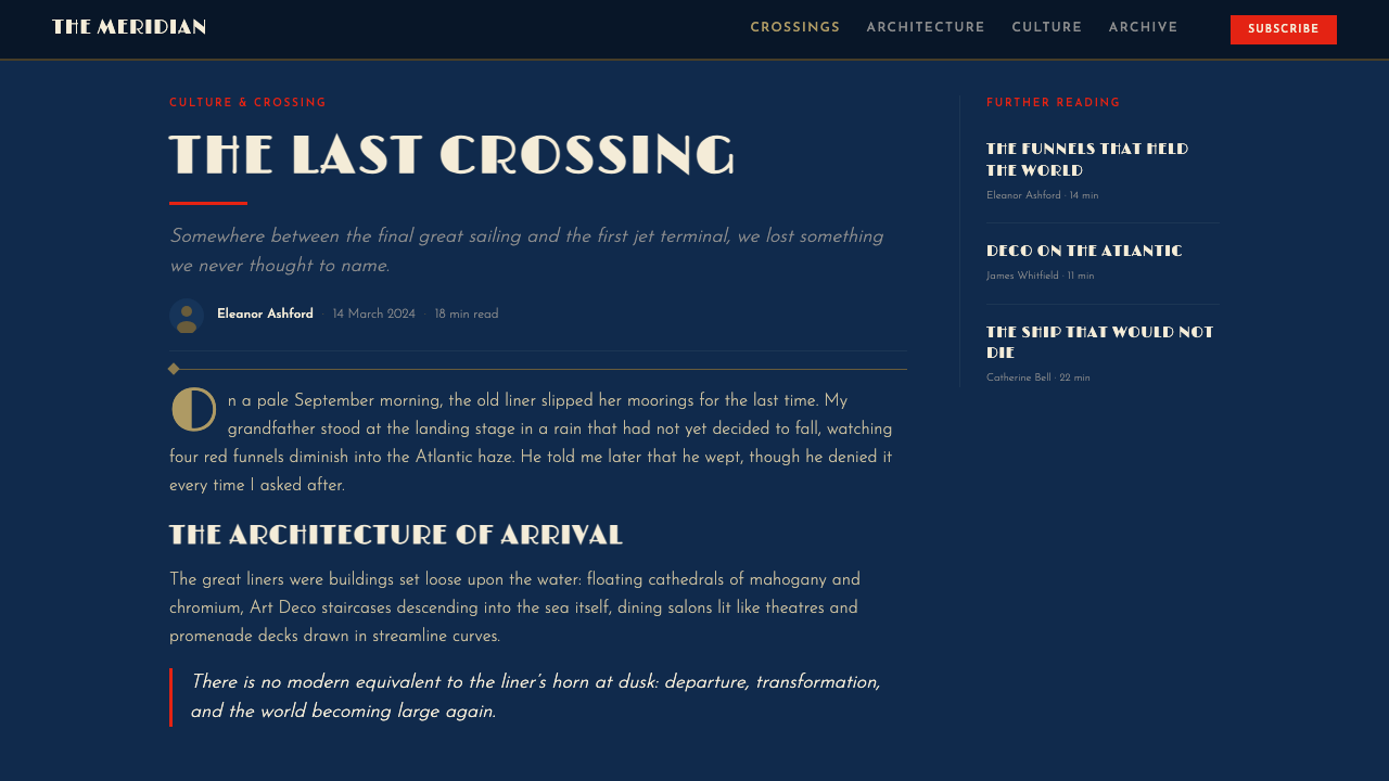
The typography in Cunard posters belongs firmly to the Art Deco tradition of the 1920s and 1930s: wide, flat-capped capitals with clean horizontal and vertical strokes, generous letter-spacing, and a preference for stacked layouts in which each line of text occupies its own visual register. Destination names are typically the largest element on the page after the ship itself. The type color is usually warm gold, cream, or pure white — never competing with the vermilion of the funnels — and the letters sit on the upper portion of the poster, above the ship's mass, giving the composition a poster logic in which image supports text and text announces image.
Flat Lithographic Color
The printing medium — stone or zinc lithography — determined the visual character of these posters as decisively as any artistic choice. Lithographic printing in the interwar period typically used between four and ten color plates, each applied as a solid, flat tone. This process eliminated gradients and subtle tonal transitions in favor of clean, bounded color areas that held their integrity even in large-format printing. Artists working in this tradition learned to design with color as a structural element rather than a shading tool: where one color ends and another begins is a visual decision as deliberate as a drawn line.
Scale as Rhetoric
These posters made no attempt at a naturalistic sense of scale. The ships depicted are rendered at a size and angle that makes them impossible — they fill the pictorial field from edge to edge, their hulls extending beyond the poster's border at both sides, their masts nearly touching the top margin. This deliberate exaggeration was rhetorical: Cunard was selling the experience of being in the presence of something vast, something that dwarfed ordinary human experience. Tiny figures, where they appear at all, are placed on the dock or at the ship's railing specifically to confirm the scale of the vessel by their miniatureness.
Restrained Atmospheric Sky
The sky in these posters is never the primary subject but always a contributing element. In daytime compositions it might be rendered as a pale cream-grey with simplified cloud masses treated as flat geometric shapes. In the more common nocturnal versions, the sky graduates from the deep marine blue at the horizon to a slightly lighter indigo above, with stars rendered as simple geometric points rather than painterly glows. The economy of the sky treatment reinforces the ship's dominance: the atmosphere exists to provide contrast and backdrop, never to compete.
Who shaped Cunard Liner Poster?
Walter Thomas was among the most prolific and influential of Cunard's contracted artists, producing dozens of poster commissions across the 1920s and 1930s. His compositions established many of the conventions that defined the genre: the extreme low viewpoint, the bold funnel banding, the minimal sea treatment, and the confident marriage of illustrated ship and flat typographic announcement. His work for RMS Mauretania and later for the Queens established a visual identity for Cunard that persisted long after his own career had concluded.
Charles Edward Turner was a marine artist who brought particular attention to the physical drama of the ships' hulls and the quality of light on dark water. His posters tend toward a richer tonal range within the constraints of flat lithographic printing — he used more overlapping color passes to suggest depth in the hull and gradation in the sky than many of his contemporaries. His compositions often feature spray and wave action at the bow to convey forward motion without introducing naturalistic fussiness.
Frank Henry Mason was a prolific travel poster artist who worked across multiple British shipping and railway clients, bringing a consistent quality of atmospheric restraint to all of them. His Cunard work is distinguished by a particular economy in the handling of the sea surface — he frequently reduced the ocean to two or three tonal bands of blue-green and dark grey that convey depth without complication. Mason's training as a merchant seaman before becoming a professional artist gave his marine compositions a quality of observed authenticity that distinguished them from purely decorative interpretations of the same subject.
The Scottish engineer Robert Napier, while active a generation earlier than the poster artists discussed here, is worth including as the engineering foundation on which Cunard's visual identity rested. Napier built Cunard's first mail steamers in the 1840s and established the technical standards — including the distinctive funnel proportions — that persisted into the interwar era. The funnels that Thomas and Turner depicted with such care in the 1930s were direct descendants of Napier's Victorian engineering decisions, making the posters a visual record of a continuous technical lineage.
How do you use Cunard Liner Poster today?
Cunard Liner Poster style is one of the most atmospherically complete historical styles available to contemporary designers — it arrives with a full emotional register, a clear compositional logic, and a strong association with an era that popular culture continues to find compelling. Applying it well requires understanding that the style is fundamentally about grandeur as argument: every compositional choice — the low viewpoint, the monumental typography, the simplified dark sea — is in service of a rhetorical claim about the size and magnificence of the subject.
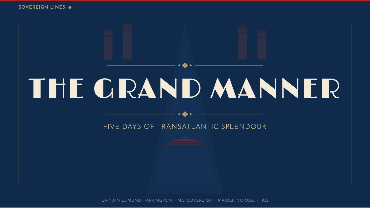
For presentation slides, the style is best suited to cover pages and section dividers rather than body content. A cover built in this language uses a full-bleed dark marine background, a single central illustration or photographic image treated with posterized flatness, and a destination-style headline in wide-set cream or gold capitals stacked in the upper or lower third. Section dividers can adapt the convention: a strong horizontal band of the subject's dominant color, a brief title in monumental type, and restrained negative space. Data slides in this style work well with bold typographic emphasis — large numerals treated as graphic elements — rather than detailed charting, since the aesthetic does not support fine-line work at screen scale.
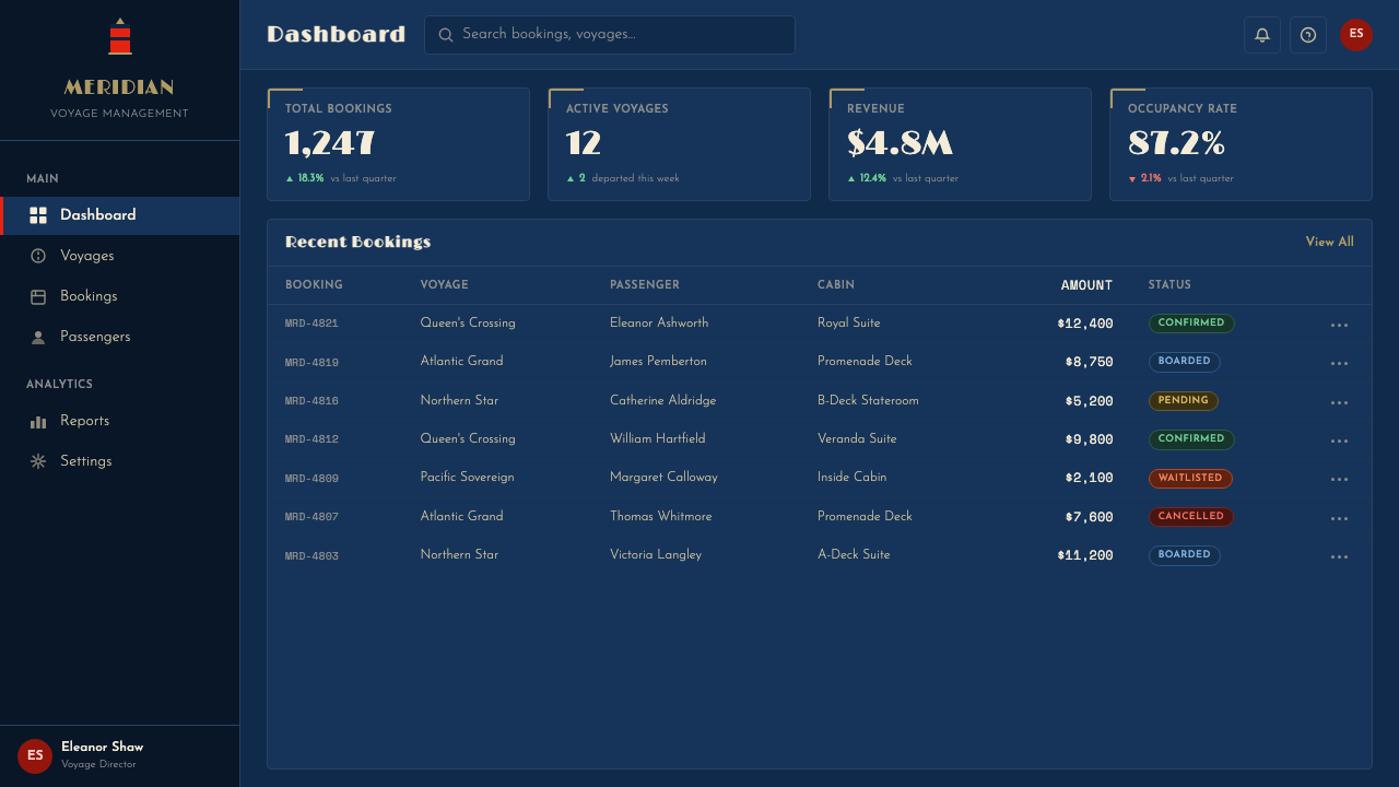
For web interfaces and digital products, the style adapts most naturally to landing pages, feature announcements, and hero sections for products or services that want to convey prestige, heritage, or aspiration. The deep marine-blue-to-near-black gradient field provides an immediately legible signal of quality without requiring explicit explanation. Cream and gold lettering over this ground reads warmly at any scale. The challenge is texture: the style was designed for large-format print, and its lithographic flatness can feel thin on screen without careful attention to type scale and compositional weight.
For editorial and marketing work, the poster style translates well into print campaigns, packaging, and event identity systems. A luxury product or experience brand can adopt the compositional grammar — dominant illustration, stacked monumental headline, restrained supporting text in the lower quarter — and apply it across formats from business cards to billboard. The color system is inherently limited (which is a strength: it enforces visual coherence without requiring design system documentation), and the typographic conventions are clear enough to be applied consistently by multiple contributors.
The most common mistake when applying this style is replacing the flatness with rendered depth. Modern illustration tools make it easy to add ambient occlusion, soft gradients, and detailed texture to what should be a bold, flat image — and every addition of this kind dilutes the poster's rhetorical power. The low-viewpoint composition loses its drama when the ship is modeled photographically; the monumental type becomes decorative rather than declarative when surrounded by visual noise. The discipline required is to remove, not to add: the power of this style lives in its willingness to leave most of the picture plane as uninterrupted dark field.
Cunard Liner Poster — FAQ
How does this style relate to other Art Deco travel poster traditions?
The Cunard liner poster is one branch of a broader interwar travel lithography tradition that also includes railway posters (LNER, LMS, PLM), aviation posters, and resort destination posters. All share Art Deco typography and a lithographic flatness of color, but each has different compositional preoccupations. Railway posters typically feature landscape at the destination rather than the vehicle; aviation posters emphasize the tiny aircraft against a vast atmospheric field; resort posters are often brighter, more playful, and more concerned with leisure than with mechanical power. The Cunard liner poster is the most vehicle-centric of the group — the ship is always the subject, and the destination is announced rather than depicted.
Can this style work for dark-mode digital interfaces?
Yes — and in fact the nocturnal palette that characterizes the most iconic Cunard posters translates more directly to dark-mode interfaces than almost any other historical travel style. The deep marine blue and near-black ground, the cream and gold typography, and the emphasis on a single dramatically lit central subject are all conventions that work naturally in dark UI contexts. The adaptation challenge is typographic: the wide-set, stacked capitals of the poster tradition are designed for large formats, and scaling them down to interface text requires careful restraint. At UI scale, the style suggests bold headline treatments, generous dark-ground hero panels, and cream-on-near-black as the primary text contrast — not an attempt to reproduce the poster's full visual grammar in a component library.
Is the vermilion red specific to Cunard, or can it be used generically?
The specific vermilion-and-black funnel banding is Cunard's livery, as recognizable to early twentieth-century travellers as an airline's tail livery today. In a design context referencing this style, using the same warm red in a similar role — structural accent against a dark field, concentrated at the top of the composition — evokes the Cunard association deliberately and specifically. If that association is what you want, it is available and legitimate. If you want the compositional and atmospheric grammar of the ocean liner poster style without Cunard specificity, you can substitute a different strong warm tone in the same structural role. The conventions of the style (low viewpoint, dark ground, monumental type, flat color) hold regardless of which specific red you use.
How do you handle the illustrative ship image in a digital context where you have no access to period lithography?
There are three workable approaches, each with different tradeoffs. The first is photographic with posterization: take a contemporary or archival photograph of a ship or large vessel, convert it to a high-contrast, limited-tone image using threshold or duotone processing, and place it against the deep blue field. This preserves the photographic detail while introducing the flatness the style requires. The second is vector illustration: redraw the ship as a clean vector silhouette with minimal internal detail, using the flat color areas and funnel banding as the primary rendering strategy. This is the most faithful to the original lithographic approach. The third is to use the compositional and typographic conventions of the style without the ship illustration entirely — letting a bold headline, a strong color field, and carefully chosen supporting imagery carry the aesthetic. This is the most adaptable approach for contexts where no appropriate ship imagery is available.
Does this style suit contemporary brands, or does it read as pastiche?
The line between evocation and pastiche is drawn by how literally the conventions are applied and how clearly the contemporary use case is foregrounded. A direct replication — period typefaces, funnel livery, faux-aged printing — will always read as nostalgia or costume. But the underlying compositional logic of the style — a single dominant subject rendered with deliberate flatness, a strongly saturated dark-ground field, and monumental typographic announcement — is abstract enough to function in contemporary brand contexts without triggering the pastiche response. The brands that deploy this vocabulary most effectively do so by committing to the atmospheric register (the nocturnal grandeur, the sense that the subject is overwhelming in scale) while using contemporary typography and subject matter. The style is not a period skin to be applied; it is a rhetorical strategy about scale and atmosphere that can be borrowed without the period trappings.
Related design styles
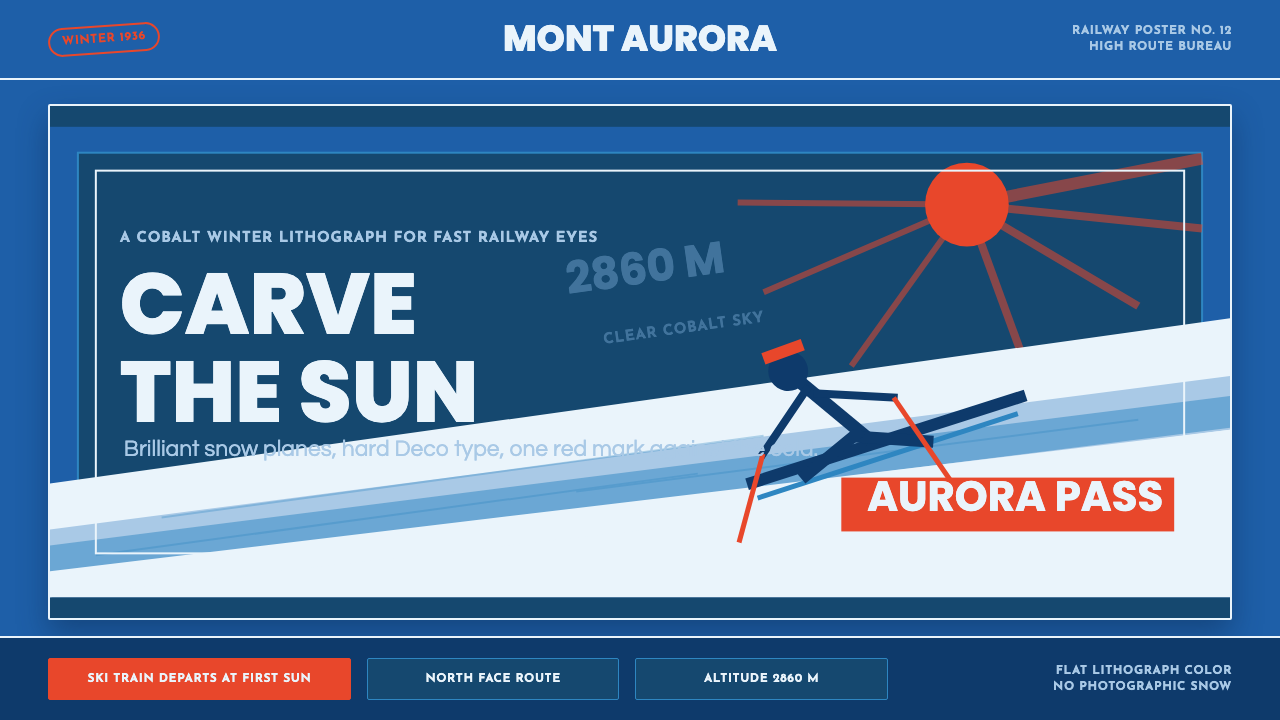 Alpine Ski PosterCold speed sells winter. Cobalt sky, snow planes, sun rays, and one resort-re…
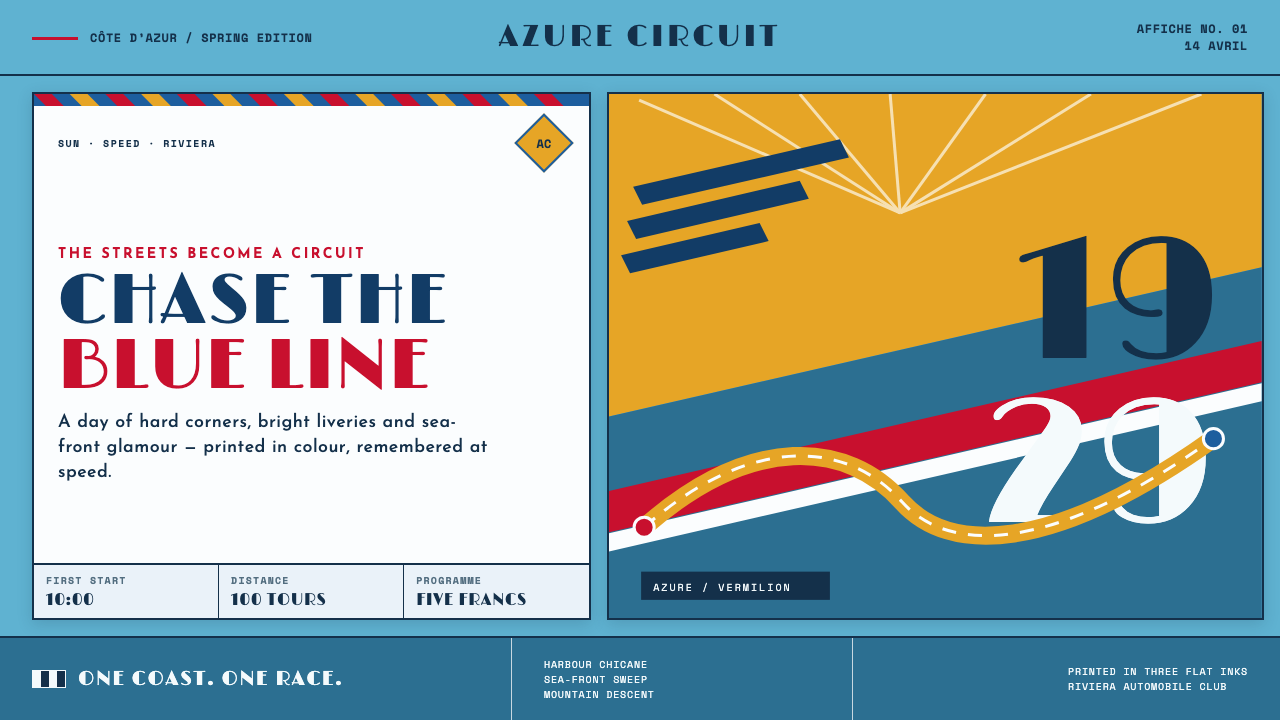 Monaco Grand Prix (1929)Speed becomes glamour. Riviera azure, racing red, and giant Deco numerals cut…
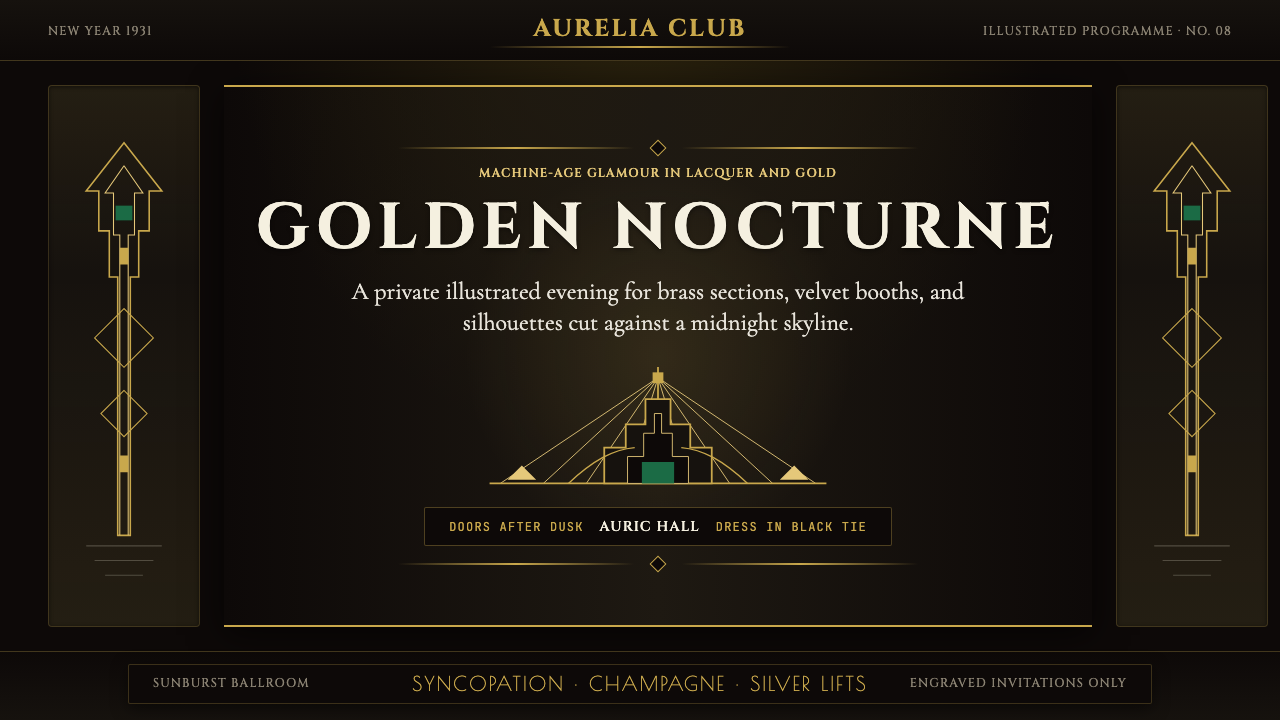 Art Deco Jazz AgeJazz Age glamour. Sunburst rays, stepped ziggurats, gold on black — Chrysler…
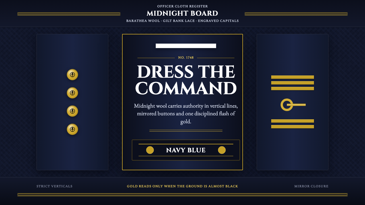 Naval Dress UniformAuthority in midnight wool. Cinzel capitals, gold lace and button symmetry ho…
 Ocean Liner SeafoamLuxury in motion. Seafoam lacquer, gilt speed-lines, and Deco symmetry frame…
 Orient ExpressRegal motion in lacquer. Midnight blue, Cinzel capitals, and gold hairlines f…