What is Dior New Look (1947)?什么是 Dior New Look (1947)?
A single Paris couture show in February 1947 redrawn femininity, silence, and luxury into a visual system that still dictates what elegance looks like.1947年2月,巴黎的一场高级订制秀重新定义了女性气质、静默与奢华,凝铸出一套至今仍在诠释「优雅」的视觉语言。
Dior New Look (1947) in briefDior New Look (1947) 速览
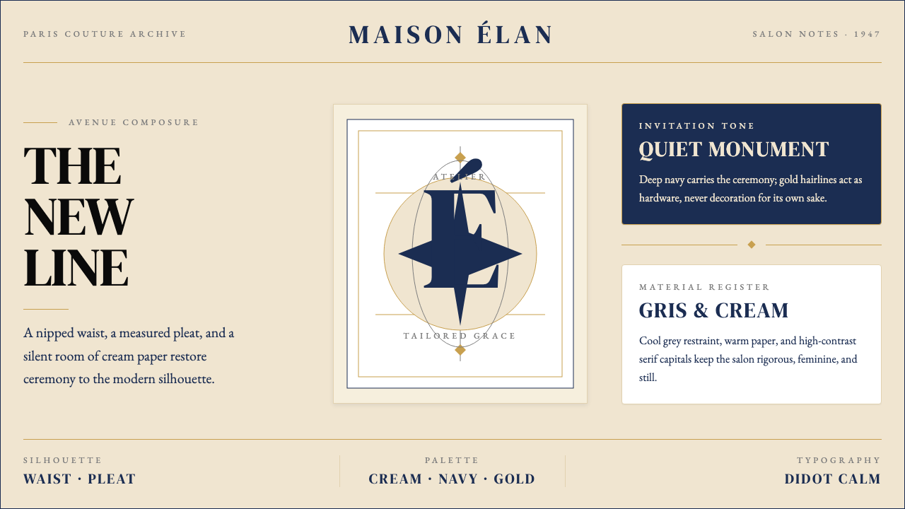
The Dior New Look is a visual system born from a single couture collection — Christian Dior's debut, presented February 12, 1947, at 30 Avenue Montaigne in Paris. Its palette is anchored in three colors: a cool, dusty grey known as gris-Dior, a warm cream recalling fine writing paper, and a deep, authoritative navy. Against these grounds, tall Didot-style serif capitals carry headlines with the precision of an engraved calling card. Gold hairlines — filigree-thin — divide compositions as if drawn with a draughtsman's ruling pen. The total effect is monumental restraint: not the loudness of wealth, but the quietness of certainty.迪奥「新风貌」是诞生于单一高级订制系列的视觉体系——1947年2月12日,克里斯汀·迪奥在巴黎蒙田大道30号发布了他的首个系列。这套体系的色彩根植于三种色调:被称为「gris-Dior」的冷灰蓝,让人联想到上等信纸的温润米白,以及沉稳而权威的深海军蓝。在这些底色之上,高耸的Didot风格衬线大写字母以雕版名片般的精准承载着标题。金色发丝线——细如纤维——像绘图员的直尺笔迹般分隔构图。整体效果是庄重的克制:不是财富的喧嚣,而是确定性的静默。
What separates the New Look aesthetic from generic luxury is its relationship to structure. The style's founding garment, the Bar Jacket, was built on an interior architecture of boning, interfacing, and padding that sculpted the silhouette before a single visible seam appeared. The same logic carries into the visual language: every layout decision is load-bearing. Wide letter-spacing in capitals is not decoration but pacing. A generous page margin is not waste but breathing room that confers importance on what occupies the center. Hairline rules are not embellishment but joint lines that articulate where one zone ends and another begins.将「新风貌」美学与普通奢华区别开来的,是它与结构的关系。这套风格的奠基单品——Bar小立领套装——依靠内里的骨架、衬布与填充物构建出雕塑般的轮廓,在任何一条可见的缝线呈现之前,廓形便已成立。同样的逻辑贯穿视觉语言:每一个版面决策都是承重的。大写字母的慷慨字距不是装饰,而是节奏的控制。宽阔的页边空白不是浪费,而是令中心区域的内容获得分量的呼吸空间。发丝细线不是点缀,而是明确区域边界的接缝线。
The style is not maximalist, and it is not minimalist in the contemporary sense. It is couture-precise — a word chosen deliberately. Where minimalism strips down to emptiness, the New Look strips down to exactitude: only the necessary elements remain, but each of those elements is given the full weight of craft attention. Negative space is active. Cream grounds do not recede; they command. This is elegance defined not by addition but by the discipline of selection.这套风格既非极繁主义,也非当代意义上的极简主义。它是「高级订制精确」——这个词被刻意选用。极简主义剥削至空无,「新风貌」则剥削至精确:只保留必要的元素,但每一个留下的元素都被赋予工艺关注的全部重量。负空间是主动的。米白底面不会退却,它主导全局。这是由「选择的自律」而非「叠加」所定义的优雅。
See the Dior New Look (1947) design system查看 Dior New Look (1947) 完整设计系统
Where does Dior New Look (1947) come from?Dior New Look (1947) 从何而来?
Christian Dior was not an overnight phenomenon. Born in 1905 in Granville, Normandy, he spent the 1930s working as an art dealer and then as a sketch-seller, eventually apprenticing under the couturier Robert Piguet and later under Lucien Lelong during the German occupation of Paris. The occupation years were artistically stifling but technically formative: the skilled petites mains — the seamstresses, embroiderers, and toilers of the ateliers — continued their craft under constraint, and Dior absorbed both the standards and the melancholy of that period. When textile industrialist Marcel Boussac agreed to back a new house in 1946, Dior had already assembled a precise vision of what he wanted to say.克里斯汀·迪奥并非横空出世。他1905年生于诺曼底的格朗维尔,整个1930年代先后以画商和手稿贩卖者谋生,后在高级时装设计师罗贝尔·皮盖门下学艺,继而在德军占领巴黎期间在吕西安·勒隆麾下工作。占领岁月在创作上令人窒息,却在技艺上奠定了根基:工坊里那些娴熟的「小手们」——缝纫工、刺绣工、各路手工艺人——在重重束缚下延续着她们的技艺,迪奥由此内化了那个时代的标准与忧郁。1946年,纺织业大亨马塞尔·布萨克同意资助创立新品牌时,迪奥对自己想要表达的一切已有精确构想。
The February 1947 show — which editor Carmel Snow of Harper's Bazaar named the 'New Look' immediately after seeing it — was received as both a revelation and a provocation. The padded shoulders and boxy silhouettes of wartime rationing gave way to a rounded shoulder line, a cinched waist, and a full skirt falling to mid-calf. The Bar Jacket, in pale wool, with its curved peplum and hip padding, was the collection's centerpiece. To some observers the show felt like an affront to austerity; to others it felt like the restoration of something that had been unjustly suppressed. Paris claimed its position as the undisputed capital of fashion, a status it had not been sure of during the occupation.1947年2月的那场发布会——《时尚芭莎》编辑卡梅尔·斯诺在观秀后立刻将其命名为「新风貌」——被视为一次启示,也是一次挑衅。战时物资匮乏催生的宽垫肩与方形廓形,让位于圆润的肩线、收紧的腰身,以及落至小腿中部的丰盈圆裙。Bar小立领套装——浅色羊毛制成,带有弧形下摆与臀部填充——是这个系列的核心单品。在部分观察者眼中,这场秀是对紧缩时代的冒犯;在另一些人眼中,它是对某种被不公正压制之物的恢复。巴黎借此重申了自己作为时尚无可争议之都的地位——这一地位在占领期间曾岌岌可危。
The visual identity that crystallized around the house — the grey and cream interiors of 30 Avenue Montaigne, the oval-and-serif logo, the tissue-paper wrapping, the gold-stamped boxes — was not an afterthought but an extension of the same couture logic Dior applied to the clothes. He understood, perhaps more consciously than any designer before him, that the environment in which a garment is seen shapes the meaning of the garment itself. The boutique was designed to feel like a private residence of studied elegance, not a retail environment. Every touchpoint — the invitation, the program, the label sewn into the lining — participated in the same visual grammar.围绕这家品牌逐渐凝固的视觉识别——蒙田大道30号灰白相间的室内陈设、椭圆衬线标志、薄棉纸包装、烫金礼盒——并非事后补加,而是迪奥用于服装的同一高级订制逻辑的延伸。他比任何一位前辈设计师都更为自觉地理解:展示服装的环境本身塑造着服装的意义。精品店被设计成经过深思熟虑的私人宅邸,而非零售空间。每一个触点——邀请函、场刊、缝入衬里的标签——都参与着同一套视觉语法。
The house has since passed through a succession of creative directors whose work has reinterpreted and sometimes dramatically expanded the original aesthetic. Yves Saint Laurent, who succeeded Dior after his sudden death in 1957, introduced a more youthful edge while preserving the couture architecture. John Galliano, appointed in 1996, pushed the house into theatrical excess and historical pastiche, exploring the New Look's silhouette as a starting point for extremity. Since 2016, Maria Grazia Chiuri has brought a feminist re-reading: citing Dior's female relatives and collaborators, and exploring the political dimensions of the constructed feminine silhouette. Through all these interpretations, the core visual language — the palette, the Didot-style capitals, the hairline gold, the grey and cream — has remained the house's graphic identity, administered with increasing consistency under LVMH ownership since 1984.此后,品牌历经多位创意总监的更迭,他们的工作重新诠释了原有美学,有时甚至大幅拓展了它的边界。伊夫·圣罗兰在1957年迪奥猝然离世后继任,在保留高级订制建筑感的同时引入了更年轻的锐气。1996年接任的约翰·加利亚诺将品牌推向戏剧性的极致与历史性的拼贴,将「新风貌」廓形作为走向极端的出发点加以探索。2016年起,玛丽亚·嘉茜娅·谬丽试图进行女性主义重读:援引迪奥的女性亲属与合作者,探究建构性女性廓形的政治维度。穿越所有这些诠释,这套核心视觉语言——色板、Didot风格大写、金色发丝线、灰与米白——始终是品牌的平面识别系统,并在1984年归入LVMH旗下后以愈发一致的方式被执行。
What defines the Dior New Look (1947) look?Dior New Look (1947) 的视觉特征是什么?
Palette色板
The New Look palette is built on three carefully weighted tones: gris-Dior, a cool grey with a faintly blue undertone that reads as both neutral and authoritative; warm cream, which carries the warmth of aged paper and functions as the primary ground; and deep navy, used for type, borders, and structural emphasis. Gold — not yellow, but the restrained warmth of polished hardware — appears as a fourth accent, reserved for hairline rules, monogram stamps, and small graphic flourishes. No bright primaries. No black-and-white stark contrast. The system is pitched at the register of a very quiet confidence.「新风貌」色板建立在三种经过精确权衡的色调之上:gris-Dior,一种略带蓝调的冷灰,兼具中性与权威感;温润米白,携带着陈年纸张的暖意,作为主要底色使用;以及深海军蓝,用于文字、边框与结构性强调。金色——不是黄色,而是抛光金属配件的那种克制温暖——作为第四种强调色出现,保留给发丝细线、字母印章与小型图形点缀。没有明亮的三原色,没有黑白之间的强烈对比。这套体系所传达的,是一种极为安静的自信。
Typography字体排印
Headlines are set in tall, high-contrast serif letterforms in the Didot tradition — letterforms in which the difference between the thinnest stroke and the thickest stroke is extreme, producing an almost engraved quality. Uppercase settings dominate, particularly for brand names, section titles, and any word that needs to carry the weight of a label. Letter-spacing in these uppercase settings is consistently generous — each character given room to stand as an independent form rather than being compressed into a dense word-shape. Body text, when present, is set with deliberate restraint and typically at a smaller scale, treating the editorial density of fine print as a quality rather than a liability.标题采用Didot传统的高对比度衬线字形——这种字形中,笔画最细处与最粗处的差异极为悬殊,呈现出近乎雕版的质感。大写字母设置占主导地位,尤其用于品牌名称、版块标题以及任何需要承载标签分量的词语。这些大写设置中的字距始终保持慷慨——每个字符都有充分的空间独立成形,而非被压缩进密集的词形之中。正文(如出现)以刻意的克制排印,通常以较小尺度呈现,将精细印刷的编辑密度视为品质而非缺陷。
Silhouette and White Space廓形与留白
Just as the Bar Jacket constructed its elegance through interior architecture invisible to the eye, New Look layouts construct their authority through the management of empty space. Margins are wide — sometimes dramatically so — and this width is not a failure to fill the page but a deliberate elevation of whatever sits within the center. The composition principle is that negative space is as weighted as positive space. An isolated headline on a cream ground carries more authority than the same headline surrounded by competing elements. Single central motifs, placed with mathematical deliberateness, anchor pages and spreads.正如Bar小立领套装通过眼睛不可见的内部结构建构优雅,「新风貌」版面通过空白的管理来建构权威。页边距宽阔——有时甚至令人印象深刻——这种宽度不是未能填满页面的失误,而是对中心内容的刻意抬升。这套构图原则认为:负空间与正空间拥有同等重量。一行孤立的标题置于米白底面上,比同一行标题被竞争性元素环绕时承载更多权威。以数学般的刻意放置的单一中心母题,锚定着页面与对开版面。
Gold Filigree and Linear Detail金色细线与线条细节
Hairline rules in gold — strokes so thin they read as drawn rather than printed — function as the system's primary articulation device. They divide header from body, frame a central motif, or underline a logotype with the precision of a ruled line on formal stationery. This is not decoration in the ornamental sense; it is joinery. The gold hairline marks where one structural zone ends and another begins, performing the same role as the topstitching on a couture lapel. Floral flourishes — particularly lily-of-the-valley, Dior's emblematic flower — appear at the smallest scale, used as period marks or section-end indicators rather than as area-filling motifs.金色发丝细线——细到令人感觉是手绘而非印刷的笔迹——作为这套体系最主要的连接装置发挥作用。它们分隔标题与正文,为中心母题描绘边框,或以正式信笺上划线般的精准为标志字做下画线。这不是装饰意义上的点缀,而是接缝处理。金色发丝线标记着一个结构区域的终结与另一个的开始,与高级订制翻领上的明线所扮演的角色如出一辙。花卉点缀——尤其是迪奥标志性的铃兰——以最小的尺度出现,充当句号或段落结尾的指示符,而非填充面积的图案。
Photography and Image摄影与图像
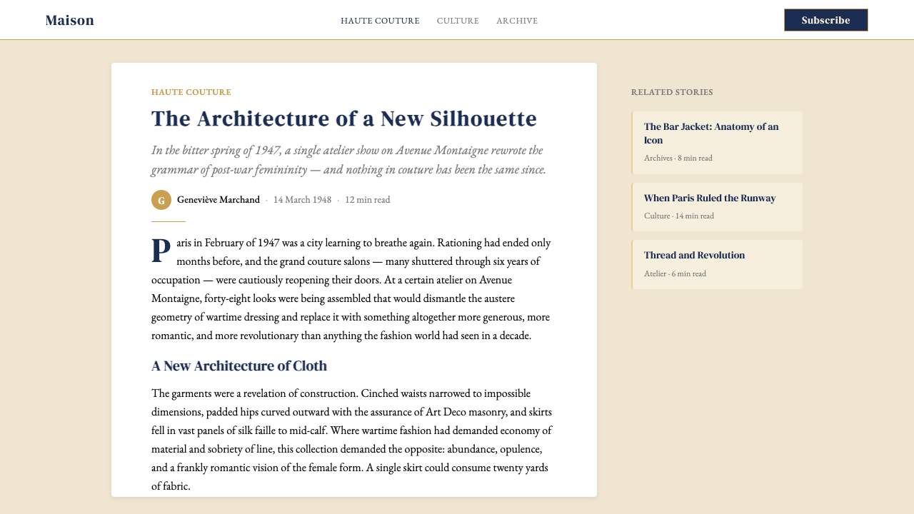
New Look imagery follows editorial fashion-photography conventions at their most controlled. Compositions are typically centered or near-centered, lit for sculptural volume rather than documentary flatness, and cropped to emphasize silhouette. The subject occupies a generous amount of frame, surrounded by breathing room. Color photographs appear muted and tonal rather than saturated; black-and-white images lean toward high contrast and deep shadows. There is no lifestyle photography in the candid sense — every image is staged, knowing, and composed with the precision of a still life. Product imagery is photographed against grounds that echo the palette: cream, grey, or deep field.「新风貌」的图像遵循编辑级时装摄影在最受控状态下的惯例。构图通常居中或接近居中,打光以呈现雕塑体积感而非纪录片式的平坦,裁切以强调廓形为准。被摄主体在画面中占据充足比例,被呼吸空间所环绕。彩色照片呈现柔和的色调感而非高饱和;黑白图像则倾向于高对比度与深沉阴影。没有任何意义上的抓拍式生活场景——每张图像都是经过摆布、深思熟虑、以静物画般的精准构图的。产品图像在与色板呼应的底面上拍摄:米白、灰,或幽深的色域。
Restrained Materiality克制的材质感
The New Look visual language implies material quality rather than illustrating it. Cream grounds suggest fine paper without simulating paper texture. Navy type implies ink without imitating the variation of actual ink flow. Gold suggests polished metal without applying a gradient or sheen effect. This restraint is deliberate: simulating texture is a form of insecurity, a signal that the design does not trust its own elegance. The system assumes a viewer who already understands the codes and requires no explicit demonstration. The surface is smooth, precise, and entirely assured.「新风貌」视觉语言暗示材质品质,而非对其加以图解。米白底面暗示精质纸张,而不模拟纸张纹理。海军蓝字体暗示墨水,而不仿效真实墨水的流动变化。金色暗示抛光金属,而不施用渐变或光泽效果。这种克制是刻意为之:模拟质感是一种不安全感的表现,是设计不信任自身优雅的信号。这套体系预设了一位已然理解其符码、无需显式示范的观看者。表面是光滑的、精确的、浑然自信的。
Monogram and Emblem Logic字母组合与徽章逻辑
The house's oval cartouche — a contained shape framing the brand name in serif capitals — functions as the system's heraldic anchor. It appears at the center of packaging, at the head of correspondence, at the foot of an advertisement. Its shape is complete and self-sufficient: it does not need adjacent elements to read as authoritative. This emblem logic extends to sub-elements: a single initial, a perfume bottle silhouette, a floral sprig can each function as standalone graphic marks when set against the palette grounds. The system is built for reduction — any element, isolated and given space, retains the identity of the whole.品牌的椭圆图章——一个容纳衬线大写字母品牌名的封闭形状——作为这套体系的纹章锚点发挥作用。它出现在包装的中央,信件的顶端,广告的底部。它的形状是完整自足的:不需要相邻元素也能被解读为权威。这套徽章逻辑延伸至子元素:单个字母、香水瓶轮廓、花卉枝条,置于色板底色上时各自都能作为独立的图形标记使用。这套体系是为化简而建的——任何元素,孤立存在并被赋予空间时,都保留着整体的识别性。
See the Dior New Look (1947) design system查看 Dior New Look (1947) 完整设计系统
Who shaped Dior New Look (1947)?谁塑造了 Dior New Look (1947)?
Dior (1905–1957) founded the house in 1946 and launched the New Look collection on February 12, 1947. Trained in the ateliers of Robert Piguet and Lucien Lelong, he brought to his own house a thorough command of couture's internal architecture — the bonework of boning, padding, and interfacing that builds silhouette before fabric is cut. His design philosophy was as much curatorial as creative: he studied eighteenth-century French portraiture, the proportions of Second Empire furniture, and the floral grammar of Impressionist painting. The visual language he established — the palette, the typography conventions, the boutique environment — remained legible as his long after his sudden death from a heart attack in Italy in 1957.迪奥(1905—1957年)于1946年创立品牌,并于1947年2月12日发布「新风貌」系列。在罗贝尔·皮盖与吕西安·勒隆的工坊受训期间,他深入掌握了高级订制的内部结构——那套在裁剪布料之前便已构建廓形的骨架、填充与衬布工艺。他的设计哲学兼具策展性与创造性:他研究十八世纪法国肖像画、第二帝国家具的比例与印象派绘画的花卉语法。他所建立的视觉语言——色板、字体排印惯例、精品店环境——在他1957年于意大利突发心脏病猝然离世后,仍被长久地辨认为他的遗产。
Chiuri became the first woman to serve as artistic director of Christian Dior when she was appointed in 2016. Her tenure has been defined by a sustained feminist re-reading of the house's history: her debut collection featured a sheer top printed with 'We Should All Be Feminists,' and she has consistently sourced collaborators from feminist art, craft traditions, and non-Western cultural practice. Crucially, Chiuri has not dismantled the New Look visual grammar but has excavated the women who made it possible — the petites mains, Dior's sister Catherine, the seamstresses and pattern-makers — reframing the house's founding mythology without erasing its aesthetic codes.谬丽于2016年出任克里斯汀·迪奥艺术总监,成为首位担任这一职务的女性。她的任期以对品牌历史持续的女性主义重读为标志:她的首个系列推出了印有「我们都应该成为女权主义者」字样的薄透上衣,并持续引入来自女性主义艺术、手工艺传统与非西方文化实践的合作者。至关重要的是,谬丽并未拆除「新风貌」的视觉语法,而是挖掘了使之成为可能的那些女性——工坊的「小手们」、迪奥的姐姐凯瑟琳、裁缝和打版师——在不抹去美学符码的前提下重构品牌的创立神话。
Appointed in 1996, Galliano presided over what many consider the most theatrically extravagant era in the house's history. His couture shows — staged as elaborate narrative performances, with invitations printed as newspapers, models entering as Edwardian eccentrics or Egyptian queens — expanded the New Look's formal vocabulary into historical pastiche and baroque accumulation. Paradoxically, this maximalism reinforced the canonical identity: Galliano's most extreme departures were legible as Dior precisely because the underlying palette, the emphasis on sculpted silhouette, and the couture precision of finish remained intact beneath the spectacle.1996年接任的加利亚诺主持了许多人认为是品牌历史上最具戏剧性张扬的时代。他的高级订制秀——以精心编排的叙事表演形式呈现,邀请函印成报纸,模特以爱德华时代的怪人或埃及女王身份入场——将「新风貌」的形式词汇扩展进历史拼贴与巴洛克式的堆叠之中。悖论在于,这种极繁主义反而强化了经典识别:加利亚诺最极端的背离之所以仍被解读为迪奥,正是因为底层的色板、对雕塑廓形的强调,以及高级订制的精工完成度,在奇观之下完好无损。
Often overshadowed by the drama of his successors, Bohan served as artistic director from 1960 to 1989 — the longest tenure in the house's history. His nearly three decades of work were defined by a quiet fidelity to the New Look's structural principles: the sculpted waist, the emphasis on line and proportion, the understated palette. It was Bohan who steered the house through the social upheaval of the 1960s and the shifting silhouettes of the 1970s without abandoning the couture grammar, effectively consolidating the New Look as a continuous aesthetic tradition rather than a period style. His restraint was the condition of the house's longevity.博昂常常被继任者的戏剧性所遮蔽,但他从1960年至1989年担任艺术总监——这是品牌历史上任期最长的一次。他将近三十年的工作以对「新风貌」结构原则的安静忠诚为标志:雕塑感的腰线、对线条与比例的强调、低调的色板。正是博昂在不抛弃高级订制语法的前提下,引领品牌渡过了1960年代的社会动荡与1970年代的廓形更迭,将「新风貌」有效地稳固为一套延续的美学传统,而非一种特定历史时期的风格。他的克制是品牌长寿的条件。
Arnault acquired Christian Dior as part of his construction of the LVMH luxury conglomerate, taking control in 1984. While not a designer, his stewardship has been decisive for the visual consistency of the brand: LVMH's management philosophy prizes heritage legibility over creative disruption, which in practice means the house's graphic identity — the oval logo, the cream-and-navy palette, the Didot-style serif conventions — has been administered with increasing system discipline. The contemporary Dior visual language, as encountered across packaging, digital, advertising, and retail environments, owes its coherence as much to this institutional commitment as to any single designer.阿诺特在构建LVMH奢侈品集团的过程中收购了克里斯汀·迪奥,并于1984年取得控制权。尽管并非设计师,他的掌舵对品牌视觉一致性而言却具有决定性意义:LVMH的管理哲学将传承的可辨识性置于创意颠覆之上,在实践中这意味着品牌的平面识别——椭圆标志、米白与海军蓝色板、Didot风格衬线惯例——以日趋系统化的纪律加以执行。当代迪奥视觉语言,跨越包装、数字、广告与零售环境所呈现的连贯性,同等程度上要归功于这种机构性承诺,以及任何一位单独的设计师。
How do you use Dior New Look (1947) today?今天怎么用 Dior New Look (1947)?
Applying the New Look system correctly depends on understanding what it is actually communicating: not richness in the populist sense, but the specific authority of a house that does not need to compete for attention. Every application decision should ask the same question the couturier asked of every seam: is this element earning its place? The palette, the typography conventions, and the spatial logic must work together as a unified grammar — borrowing only the gold hairlines, or only the Didot-style caps, produces pastiche rather than system.正确应用「新风貌」体系,有赖于理解它实际传达的是什么:不是大众意义上的富丽,而是一家无需争夺注意力的品牌所特有的权威。每一个应用决策都应该向自己提出裁缝向每一道缝线提出的同一个问题:这个元素有没有赢得它存在的理由?色板、字体排印惯例与空间逻辑必须作为统一的语法协同运作——仅借用金色细线或仅借用Didot风格大写字母,产生的是仿制而非体系。
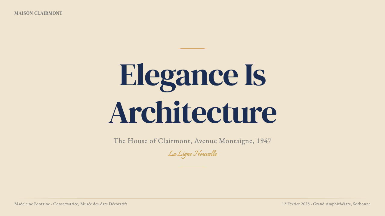
For presentation slides, the New Look translates into a highly specific visual register. Cover slides should commit to near-total restraint: the title in tall, well-spaced serif capitals on a cream ground, a single hairline rule above or below, and — at most — a monogram or emblem placed with deliberateness. No photography on covers unless it is treated as a full-bleed editorial image with the subject large and the composition centered. Content slides should use the navy-on-cream or cream-on-navy register for section titles, with body text in a smaller, more closely set serif. Data slides should treat charts as diagrammatic objects: axis labels in small caps, bars or segments colored in navy and gris-Dior with a single gold accent line marking a threshold or total.对于演示文稿,「新风貌」转化为高度特定的视觉语域。封面页应当追求近乎彻底的克制:标题以高挑、宽松间距的衬线大写字母置于米白底色,上方或下方一条发丝细线,以及——至多——一个刻意放置的字母组合或徽章。除非将其处理为以主体为大、构图居中的满版编辑图像,否则封面不使用摄影。内容页为版块标题使用海军蓝底米白字或米白底海军蓝字的组合,正文以更小、间距更紧的衬线字体排印。数据页将图表视为示意图对象:坐标轴标签使用小型大写字母,柱条或扇区以海军蓝与gris-Dior着色,以单条金色强调线标记阈值或合计。
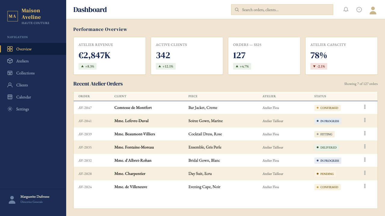
For web interfaces — particularly dashboards, pricing pages, and brand sites for luxury-adjacent products — the New Look palette provides immediate authority on landing. The approach: use cream as the primary surface, navy for primary type and structural elements, and gris-Dior as a secondary surface for cards, panels, or sidebars. Reserve gold for the most elevated interactive moments: a selected state, a premium badge, a CTA button border. Navigation should be typographic — the brand name in a contained oval or cap-spaced setting, section labels in tracked caps — with no decorative iconography beyond very simple geometric indicators. Button styles should use bordered outlines rather than filled shapes for secondary actions, and filled navy for primary actions.对于网页界面——尤其是仪表板、定价页面,以及奢侈品相邻产品的品牌站——「新风貌」色板在首屏便赋予了即时权威。方法如下:以米白作为主要界面底色,以海军蓝用于主要文字与结构性元素,以gris-Dior作为卡片、面板或侧边栏的次级底色。将金色保留给最高级别的交互时刻:选中状态、高级徽章、行动召唤按钮的描边。导航应是字体性的——品牌名置于封闭椭圆形或大写字母间距设置中,版块标签使用有字距的大写字母——除非是极简几何指示符,否则不使用装饰性图标。次要操作采用描边轮廓按钮样式而非填充形,主要操作采用填充海军蓝。
For editorial and marketing work, the style's strongest suit is the fashion editorial paradigm: an image occupying most of the spread, a title in tall tracked caps at the head or foot, and a pull-quote in italics as the only body copy that appears at reading scale. Marketing pages benefit from a section rhythm that alternates cream grounds and deep-navy grounds, maintaining the palette relationship while creating visual pace. Headlines should always be set in uppercase, with enough tracking to give each word the feeling of a label. Any call-to-action should be understated by contemporary standards — a bordered text link or a small filled button, never a large high-saturation shape.对于编辑与营销内容,这种风格最擅长的是时装编辑范式:图像占据版面的大部分,标题以高挑、有字距的大写字母置于顶部或底部,引述语以斜体作为唯一在阅读尺寸下呈现的正文内容。营销页面受益于交替使用米白底与深海军蓝底的版块节奏,在保持色板关系的同时制造视觉节拍。标题始终应以大写字母排印,并有足够的字距使每个词语都具备标签般的存在感。行动召唤以当代标准衡量应是低调的——一个描边文字链接或一个小型填充按钮,绝非一个大面积高饱和度的形状。
A persistent mistake when applying the New Look is the assumption that its luxury register licenses visual abundance. In fact the system's authority depends entirely on its restraint. The most common failures: too many gold elements competing with one another (the system calls for a single hairline, not a border made of hairlines); Didot-style type used at body-copy scale where its extreme stroke contrast becomes illegible; photography chosen for lifestyle warmth rather than editorial control, which imports the visual register of a completely different brand system; and backgrounds that drift from the canonical cream-grey-navy toward beige, taupe, or brown, which collapses the palette's cool precision into generic warmth. Restraint is not optional — it is the mechanism.应用「新风貌」时一个持久存在的错误,是认为其奢华语域赋予了视觉丰盛的许可。事实上,这套体系的权威完全依赖于其克制。最常见的失败:过多金色元素相互竞争(这套体系要求的是单一发丝细线,而非由发丝线构成的边框);Didot风格字体在正文尺寸下使用,导致其极端的笔画对比度在阅读时失去辨识性;选用传达生活方式温度的摄影而非具有编辑控制感的图像,从而将完全不同的品牌体系的视觉语域引入其中;以及背景色从经典的米白-灰-海军蓝体系漂移向米黄、灰褐或棕色,令色板冷静的精确感坍塌进普通的温暖感之中。克制不是选项——它是机制本身。
See the Dior New Look (1947) design system查看 Dior New Look (1947) 完整设计系统
Dior New Look (1947) — FAQDior New Look (1947) · 常见问题
Is the New Look style appropriate for brands outside luxury fashion?「新风貌」风格适用于奢侈时装之外的品牌吗?
Yes, with careful calibration. The New Look visual grammar — restrained palette, Didot-style serif caps, hairline gold accents, generous white space — is transferable to any context where authority, heritage, and quiet confidence are the desired values. Architecture and interior design studios, financial advisory firms, perfumery or cosmetics brands, and premium food or wine producers have all successfully operated within this register. The key test is whether the brand's actual positioning earns the implicit claim the visual system makes. If the product or service is genuinely positioned at the top of its category, the New Look grammar amplifies that positioning. If it is not, the visual language reads as aspiration rather than fact — which is a different and weaker signal.可以,但需要仔细校准。「新风貌」视觉语法——克制的色板、Didot风格衬线大写、金色发丝强调、慷慨的留白——可以迁移至任何权威感、传承与安静自信是期望价值的场景。建筑与室内设计工作室、金融顾问公司、香水或美妆品牌,以及顶级食品或葡萄酒生产商,都曾成功地在这一语域中运作。关键的检验是:品牌的实际定位是否能赢得视觉体系所隐含宣示的资格。如果产品或服务在其品类中确实处于顶端,「新风貌」语法会放大这一定位。如果并非如此,视觉语言传达的将是抱负而非事实——这是一种不同且更弱的信号。
How does the New Look handle dark or high-contrast themes?「新风貌」如何处理深色或高对比度主题?
The canonical New Look is a light-ground system — cream as the primary surface, with navy and gold as the structural and accent layers. A dark inversion is possible: deep navy as ground, cream as type, gold as accent. This version exists in Dior's own archive — evening packaging, high-end gift boxes, campaign photography with dark atmospheric grounds. The inversion works because the navy-cream-gold relationship is preserved even when their hierarchy is swapped. What does not work is substituting black for navy: black collapses the palette's cool refinement into generic dark-luxury territory. The specific temperature of deep navy is structural, not cosmetic.经典「新风貌」是以浅色为底的体系——米白作为主要底面,海军蓝与金色作为结构性与强调性层次。深色反转是可能的:以深海军蓝为底,米白为字,金色为强调色。这个版本存在于迪奥自身的档案中——晚宴包装、高端礼品盒、以深沉氛围底色拍摄的广告摄影。反转之所以有效,是因为即便层级互换,海军蓝-米白-金色的关系依然得以保留。无效的做法是以黑色替代海军蓝:黑色会将色板的冷静精致感坍塌进泛化的深色奢华领域。深海军蓝的特定色温是结构性的,而非装饰性的。
What is the difference between New Look elegance and Swiss International Style precision?「新风貌」的优雅与瑞士国际主义风格的精确有何不同?
Both systems are highly controlled, but they are controlled toward different ends. Swiss International Style, emerging from the 1950s onward, is a rationalist system: it seeks to achieve maximal legibility and universal applicability through mathematical grids, neutral typefaces, and objective information hierarchy. Decoration is excluded because it interferes with communication. New Look is a prestige system: it seeks to communicate authority and rarity through selective richness — the one gold hairline, the one Didot-style headline, the expanse of cream — deployed with extreme economy. Decoration is not excluded on principle; it is included sparingly, and only when it signals craft. Swiss Style is for everyone; New Look is for a particular kind of someone.两套体系都高度受控,但受控的方向不同。瑞士国际主义风格从1950年代起发展,是一套理性主义体系:它通过数学网格、中性字体与客观信息层级,追求最大可读性与普遍适用性。装饰因干扰传达而被排除。「新风貌」是一套声望体系:它通过有选择性的丰富感——那单一的金色发丝线、那单一的Didot风格标题、那大片的米白底色——以极度经济的方式传达权威与稀缺。装饰并非出于原则被排除;它以节制的方式被纳入,且仅在能够传递工艺感时才被纳入。瑞士风格是为所有人准备的;「新风貌」是为特定类型的某个人准备的。
Can the New Look system accommodate warm or organic brand personalities?「新风貌」体系能够容纳温暖或有机感的品牌个性吗?
Only at the margins. The New Look's cool grey, deep navy, and precision-ruled gold are fundamentally aristocratic in temperature — they read as studied, constructed, and deliberate, not warm or spontaneous. A brand that genuinely needs to communicate human warmth, organic texture, or sensory pleasure in food or wellness terms will find the system resistant. The cream ground carries some warmth, and lily-of-the-valley flourishes add a floral softness, but these are subtle inflections within a dominantly cool and formal frame. The honest answer is that some brand personalities — earthy, playful, communal, inclusive — are simply not New Look territory, and the attempt to make the system carry those values will feel contradictory rather than sophisticated.只能在边缘地带容纳。「新风貌」的冷灰、深海军蓝与精确划出的金色,在色温上本质上是贵族性的——它们传达的是经过深思熟虑的、被建构的、刻意为之的感受,而非温暖或自发的感受。一个真正需要传达人文温暖、有机质感,或在食品、健康语境中传达感官愉悦的品牌,会发现这套体系具有抵抗性。米白底面携带一些暖意,铃兰点缀添加了几分花卉的柔软,但这些都是主导性冷峻与正式框架内的细微变调。诚实的答案是:某些品牌个性——质朴的、嬉戏的、社群感的、包容性的——根本不属于「新风貌」的领域,试图让这套体系承载那些价值观,感受上将是矛盾的,而非精炼的。
How should the New Look system handle digital animation and motion?「新风貌」体系应如何处理数字动效与动态?
Motion in the New Look register should follow the same logic as the static system: deliberate, precise, and never gratuitous. The most characteristic motion decisions are slowness and inevitability — a title that fades in over a long duration, a hairline rule that draws itself from one end to the other, a page transition that resolves into stillness rather than energy. Elements should not bounce, spring, or cascade. The arrival of an element on screen should feel like the placing of an object rather than the throwing of one. Gold hairlines that animate on entry should draw at a consistent pace, not accelerate or decelerate with an easing curve that suggests organic movement. If in doubt, the correct New Look answer to any motion question is: slower, and then slower still.「新风貌」语域中的动效应遵循与静态体系相同的逻辑:刻意的、精确的,绝不多余的。最具特征性的动效决策是缓慢与必然——标题在漫长的时长内淡入,发丝细线从一端向另一端自我描绘,页面转场解析为静止而非能量。元素不应弹跳、弹簧式运动或级联出现。某个元素在屏幕上的到来,感受上应像物件被放置,而非被抛出。入场时动画化的金色细线应以一致的速度描绘,而不应以暗示有机运动的缓动曲线加速或减速。如有疑问,「新风貌」对任何动效问题的正确答案是:更慢,然后再更慢一些。
Related design styles相关设计风格
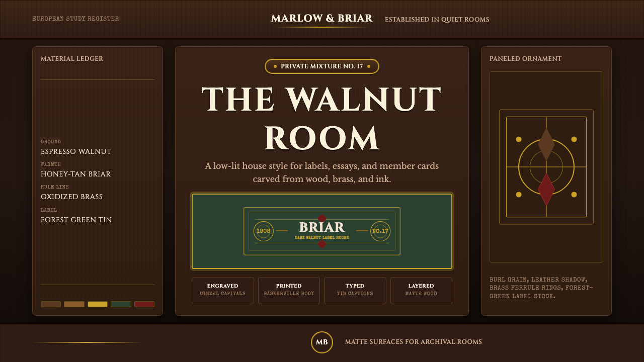 Briar Pipe & TobaccoWarm gloom, precisely aged. Brass rules and Cinzel capitals sit on espresso w…温暖幽暗而考究:黄铜细线与Cinzel大写落在浓咖胡桃木上。
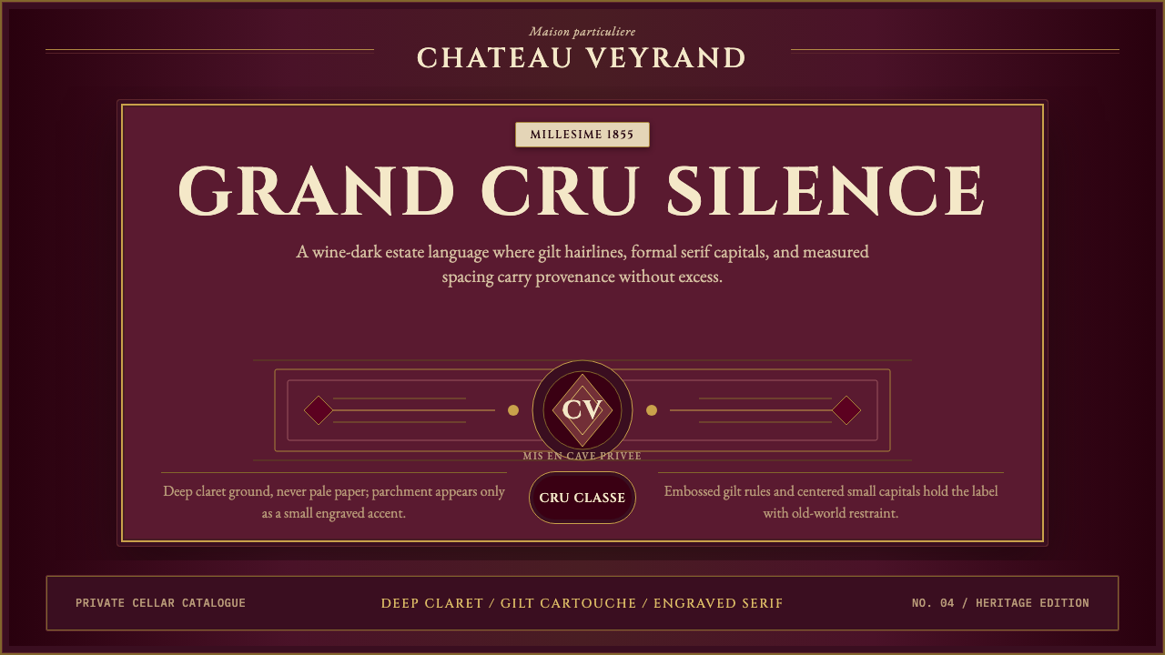 Bordeaux Wine ChâteauAged claret authority. Cinzel capitals, gilt rules, and label symmetry on win…沉静的酒红权威:Cinzel大写、金色细线与酒标式对称。
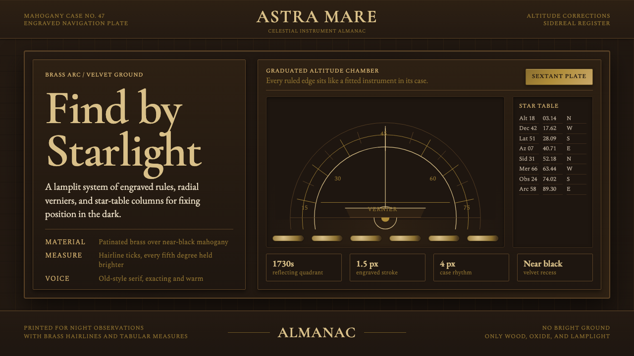 Sextant NavigationPrecision feels ceremonial. Brass ticks and mahogany grids chart the dark by…精密如仪式。黄铜刻线与红木格架在暗处定星位。
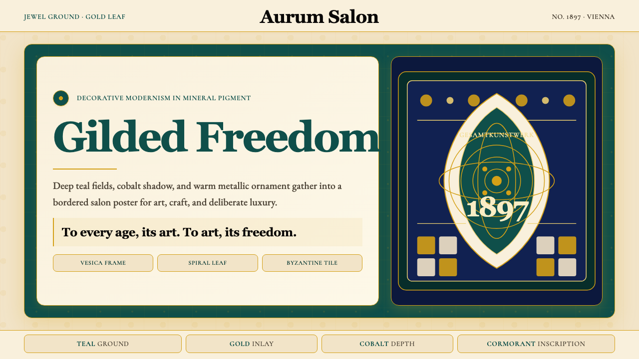 Wiener Secession (Klimt)Opulence made modern. Teal grounds, gold inlay, vesica frames and Cormorant d…奢华被现代化:深翠绿底、金箔嵌线、杏仁框与Cormorant标题。
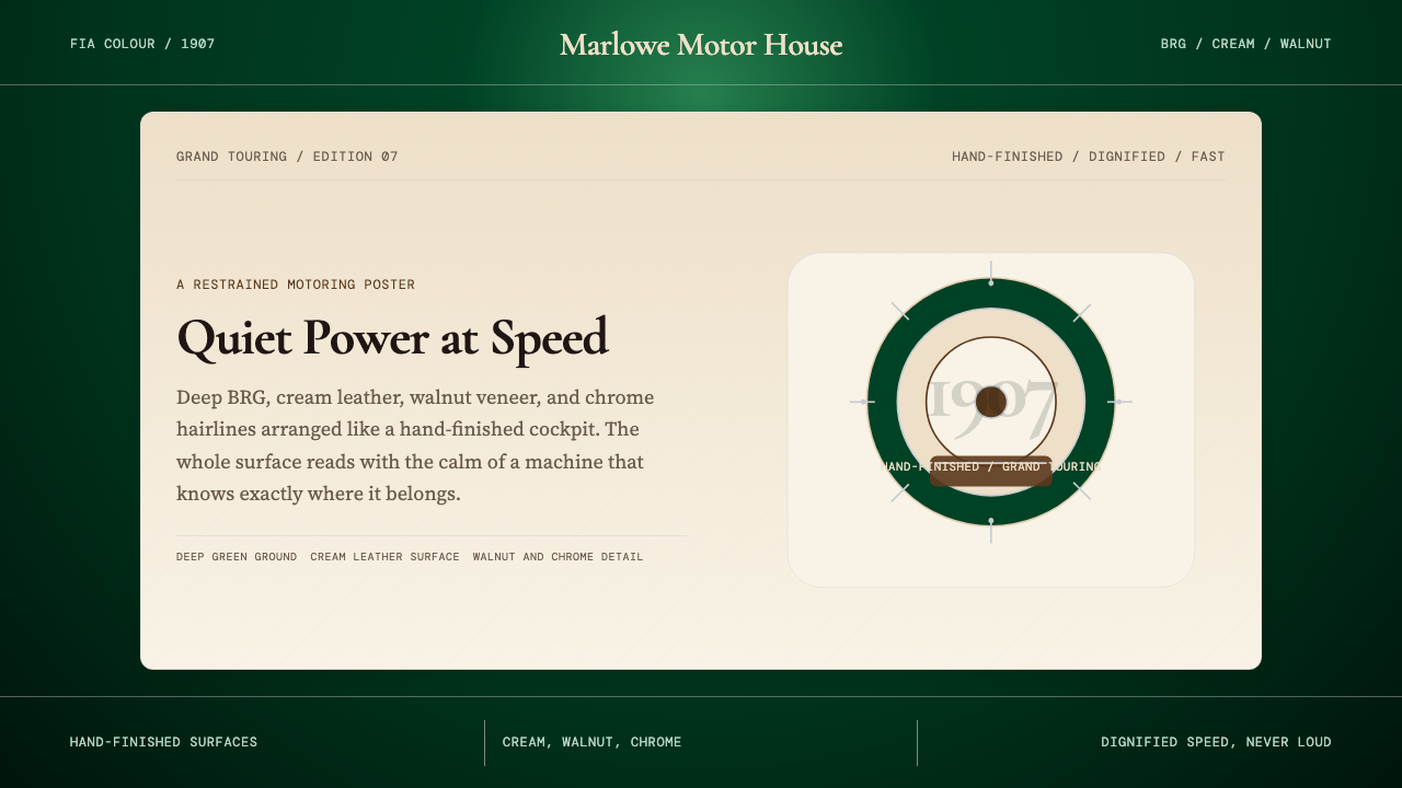 British Racing Green (Motorsport, 1907)Quiet authority at speed. Deep BRG, cream leather, walnut, and chrome hairlin…安静却有速度感。深赛车绿配奶油皮革、胡桃木和铬银细线。
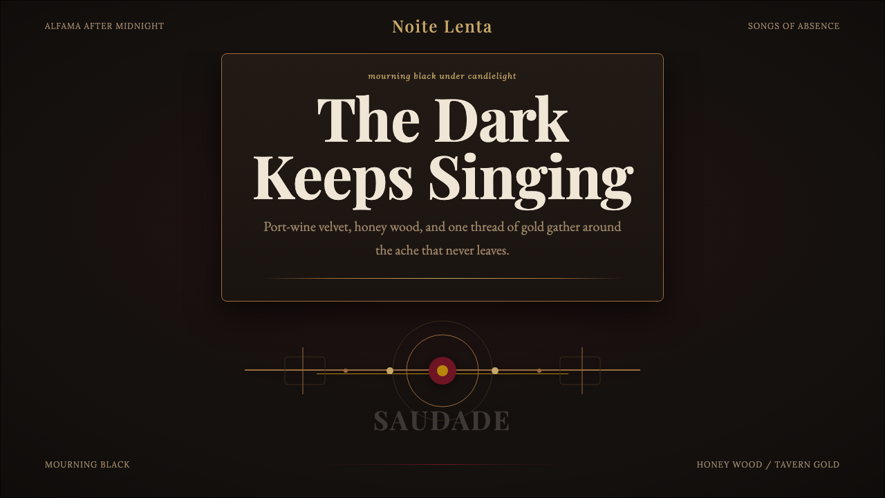 Fado SaudadeSaudade in shadow. Mourning black holds wine red, honey wood, and one gold li…阴影里的思念:哀黑托住酒红、蜜木与一线烛金。