What is Klezmer Revival?
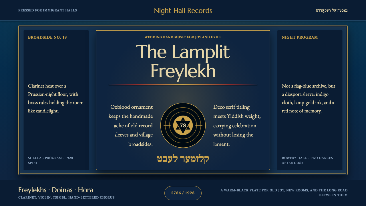
Klezmer Revival carries the sound of the Ashkenazi wedding band into visual form — Prussian night, brass-warm lamplight, and hand-lettered Yiddish, holding celebration and mourning in the same breath.
Klezmer Revival in brief
Klezmer Revival is a design system built around the visual world of klezmer — the instrumental wedding and celebration music of Ashkenazi Jewry, carried by clarinet, violin, and tsimbl through the shtetls of Eastern Europe and, after mass emigration, into the dance halls and recording studios of America. Its anchor is not the whole several-century history of the tradition but one richly documented moment: the 78rpm recording boom of the 1920s, when klezmer bands cut sides for immigrant record labels in New York and Chicago, and the visual culture around them — record sleeves, dance-hall posters, hand-set Yiddish typesetting — crystallized into a recognizable look.
The palette holds firmly to a deep night ground, never a pale or cream one — a Prussian-toned indigo that reads as evening rather than daylight. Against it, warmth comes from lamplight gold and brass, the kind of light that spills from a tavern window or a stage footlight, and folk ornament in an oxblood red carries the pattern-work of embroidery and printed ephemera. Display lettering draws on the era's serif and Yiddish-script traditions, giving the system a hand-set, hand-lit quality rather than a polished commercial one.
What makes the style distinct from other period revivals is its emotional register. It is not a nostalgia piece for a nation or a brand — it does not reach for the tricolor cheer of a flag or the streamlined optimism of Art Deco travel posters. It holds two moods at once: the lift of a wedding dance and the ache of a community that carried its music across an ocean because it could not stay where it was. Any system built on this style should protect that duality — warmth without cheapness, ornament without kitsch, melancholy without gloom.
Where does Klezmer Revival come from?
Klezmer is a Yiddish word derived from the Hebrew klei zemer, literally 'vessels of song' or 'instruments of melody' — a term that originally described the instruments themselves before it came to name the musicians and, eventually, the genre. The music grew out of centuries of Jewish communal life in the Pale of Settlement, the region of the Russian Empire where Jewish residence was legally confined, spanning parts of present-day Poland, Ukraine, Belarus, Lithuania, and Moldova. In the shtetls — the small Yiddish-speaking market towns scattered across this territory — klezmorim (klezmer musicians) were professional tradesmen, hired to play weddings and celebrations, absorbing melodic material from the surrounding Roma, Ottoman, Ukrainian, and Romanian musical traditions while serving a specifically Jewish ritual calendar and repertoire.
Mass emigration from the Russian Empire, driven by pogroms and economic hardship from the 1880s onward, carried klezmer musicians to the United States along with millions of other Ashkenazi Jews. In New York's Lower East Side and similar immigrant neighborhoods in Chicago and Philadelphia, klezmer met the commercial infrastructure of the American recording industry. The 1920s became the genre's first golden age on record: labels catering to immigrant audiences pressed hundreds of 78rpm sides by klezmorim such as Naftule Brandwein and Dave Tarras, whose clarinet playing — full of vocal-style bends, sobs, and ornaments called krechts and kvetches — defined the sound for a generation of listeners both in America and, via imported pressings, back in Eastern Europe.
This recording-era klezmer sat alongside a broader flowering of Yiddish culture in interwar New York and Warsaw — Yiddish theater, Yiddish press, Yiddish popular song — produced within the same visual culture as the wider Art Deco and jazz-age design world, but rendered by and for a Yiddish-speaking audience. Record labels and dance halls needed lettering that could carry Yiddish script (traditionally set right-to-left in Hebrew characters) alongside Latin-alphabet English for the American market, and imagery that could signal both showbiz glamour and a specifically Ashkenazi, old-world sensibility. That dual address — American commercial polish laid over Eastern European folk memory — is the visual seed of this style.
The klezmer revival movement of the late twentieth century, from the 1970s onward, rediscovered and re-popularized this recorded repertoire, bringing renewed attention to the 78rpm era's record sleeves, handbills, and press photography as source material. It is this rediscovery — a contemporary audience looking back at the 1920s through surviving records and ephemera — that gives the style its name and its function as a design system: not a reconstruction of shtetl life itself, but a visual language built from what the recording industry preserved of it.
What defines the Klezmer Revival look?
Color
The ground is always a deep, saturated night blue with a cool, almost Prussian cast — never a cream or pale surface. Against this dark field, warmth arrives through a lamplight gold used sparingly for accents, headlines, and small illuminated details, evoking stage footlights and tavern windows rather than daylight. A muted, oxblood-leaning red carries ornament and folk pattern work, and brass or aged-metal tones appear in linework and framing. The overall effect should read as a lit room at night, not a poster in full sun.
Typography
Display lettering draws on two intertwined traditions: the bold serif display faces of 1920s American commercial printing, and the calligraphic rhythm of hand-set Yiddish script, traditionally written right-to-left in Hebrew letterforms. Even where Latin characters are used throughout, headline treatments should carry some hint of that hand-lettered, slightly uneven warmth — letters that look inked and pressed rather than digitally perfected. Body text stays plain and legible, letting the display type carry the era's character so the system doesn't tip into illegibility or pastiche.
Ornament
Pattern work is hand-drawn in spirit, not machine-precise — the kind of folk motif found on embroidered textiles, printed dance-hall handbills, and record-label borders of the period. Ornament frames and separates rather than filling open space; it appears at the edges of a composition — borders, dividers, corner flourishes — leaving the center calm enough for lettering and imagery to lead. The oxblood and brass tones carry most of this ornament, keeping it warm rather than cold or mechanical.
Light and Warmth
Because the ground is night-dark, light is treated as a deliberate, localized event rather than an ambient wash — a glow around a headline, a warm halo behind a central motif, a gold rule that seems to catch lamplight. This mirrors the physical world the style draws from: a wedding hall lit by lamps against the dark of an evening, not a sunlit outdoor scene. Warmth should feel earned and concentrated where it matters, not spread evenly across the composition.
Mood and Imagery
The style must hold celebration and melancholy simultaneously — the lift of a wedding dance and the weight of diaspora memory — never tipping into pure festive kitsch nor into flat, joyless gloom; the correct register is closer to a bittersweet toast, warm and a little worn. Where imagery appears, it favors the documentary texture of the era's own artifacts — record labels, hand-set playbills, studio photography of musicians with clarinet, violin, or tsimbl in hand — carrying some grain or print-texture quality rather than a crisp contemporary polish, so it reads as recovered from a period source rather than freshly rendered.

Who shaped Klezmer Revival?
Brandwein was among the most recorded klezmer clarinetists of the 1920s, celebrated for a wild, vocal-inflected playing style full of bends, sobs, and ornamental cries that listeners heard as pure emotional expression rather than technical display. His recorded output on American labels catering to immigrant audiences helped define what the genre sounded like to a generation on both sides of the Atlantic, and his showmanship — he was known for flamboyant stage dress — fed directly into the visual glamour that period record sleeves and handbills tried to capture.
Tarras was Brandwein's contemporary and, in some ways, his stylistic counterpart — a more disciplined, refined clarinet voice who became the dominant klezmer bandleader on record from the 1920s through the following decades. His recordings bridged old-world repertoire and the commercial demands of the American recording industry, and his sustained career gave klezmer a through-line from the 78rpm golden age into the mid-century, later making him a central reference point for the klezmer revival musicians who rediscovered this material.
The immigrant-facing record labels of 1920s New York and Chicago were not incidental to the style — they were its primary visual production system, producing sleeves, catalogs, and advertising that had to work in two scripts and two cultural registers at once: American commercial polish and Eastern European old-world sensibility. This sat alongside a broader Yiddish-language cultural infrastructure of the same era, including Yiddish theater houses and a thriving daily press, which shared and reinforced the same hand-set-lettering-paired-with-Latin-type vocabulary. Surviving ephemera from this world are the closest thing to primary source material for the look, and the klezmer revival movement leaned on rediscovered copies of exactly this material.
How do you use Klezmer Revival today?
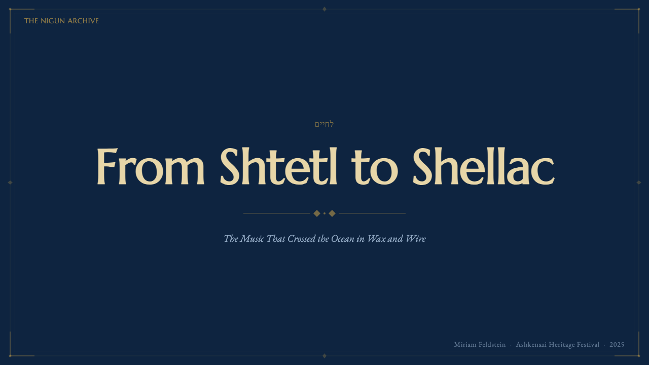
Klezmer Revival works best in contexts that want warmth, heritage, and emotional depth rather than clean corporate neutrality. For presentation cover slides, the style earns its keep: a deep night-blue field, a lamplight-gold headline treatment, and a restrained oxblood ornament in one corner communicate heritage and craft instantly. Content slides should keep the dark ground consistent throughout the deck rather than switching to a light background for readability — legibility comes from generous contrast between gold or warm-white text and the night field. Data slides can use the gold accent for the single most important figure or bar, with everything else rendered in muted tones so emphasis stays intentional rather than decorative.
In web UI, the style suits dashboards and pricing pages for products with a cultural, heritage, hospitality, or storytelling angle — a night-mode-native interface where the dark ground is the default identity, not a toggle. Card components can use a subtly lighter panel tone against the deep blue base, with gold reserved for primary actions or the current plan's highlight, and oxblood for secondary emphasis such as a badge. Because the palette is inherently dark, contrast needs real attention: body text should sit in a warm off-white rather than pure white, which helps it feel lamplit rather than clinical.
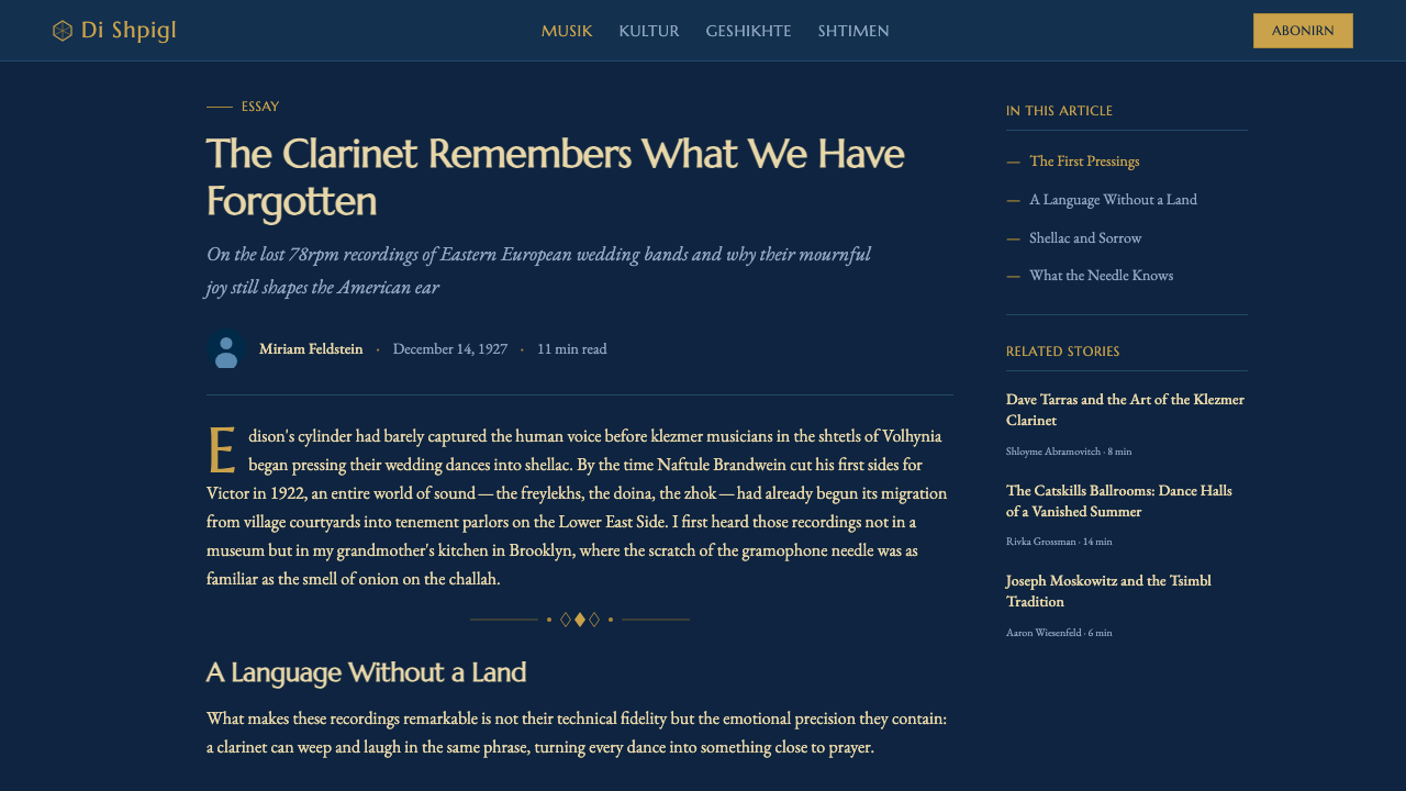
For editorial and long-form content, this style supports pieces about music, migration, heritage, and cultural memory particularly well. A header with hand-lettered-feeling display type over the night ground, followed by a generously spaced article body, lets the ornament do its work at the edges — a divider here, a corner flourish there — without crowding the reading experience. Pull-quotes suit the gold accent, giving a single line the same lit, deliberate quality as a stage spotlight.
In marketing contexts — event promotion, cultural programming, heritage brands — the style's poster lineage makes it well suited to bold, single-message compositions: one striking headline, one piece of ornament, generous dark space around both. Resist filling the whole frame with pattern; the historical ephemera this style draws from used ornament as a frame, not a wallpaper.
The most common mistake is treating this as a generic 'vintage dark' theme and losing the emotional balance that defines it — either pushing so hard into festive gold-and-red ornament that it reads as folk-kitsch with no melancholy, or draining the warmth until it reads as a cold, generic dark-mode UI with no heritage signal at all. The style only works when both halves are present together: warmth and ache, celebration and diaspora memory, in the same composition.
Klezmer Revival — FAQ
Is Klezmer Revival the same as general 'Eastern European folk' design?
No. Eastern European folk design more broadly draws on a wide range of national and regional textile, ceramic, and print traditions across many cultures and time periods. Klezmer Revival is narrower and more specific: it is anchored to a particular Ashkenazi Jewish musical tradition and, most precisely, to the 1920s recording-era visual culture that grew up around it in both Eastern Europe and the American immigrant diaspora. Its palette, mood, and lettering choices are drawn from that specific moment rather than from folk pattern-making in general.
Why does the style insist on a dark, night-blue ground instead of a lighter background?
Because the ground carries meaning, not just contrast. The style is built around the image of lamplight and stage light against an Eastern European evening — a wedding hall or tavern lit from within, surrounded by dark. Switching to a pale or cream background removes the very thing that makes the warm gold and oxblood accents feel earned; on a light ground, those same colors read as generic vintage decoration rather than as light glowing in darkness. The night-blue ground is a load-bearing part of the concept, not an interchangeable design choice.
Can this style be used for something entirely secular and unrelated to Jewish culture, like a general vintage jazz-age brand?
It can be applied to any product that wants its warmth-and-melancholy mood and its 1920s recording-era visual texture, but doing so respectfully means keeping the specific cultural markers — the Yiddish-script-influenced lettering choices, the diaspora-memory framing — intentional rather than decorative flourishes stripped of context. If a project wants the general jazz-age recording aesthetic without the specifically Ashkenazi cultural content, it's worth being explicit about that choice rather than using the ornament and lettering as generic 'old-timey' set dressing.
How does this style differ from a generic Art Deco theme, given they share the same historical decade?
Art Deco of the 1920s is largely about streamlined optimism, machine-age glamour, and symmetrical, often metallic ornament aimed at a broad commercial audience — think travel posters and skyscraper lobbies. Klezmer Revival shares the decade but not the mood: it is warmer, more hand-worked, and emotionally split between celebration and loss rather than uniformly optimistic. Where Art Deco ornament is often geometric and machine-precise, this style's ornament is folk and hand-drawn in spirit. The two can share a timeframe while pointing toward opposite emotional destinations.
What kinds of products or brands should avoid this style?
It struggles for products that need bright, high-energy, or purely optimistic communication — children's products, fitness apps, or anything requiring a light, airy feel, since the style's dark ground and melancholic undertone actively work against that mood. It is also a poor fit for contexts demanding strict neutrality or where cultural specificity would feel out of place or appropriative, such as an unrelated brand borrowing the look purely for its 'exotic' surface appeal without any connection to its heritage or subject matter. The style rewards products with a genuine storytelling, heritage, or nostalgic angle, and struggles everywhere else.
Related design styles
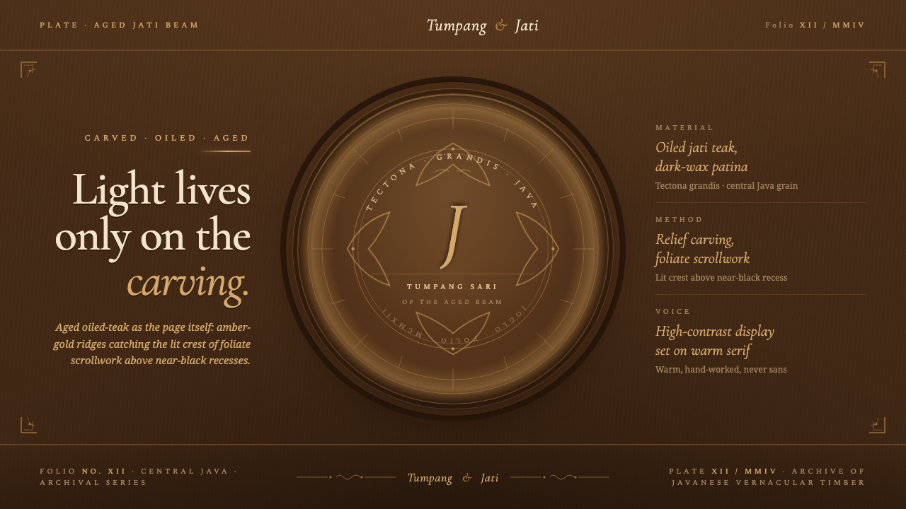 Javanese Teak JogloCarved warmth rules the page. Oiled teak-brown ground, near-black recesses, a…
 Afghan Baluchi Prayer RugDevotional darkness glows. Plum field, oxblood mihrab, and camel borders surf…
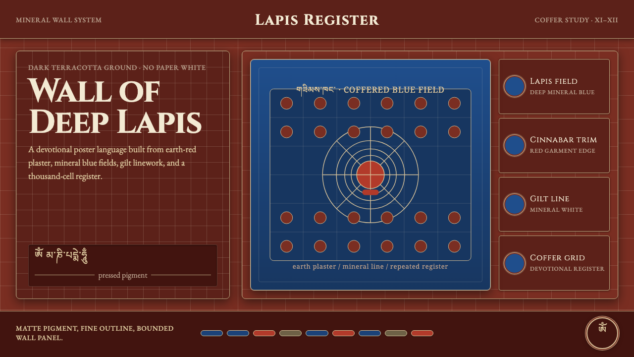 Alchi Monastery MuralDevotional depth. Lapis fields and coffered grids glow on terracotta plaster.
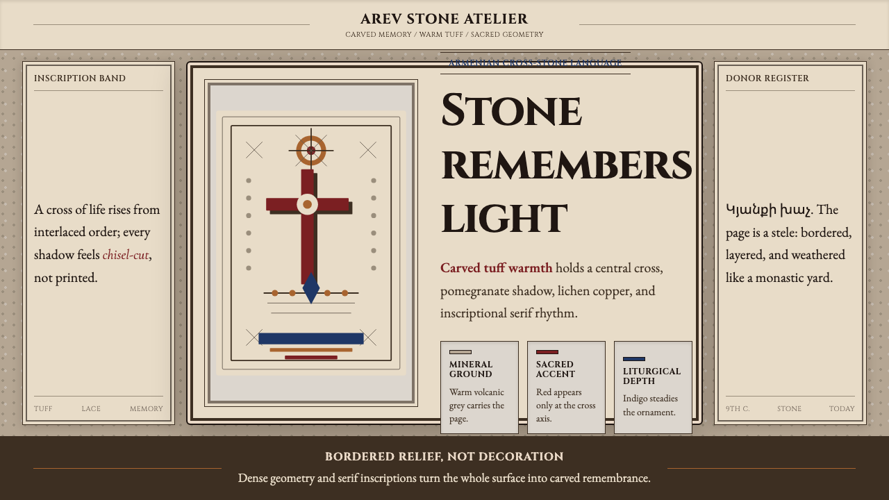 Armenian Khachkar Cross-StoneStone becomes memory. Tuff grey, pomegranate red, and carved borders hold the…
 Bagan Yun LacquerwareEngraved, not painted. Cinnabar, orpiment and jade hairlines polished from ne…
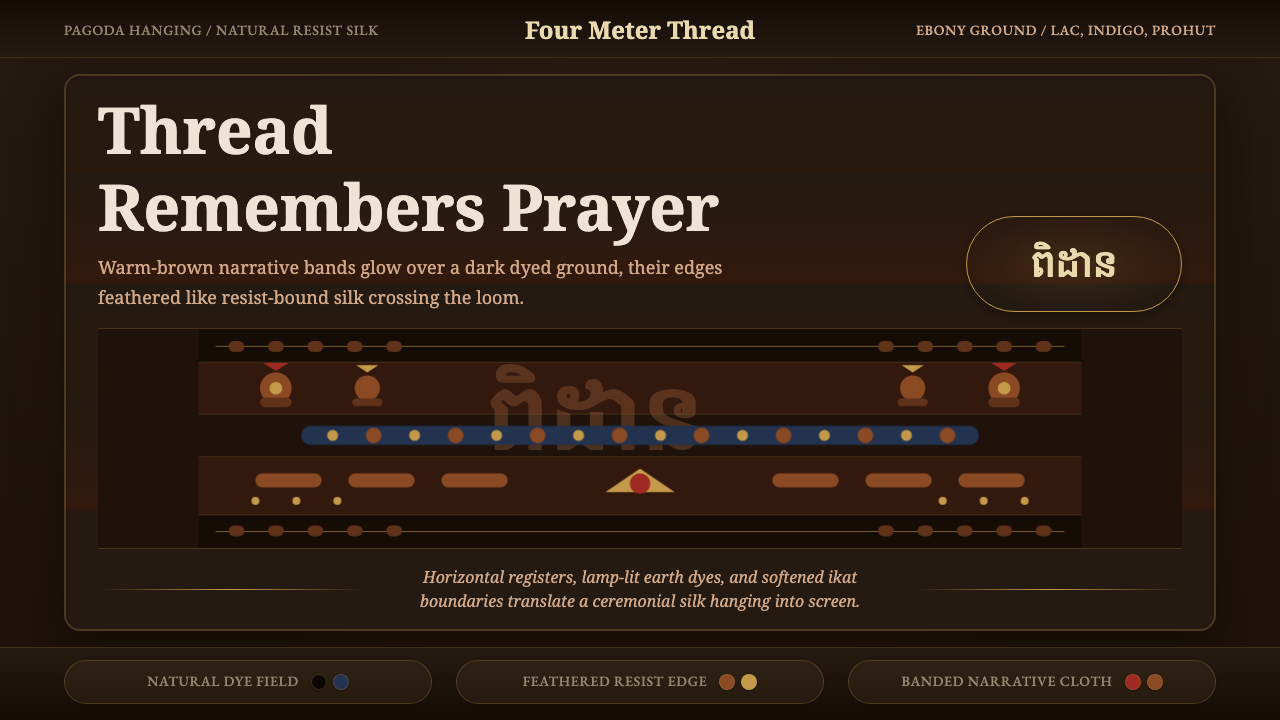 Cambodian Pidan IkatSacred cloth glows. Ebony-indigo bands carry warm-brown ikat figures with fea…