Design style guide设计风格指南
What is Georgian Pirosmani 1910?什么是 Georgian Pirosmani 1910?
From the back walls of Tbilisi taverns, Niko Pirosmani painted a Georgia of stags, feasts, and candlelit warmth on black oilcloth — and left behind a visual language where darkness itself becomes sacred ground.尼科·皮罗斯马尼在第比利斯酒馆的后墙上作画——黑色油布上是鹿群、宴席与烛光——留下了一套将黑暗本身视为圣地的视觉语言。
Georgian Pirosmani 1910 in briefGeorgian Pirosmani 1910 速览
Georgian Pirosmani 1910 is a design system rooted in the signboard paintings of Niko Pirosmani, a self-taught Georgian artist who worked in Tbilisi at the turn of the twentieth century. Pirosmani painted tavern walls and merchant signs on black oilcloth — a cheap, durable surface that forced him to treat darkness as a positive material rather than an absence. The result was a visual tradition of luminous color planes emerging from deep black grounds, frontal and symmetrical compositions, and a spiritual gravity that owed more to Georgian icon-painting than to any European academy.Georgian Pirosmani 1910是一套植根于尼科·皮罗斯马尼招牌画的设计系统。皮罗斯马尼是一位自学成才的格鲁吉亚画家,在世纪之交的第比利斯靠画酒馆墙壁和商铺招牌为生。他用黑色油布做画底——这种廉价耐用的材料迫使他把黑暗当作一种积极的物质来对待,而非一种缺失。由此形成的视觉传统,是发光的色块从深黑底色中浮现,构图正面而对称,带着一种更接近格鲁吉亚圣像画而非任何欧洲学院的精神重量。
The system channels that tradition into a contemporary design vocabulary: oilcloth black as an infinite, absorptive background; meadow ochre and chokha red as the primary warmth tones that surface from the darkness; and serif type set with the measured weight of hand-lettered signboard inscriptions. Nothing in the palette competes for attention — each color is earned against the black ground the way a candle earns the dark around it.这套系统将那种传统转化为当代设计语汇:油布黑作为无限、吸纳性的背景;草地赭黄与楚哈深红作为从黑暗中浮现的主要暖调;衬线字体以手绘招牌文字的沉稳分量排布。色板中没有任何元素争抢注意力——每种颜色都是在黑底上赢得自己的位置,正如蜡烛赢得它周围的黑暗。
What distinguishes this aesthetic from generic dark-mode design is its quality of restraint and ceremony. Pirosmani's paintings never feel dramatic for drama's sake; they feel solemn, like objects that know they will outlast their maker. The design system carries that solemnity forward — stillness rather than tension, warmth rather than excitement, and a flat frontal honesty that never performs depth it hasn't earned.让这套美学有别于泛泛的深色模式设计的,是它的克制与仪式感。皮罗斯马尼的画从不为戏剧而戏剧;它们是庄严的,像知道自己会比创作者更长久的物件。这套设计系统承载了那份庄严——是静默而非张力,是温暖而非兴奋,是一种平直、正面的诚实,从不表演它尚未获得的深度。
See the Georgian Pirosmani 1910 design system →查看 Georgian Pirosmani 1910 完整设计系统 →
Where does Georgian Pirosmani 1910 come from?Georgian Pirosmani 1910 从何而来?
Niko Pirosmani was born around 1862 in Mirzaani, a village in the Kakheti wine region of eastern Georgia. He arrived in Tbilisi — then called Tiflis, a multilingual Caucasian city under Russian imperial administration — as a young man, and spent most of his adult life working as an itinerant signboard painter and occasional guest of the dukhan taverns whose walls he decorated. He traded paintings for meals and wine, sleeping in cellars and doorways, accumulating an extraordinary body of work while living in radical poverty.尼科·皮罗斯马尼约生于1862年,出生地是格鲁吉亚东部卡赫季葡萄酒产区的米尔扎阿尼村。他青年时来到第比利斯——彼时名为梯弗里斯,是俄罗斯帝国统治下的一座多语言高加索城市——此后大半生以流动招牌画师为业,有时寄居于他为之作画的杜坎酒馆。他用画换饭食和葡萄酒,在地窖和门洞中栖身,在赤贫中积累了数量惊人的作品。
The black oilcloth that defined his technique was not an artistic choice so much as a practical one: it was the cheapest available surface for outdoor signs, durable against rain and tavern smoke. But Pirosmani turned the constraint into a method. Working with house paints directly on black ground, he learned to build color not by mixing toward light but by laying warm tones against darkness — each ochre patch, each red field, each white highlight existed in relationship to the ground rather than against a neutral field. The effect was something between oil painting and illuminated manuscript: flat yet glowing, iconic yet intimate.定义他技法的黑色油布,与其说是艺术选择,不如说是现实迫就:这是当时最廉价的户外招牌材料,耐雨水和烟熏。但皮罗斯马尼将这一限制变成了方法。他用建筑涂料直接在黑底上作画,学会了不是向亮处调色,而是将暖调置于黑暗之中——每一块赭黄、每一片深红、每一处白色高光,都以与底色的关系而存在,而非衬于中性底面之上。效果介于油画与泥金装饰手稿之间:平涂却发光,图像性却亲密。
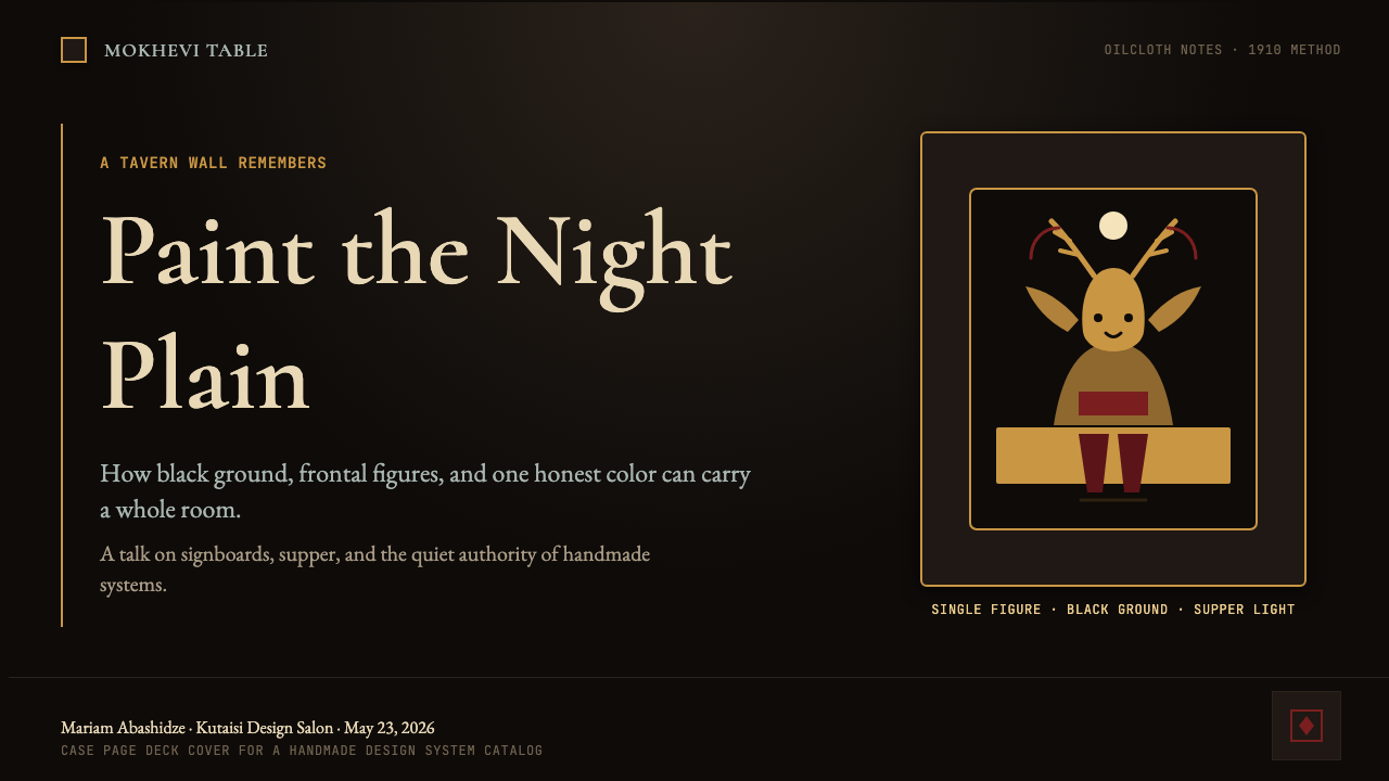
Pirosmani's subjects were the fauna and social life of Georgia: bears, deer, stags, and the famous Black Bear of the Georgian landscape; feasting scenes in dukhan taverns; portraits of merchants, fishermen, and the French actress Margarita de Sevres, for whom legend says he once filled a street with flowers. His compositions were almost always frontal, his animals alert and still, his humans posed with the grave dignity of folk icons. He borrowed the frontal symmetry of Georgian ecclesiastical painting without its theological program — producing images that felt sacred without making religious claims.皮罗斯马尼的题材是格鲁吉亚的动物与社会生活:熊、鹿、雄鹿,以及格鲁吉亚风景中著名的黑熊;杜坎酒馆的宴席场景;商人、渔夫的肖像,以及法国女演员玛格丽特·德·塞夫勒——传说他曾为她用鲜花铺满一条街道。他的构图几乎总是正面的,动物警觉而静止,人物以民间圣像般的庄严尊严姿立。他借用了格鲁吉亚教堂绘画的正面对称,却剥去其神学方案——创作出感觉神圣却不提宗教主张的图像。
His rediscovery came through the Russian futurists. In 1912, the brothers Ilia and Kirill Zdanevich — then working in a circle of Moscow avant-garde artists — visited Tbilisi and encountered Pirosmani's work in situ, on tavern walls and shop fronts. They championed him in Moscow as an example of authentic primitive genius, organized an exhibition, and brought his name into the European avant-garde conversation. Pirosmani died in 1918, in poverty, before the recognition fully reached him — but the Zdanevich intervention ensured that his visual language survived as a conscious inheritance rather than disappearing with the dukhan culture that had sustained it.他的重新发现来自俄国未来主义者。1912年,兄弟俩伊利亚和基里尔·兹达涅维奇——当时在莫斯科先锋艺术圈中工作——造访第比利斯,在酒馆墙壁和商铺门面上亲眼看到皮罗斯马尼的作品。他们在莫斯科将他推举为本真的原始天才,组织展览,将他的名字带入欧洲先锋艺术的对话。皮罗斯马尼于1918年在贫困中辞世,在承认充分到达他之前——但兹达涅维奇兄弟的介入确保了他的视觉语言作为有意识的遗产而存活,而非随养育它的杜坎文化一同消逝。
What defines the Georgian Pirosmani 1910 look?Georgian Pirosmani 1910 的视觉特征是什么?
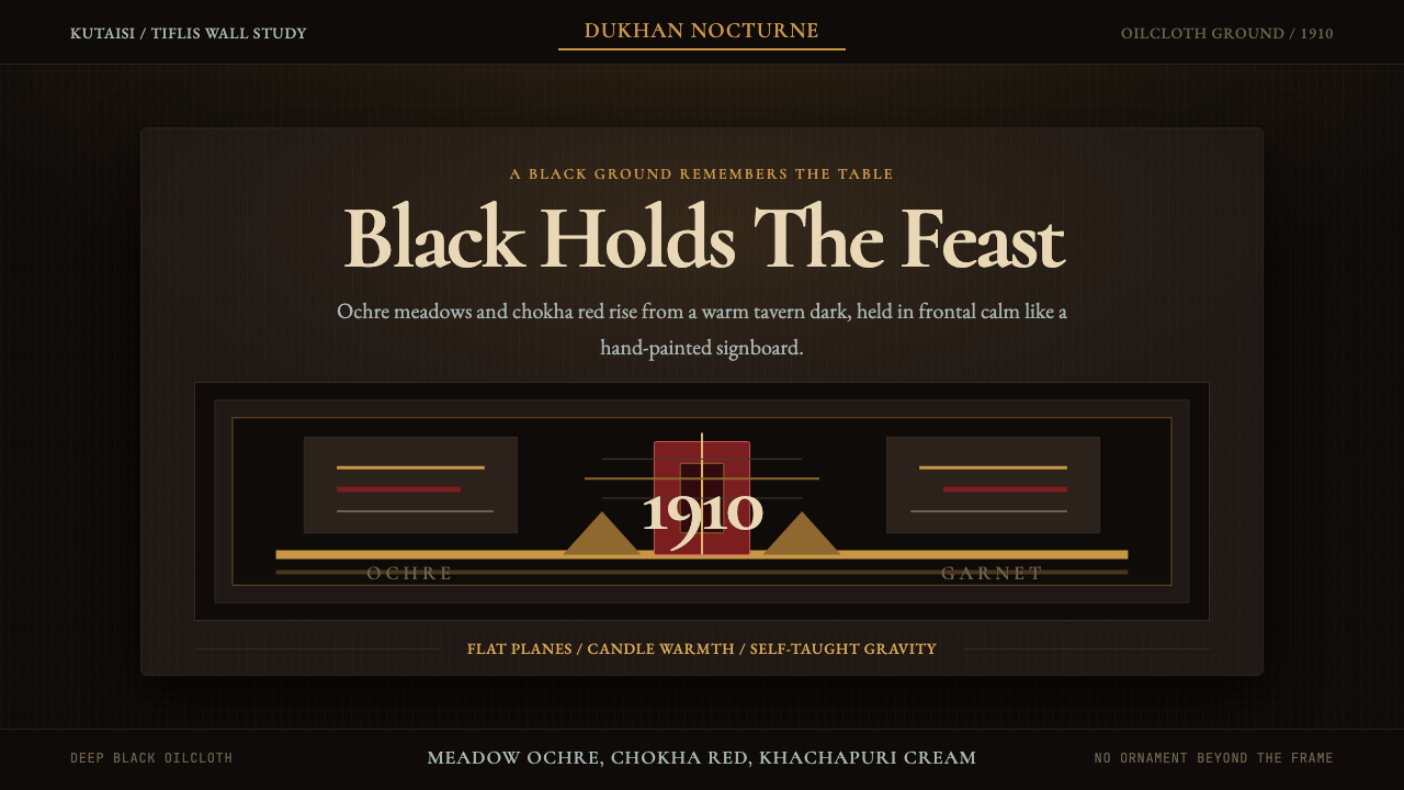
Ground Color底色
Oilcloth black is the absolute foundation: not a dark gray, not a textured blackboard, but a flat, light-absorbing black that reads as infinite depth. All other colors are understood as emergences from this ground, not placements on top of it. The black is never decorative — it is structural, the way night is structural to candlelight.油布黑是绝对的基础:不是深灰,不是有纹理的黑板,而是一种平涂、吸光的黑,读来如同无限深邃。所有其他颜色都被理解为从这个底色中浮现,而非放置于其上。黑色从不是装饰性的——它是结构性的,就像夜晚之于烛光是结构性的。
Warm Tone Palette暖调色板
The foreground palette draws from the earthy warmth of Georgian landscape and folk dress: meadow ochre suggesting dried grasses and candlelight, chokha red evoking the traditional Georgian wool coat, and cream or warm ivory for figures and highlights. These tones work because they carry the specific warmth of oil-lamp and firelight — they glow rather than shine, radiate rather than reflect.前景色板取自格鲁吉亚风景与民间服饰的土质暖意:草地赭黄唤起枯草与烛光,楚哈深红让人联想到传统格鲁吉亚羊毛外衣,奶油色或暖象牙色用于人物与高光。这些色调之所以有效,是因为它们携带着油灯和篝火的特定温度——它们发光而非反光,散热而非折射。
Frontal Composition正面构图
Subjects are presented face-on, with minimal foreshortening or perspectival recession. Animals face the viewer directly; figures stand with the alert stillness of folk icons. This frontality is not naivety — it is a deliberate compositional choice inherited from Georgian ecclesiastical painting, where the frontal gaze carries devotional weight. In design, it translates to centered or bilaterally symmetrical layouts with strong vertical axes.对象以正面呈现,几乎没有透视缩短或空间退缩。动物直视观看者;人物以民间圣像般警觉的静止姿态立于画面。这种正面性不是朴拙——而是从格鲁吉亚教堂绘画中继承的刻意构图选择,正面凝视在其中承载着虔诚的重量。在设计中,它转化为以强烈垂直轴为中心或双侧对称的版面。
Flat Color Planes平涂色块
Color is applied in even, unmodulated fields — no blending, no soft gradients, no atmospheric haze. Each color area has a distinct boundary, creating shapes that feel cut and placed rather than painted and shaded. This flatness is not simplicity; it is a sophisticated choice that keeps each element visually sovereign, readable at a distance, and free from the distracting texture of surface variation.色彩以均匀、无调变的色域涂布——不混色,不渐变,无大气朦胧。每个色彩区域都有明确的边界,产生的形状感觉像是被剪切摆放而非描绘上色。这种平涂并非简陋;而是一种精密的选择,让每个元素在视觉上保持主权,在远处可辨,不受表面变化纹理的干扰。
Ceremonial Typography仪式性字体
Type in this system carries the measured gravity of hand-lettered signboard inscriptions. Serif letterforms are preferred — their bracketed strokes echo the deliberate hand of a painter who formed each letter as a discrete object. Weight is used for hierarchy, not for decoration; there is no casual type in this system. Even small labels carry a formality that treats every word as worth the space it occupies.这套系统中的字体承载着手写招牌文字的沉稳庄重。衬线字形是首选——其括号形笔画呼应了一位将每个字母视为独立对象来描绘的画家的刻意之手。字重用于层级,而非装饰;这套系统中没有随意的字体。即使是小型标注也带有一种正式感,将每个词语视为值得它所占空间的存在。
Austere Symmetry朴素对称
The compositions are often symmetrical or near-symmetrical, but the symmetry is never mechanical. It has the quality of a handmade icon: almost perfectly balanced, with the small irregularities of a human hand rather than a geometric compass. This restrained symmetry produces a sense of solemnity without rigidity — the layout feels considered rather than computed.构图通常是对称或近对称的,但这种对称从不是机械性的。它有手工圣像的品质:几近完美的平衡,带着人手而非几何圆规留下的微小不规则。这种克制的对称产生庄严感而非僵硬感——版面让人感觉是经过思考的,而非被计算出来的。
Minimal Ornament最少装饰
Decoration is sparse and purposeful. When borders or dividers appear, they are simple — a thin warm line, a narrow band of ochre — and they function as spatial organizers rather than embellishments. There are no flourishes, no filigree, no decorative fills. The restraint is not ascetic; it reflects the economy of a painter who worked fast, on cheap materials, for patrons who needed legible signs more than beautiful ones.装饰稀少而有目的。边框或分割线出现时是简单的——一条细暖线,一道窄赭黄色带——作为空间组织者而非装饰物。没有花饰,没有金属细工,没有装饰性填充。这种克制不是苦行;它反映了一位在廉价材料上快速作画的画家的经济性——他的委托人需要清晰可读的招牌,而非美丽的装饰。

See the Georgian Pirosmani 1910 design system →查看 Georgian Pirosmani 1910 完整设计系统 →
Who shaped Georgian Pirosmani 1910?谁塑造了 Georgian Pirosmani 1910?
Pirosmani is the originating figure of this aesthetic tradition. Born in Mirzaani around 1862, he arrived in Tbilisi as a young man and spent his life painting tavern walls, merchant signs, and the animals and social scenes of Georgian life — trading his work for food and wine, living in poverty, accumulating an extraordinary body of paintings that were almost entirely unknown outside the Caucasus until the futurist rediscovery of 1912. His technique of building luminous color against black oilcloth ground, his frontal compositions, and his devotional gravity defined a visual language that was simultaneously naive and hieratic, local and universal.皮罗斯马尼是这一美学传统的起源人物。约生于1862年的米尔扎阿尼,他青年时来到第比利斯,此后一生以画酒馆墙壁、商铺招牌以及格鲁吉亚生活中的动物和社会场景为业——以画换饭食和葡萄酒,生活在贫困中,积累了数量惊人的作品,直到1912年被未来主义者重新发现之前,这些作品在高加索地区之外几乎无人知晓。他在黑色油布底上构建发光色彩的技法、正面构图,以及虔诚的庄重感,定义了一种视觉语言——既朴拙又神圣,既地方性又普世性。
Ilia Zdanevich and his brother Kirill visited Tbilisi in 1912 and encountered Pirosmani's work on tavern walls. Ilia, already connected to Russian futurist and primitivist circles in Moscow, immediately recognized the significance of what he saw and began championing Pirosmani within the avant-garde. He organized the first exhibition of Pirosmani's work in 1913 and wrote critically about him in terms that framed naive Georgian painting as a legitimate counterweight to European academicism. Without this intervention, Pirosmani's work might have dispersed and deteriorated with the buildings it occupied.伊利亚·兹达涅维奇和他的兄弟基里尔于1912年造访第比利斯,在酒馆墙上看到皮罗斯马尼的作品。伊利亚已与莫斯科的俄国未来主义和原始主义圈子有所关联,立即认识到他所见之物的意义,开始在先锋艺术界为皮罗斯马尼鼓与呼。他于1913年组织了皮罗斯马尼作品的首次展览,并从将朴拙格鲁吉亚绘画定位为欧洲学院主义正当对位的角度,撰文讨论他。若无这次介入,皮罗斯马尼的作品可能会随承载它的建筑一同散佚消亡。
Kirill Zdanevich, a painter himself, traveled with his brother Ilia on the Tbilisi visit that led to Pirosmani's rediscovery. He was instrumental in the practical work of locating, documenting, and preserving Pirosmani's paintings — identifying which works still existed on tavern walls, persuading owners to allow the paintings to be studied, and beginning the archival process that would eventually make Pirosmani's legacy accessible. His painter's eye gave him insight into the technical specifics of Pirosmani's oilcloth method that Ilia's more literary approach sometimes missed.基里尔·兹达涅维奇本人是一位画家,与兄弟伊利亚共同完成了那次导致皮罗斯马尼被重新发现的第比利斯之行。他在定位、记录和保存皮罗斯马尼画作的实际工作中发挥了关键作用——辨认哪些作品还留在酒馆墙上,说服房主允许对画作进行研究,并启动了最终使皮罗斯马尼遗产得以保存的档案化进程。他画家的眼光让他对皮罗斯马尼油布技法的具体细节有着伊利亚更偏文学性的视角有时忽略的洞察。
Margarita de Sevres was a French actress who performed in Tbilisi in the early twentieth century and became the subject of one of Pirosmani's most celebrated portraits. According to Georgian legend, Pirosmani spent everything he had to fill the street outside her residence with flowers — a gesture of devotion that became one of the defining stories of his life and that underscores the intensity of feeling that ran beneath the surface of his seemingly simple paintings. Whether historically precise or embellished, the story captures something real about his relationship to his subjects: they were not merely observed but loved.玛格丽特·德·塞夫勒是二十世纪初在第比利斯演出的一位法国女演员,成为皮罗斯马尼最著名的肖像画题材之一。根据格鲁吉亚传说,皮罗斯马尼倾其所有,用鲜花铺满她住所外的街道——这一虔诚的举动成为他生命中最具代表性的故事之一,也凸显了他那些看似简单的画作表面之下涌动的强烈情感。无论在历史上是否精确,这个故事捕捉到了他与描绘对象关系的某种真实:他们不仅被观察,而且被爱。
Though not a single individual, the Georgian ecclesiastical painting tradition — centered in the monasteries of Kakheti and Kartli from the early medieval period onward — is an essential figure in understanding Pirosmani's visual language. Georgian icons share with his work the frontal gaze, the gold-adjacent warm grounds, the hierarchical scale, and the gravity of a form that exists to be contemplated rather than merely seen. Pirosmani absorbed this tradition without religious intent, transposing its formal vocabulary into secular subjects — creating images that carry the weight of icons without their theological claims.虽然不是单一个体,但格鲁吉亚教堂绘画传统——自中世纪早期起以卡赫季和卡特利的修道院为中心——是理解皮罗斯马尼视觉语言不可或缺的存在。格鲁吉亚圣像与他的作品共享正面凝视、近金色的暖底、等级化的比例,以及一种存在于被凝视而非仅被观看之物的庄重感。皮罗斯马尼在无宗教意图的情况下吸收了这一传统,将其形式词汇转置到世俗题材中——创作出承载圣像重量却无其神学主张的图像。
How do you use Georgian Pirosmani 1910 today?今天怎么用 Georgian Pirosmani 1910?
Georgian Pirosmani 1910 is one of the few dark-ground historical styles that works for contemporary digital design without requiring heavy adaptation — because its darkness is already a material quality, not a mode inversion. The key principle when applying it is to treat black as ground, not as background: every element should appear to surface from depth rather than float in front of a dark panel. This distinction changes how you handle contrast, spacing, and the relationship between text and imagery.Georgian Pirosmani 1910是少数几种无需大幅改造即可用于当代数字设计的深色底历史风格之一——因为它的黑暗本就是一种物质品质,而非模式反转。应用时的核心原则是将黑色视为底色,而非背景:每个元素都应该看起来是从深度中浮现,而非漂浮在深色面板前方。这一区别改变了你处理对比度、间距以及文字与图像关系的方式。
For presentation slides, the style works exceptionally well on cover slides and section dividers where ceremonial weight is an asset. A cover in this tradition places the title in warm-toned serif type against oilcloth black, with a single large illustrative element — an animal silhouette, a botanical form, a geometric field in ochre or deep red — set with the frontal symmetry of a tavern sign. Content slides should be treated with the same economy: generous dark ground, warm type, and a hierarchy defined by scale and weight rather than color variation. Data visualizations work best when bars and shapes are treated as flat color planes against the dark field — ochre for primary series, deep red for secondary, cream for labels.对于演示文稿,这种风格在封面幻灯片和章节分隔页上表现尤为出色——在那里,仪式感的重量是一种资产。这一传统中的封面将标题置于油布黑底上的暖调衬线字体中,辅以单一的大型插图元素——动物剪影、植物形态、赭黄或深红色几何色块——以酒馆招牌般的正面对称排布。内容页应以同样的经济性处理:慷慨的深色底面,暖调字体,以尺度和字重而非色彩变化来定义层级。数据可视化效果最好是将条形和形状视为深色底面上的平涂色块——赭黄用于主要系列,深红用于次要系列,奶油色用于标注。
For web interfaces and dashboards, this system is well-suited to editorial platforms, portfolio sites, arts institutions, and any product that wants the authority of darkness without the aggression of high-contrast tech aesthetics. The approach: commit fully to the dark ground, use warm serif type for headers and ochre or cream for body text, and reserve the deep red for interaction states or critical alerts. Card components should have soft, warm-toned borders or subtle warm glows rather than hard shadows — the depth here is painterly, not geometric. Navigation should be minimal and typographic.对于网页界面和仪表板,这套系统适合编辑平台、作品集网站、艺术机构,以及任何想要黑暗权威感而不带高对比度科技美学攻击性的产品。方法:完全投入深色底面,标题用暖调衬线字体,正文用赭黄或奶油色,深红色保留给交互状态或关键提示。卡片组件应有柔和的暖调边框或细微暖光,而非硬边阴影——这里的深度是绘画性的,而非几何性的。导航应简洁且字体性。
For editorial and marketing work, the style carries a gravitas that suits cultural institutions, luxury goods, independent publishing, and any context where seriousness of purpose is a design value. A Georgian Pirosmani editorial layout uses the black ground as a full-page anchor, places pull quotes in ochre or cream at a scale that reads as a formal inscription, and treats images with the flatness of color planes rather than photographic naturalism. Marketing pages benefit from the poster-like quality of the tradition: a single strong focal image, a few words in weighted serif type, and the confidence of a layout that doesn't need to explain itself.对于编辑和营销内容,这种风格承载的庄严感适合文化机构、奢侈品、独立出版,以及任何以目的的严肃性作为设计价值的场合。一个Georgian Pirosmani编辑版面将黑色底面作为全页锚点,将引语以赭黄或奶油色置于读来如正式题词的尺度上,将图像以色块的平涂性而非摄影自然主义来处理。营销页面受益于这一传统的海报式品质:单一强有力的焦点图像,几个字以分量感的衬线字体排布,以及一种不需要自我解释的版面自信。
The most common mistake when applying this style is treating the warm palette as permission to be decorative. Pirosmani's paintings are austere — the warmth is structural, not ornamental. In design terms, this means resisting the temptation to add ochre texture overlays, decorative borders, or multiple warm accent colors simultaneously. One warm tone dominant, one in reserve, darkness everywhere else. A second common mistake is breaking the frontal principle with diagonal compositions or dynamic angles; the system's authority depends on stillness and symmetry. Introduce movement only where the content itself demands it, and never at the expense of the ground.应用这种风格时最常见的错误是将暖调色板理解为装饰的许可。皮罗斯马尼的画是朴素的——温暖是结构性的,而非装饰性的。在设计术语中,这意味着要抵制同时添加赭黄纹理叠加、装饰性边框或多种暖调强调色的诱惑。一种暖调主导,一种备用,其余处皆是黑暗。第二个常见错误是用对角构图或动态角度打破正面原则;这套系统的权威依赖于静默与对称。只在内容本身需要时引入动感,且永远不以牺牲底色为代价。
See the Georgian Pirosmani 1910 design system →查看 Georgian Pirosmani 1910 完整设计系统 →
Georgian Pirosmani 1910 — FAQGeorgian Pirosmani 1910 · 常见问题
Is this style only suitable for dark-mode products?这种风格只适合深色模式产品吗?
The oilcloth black ground is central to the style's identity, so yes — this system is fundamentally a dark-ground aesthetic. A light-mode inversion is technically possible but would lose the defining quality: the sense that warm colors are emerging from depth rather than sitting on a surface. If you need a light-ground variant, you would essentially be working in a different tradition — perhaps a folk-art or icon-adjacent palette on cream — not Georgian Pirosmani 1910 proper. The darkness here is not a mode; it is the painting surface itself.油布黑底是这种风格身份认同的核心,所以是的——这套系统从根本上是一种深色底美学。浅色模式反转在技术上是可行的,但会失去定义性品质:暖色从深度中浮现而非坐落于表面的感觉。如果你需要浅色底变体,你本质上是在使用不同的传统——也许是奶油底面上的民间艺术或圣像相邻色板——而非Georgian Pirosmani 1910本身。这里的黑暗不是模式;它是绘画表面本身。
How does this style relate to other dark-ground historical aesthetics like Dutch Golden Age or Japanese lacquerware?这种风格与荷兰黄金时代或日本漆器等其他深色底历史美学有何关系?
All three traditions use dark grounds to make warm tones luminous, but the mechanisms and effects differ significantly. Dutch Golden Age painting uses chiaroscuro — modeled lighting and three-dimensional depth — to produce drama. Japanese lacquerware uses the black surface as a luxury material, often with gold and highly refined surface detail. Georgian Pirosmani uses flat, unmodeled color planes on black in a way that is closer to Byzantine icon tradition than to either: no drama, no luxury signaling, no depth modeling — just the frontality and calm of a painter who trusted the ground to do its work. The design system inherits this flatness and frontality, distinguishing it from film-noir-influenced dark aesthetics or lacquer-luxury aesthetics.三种传统都用深色底使暖调发光,但机制与效果有显著差异。荷兰黄金时代绘画使用明暗对照法——有模型感的光照和三维深度——产生戏剧性。日本漆器将黑色表面作为奢华材料,通常辅以金色和高度精炼的表面细节。格鲁吉亚皮罗斯马尼在黑底上使用平涂、无模型感的色块,这更接近拜占庭圣像传统而非前两者:无戏剧性,无奢华信号,无深度建模——只有一位相信底色会自己发挥作用的画家的正面性与平静。这套设计系统继承了这种平涂性和正面性,使它有别于受黑色电影影响的深色美学或漆器奢华美学。
Can this style work for data-heavy dashboards, or is it too ceremonial?这种风格能用于数据密集型仪表板吗,还是它太过仪式化?
It can work, but it requires discipline. The ceremonial gravity of the style is an asset for single-metric displays, hero numbers, and status indicators where solemnity is appropriate. It becomes a liability in dense data grids where many competing elements need simultaneous differentiation. The warm palette — essentially ochre, deep red, and cream against black — limits the number of distinct color channels available for encoding data categories. If your dashboard has more than three or four data series requiring color differentiation, a richer palette would serve better. Where the style excels is in giving weight to the metrics that matter most: a single large number in warm type on a deep black ground communicates importance more effectively than a table of fine-print figures.可以,但需要自律。这种风格的仪式性庄重感对于单指标展示、主数字和状态指示器是资产——在那里,庄重是恰当的。在众多竞争元素需要同时区分的密集数据网格中,它就成了负担。暖调色板——本质上是赭黄、深红和奶油色衬于黑底——限制了用于编码数据类别的不同颜色通道数量。如果你的仪表板有超过三四个需要色彩区分的数据系列,更丰富的色板会更好服务。这种风格擅长的是给最重要的指标赋予分量:深黑底面上的单一大数字以暖调字体呈现,比一张细字号数据表更有效地传达重要性。
How do I avoid making this style look generic or goth rather than specifically Georgian?我如何避免让这种风格看起来像通用的哥特风,而非特定的格鲁吉亚风?
The distinction lies in warmth, frontality, and restraint rather than in cultural markers. Generic dark aesthetics often rely on cool or neutral blacks, blue-tinged grays, angular dynamic compositions, and decorative flourishes — skull motifs, spiky borders, extreme contrast. Georgian Pirosmani's darkness is warm-adjacent: the black ground reads as earthy and absorptive, not cool and aggressive. The compositions are centered and still, not diagonal and kinetic. And the style is almost entirely free of surface decoration — no filigree, no ornamental borders. If your application maintains these three qualities — warm blackness, frontal stillness, bare surfaces — it will read as the painting tradition it draws from, not as a genre exercise.区别在于温暖感、正面性和克制,而非文化标志物。通用的深色美学通常依赖冷调或中性黑、带蓝调的灰色、棱角动态的构图和装饰性花饰——骷髅母题、尖刺边框、极端对比度。Georgian Pirosmani的黑暗是近暖的:黑底读来是土质而吸纳性的,而非冷酷而攻击性的。构图是居中而静止的,而非对角而动态的。这种风格几乎完全没有表面装饰——没有金属细工,没有装饰性边框。如果你的应用保持这三种品质——温暖的黑暗、正面的静止、朴素的表面——它会被读作它所汲取的绘画传统,而非一种类型练习。
What is the right way to handle imagery in this style — should photographs be avoided?在这种风格中处理图像的正确方式是什么——应该避免使用照片吗?
Photography is not prohibited, but it needs to be treated in a way consistent with the style's flatness. Naturalistic, full-color photographs with soft lighting and atmospheric depth will create visual dissonance against the flat, warm, dark-ground aesthetic. If photography is necessary, the right approaches are: high-contrast conversion that reduces tonal range to a few warm planes, heavy vignetting into deep black edges so the image fades into the ground rather than sitting in a frame, or duotone treatment using the ochre and black of the palette. Illustrative or graphic images — silhouettes, flat illustrations, stylized botanical or animal forms — work more naturally because they can share the system's commitment to flat color planes and frontal presentation.摄影并非禁忌,但需要以符合这种风格平涂性的方式处理。带有柔和光照和大气深度的自然主义全彩照片,会与平涂、暖调、深色底的美学产生视觉不和谐。如果摄影是必要的,正确的方法是:将色调范围简化为几个暖色平面的高对比度转换;将边缘大幅暗化进深黑色,使图像融入底色而非坐在画框中;或者用色板的赭黄和黑色做双色调处理。插图或图形图像——剪影、平涂插图、程式化的植物或动物形态——更自然地奏效,因为它们可以共享这套系统对平涂色块和正面呈现的承诺。
Related design styles相关设计风格
 Jordanian Bedouin Black TentNight camp honesty. Goat-hair black, sadu crimson, brass lines.夜营般诚实。黑羊毛底、萨杜绛红与黄铜线。
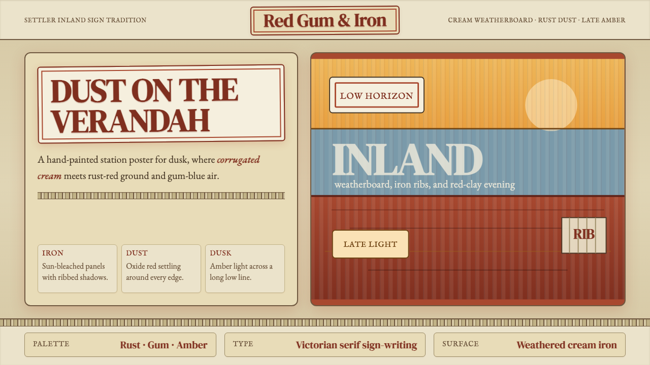 Australian Outback VernacularWeather is the voice. Rust dust, gum-blue bands, and serif sign-writing age t…风化就是声音:锈红尘土、桉蓝横带与衬线招牌让页面有年岁。
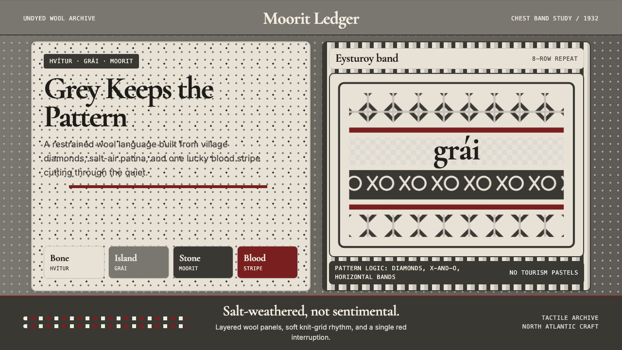 Faroese Knit Pattern Island GreyWeathered wool, not cozy kitsch. Island greys, Cormorant serif, one blood-red…风化羊毛,不是旅游暖意。岛屿灰、Cormorant衬线与一道血红横纹。
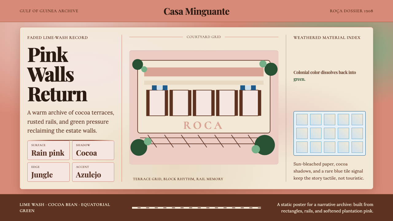 São Toméan Cocoa RoçaTropical ruin has weight. Faded pink, cocoa serif, and green edges frame the…热带废墟有重量:褪粉墙、可可衬线与绿意边缘围住庄园网格。
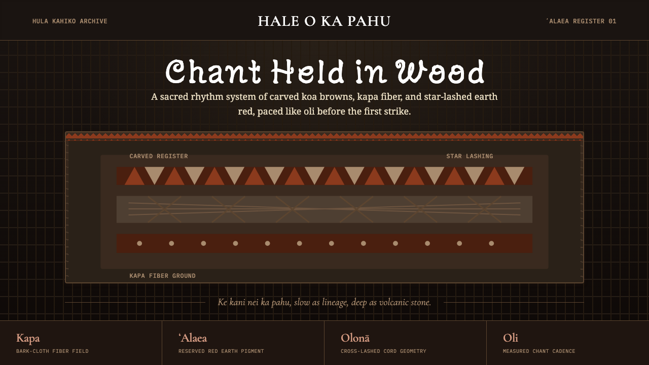 Hawaiian Hula Pahu DrumSacred weight, hand-marked. ʻAlaea red, kapa texture, and stacked carved regi…圣重而手作。ʻAlaea红、卡帕纹理与层叠雕刻带。
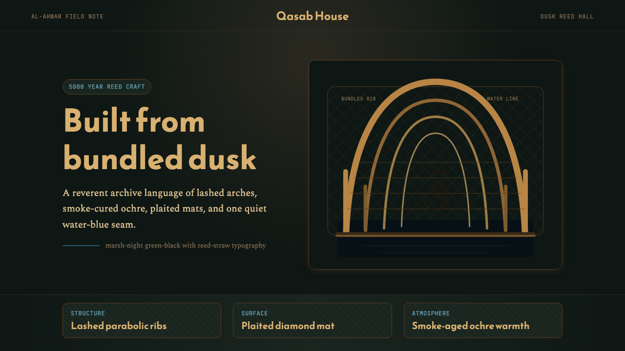 Iraqi Marsh Arab Mudhif ReedReverent reed darkness. Kufi arches, ochre lattice, and one water-blue line h…庄重的芦苇夜色。库菲拱线、赭黄格纹与一笔水蓝托住黄昏。