Design style guide设计风格指南
What is Faroese Knit Pattern Island Grey?什么是 Faroese Knit Pattern Island Grey?
Woven from undyed island wool and centuries of Atlantic solitude, Faroese Knit Pattern Island Grey is a design language built on weathered restraint — where grey is not an absence of color but the full story of a landscape.从未染色的岛屿羊毛与数百年大西洋孤寂中织就,法罗群岛编织图案「岛屿灰」是一套以风化克制为核心的设计语言——在这里,灰色不是色彩的缺席,而是一片大地的完整叙事。
Faroese Knit Pattern Island Grey in briefFaroese Knit Pattern Island Grey 速览
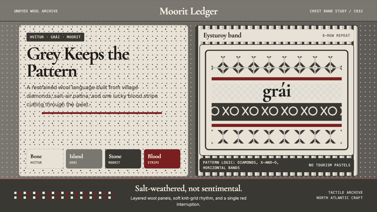
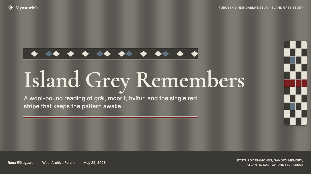
Faroese Knit Pattern Island Grey draws its visual identity from the stranded two-color knitting traditions of the Faroe Islands — eighteen windswept islands in the North Atlantic between Norway and Iceland. Its palette comes directly from the undyed fleece of the native Faroese sheep: natural greys running from pale ash-white through cool mid-grey to the deep brownish-grey islanders call moorit. Into this restrained field, a single thread of blood-red provides the sole saturated punctuation.法罗群岛编织图案「岛屿灰」的视觉身份源自法罗群岛的双色提花编织传统。法罗群岛是北大西洋上的十八座多风岛屿,位于挪威与冰岛之间。这套设计体系的色板直接取自当地法罗绵羊的天然羊毛:从浅灰白、冷调中灰到岛民称为「moorit」的深褐灰,构成一个连续的无染色灰阶。在这一克制的底色中,唯一一道血红色提供了全场唯一的饱和点睛。
Unlike the warmth of Icelandic lopapeysa or the bright contrasts of Norwegian Selbu knitting, Faroese aesthetics resist cosiness. The visual register is tectonic: horizontal band compositions echo the archipelago's layered basalt cliffs; motif geometries — diamonds, crosses, X-and-O repeats — are named after specific islands, giving abstract pattern a geographic anchor. The texture implied throughout is that of wool fiber seen close: slightly irregular, gently napped, never glossy.与面向旅游市场的冰岛lopapeysa的温暖感,或挪威Selbu手套的明亮对比截然不同,法罗群岛编织美学拒绝舒适的暖意。其视觉基调是构造性与元素性的:水平条带构图呼应岛屿层叠的玄武岩崖壁;菱形、十字、小X与圆的交替重复等母题均以特定岛屿和村庄命名,赋予抽象图案精确的地理锚点。整体隐含的质感是近距离观看羊毛纤维的感受:略带不规则、轻微起绒、绝无光泽。
As a contemporary design system, Island Grey translates this craft heritage into interface and print while preserving its core: a near-monochrome grey palette with one deliberate accent, horizontally banded composition, motif-derived geometric ornament used sparingly, and tactile materiality that keeps the visual temperature cool without becoming clinical.作为当代设计体系,「岛屿灰」将这一工艺遗产转化为界面与印刷作品,同时保留其核心属性:近乎单色的灰色色板配以一处刻意为之的暖调强调,以水平条带为基础的构图逻辑,克制使用于小尺度的母题几何装饰,以及贯穿始终的触感物质性——让视觉温度保持清冷而不失为冷漠。
See the Faroese Knit Pattern Island Grey design system →查看 Faroese Knit Pattern Island Grey 完整设计系统 →
Where does Faroese Knit Pattern Island Grey come from?Faroese Knit Pattern Island Grey 从何而来?
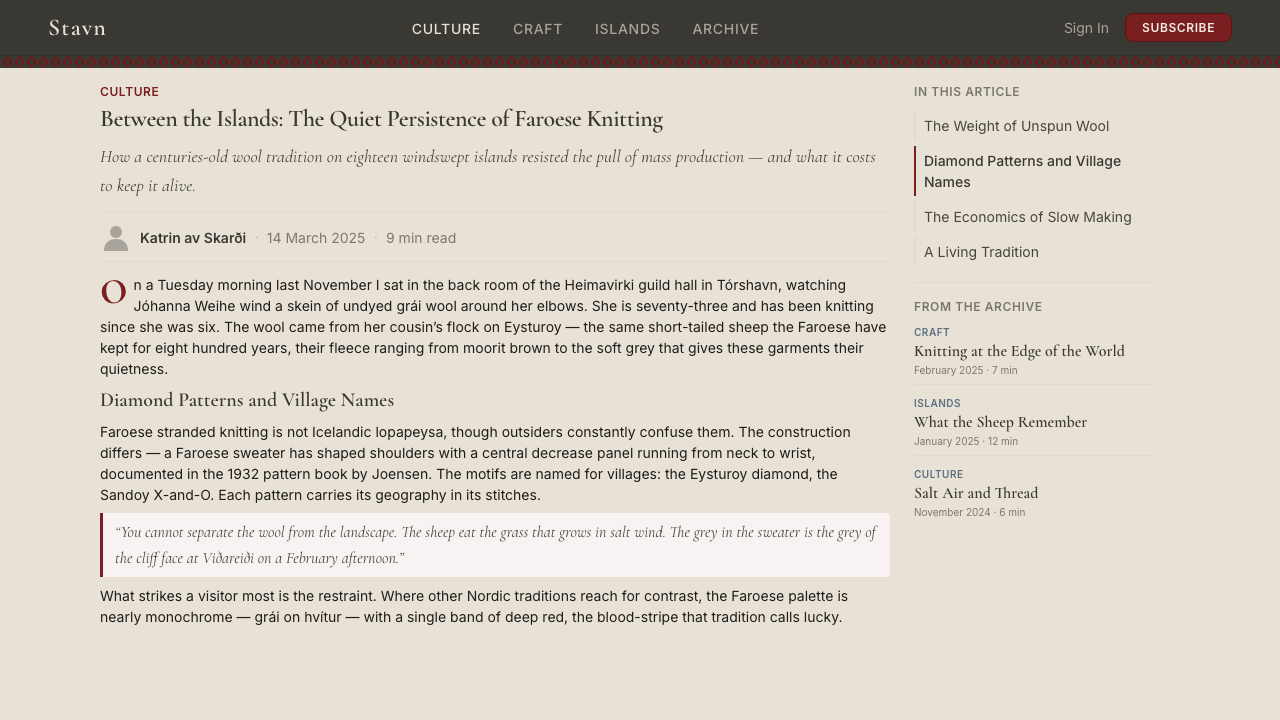
Knitting in the Faroe Islands is documented from at least the seventeenth century, when woolen goods formed a significant part of the export economy under Danish administration. The Faroese sheep, descended from Norse settler stock, produces fleece naturally occurring in white, grey, and moorit — warm dark brown. Islanders learned that stranded knitting's drama came not from dye but from the counterpoint of two natural tones taken directly from the fleece.法罗群岛的编织实践至迟在十七世纪已有文字记录——彼时,羊毛袜与手套在丹麦殖民管辖下构成群岛出口经济的重要组成。原材料始终来自本地:法罗绵羊是一种小型、耐寒的品种,直接传承自九世纪挪威定居者携来的牲畜,其天然羊毛呈白色、灰色与moorit(温暖的深褐色)三种色调。岛民很早便意识到,他们可用的全部色彩范围就蕴含在未染色的羊毛本身之中,而双色提花编织的张力来自两种天然色调的对位,而非来自染料。
Faroese knit motifs carry geographic specificity unusual in Nordic textile traditions. The patterns are named after their communities of origin: the Eysturoy diamond, the Sandoy X-and-O, the broad geometric bands of Suðuroy. This place-naming suggests the motifs functioned as community identity markers — a village's pattern recognizable to anyone from the archipelago — and as geographic storytelling encoded in wool.法罗群岛编织母题具有在北欧纺织传统中罕见的地理特定性。这些图案并非泛化的雪花或抽象菱形填充,而是以各自的岛屿起源社区命名:东岛菱形(Eysturoy diamond)、桑岛X与O交替(Sandoy X-and-O)、与南岛(Suðuroy)相关联的宽幅几何条带。这种地名命名实践表明,这些母题一方面作为社区身份标志发挥作用——一个村庄的图案在整个群岛中均可辨认——另一方面也是一种编织于羊毛中的地理叙事形式。
The critical moment of codification came in 1932, when Joensen published his systematic pattern book documenting the full vocabulary of Faroese knit motifs. By the 1930s, younger women were drawn toward imported textiles and traditional knitting faced the erosion sweeping Nordic cottage industries. Joensen fixed the motif names, the horizontal band system's logic, and color pairing conventions — establishing the canon from which all subsequent revival work drew.关键的系统化时刻发生于1932年——汉斯·马里乌斯·德贝斯·约恩森出版了系统记录法罗编织母题全部词汇的图案集。约恩森的工作兼具描述性与保存性:1930年代,年轻的法罗女性越来越倾向于进口纺织品与工厂生产,传统编织实践面临与整个北欧家庭手工业相同的衰退。他的文献固定了母题名称、水平条带系统的结构逻辑与配色惯例——实质上确立了此后所有复兴工作所依据的经典。
A formal revival came with the 1998 founding of the Føroya Heimavirki guild, which produced updated pattern collections, established quality standards, and made the tradition legible internationally through craft tourism and export. Designers including Rógvadóttir, Ludvig, and Annika í Dáli then brought Faroese aesthetics into contemporary design and fashion, working the grey-on-grey palette and blood-red accent as deliberate artistic position — establishing the visual grammar that Island Grey translates into digital systems.正式的复兴始于1998年法罗家庭手工艺协会(Føroya Heimavirki)的成立——这是一个致力于复兴与规范传统法罗编织的岛屿女性工匠集体。协会出版了更新后的图案集,建立了质量标准,并通过工艺旅游与出口使这一传统对国际受众清晰可读。设计师古德伦·罗格瓦多蒂尔(Guðrun Rógvadóttir)、古德伦·路德维格(Guðrun Ludvig)与安妮卡·伊·达利(Annika í Dáli)是将法罗编织美学引入当代设计与时装语境的代表人物,她们将灰对灰色板与血红强调色作为一种刻意的艺术立场而非单纯的历史遗迹加以运用。她们的工作帮助确立了「岛屿灰」转化为数字体系的视觉语法。
What defines the Faroese Knit Pattern Island Grey look?Faroese Knit Pattern Island Grey 的视觉特征是什么?
Grey Palette as Full Language灰色调色板即完整语言
The core palette spans the undyed natural range of Faroese fleece: near-white ash, cool mid-tone grey, and deep brownish-grey. These three tones carry all compositional weight without manufactured color. The palette reads as cool and elemental — close to basalt, cloud, and salt-bleached stone. Each grey carries a distinct warmth or coolness, functioning as a purposeful choice rather than a neutral default.核心色板涵盖法罗羊毛的天然无染色范围:接近白色的浅灰、冷调中灰与深褐灰。这三个色调承担系统内所有构图重量——背景、前景与中景——无需任何人工色彩介入。整体色感清冷而具元素性,接近岛屿风景中的玄武岩、云层与被盐雾漂白的岩石。它并非现代极简主义意义上的单色调;每种灰色都带有独特的暖调或冷调,作为刻意选择而非中性默认值发挥作用。
The Single Blood-Red Accent唯一的血红强调
Traditional Faroese knitting incorporates one stripe of deep saturated red — associated with good fortune and protection — into an otherwise grey composition. The design system makes this a structural rule: one saturated accent only, appearing as a horizontal band, a border, or a single typographic emphasis. When used correctly, the red carries extraordinary visual weight precisely because everything around it is grey.传统法罗编织在灰调构图中融入单条深饱和红色横纹或条带——在岛屿民间传说中与好运和庇护相关联。在这套设计体系中,这一原则成为结构性规则:只允许存在一处饱和强调色,且必须以编织者同等的克制使用——作为水平条带、边框元素或单一字体强调出现,而非大面积填充。当红色被正确使用时,它携带着非凡的视觉重量,正是因为它周围的一切都是灰色。
Horizontal Band Composition水平条带构图
A traditional Faroese sweater is built from horizontal registers — bands of pattern from hem to shoulder, each self-contained while the whole creates a top-to-bottom reading sequence. The design system preserves this logic: layouts organize into full-width horizontal bands with distinct visual densities, guiding the eye in a sweep rather than a centripetal focus. This banding works naturally in long-form content, landing pages, and print.传统法罗毛衣的决定性结构逻辑是水平条带——从下摆到肩部层叠的图案带,每条带在几何上自成一体,整体构成一个从上至下的阅读序列。这套设计体系保留了这一构图DNA:版面以水平条带或分区组织,全宽区块各具不同视觉密度,视线以从上至下的扫视引导而非向心聚焦。这种条带逻辑在长篇内容、落地页与印刷品中自然适用——页面的水平分割呼应毛衣的构造逻辑。
Island-Named Geometric Motifs以岛屿命名的几何母题
The ornamental vocabulary derives from motifs named after specific Faroese islands: the Eysturoy diamond, the Sandoy X-and-O, the broad bands of Suðuroy. Built from knitting's binary logic — every stitch either foreground or background — these are small, repeating geometric units. In the design system they are micro-ornaments: a diamond band as divider, an X-and-O grid as background texture, a border framing a content block. Always small in scale, always contained within a band.「岛屿灰」的装饰词汇源自以特定法罗岛屿和聚落命名的母题:东岛菱形、桑岛X与O交替、南岛的宽幅重复条带。这些母题是几何性而非具象性的——由编织的二元逻辑构建的小型重复单元,每一针要么是前景色要么是背景色。在设计体系中,它们作为微型装饰发挥作用:菱形重复的细条带用作分隔线,X与O网格用作背景肌理,边框母题框住内容块。它们始终以小尺度使用并被限定在条带之内,从不用作大幅图案填充。
Tactile Materiality触感物质性
A persistent quality in Island Grey is the suggestion of physical texture without literal simulation. Cool palette and rough natural origins evoke handled wool without skeuomorphic illustration or texture overlays. Layering slightly different greys creates a surface that reads as having depth — the way hand-knit fabric has depth not from shadow but from fiber variation. Tactile implication, not texture mimicry.「岛屿灰」作品中持续存在的一种品质是在不进行字面模拟的前提下暗示物理质感。色板的视觉温度——冷调的灰色、粗粝的天然起源——唤起触碰羊毛的感受,却不使用任何拟物化的纤维插图或摄影纹理叠加。这通过色调关系与构图重量来实现:略有差异的灰色层叠创造出一个读起来具有物理深度的表面,正如一件手编织物的深度不来自投影,而来自纤维本身的变化。目标是触感暗示,而非质感模仿。
Craft Austerity Over Decoration工艺朴素超越装饰
Faroese knitting developed under material scarcity: wool was plentiful, dye was imported luxury, pattern complexity bounded by two-color technique. The aesthetic severity of Island Grey is the direct residue of these constraints, not an artistic choice imposed from outside. Every element earns its presence; nothing was included by habit. When ornament appears it is structural — a band motif that marks a transition, a border that frames a reading area.法罗编织在物质匮乏的条件下发展——羊毛是群岛最易获取的资源,染料是进口的奢侈品,图案复杂性受限于双色提花编织的约束。「岛屿灰」的美学严格性并非从外部强加的艺术选择,而是这些约束的直接残留。装饰受到克制,不是因为克制时髦,而是因为过剩从未存在过。这一起源赋予这套视觉体系一种特别的诚实:每个元素都凭自身获得存在的资格,因为没有任何东西是出于习惯或惯例而被纳入的。装饰一旦出现,始终是结构性的——一条既标记过渡的条带母题,一条既框住阅读区域的边框。
Typographic Coldness and Weight字体的冷峻与重量
The typographic register is anchored in deliberate weight and sobriety — letterforms that feel close to cut stone or stamped metal, with visible substance and no decorative curvature. Type sits at strong contrast against grey grounds; hierarchy is established through scale and weight, not color. The blood-red may mark one typographic element per composition — a date, a chapter number, a byline — never more. The effect is that of a formal inscription rather than a friendly label.「岛屿灰」的字体倾向以刻意的分量与庄重为基础。字形应给人以切割石材或冲压金属的感觉,而非描画或印刷——具有可见实体感而无装饰性弧度的形态。文字以强烈对比置于灰色底面,层级通过字号与字重而非色彩建立。血红强调色可标记单一字体元素——日期、章节序号或作者署名——但每个构图中只允许存在一处这样的强调。视觉效果类似正式铭文而非友好标签,召唤着手工艺传统对命名与记录的严肃态度。
See the Faroese Knit Pattern Island Grey design system →查看 Faroese Knit Pattern Island Grey 完整设计系统 →
Who shaped Faroese Knit Pattern Island Grey?谁塑造了 Faroese Knit Pattern Island Grey?
Joensen's 1932 pattern book gave Faroese knit traditions a fixed canonical form. Documenting motif names, band structures, and color pairing conventions at the moment the practice was declining under industrial pressure, he created the reference grammar all subsequent revival work would measure itself against. Without it, the geographic specificity of the motifs might have dissolved into a generalized style with no community roots.约恩森1932年出版的图案集是一次文化保存行为,赋予了法罗编织传统固定的经典形式。他在这一实践因工业化纺织品冲击而衰退的时刻,系统记录了母题名称、条带结构与配色惯例,实质上创建了参考语法——此后所有复兴与设计工作均以此为衡量标准。若非他的文献工作,母题的地理特定性——以起源岛屿命名图案的做法——可能已消融于一种抹去社区起源的泛化「法罗风格」之中。
A central figure in the post-1998 revival, Rógvadóttir brought traditional knit patterns into contemporary clothing and design without smoothing away their geographic specificity. Her insistence on precise provenance — Eysturoy patterns as Eysturoy patterns, not generic Nordic geometry — established the principle that Island Grey authenticity requires naming each motif's source community.罗格瓦多蒂尔是1998年后法罗纺织工艺复兴的核心人物,致力于将传统编织图案引入当代服装与设计,同时不抹去其地理与文化特殊性。她的工作坚持各个母题的精确来源——将东岛图案作为东岛图案使用,而非泛化为北欧几何——并帮助确立了「岛屿灰」工作中真实性要求命名与尊重每个图案元素所属社区的设计原则。
Working at the intersection of craft practice and commercial legibility, Ludvig translated the traditional grey-and-red palette into products that reached international markets without losing their North Atlantic character. Her approach treated the blood-red as a signature of island identity that communicated instantly to insiders and read as striking austerity to everyone else.路德维格对法罗设计的贡献处于工艺实践与商业可读性的交汇处。在复兴女性工匠的网络中工作,她帮助将传统灰红色板转化为一系列既能进入国际市场又不失北大西洋独特气质的产品。她的做法将血红强调色视为一种标志而非装饰——一个岛屿身份的印记,对熟悉这一传统的人立即传达意义,对不熟悉的人则呈现出令人印象深刻的朴素感。
Annika í Dáli brought Faroese aesthetics most directly into contemporary design thinking, working the visual grammar as a system rather than nostalgic motifs. Her practice explored how horizontal banding, the undyed palette, and geographic motif coding could transfer to print, identity work, and digital interfaces without losing the austere North Atlantic sensibility that separates the tradition from more decorative Nordic styles.安妮卡·伊·达利将法罗编织美学最直接地引入当代设计思维领域,将这一传统的视觉语法作为一套体系而非一批怀旧母题加以运用。她的实践探索了水平条带的结构逻辑、未染色色板的克制,以及母题名称精确的地理编码,如何在远离纺织品的场景中——包括印刷、品牌识别与数字界面——得以应用,同时不失使这一传统区别于更具装饰性北欧风格的严峻北大西洋气质。
Founded in 1998, the Føroya Heimavirki is a collective institution whose documentation, standardization, and promotion created the conditions for Island Grey to function as a coherent, exportable design tradition. Its most important contribution was establishing provenance standards — insisting that a motif named after Sandoy must trace to Sandoy practice, not merely resemble it. That institutional care for provenance is central to Island Grey's gravity as a design reference.法罗家庭手工艺协会成立于1998年,它不是一位个人设计师,而是一个集体机构——其系统性的文献整理、标准化与推广工作,为「岛屿灰」作为一套连贯的、可输出的设计传统发挥作用创造了条件。协会最重要的贡献是建立了质量与来源标准,将真实的法罗作品与泛化的北欧模仿品区分开来——坚持以桑岛命名的母题必须追溯至桑岛实践,而非仅仅与之相似。这种对来源的机构性关注,是「岛屿灰」作为设计参考具有特殊分量的部分原因。
How do you use Faroese Knit Pattern Island Grey today?今天怎么用 Faroese Knit Pattern Island Grey?
Applying Island Grey well means building with the same constraints that shaped the original craft — limited palette, horizontal structure, no decoration without purpose. The result is a design language that reads as grounded, serious, and materially honest, suited to contexts where craft heritage, premium provenance, or austere authority are desired values.出色地应用「岛屿灰」需要理解这套视觉体系在根本上做的是什么:它不是在版面上添加北欧氛围,而是以塑造原始工艺的同等约束来构建——有限的色板、水平的结构、无目的不装饰。其结果是一套读起来扎实、严肃而具物质诚实性的设计语言,适合工艺传承、高端来源或朴素权威是期望价值的场景。
For presentation slides, Island Grey suits contexts where content authority is the priority. A cover benefits from full-width horizontal banding: near-white ash ground carrying heavy-type title, a deeper grey band separating a subtitle zone, and the blood-red marking a single detail — a date, a brand mark, a section label. Content slides work as registers with each information block in a defined horizontal zone. Data slides take on a diagrammatic quality, with charts as geometric objects against grey ground and the red reserved for the single most important data point.在演示文稿中,「岛屿灰」最自然地适用于内容权威而非视觉娱乐是优先级的场景。封面幻灯片适合全宽水平条带结构:浅灰白底面承载粗重字体的标题,一条色调略深一级的灰色条带分隔副标题区,血红强调用于单一细节——日期、品牌标识或章节标签。内容幻灯片应当作条带处理,每个信息块占据一个定义好的水平区域。数据幻灯片呈现出近乎示意图式的品质,图表作为几何对象置于灰色底面,红色强调保留给单一最重要的数据点或趋势线。
For web interfaces, the system suits editorial platforms, craft commerce, and brands where premium materiality and Northern European restraint are core to the proposition. Navigation should be typographically weighted — wordmarks and clean labels, no icon clutter. Card components work best with a subtle grey differential between card and page rather than shadow or border; the single red marks interactive states or editorial highlights. Avoid introducing a second accent color: the logic depends entirely on the blood-red being singular.对于网页界面,这套体系适合品牌、编辑平台、工艺电商,以及任何高端物质性与北欧克制是品牌主张组成部分的场景。导航应当精简而具字体重量——文字标识与干净标签,无图标杂乱。卡片组件最好以卡片表面与页面底面之间微妙的灰色差异而非投影或边框来区分;单一红色强调标记交互状态或编辑重点。避免引入第二种强调色的诱惑:视觉逻辑完全依赖血红色的唯一性。
For editorial and marketing work, Island Grey carries authority for heritage brands, craft goods, and any brand positioned around authenticity rather than novelty. The horizontal banding logic suits long-form layouts: body text in a clear register, pull quotes in a narrower parallel band, section breaks marked by a thin rule. Marketing pages work with alternating light-grey and dark-grey sections, each a horizontal band with its own tonal ground — the red accent appearing once per page as a call to action.对于编辑与营销内容,「岛屿灰」对传统品牌、工艺与材料商品、北欧或大西洋背景的旅行与酒店,以及任何围绕真实性与耐久性而非新奇性进行品牌定位的场景具有强烈权威性。水平条带逻辑使其在长篇编辑版面中高效:正文占据清晰的条带区,引语或说明文字在旁侧占据较窄的平行条带,段落分隔以细线而非装饰元素标记。营销页面适合交替的浅灰与深灰分区逻辑,将每个区块视为有自身色调底面的水平条带——红色强调每页出现一次,作为行动号召或特色元素。
The most common mistake is softening the grey palette toward warmer beiges or off-whites — the mineral coldness is essential; losing it loses the North Atlantic edge that separates Island Grey from generic Scandinavian minimalism. A second error is using geometric motifs at large scale; they are micro-ornaments by origin and must remain so. Third, introducing any second accent color destroys the central tension: the drama depends entirely on a single saturated interruption in a field of structural grey.应用「岛屿灰」时常见的错误是软化灰色色板使其感觉更温暖或更当代。灰色更冷、更矿物质的特性对系统的权威性至关重要——向更暖的米色或灰白色偏移会失去使其区别于泛化斯堪的纳维亚极简主义的北大西洋气质。第二个错误是以大尺度使用几何母题或将其作为主导视觉元素;它们就其起源与功能而言是微型装饰,应当保持如此。最后,引入第二种强调色会摧毁系统的核心张力——「岛屿灰」的戏剧性完全依赖单一饱和色对结构性灰色场的中断,哪怕加入一种小幅次要色彩也会使这一逻辑崩溃。
See the Faroese Knit Pattern Island Grey design system →查看 Faroese Knit Pattern Island Grey 完整设计系统 →
Faroese Knit Pattern Island Grey — FAQFaroese Knit Pattern Island Grey · 常见问题
How is Island Grey different from other Nordic design traditions like Scandinavian minimalism or Norwegian folk craft?「岛屿灰」与斯堪的纳维亚极简主义或挪威民间工艺等其他北欧设计传统有何不同?
Partly geographic, partly temperamental. Scandinavian minimalism tends toward warm neutrals, rounded forms, and domestic friendliness. Norwegian Selbu knitting uses a broader palette — strong blues and greens — and is more celebratory. Island Grey is more severe: its palette comes directly from undyed wool with no warmth added, the motifs are geographically coded to specific island communities rather than generalized, and the blood-red accent is a single deliberate interruption rather than part of a colorful language. Island Grey is North Atlantic, not Nordic-tourist-friendly.差异一半在地理,一半在气质。斯堪的纳维亚极简主义——从丹麦现代主义到瑞典设计体系的传统——倾向于温暖的中性色、圆润的形态,以及植根于家居舒适的友好感。挪威民间工艺如Selbu编织使用更宽广的色板,包括强烈的蓝色与绿色,性格更具庆典感。法罗群岛「岛屿灰」则更为严峻,更具特定的元素性:灰色色板直接来自无染色羊毛,不添加任何暖调;母题以地理编码指向特定岛屿社区而非泛化;血红强调是单一刻意为之的中断,而非丰富装饰语言的组成部分。「岛屿灰」是北大西洋的,而非北欧旅游友好型的。
Can Island Grey work in a dark or inverted layout?「岛屿灰」能在深色或反转版面中运作吗?
It can, with care. The traditional palette puts lighter ash-white as background with moorit as foreground; an inversion reverses this, placing deep brownish-grey as ground and lighter tones as type. This works because Faroese wool's natural range includes very dark tones without becoming pure black. The blood-red accent grows more powerful on a dark ground and must be used even more sparingly — a single rule, a single label. The main risk is losing the textile depth of grey layering; tonal relationships need recalibration so the surface reads as having material weight rather than as flat near-black.可以,但需要谨慎。传统色板将较浅的灰白色置于背景,将较深的moorit色调置于前景——反转版本颠倒这一关系,将深褐灰作为底面,较浅色调用于文字与表面元素。这种做法可行,因为法罗羊毛的灰色范围自然包含非常深的色调而不至于成为纯黑。血红强调在深色底面上变得更有力量,必须更加克制地使用——单一线条、单一标签——以避免主导整体构图。深色反转的主要风险是失去灰色分层的织物质量深度;色调关系需要重新校准,使表面读起来具有物质重量而非平板的近黑色。
Is the single red accent always required, or can Island Grey work as a purely greyscale system?单一红色强调是否总是必需的,或者「岛屿灰」可以作为纯灰阶体系运作?
A purely grey version is possible — particularly in formal or institutional applications where any saturated color would feel intrusive. But the blood-red is not merely decorative; it carries symbolic weight tied to island folk tradition and functions structurally as the palette's single point of human warmth. Removing it produces a colder, more austere system that is also less distinctively Faroese, at risk of dissolving into generic neutral minimalism. If red is omitted, something else must carry its weight: a tonal shift, a textural change, or a compositional asymmetry that signals deliberateness.纯灰阶版本是可行的,在某些场景中也是适当的——特别是在任何饱和色都会感觉突兀的正式或机构性应用中。然而,血红强调在原始传统中并非纯粹装饰性的;它承载着与岛屿民间习俗中好运与庇护相关的特定象征重量,并在结构上发挥作用——为灰色色板提供单一的人文温暖与刻意为之的锚点。去掉它产生一个更冷更朴素的体系,但也更少法罗群岛的独特性。纯灰阶的「岛屿灰」有被泛化中性极简主义吸收的风险。若省略红色,其他某种元素必须承担它的工作:色调重量的变化、质感的转换,或一种标志刻意性而非默认设置的构图不对称。
Why does Island Grey use geographically named motifs rather than generic geometric patterns?「岛屿灰」为何使用以地理命名的母题,而非泛化的几何图案?
Because the naming is part of the meaning. In Faroese knit tradition, a pattern named after Eysturoy is not just a diamond — it is a marker of origin and community identity. Using geographic names in a design context carries this forward: the patterns come from somewhere specific and are not generic Nordic geometry. A designer who knows that the X-and-O repeat is specifically Sandoy, not a generalized Faroese pattern, is using the system with the same care for provenance the original weavers exercised.因为命名本身即是意义的组成部分。在法罗编织传统中,以东岛命名的图案不仅仅是一个菱形——它是起源、社区与身份的标记,将一个岛屿的工艺遗产与另一个区分开来。在设计场景中使用地理名称延续了这一原则:它坚持这些图案来自某个特定地方,而非可供泛化应用的北欧几何。这正是将真实的「岛屿灰」作品与表面相似的北欧灵感设计区分开来的品质。一位知道X与O交替重复专属于桑岛而非泛化法罗图案的设计师,是以与原始织造者同等的来源关注使用这套体系。
What kinds of products or brands should avoid Island Grey?哪些类型的产品或品牌应当避免使用「岛屿灰」?
Island Grey is poorly suited to contexts where warmth, visual excitement, or broad approachability are primary values. Food and beverage brands targeting pleasure rather than craft provenance will find the palette too cold to evoke appetite. Children's products and educational platforms need color range the single-accent system cannot provide. Fashion and lifestyle brands that depend on trend responsiveness will find Island Grey too static. Its strongest suit is premium craft goods, Northern European or Atlantic heritage brands, and platforms whose authority rests on seriousness and longevity rather than novelty.「岛屿灰」不适合温暖感、视觉刺激、文化丰富性或广泛亲和力是核心价值的场景。食品与饮料品牌——尤其是那些以愉悦与享乐而非工艺来源为定位的——会发现这个色板过于冷峻朴素,难以唤起食欲或享受感。儿童产品与面向低龄用户的教育平台需要单一强调色体系无法提供的色彩范围与视觉活力。依赖趋势响应与视觉新奇性的娱乐、时尚或生活方式品牌会发现「岛屿灰」过于静态且地理特定性过强。这种风格最适合高端工艺品、北欧或大西洋传承品牌,以及任何权威性建立在严肃性与持久性而非新奇与温暖之上的平台或出版物。
Related design styles相关设计风格
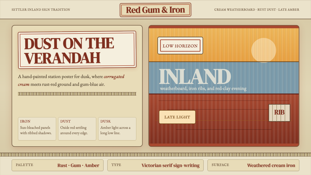 Australian Outback VernacularWeather is the voice. Rust dust, gum-blue bands, and serif sign-writing age t…风化就是声音:锈红尘土、桉蓝横带与衬线招牌让页面有年岁。
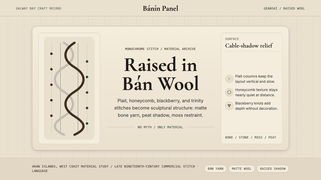 Irish Aran Island Cable KnitMaterial honesty raised in wool. Bone ground, moss ink, and cable columns cas…材料诚实成形:骨白底、苔绿字与绞花柱投下静影。
 Iraqi Marsh Arab Mudhif ReedReverent reed darkness. Kufi arches, ochre lattice, and one water-blue line h…庄重的芦苇夜色。库菲拱线、赭黄格纹与一笔水蓝托住黄昏。
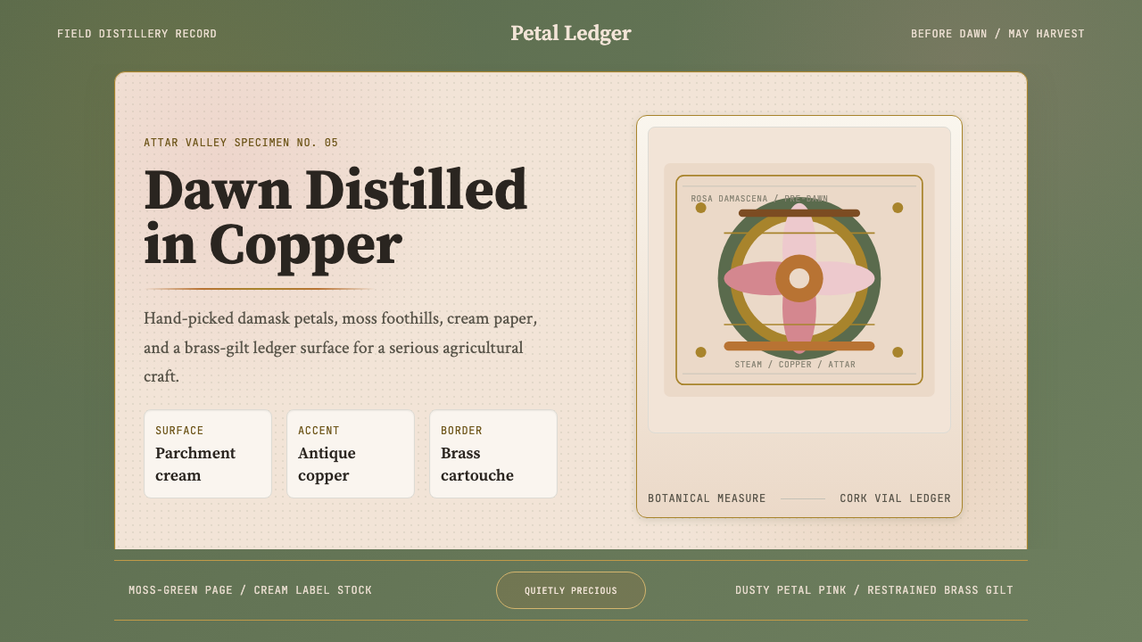 Bulgarian Rose Attar (Valley of Roses)Quietly precious craft. Moss green, dusty rose and brass borders frame a dawn…静谧而珍贵的农艺:苔绿、尘粉与黄铜边框装裱黎明标本。
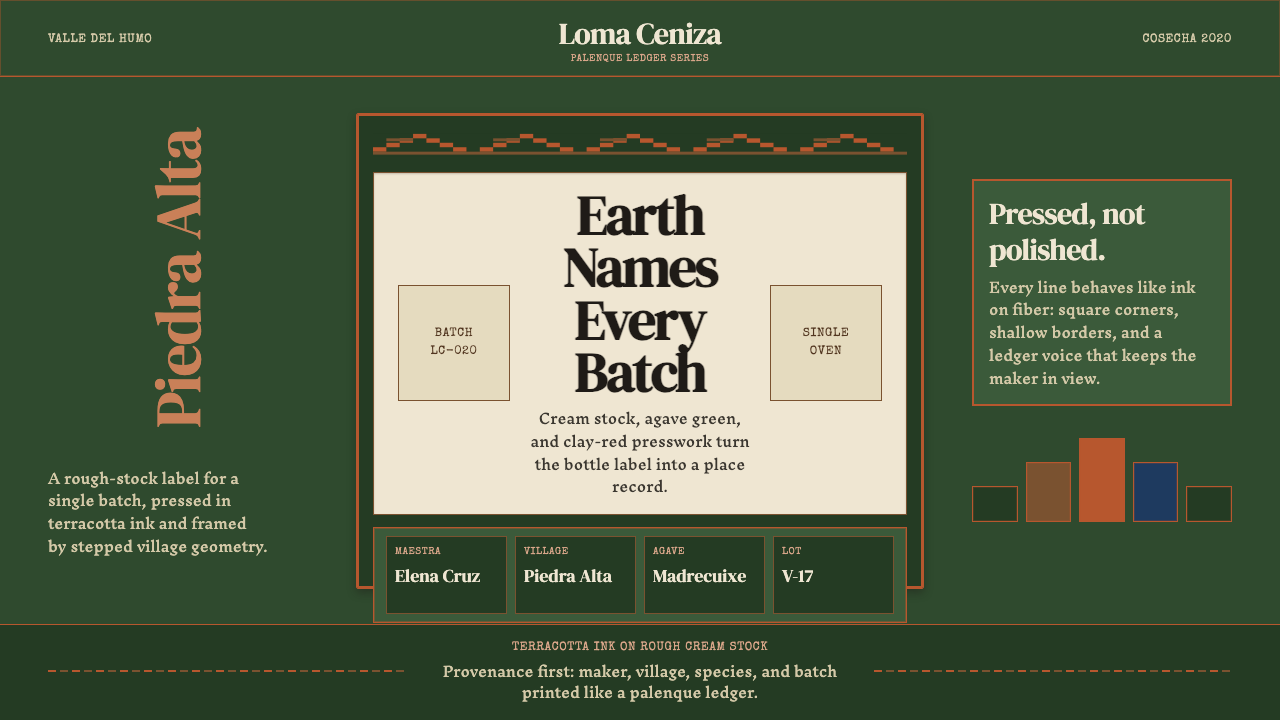 Mexican Mezcal CraftRooted and exact. Agave green, terracotta borders, and DM Serif labels tell t…质朴且精确。龙舌兰绿、赤陶边框与DM Serif标签记录批次。
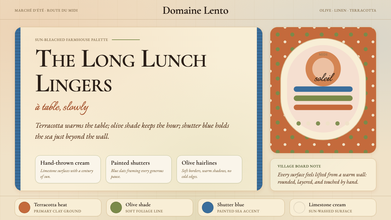 Provençal MediterraneanWarmth refuses the clock. Terracotta, olive lines, and shutter blue frame slo…温暖拒绝计时:陶土、橄榄线与百叶窗蓝框住奶油墙面。