Design style guide设计风格指南
What is Bulgarian Rose Attar (Valley of Roses)?什么是 Bulgarian Rose Attar (Valley of Roses)?
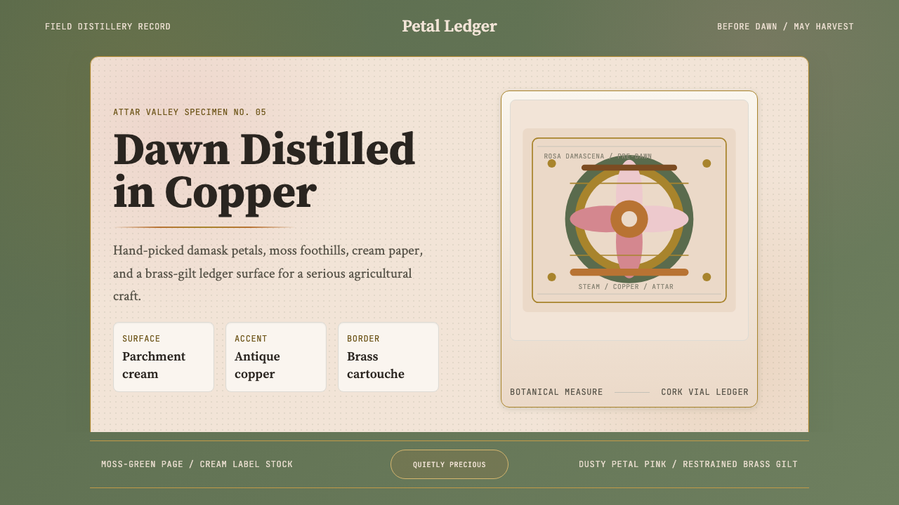
Where copper alembics have distilled the world's finest rose oil since the seventeenth century, an entire design language was born from the dawn harvest — dusty petal-pink, deep moss-green, warm brass, and the gravity of craft that treats every drop as precious.自十七世纪铜制蒸馏器萃取出世界最珍贵玫瑰精油的黎明时分,一整套设计语言由此诞生——尘粉色花瓣、深沉苔绿、温暖黄铜,以及那份将每一滴精油视若珍宝的农艺庄重感。
Bulgarian Rose Attar (Valley of Roses) in briefBulgarian Rose Attar (Valley of Roses) 速览
Bulgarian Rose Attar (Valley of Roses) is a design system rooted in the agricultural craft heritage of Bulgaria's Rozova Dolina — the Valley of Roses — where Rosa damascena has been cultivated and distilled continuously since the Ottoman era. The visual language translates this living tradition into screen-native form: warm parchment grounds, dusty rose and moss-green tones drawn from petal and foliage, antique copper highlights, and brass-gilded borders that recall the apothecary's careful hand.保加利亚玫瑰精油(玫瑰谷)是一套深植于保加利亚玫瑰谷(Rozova Dolina)农艺遗产的设计系统。自奥斯曼时代起,大马士革玫瑰便在这片土地上被连续种植与蒸馏,从未中断。这套视觉语言将这一活着的传统转译为屏幕原生的形态:温暖羊皮纸底色、从花瓣与叶片提取的尘粉色与苔绿色、古铜色高光,以及令人联想到药剂师细心之手的黄铜镀金边框。
The aesthetic is deliberately not glamorous in a commercial perfumery sense. It belongs instead to the world of the specimen plate, the distillery ledger, and the herbalist's cabinet — serious, warm, and quietly precious. Cards frame content as though mounting a botanical sample for archival examination. Surfaces carry the grain of aged paper. Every ornamental accent is restrained, echoing the brass weights and copper vessels of a working laboratory rather than the gloss of a luxury boutique.这套美学刻意回避商业香水的浮华感。它属于另一个世界——标本板、蒸馏坊账本、草药师柜橱——庄重、温暖、静谧而珍贵。卡片将内容装裱得如同将植物标本固定于档案检验台上。表面带有陈年纸张的纹理。每一处装饰点缀都克制含蓄,呼应的是实验室工作台上的黄铜砝码与铜制容器,而非奢侈品店的光泽。
What makes this system distinctive is the tension it holds between organic warmth and rigorous documentation. It is a craft tradition that is also a science — rose attar production involves precise harvest timing, controlled distillation temperatures, and careful measurement — and the design language carries both registers. Decorative warmth and documentary precision coexist without contradiction.这套系统的独特之处在于它所保持的张力:有机温暖与严格文献性并存。玫瑰精油生产既是手工艺,也是一门科学——精确的采摘时机、受控的蒸馏温度、一丝不苟的计量。设计语言同时承载着这两种语境。装饰性的温暖与记录性的精确,在这里毫无矛盾地共存。
Where does Bulgarian Rose Attar (Valley of Roses) come from?Bulgarian Rose Attar (Valley of Roses) 从何而来?
The Valley of Roses — Rozova Dolina — stretches between the Balkan Mountains (Stara Planina) and the Sredna Gora range, centered on the towns of Kazanlak and Karlovo. The Damascus rose, Rosa damascena, was introduced to this region during the Ottoman period, likely in the seventeenth century, brought along trade routes from the rose-growing gardens of Persia and the Near East. The valley's particular microclimate — cool nights, morning fog held in the mountain basin, mineral-rich soil — proved ideal for concentrating the floral compounds that make attar so rare and costly.玫瑰谷(Rozova Dolina)绵延于巴尔干山脉(老山)与中央巴尔干山脉之间,以卡赞勒克与卡尔洛沃为中心。大马士革玫瑰(Rosa damascena)在奥斯曼时期传入这一地区,很可能是在十七世纪,沿贸易路线从波斯和近东的玫瑰园带来。山谷独特的微气候——凉爽的夜晚、山盆地中弥漫的晨雾、矿物质丰富的土壤——使大马士革玫瑰所含的花卉化合物得以高度浓缩,令其精油如此稀有珍贵。
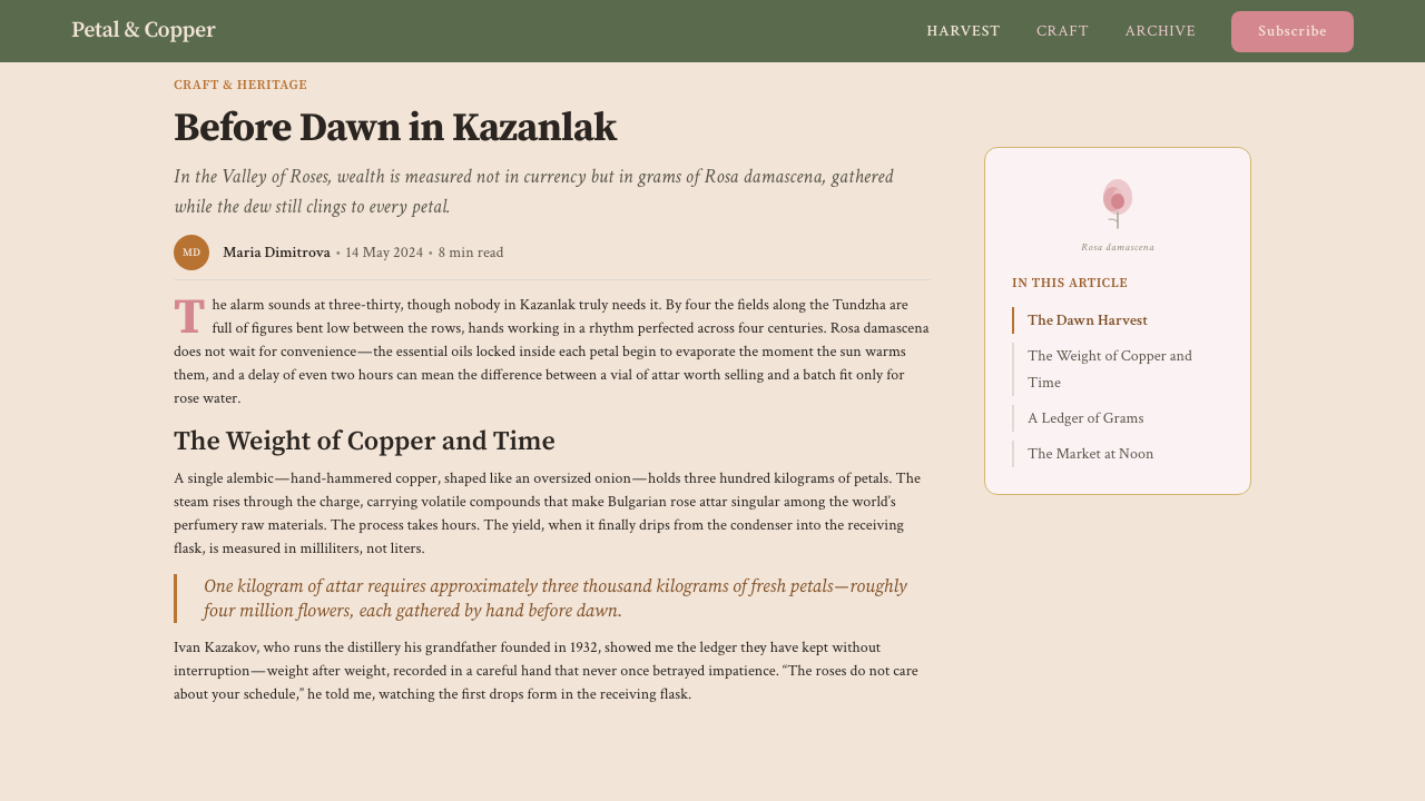
Distillation technology arrived alongside the rose. Early production used simple copper alembics, the standard still of Ottoman-era apothecaries across the empire, producing a small quantity of essential oil floating atop a much larger volume of rose water. As demand grew through the eighteenth and nineteenth centuries, Kazanlak developed into a specialist center: family-owned distilleries, cooperative processing houses, and eventually a guild-like culture of attar producers who jealously guarded their methods. The production peak came in the late nineteenth and early twentieth centuries, when Bulgarian attar supplied perfumers in Grasse, Paris, and London with a material that was genuinely irreplaceable.蒸馏技术随玫瑰同步传入。早期生产使用简单铜制蒸馏器——奥斯曼帝国时代药剂师的标准设备——在大量玫瑰水之上萃取少量精油。随着十八、十九世纪需求增长,卡赞勒克发展成专业中心:家族蒸馏坊、合作社加工厂,以及最终形成的行会式精油生产者文化——他们珍视并守护自己的工艺秘法。产量高峰出现在十九世纪末至二十世纪初,保加利亚精油向格拉斯、巴黎和伦敦的调香师供应着一种真正不可替代的原料。
Key figures in the tradition include Dobri Papazov and Iliya Vapchev, early industrial-era producers who systematized the distillation process and established quality standards that smaller cooperatives then adopted. The Khan Krum cooperative, founded in the region, represented the collective farming model that dominated Bulgarian rose production during the socialist era (1944–1989). The Kazanlak Rose Festival, held annually since 1903, crystallizes the cultural weight of the tradition: a public celebration that draws tourists from across the world while remaining, at its core, a working farmer's ritual — the crowning of a rose queen, the reenactment of the harvest, the sharing of rose-petal jam and rose-scented brandy.这一传统的关键人物包括多布里·帕帕佐夫与伊利亚·瓦普切夫——工业时代早期的生产者,他们系统化了蒸馏工序,建立了质量标准,供小型合作社采用。汗·克鲁姆合作社代表了社会主义时期(1944—1989年)主导保加利亚玫瑰生产的集体农庄模式。自1903年起每年举办的卡赞勒克玫瑰节,凝结了这一传统的文化分量:这场公共庆典吸引全球游客,却在骨子里仍是一个劳作农人的仪式——为玫瑰女王加冕、重现采摘场景、分享玫瑰花瓣果酱与玫瑰香白兰地。
The collapse of the socialist agricultural system in the early 1990s dealt severe disruption to the industry, as collective farms dissolved and the distribution infrastructure for Bulgarian attar fractured. A revival began in the 2000s and accelerated through the 2010s, led partly by the Bulgarian Rose Producers Association and partly by the global market's renewed appetite for natural, traceable ingredients — driven by the clean-beauty movement and the premiumization of natural perfumery. Today, Bulgarian attar is once again a prestige raw material, with certified-origin product commanding prices comparable to precious metals, and a new generation of distillers documenting their methods with the transparency that contemporary buyers expect. It is this revival — heritage craft meeting modern accountability — that gives the design system its particular combination of aged warmth and documentary seriousness.1990年代初社会主义农业体系的瓦解对这一产业造成严重冲击:集体农庄解散,保加利亚精油的分销基础设施随之瓦解。2000年代以来,振兴之势逐渐形成,并在2010年代加速——部分由保加利亚玫瑰生产者协会推动,部分由全球市场对天然可溯源原料的重新渴望驱动,而后者正是由清洁美妆运动与天然香水的高端化浪潮共同催生的。时至今日,保加利亚玫瑰精油再次成为奢侈级原料,经认证的原产地产品价格堪比贵金属,新一代蒸馏师以现代消费者所期待的透明度记录着自己的工艺。正是这场振兴——遗产手工艺与现代责任感的相遇——赋予了这套设计系统那种独特的结合:陈旧的温暖与文献性的严肃并存。
What defines the Bulgarian Rose Attar (Valley of Roses) look?Bulgarian Rose Attar (Valley of Roses) 的视觉特征是什么?
Palette色彩
The color palette derives directly from the valley landscape and distillery materials. The dominant ground tone is a warm parchment — the color of aged linen or unbleached paper — against which two signature hues operate: dusty rose, pulled from the half-opened Rosa damascena petal at early morning, and deep moss-green, drawn from the Stara Planina foothills visible from the valley floor. Antique copper and restrained brass function as accent metals, appearing in borders, dividers, and highlight elements. The overall register is muted and warm rather than saturated and bright — as though everything has been touched by morning mist and years of gentle use.色板直接源自山谷景观与蒸馏坊材料。主导底色是温暖的羊皮纸色——陈年亚麻布或未漂白纸张的颜色——两种标志性色调在其上运作:尘粉色,取自清晨半开的大马士革玫瑰花瓣;深苔绿,来自从谷底望去的老山山麓。古铜色与含蓄黄铜作为金属强调色,出现在边框、分隔线与高光元素中。整体调性柔和而温暖,而非饱和明亮——仿佛一切都曾被晨雾轻抚,经历了岁月温柔的使用。
Surface and Texture表面与质感
Surfaces throughout the system carry a subtle parchment or grain quality — the visual memory of aged paper, woven linen, and worn copper. This is not skeuomorphic decoration imposed on top of content; rather, it is an undertone that warmth the foundation without overwhelming the material placed on it. Cards feel archival rather than sterile, as though they belong in a naturalist's cabinet alongside preserved specimens. The texture is always subordinate to the content, present but never insistent.系统各处的表面带有微妙的羊皮纸或纹理感——陈年纸张、编织亚麻、磨旧铜器的视觉记忆。这不是叠加在内容之上的仿物化装饰,而是一种底色,温暖着基础而不压制其上的素材。卡片有着档案馆的气质,而非无菌的干净,仿佛它们属于博物学家的柜橱,与保存的标本并排陈列。质感始终从属于内容——存在,但从不强求注意。
Borders and Framing边框与装裱
Borders are a structural signature of the system, used with a confidence that is unusual in contemporary screen design. Brass-tinted or copper-toned rules frame cards, section headers, and decorative panels in the manner of apothecary labels and specimen plates. The borders are not mere outlines — they signal that content inside has been carefully contained and presented, worth the viewer's deliberate attention. Thin inner borders create matting effects that recall botanical illustration framing, adding visual depth without dimensional illusion.边框是这套系统的结构性标志,使用它的自信在当代屏幕设计中实属罕见。黄铜色或铜色线条以药剂师标签与标本板的方式装裱卡片、段落标题与装饰面板。边框不仅仅是轮廓——它们传递一个信号:内部的内容经过精心收纳与呈现,值得观者的专注目光。细内边框营造出衬垫效果,让人联想起植物插图的装裱方式,在不制造维度幻觉的前提下增添了视觉深度。
Typography Register字体排印气质
Typographic choices favor serif letterforms with classical proportions — forms that carry the authority of printed botanical texts and historical scientific documentation. Headings adopt a restrained elegance, neither heavy-industrial nor delicately ornamental, sitting somewhere between a nineteenth-century field guide and a contemporary artisan label. Body text is set with generous line spacing and moderate measure, emphasizing readability and the sense that each word has been placed with care. Labels, metadata, and classification tags use refined small capitals or spaced letterspacing to evoke the precision of scientific nomenclature.字体选择偏向带有古典比例的衬线字形——承载着印刷植物志与历史科学文献权威感的字体。标题呈现一种含蓄的优雅,既不工业粗重,也不纤细装饰,落在十九世纪野外指南与当代工匠标签之间某处。正文以宽松行距与适中行宽排印,强调可读性与每个字都经过精心安放的感觉。标签、元数据与分类标注使用精致小型大写字母或宽字距,唤起科学命名法的精确感。
Ornamental Restraint装饰的克制
The system is not minimalist in the contemporary sense, yet its ornamentation is carefully rationed. Botanical-derived motifs — a simplified rose hip, a leaf outline, a distillation coil suggested in a border corner — appear sparingly, as details rather than dominant visual elements. They function as signatures of origin, reminding the viewer of the agricultural and alchemical roots of the tradition, without overloading the composition with decorative noise. Every ornamental element earns its presence by adding meaning, not merely visual richness.这套系统并非当代意义上的极简主义,但其装饰是经过仔细配给的。来自植物的母题——简化的玫瑰果、叶片轮廓、边框角落暗示的蒸馏线圈——以细节而非主导视觉元素的方式稀少出现。它们作为来源的印记发挥作用,提醒观者这一传统的农艺与炼金术根源,同时不以装饰噪音淹没构图。每一处装饰元素都以增添意义而非仅仅丰富视觉来证明自身存在的合理性。
Light and Warmth光感与温度
Light in this system is soft and directional, evoking the diffused morning light of a mountain valley at harvest time rather than the crisp overhead illumination of a laboratory or studio. Shadows, when present, are warm-toned and gentle — neither the hard geometric shadows of Bauhaus-derived systems nor the complete flatness of contemporary utility design. This warmth is structural, distinguishing primary content zones from secondary metadata and contextual information, but it is always expressive of a particular time of day and a particular place: pre-dawn Kazanlak, copper vessels beginning to warm, petals releasing their fragrance into cool air.这套系统中的光感柔和而有方向性,唤起的是采摘时节山谷清晨漫射的光,而非实验室或工作室清冷的顶光。投影(若出现)色调温暖而轻柔——既非包豪斯派生系统的硬边几何投影,也非当代实用设计的完全平面。这种温度感是结构性的,区分主要内容区与次要元数据和语境信息,但它始终表达着一个特定的时刻与地点:黎明前的卡赞勒克,铜制容器开始升温,花瓣将芬芳释放入凉意的空气中。
Documentary Precision文献性的精确
Beneath the warmth and ornamental detail runs a counter-register of documentary precision inherited from the scientist's notebook and the apothecary's record book. Data tables, measurement records, and provenance information are rendered with clear grid alignment, consistent typographic hierarchy, and purposeful whitespace. This precision prevents the system from becoming merely nostalgic or decorative — it insists that the warmth of the palette is always in service of content that rewards careful attention. The interplay between the organic and the systematic is the system's defining quality.温暖与装饰细节之下,流淌着一股源自科学家笔记本与药剂师记录册的反向调性——文献性的精确。数据表格、计量记录与产地信息以清晰的网格对齐、一致的字体层级和有意为之的留白呈现。这种精确感防止系统滑入单纯的怀旧或装饰性——它坚持认为色板的温暖始终服务于值得细心审视的内容。有机性与系统性之间的张力,正是这套系统的决定性品质。

Who shaped Bulgarian Rose Attar (Valley of Roses)?谁塑造了 Bulgarian Rose Attar (Valley of Roses)?
One of the pioneering industrial-era rose attar producers in the Kazanlak region, Papazov helped systematize distillation practices that had previously varied widely between family operations. By establishing more consistent processing standards, he contributed to the regionalization of quality that allowed Bulgarian attar to compete as a premium international raw material. His work represents the transition from purely artisanal production to a craft industry that could operate at scale without sacrificing the essential character of the product.卡赞勒克地区工业时代的玫瑰精油先驱生产者之一,帕帕佐夫帮助系统化了此前在各家庭作坊间差异悬殊的蒸馏工艺。通过建立更为一致的加工标准,他推动了品质的地区化,使保加利亚精油得以作为高端国际原料参与竞争。他的工作代表了从纯手工生产向规模化工艺产业的过渡——这一过渡在扩大规模的同时,并未牺牲产品的本质特性。
Vapchev was central to the development of cooperative production models in the Valley of Roses during the late nineteenth and early twentieth centuries. Recognizing that the capital requirements for copper distillation equipment and the logistics of fresh-petal processing made purely individual production fragile, he worked to build shared infrastructure and collective quality standards. The cooperative traditions he helped establish became the structural template for how Bulgarian rose production was organized through much of the twentieth century.瓦普切夫在十九世纪末至二十世纪初对玫瑰谷合作社生产模式的发展起到了核心作用。他认识到铜制蒸馏设备的资本需求与鲜花瓣加工的物流要求,使纯个体生产十分脆弱,因此致力于建立共享基础设施与集体质量标准。他所帮助奠定的合作社传统,成为保加利亚玫瑰生产在二十世纪大部分时期的组织结构模板。
The Khan Krum cooperative — named after the ninth-century Bulgarian ruler — embodied the collectivized phase of rose attar production under Bulgaria's socialist government. At its peak, cooperatives of this type pooled land, labor, and distillation infrastructure across entire villages, enabling a volume and consistency of production that supplied the global fragrance industry for decades. The cooperative model also shaped the visual culture of the industry: documentation, labeling, and quality certification became formalized during this period, contributing to the documentary aesthetic that the design system carries.汗·克鲁姆合作社——以九世纪保加利亚君主命名——体现了保加利亚社会主义政府治下玫瑰精油生产的集体化阶段。全盛时期,此类合作社将整个村庄的土地、劳动力与蒸馏基础设施整合一体,使生产规模与一致性足以向全球香水产业供货数十年。合作社模式也塑造了这一产业的视觉文化:文档记录、标签设计与质量认证在这一时期走向规范化,为设计系统所承载的文献性美学奠定了基础。
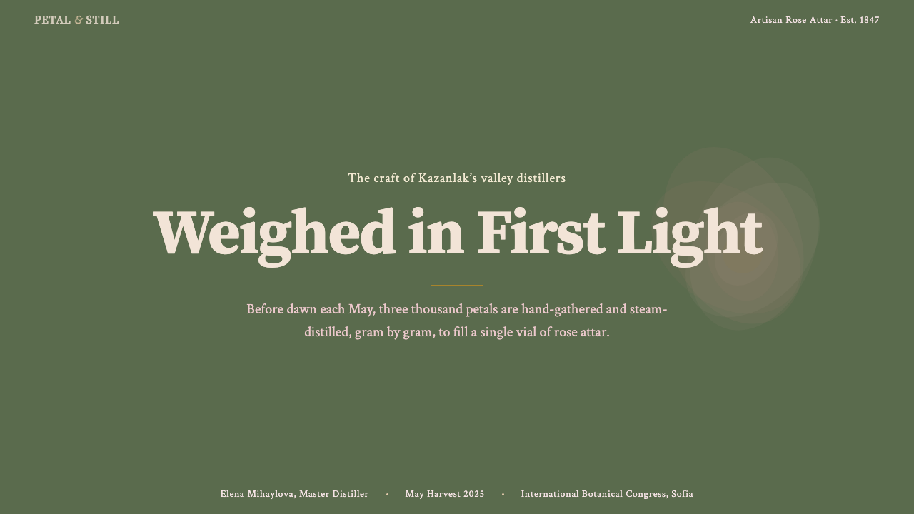
The annual Rose Festival in Kazanlak is among the oldest continuously-held agricultural festivals in southeastern Europe, established in 1903 as a formal celebration of the harvest and the trade that had made the valley prosperous. It combines the ritual elements of an agrarian folk ceremony — the crowning of a rose queen, the reenactment of the picking at dawn, the public distillation demonstration — with the civic functions of an industry showcase. The festival has shaped how the valley presents itself visually to the outside world, creating a public vocabulary of imagery: petal-strewn processions, copper vessels steaming in morning light, traditional embroidered garments, and the particular combination of natural abundance and artisanal care that the design system distills.每年一届的卡赞勒克玫瑰节是东南欧历史最悠久的持续性农业节庆之一,创立于1903年,是对采摘季与令山谷富庶的贸易的正式庆祝。它将农耕民俗仪式的仪典元素——为玫瑰女王加冕、黎明采摘的重演、公开蒸馏展示——与产业展示的市民功能融为一体。玫瑰节塑造了这片山谷向外部世界呈现自身的视觉方式,创造了一套公共图像词汇:撒满花瓣的游行队伍、清晨光线中升腾蒸汽的铜制容器、传统刺绣服饰,以及这套设计系统所蒸馏出的那种特别结合——自然的丰盛与手工艺的细心并存。
Established to protect and promote the interests of domestic attar producers following the post-socialist restructuring of the 1990s, the Bulgarian Rose Producers Association has played a central role in the contemporary revival of the industry. It lobbied for protected geographical indication status, established traceability standards that allow buyers to verify the origin of specific batches, and worked to position Bulgarian attar as a premium certified-origin product in an international market increasingly aware of authenticity and provenance. The association's emphasis on documentation, certification, and the communication of craft heritage is directly reflected in the design system's documentary and archival aesthetic register.保加利亚玫瑰生产者协会成立于1990年代后社会主义改制之后,旨在保护和推广国内精油生产者的利益,在这一产业的当代复兴中扮演了核心角色。该协会推动了受保护地理标志地位的认定,建立了允许买家核实特定批次来源的可溯源标准,并致力于将保加利亚精油定位为认证原产地高端产品——在日益关注真实性与来源证明的国际市场上。协会对文档记录、认证标准与工艺遗产传播的重视,直接映射在这套设计系统的文献性与档案美学气质中。
How do you use Bulgarian Rose Attar (Valley of Roses) today?今天怎么用 Bulgarian Rose Attar (Valley of Roses)?
Bulgarian Rose Attar is among the most contextually specific design systems in the Curio library — it carries a strong cultural and sensory signature that rewards deliberate application. Using it correctly means understanding the values it embodies: agricultural craft, careful documentation, the coexistence of organic warmth and systematic precision. Applied to content that shares these values, the system feels inevitable. Applied to content that does not, it reads as affectation.保加利亚玫瑰精油是 Curio 库中语境特异性最强的设计系统之一——它承载着鲜明的文化与感官印记,回报的是刻意而为的应用。正确使用它意味着理解它所体现的价值观:农艺手工、细心记录、有机温暖与系统精确的共存。将它应用于共享这些价值观的内容,系统会显得顺理成章。应用于无关的内容,则会读来矫揉造作。
For presentation slides, the system suits cover and context-setting pages exceptionally well. A cover built in this language uses the warm parchment ground, a copper-toned or brass-tinted border framing the title area, and a single motif — a simplified botanical element or a distillery silhouette — positioned as a quiet accent rather than a dominant visual. Content slides benefit from the system's documentary register: generous margins, clear typographic hierarchy with classical serif proportions, and restrained use of the dusty-rose or moss-green tones to distinguish primary content from supplementary annotation. Data slides should treat charts as specimen plates — clearly labeled, bordered, and set against the parchment ground with no superfluous decoration.在演示文稿中,这套系统尤其适合封面与背景铺垫页面。用这套语言构建的封面,以温暖的羊皮纸色为底,铜色或黄铜色边框装裱标题区域,一处单一母题——简化的植物元素或蒸馏坊剪影——作为安静的点缀而非主导视觉。内容页受益于系统的文献性气质:宽阔页边,具有古典衬线比例的清晰字体层级,以及克制使用尘粉色或苔绿色来区分主要内容与补充注释。数据页应将图表当作标本板处理——清晰标注、添加边框,置于羊皮纸底色之上,无多余装饰。
For web interfaces, the system is best suited to contexts where craft provenance, natural ingredients, heritage products, or artisanal production are central themes. A product page for a luxury food, beverage, or personal-care brand; a marketplace for certified-origin materials; a cultural heritage organization's archive — these are natural homes for the visual language. In interface terms, this means: warm ground tones rather than clinical white, brass-accented interactive elements rather than flat neutral states, serif headings rather than geometric sans, and card components framed with thin warm-toned borders rather than hard shadows or borderless floating.对于网页界面,这套系统最适合以工艺来源、天然成分、遗产产品或手工生产为核心主题的场景。奢侈食品、饮料或个人护理品牌的产品页;认证原产地材料的市集;文化遗产组织的档案库——这些都是这套视觉语言的天然归宿。在界面层面,这意味着:温暖底色而非临床白,黄铜强调的交互元素而非平面中性态,衬线标题而非几何无衬线,以及带有薄温色调边框的卡片组件,而非硬边投影或无边框浮动。
For editorial and marketing work, the system supports long-form content that rewards patient reading. An editorial spread that uses the full palette — parchment ground, dusty rose pull-quotes framed with brass rules, moss-green section dividers, antique copper drop initials — creates an atmosphere of considered craft that primes the reader to invest attention. Marketing materials for heritage or origin-certified products benefit from the system's emphasis on documentation: including harvest dates, distillery names, geographic coordinates, or certification marks as typographic details adds authenticity without resorting to generic luxury clichés.对于编辑与营销内容,这套系统支持回报耐心阅读的长篇内容。充分使用全套色板的编辑版面——羊皮纸底色、黄铜线条装裱的尘粉色引用语、苔绿色段落分隔、古铜色大型首字母下沉——营造出一种深思熟虑的工艺氛围,引导读者投入注意力。遗产或原产地认证产品的营销材料,得益于系统对文献记录的强调:将采摘日期、蒸馏坊名称、地理坐标或认证标志作为排印细节加入,在不诉诸通用奢侈品陈词滥调的前提下,增添了真实感。
A common mistake when applying this system is over-saturating the palette — pushing the rose and green tones toward full commercial vibrancy rather than holding them at the muted, dusty register that gives the system its gravity. The dusty quality of the signature tones is not a limitation; it is the character. Similarly, introducing too many ornamental botanical motifs risks tipping the aesthetic from archival elegance into decorative nostalgia. The most effective applications use ornament sparingly, as punctuation, trusting the palette and framing structure to do the expressive work.应用这套系统时最常见的错误,是过度饱和色板——将玫瑰色与绿色推向全饱和的商业活力,而非将它们保持在赋予系统厚重感的柔和尘雾调性。这种标志性色调的尘雾质感不是局限,而是性格所在。同样,引入过多装饰性植物母题,有将美学从档案优雅倒向装饰性怀旧的风险。最有效的应用克制使用装饰,将其当作标点符号,信任色板与装裱结构来完成表达性的工作。
Bulgarian Rose Attar (Valley of Roses) — FAQBulgarian Rose Attar (Valley of Roses) · 常见问题
How is this style different from general vintage or apothecary aesthetics?这种风格与一般复古或药剂师美学有何不同?
Generic vintage and apothecary aesthetics tend to borrow surface elements — aged paper textures, serif type, botanical motifs — as decorative veneer without the underlying structural logic. Bulgarian Rose Attar is grounded in a specific, historically documented agricultural and artisanal tradition with its own material culture, production environment, and documentary habits. The design choices in this system are motivated by that specificity: the copper and brass accents refer to actual distillation equipment, the moss-green connects to the actual landscape, the documentary precision reflects the actual record-keeping culture of certified-origin attar production. Surface-level vintage aesthetics feel nostalgic in a generic way; this system aims for the gravitas of a living craft tradition.通用的复古与药剂师美学倾向于借用表面元素——陈旧纸张质感、衬线字体、植物母题——作为装饰外衣,而没有其下的结构逻辑。保加利亚玫瑰精油植根于一个具体的、有历史记录的农艺与手工传统,拥有其自身的物质文化、生产环境与记录习惯。这套系统中的设计选择均由这种特殊性驱动:铜与黄铜的强调色指向真实的蒸馏设备,苔绿色连接真实的景观,文献精确性反映了认证原产地精油生产真实的记录文化。表面层面的复古美学以通用的方式显得怀旧;这套系统追求的是一门活着的手工传统所具有的那种厚重感。
Can this system work for digital-first products, or is it only suited to heritage brands?这套系统适用于数字原生产品吗,还是只适合遗产品牌?
The system can work well for digital-first products, but the fit depends on whether the product's values align with the system's expressive register. A digital marketplace for verified natural ingredients, a subscription service for artisan food products, a platform documenting traditional crafts or agricultural heritage, a wellness application emphasizing natural provenance — these are digital-first contexts where the Bulgarian Rose Attar visual language feels motivated rather than imposed. The key is that the warmth and documentary quality of the system should reflect something true about the product's own relationship to craft, origin, and care. Using it purely as a visual style, without that underlying alignment, tends to feel unconvincing.这套系统可以在数字原生产品中良好运作,但适配程度取决于产品价值观是否与系统的表达语境对齐。天然成分认证交易市集、手工食品订阅服务、记录传统工艺或农业遗产的平台、强调天然来源的健康应用——这些都是数字原生语境,在其中使用保加利亚玫瑰精油视觉语言感觉顺理成章而非强行套用。关键在于:系统的温暖感与文献品质应当反映产品本身与工艺、来源和细心之间真实存在的关系。仅作为视觉风格使用,而没有这种底层对齐,往往显得缺乏说服力。
How should this style handle product photography or imagery?这种风格应该如何处理产品摄影或图像?
Imagery in this system works best when it has the quality of documentation — botanical illustration, archival photography, still-life arrangement with natural light — rather than high-gloss commercial photography. Photographs should be warm-toned and diffuse-lit rather than crisp and studio-white. Still-life compositions featuring raw materials, tools, vessels, or landscape elements communicate more authentically than polished product shots. When the subject is the product itself, staging it against parchment, linen, or worn wood grounds — materials that echo the system's palette — is more effective than floating it on pure white. Illustration, when used, should favor the linearity and precision of botanical or scientific drawing over decorative looseness.这套系统中的图像,以具有文献质感时效果最佳——植物插图、档案摄影、自然光下的静物陈设——而非高光泽商业摄影。照片应色调温暖、漫射打光,而非清冷的棚拍白光。以原材料、工具、器皿或景观元素构成的静物画面,比精良的商品展示图更为真实可信。当主体是产品本身时,将其置于羊皮纸、亚麻布或磨旧木材底面上——与系统色板呼应的材料——比悬浮于纯白之上更为有效。插图(若使用)应偏向植物或科学绘图的线条性与精确性,而非装饰性的随意感。
Is it appropriate to use this style for dark-mode interfaces?这种风格适合用在深色模式界面中吗?
A dark variant of this system is possible but requires careful reinterpretation rather than simple inversion. The canonical palette is light-ground — warm parchment — and the system's warmth derives substantially from that luminous base. A dark version works best by shifting the ground to a very deep, warm-tinted near-black rather than a neutral dark gray or pure black. Against this deep warm ground, the dusty rose and moss-green tones retain their character without competing against each other. Brass and copper accents continue to function as structural highlights. The documentary typographic register should be preserved regardless of ground tone — the shift to dark mode should affect light levels, not the archival gravity of the system.这套系统的深色变体是可行的,但需要仔细的重新诠释,而非简单反色。标准色板以浅色为底——温暖的羊皮纸色——系统的温度感很大程度上来源于这种发光的基底。深色版本最有效的做法是:将底色转向极深、带温暖色调的接近黑色,而非中性深灰或纯黑。在这种深暖底色映衬下,尘粉色与苔绿色保留了各自的性格,不会相互竞争。黄铜与铜色强调色继续作为结构性高光发挥作用。无论底色如何,文献性的排印气质都应当保留——深色模式的转变应当影响亮度水平,而非系统的档案庄重感。
What distinguishes authentic use of this system from merely decorative pastiche?真正使用这套系统与单纯装饰性模仿之间有何区别?
Authentic use is motivated by content alignment — the design choices serve to communicate something true about the subject matter. Pastiche borrows the surface: warm tones, brass borders, serif type, botanical motifs, without the underlying logic that gives those choices meaning. The test is whether the documentary precision of the system is being deployed or merely dressed around. An authentic application treats data, provenance information, and classification details with the same care as decorative elements — integrating them into the visual hierarchy rather than marginalizing them as footnotes. The ornamental details should feel like they are earning their presence by adding contextual meaning; if they feel like decoration applied to make something look artisanal, the application has slipped into pastiche.真正的应用由内容对齐所驱动——设计选择服务于传达关于主题真实的某些东西。模仿借用的是表面:温暖色调、黄铜边框、衬线字体、植物母题,却没有赋予这些选择意义的底层逻辑。检验标准在于:系统的文献性精确是否被真正部署,还是仅仅被穿戴其上。真正的应用将数据、来源信息与分类细节与装饰元素同等对待——将它们整合进视觉层级,而非边缘化为脚注。装饰性细节应当让人感到它们正在通过增添语境意义来证明自身存在的合理性;如果它们感觉像是为了让某物看起来有工艺感而施加的装饰,那应用便滑入了模仿。
Related design styles相关设计风格
 Australian Outback VernacularWeather is the voice. Rust dust, gum-blue bands, and serif sign-writing age t…风化就是声音:锈红尘土、桉蓝横带与衬线招牌让页面有年岁。
 Costa Rican Oxcart Sarchí 1900Geometry sings. Fire red, cobalt, lemon and black outlines turn the wheel int…几何在歌唱。火红、钴蓝、柠黄与黑描边让车轮成为法则。
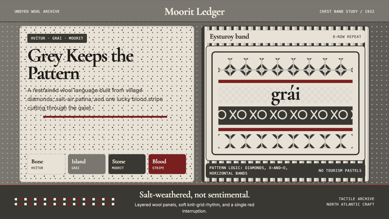 Faroese Knit Pattern Island GreyWeathered wool, not cozy kitsch. Island greys, Cormorant serif, one blood-red…风化羊毛,不是旅游暖意。岛屿灰、Cormorant衬线与一道血红横纹。
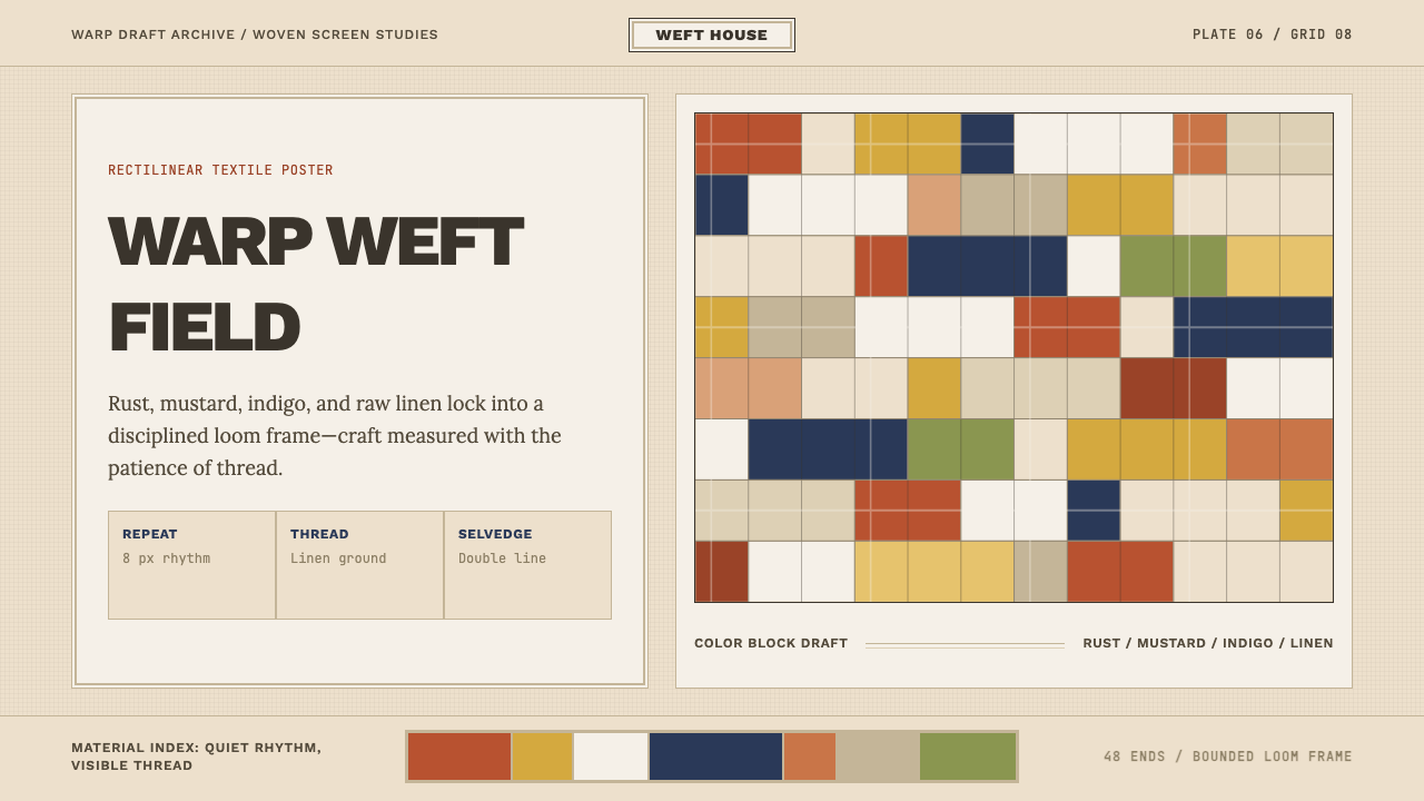 Bauhaus Textile (Anni Albers)Anni Albers' loom as design grid. Modular rust-mustard-indigo blocks, visible…安妮·阿尔伯斯的织机即设计网格:铁锈、芥末、靛蓝的模块色块,可见的经纬质感与韵…
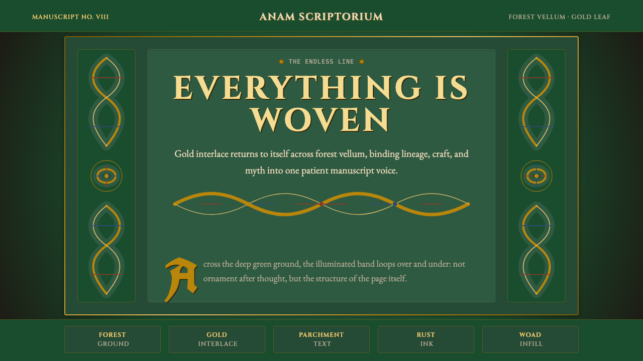 Celtic KnotworkEverything is connected. Gold Cinzel interlace frames forest-green vellum.万物相连:金色绳结与Cinzel字形框住森林绿羊皮纸。
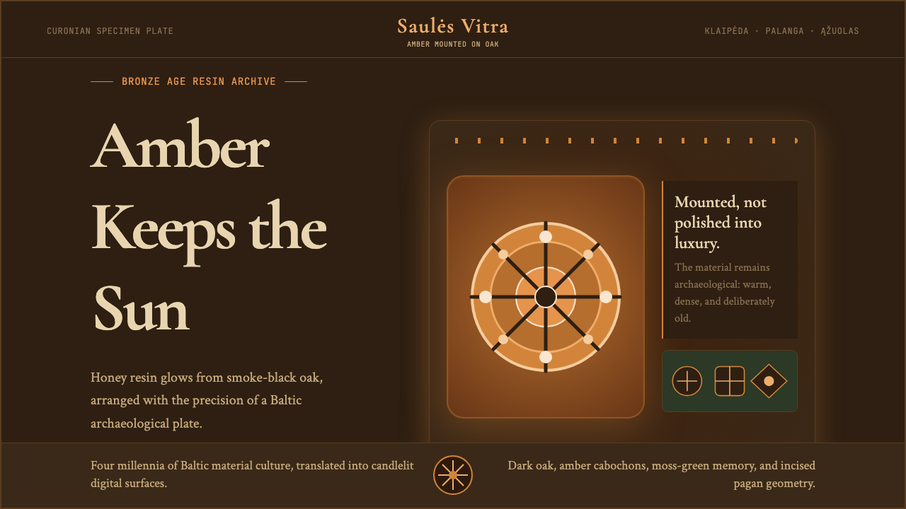 Lithuanian Amber (Baltic Pagan)Ancient amber glows. Honey resin on smoked oak, framed by saulė geometry.古琥珀在发光:烟熏橡木上蜂蜜树脂,太阳轮几何定框。