What is Celtic Knotwork?什么是 Celtic Knotwork?
Celtic Knotwork weaves fifteen centuries of sacred geometry into a single unbroken line — where every strand returns to its origin and nothing ever truly ends.凯尔特绳结将十五个世纪的神圣几何编织进一条永不断绝的线——每一股线都回到起点,万物生生不息。
Celtic Knotwork in briefCeltic Knotwork 速览
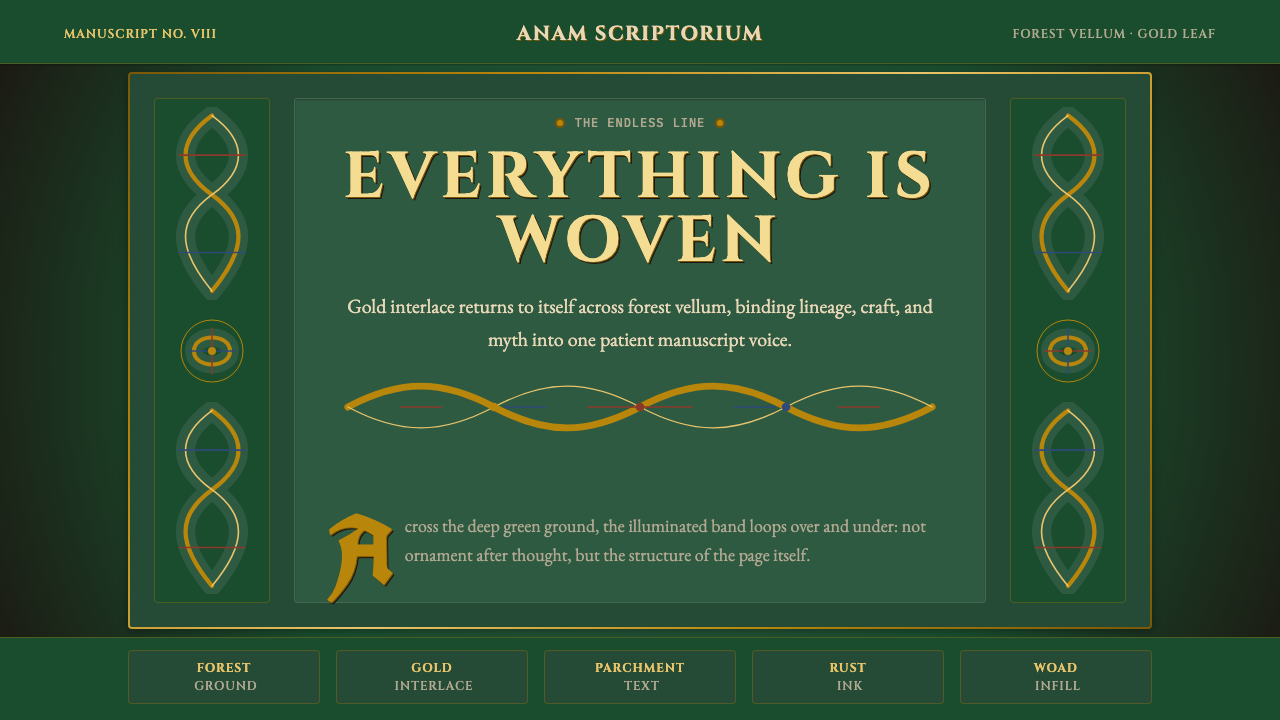
Celtic Knotwork is a decorative tradition rooted in the Insular art of early medieval Ireland, Scotland, and Northumbria, characterized by continuous interlaced bands that loop, cross, and return on themselves without visible beginning or end. The style encompasses zoomorphic animal interlace, geometric plaitwork, spiral knotwork derived from La Tène metalwork, and the illuminated carpet pages that remain its most recognizable expression. At its core is a single governing idea: the endless line as metaphor for eternity, interconnection, and the cyclical nature of life and spirit.凯尔特绳结是植根于中世纪早期爱尔兰、苏格兰与诺森布里亚岛屿艺术(Insular Art)的装饰传统,以连续交织的带状线条为特征——这些线条相互缠绕、穿越,又回归自身,没有可见的起点或终点。这一风格涵盖动物形交织纹样(Zoomorphic Interlace)、几何编织纹、源自拉坦纳金属工艺的螺旋结纹,以及至今最为人熟知的彩饰「地毯页」(Carpet Page)。其核心是一个统驭一切的意象:无尽之线,作为永恒、相互关联与生命轮回的隐喻。
Unlike ornamental traditions that rely on symmetrical repeat patterns applied to a neutral field, Celtic Knotwork is structurally generative — the knot is both the pattern and the structure. Each intersection is a crossing-over decision: one strand passes above, the other below, in alternating sequence. Follow any strand and it will eventually return to itself, having threaded through every other strand in the composition. This interlocking logic gives the style its characteristic density and the hypnotic quality that draws the eye inward.与依赖对称重复纹样铺陈于中性底面的装饰传统不同,凯尔特绳结在结构上是自我生成的——绳结本身既是纹样,也是结构。每一个交叉点都是一次穿越的决定:一股线从上方经过,另一股从下方穿行,交替循环。沿任意一股线追踪下去,它终将回到自身,并在途中穿越构图中的每一股其他线条。这种互锁的逻辑赋予这一风格以标志性的密度,以及将视线引向内部的催眠品质。
The visual palette of historical Celtic work is drawn from the materials of manuscript illumination: deep forest greens from verdigris and malachite pigments, warm gold from actual gold leaf or orpiment, deep blue from lapis lazuli or woad, iron-rust red from red lead, and the warm cream of prepared calfskin vellum. These are not colors chosen for decorative effect alone — they were the colors that the physical craft made available, and their particular warmth and depth reflect centuries of material refinement.历史上凯尔特作品的视觉色彩取自抄本彩饰的材料语言:铜绿与孔雀石颜料调出的深林绿,真正金箔或雌黄带来的暖金,青金石或菘蓝染出的深蓝,铅丹制成的铁锈红,以及精制犊皮纸的温暖奶油色。这些颜色并非单纯出于装饰考量而选定——它们是那个时代的物质工艺所能给予的色彩,其特有的温度与深度折射出数百年工艺积累的光泽。
See the Celtic Knotwork design system查看 Celtic Knotwork 完整设计系统
Where does Celtic Knotwork come from?Celtic Knotwork 从何而来?
The roots of Celtic interlace are not exclusively Celtic. Early evidence of interlaced banding appears in Roman mosaic floors and Coptic textile work from Egypt, and similar plaiting motifs were common across the late antique Mediterranean. What distinguishes the Insular tradition is the degree to which these borrowed motifs were systematized, densified, and elevated into a primary artistic vocabulary rather than marginal decoration. Between roughly the fifth and ninth centuries CE, the monasteries of Ireland and the Scottish isles transformed plaitwork into an autonomous art form whose complexity has no parallel in the broader European tradition.凯尔特交织纹样的根源并不专属于凯尔特文化。罗马马赛克地板与埃及科普特纺织品中已可见早期的交织带状纹样,类似的编织母题在晚期古代地中海世界亦普遍存在。岛屿艺术(Insular Art)传统的独特之处,在于这些借用的母题被系统化、高度密集化,并提升为主要艺术语言,而非边缘装饰。大约在公元五至九世纪之间,爱尔兰与苏格兰诸岛的修道院将编织纹样转化为一种自律的艺术形式,其复杂程度在更广泛的欧洲传统中无出其右。
The Book of Kells, produced around 800 CE at the monastery of Iona or a closely related scriptorium and now held at Trinity College Dublin, represents the pinnacle of this tradition. Its carpet pages — full compositions given over entirely to interlaced knotwork with no text — contain knot patterns of extraordinary intricacy, with individual bands often finer than a human hair and compositions that would occupy a modern analyst for hours to trace completely. Contemporary scholars believe the illuminators used grids and compasses to plan the geometry before laying in the ink, a level of systematic preparation that anticipates modern design systems thinking. The Lindisfarne Gospels, produced around 715 CE at the monastery off the Northumbrian coast, and the Lichfield Gospels provide parallel examples of the tradition at comparable sophistication.约于公元八〇〇年在爱奥纳修道院或与其密切相关的抄经室写就、现珍藏于都柏林三一学院的《凯尔斯书》,代表了这一传统的顶峰。其地毯页——整页构图完全由交织绳结组成,不含任何文字——呈现出极致繁复的结纹,单条带状线条往往细于发丝,完整追踪一幅构图甚至需要现代研究者耗费数小时。当代学者认为,彩饰师在落墨之前使用方格网与圆规规划几何布局,这种系统化的预备程度预示着现代设计系统的思维方式。约于公元七一五年在诺森布里亚海岸外林迪斯法恩修道院写就的《林迪斯法恩福音书》,以及《利奇菲尔德福音书》,提供了这一传统在同等精妙程度上的平行范本。
The standing stone crosses of Ireland and Scotland — the High Crosses of Muiredach at Monasterboice, Clonmacnoise, and Iona among the most celebrated — translated the interlace tradition into monumental carved stone. Working in sandstone and granite without the benefit of modern tools, the Pictish and Irish carvers achieved knotwork panels of sustained complexity, often combining geometric interlace with figural panels depicting biblical narrative. These crosses were public works in the fullest sense: theological and political statements visible at distances, whose knotwork borders served both as decoration and as symbolic framing for the sacred scenes within.爱尔兰与苏格兰的立石高十字架——其中以蒙纳斯特博伊斯、克隆麦克诺伊斯和爱奥纳的穆瑞达赫(Muiredach)高十字最为著名——将交织传统转化为纪念碑式的石刻艺术。皮克特与爱尔兰的石匠在没有现代工具的情况下,在砂岩与花岗岩上实现了持续复杂的绳结面板,并常常将几何交织与描绘圣经叙事的人物面板相结合。这些高十字架是最完整意义上的公共作品:神学与政治的宣示,在远处即可辨认,其绳结边框既是装饰,也是内部神圣场景的象征性框架。
The Celtic Revival of the nineteenth century reintroduced knotwork to a broad European and American audience, filtered through Romantic nationalism and the antiquarian scholarship of figures such as George Bain, whose 1951 book Celtic Art: The Methods of Construction remains the foundational practical guide to drawing Celtic knots geometrically. Bain's contribution was to reconstruct the grid-based method he believed the original illuminators used, making the tradition reproducible and learnable outside a monastic context. The Revival also connected knotwork to Irish cultural identity politics in ways that persist today — Celtic Knotwork is simultaneously an art-historical category, a living craft tradition, and a cultural signifier with strong contemporary resonance.十九世纪的凯尔特复兴运动通过浪漫主义民族主义与古物学术的过滤,将绳结纹样重新引介给广大欧洲与美国受众。其中,乔治·班(George Bain)于一九五一年出版的《凯尔特艺术:构造方法》至今仍是以几何方式绘制凯尔特结的基础实践指南。班的贡献在于重建了他认为原始彩饰师所使用的网格方法,使这一传统得以在修道院语境之外可复现、可学习。这场复兴运动也将绳结纹样与爱尔兰文化身份政治紧密相连,这种联结延续至今——凯尔特绳结同时是一个艺术史范畴、一个仍在延续的活态工艺传统,以及一个在当代具有强烈共鸣的文化符号。
What defines the Celtic Knotwork look?Celtic Knotwork 的视觉特征是什么?
The Endless Line无尽之线
The defining structural feature of Celtic Knotwork is the unbroken strand that passes continuously through the composition, looping over and under other strands in strict alternation. A correctly drawn Celtic knot contains no loose ends and no breaks — every strand returns to itself, forming a closed loop. This is not merely a visual convention but a structural rule: any composition where a strand terminates is technically a plait rather than a knot. The endless quality was understood by medieval illuminators as carrying spiritual meaning — the infinite, the eternal, the indivisibility of divine order.凯尔特绳结最根本的结构特征是那条不间断的线股——它持续穿越构图,依照严格的交替规则从其他线股的上方或下方穿行。一幅正确绘制的凯尔特结没有松散的线头,也没有断点——每一股线都回归自身,形成一个闭合的环。这不仅是视觉惯例,更是结构规则:任何线股有终端的构图,严格意义上只是编织纹(plait)而非结纹(knot)。这种无尽的特质被中世纪彩饰师理解为承载精神含义——无限、永恒与神圣秩序的不可分割。
Color and Material Warmth色彩与材质温度
The authentic Celtic palette is drawn from mineral and organic pigments applied to warm vellum: deep forest green, burnished gold, lapis blue, iron-rust red, and the undyed cream of the support itself. These colors are never cold or purely synthetic — they carry the warmth of their material origins. In application, gold and green are primary; blue and red are accents used to distinguish zoomorphic elements or to mark structural divisions within complex compositions. The ground — whether cream vellum or deep green — is always substantive, never neutral white.正宗的凯尔特色板源自施于温暖犊皮纸上的矿物与有机颜料:深林绿、磨光的金色、青金石蓝、铁锈红,以及底材本身未染色的奶油色。这些颜色从不冰冷或纯粹合成——它们携带着各自物质起源的温度。在应用中,金色与绿色居主导;蓝色与红色作为强调色,用于区分动物形元素或标示复杂构图内部的结构分区。底面——无论是奶油色犊皮纸还是深绿色——始终具有实质感,绝非中性的白色。
Geometric Underpinning几何底层逻辑
Behind every Celtic knot lies a grid. Historical analysis of the Book of Kells and the Lindisfarne Gospels reveals the use of precisely ruled frameworks — based on squares, diamonds, and circular segments — from which the visible interlace pattern is derived. George Bain's reconstruction of this method shows that even the most complex knotwork carpet page can be reduced to a finite set of geometric decisions: grid spacing, crossing pattern, terminal treatment. This geometric discipline gives the style its precision and its capacity for infinite variation within a consistent structural grammar.每一幅凯尔特结的背后都有一张方格网。对《凯尔斯书》与《林迪斯法恩福音书》的历史分析揭示了精确描画的框架结构——基于正方形、菱形与圆弧段——可见的交织纹样正是从中衍生而来。乔治·班对这一方法的重建表明,即使是最复杂的绳结地毯页,也能被归结为一组有限的几何决定:网格间距、交叉模式与末端处理。这种几何纪律赋予这一风格以精准性,以及在一套一致结构语法内实现无限变化的能力。
Zoomorphic Interlace动物形交织
A major subcategory of Insular art, zoomorphic interlace replaces geometric bands with stylized animal bodies — typically birds, wolves, serpents, and hybrid creatures — whose elongated limbs, necks, and tails become the interlacing strands. The animals are not depicted naturalistically but abstracted to the degree required for the strand-logic to hold: a bird's neck may spiral three times before connecting to its tail, a wolf's limbs may braid through three other creatures. Zoomorphic panels were used especially in Gospel book illumination to frame canon tables and initial letters.作为岛屿艺术的一大重要子类,动物形交织以程式化的动物躯体取代几何带状线条——通常是鸟类、狼、蛇与混合生物——它们细长的肢体、颈部与尾巴成为交织的线股。这些动物并非写实描绘,而是被抽象到线股逻辑得以成立所必要的程度:一只鸟的颈部可能盘旋三圈后才与尾部相连,一头狼的肢体可能与另外三只生物交编在一起。动物形面板尤其被用于福音书彩饰中,框绕经典对照表(Canon Table)与首字母装饰。
Spirals and La Tène Heritage螺旋纹与拉坦纳传承
Alongside true knotwork, Celtic design employs a family of spiral motifs inherited from the earlier Iron Age La Tène tradition of continental Europe, transmitted through metalwork — torcs, fibulae, shield bosses — before appearing in manuscript form. The characteristic trumpet spiral, triskele, and triple spiral connect outward points through curved, expanding lines that accelerate toward their centers. These spirals operate differently from interlace — they expand outward rather than folding back — but they share the same visual logic of continuous motion and are often combined with true knotwork in the same composition.在真正的绳结纹样之外,凯尔特设计还运用一系列源自欧洲大陆早期铁器时代拉坦纳(La Tène)传统的螺旋母题——这些母题经由金属工艺——颈饰、别针、盾牌中央饰件——传承而来,后才出现于抄本形式中。标志性的喇叭螺旋(Trumpet Spiral)、三股旋(Triskele)与三重螺旋(Triple Spiral)以向外扩展、朝中心加速的弯曲线条连接各端点。这些螺旋纹与交织纹运作方式不同——它们向外扩展而非折回——但共享同样的连续运动视觉逻辑,并常与真正的绳结纹样在同一构图中结合使用。
Illuminated Initials and Text Integration彩饰首字母与文本融合
In manuscript tradition, Celtic Knotwork rarely appears in isolation from text. The illuminated initial — a letter enlarged and elaborated to fill a substantial portion of the page — is one of the tradition's signature formats. These initials are not merely decorated letterforms; they are architectural structures in which the letter's body becomes a framework for knotwork panels, zoomorphic figures, and spiral ornament. The Chi-Rho page of the Book of Kells, which opens the account of the Nativity, is the most celebrated example: the letters themselves dissolve into a composition of extraordinary complexity containing the figures of angels, cats, mice, and at least one otter.在抄本传统中,凯尔特绳结极少脱离文本而独立存在。彩饰首字母——一个被放大并精心装饰、占据页面相当大面积的字母——是这一传统的标志性格式之一。这些首字母并非仅仅是被装饰过的字形;它们是建筑般的结构,字母的躯体成为绳结面板、动物形图案与螺旋装饰的框架。《凯尔斯书》开启诞生叙事的Chi-Rho页是最著名的范例:字母本身消融进一幅极致复杂的构图,其中包含天使、猫、老鼠与至少一只水獭的身影。
Monumental Scale and Stone Carving纪念碑尺度与石刻
Celtic Knotwork was not confined to the intimate scale of manuscript pages. The carved High Crosses of Ireland and Scotland carried knotwork patterns at a monumental scale, cut into sandstone and granite using iron chisels without the benefit of any power tools. The translation from pen-and-pigment to mallet-and-chisel required a simplification of line — carved knotwork tends toward broader bands and more widely spaced crossings than manuscript work — but retained the essential structural logic. This cross-media character is fundamental to understanding the style: it is not a technique but a grammar, equally at home at the scale of a marginalia detail and the scale of a two-metre stone monument.凯尔特绳结并不局限于抄本页面的亲密尺度。爱尔兰与苏格兰高十字架上的绳结纹样在纪念碑式的尺度下被呈现,以铁凿在砂岩与花岗岩上刻就,全程无任何动力工具辅助。从笔与颜料到锤子与凿子的转换要求对线条做出简化——石刻绳结倾向于比抄本作品更宽的带状线条与更宽松的交叉间距——但保留了基本的结构逻辑。这种跨媒介特性对理解这一风格至关重要:它不是一种技法,而是一套语法,既能在旁注细节的尺度上生存,也能在两米高的石碑尺度上呈现。
See the Celtic Knotwork design system查看 Celtic Knotwork 完整设计系统
Who shaped Celtic Knotwork?谁塑造了 Celtic Knotwork?
The monastery on the island of Iona, off the western coast of Scotland, is the most likely origin of the Book of Kells, which was begun there and possibly completed after the community fled Viking raids to Kells in County Meath around 806 CE. Iona was the founding house of the Columban network of monasteries that spread from Ireland across Scotland and into Northumbria, and its scriptorium represented the intellectual and artistic center of what scholars now call the Columban tradition. The style developed at Iona synthesized Irish La Tène spiral traditions with Mediterranean interlace motifs introduced through contact with Coptic and Byzantine manuscripts.位于苏格兰西海岸爱奥纳岛上的修道院,极有可能是《凯尔斯书》的发源地——该书在此开始写作,可能在公元八〇六年前后共同体为躲避维京侵袭撤往米斯郡凯尔斯后方才完成。爱奥纳是科伦班(Columban)修道院网络的创始院,这一网络从爱尔兰延伸至苏格兰并深入诺森布里亚,其抄经室代表了学者所称「科伦班传统」的智识与艺术中心。爱奥纳发展出的风格,将爱尔兰拉坦纳螺旋传统与经由科普特及拜占庭抄本接触引入的地中海交织母题融为一体。
Muiredach mac Domhnaill, an abbot of Monasterboice in County Louth who died in 923 CE, is the figure most directly associated with the high cross that bears his name — the Muiredach Cross, regarded as the finest surviving example of Irish High Cross carving. An inscription at its base reads 'a prayer for Muiredach by whom this cross was made.' The cross stands over five metres tall and combines figural biblical panels with knotwork and spiral borders of extraordinary refinement, demonstrating the mature integration of narrative and ornamental traditions that defined the ninth and tenth century Irish monastic aesthetic.穆瑞达赫·麦克·多纳(Muiredach mac Domhnaill)是劳斯郡蒙纳斯特博伊斯的修道院院长,卒于公元九二三年,与以他名字命名的高十字架最为直接相关——穆瑞达赫十字架被视为现存最精美的爱尔兰高十字石刻范例。其底部铭文写道:「为穆瑞达赫祈祷,此十字架由他所立。」这座高十字架逾五米高,将圣经叙事人物面板与极为精致的绳结和螺旋边框相结合,展现了九至十世纪爱尔兰修道院美学中叙事与装饰传统的成熟融合。
Eadfrith, Bishop of Lindisfarne from 698 CE until his death in 721 CE, is identified in a colophon added to the Lindisfarne Gospels in the tenth century as the scribe and illuminator of the manuscript. Whether the attribution is accurate — some scholars believe the work may have involved multiple hands — Eadfrith or the scriptorium tradition he led produced one of the most technically demanding examples of Insular illumination. The carpet pages of the Lindisfarne Gospels show knotwork of a precision and regularity that modern analysts have confirmed required mathematical planning comparable to the kind of systematic layout work done in contemporary design software.伊德弗里斯(Eadfrith)自公元六九八年起担任林迪斯法恩主教,直至公元七二一年辞世,十世纪添加于《林迪斯法恩福音书》中的一段题记认定他是该抄本的抄写与彩饰者。无论这一归属是否准确——部分学者认为这项工作可能涉及多位参与者——伊德弗里斯或他所领导的抄经室传统,创作了岛屿彩饰中技术要求最为严苛的范例之一。《林迪斯法恩福音书》的地毯页展现了精准度与规整性兼具的绳结纹样,现代分析者已证实这需要与当代设计软件布局工作相当的数学规划。
George Bain (1881–1968) was a Scottish artist and art educator who devoted decades to the systematic analysis and reconstruction of Celtic design methods. His 1951 book Celtic Art: The Methods of Construction, published after years of careful study of illuminated manuscripts and carved stones, demonstrated that the complex knotwork of the Book of Kells and the High Crosses was generated by geometric grid systems that any trained practitioner could reproduce. Bain's work was decisive in transforming Celtic Knotwork from an inaccessible historical artifact into a living craft tradition, and his method — drawing the grid, setting the crossing pattern, then tracing the strand — remains the standard pedagogical approach used in Celtic art workshops worldwide today.乔治·班(George Bain,1881—1968)是苏格兰艺术家与艺术教育者,他将数十年投入对凯尔特设计方法的系统分析与重建。他在对彩饰抄本与石刻进行多年细致研究后出版的《凯尔特艺术:构造方法》(1951年)证明,《凯尔斯书》与高十字架的复杂绳结纹样,是由任何受过训练的实践者都能复现的几何网格系统生成的。班的工作在决定性地将凯尔特绳结从难以企及的历史文物转化为活态工艺传统方面功不可没;他的方法——画网格、设定交叉模式、再描绘线股——至今仍是全球凯尔特艺术工坊所使用的标准教学方法。
The Picts — the pre-Gaelic inhabitants of northern and eastern Scotland — developed a parallel tradition of carved symbol stones that incorporated interlace alongside a unique system of abstract symbols whose meanings remain undeciphered. Pictish carved stones of the seventh through ninth centuries show interlace work of sophistication comparable to the finest manuscript illumination, adapted to the very different material conditions of outdoor stone carving in the Scottish climate. The Pictish contribution is often overlooked in favor of the Irish manuscript tradition, but the cross-slabs at Nigg, Hilton of Cadboll, and Meigle demonstrate that the interlace grammar was shared across linguistic and cultural boundaries, adapted locally while maintaining its essential structural logic.皮克特人——苏格兰北部与东部的前盖尔语居民——发展出一套平行的刻石符号传统,将交织纹样与一套含义至今未被破解的独特抽象符号体系相结合。七至九世纪的皮克特刻石展现出与最精美抄本彩饰相当的交织艺术水准,并适应了苏格兰户外石刻与抄本截然不同的物质条件。皮克特人的贡献常常被爱尔兰抄本传统所遮蔽,但尼格(Nigg)、希尔顿·卡德博尔(Hilton of Cadboll)与迈格尔(Meigle)的十字石板证明,交织语法跨越语言与文化界限而共享,在地方性适应中保持了其本质的结构逻辑。
How do you use Celtic Knotwork today?今天怎么用 Celtic Knotwork?
Celtic Knotwork is among the most context-specific historical styles in the designer's toolkit — it carries deep cultural and temporal associations that actively shape how audiences receive a design. Applied thoughtfully, it conveys depth, craft, continuity, and a certain austere beauty. Applied carelessly, it reads as costume or kitsch. The difference between the two lies almost entirely in understanding what the style is doing structurally, not just what it looks like on the surface.凯尔特绳结是设计师工具箱中语境特异性最强的历史风格之一——它承载着深厚的文化与时间关联,这些关联会主动影响受众对设计的接受方式。应用得当,它传达出深度、工艺感、传承延续与某种克制的美。应用失当,则沦为戏服或俗气之物。两者之间的差异,几乎完全取决于理解这一风格在结构上做了什么,而非它表面上看起来如何。
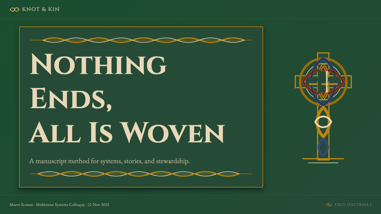
For presentation slides, Celtic Knotwork works best when applied with discipline and economy. A cover slide benefits from a single large knotwork or spiral motif set against a deep forest-green or midnight-blue ground, with title text in a carved-stone serif face placed in high contrast. The knot should be used as a framing or anchoring element, not as wallpaper — one considered piece of interlace positioned at a corner or as a central medallion reads as intentional craft; a tiled pattern reads as clip art. Content slides should restrain the ornament drastically: a knotwork divider border at the top or bottom of a slide, with the body given over to clean text hierarchy on a cream ground, preserves the visual grammar without overwhelming the information. Data slides can use knotwork-derived line motifs — interlaced borders around chart panels — to give structure without turning charts into decoration.在演示文稿中,凯尔特绳结在以纪律与节制应用时效果最佳。封面适合用一个大型绳结或螺旋母题,置于深林绿或午夜蓝的底面上,以石刻风格的衬线字体高对比度地放置标题文字。绳结应当作为框架或锚定元素使用,而非壁纸——一段经过考量、放置于角落或作为中央徽章的交织图案读起来像是有意为之的工艺;平铺的纹样则沦为剪贴画。内容页应大幅克制装饰:页面顶部或底部一道绳结分割边框,主体部分在奶油色底面上保持清晰的文字层级,在不淹没信息的同时保留视觉语法。数据页可使用从绳结派生的线性母题——围绕图表面板的交织边框——在不将图表变成装饰品的同时赋予结构感。
For web interfaces and dashboards, the style is best suited to landing pages, about pages, heritage product displays, and cultural institution sites rather than functional utility screens. The appropriate application involves forest-green or deep-ground hero sections with gold-toned typographic headings, cream-ground content sections with generous margin, and narrow knotwork border elements used as structural dividers rather than decoration. Interactive elements — buttons, links, hover states — should use the gold and rust tones as accent colors for their active states, maintaining the palette's material warmth. Pricing pages can use knotwork medallion motifs to distinguish tier cards, but the functional text within each card should be held in a clean, well-spaced serif to remain readable.对于网页界面和仪表板,这一风格最适合落地页、关于页、传统产品展示与文化机构网站,而非功能性实用界面。恰当的应用方式包括:以深绿色或深色为主的英雄区配金调排印标题,以奶油色为底、留有充裕边距的内容区,以及将细窄绳结边框元素用作结构性分割线而非纯粹装饰。交互元素——按钮、链接、悬停状态——应使用金色与铁锈色调作为激活状态的强调色,保持色板的材质温度。定价页可使用绳结徽章母题区分套餐卡片,但每张卡片内的功能性文字应以简洁、充裕间距的衬线字体呈现,以保证可读性。
For editorial and marketing applications, Celtic Knotwork provides a rich vocabulary for heritage branding, cultural event promotion, literary publishing, whiskey and spirits, artisan food and beverage, and any context where craft provenance is a desired association. A well-executed editorial spread uses a single large carpet-page-derived illustration or border to establish the cultural register on the opening page, then carries the palette — forest green, gold, cream — through the remaining pages without repeating the dense knotwork. Marketing materials work well with the style's poster-like quality when the interlace is used at large scale and high contrast: a single knotwork initial at cover scale, a spiral motif treated as a full-bleed background element at reduced opacity. The style's connection to handcraft means that paper, printing, and material finish choices are especially important — uncoated stock, letterpress or foil detailing, and warm-white rather than cool-white backgrounds all reinforce the aesthetic's integrity.对于编辑与营销应用,凯尔特绳结为传统品牌、文化活动推广、文学出版、威士忌与烈酒、手工食品饮料,以及任何希望与工艺出处发生关联的场景,提供了丰富的视觉语汇。一个执行到位的编辑跨页,在起始页使用单幅从地毯页派生的大型插图或边框确立文化基调,随后将色板——林绿、金色、奶油色——贯穿余下页面,而不重复使用密集的绳结纹样。营销材料在大尺度、高对比度使用交织纹样时,能够充分体现这一风格的海报式气魄:封面尺度的单个绳结首字母,或以降低不透明度处理的螺旋母题作为全出血背景元素。这一风格与手工艺的关联意味着纸张、印刷与材质处理的选择尤为重要——非涂布纸、活版或烫金细节,以及暖白而非冷白的背景,都能强化美学的完整性。
A common and serious mistake when applying Celtic Knotwork is treating the interlace as a purely surface texture — a background pattern or clip-art border — rather than as a structural element with its own internal logic. Designs that tile a knotwork pattern across a background without regard for compositional placement read as generic medievalism rather than authentic Celtic design. A related error is combining Celtic ornament with sans-serif or modernist typography on the assumption that the contrast is sophisticated — more often it reads as incoherent, because the two systems carry opposite assumptions about the relationship between ornament and structure. Celtic Knotwork pairs most naturally with serif typefaces that have their own historical depth: carved-stone capitals, humanist serifs, and blackletter forms all work; neutral geometric sans-serifs fight the style. Finally, oversaturation of the palette — using all four of the tradition's colors simultaneously at full intensity — produces muddy visual results. In historical work, one color dominated at a time, with others appearing as accents; contemporary work should respect the same economy.应用凯尔特绳结时最常见也最严重的错误,是将交织纹样当作纯粹的表面纹理——背景图案或剪贴画边框——而非具有自身内在逻辑的结构性元素。将绳结纹样不顾构图位置地平铺于背景之上的设计,读起来像是泛化的中世纪主义,而非真正的凯尔特设计。一个相关的错误是将凯尔特装饰与无衬线或现代主义字体结合,以为这种对比是成熟的——更多情况下它读起来是不连贯的,因为两套系统对装饰与结构之间关系持有截然相反的假设。凯尔特绳结与具有自身历史深度的衬线字体最为自然地搭配:石刻体大写字母、人文主义衬线体与黑体(Blackletter)均可;中性几何无衬线体则与这一风格相互抵牾。最后,色板的过度饱和——同时以全强度使用传统的全部四种颜色——会产生混浊的视觉效果。在历史作品中,同一时间只有一种颜色占主导,其余作为强调;当代应用应当遵守同样的节约原则。
See the Celtic Knotwork design system查看 Celtic Knotwork 完整设计系统
Celtic Knotwork — FAQCeltic Knotwork · 常见问题
Is Celtic Knotwork the same as Viking or Norse ornament?凯尔特绳结和维京或北欧装饰是同一回事吗?
They are related but distinct. Both traditions use interlace, and there was genuine historical exchange between them — the Viking Age brought Norse settlers into close contact with Insular art in Ireland, Scotland, and Northumbria, and Hiberno-Norse art blends both traditions in objects like the Ardagh Chalice and various Viking-period brooches. However, the structural grammar differs: Celtic interlace follows a strict over-under alternation with no loose ends, while Norse interlace (particularly in the Urnes and Jelling styles) is characterized by animal bodies in more fluid, asymmetric compositions with ribbon-like beasts that grip and bite each other. Pure Celtic Knotwork also lacks the aggressive figural drama of Norse work; its zoomorphic elements tend toward abstraction rather than narrative. The two traditions are best understood as cousins that shared vocabulary while developing distinct grammars.两者相关但截然不同。两种传统都使用交织纹样,历史上也确实有真实的相互影响——维京时代将北欧定居者带入与爱尔兰、苏格兰及诺森布里亚岛屿艺术的密切接触中,希伯诺-北欧(Hiberno-Norse)艺术在阿达赫圣杯(Ardagh Chalice)等器物与各类维京时期别针上混合了两种传统。然而,结构语法不同:凯尔特交织遵循严格的上下交替规则,没有松散线头;而北欧交织(特别是乌尔内斯风格与耶林风格)以更流动、更不对称的构图中的动物躯体为特征,带状怪兽相互抓咬。纯粹的凯尔特绳结也缺乏北欧作品中激烈的人物戏剧性;其动物形元素倾向于抽象化而非叙事化。两种传统最好被理解为共享词汇而发展出不同语法的表亲。
Can Celtic Knotwork work in a contemporary or minimal design context?凯尔特绳结能在当代或极简设计语境中使用吗?
It can, but the accommodation must be made on the style's terms rather than the contemporary design language's terms. The most successful contemporary applications use a single, well-resolved knotwork element — a border, a medallion, a terminal ornament — as a deliberate gesture against the surrounding minimalism, rather than attempting to strip the interlace down until it reads as a modern pattern. Celtic Knotwork simplified to abstraction loses its defining structural logic and becomes indistinguishable from generic geometric ornament. Conversely, a single confident piece of historically informed interlace, placed with precision against a clean modern layout, creates productive visual tension. The contrast works when the knotwork is allowed to be fully itself — complex, dense, historically rooted — within an otherwise restrained composition.可以,但这种适应必须以这一风格自身的条件为依归,而非以当代设计语言的条件为依归。最成功的当代应用,是将单个经过完整推敲的绳结元素——一道边框、一枚徽章、一个终端装饰——作为对周围极简主义的刻意姿态,而非试图将交织纹样简化到读起来像现代图案为止。被简化至抽象的凯尔特绳结失去了其决定性的结构逻辑,变得与泛化的几何装饰无法区分。反之,单件经过历史考量的交织图案,精准地置于简洁的现代版面之中,创造出富有成效的视觉张力。当绳结被允许在一个其余部分克制的构图中完全做自己——复杂、密集、植根于历史——这种对比才能奏效。
How do I distinguish authentic Celtic Knotwork from generic medieval-inspired pattern?如何区分真正的凯尔特绳结与泛化的中世纪灵感图案?
The primary test is structural: trace any strand in the composition. If it returns to itself after threading continuously through all other strands in alternating over-under fashion with no breaks, it is structurally a true knot. If strands terminate, if crossings are inconsistent, or if the pattern is simply a repeated tile without internal strand continuity, it is a generic plaitwork or faux-Celtic pattern. The secondary test is geometric: authentic Celtic compositions are derived from grid systems whose geometry can be identified and reconstructed. Authentic work also tends to have consistent band width throughout the composition, because the grid disciplines the strand spacing. Generic Celtic-inspired work often has irregular band widths that reveal improvised rather than geometrically planned construction.首要检验是结构性的:追踪构图中的任意一股线。如果它在以严格的上下交替方式持续穿越所有其他线股、中途无断点的情况下回归自身,它在结构上就是一个真正的结。如果线股有终端,如果交叉不一致,或者图案只是一个没有内部线股连续性的重复平铺,它就是泛化的编织纹或仿凯尔特图案。第二项检验是几何性的:真实的凯尔特构图源自可被识别和重建的网格系统。真实的作品在整个构图中往往具有一致的带状宽度,因为网格规范了线股间距。泛化的凯尔特灵感作品则常常具有不规则的带状宽度,这揭示了即兴构建而非几何规划的本质。
What are the right contexts for Celtic Knotwork, and where does it misfire?凯尔特绳结适合什么语境?在哪些场合会用错?
Celtic Knotwork is most at home in contexts where craft, heritage, depth of tradition, and a certain patient intricacy are desired values: literary publishing, whiskey and spirits branding, cultural institution identity, historical documentary design, premium artisan goods, and any communication whose purpose is to evoke the long view of human making. It struggles anywhere that demands speed, frictionless modernity, or emotional lightness — consumer tech interfaces, fast-food branding, children's educational products, and ultra-minimal luxury positioning all work against the style's fundamental character. It also misfires when applied ironically or superficially, since the style has enough cultural weight that careless application reads as disrespect rather than playfulness. The question to ask is whether the product or communication genuinely benefits from an association with deep time, handcraft, and the kind of beauty that rewards slow attention — if the answer is yes, Celtic Knotwork is a powerful choice.凯尔特绳结在工艺感、传统遗产、传承的深度与某种耐心繁复性是期望价值的语境中最为自在:文学出版、威士忌与烈酒品牌、文化机构形象、历史纪录片设计、高端手工商品,以及任何目的在于唤起人类制造活动之长时视角的传播项目。它在任何要求速度、无摩擦的现代性或情感轻盈性的场合都难以施展——消费科技界面、快餐品牌、儿童教育产品与极简奢侈品定位,都与这一风格的根本性格相悖。在反讽或表面性的应用中它也会失手,因为这一风格承载着足够的文化分量,粗心的应用读起来像是不尊重而非轻松玩耍。需要问的问题是:这个产品或传播项目是否真正从与深远时间、手工工艺,以及那种回报缓慢注意力的美的关联中获益——如果答案是肯定的,凯尔特绳结就是一个有力的选择。
Does Celtic Knotwork have to be dark and heavy, or can it be used in light, airy compositions?凯尔特绳结一定要深暗厚重吗?还是也可以用于明亮、轻盈的构图?
The historical palette is warm and substantive rather than inherently dark — the canonical ground is cream vellum, not black, and the gold and green of the illuminated tradition carry significant luminosity. A light variant of the style, using cream or warm off-white as the primary ground with gold and forest-green as the ornamental colors and a warm deep tone for text, is historically grounded and produces compositions that feel refined rather than heavy. What does not work is moving the palette toward cool, pastel, or desaturated tones — these drain the style of the material warmth that is central to its character. Similarly, reducing the density of the interlace to the point of sparseness undermines the style's essential logic: a Celtic knot at very low density simply looks unresolved. The style tolerates light grounds and moderate scale perfectly well; it does not tolerate thinness or coolness.历史色板是温暖而有实质感的,而非本质上的深暗——标准底面是奶油色犊皮纸,而非黑色,彩饰传统中的金色与绿色携带着相当的发光度。这一风格的浅色变体——以奶油色或温暖的米白色作为主要底面,以金色与林绿色作为装饰色,以深暖色调承担文字——有历史依据,并且呈现出精致而非厚重的构图感。不奏效的是将色板移向冷调、粉彩或去饱和色调——这会将这一风格特有的材质温度抽干。同样,将交织的密度降低到稀疏程度也会破坏这一风格的本质逻辑:密度极低的凯尔特结看起来只是未完成而已。这一风格完全接受浅色底面与适中尺度;它不接受单薄或冷调。
Related design styles相关设计风格
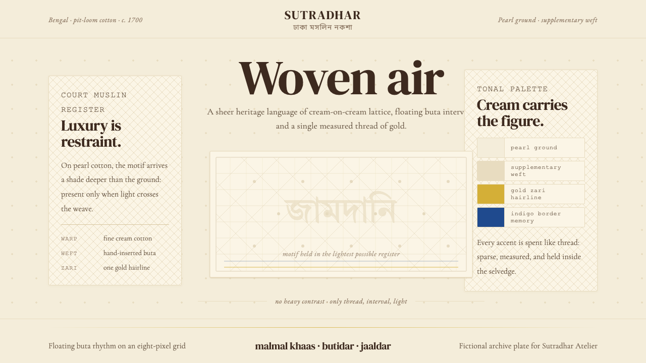 Bengali Jamdani WeavingLuxury whispers. Pearl cream, tonal buta, and one gold hairline make woven ai…奢华低语:珍珠奶白、浅色布塔与一线金丝,让织空气可见。
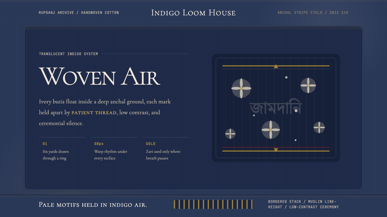 Bengali Jamdani MuslinBreathes like woven air. Indigo ground, ivory butis, and threadline borders s…如织空气般呼吸:靛蓝底、象牙布蒂与细线边框保持低对比。
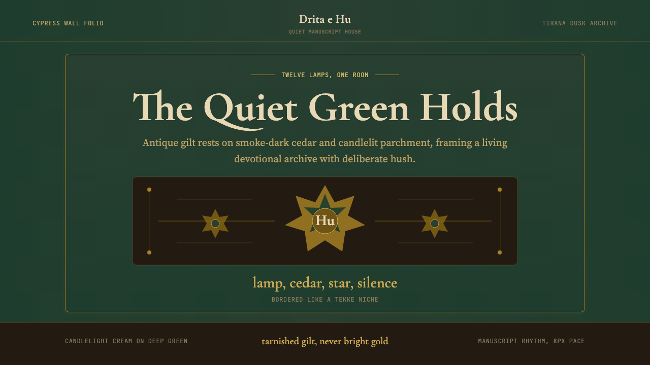 Albanian Bektashi Sufi (Tekke)Sacred quiet in cypress green. Gilt stars and Cormorant type frame a dusk tek…柏绿中的神圣静默。鎏金星纹与Cormorant字框出黄昏修道院壁龛。
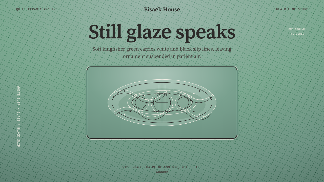 Goryeo Celadon 高麗青瓷Stillness carries ornament. Bisaek jade ground holds white and black hairline…静中见纹:翡色釉底承托黑白发丝镶嵌线。
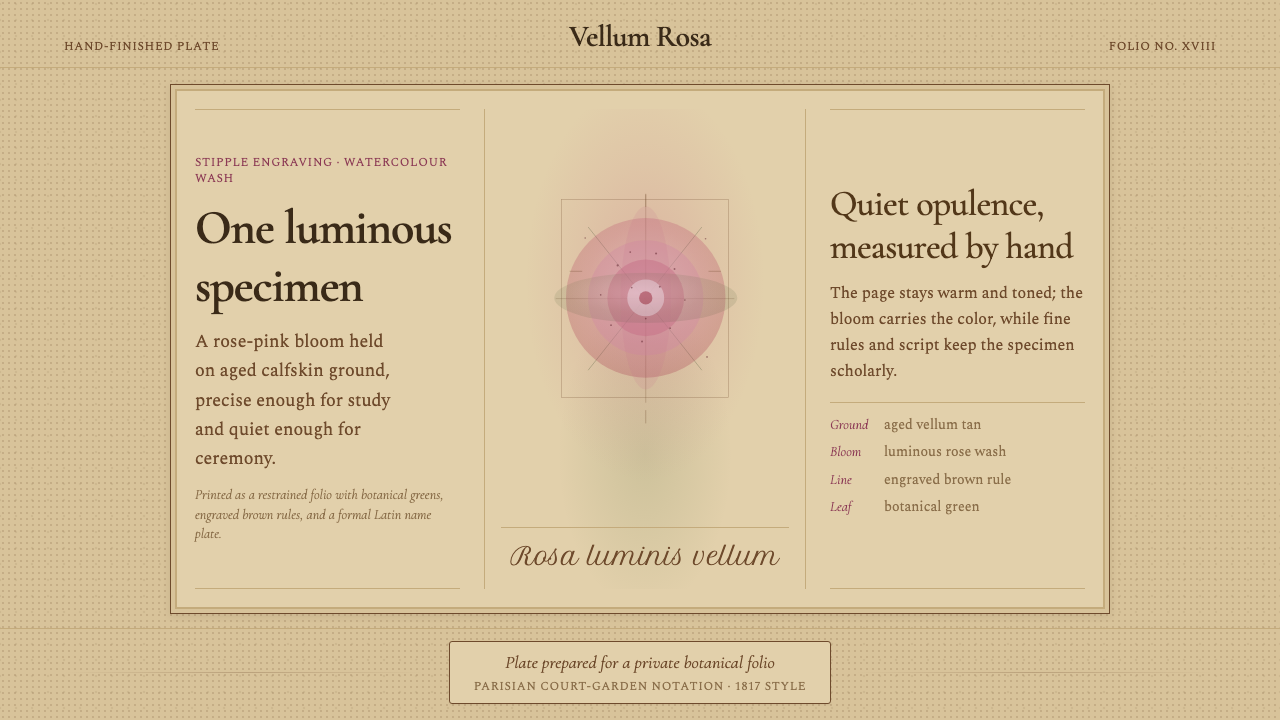 Redouté BotanicalScholarly opulence. Rose wash on aged vellum, framed by engraved brown rules.考究而低调华美:陈年羊皮纸上的玫瑰水彩,由棕色刻线框定。
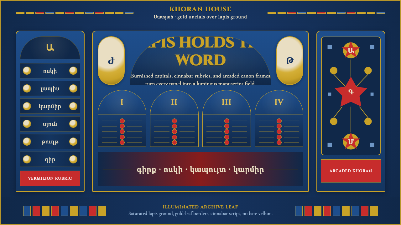 Armenian Manuscript FolkloreJewel-dense devotion. Lapis ground, gold uncials, and vermilion arcades fill…宝石般虔敬。青金石底、金色大写与朱砂拱廊填满画面。